
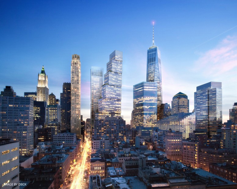
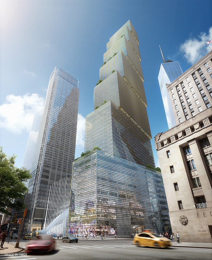
YIMBY sat down with Bjarke Ingels to talk about his firm’s design for 200 Greenwich Street, aka Two World Trade Center. Despite public outcry following the change from the Norman Foster version of the tower, BIG’s innovative and forward-thinking building will truly respond to the human needs of its tenants, while also punctuating the Downtown skyline with a 1,340-foot take on a classic ziggurat. We’ve also obtained a few additional renderings of the soon-to-be icon’s impact on the cityscape.
YIMBY in bold.
What’s the concept?
Two World Trade is almost like a vertical village of bespoke buildings within the building, that also can be seen as a single tower. The program creates large floor-plates for the studios, medium-sized floors for the newsrooms, and more classic tower floor-plates for the spec tenants.
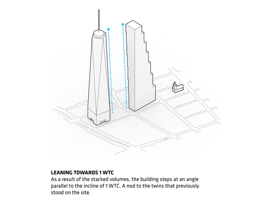
We tested out various kinds of massing — different types of logic — so we ended up saying it’s ok that the building’s components have different proportions, and are then stacked on top of each other. It actually has an inclination towards One World Trade Center, so the two towers — even though they’re not twinning — by having a mutual relationship, the space between them is parallel, although at an incline.
From the memorial, Two World Trade is really one of the group of towers; it has a vertical corner, but then it has an almost leaning aspect to it. It feels like it’s a completely straight-forward tower, but then there’s something weird going on, that it seems to lean with One World Trade Center.
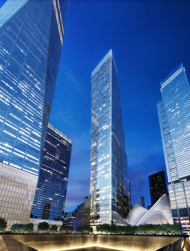
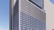
One + Two World Trade Center, image from BIG
What do you think of the negative commentary regarding your design versus the Foster design, and what are the positives when comparing the new building to what was formerly planned?
It’s a city of millions, you’re going to have a million different opinions. I’ve read a lot of really positive comments as well. But I think what’s important is, basically when 9/11 happened, it created this migration away from the Financial District, at least for all the financial firms. And then the financial crash of 2008 happened, emptying out even more space. Basically [the Foster tower] was designed as a bank, with the same floor-plate on every single level, until it would’ve had stranger floor-plates up at the top — it was also designed with a sky lobby, which means if you’re working in the upper half of the building, you have to change elevators.
Old design for 200 Greenwich Street, rendering by Foster + Partners
And this doesn’t have a sky lobby?
No, it’s the same all the way up. If you’re working on the 60th floor you don’t want to change elevators every trip up and down. The reason it’s tempting to propose a sky lobby is it allows you to slim the core at the bottom and have the same core all the way up, but it’s inefficient because everyone has to change elevators twice. So I think that may have also contributed to the old design not getting built. I think what we’ve tried to do is design a building that looks different because it performs differently; it’s the changing proportions of the different floor-plates that means a lot of different companies with a lot of different activities can happen within the same building.
Two World Trade Center, Fox News Lobby, image by DBOX
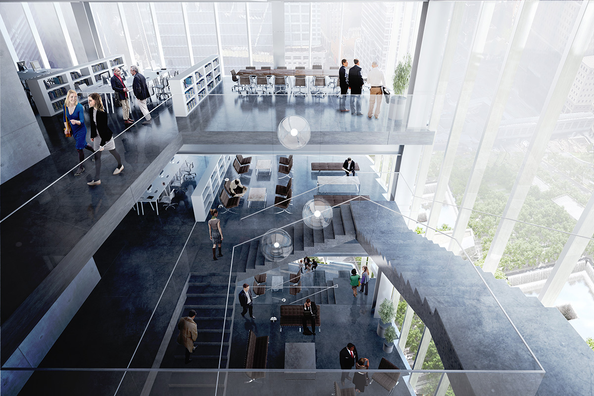
It has the diversity of a neighborhood, instead of duplicating a floor-plate X number of times. And then I think the fact that you have abundant outdoor spaces means that working in the building — not only will we dissolve the segregation between one floor and the other with the cascading voids, where people can see their colleagues four floors down, but you can actually extend your work out into the outdoors, so you can have phone-calls or meetings or lunches on terraces, 600 feet up, under the shadow of a tree, enjoying the fresh air.
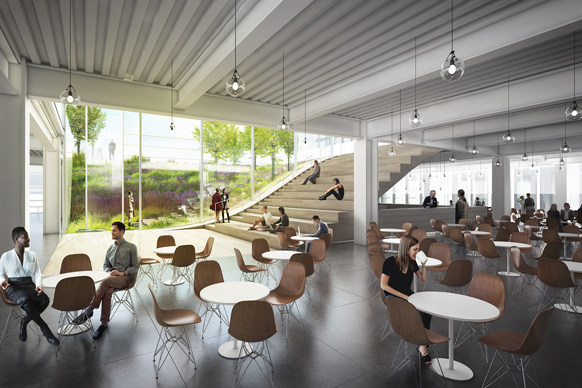
Two World Trade Center, cafe space, image by DBOX
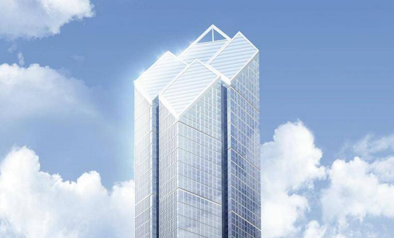
This would be the first tower in New York that cantilevers several times over, right?
Yes. Typically contemporary towers have extruded floor-plates, then something interesting at the top, and something interesting at the bottom. Here we tried to maintain the same logic throughout the entire building; from the Memorial it’s a very disciplined silhouette, but from Tribeca it becomes a more abstract, active building.
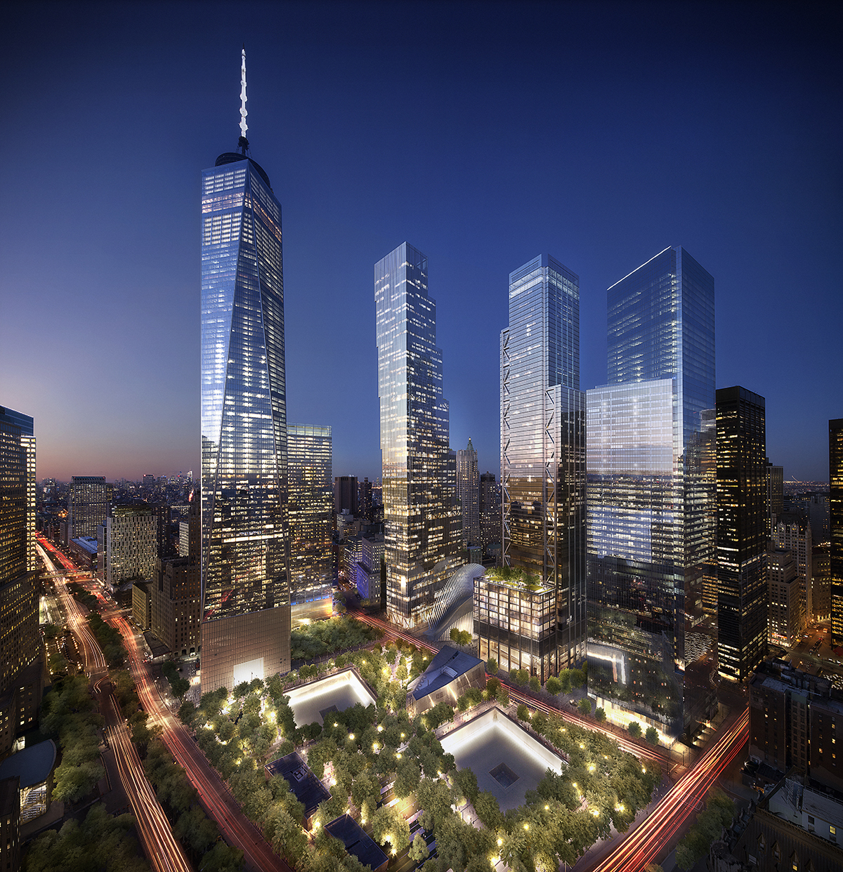
The new World Trade Center, image by DBOX
What are the plans for lighting and will it have any sort of iconic scheme?
We’re just starting schematic design now.
Two World Trade Center, image by DBOX
When did you start the design process?
Let’s say in December.
How much retail space is it going to have?
About 50,000 square feet, on the first three floors plus the ground level.
How was translating a partially built building into your new design realized?
It’s one of the main challenges — to land on predetermined locations. It’s like playing Twister with a 1,300-foot tower.
Basically we placed the cores where they want to sit, and then they come down, and we see the architecture of translation, as they distort to reach from one position to a predetermined rod; the same with the columns. That means that the lobby is going to have very expressive architecture but it’s purely out of trying to connect the dots.
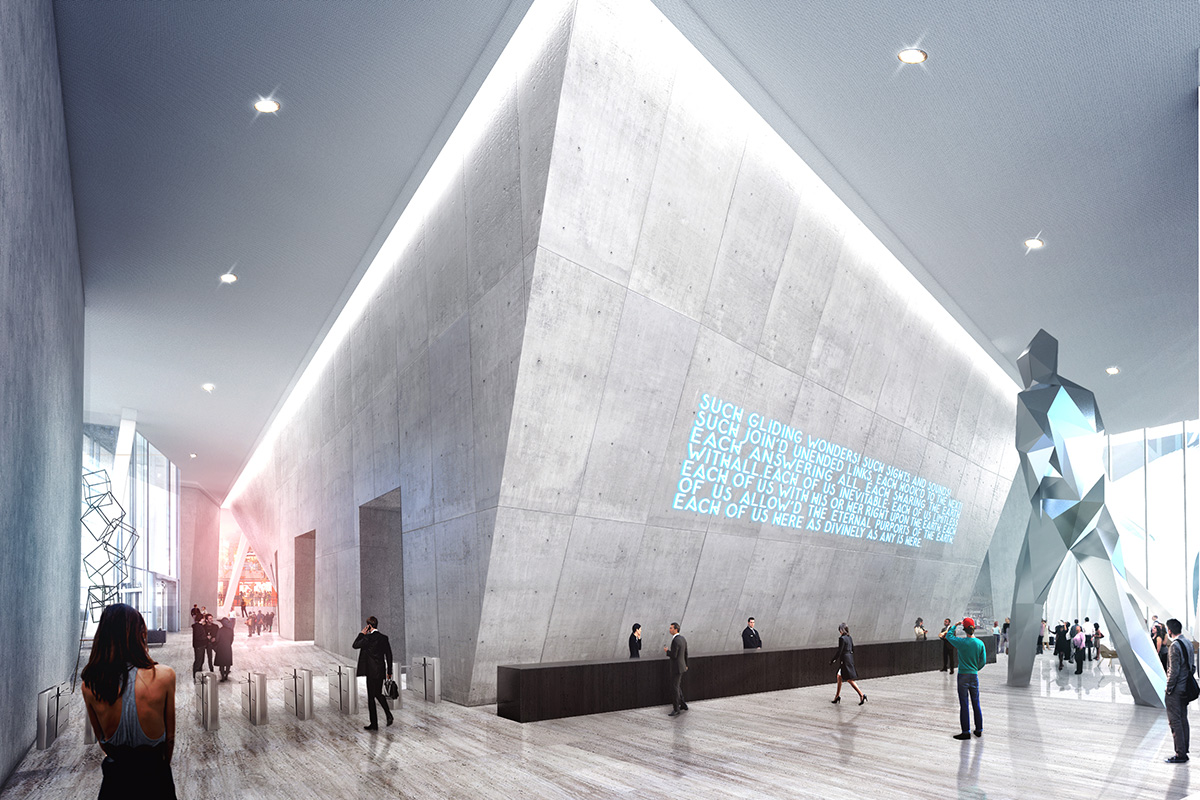
Two World Trade Center lobby, image by DBOX
How do you deal with New York’s climate when it comes to landscaping the outdoor space?
We’re looking at having different landscaping on each of the terraces, from lush climates on the lower levels, ending up with almost an arctic tundra. You will have different average temperatures and different conditions — in the Highlands, for every 200 meters or 600 feet, you drop about a degree. So the difference should be about two degrees [between top and bottom temperatures].
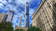
Can you describe the facade?
For the facade we looked at this idea of relating to our neighbors, but also from inside you want transparency. And from the outside, texture, and materials that patina, or have warmth. We’re looking at the idea of a shingle, both vertically and horizontally. It’s facing away from the southwest corner, so from that perspective it’s an all glass tower. But from the east or north, you can see the material of the mullion. The same is true when you look from below — you can see the mullions. So from the inside it gives you two different feelings.
Two World Trade Center, image by DBOX
The news ticker is going to be underneath?
Yes. Normally we refer to the roof as the fifth facade, but this will be the sixth facade, on the underside of the building. It’s a very active and lively building towards the rest of the city, but formal towards the Memorial. As you get distance, it recreates the twinning, not by having two identical buildings, but by having siblings. They both lean at the same angle, which means the space between them is parallel even though it’s sloping.
Have you heard anything regarding the Performing Arts Center?
I think details will be coming on that soon, but we’re not working on that.
Last question: will this be the tallest building you design in New York?
Only time will tell.
Subscribe to YIMBY’s daily e-mail
Follow YIMBYgram for real-time photo updates
Like YIMBY on Facebook
Follow YIMBY’s Twitter for the latest in YIMBYnews
Foster’s 2WTC was generic and the weakest design vs Rogers’ #3 and Maki’s #4. We all know Foster is capable of so much more. Ingels’ design is a VAST improvement and has the potential to become iconic. I’m very happy that Silverstein has allowed this building to be redesigned.
On what planet is Maki’s yawn inducing design better than Foster’s?
Foster’s design was easily what I was looking forward to the most of any building in the WTC complex. I’m normally a fan of BIG, but this is just bulky, inelegant and just “off.” The cantilevering almost makes it look like it’ll top over and the positioning leaves an awkward gap in the overall WTC silhouette. It just doesn’t fit.
I’m not feeling this design at all. It looks childish, immature and is borderline disrespectful to the memorial. The previous design may have had issues but it looked elegant, iconic and worthy of the New York City skyline. This is embarrassing.
i absolutely agree the design is so childish, but more importantly does not effectively pay tribute to the structures that were before. leave it up to silverstien the man who made the most on 9/11/01 with his terrorism insurance policy to want to further disgrace the site.
only one thing: Silverstein didn’t make a single red cent on 9/11. the insurance money was only for the cleanup. he had to lease a few of the new WTC buildings to the Port Authority just to make even.
Larry Silverstein is so very poor in how I measure wealth
I appreciate the touch of creativity and whimsey in this design. I sort of like it. I’d like it more anywhere else. WTC is such an important site and the other towers are so dull. I really liked the old Two design and was looking forward to it. It’s a damn shame that will never get built.
I’m no fan of Norman Foster but this new Ingels design has really startled me, to put it mildly. However the new views shown here in YIMBY have changed my original reaction. The side of the building facing the Memorial is not unlike the ohter buildings there now – a vertivcal wall of glass. So its now going to damage our sacred site. The game-changer for me is the view facing outward over St. Paul’s and downtown’s Fulton Street neighborhood. There’s something special about the tapering of the building from a small top to a much larger bottom – and somehow I think that would really work to make that part of downtown less removed from the wall of buildings separating the new Trade Center from the traditional downtown streets.
My apologies, but there are several misspellings in my comments. I meant to say “So its NOT going to damage our sacred site.” The other misspellings are unfortunate but don’t change the character of what I meant to say.
I think it looks like a child’s stack of cubes, it totally crashes the obvious global wtc masterplan which has been on for a lot of years (ten maybe?). It goes to kill the tower I was most eager to see built (ok I’m european, I give you that), because it has the most innovative shape to me. It calls for twinning to tower one and who wants that..? The regular jagging, both inwards and outwards, calls for a static design: it’s very similar to seeing a straight monolithic tower, there is no dynamics to it. And as far as activity space distribution, I’m sure this can be done as well with equal sized floors, aside from their obvious cost efficiency. Not good to me
Not a fan of this design at all. Just another square building next to other square buildings. The view from mid town the building looks miss-proportioned in these renderings. This doesn’t add to the overall foot print or look of the complex at all, seems out of place.
I agree! We need a tower that is not FLAT on the top…is that so difficult these days?
What about the human need for an appealing skyline, once again NYC goes for dull, boxy and ugly. The new design looks like it would fit in well in Houston, TX or 1980s Los Angeles, but a city like New York, like Chicago should be more creative. Get a clue why NYC has fallen down the list for the worlds greatest skylines, it’s become a giant blob of boxes and dull color towers.
Boo this design, and boo fox. BOOOOOOOOO
When an architect is given the responsibility of altering, arguably, the most iconic skyline in the world, particularly at the site of the Trade Center attack, it should be approached with respect. The playfulness of this building – I’m being generous – borderlines on absurdity. We already have one New Museum in the city, we don’t need another.
As for the interior, a quick Google search will show the open office trend is finally starting to reverse itself. People are learning the tech culture of constant collaboration does not fit all industries and can be disruptive.
I really hope this doesn’t happen.
The new design has potential to be most interesting, given that towers 3 and 4 are corporate monoliths, albeit very good ones. The new Tower 2 plays really smartly off of the neighboring structures, although the emphasized references to Tribeca seem a stretch to me. I’m more impressed with the chameleon like postures that each side of the new tower presents, especially to the West and South. The ticker tape leds could be fun, although I’m envisioning much more drama from the use of different colored led washes, especially emphasizing those differentiated setbacks on the northern face.
With all the negative reactions to this building, we should rename the complex the “World Tirade Center”
World Toy Center?
this concept is already overdone everywhere….In Bogota, Colombia there is a very similar building under construction
check it out:
http://bdbacata.com/
I also am normally a fan of BIG’s work. However I was really looking forward to Foster’s design for 2 WTC. This new BIG take on 2 WTC looks better suited for Hudson Yards than the World Trade Center site. There are some innovative touches and I can see where the building fits a media company better than a financial firm, but I’m disappointed with the design — at least for this very special, revered site.
there is no BIG touch n feeling in this BIG building.
I have never been to NY, but I was always so proud to See the Twin Towers. They WERE New York! I still get chills when I see movies and the Towers are Still there, and I can only imagine if I Were a New Yorker, that I would feel a Total Void with them gone, but to be Replaced with This Gawdy Site, WHAT A SHAME,, I think they should Still Closely Resemble the Original Towers, as to make New York Completely Whole again. The Towers were so Beautiful as they were, maybe built better and Sturdy enough to withstand an attack, if we were unfortunate enough for another one. These Towers look like something a little kid just threw together. They should Closely Resemble the Original Towers in my opinion.. New York Needs to be Complete again, and the Closely resembled towers would surely do this..
I agree.What a shame. He didn`t have to make a design for his own liking. HE is the one with a childlike mindset. The towers should have been replaced with the exact same structures, only stronger. The N.Y. skyline looks more like something out of a Star Trek movie.
Absolutely terrible design. Something a child would make while playing with blocks. The original design was beautiful and elegant.
Bad design…. I miss the old tower..was totally unique and a true symbol of NYC.
I am shocked. It looks horrible. It will absolutely destroy the sky line. I was a resident of BPC for ten years, right up to 911. The work so far has been impressive and inspirational. This looks as if there was no thought, or plan. A simple stack of children’s blocks. I always hoped for “twin towers”, a modern replacement of what was taken away. 2 Freedm Towers would look incredible. The original plan for 2 was far superior. I only pray thyat this can be undone. This building is absolutely ugly and would be a tragic mistake….
the shaping definitely disturbs my alignment sensibility but maybe that is good. I love the green terracing. I don’t love the overall skyline look but there is a coolness and artsy factor that offsets it. Overall – I think I like it?
i think it will be an iconic addition to the WTC site. Near the memorial you will have mental image of two towers rising up, as is appropriate. Nothing wrong with a playful profile on other views.
I don’t like this design. It looks unbalanced. Now the basic rule of any architecture is that the structure has to be balanced on both sides- this structure carry more weight on one side and less on the other- naturally the architect must have planned to make a balance by unnaturally making one side heavy and other less heavy. Now in this case because of the design of the building, this can not be achieved 100% (cubes sitting on top pf each other and each cube is going more outward than the one before it). Moreover how would they know if the weight is distributed equally on both sides- it calls for a concept called “weight optimization”. It is very difficult to apply that here because of the scale of the project. Also from the view of Vastu and Feng Shui, this design is not ideal- energy distribution is not equitable.
Moreover the structure doesn’t seems to have semblance with surroundings. The building plainly looks like a sore spot trying desperately to fit in.
Wow this is ugly. I was not a crazy fan of the 1 WTC, but it’s OK and I thought that the old 2 WTC design was really cool and saved the whole area. It’s much more iconic and tasteful. Not saying this building design wouldn’t fit elsewhere, but not here. It’s not worthy of being in that area due to the historical architectural significance. It’s an eyesore and tasteless. Two huge thumbs down. Foster waaaaay better and would be indeed iconic and beautiful.
I don’t see why they couldn’t stick with the original design. This whole back and forth with design concepts.
What a fantastic design! A truly remarkable concept, when it arrives on the scene it will place an incredible mark of distinction on the City. Job well done.
The Foster design suggests a corporate logo, and it’s bland against the wonder of the Hearst building. This new design is, well, truly new–there’s nothing like it at this scale. The dance with 1WTC recalls one of those German paintings from the 20s (I think) of two suspicious but compelled dancers. Let them build a commercial bank headquarters in Dallas or Charlotte using the Foster design.
I can’t believe through all of the people this had to go through that this is the design they came up with and everyone is on board with it?? Like many other comments this looks like it was designed by a child and brings nothing creative or innovative to the site. This is the most standard, boring, boxy, glass building I’ve seen and am honestly so disappointed. I’m not a huge fan of Foster but his design was miles ahead of this staircase of a building. Hoping they realize their mistake and create something more suitable for the New York skyline. It should better compliment One World Trade and be respectable enough to pay tribute to the original structures. This is an elementary design that and is the opposite of inspiring.
I watched our Twin Towers being built and most sadly coming down. They just should have replaced OUR Towers!
This monstrosity will stand forever as a sad commentary on our times: a loss of innovation and the imagination that created this wonderful city, replaced instead with bland, purely functional projects. From Central Park South to Downtown Manhattan, we witness boxes that resemble tombstones being built across our skyline. Perhaps appropriate considering what could be the death of creativity. Our skyscrapers are supposed to be cathedrals, not tombstones. Redesign this building for this sacred site.
I think the design is just decent. It’s definitely different from what I’m accustomed to. I prefer the old design much more.
I know I’m commenting twice, but the more I look at this child playing with blocks design the more I think that moving from New York City to Colorado might be a good idea. At least the Rocky mountains aren’t offensive.
Am I the only one that thinks it looks like the building is falling??
I’m not sure how that is a *tribute* to what happened on 911..
I think this design looks like a stairway to heaven which is at least a little comforting if you’re set on believing that the structure itself has to memorialize it’s predecessor. I think the memorials are there for that purpose and a new structure, even it created by God himself, would never satisfy the masses. With the amount of approval needed for this project the only thing that would get through with the ranks is something simplistic. The “building block” design also makes me think that there is a message that no matter what we go through we will mourn and then rebuild, grow and prosper.
I see quite a few comments calling this bland and boring, but I find it to be quite imaginative. It isn’t my favorite building, but I appreciate the attempt to go a different direction. I love the entire complex, and I cannot wait until it is complete.
Really Really disappointing. It’s simply ridiculous that this passes for something worthy of artistic discussion. It’s clunky. There is nothing graceful, elegant or stylish about it. I’m not a hater of the One World Trade, I wish it had a little more building height and something more stylish on the top, but it has some style at least. The twin towers were interesting in their height and their “twin-ness”… but this simply detracts from the city. I hope someone with a little clout has the wherewithal to put a stop to this non-sense…. Seriously? Gimme a break.
I would like to add, that with the exception of one world trade, which is at least okay in my mind by itself… this is the stupidest looking collection of buildings I’ve ever seen, considering this space has national if not global significance and is being designed with at least that much in mind. It is embarrassing… The 1% could make a difference here… where are the magnates who poured their money into the Woolworth building and the Chrysler building solely to be grand. Doesn’t anyone want to make a statement of lasting significance?
nick | June 13, 2015 at 3:33 am | Reply
i absolutely agree the design is so childish, but more importantly does not effectively pay tribute to the structures that were before. leave it up to silverstien the man who made the most on 9/11/01 with his terrorism insurance policy to want to further disgrace the site.
Emigdio | June 13, 2015 at 8:24 am | Reply
only one thing: Silverstein didn’t make a single red cent on 9/11. the insurance money was only for the cleanup. he had to lease a few of the new WTC buildings to the Port Authority just to make even.
looks ridiculous.
While I like the idea of these outdoor gardens. This design is absolutely horrendous. Like a kid just stacked up a bunch of lego pieces. It doesn’t look like it complements the “Freedom Tower” but looks more as if it’s trying to compete with it for attention. Horrible.
And, what’s so bad about 2 WTC aka 2 World Toy Center??? If more Adults use their “Young Minds and Talents” for “Good” . . . we would have never lost the Twin Towers in the first place!!! A room full of Toddlers and Blocks is a room full of laughter, harmony, joy, and peace!!! Isn’t that what the World needs??? This BIG Masterpiece will embody all of the above for Generations to come and it is up to the Adults to change their “Bad” Habits!!! Once again, New York is very lucky to have another genius/gorgeous Work of Art by BIG to have fun with and appreciate well into the future!!! Kudos!!! I luv LEGO!!! I luv BIG!!! I luv Bjarke Ingels!!! #YesIsMore
The design ethos just feels so shallow; there’s a ‘parallel’ construction implied by the two towers standing next to each other? Gee, in a city without sprawl isn’t there an implied necessity for that? Of course two towers adjacent to each other will tower upwards, give us a better design integration that some shitty line art drawing with arrows showing how the designs engage each other in theme, motif, material, perspective, and more.