
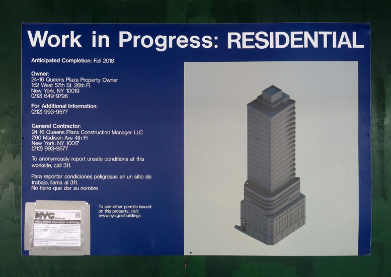
Last week, YIMBY reported on the start of construction work for the high-rise expansion of the pre-war building at 24-16 Queens Plaza South in Long Island City. The project, spearheaded by Greystone Development, would boost the existing five-story structure to 22 floors. Today, we bring you the first renderings, made available via the brand new on-site project board. The design by architecture firm Woods Bagot appears to draw inspiration from Art Moderne, an early modern style that complements its pre-war foundation.

Looking west
As was predicted in last week’s article, the new tower appears slimmer than the existing structure. The proposal telescopes skyward in three sections. The original five stories are topped with a four-story transition, the main 16-story tower, a penthouse level, and a bulkhead. The total level count clocks in at 26 (not including the bulkhead), four more than listed within the permits (including the latest one, filed on August 11).
Contrary to popular belief, modernism did not constitute a sudden break from architectural tradition. Instead, it came about as a gradual stylistic shift from the classic styles. Art Deco is perhaps the most notable transitional style. While its heavy masonry and ornate décor were in tune with historicism, its stark lines foreshadowed the modernist spirit. Its geometric ornament was inspired by America’s own Aztecs and Mayans, rather than the classical styles of the Old World. The sleek curves and jagged zig-zags burst with the energy and freedom of jazz, the sound of the zeitgeist of the Roaring Twenties. But even the most flamboyant structures of the time, such as the fantastical General Motors Building on Lexington Avenue, appeared decisively more streamlined than their overwrought Beaux Arts predecessors.
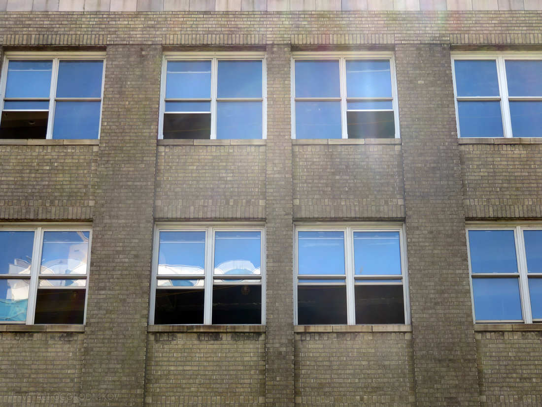
The style of 24-16 Queens Plaza South, built in the mid-1920s, is rather reserved compared to its more elaborate contemporaries. Its ornamentation is minimal, expressed chiefly through restrained limestone trim above the first, fourth, and fifth floors. The building’s mid-section is particularly bare. However, its windows, accented with limestone sills, are organized within recessed vertical niches, which lend depth and texture to the facade. Architecture critic Paul Goldberger once said that a well-designed facade reads like a fine plaid pattern, where horizontal elements interact with verticals in a rigorous but not overbearing manner. Here, the pre-war building succeeds at this task without resorting to excesses. The chamfered, intersection-facing corner makes for a subtle focal point.
The most notable change to the existing facade appears as two-story cutaway at the southeast corner along Crescent Street. This apparent open-air niche would connect to the open lot to the rear of the building, which separates it from the 13-story 42-14 Crescent Street under construction to the south. We hope that the open space, in conjunction with the niche, would serve as a public plaza. Aside from this intervention, the original facade, which is in dire need of a power wash, appears preserved in its entirety.
North facade
While New York architects were erecting ornate ziggurats during the 1920s, their modern-minded counterparts experimented with other forms of modernism, such as Streamline Moderne, also known as Art Moderne. Technically a sub-genre of the Art Deco, the style emerged into prominence in the 1930s. Its long horizontals and sweeping curves symbolized the sleek, seductive spirit of speed and motion, synonymous with the notion of the modern age. Grand ocean liners that raced across the Atlantic epitomized this era, and it is not coincidental that many Art Moderne buildings took cues from the nautical theme. Since the twentieth century would belong to the motorist, the sleek aesthetic found a perfect fit within the car culture, inspiring not only future generations of automobile designers, but also roadside attractions ranging from diners to gas stations.

Queens Plaza South. Looking west from Crescent Street.
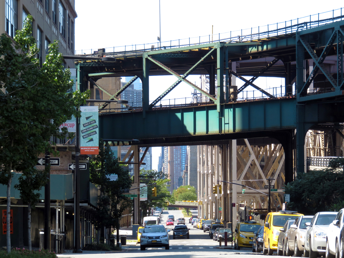
The retro-futurism of Art Moderne is particularly appropriate at Queens Plaza. The building faces the multi-layered trestle of the Queensboro Bridge approach, where cars speed along ramps that weave beneath the elevated N, Q, and 7 trains. This tangle of transit is perhaps the closest the city ever got to the delirious futurist visions of the 1920s, perhaps best exemplified by the 1927 motion picture “Metropolis.”
Since Art Moderne follows in the footsteps of early 1920’s architecture, the proposed design reads as a stylistic evolution rather than a modern juxtaposition, such as the one seen at the Hearst Tower’s 2006 vertical extension. The transition between the base and the four-story, curved-corner middle module bears a resemblance to the Tiffany Building at the southeast corner of 57th Street and Fifth Avenue. There, the pre-war structure, lined with vertical window niches, was extended with a four-story Modernist addition marked with horizontal window bands.
The upper portion of 24-16 Queens Plaza South is articulated with horizontal bands, accented with undulating curves. At its northwest corner, the bands peel away from the facade to form curved balconies, which grow in size as the building rises. They face the Queensboro Bridge like the prow of an ocean liner.
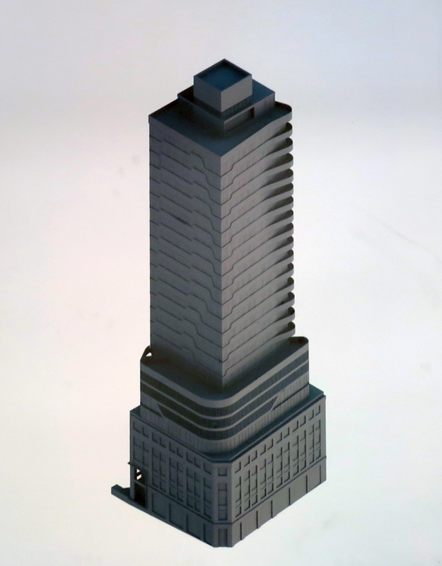
The tower is capped with a single penthouse level, which faces onto what appears to be a rooftop deck. Presumably, this is where the rooftop pool would be located. Surprisingly, the deck faces east, away from the breathtaking views of the bridge and Midtown Manhattan beyond.
To find the new proposal’s stylistic peers, we must venture to the other side of that bridge. The proposed building’s size, massing, and curved horizontals remind us of The Metropolitan, built at 171 East 90th Street in 2004. The design also echoes the vertical extension proposed at 512 West 22nd Street, next to the High Line, as well as another High Line-adjacent apartment building rising at 520 West 28th Street, designed by the late and great Zaha Hadid. Of course, it remains to be seen whether the final product would actually resemble any of its peers, or if it merely bears a passing resemblance.
Upon completion, the roughly 300-foot-tall 26-14 Queens Plaza South would barely rank within the top 20 tallest buildings in the neighborhood. However, the building would remain highly visible as one of the tallest facing the wide Queens Plaza, marking the northwest vanguard of the growing skyline. Of course, we have to wait for more detailed renderings to make a final judgment call regarding the design. But from what we can tell so far, 26-14 Queens Plaza South appears on track to enhance the distinctive, retro-futurist appeal of the principal gateway to Queens.
Subscribe to YIMBY’s daily e-mail
Follow YIMBYgram for real-time photo updates
Like YIMBY on Facebook
Follow YIMBY’s Twitter for the latest in YIMBYnews
#/media/File:Metropolis-new-tower-of-babel.png)
Gladly to see Art Moderne-Inspired Design, that work in progress consented new building.
Seeing something fresh and different is an inspiring change from the glass-clad constructions that have dominated the LIC development scene.