Browsing the internet, sometimes new projects/concepts appear out of the blue, and that’s certainly the case with this tower designed by Helpern Architects.
Rising roughly 65 stories, the new building appears to be somewhere in the vicinity of the NoMad (North of Madison Park) neighborhood, probably in the upper 20s along either 5th or 6th Avenue. The architect’s website keeps the public in the dark, with the renderings of the project only accompanied by a ‘client undisclosed’ disclaimer. No figures are available, but I do believe this building would stand roughly 750 feet tall.
While it is true that most designs by architects ultimately are not built-out, the concept by Helpern is certainly interesting (by the same token that the ‘Pyramid’ and Mercedes House are also innovative). I personally believe the project would be an excellent addition to the neighborhood for several reasons…
Despite the overall unique appearance of the building, the architects have not deviated from standard New York form in designing a base that conforms to the street-wall. Since the beginning of post-war architecture (the International Style in particular is guilty of this), buildings are often withdrawn from the street, with plazas often taking the place of a broader base.
Withdrawing a building from the street-wall often destroys the synergy found on New York blocks, as buildings are literally separated from their neighbors. Modern architecture does not have to involve dissonance between buildings, and the above rendering certainly shows that large towers can have bases/podiums that contribute to neighborhood synergy, specifically through maintaining the street-wall.
Besides conforming to the classic New York street-wall, the design of the tower’s upper levels is also interesting. The tower’s appearance bears a resemblance to the Lipstick Building, but is definitely a modern take on its appearance–it’s as if the Lipstick Building grew several hundred feet, with the architects then proceeding to twist the upper-half completely around.
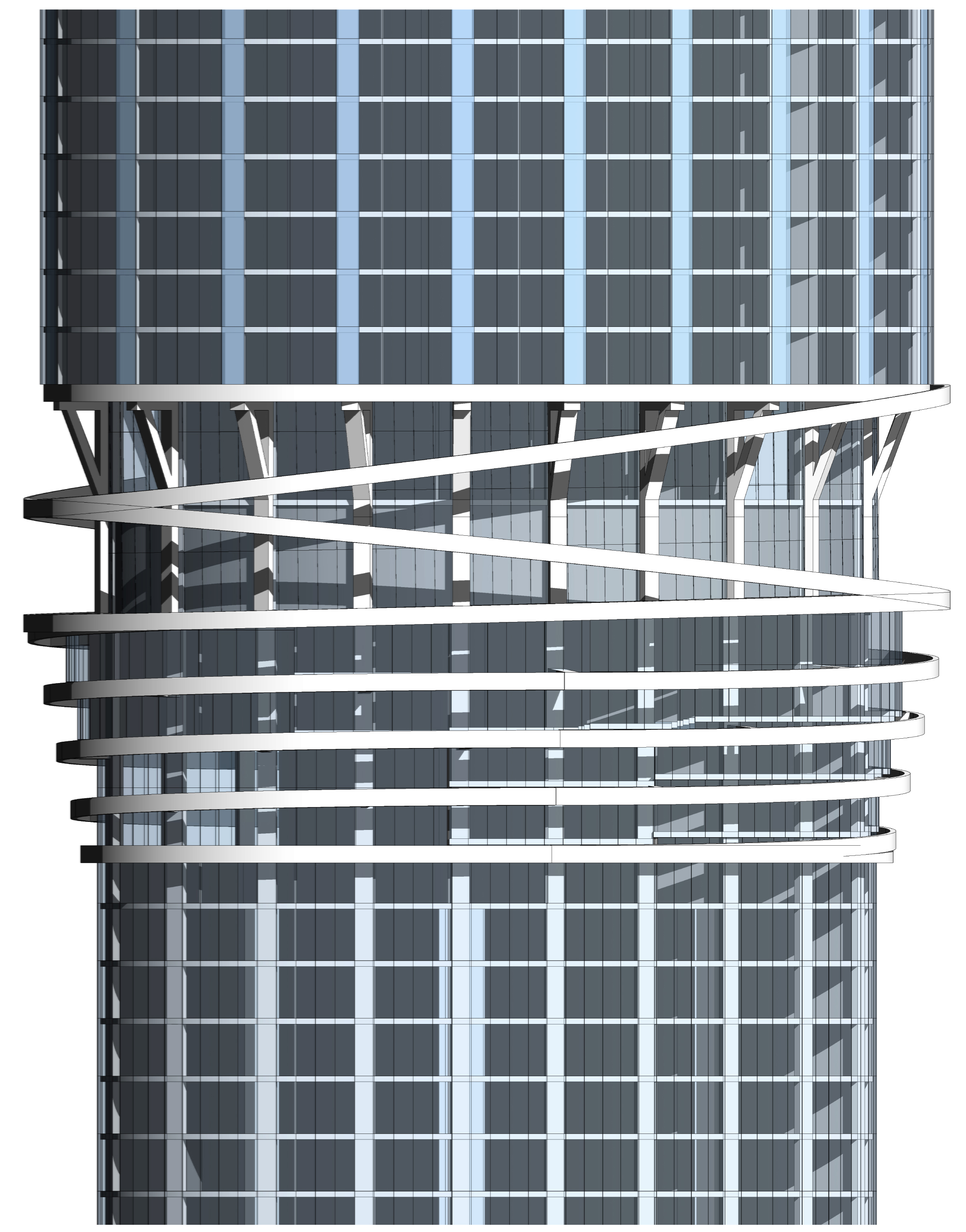 |
| Detail of the building’s mid-section: Image from Helpern Architects |
The unique design of this building is definitely a positive, as New York’s architecture as of late has become dominated by simple and boring glass-box designs. While creative designs can turn out horribly wrong from time to time, at least the architects of this building have made a bold attempt to part ways with monotony.
Subscribe to YIMBY’s daily e-mail
![]()
Follow YIMBYgram for real-time photo updates
Like YIMBY on Facebook
Follow YIMBY’s Twitter for the latest in YIMBYnews


