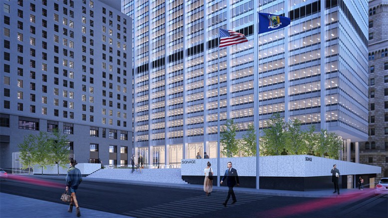
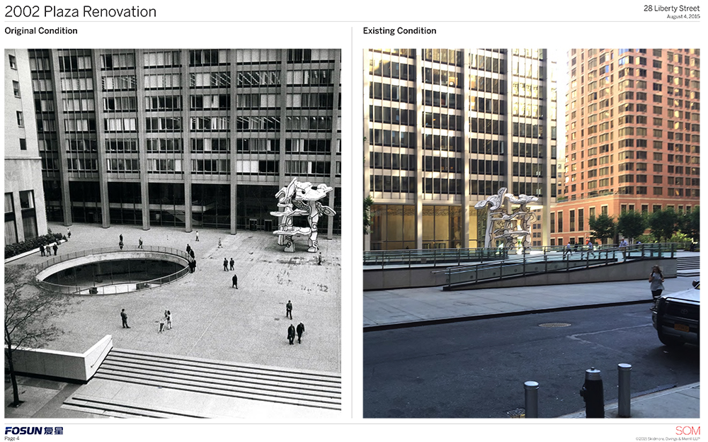
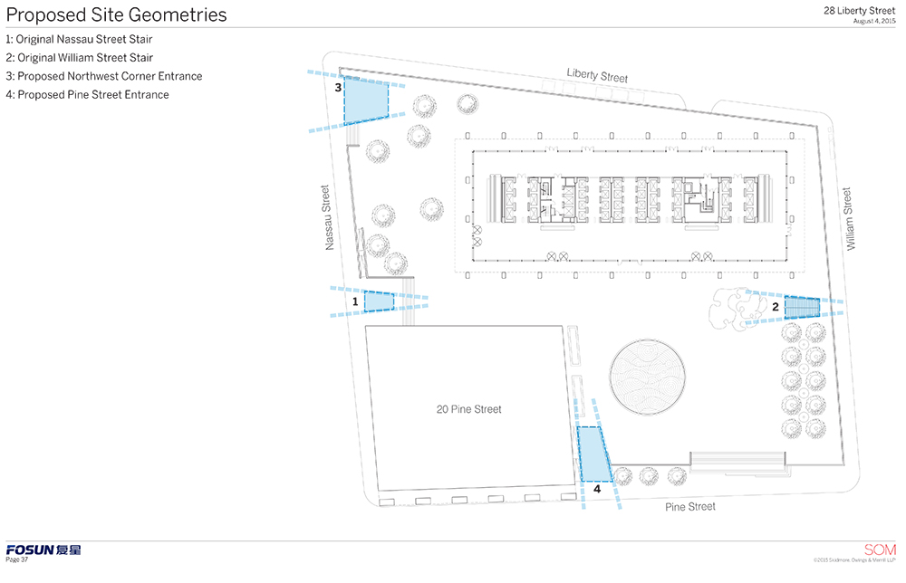
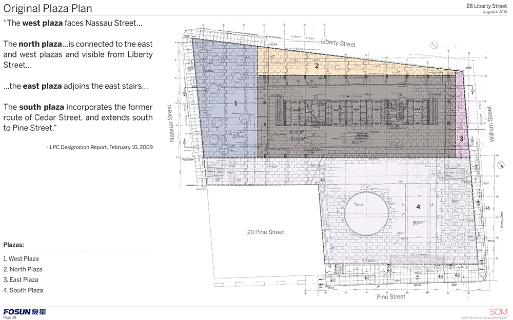
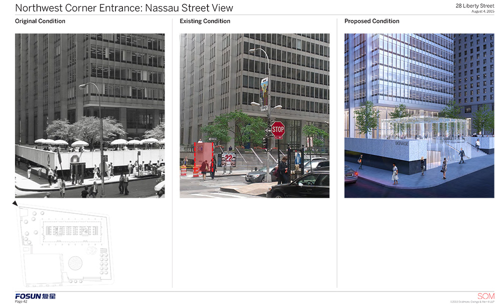
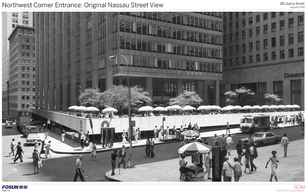
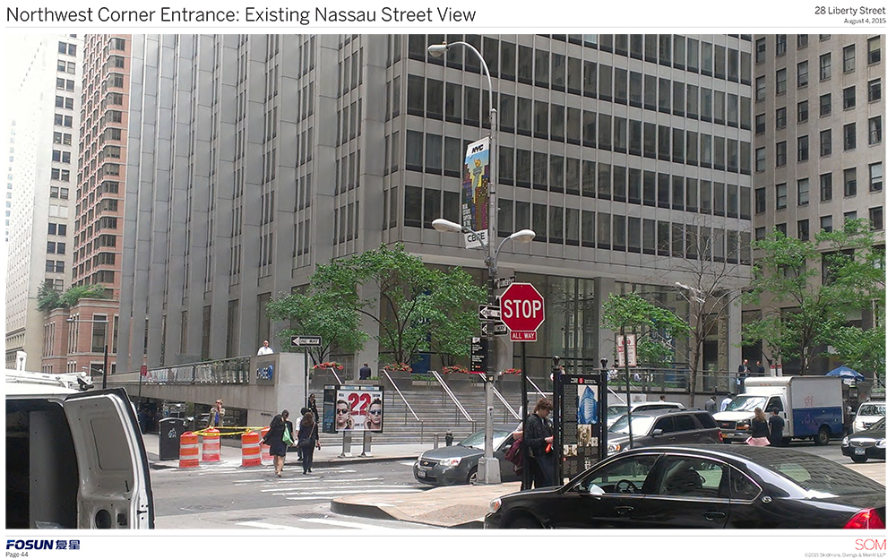
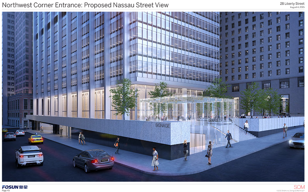
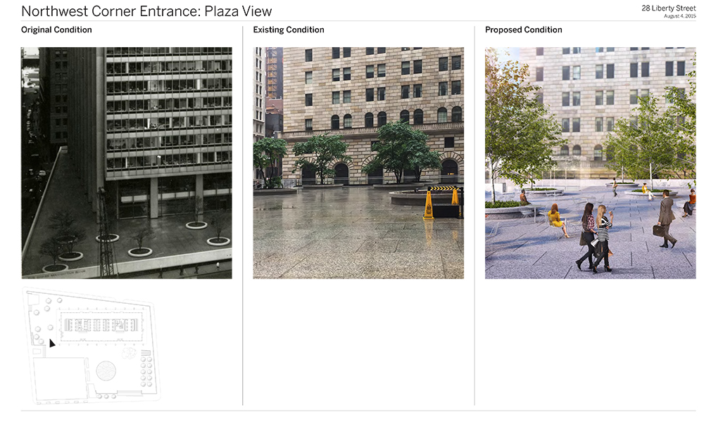
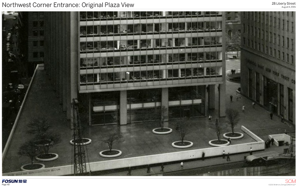
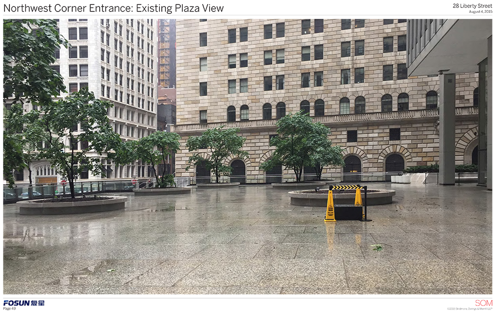
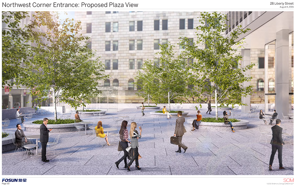
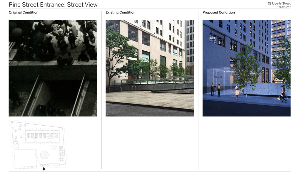
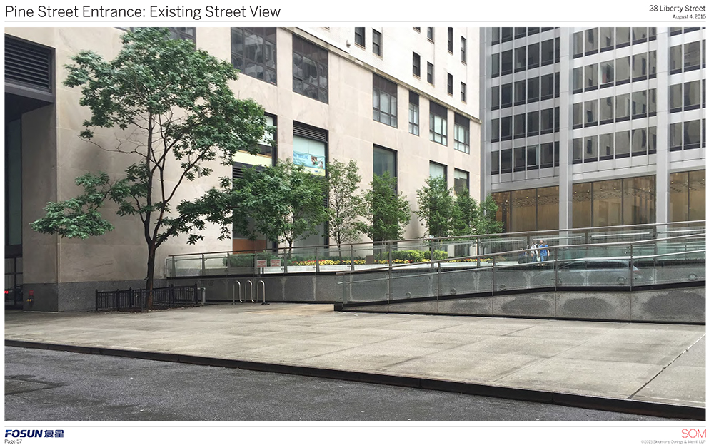
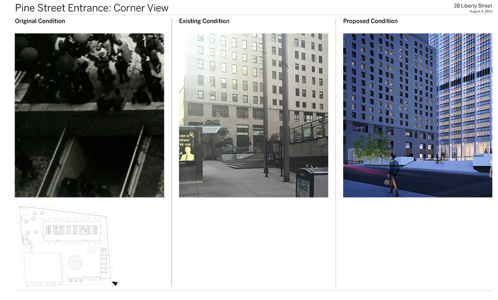
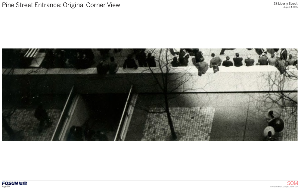
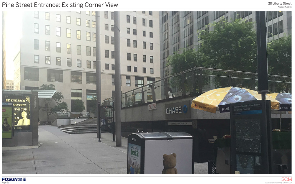
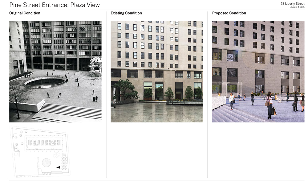
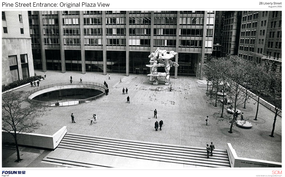
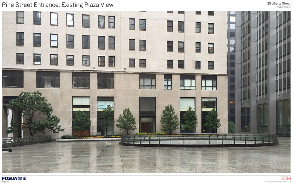
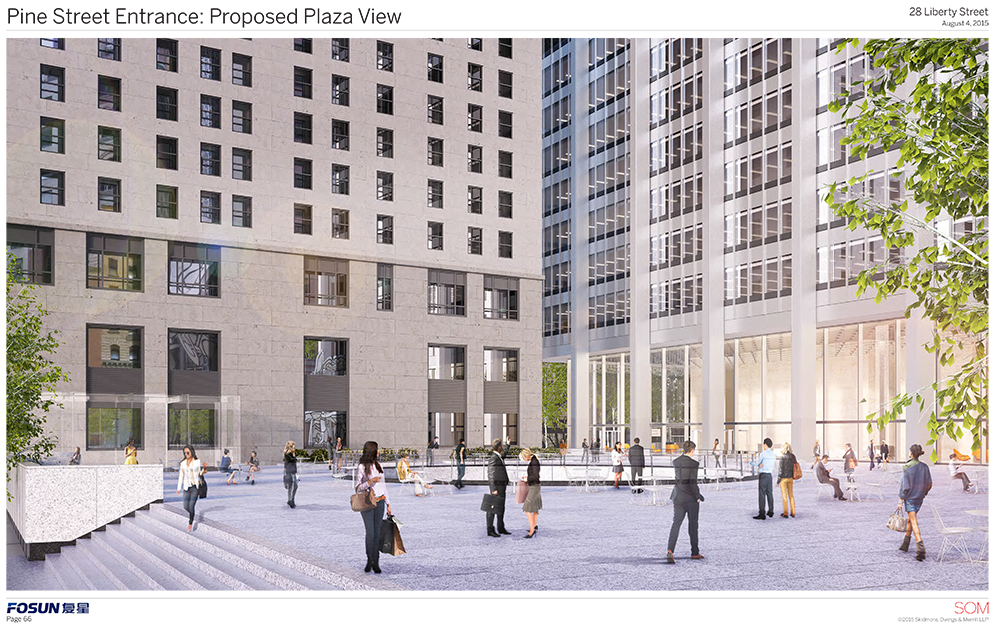
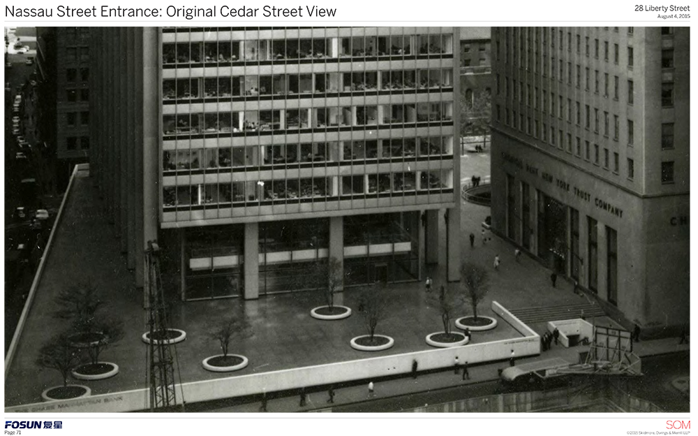
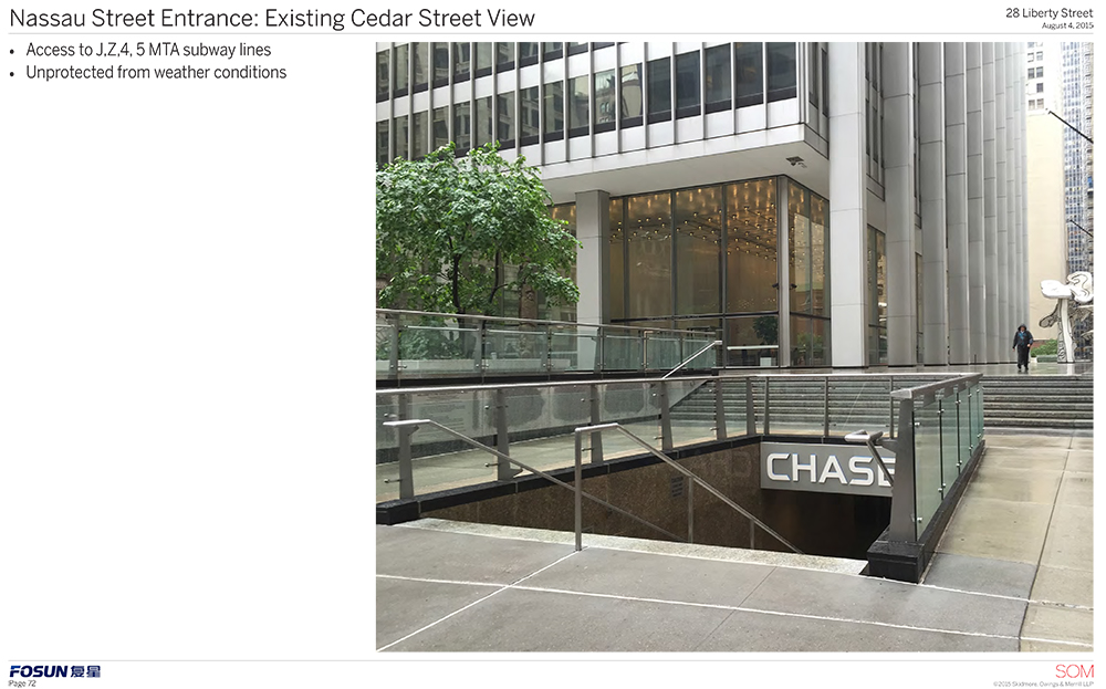
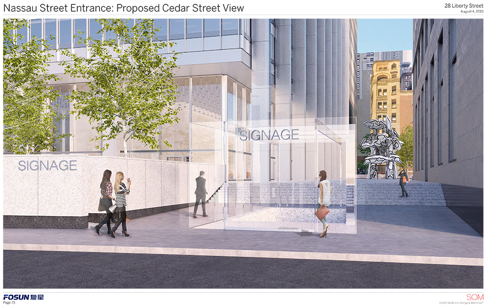
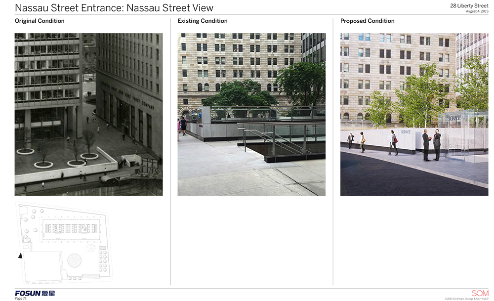
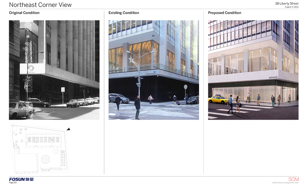
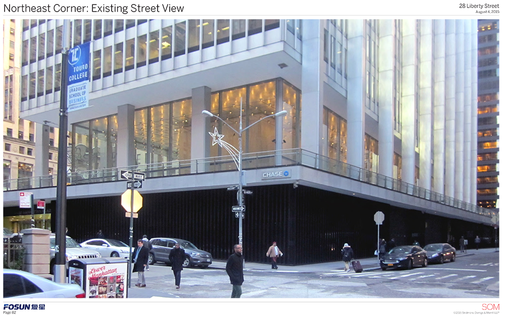
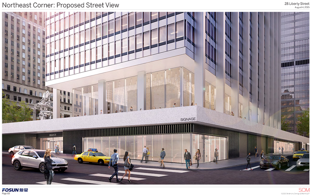
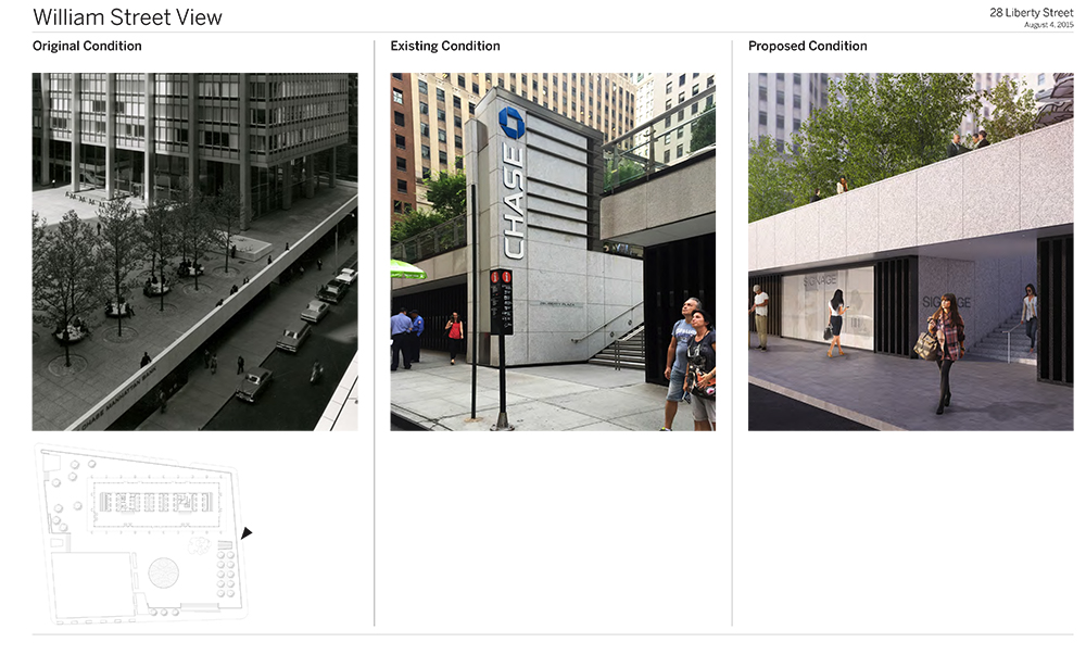
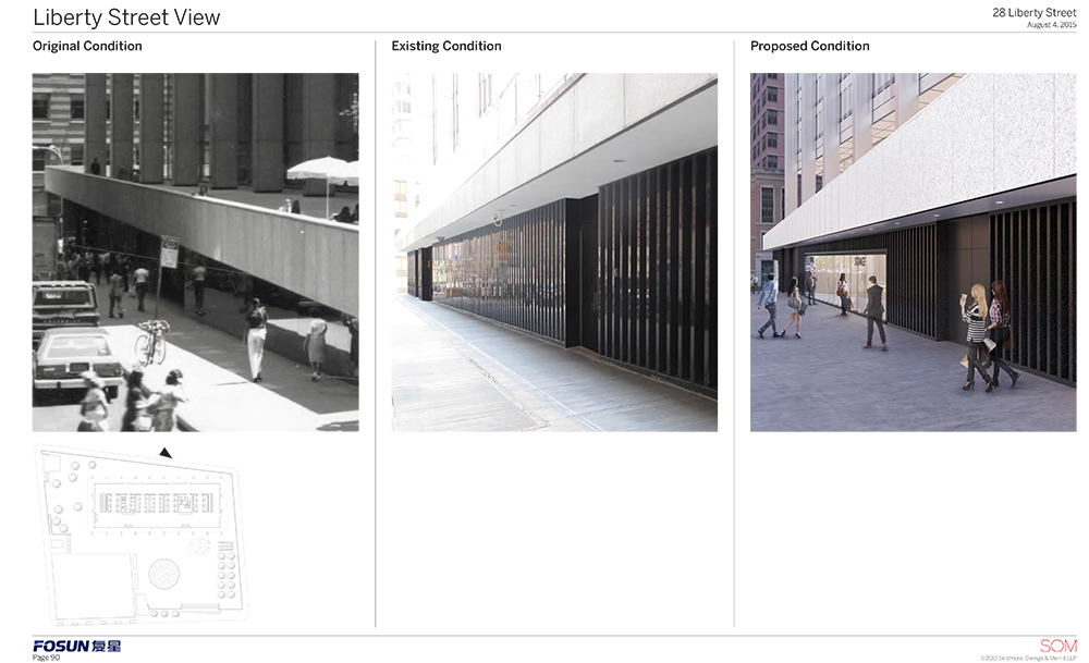
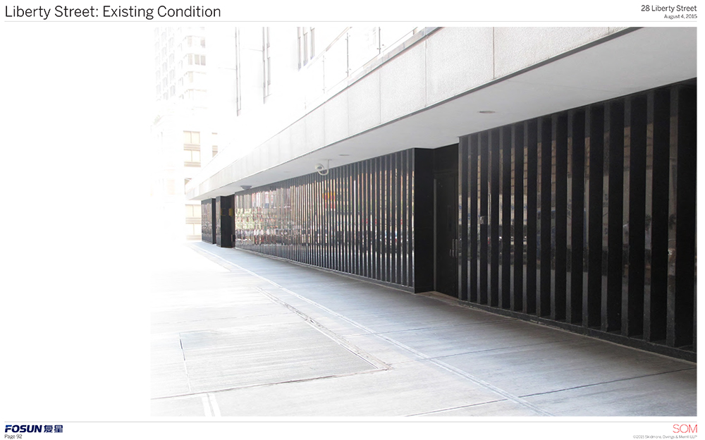
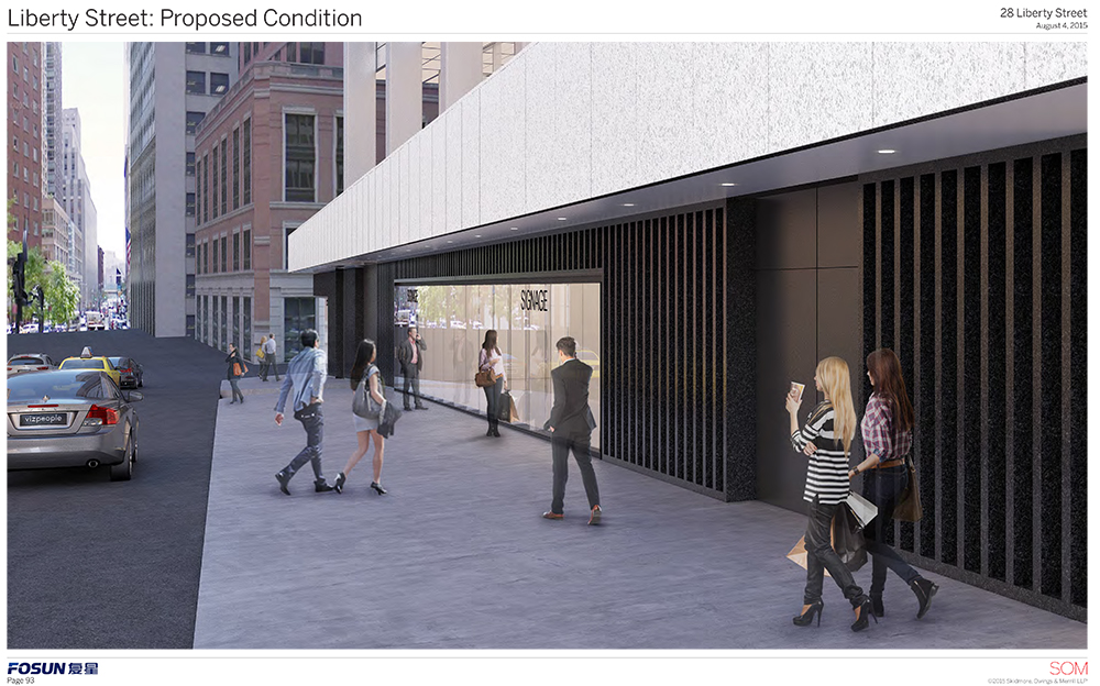
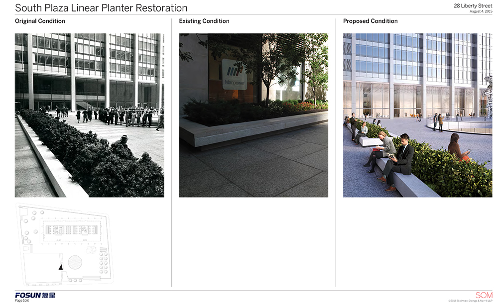
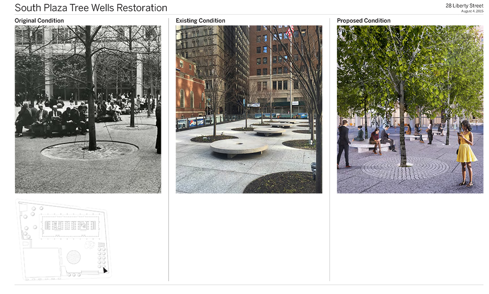
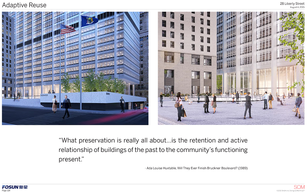
A new dawn is coming for a lower Manhattan landmark. With Chase gone, the Landmarks Preservation Commission approved a proposal for an adaptive reuse of the plaza in front of the building formerly known as One Chase Manhattan Plaza (now 28 Liberty Street since Fosun International Ltd. bought). There will be ground floor retail and major changes to the plaza that should bring a lot of it back to its former glory.
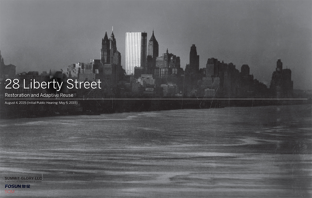
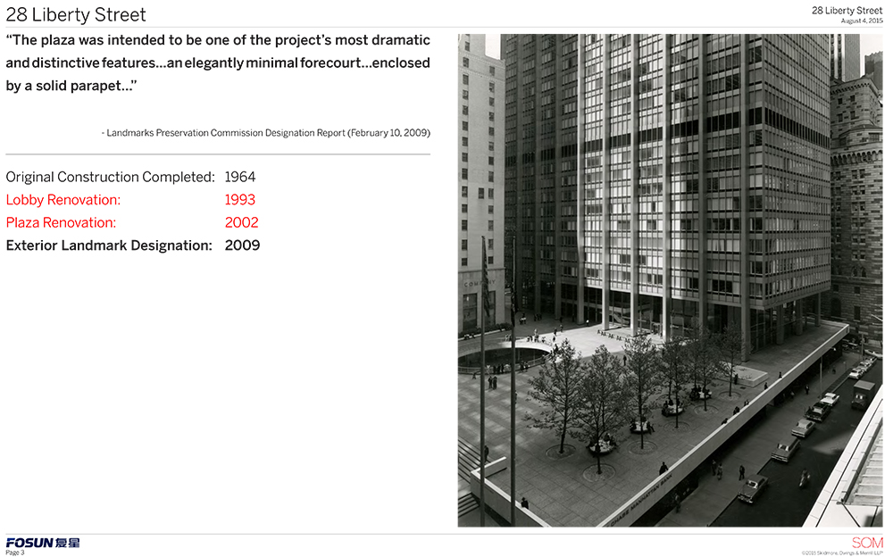
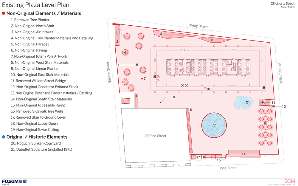
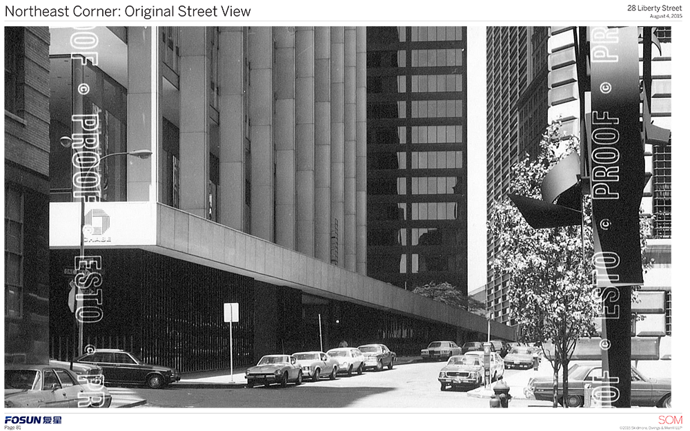
One Chase Manhattan Plaza was designed by the legendary firm Skidmore, Owings & Merrill (SOM) and completed in 1964 on the block bounded by Liberty, William, Pine, and Nassau streets. The 60-story building is considered a monument to the International Style. The lobby was renovated in 1993 and the plaza in 2002. It was declared an individual landmark in 2009. The designation report called it “among the largest and most important 20th century skyscrapers in New York City.” JPMorgan Chase sold it in 2013 and no longer resides there.
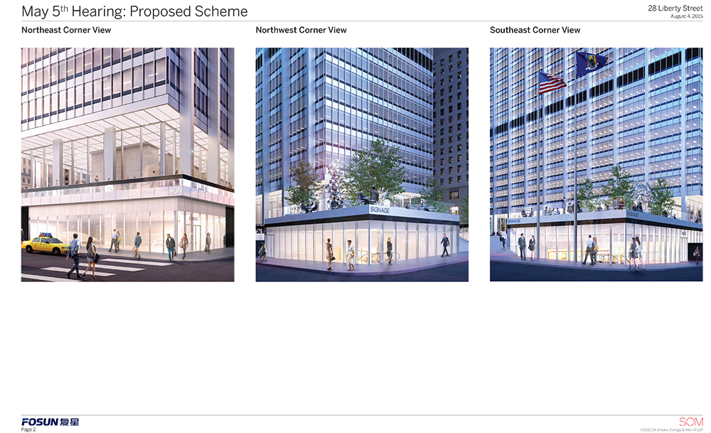
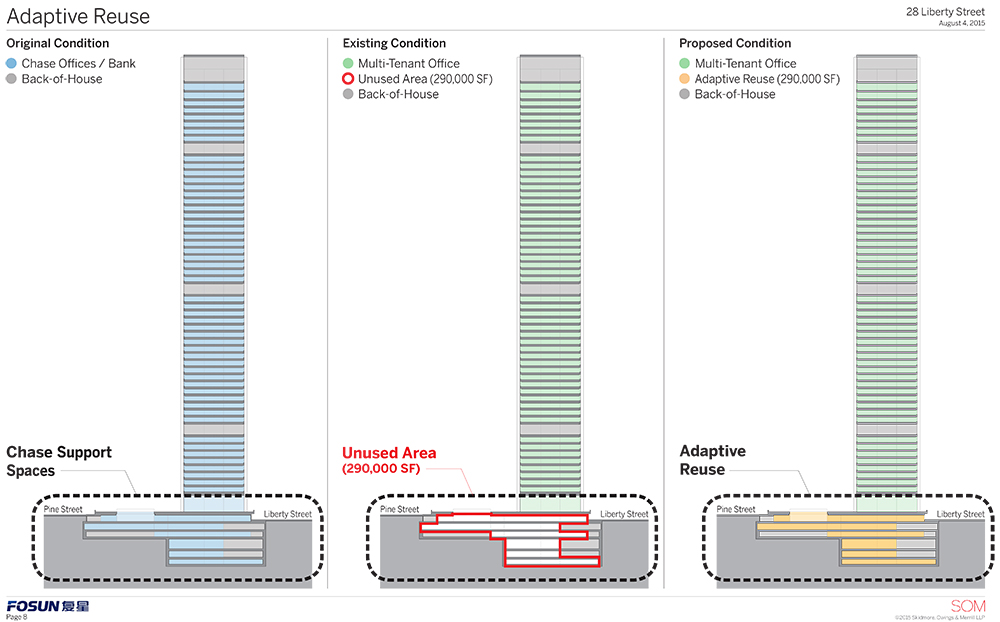
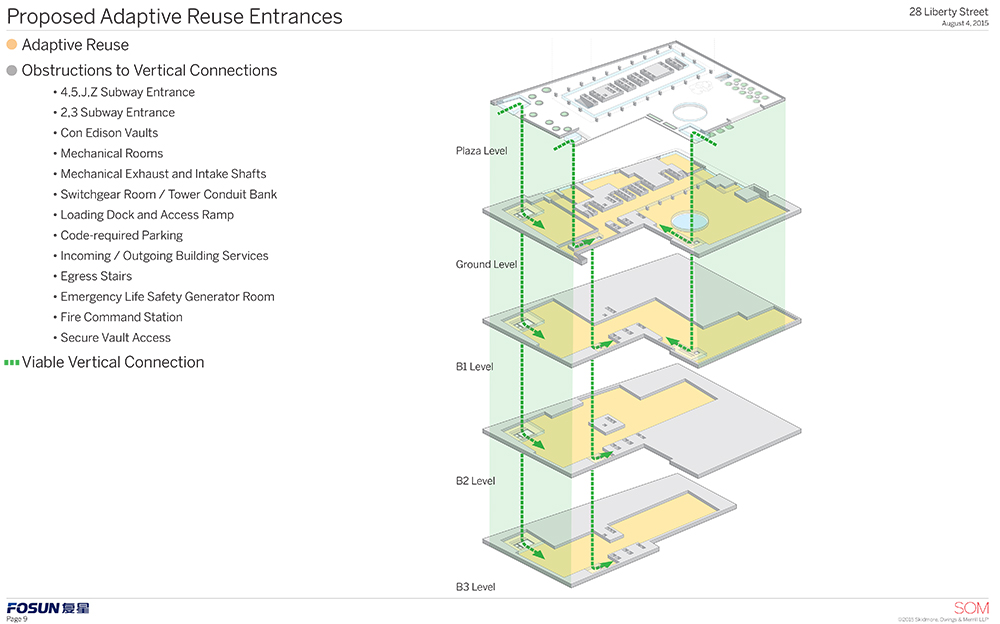
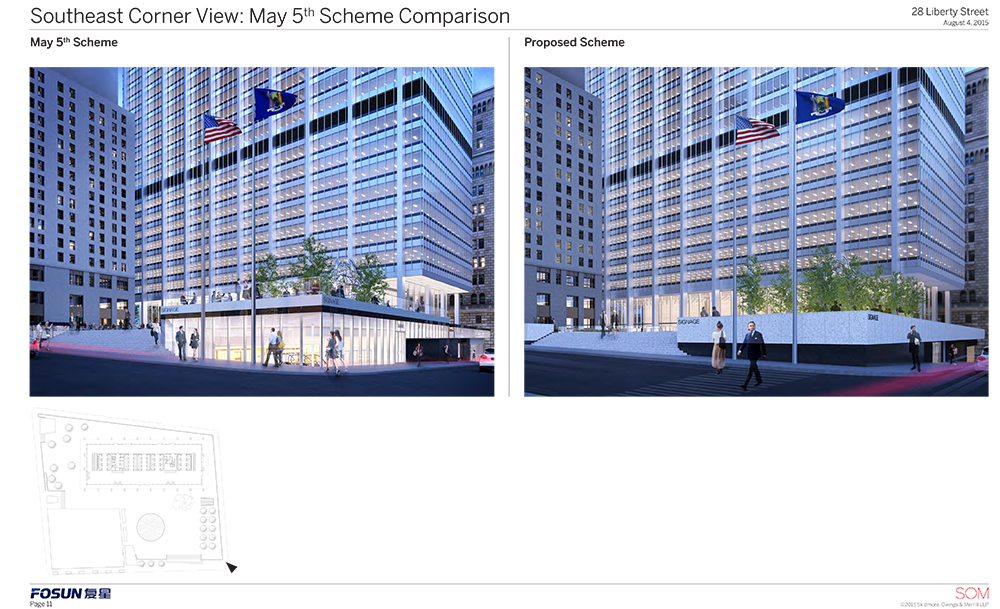
The tower will remain an office building and there are no current applications to change it. But the plaza will get a new life (and new light) and the ground floor and three basement levels are slated for retail. When the proposal was presented in May, it was made by SOM’s Frank Mahan. The commissioners found it to be too glassy, among other issues.
The revised presentation was made by Bill Higgins of the preservation firm Higgins Quasebarth & Partners, who referred to a “powerful expression of a horizontal plaza” with a tower. After Higgins came SOM’s Roger Duffy.
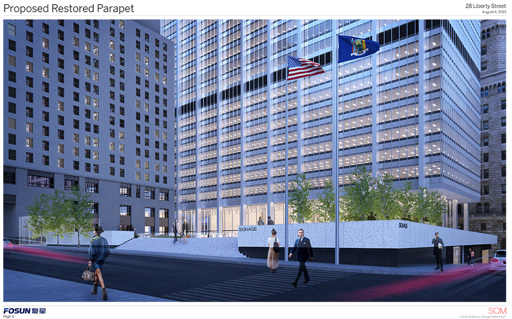
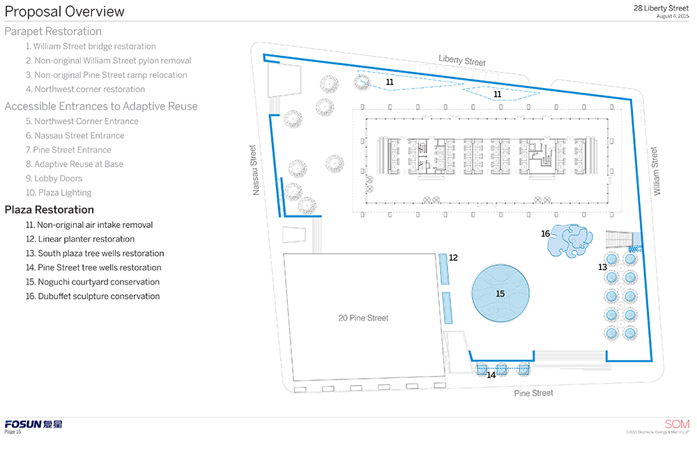
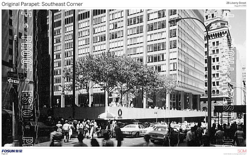
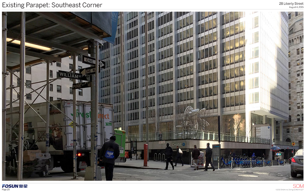
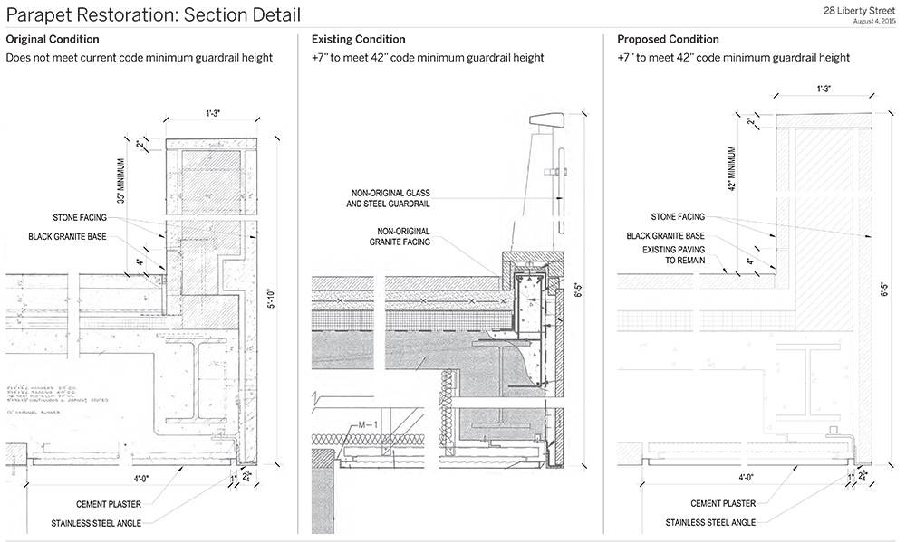
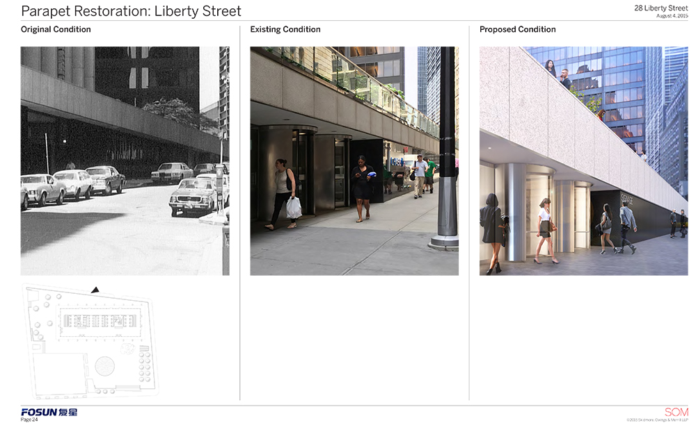
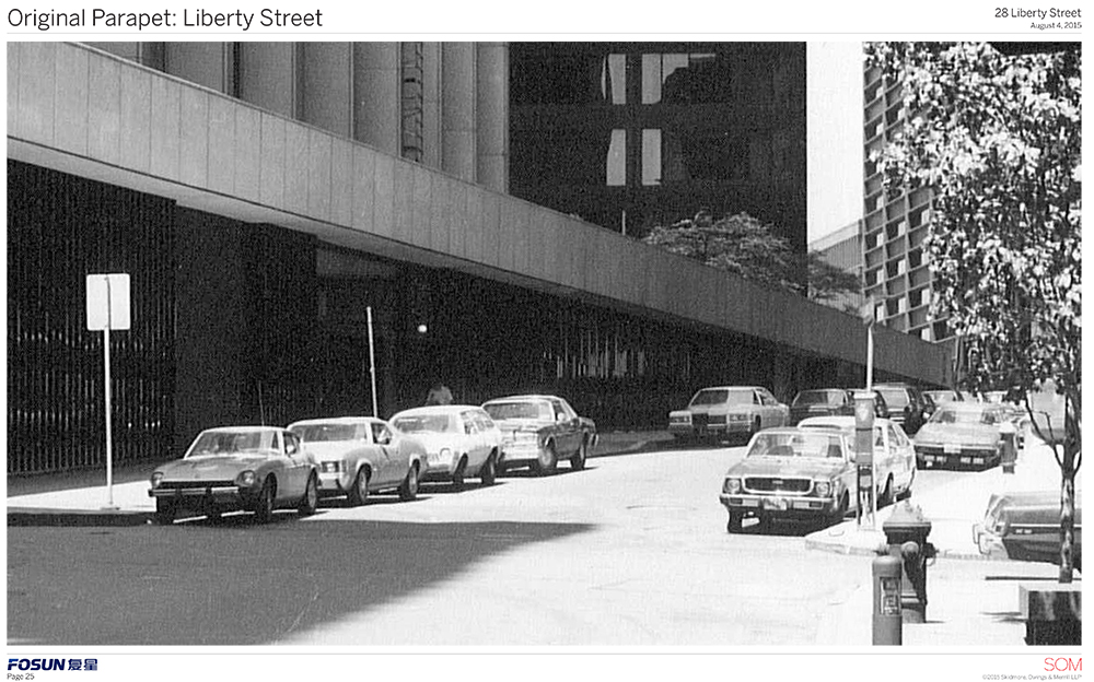
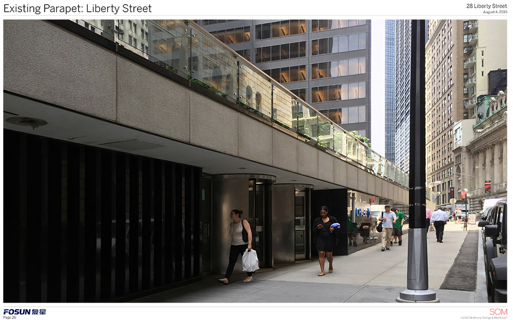
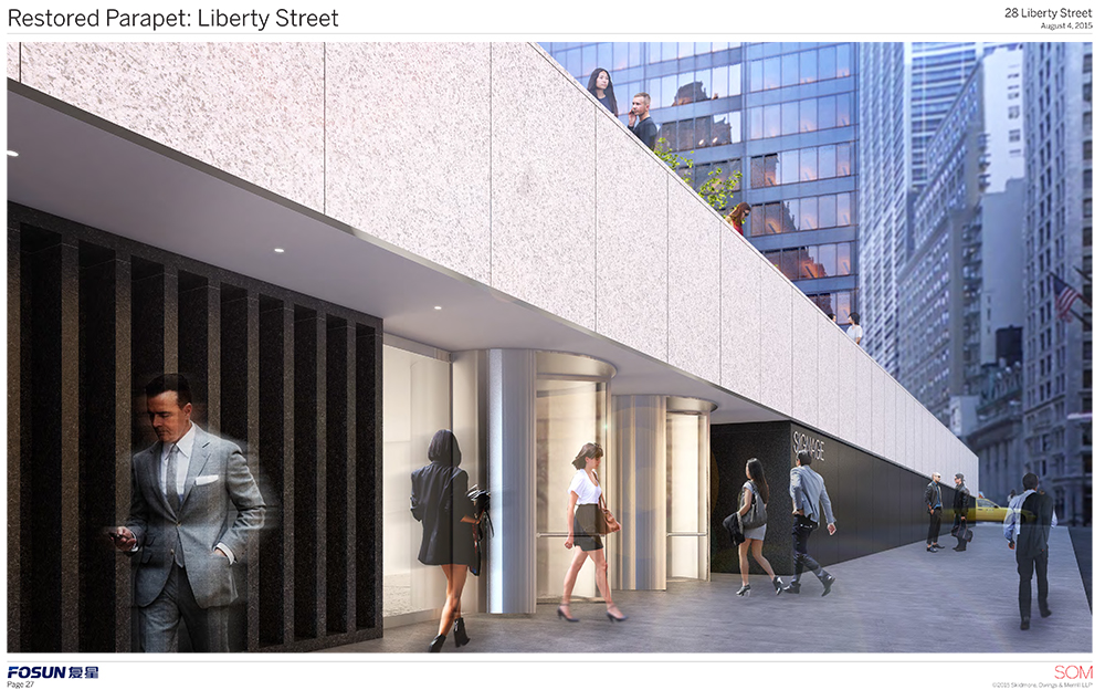
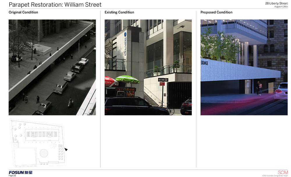
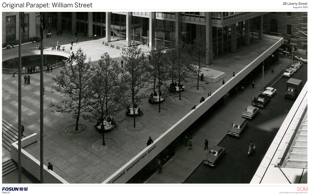
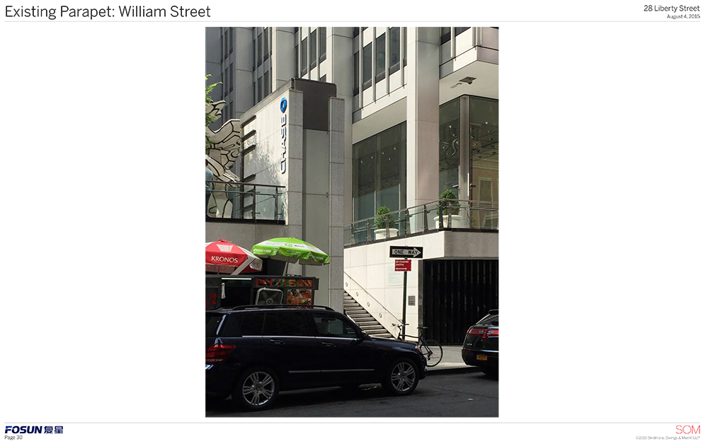
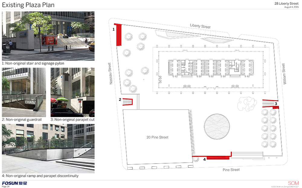
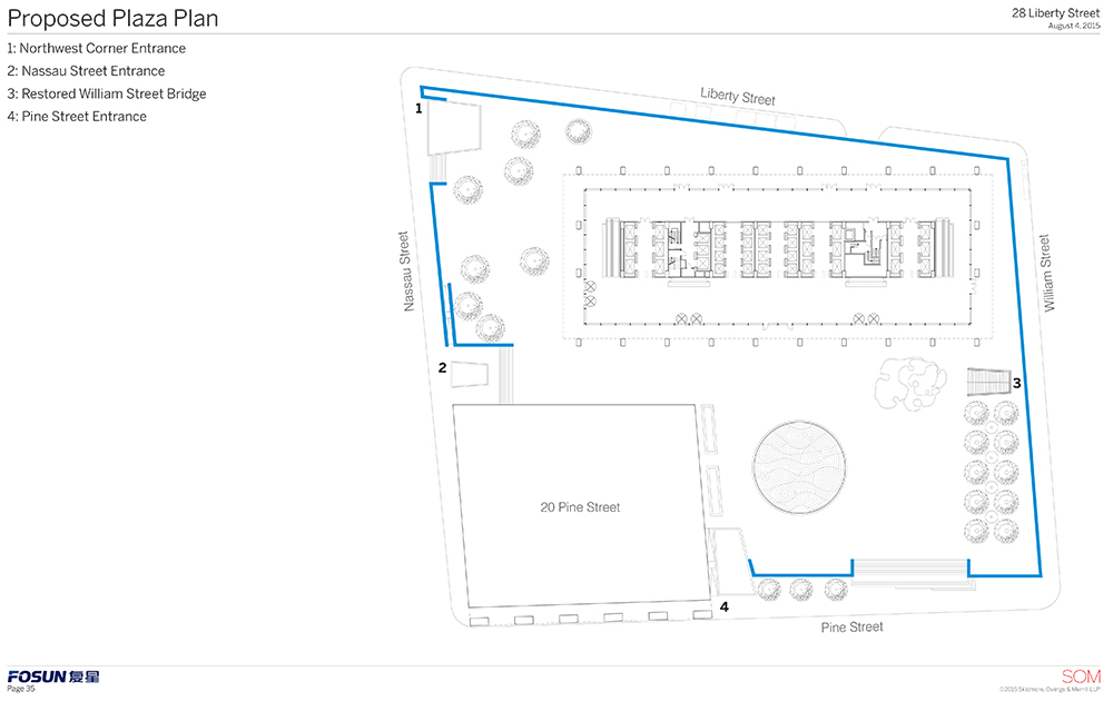
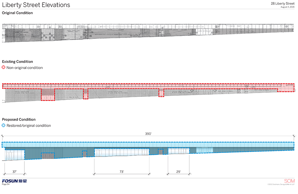
Out are the plans for some new benches, an extended lit lobby ceiling, and the glassy extensions on the parapet. In fact, out is the current parapet, which is not original. The new one will be bolder, thicker, and more in keeping with the original, and it will be constant along both Liberty and William Streets.
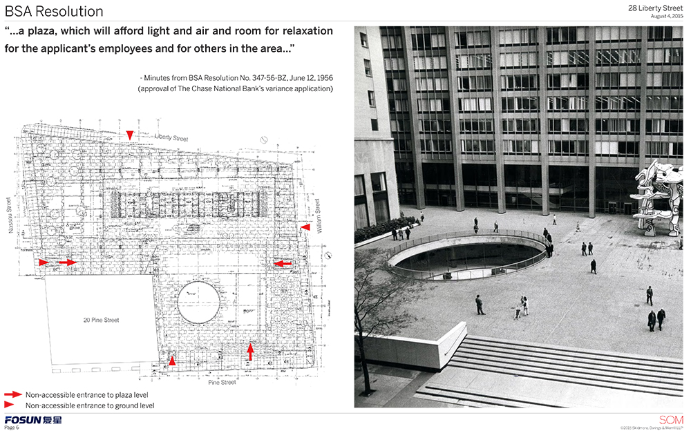
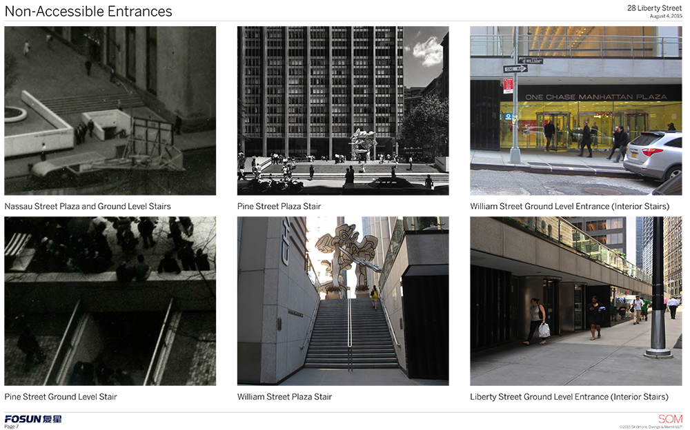
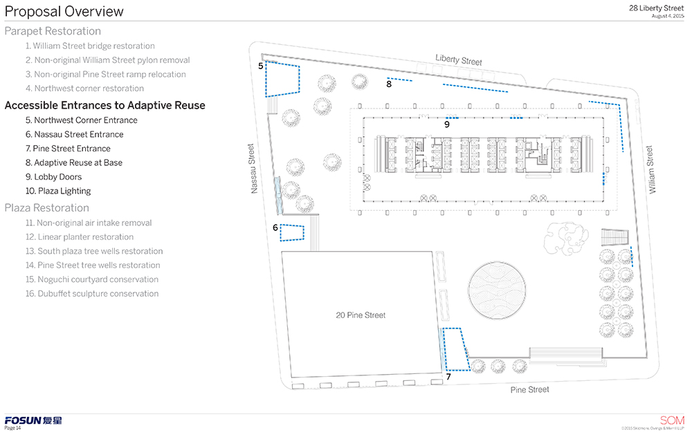
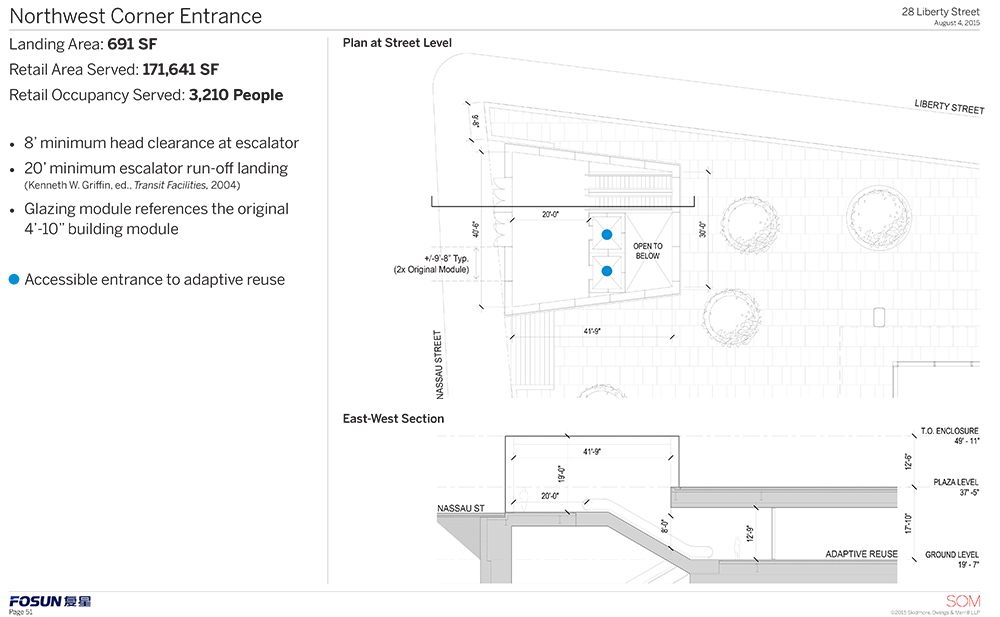
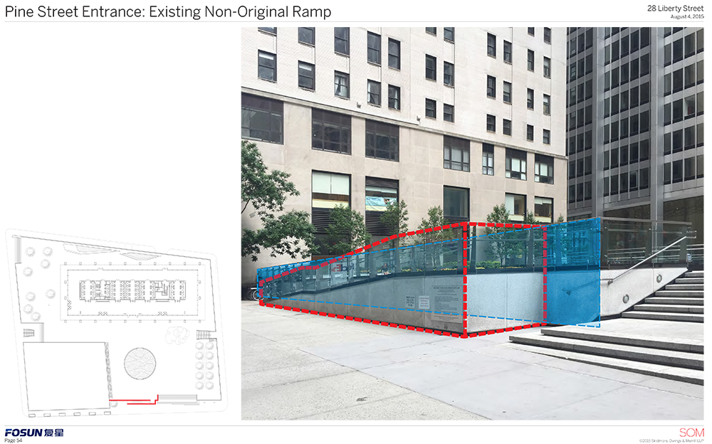
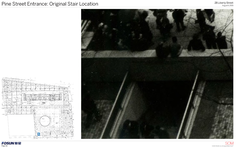
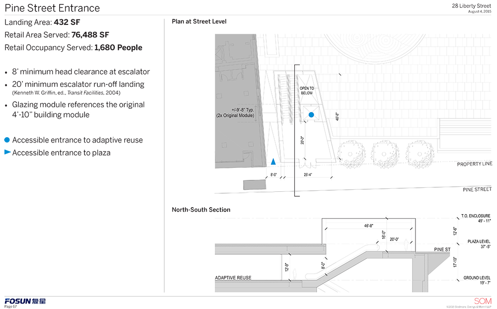
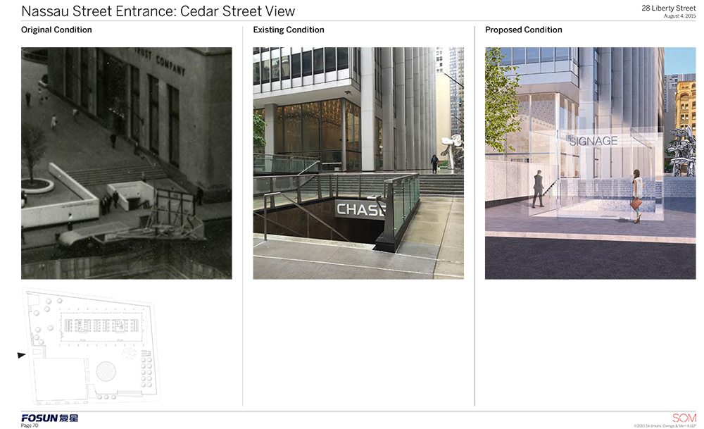
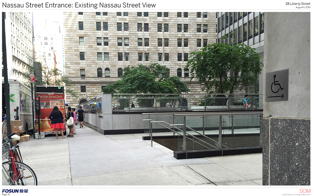
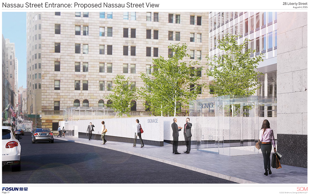
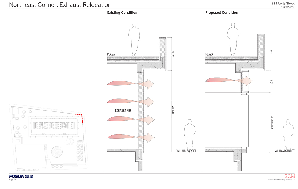
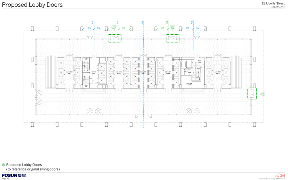
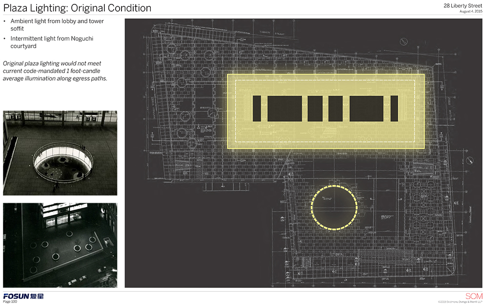
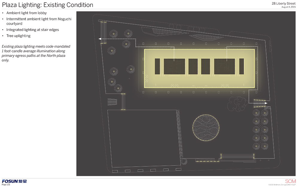
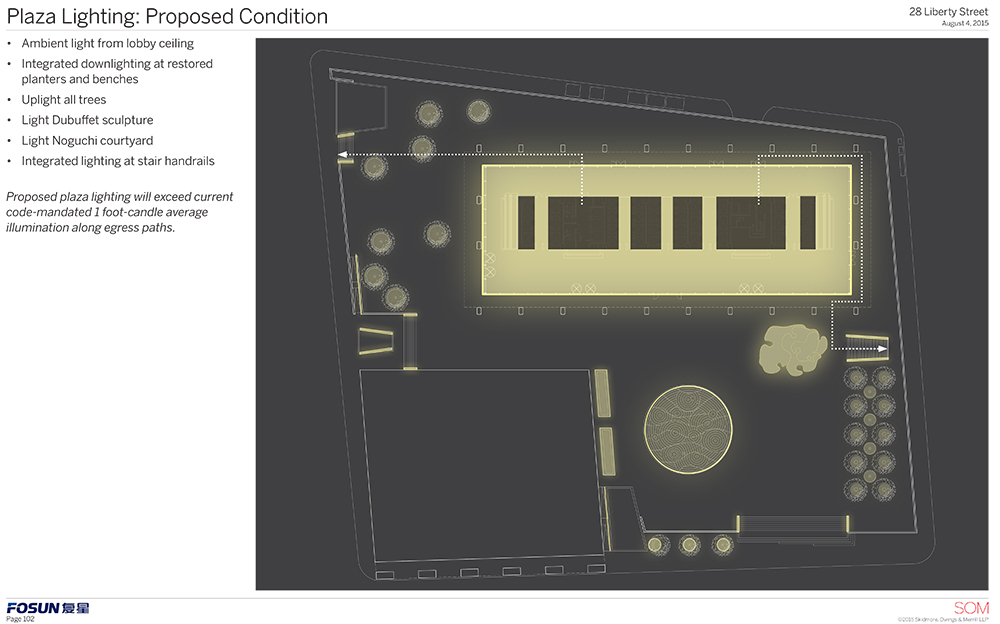
There will be new accessible entrances, restored lobby doors, and lighting for the sculpture, all trees, the stairs, and even the handrails. Non-original air intakes along Liberty Street will be removed. There will also be two glass entry cubes inspired by the Apple store on Fifth Avenue, though their size will be tweaked with LPC staff. Also to be tweaked will be the distribution of the black marble.
LPC Chair Meenakshi Srinivasan called the revised proposal a “significant improvement.” Commissioner John Gustafsson called it “extremely responsive.” Commissioner Frederick Bland said it was a “masterful presentation” and the building’s original architect, Gordon Bunshaft, would be pleased. Commissioner Roberta Washington said this was 100 times better than what they saw in May.
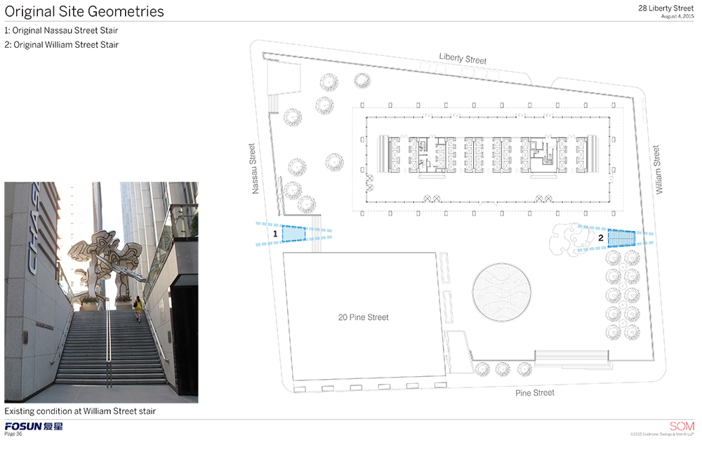
Fun fact: The plaza contains no right angles.
The plans were presented in extreme detail. Here is the full presentation:
Evan Bindelglass is a local freelance journalist, photographer, cinephile, and foodie. You can e-mail him, follow him on Twitter @evabin, or check out his personal blog.
Subscribe to YIMBY’s daily e-mail
Follow YIMBYgram for real-time photo updates
Like YIMBY on Facebook
Follow YIMBY’s Twitter for the latest in YIMBYnews

