Back in September, we told you about a competition to conceive a redesign of the MetLife Building. Earlier this week, the six finalists of the “Reimagine a New York City Icon” competition were announced. The competition, sponsored by Metals in Construction magazine and the Ornamental Metal Institute of New York, isn’t part of any actual process in the works to modify the Midtown office tower, but are fascinating ideas of what could be. Perhaps these ideas will be put into use at other buildings.
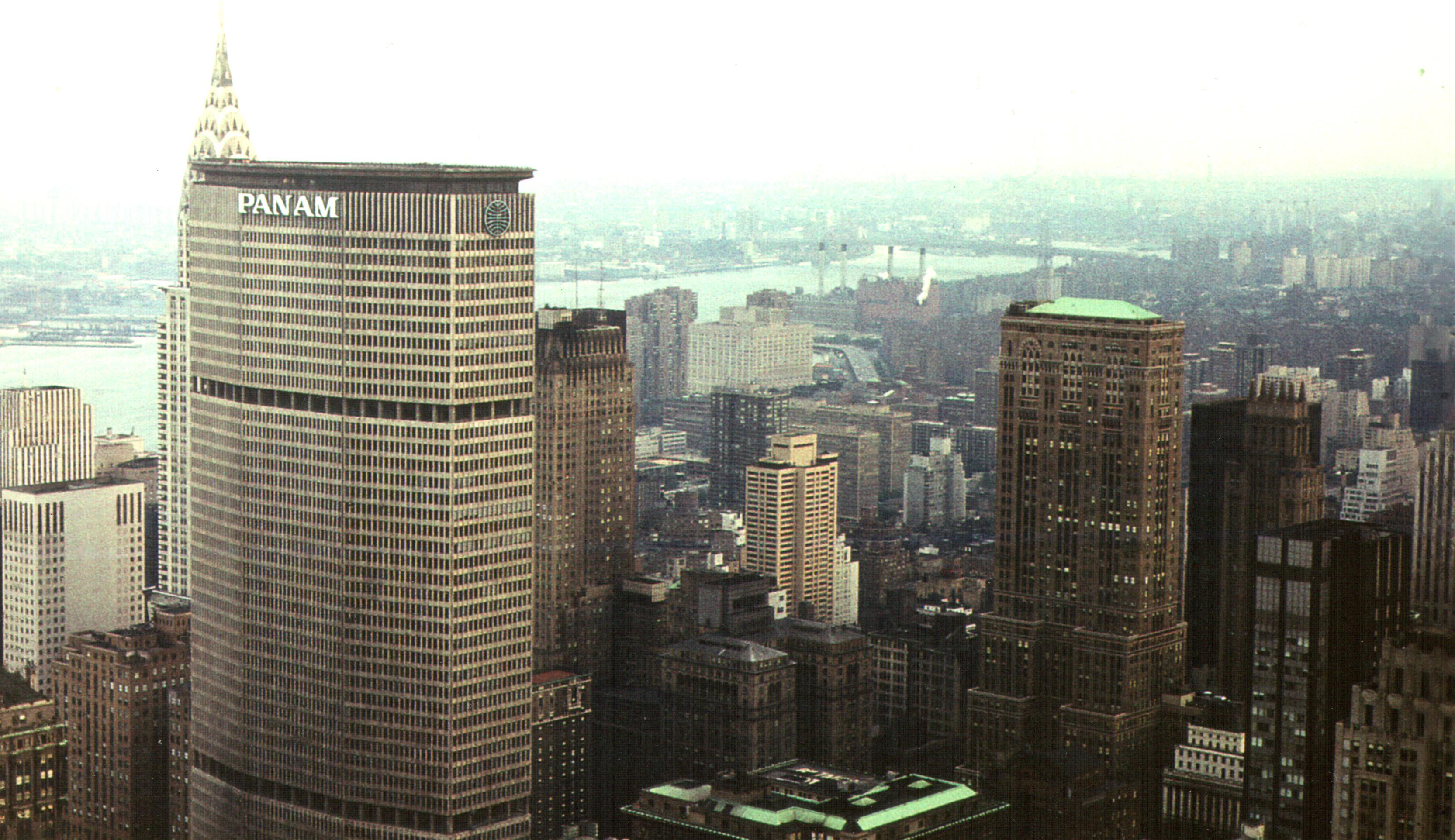
Before we get to the finalists, which split a $15,000 prize, here is a some background on the building itself. The 59-story-tall MetLife Building is located immediately north of Grand Central Terminal, at 200 Park Avenue. Designed by Emery Roth & Sons, Pietro Belluschi, and Walter Gropius, it opened on March 7, 1963, only back then it was the Pan Am Building. It served as the airline’s headquarters and even had airport helicopter shuttle service on its roof. Though there was a gap in the service from 1968 to 1977, its resumption was short-lived and came to a particularly gruesome end. A Sikorsky S-61’s landing gear collapsed, leading to one of the rotor blades coming off, killing three people waiting to board (with a fourth dying later) and then flying off the roof to kill a woman on the street, for a total of five dead. The shuttle service never resumed.
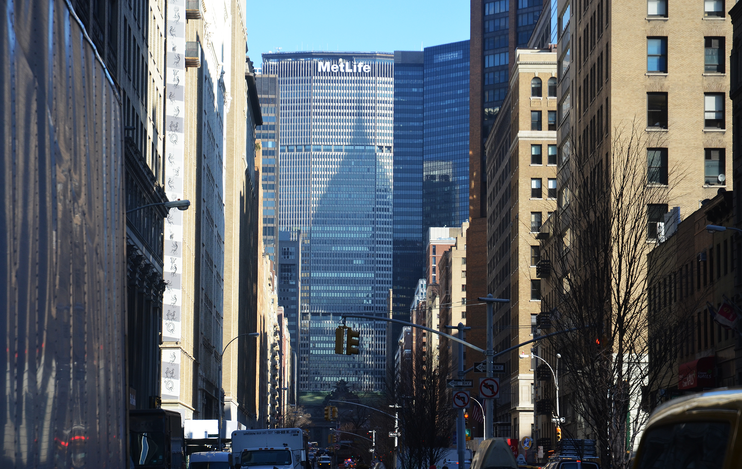
The MetLife Building with the shadow of the Chrysler Building, January 2016. Photo by Evan Bindelglass.
MetLife bought the building in 1981, though Pan Am was still headquartered there until it shortly before it folded in 1991. The building was renamed the following year and though MetLife sold it in 2005, it remains known as the MetLife Building, an architectural icon, though not a city landmark.
As for the competition, its mandate was to reimagine the building “with a resource‐conserving, eco‐friendly enclosure – one that creates a highly efficient envelope with the lightness and transparency sought by today’s office workforce – while preserving and enhancing the aesthetic of the building’s heritage.”
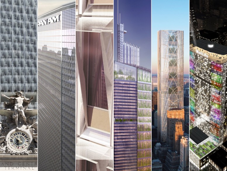
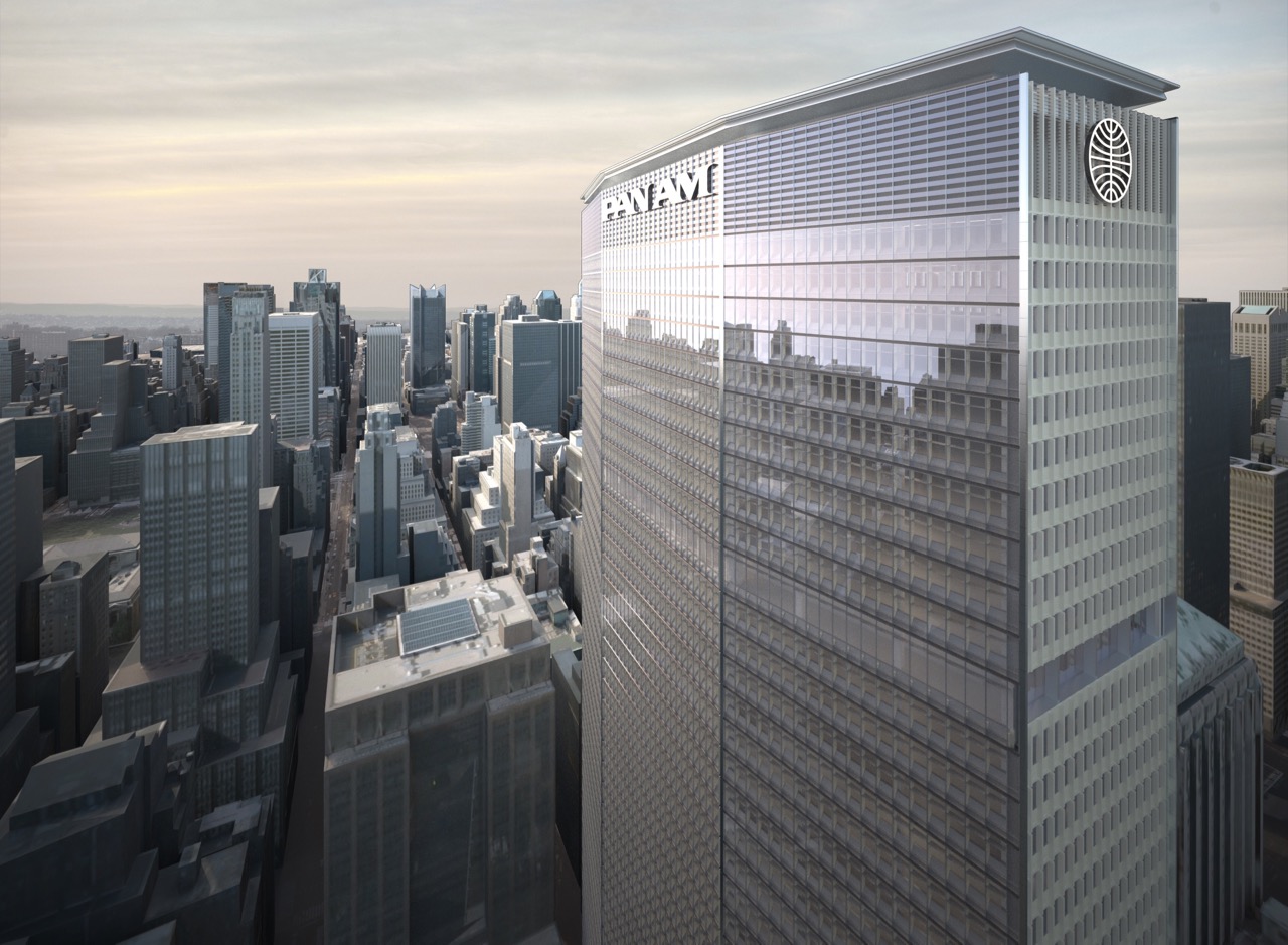
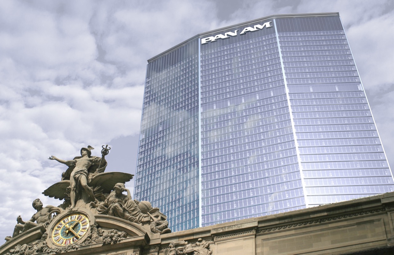
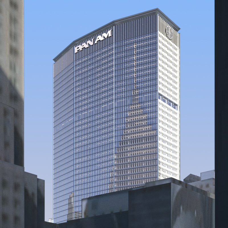
Now, here are the six finalists. Some of them mostly reclad the building while others reimagine it with significant reconstruction and/or expansion. We have also linked to the full PDF of the presentation for each entry.
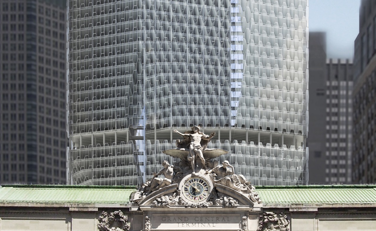
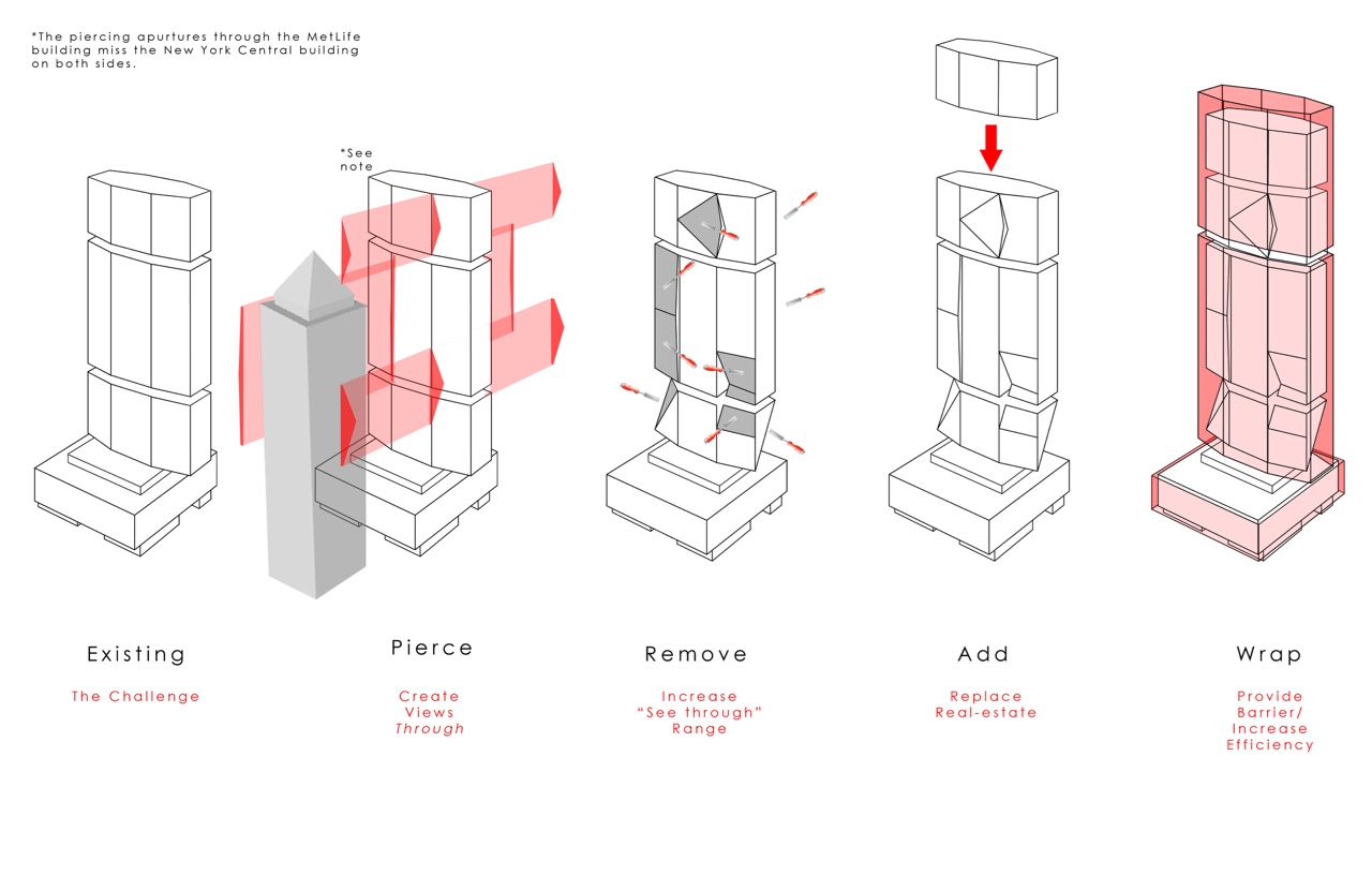
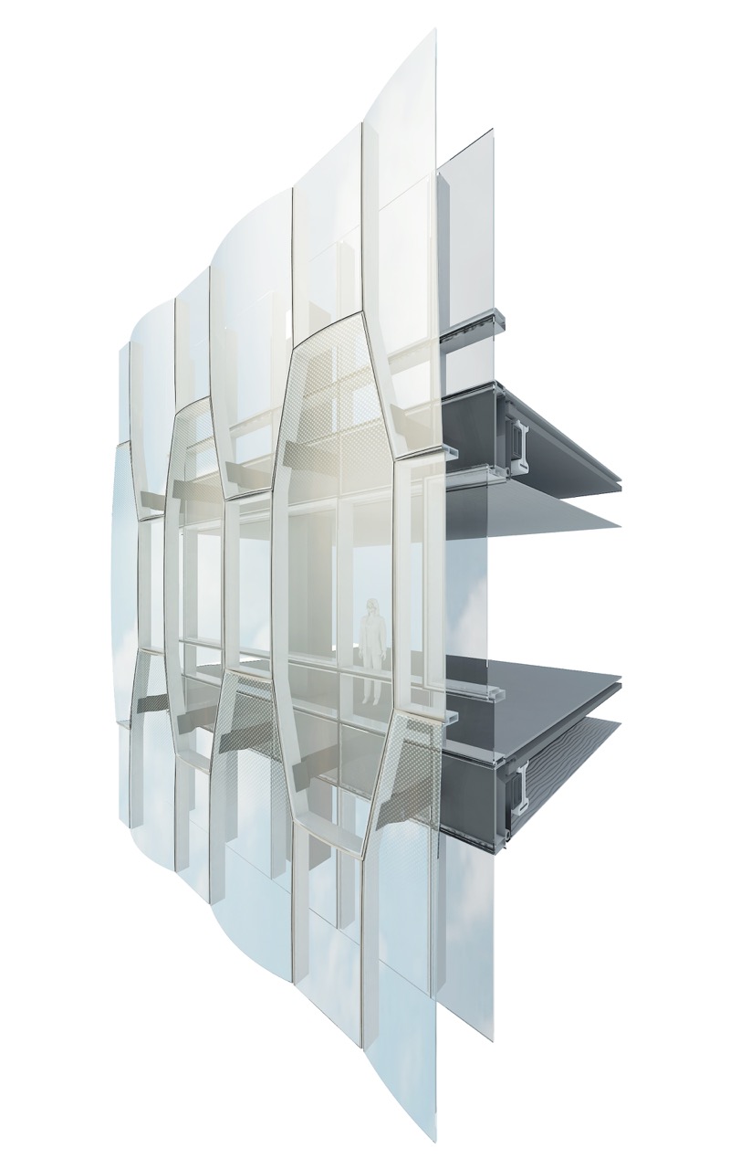
PANAM UNDER GLASS (PDF)
VOA Architecture, PLLC and Werner Sobek New York Corp.
“Piercing the tower on either side of the New York Central Building and then chiseling bulk away around the penetrations creates just enough transparency to allow the building to remain a focal point without the complete removal of mass between the core and the wings. Removed floor area is relocated to graduated upper floors to suggest skyward ascension. The outer glass sheath restores the building to a simpler geometry,” says the presentation. “Adapting the tapered form of the tower as a geometric module/motif creates a non-directional pattern across the surface of the tower – in keeping with early models and renderings which emphasized the form over the surface. Applied in a larger scale to the tower allows for maximum daylighting while the denser, smaller scale at the podium creates a more monolithic reading much closer to pedestrian level.”
PERFORMANCE‐BASED PRESERVATION (PDF)
SHoP Architects, Heintges, and CASE-RPI
“Our proposal for 200 Park Avenue preserves the most iconic element of the existing facade: its precast concrete shell. On the north and south, we add a new unitized curtainwall outboard of the concrete that uses emerging materials to generate energy while dynamically controlling solar heat gain and glare. On the east and west, we bring the new envelope inboard of the concrete to highlight the materiality and plasticity of the existing skin,” said the presentation. “By preserving and overcladding – instead of demolishing and recladding – our proposal reduces the building’s environmental impact by 42% over the next 50 years.”
THERMALSWITCH FAÇADE (PDF)
StudioTJOA
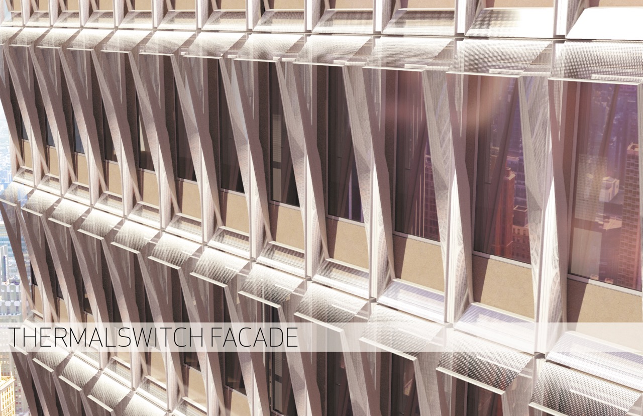
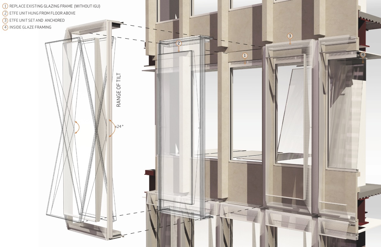
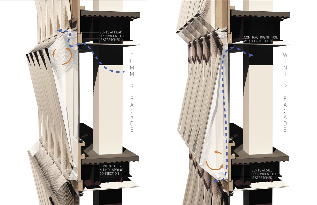
“The Thermalswitch facade looks at hybridizing the overcladding and double skin techniques to create a unitized frame which mounts directly over the existing precast panels. The Metlife facade is constructed of a primary precast panel with integrated fins on both sides that alternates every other bay. Between these primary panels, secondary infills are set at the spandrel conditions,” the presentation said. “Because the Thermalswitch unit is designed to fit over the existing single floor unit, once the units are unloaded on a floor above, the existing glazing is removed and they are set via a custom horizontal slide and floor crane through the opening of the precast unit.”
HARNESSING URBAN ENERGIES (PDF)
FXFOWLE, THORNTON TOMASETTI, and DAGHER ENGINEERING
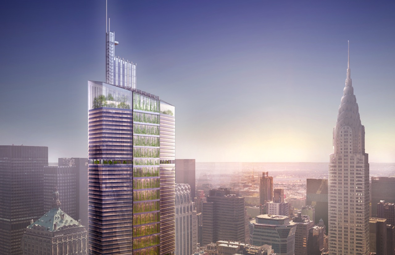
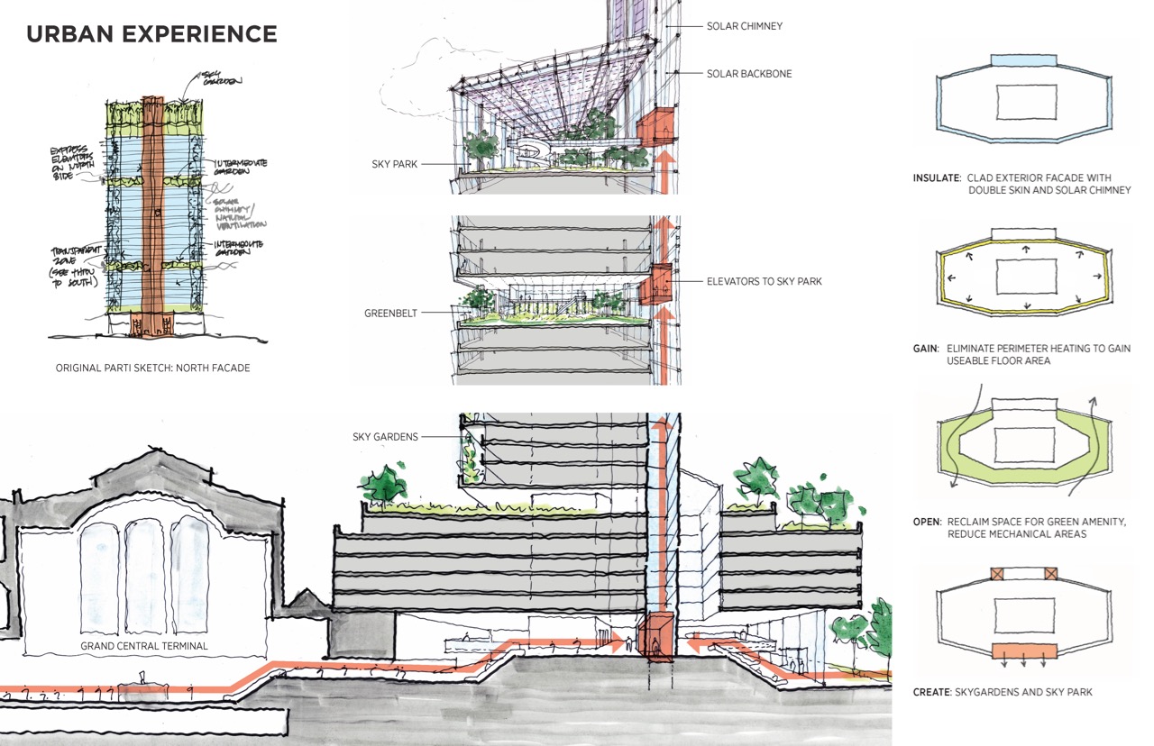
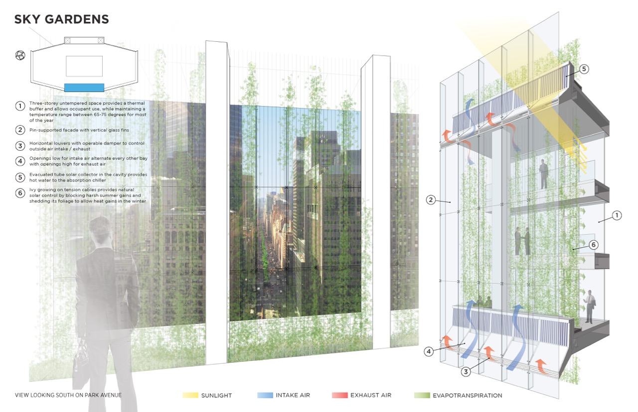
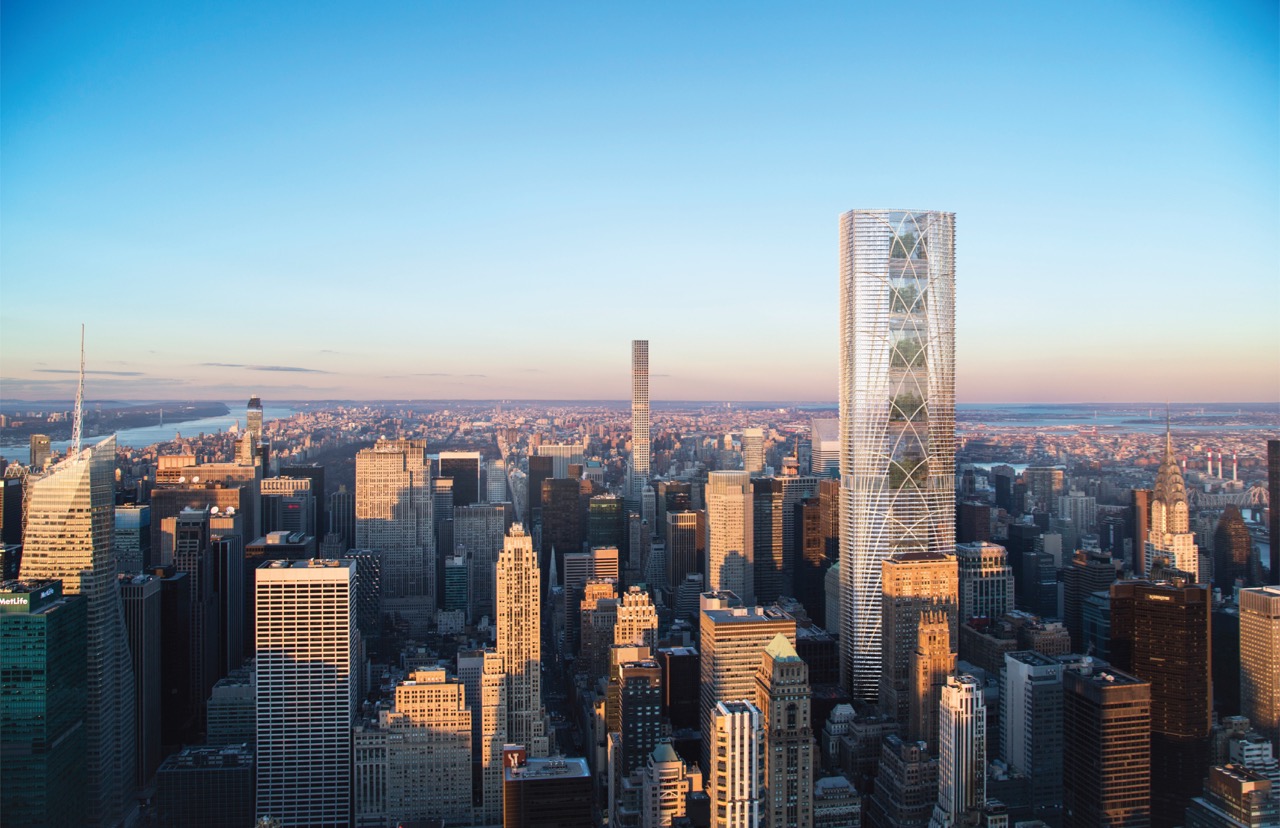
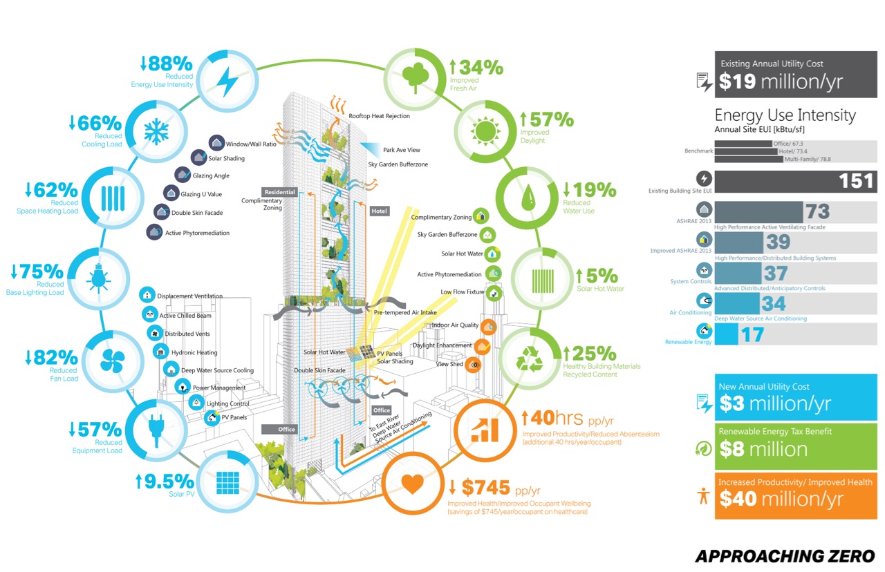
Broadly considered, the building façade is a mediating element: between public and private realms; between interior and exterior environments; and between urban and human scales. In working through and reconciling these sometimes conflicting considerations, the design takes on a specific character. At the urban scale we have striven to make readable on the façade an idea about the particular location of this building in mid-town Manhattan. We have also strategically re-shaped the tower to repair some of the damage that was done to the skyline as viewed from both ends of Park Avenue by the construction of the Pan Am building in the first place. At the building scale we have re-invented the form, the spatial experience, and the image/identity of the building while retaining in its essence the composition of the original design. At the façade scale we have developed a cladding system that significantly improves energy performance and enhances the workplace environment,” said the presentation.
“Finally, we have created amenity spaces that take advantage of unparalleled urban vistas for enjoyment by the building users as well as by the general public. All of these interventions have been made without a loss in leasable square footage, by harvesting space from the reduction in the size of mechanical systems – an example of just one of the synergies that stem from the design of an exceptionally energy efficient façade. We believe that our approach is applicable on a broader scale to many under-performing high rise buildings.”
VERTIMEME (PDF)
AECOM and Volley Studio
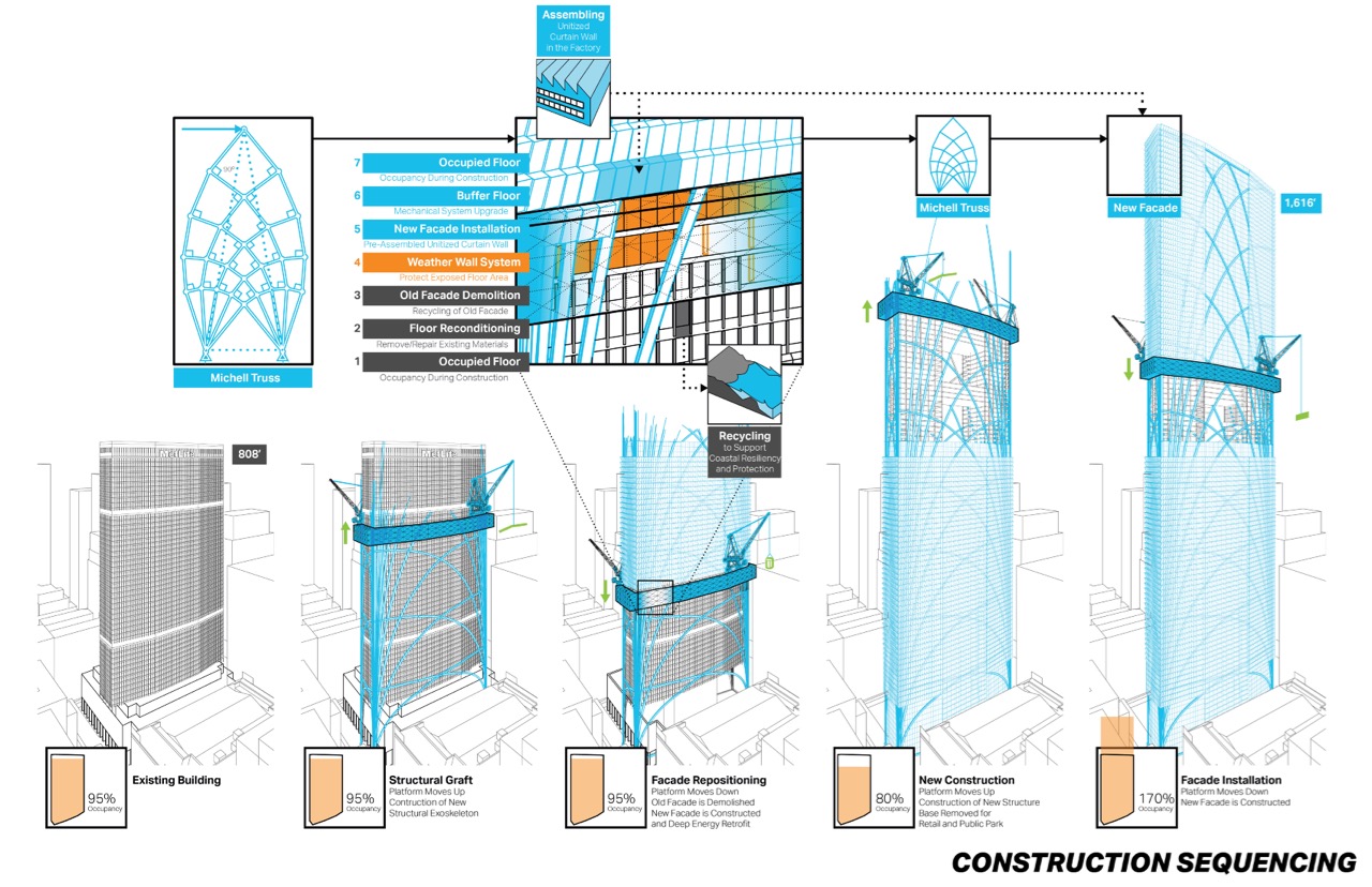
This proposal doubles the height of the building and removes and re-purposes old elements. It would “layer the new high performance facade to intercept and re-purpose the local energy flows to reduce greenhouse gas emissions and the overall carbon footprint. Approach Zero.” It would also “increase occupant wellbeing by merging deep energy retrofit strategies that provide fresh air and access to daylight to support our natural circadian rhythms. Increase biodiversity inside and out of the building, increase the wellbeing of the city by providing new public green plazas.”
FARM FOLLOWS FICTION (PDF)
LemayLAB, Ecosystem, and Sefaira
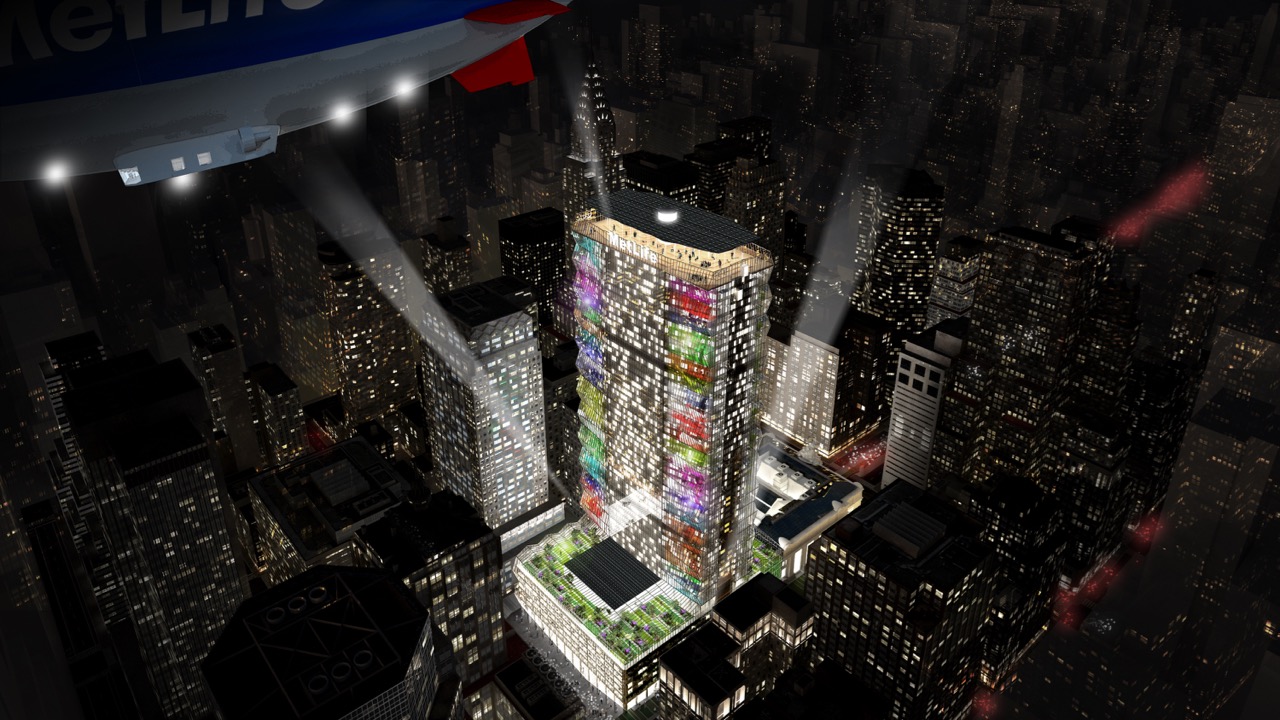
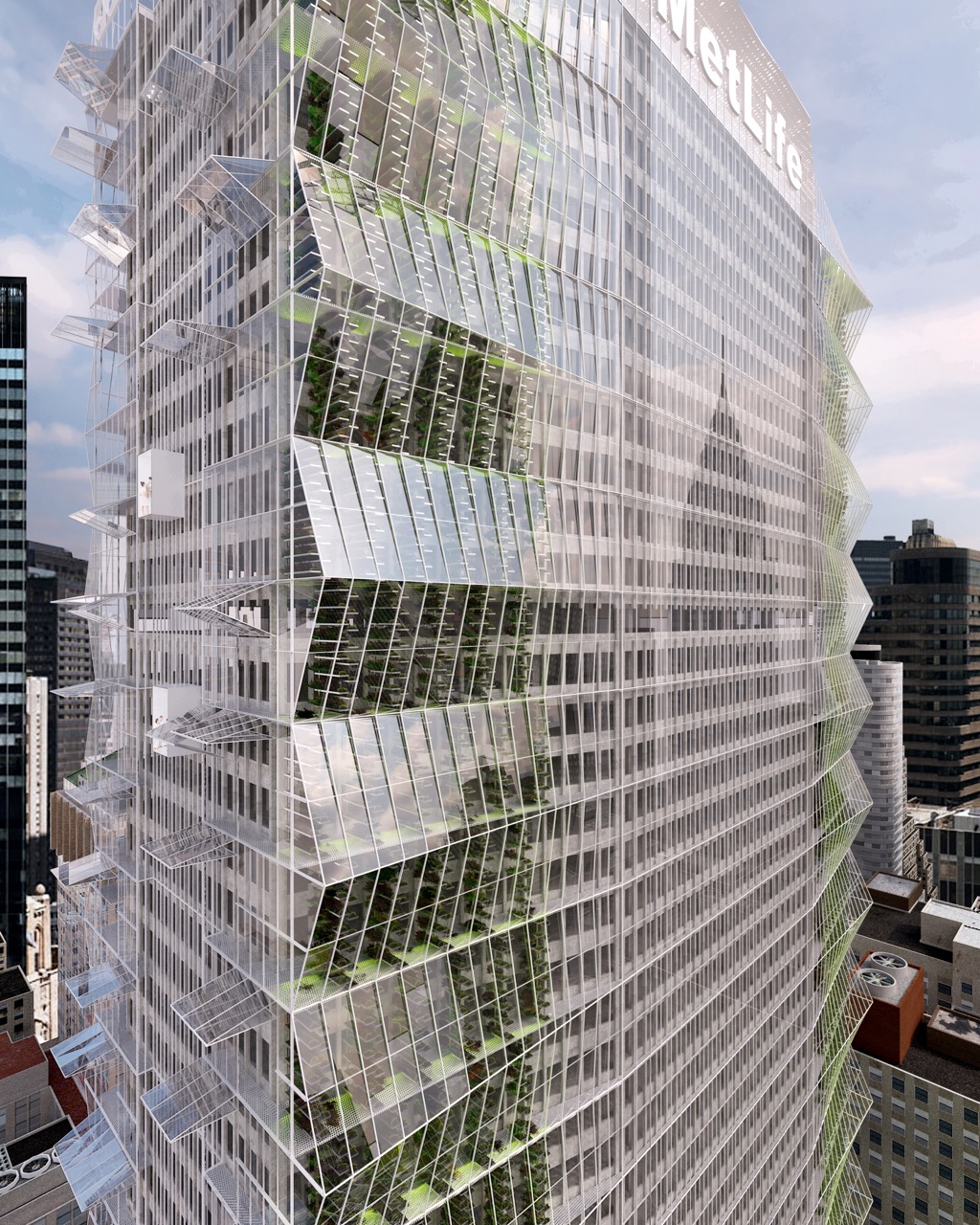
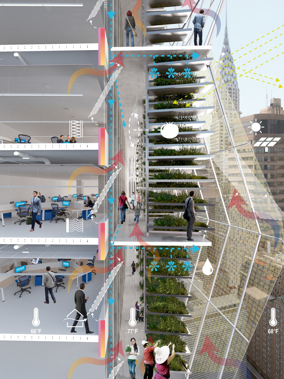
This concept reconceives a lot of the building as an urban farm. The presentation was done in the form of a short graphic novel.
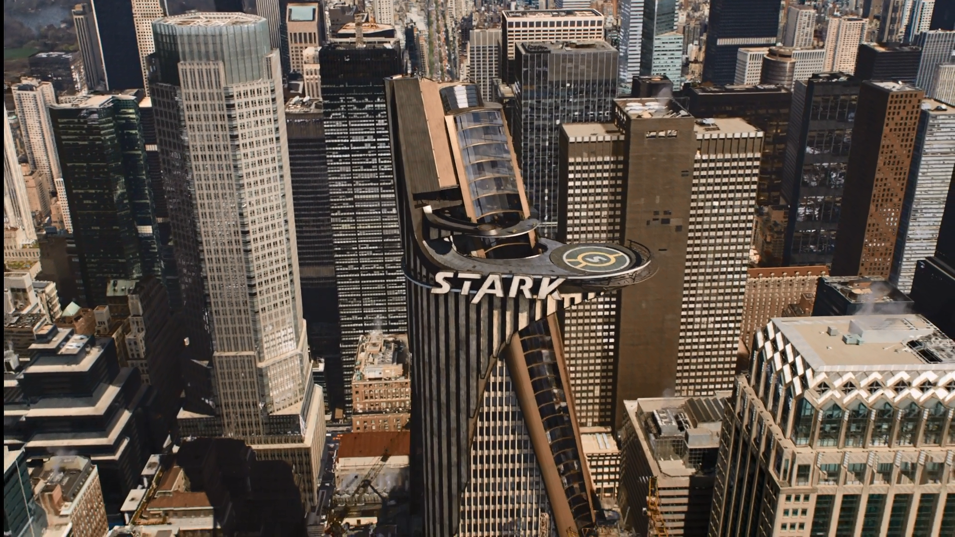
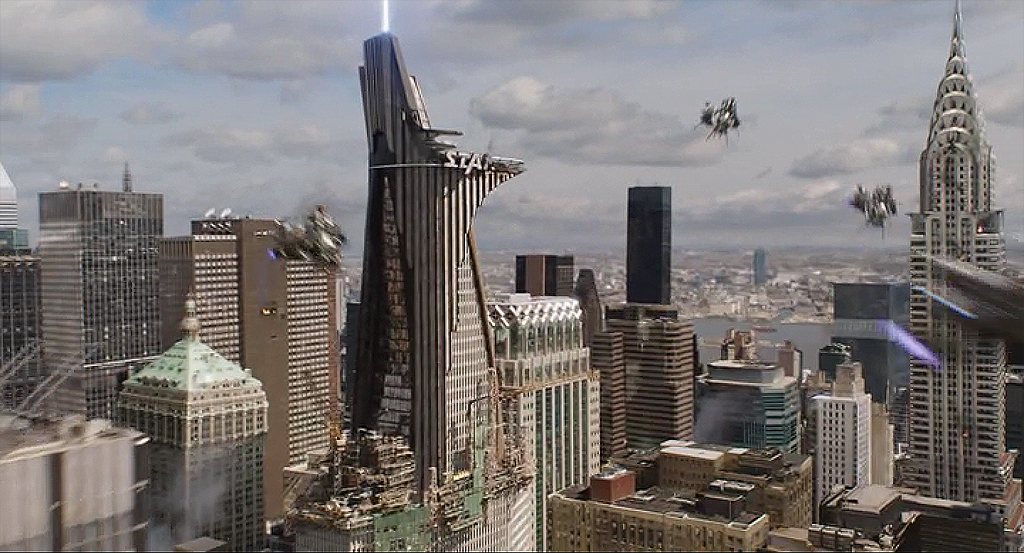
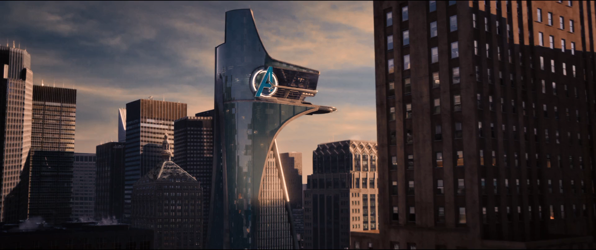
Of course, none of those entries are the first time the MetLife Building has been reimagined. In the Marvel Cinematic Universe, it was Stark Tower and, following the Battle of New York, it became Avengers Tower.
Subscribe to YIMBY’s daily e-mail
Follow YIMBYgram for real-time photo updates
Like YIMBY on Facebook
Follow YIMBY’s Twitter for the latest in YIMBYnews


Cool and magnificent with the new design on Metlife building, I trust that New York gaudy with light at night and elegant on day so the city reserved for only best skyscrapers.
Is this just an academic exercise or is it the building owner’s intention to actually carry out one of these plans? The building must be a NYCL and I can’t really imagine LPC approving changes like this. It’s a pretty iconic building on the skyline.
Wait, what? SHoP and Heintges teamed up and were one of the winners, but they were also on the Jury?? That seems fair.