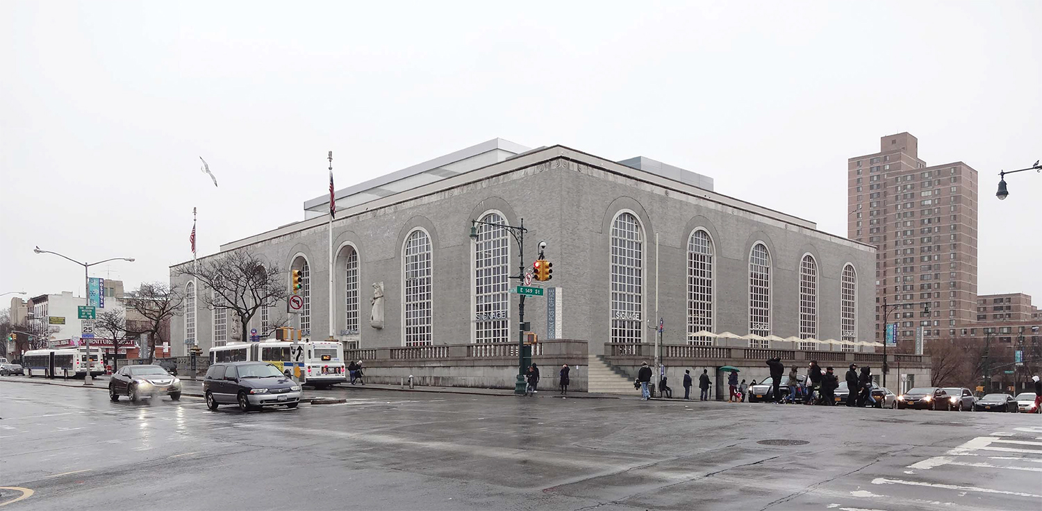
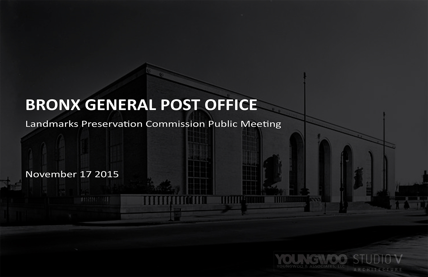
Back in February, the Landmarks Preservation Commission approved a massive renovation and restoration of the Bronx General Post Office. Located at 558 Grand Concourse, the property is a city individual and interior landmark. Now, the renovation design has changed slightly and the changes were well-received by the commissioners.
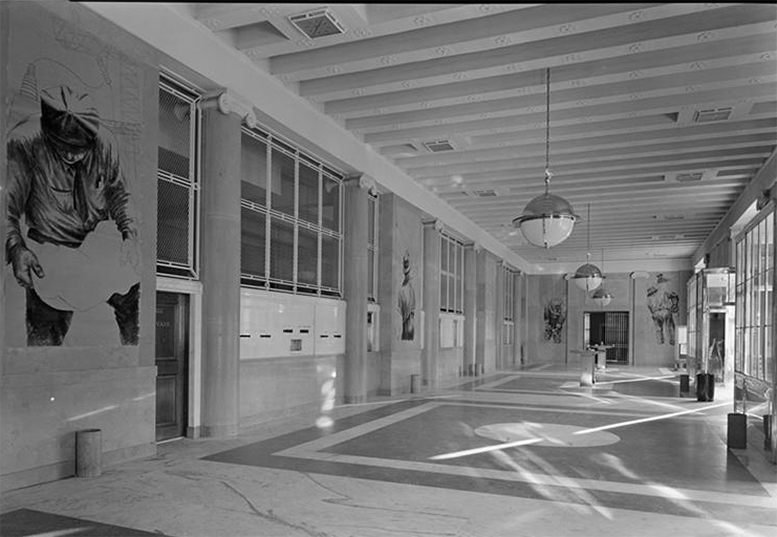
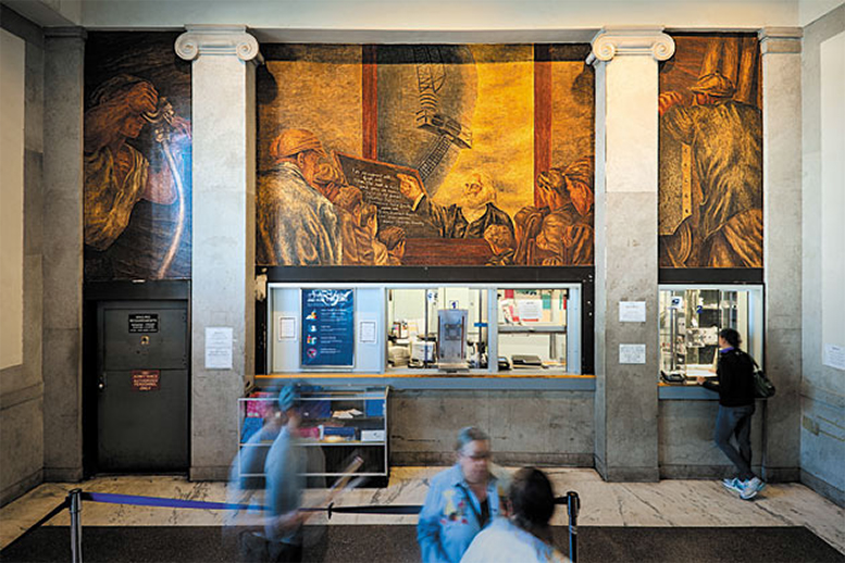
Young Woo & Associates picked up the 1937 building for $19 million in 2014. The plan is for a market, retail, and post office space on the ground and main floors, office space above that, and then a restaurant on the roof. Entrances and windows would be changed and signage applied, with more circulation intended on the building’s plinth. Additionally, the 13 New Deal-era murals in the interior will be restored.
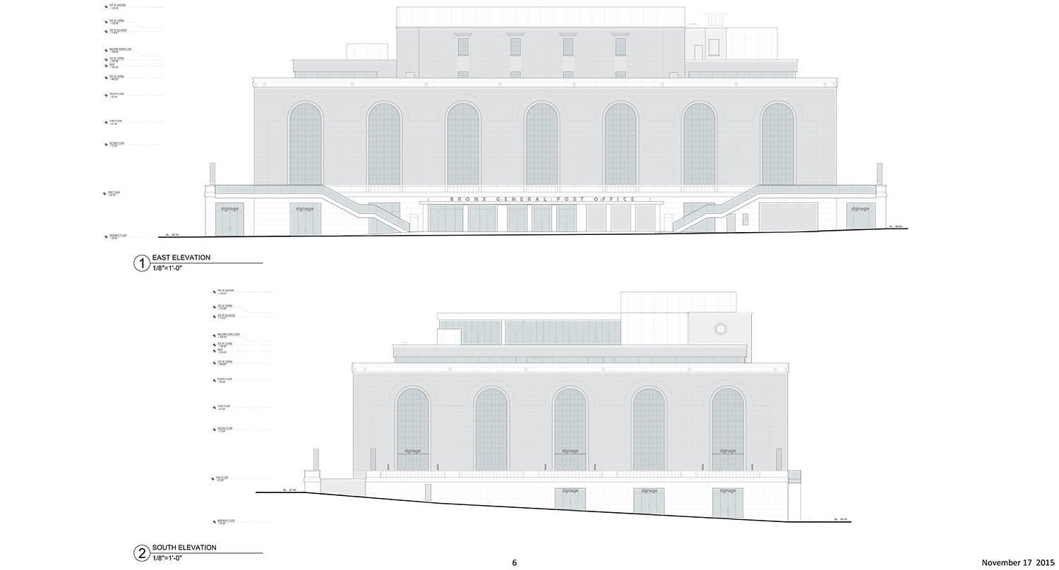
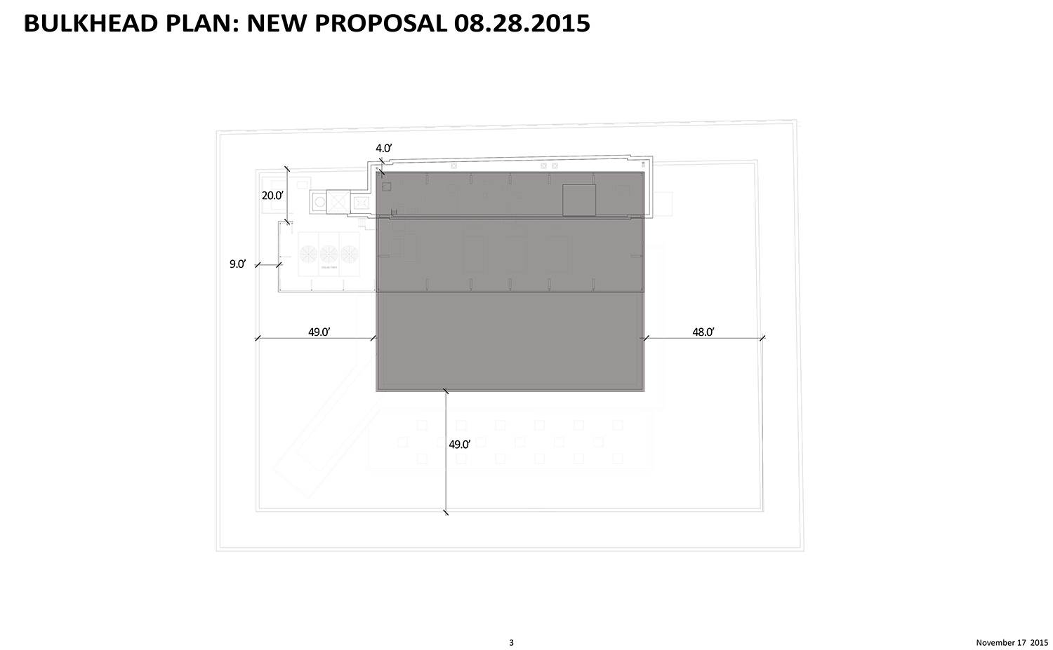
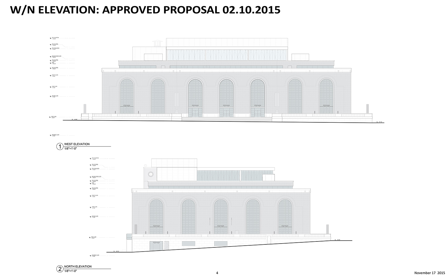
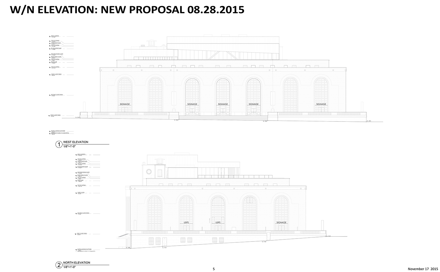
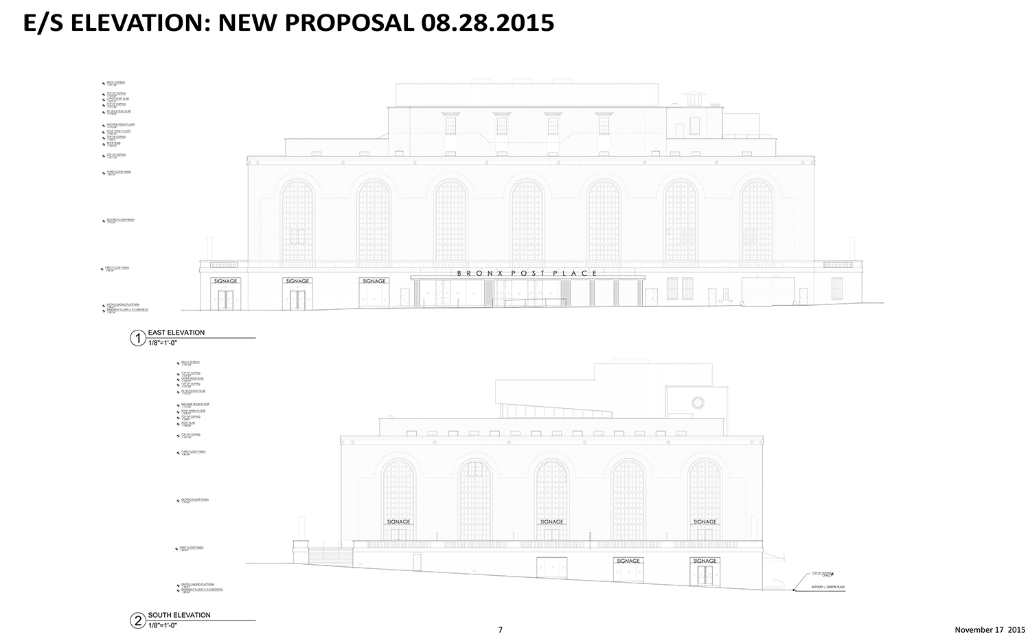
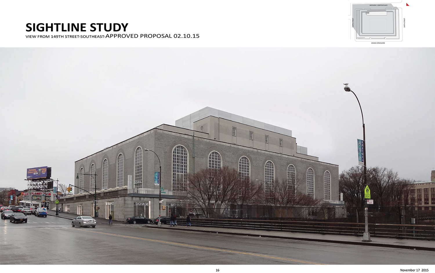
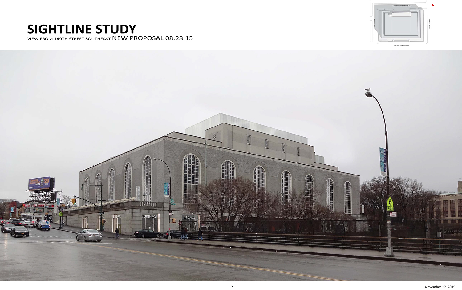
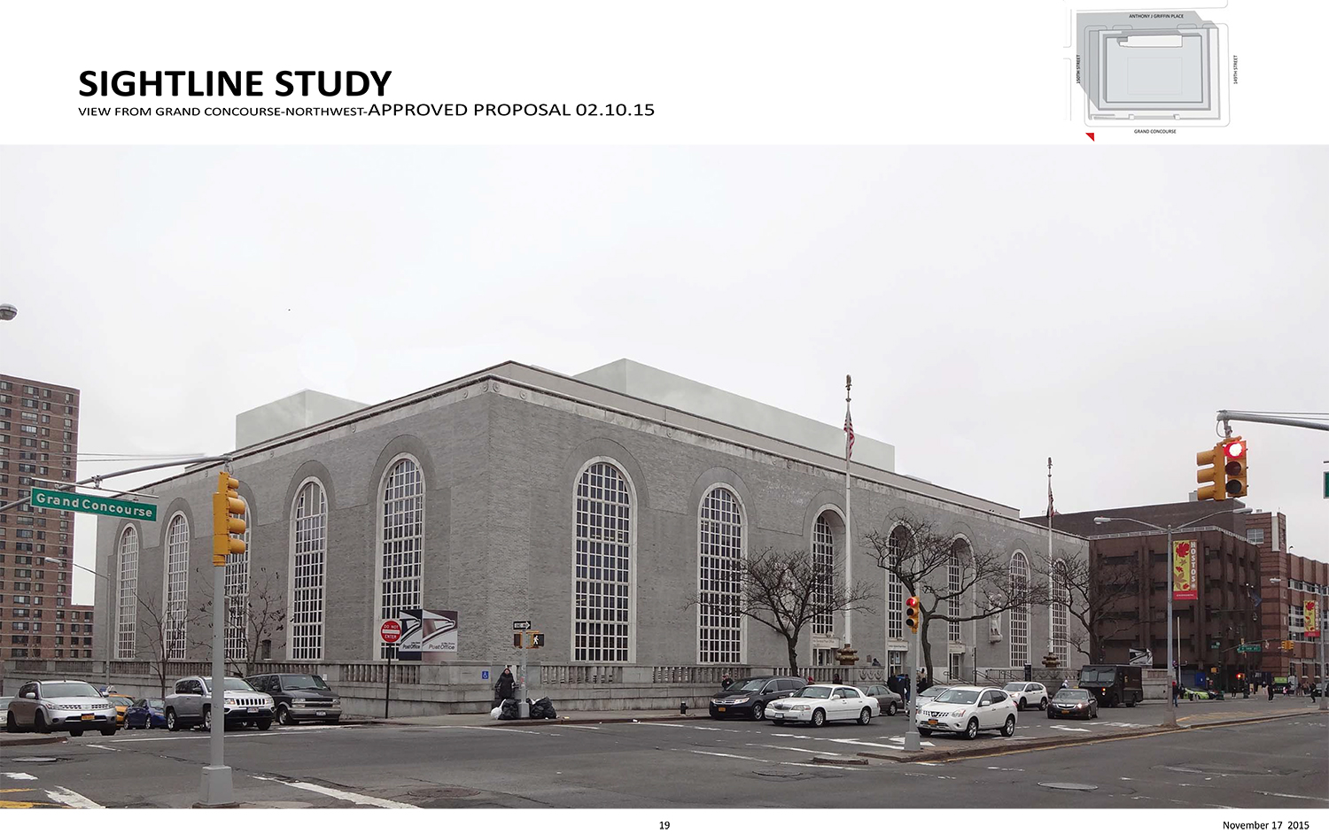
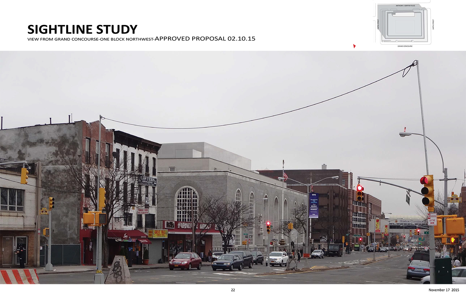
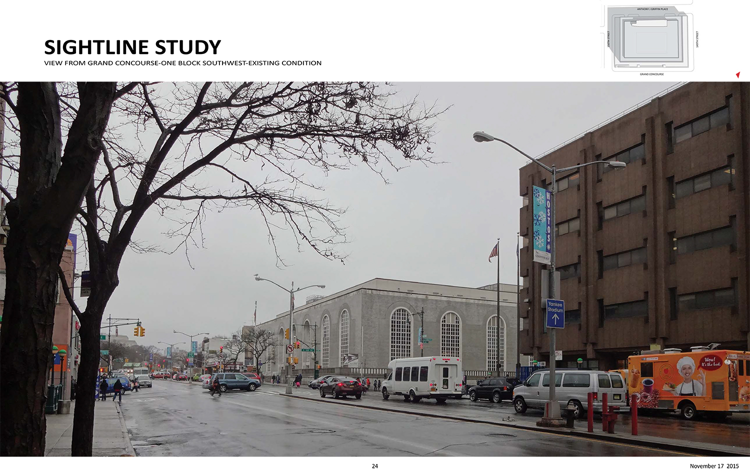
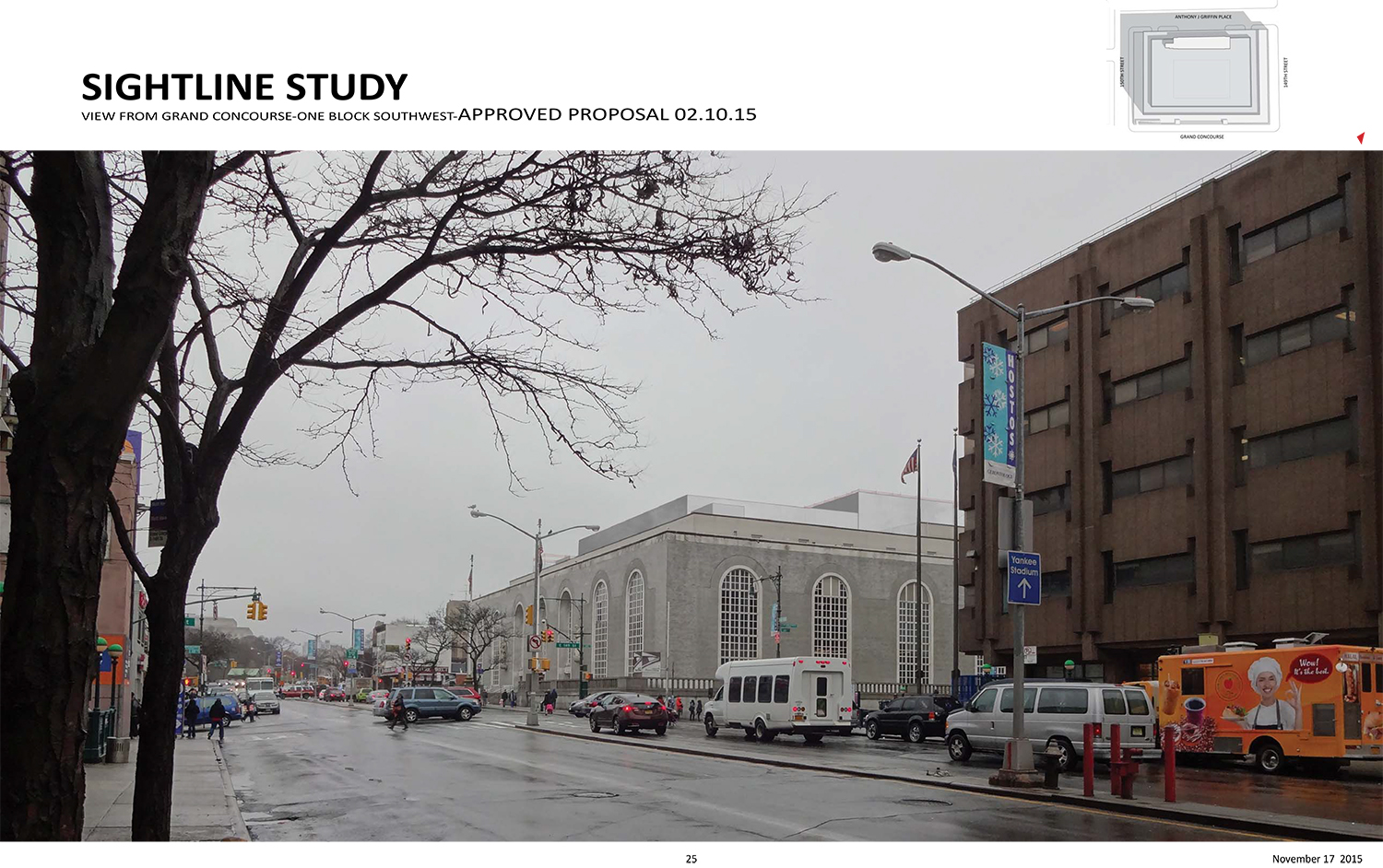
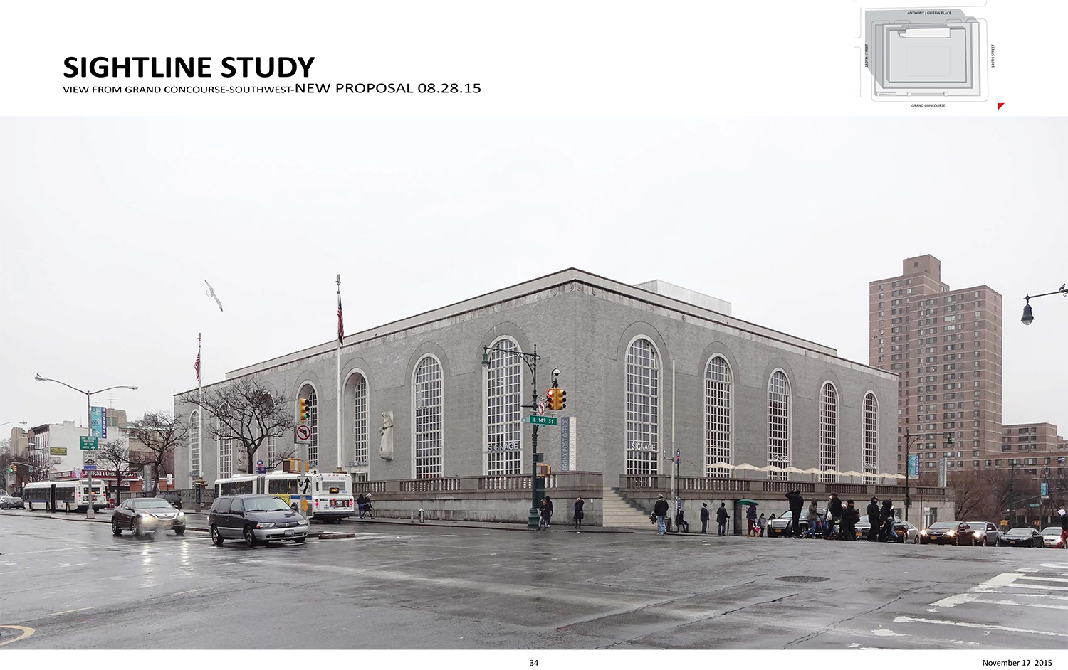
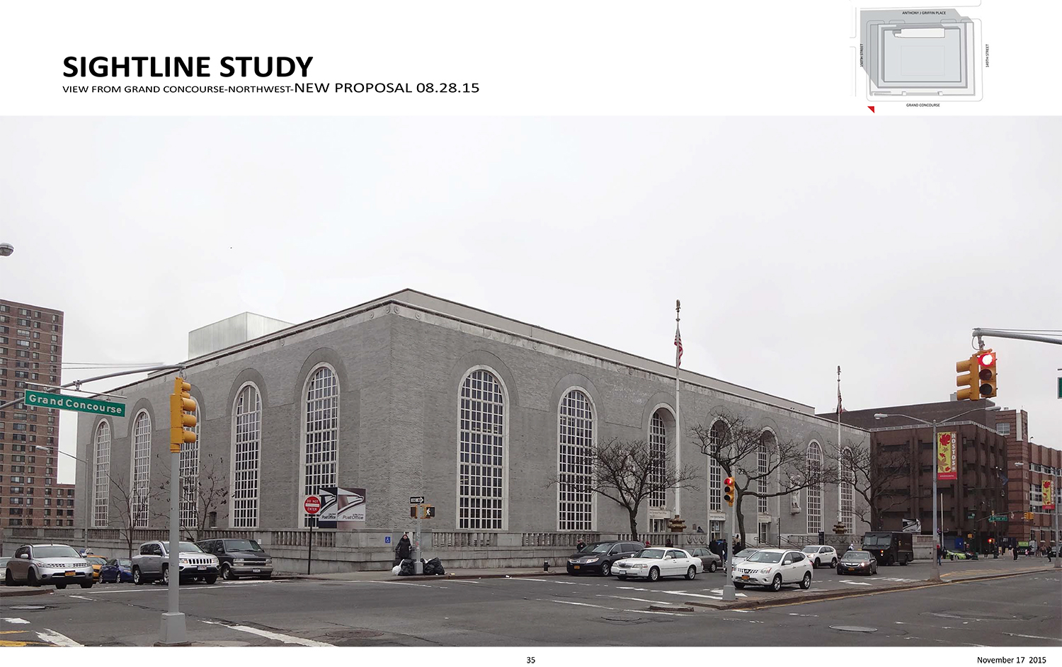
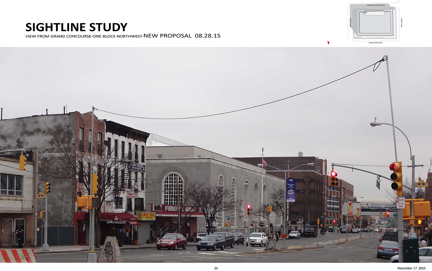
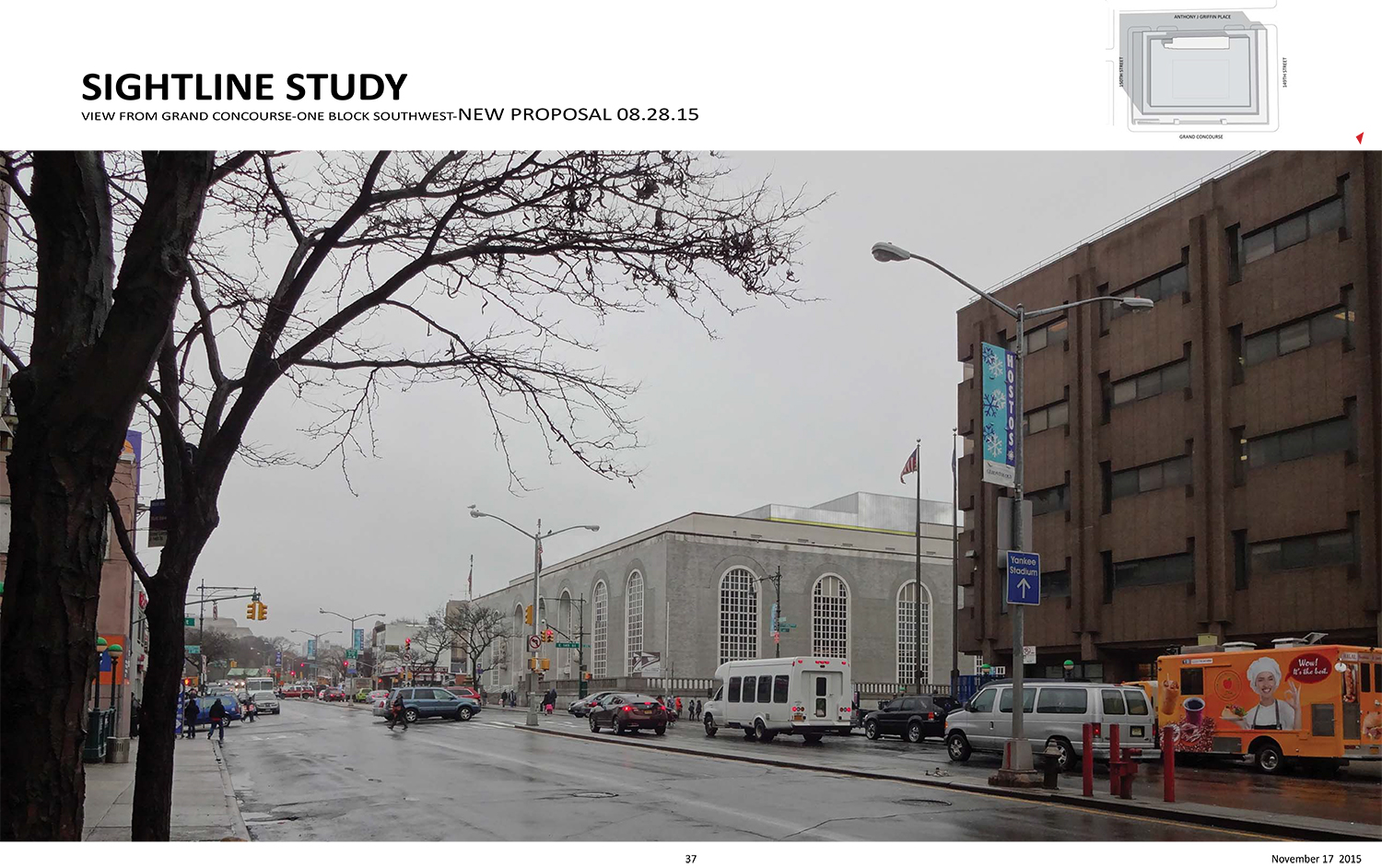
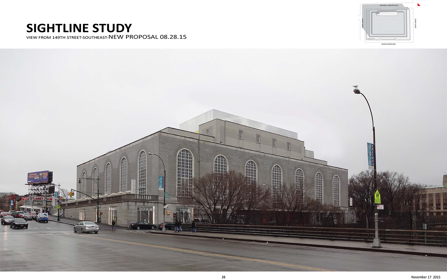
The plan is still for a restaurant on the roof, but one that is far more set back, making the rooftop addition far less visible to those walking down the street. The material will also change. As previously, the revised plan was presented by preservation consultant Cas Stachelberg of Higgins Quasebarth & Partners and architect Jay Valgora of Studio V Architecture.
“As we develop the scheme further, we’re very excited about this project, very excited to bring new uses and to bring people into this landmark,” Valgora said. “Much of it has been closed off for decades… except the public lobby.”
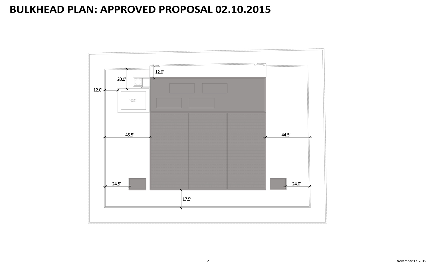
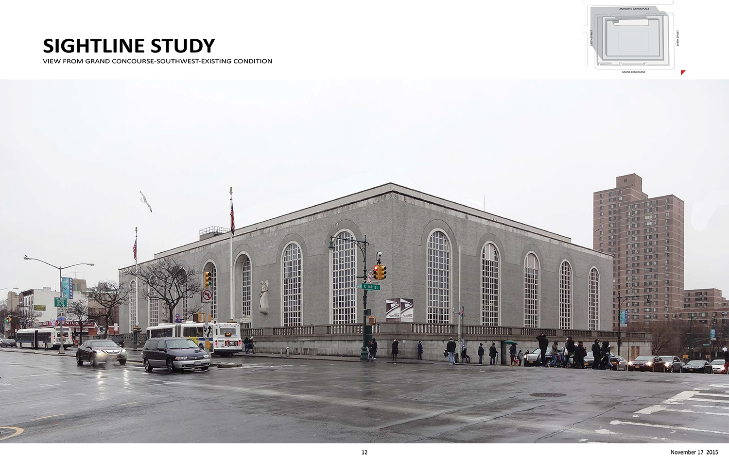
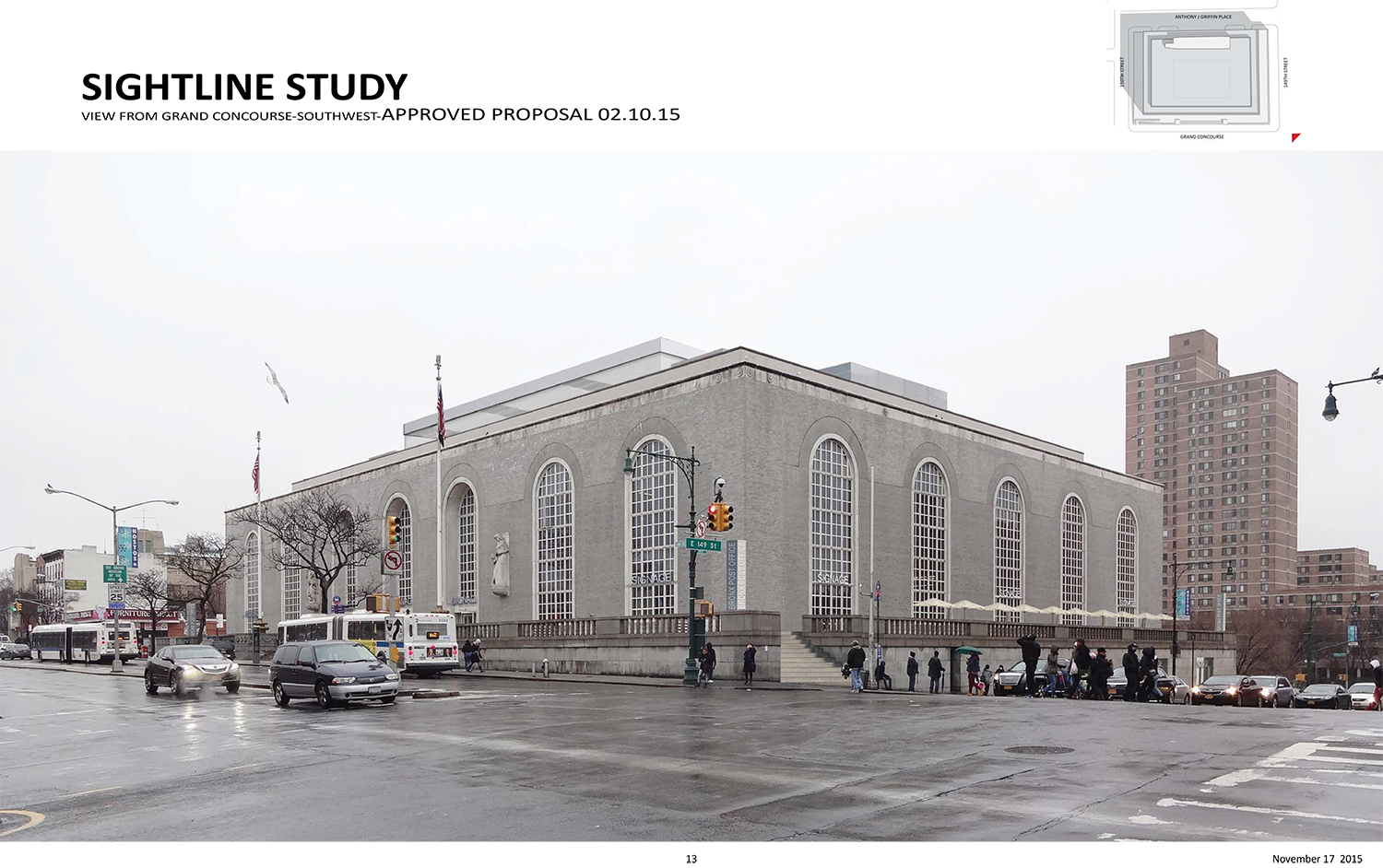
As approved in February, the rooftop addition was set back about 17.5 feet. Now, it will be set back 49 feet, almost three times the distance. The change was prompted by concerns about assembly and egress.
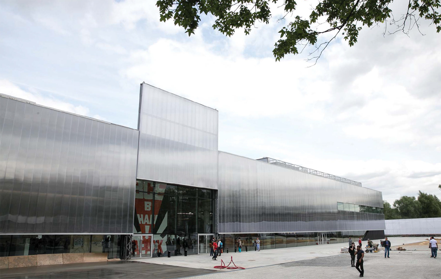
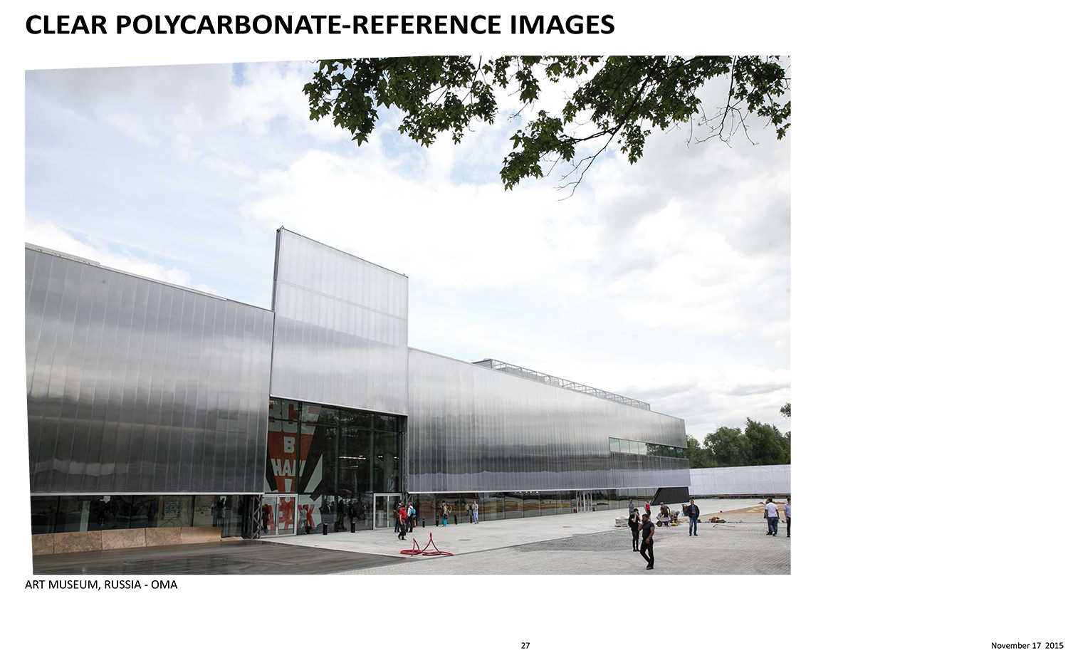
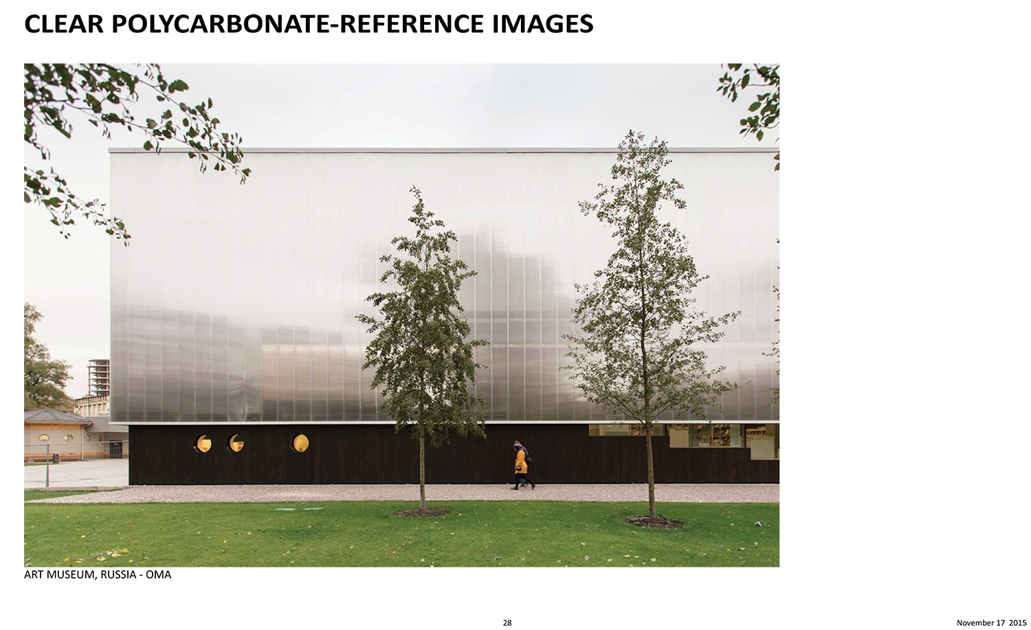
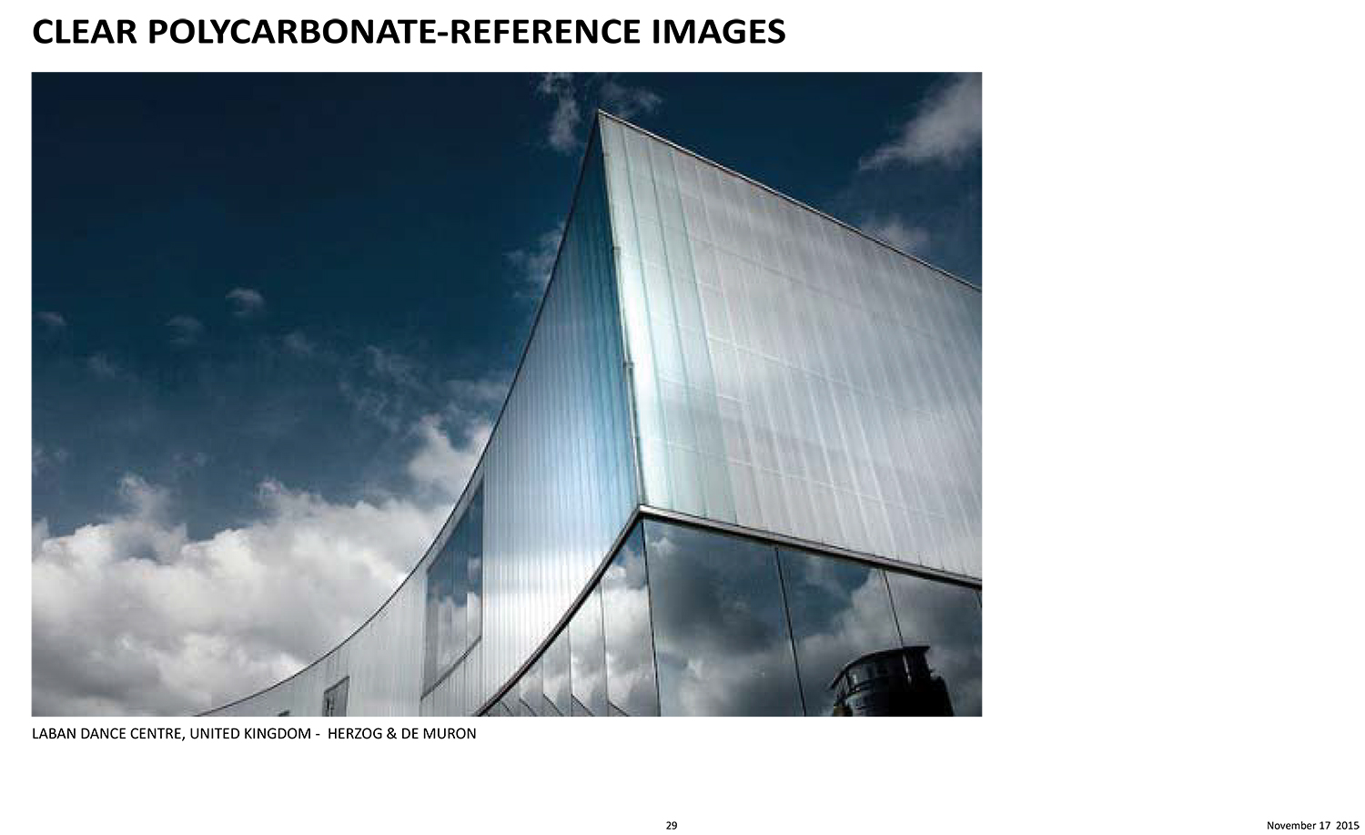
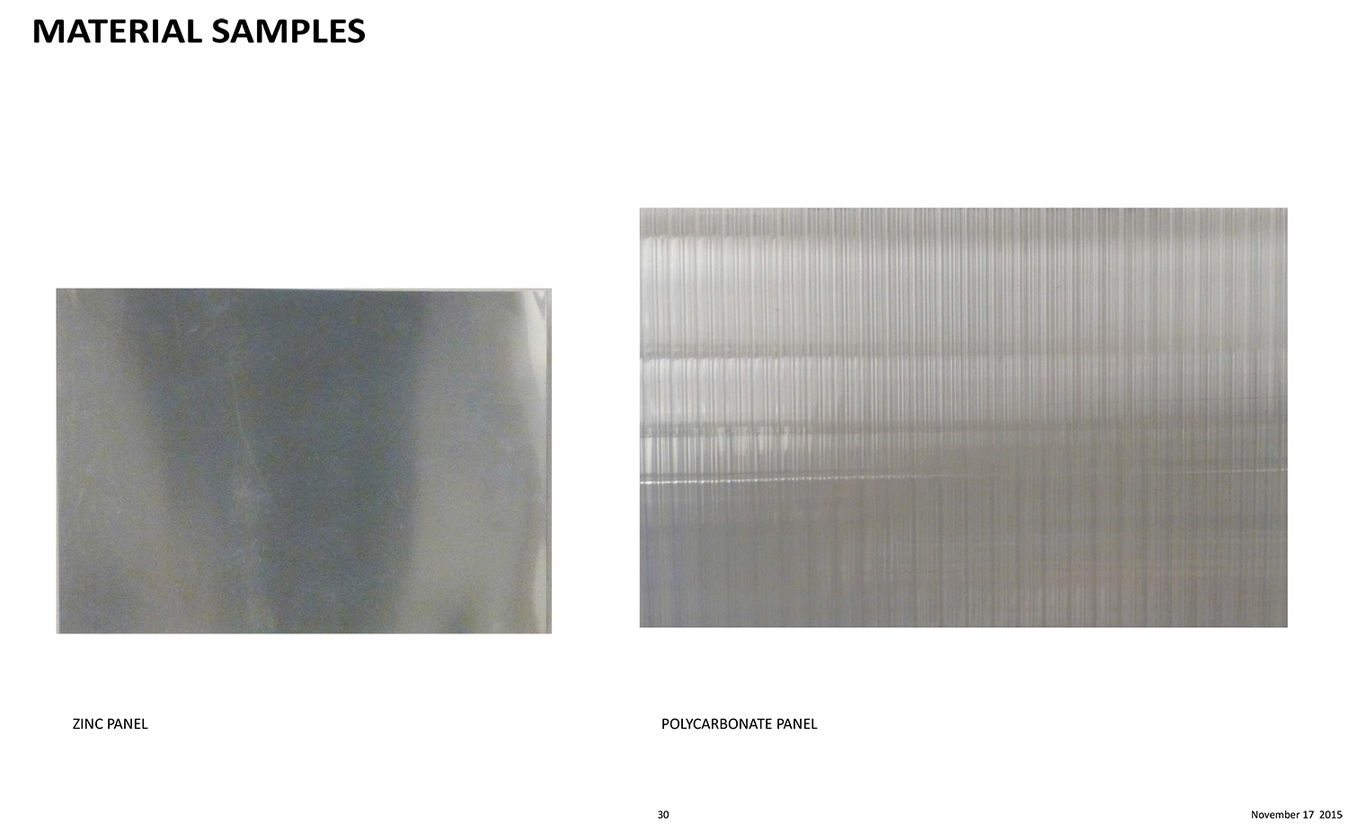
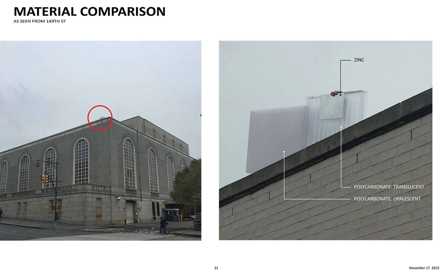
In addition to the reduction in visibility, the rooftop addition will be clad in clear polycarbonate instead of removable glass with a zinc cladding. Stachelberg said the polycarbonate is a “contemporary material for the contemporary uses of this building.”
Valgora said the zinc would have been dull and the polycarbonate will be more “monolithic” and would appear nearly without seams. It will have “almost a machine aesthetic,” he said.
Why not use brick? Valgora said the team was looking for a “product of our time.”
The revised design includes more of an angle than the somewhat block-like previous design. The angle is to “modulate the effects of light,” Valgora said. He added that there would be no increase in light transmission.
LPC Chair Meenakshi Srinivasan said the revised proposal is “much better” and said the clear polycarbonate is an “interesting material.”
“I personally find this plastic okay. I think it’s appropriate. It will read monolithically. I hope that it won’t degrade over time,” said Commissioner Michael Goldblum. “I think the reduced visibility is a total win.”
“My only concern is that angle,” he said, but because it’s basically not visible, it didn’t stop him from supporting the project.
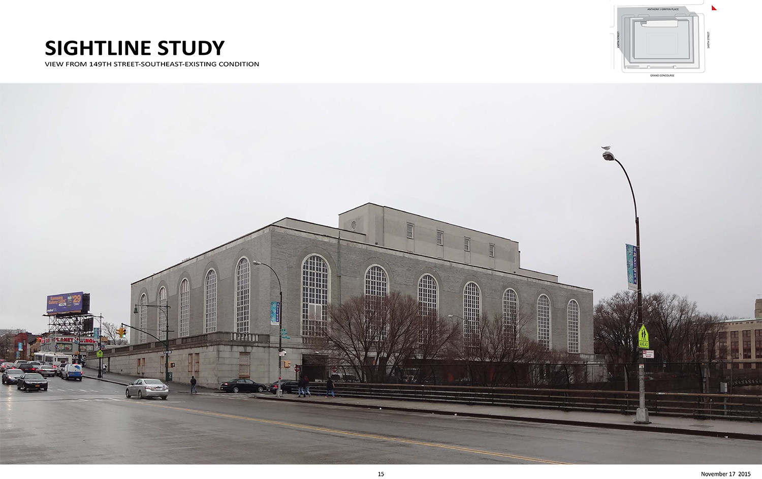
Commissioner Robert Washington said she loves the reduced visibility. Commissioner Frederick Bland noted that there will be visibility from train riders on the New Haven Line. “I look forward to seeing this new material,” he said.
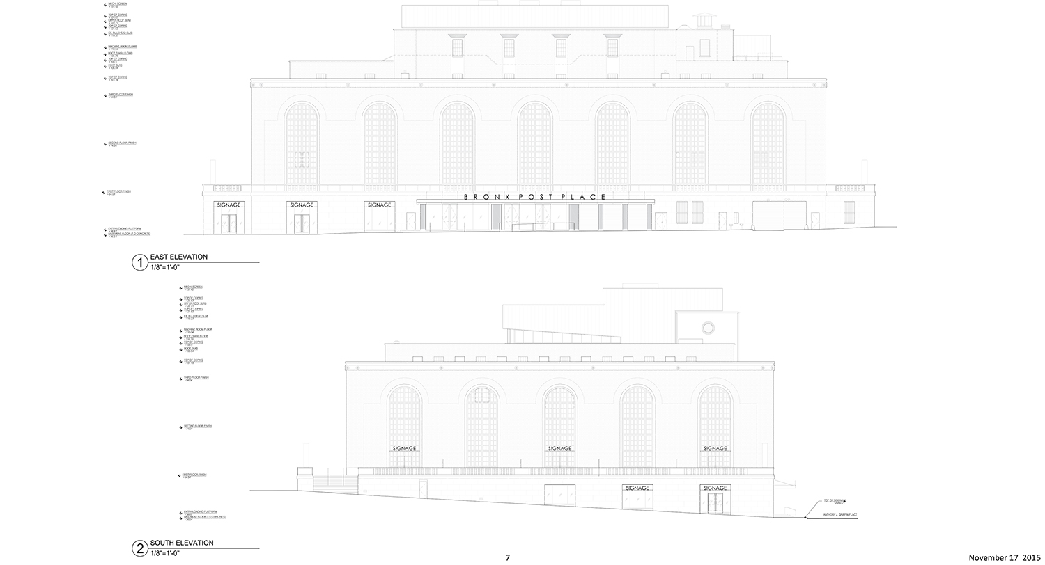
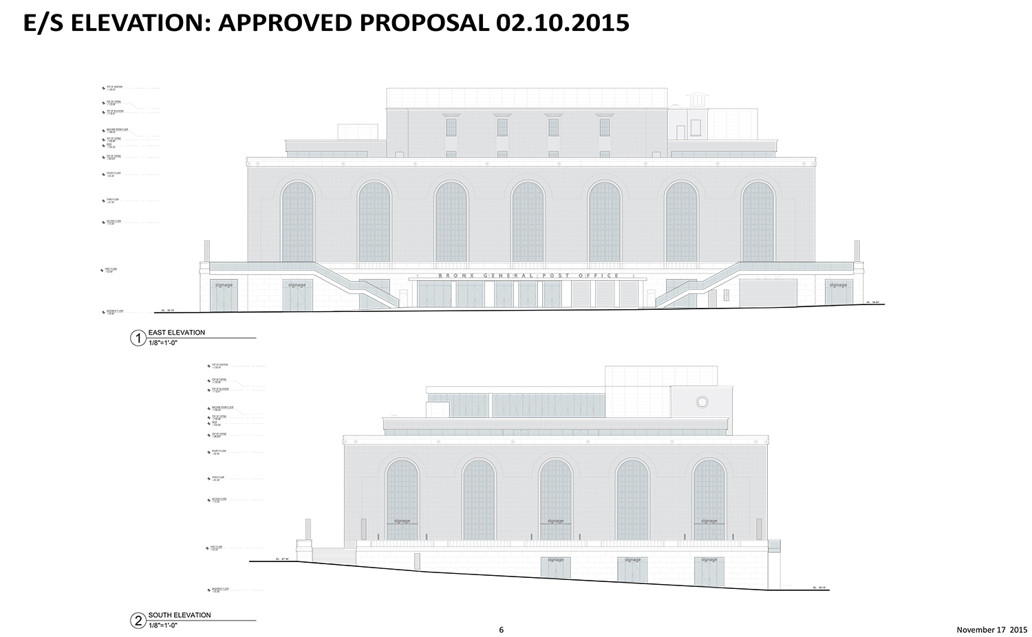
Plans on the revised presentation also indicate other changes on what is essentially the back of the building. They include the removal of the new stairs that would have led from the plinth to the ground floor, a reconfiguration of fenestrations and entrances, and a change in signage from “Bronx General Post Office” to “Bronx Post Place.” Those changes were not discussed in the commissioners’ public meeting. It’s possible that those changes were being handled at the LPC’s staff level.
View the full presentation slides below:
Subscribe to YIMBY’s daily e-mail
Follow YIMBYgram for real-time photo updates
Like YIMBY on Facebook
Follow YIMBY’s Twitter for the latest in YIMBYnews














Cheap materiel for redesigning an historic building.