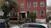
Brooklyn’s boom continues apace, and today, YIMBY has the reveal for the redevelopment of the existing building at 489 Washington Avenue, in Clinton Hill. The site is three blocks away from the Clinton-Washington Avenue subway station, serviced by the C trains. GB Properties is responsible for the applications. Construction will alter the extant structure, resulting in a tenfold increase in the unit count.
Permits show that the building will receive an additional floor, raising up 50 feet, compared to 39 feet currently. The repurposed structure will yield 12,545 square feet for residential use, creating 21 apartments. They will average 600 square feet apiece, indicating rentals. Tenants will also have access to a rooftop recreational space.
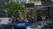
An eagle-eyed tipster reported to YIMBY a rendering reveal on the fencing around the construction site. Walter J. Hollien Architects is the architect of record, and J Goldman Design’s Joshua Felix is responsible for the design. The symmetrical building will have a regal centerpiece, with two long-shafted Corinthian columns and banisters, all resembling marble. For now, the material that will actually be used is unknown.
Permits for the building were approved in 2015, but it appears that construction has been delayed. The expected completion date has not been announced.
Subscribe to YIMBY’s daily e-mail
Follow YIMBYgram for real-time photo updates
Like YIMBY on Facebook
Follow YIMBY’s Twitter for the latest in YIMBYnews


Please pardon me for using your space: Chosen.
Please do not build this building as it is presented. Please.
It really hurts the eyes. The architect, if there really is one, should have their license revoked for crimes against taste. What’s worse is that the existing building is really lovely, and could be renovated.
It’s extremely unfortunate that we’re losing an historic mansion for … whatever that is.
Is this a belated April fools joke? What a travesty to destroy the existing historic mansion and build this mismatched collision of quasi-classical/undistinguished modern conglomeration using all the wrong materials and out of scale building details. A truly horrific additional for the neighborhood.
2009 so beautiful
For a brief moment after the removal of the nasty permastone facade, we all get a glimpse at the beautiful mansion that was hiding underneath, and which the neighborhood is about to lose. Kind of a huge tease.
It sucks.
It’s not three blocks away from the C train. It’s about 10 seconds away from the C train entrance.
Whar a disgracr
I wonder what the client requested?
Super unique!
I think it looks unique and will be a nice addition to the neighborhood. I applaud the architect for taking a risk!
Unfortunateoy Brooklyn’s real estate proces is forcing a lot of history to be vanished. At least it gets replaced with something beautiful.
Great aesthetic combination of the old and new with subtle references to the past.
Love the design! Josh Felix outdid himself here!
This disgusting faux travesty belongs to tasteless new construction areas of Sheepshead Bay or Manhattan Beach… unbelievably ugly and painful to see. Cheapest construction methods used (workers were hoisting steel beams by pulley), there’s no “reconstruction” here, there’s nothing left of previous 1850s mansion with storied history you can read on Brownstoner but foundation and short pieces of brick walls that will become internal partitions. 600 sq ft, nothing family friendly, cramming studios to maximize profits.
This is so hideous, I love it! The revenge of South Brooklyn!
The juxtaposition of classical architecture and contemporary design is exquisitely balanced. Love how it breathes a modern to flair into the architecture!