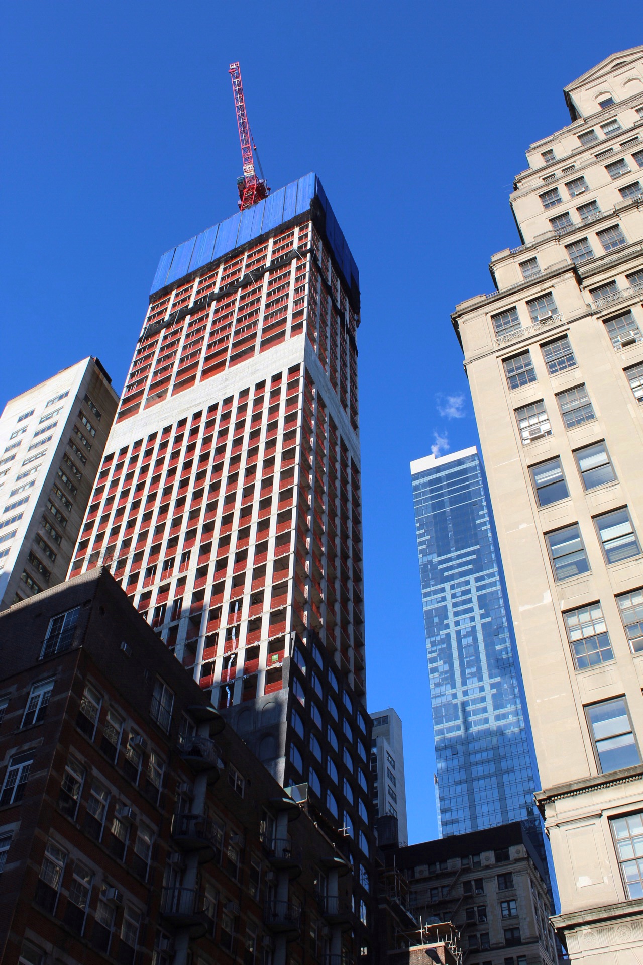
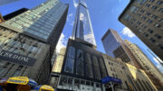
Sir David Adjaye’s residential tower at 130 William Street surpassed the halfway mark earlier this month, as it continues to climb towards its 800-foot tall pinnacle. The 66-story building is designed by Adjaye Associates with Hill West Architects as the architect of record. Lightstone is the developer, and Corcoran Sunshine Marketing Group is handling sales of the 244 condominiums.
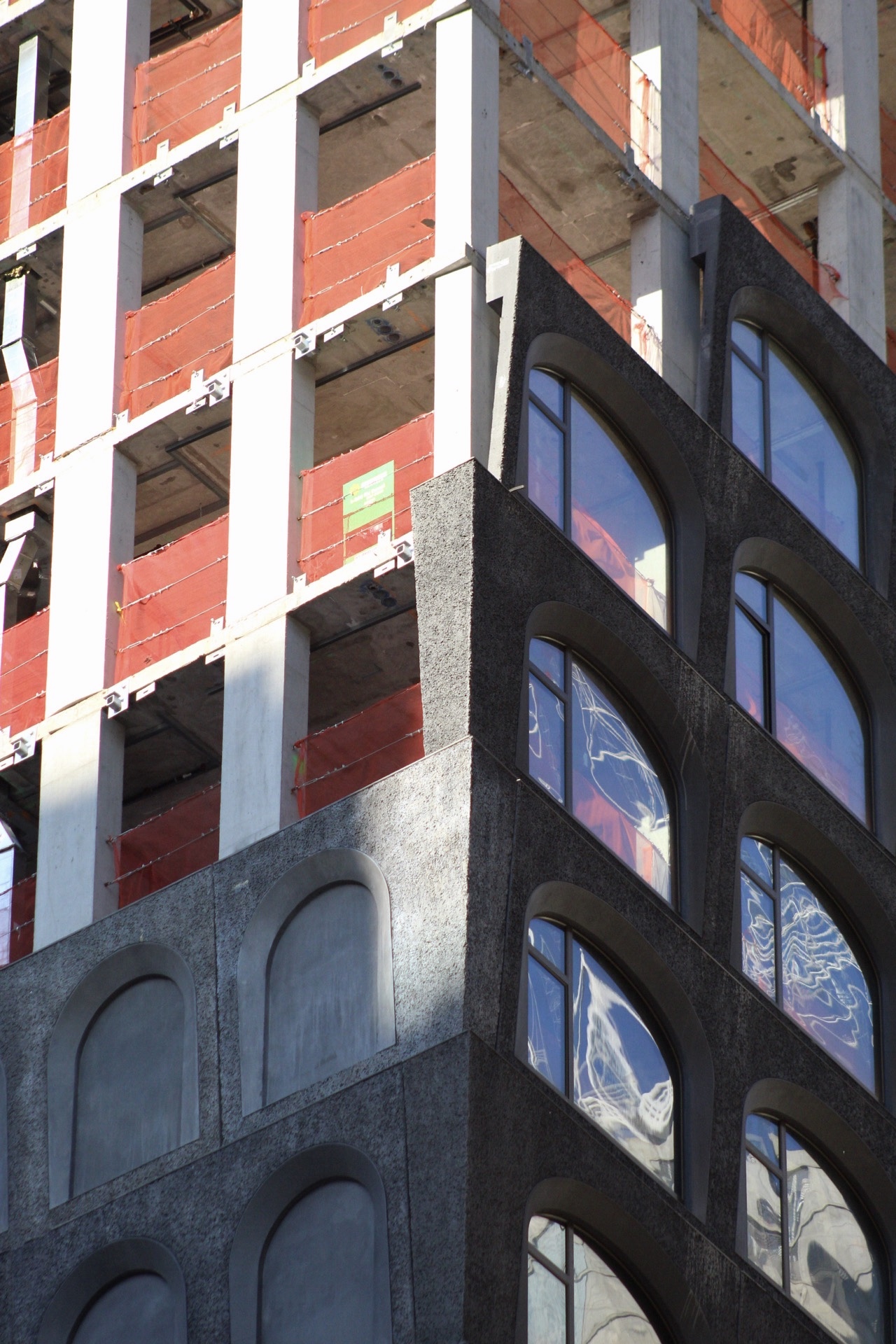
Looking west from Fulton Street, the eastern elevation of 130 William Street shows the structural makeup that will soon hide behind a dark facade. A tight perimeter of thin concrete columns are found along the bottom half of the tower. The first exterior panels on the east side of the construction are now visible, as they begin to form the sloped and inward-pointing corners of the building.
There is a blank, two-story concrete perimeter that took construction workers some time to form in the past several weeks. This is most likely mechanical floors. Above that is the upper half of the building, where the number of columns along the border are reduced by half.
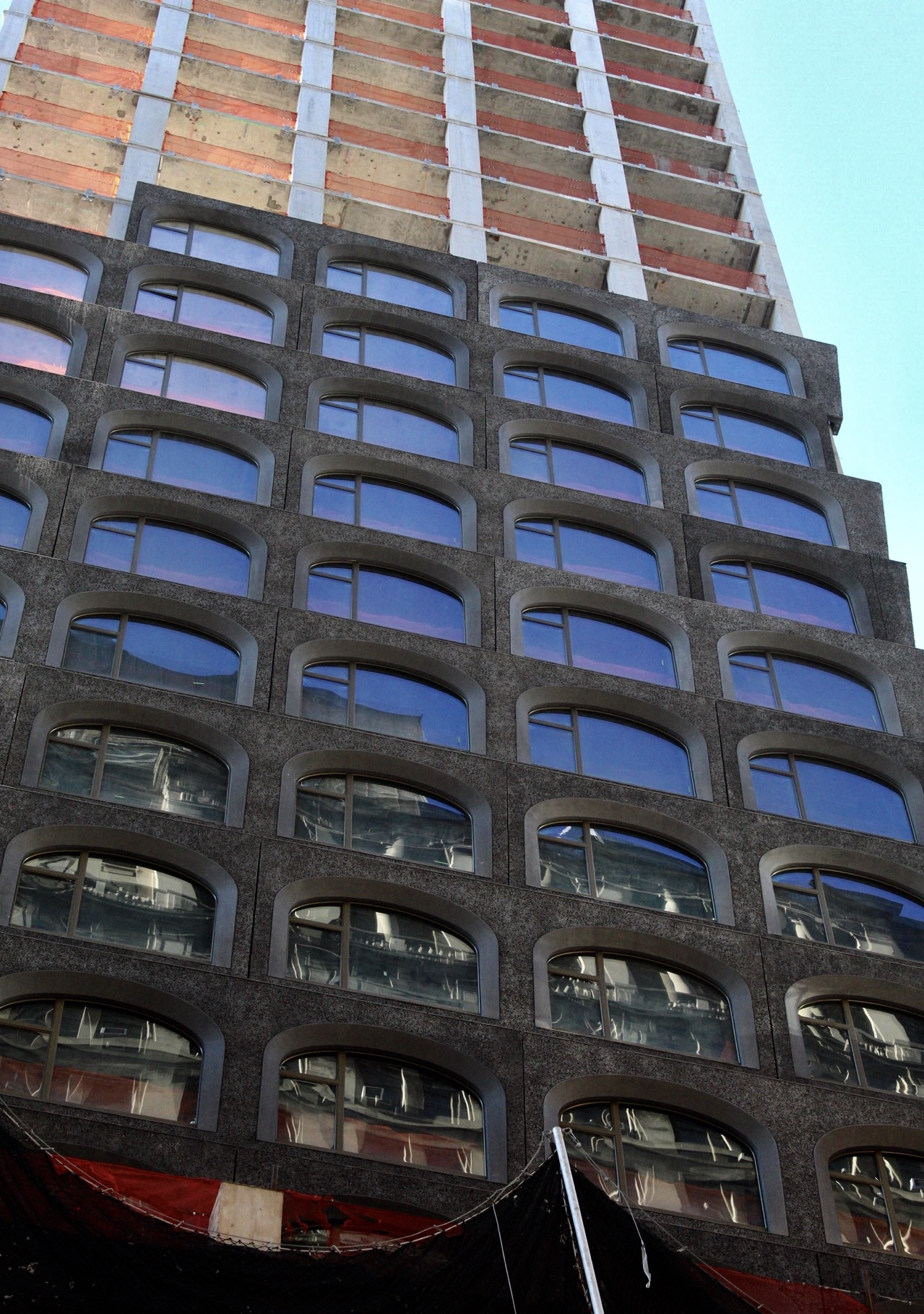
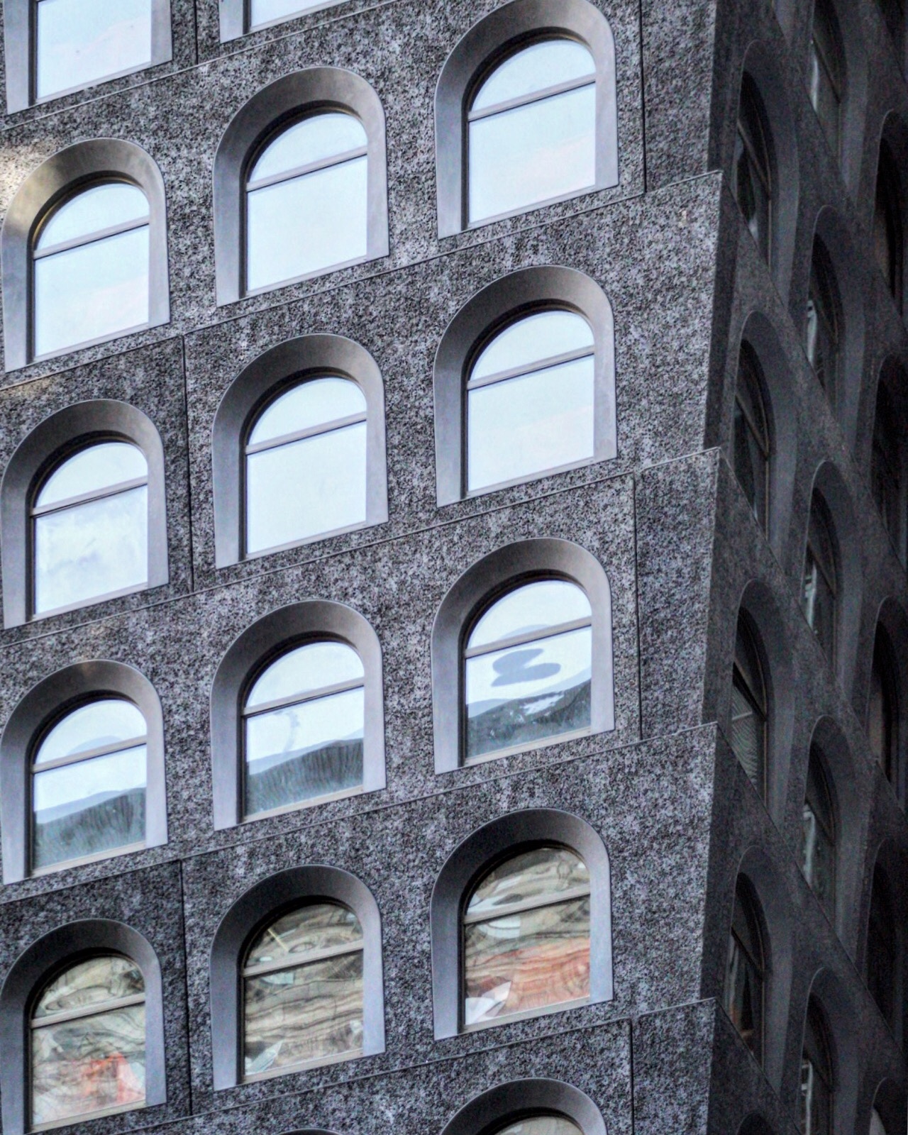
Along Fulton Street, the northern elevation will have wide arched windows running the full height of the development.
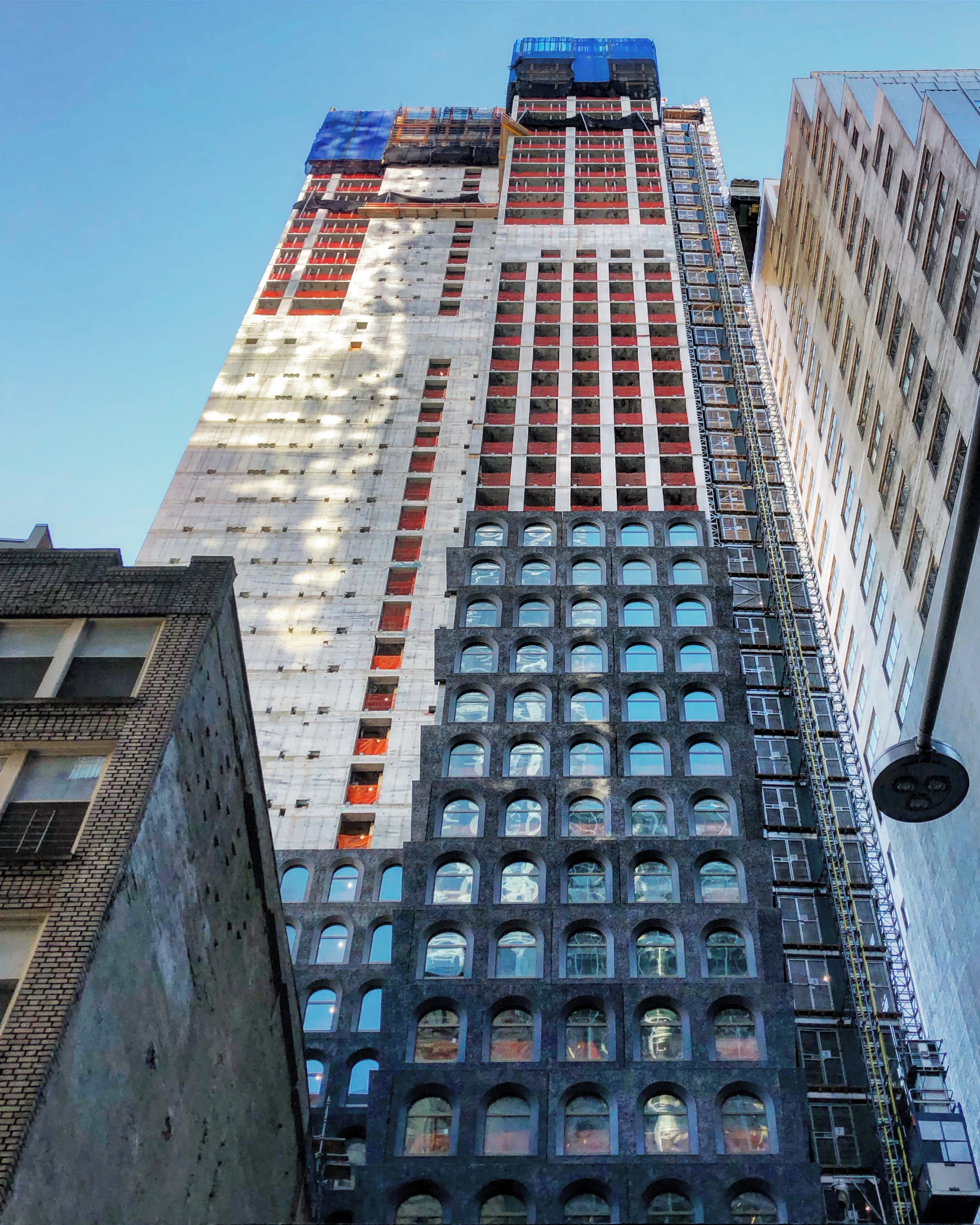
The facade is rising quickly on the western elevation that faces the World Trade Center. The assemblage of the exterior panels is best seen here. Like the teeth of a zipper, corner panels on alternating levels hang off the side, waiting to perpendicularly interlock with the adjoining concrete cast pieces. The process is seen repeated on all edges.
On the southern elevation, the final ten floors will have loggias hidden behind open-air arches. Residents will be able to step outside and have the privacy of an outdoor space, as well as the accompanying views from nearly 800 feet in the air.
130 William Street looks like it will top off sometime by late spring or early summer, with completion in 2020. YIMBY has word that the tower is currently the fastest-selling building in New York City, as well.
Subscribe to YIMBY’s daily e-mail
Follow YIMBYgram for real-time photo updates
Like YIMBY on Facebook
Follow YIMBY’s Twitter for the latest in YIMBYnews




PARDON ME FOR USING YOUR SPACE, BUT THIS IS HUUUGEEE
Better than most
Please pardon me for using your space: I lamp up and down on construction and see (not) lampoon from Donald Trump I think you should take medicine and go to sleep for your health. Languid from drugs or alcohol it will kill you soon. (Take care). About progress nothing that lacerated me on its facade and I want to thanks to Michael Young for your large-hearted. And the last part of comments I want to tell you I’m lasting on arched. (Thanks to Michael Young)
Please pardon my using of your space: granite arching grows gracefully! The color and massing of this tower certainly commands respect.
Please pardon me for using your space: The comments section of your site is becoming fit for publication in absurdist literature glossies. Thank you to David for your keen of mind.
Hideous. And it already looks dirty.
Pardon me for using your space:Pardon me for using your space: Pardon me for using your space: A bit tacky, but the open decks are quite interesting.
Could the admin please ban said individual (or at least persuade them)from using that opening line? That dude is driving everyone nuts… love this website BTW
I love ‘pardon me for using your space!’! And thank you 🙂
Awkward and ridiculous
You know the more I look at this thing, the more it looks like some kitschy Vegas theme hotel. And as always, pardon me for using your space.