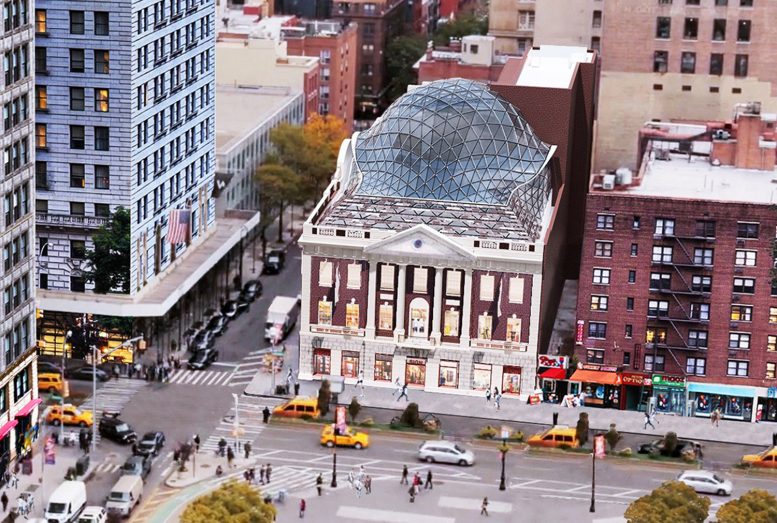
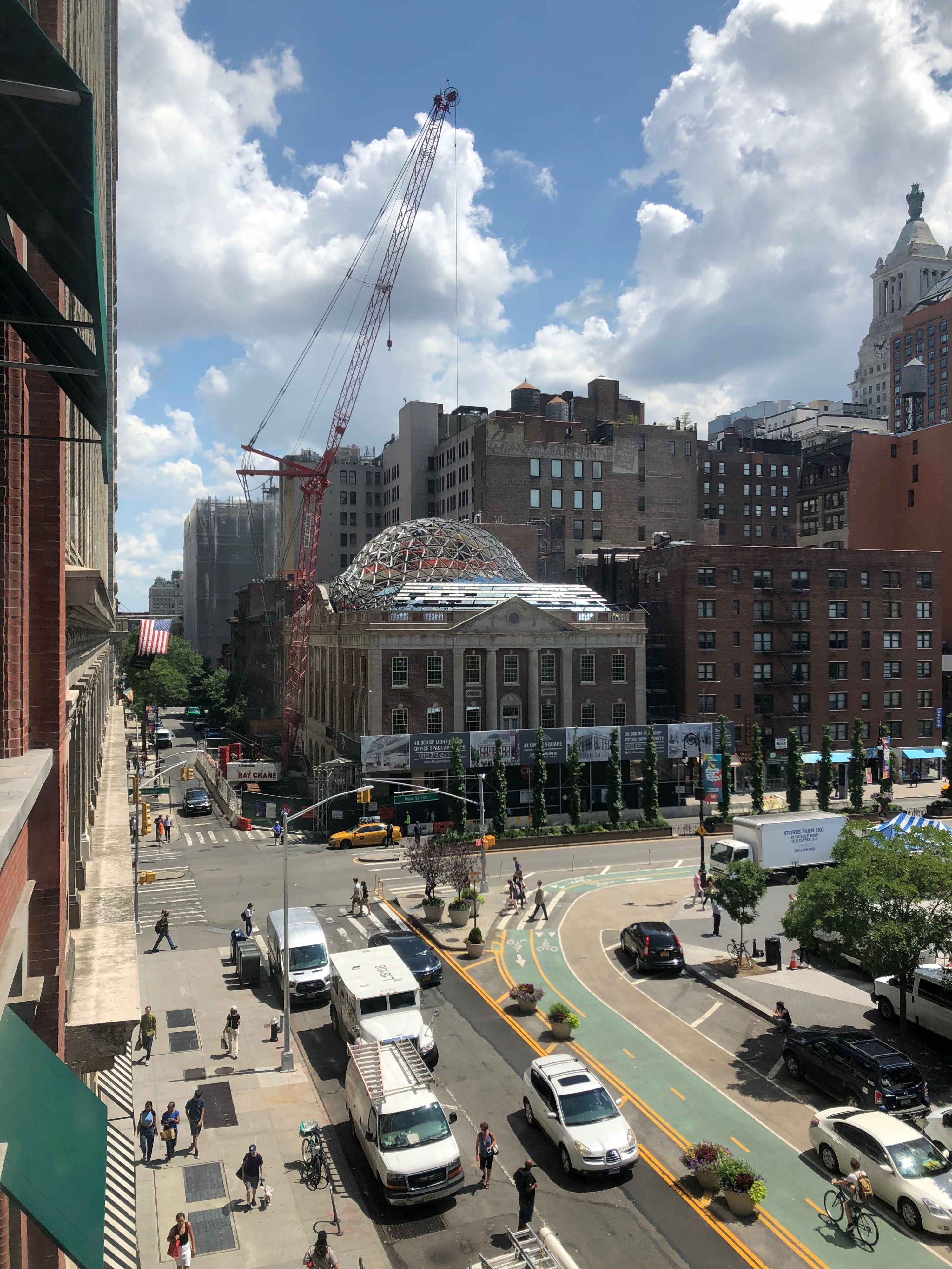
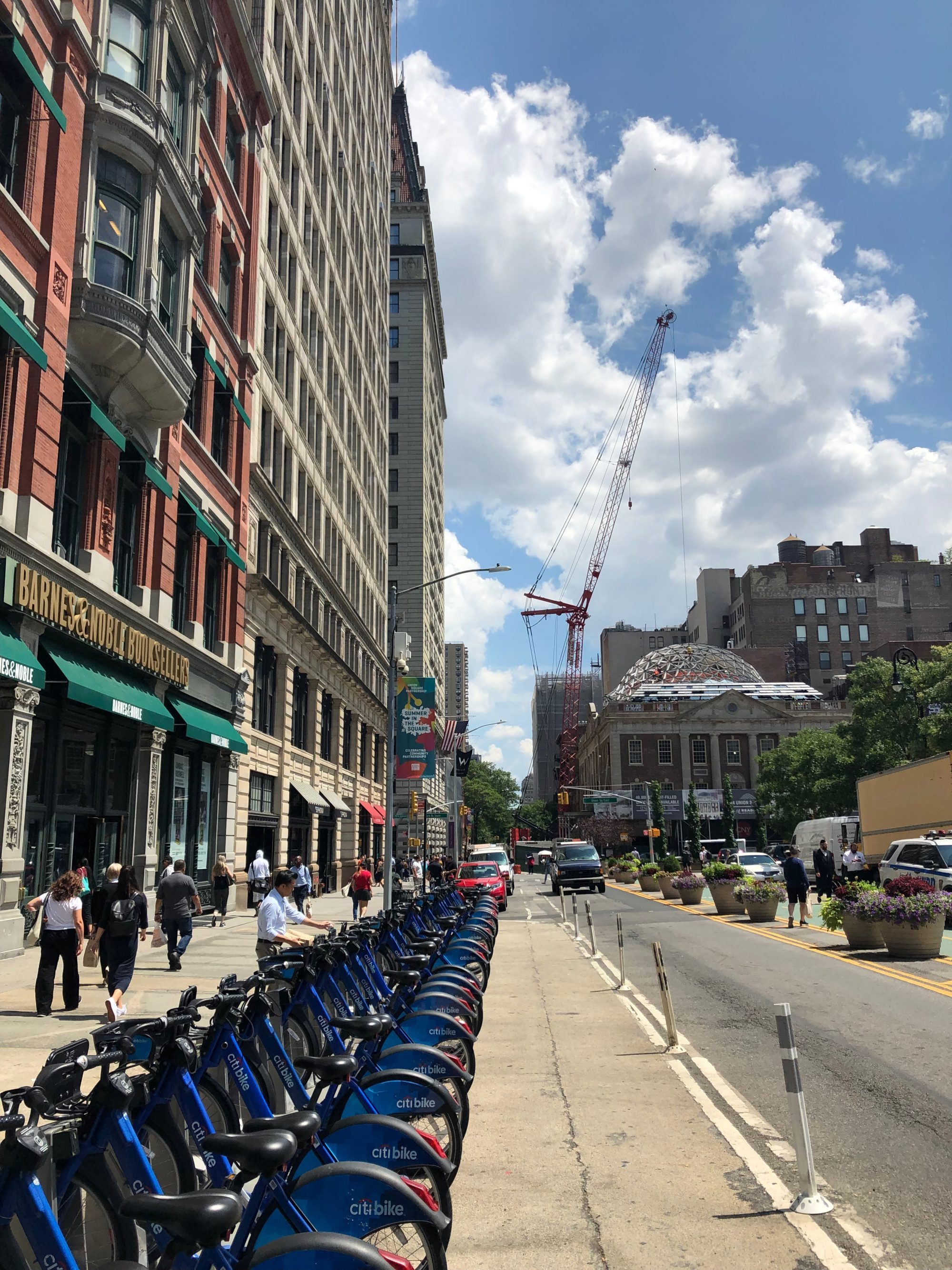
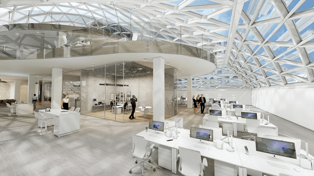
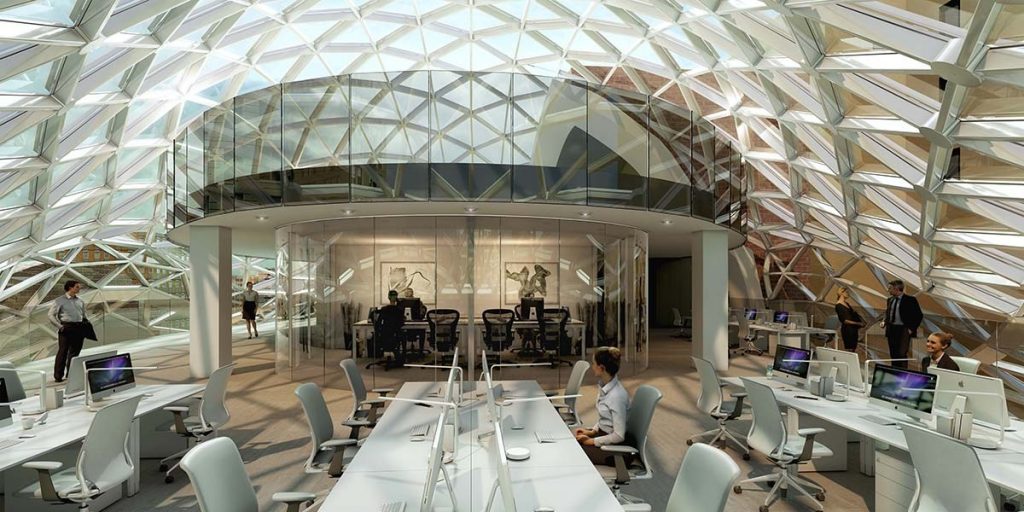
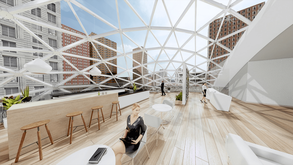
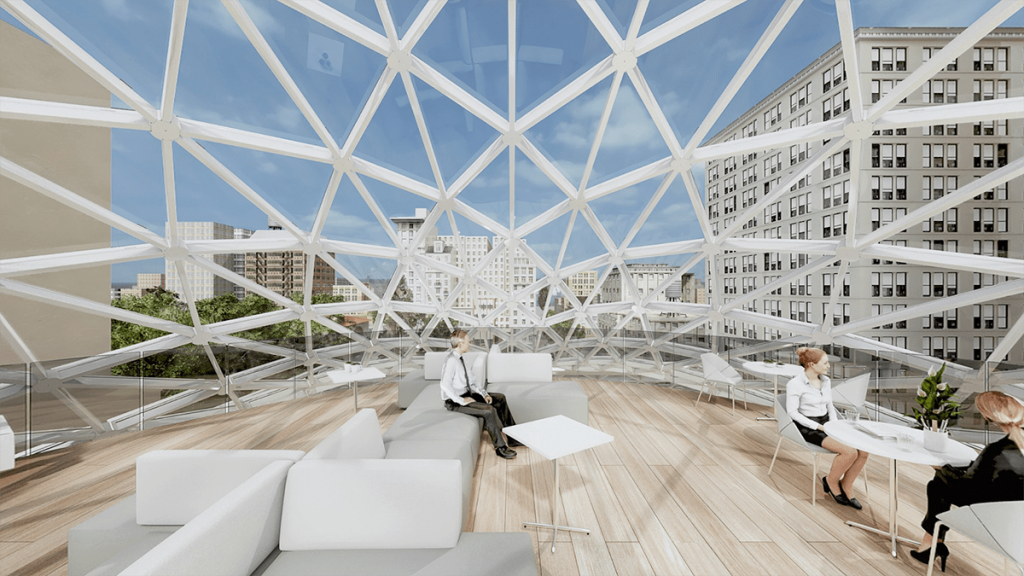
The curved dome atop 44 Union Square, the former headquarters of Tammany Hall, is structurally completed and the geometric glass panels that enclose the lattice frame are beginning to be installed. The renovation is designed by BKSK Architects and developed by Edifice Real Estate Partners. CNY Group is in charge of construction on the historic, 90-year-old landmarked structure, which is being expanded to 70,348 square feet. Two new floors will be housed beneath the dome and receive abundant natural daylight. Reading International (RDI), who purchased the building eighteen years ago, helped to advance the project thanks a $57.5 million construction loan they secured from Bank of Ozarks and Fisher Brothers.
New photographs highlight the current state of construction.
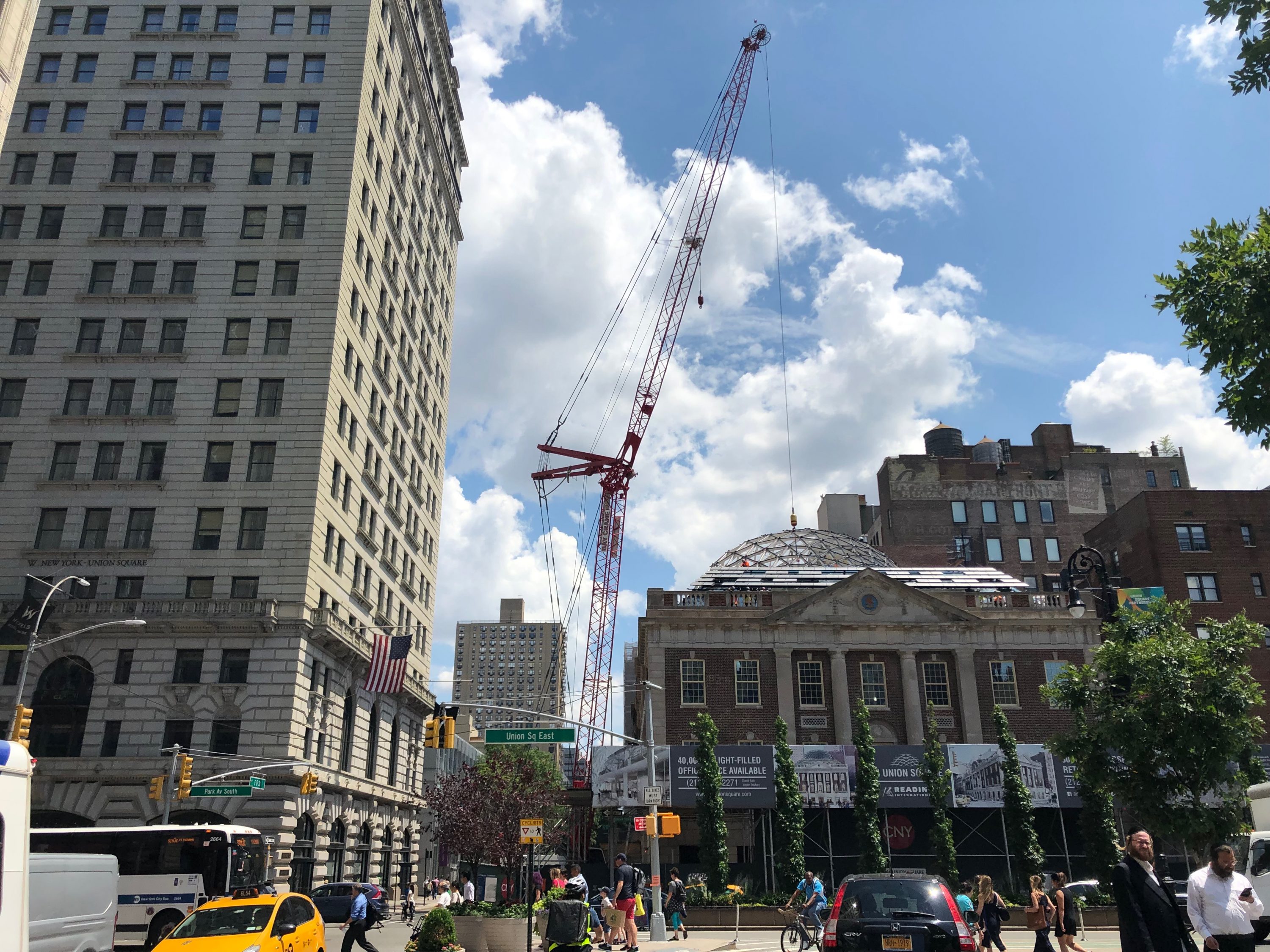
The construction crane hanging above the recently completed frame of the dome. Photo by Michael Young
The frame rises from the fourth floor and is tucked behind the original roof parapet and stone balustrade. The fifth and sixth floors are made from reinforced concrete and are laid out with an elliptical-shaped floor plate under the space frame. Ceiling heights on the fifth floor will range from 12 to 21 feet, while the sixth floor will have a 19-foot ceiling height and rise almost 80 feet above street level. Future tenants will be able to look down at the street and gaze out over Union Square.
Retail will occupy the cellar and first two levels above street level for a total of 27,485 square feet, while the remaining 43,106 square feet is dedicated to open-floor office space.
The landmarked exterior will be restored and refurbished at a later date, once work on the dome is substantially finished.
A completion date for 44 Union Square is likely next year.
Subscribe to YIMBY’s daily e-mail
Follow YIMBYgram for real-time photo updates
Like YIMBY on Facebook
Follow YIMBY’s Twitter for the latest in YIMBYnews

Truly grotesque. And ridiculously incompetent. This amorphous ameba of an add-on is neither crisp and platonically geometric to read as a like part of the original Neo Georgian building nor is it abstract enough to be an effective ‘independent’ contrasting element. It is a “neither-here-or-there” object limply sitting atop an elegant now diminished edifice. Lack of design talent abounds. Shocking this received anything near approval.
Grotesque.
Complain further
This is a crime against Humanity, and should have never been allowed on a Landmarked building
A welcome update to the repetitive and predictable streetscape of NYC, that preserves and embraces an historic building while offering a new spectacle. It is reminiscent of the Reichstag building in Berlin, that in part is meant to remind us of our traditions while looking towards the future. Not sure why some people are so quick to put down architectural achievements such as this; considering how truly difficult the process is to get anything built at all in this city, the fact that it even exists is an achievement worth celebrating. There seems to be a personal bias preventing certain people from seeing things objectively without understanding or even attempting to consider the constraints and objectives a project like this must address. I agree that it is neither “crisp and platonically geometric” (why would this be better?) nor is it so abstract that it would stand as an “independent contrasting element” (again, the reasons one would prefer one to the other would be completely objective). Statements like this actually seem to underscore its success in my opinion. Truly if it swung one way or another certain people would state as emphatically that it is “too crisp and platonically geometric” or “Too abstract and contrasting.” Unfortunately we are living in the culture of outrage where everyone with an opinion thinks they are an expert as long as they are angry enough and offer nothing of value. Only time will tell if this design is “incompetent” as we don’t have enough information to know if it was successfully detailed and constructed to not leak, to provide thermal comfort and environmental performance, and to enhance the experiences of those that occupy it. I would have no reason to assume otherwise given the high level of skill and expertise required to design such a structure.
Hate to agree with the naysayers here but I think this addition is ugly, unnecessary, and insensitive to the landmarked structure. This other guy who is blindly fawning over it just because it’s “tough to build things in nyc” and because the builders “must be really skilled” are sort of missing the point here.