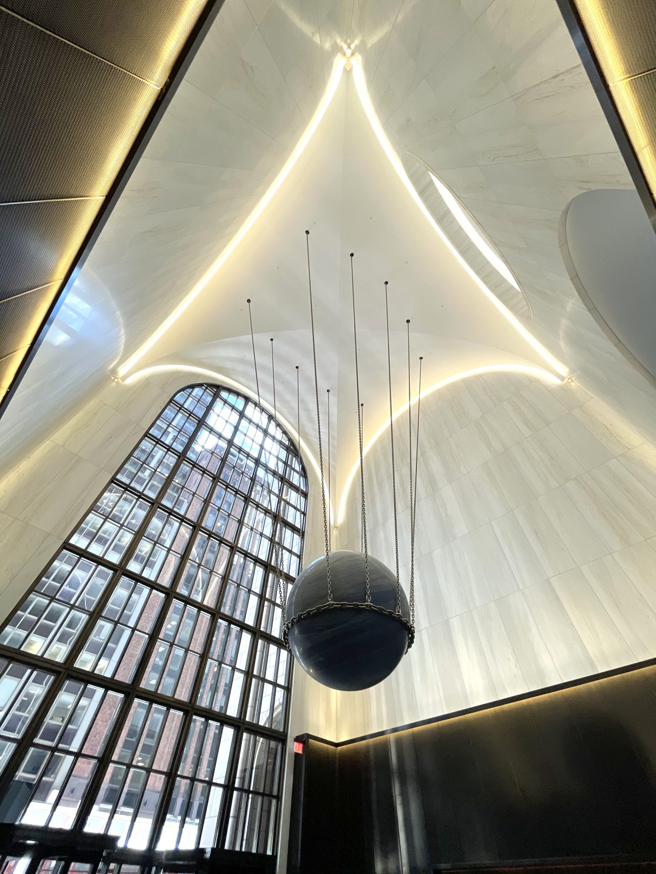
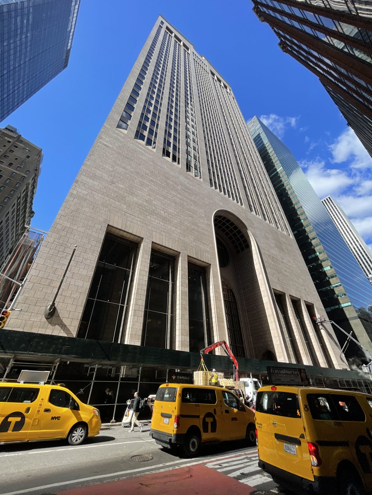
YIMBY attended the recent unveiling of the newly renovated lobby of 550 Madison Avenue, a 37-story, 684-foot-tall office skyscraper in Midtown East. Designed by Gensler and developed by The Olayan Group and RXR Realty, the project involves a 21,000-square-foot indoor-outdoor overhaul of the 1984 postmodern landmark from Philip Johnson and John Burgee. In addition to the updated lobby, which features an art installation from Polish-German contemporary visual artist Alicja Kwade called Solid Sky, the undertaking will also provide a new café, elevated and ground-level landscaping, expanded seating with additional tables, and public restrooms. 550 Madison Avenue spans between East 55th and 56th Streets.

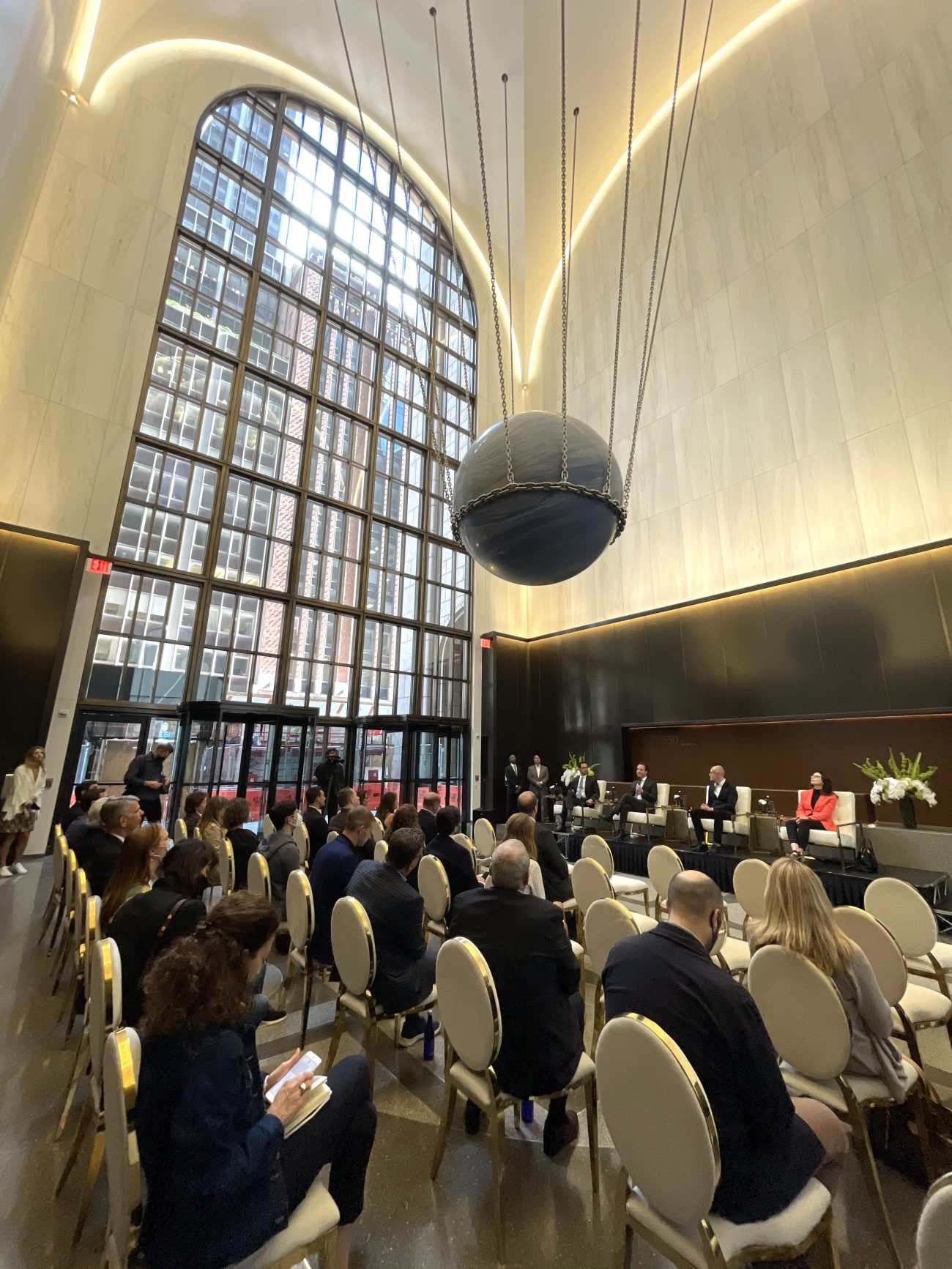
A panel discussion was held in the lobby. Panelists, from left: Erik Horvat, managing director of Real Estate at Olayan America; Alex Toledano, president of VISTO; Philippe Paré, principal and design director of Gensler; and Mary Ann Tighe, CEO of CBRE’s New York Tri-State Region. Photo by Michael Young
“550 Madison is a unique landmark in New York City that carries a rich history,” said Erik Horvat, managing director of Real Estate at Olayan America. “Our goal with Gensler and other design partners is to add modern upgrades that will ensure its future, while also preserving its history. We are thrilled to have Gensler reimagining the building’s lobby to create a beautiful and functional space that also respects Philip Johnson’s original design.”
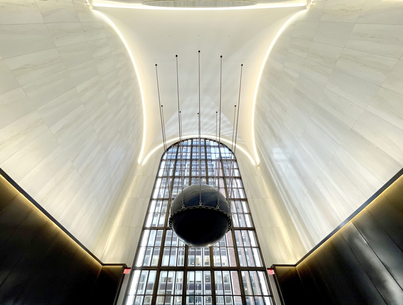
“We were inspired by the large volumes and spatial proportions of the 550 Madison lobby and sought to honor its impressive scale with simple, classical, elegant forms and materials,” said Philippe Paré, principal and design director of Gensler. “The outcome is a space which is both quiet, yet powerful; respectful, yet not a reproduction; timeless, yet very much contemporary.”
“Alicja Kwade’s iconic work of art is a bold, striking gesture, much in the spirit of Philip Johnson’s original design for 550 Madison,” said Alex Toledano, president of VISTO, 550 Madison’s art consultancy. “Solid Sky respects the building’s groundbreaking architecture, at once integrated with its surroundings, while also playing with and challenging them by its mesmerizing color, weight, and lightness. Kwade’s work also extends the building’s tradition of showcasing renowned female artists’ work, including Dorothea Rockburne murals which remain, and Evelyn Longman’s Golden Boy, which previously resided in the building.”
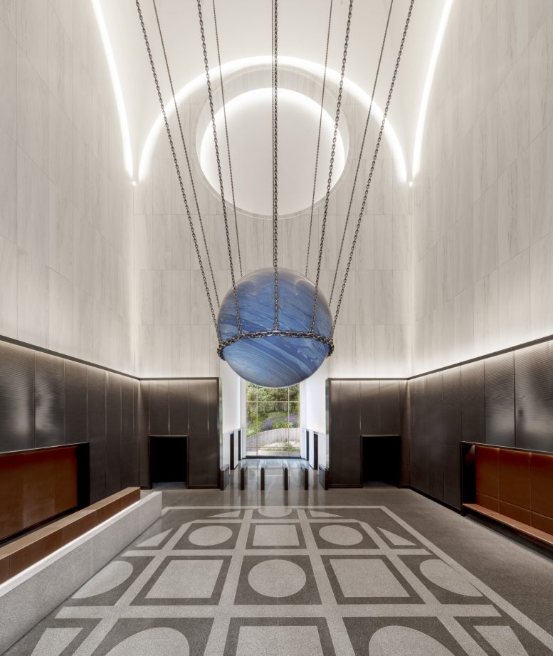
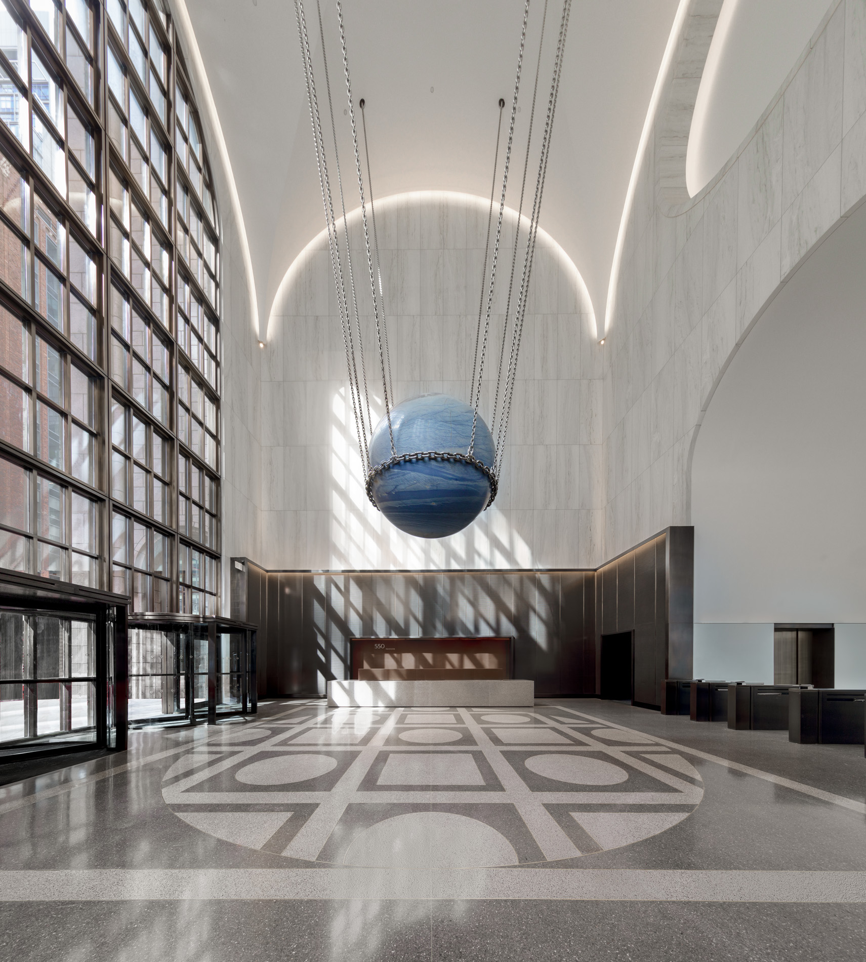
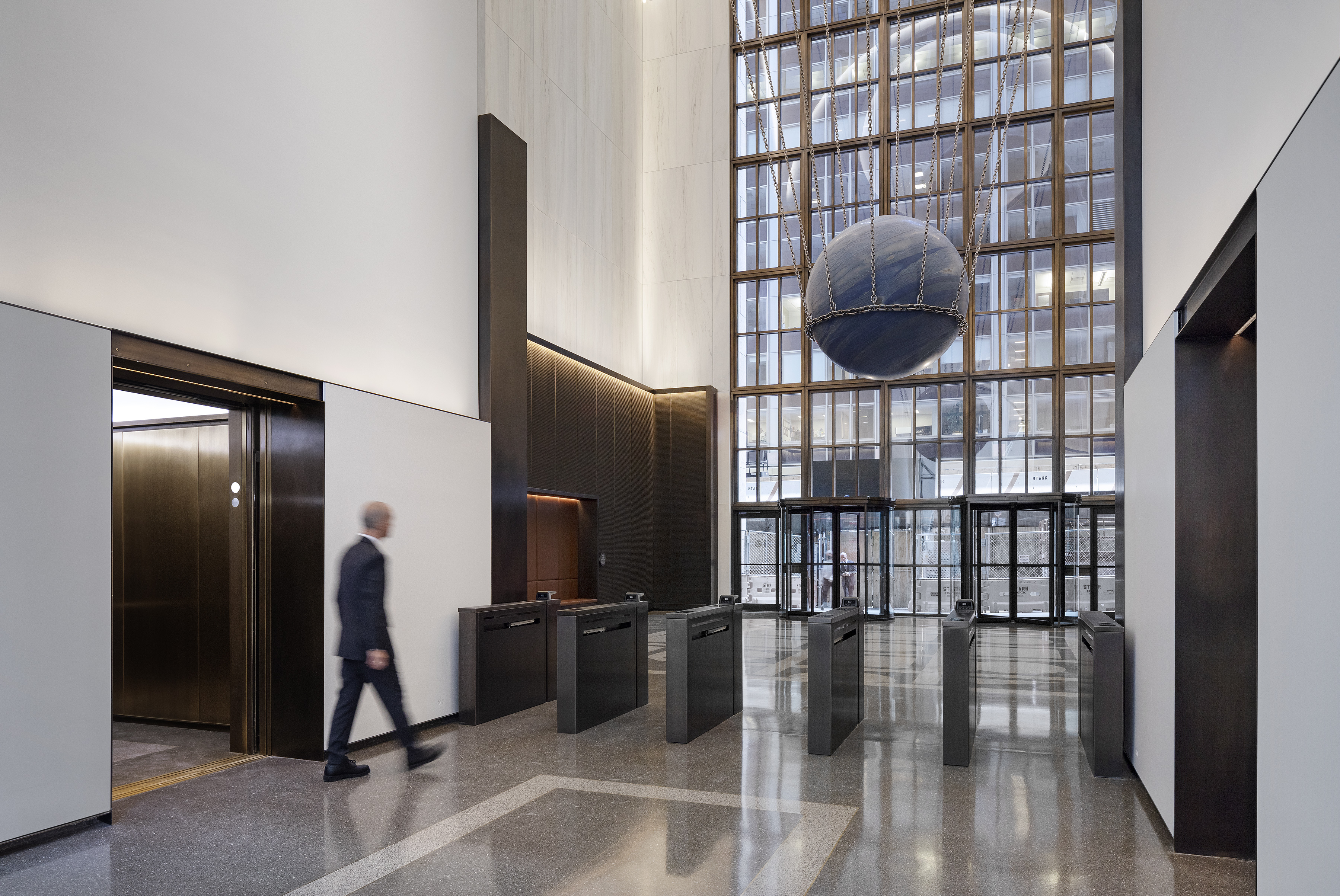
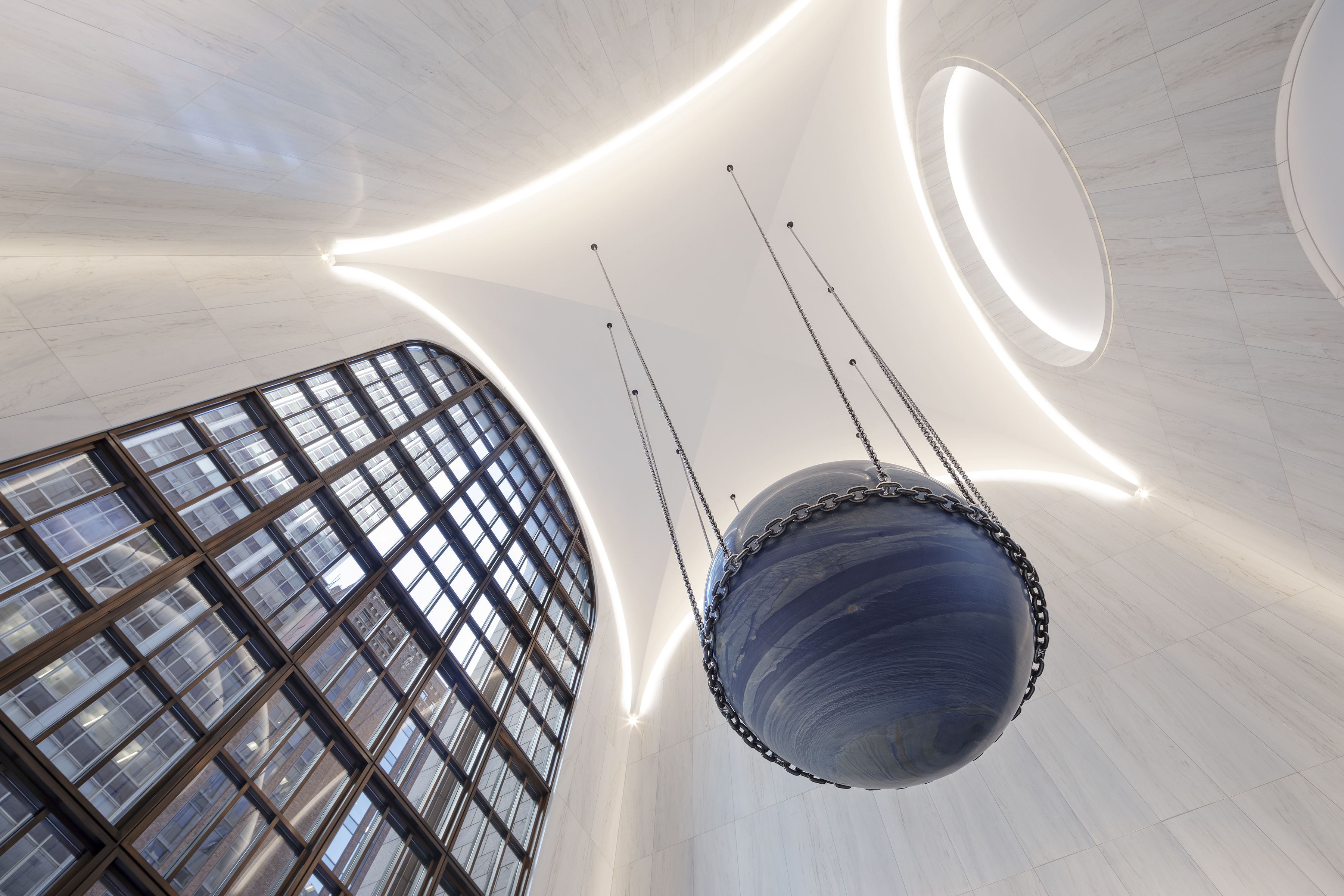
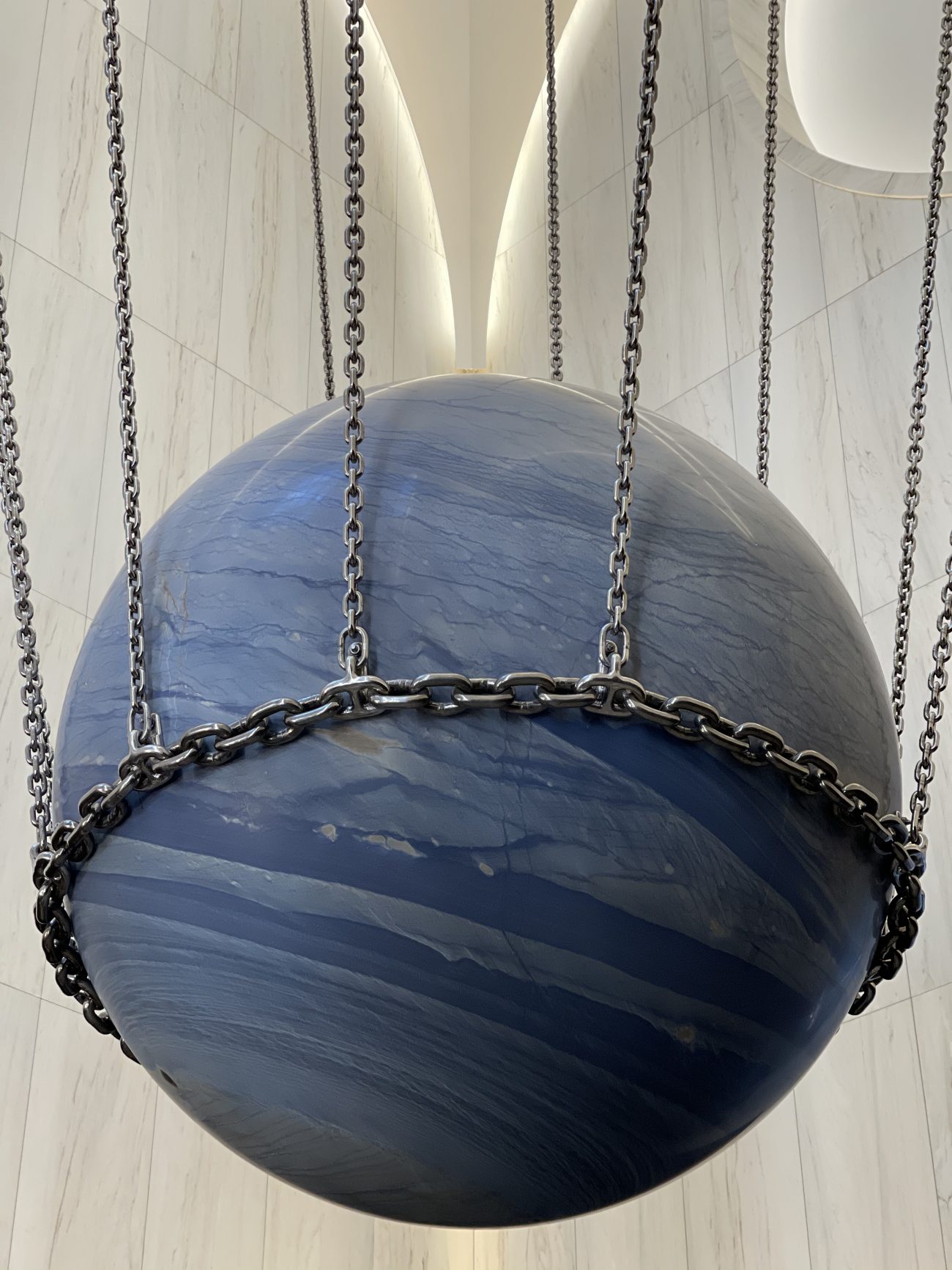
Photographs show the clean and minimalist lobby space with its soaring triple-height vaulted ceiling and its 110-foot-tall arched entryway. Materials on all four corners of the space include terrazzo, leather, and bronze mesh. Hanging 12 feet above the lobby floor and dangling in the center from the ceiling is Solid Sky, a representation of Earth made of Azul do Macaubas stone weighing a whopping 24 tons.
“This rock is the result of a metamorphosis that took place over 1 billion years ago, and was created under great pressure and elevated temperatures,” said artist Alicja Kwade. “A metamorphosis always has something metaphysical and magical about it. Due to the blue color of the stone, the ball appears like planet earth—very fragile and small, in comparison to the entirety of the universe. It is an ambitious and emotional project, taking place on one of the most famous streets in the world.”
550 Madison Avenue is also in the process of adding a new triple-height, steel-framed, and glass-enclosed garden space designed by Snøhetta in the western rear of the property. AECOM Tishman is the general contractor, Orange County Ironworks is the steel fabricator, and Gabriel Steel Erectors is assembling the addition. Click here for more details about this component of the building.
Snøhetta’s glass canopy and garden design will be finished next year.
Subscribe to YIMBY’s daily e-mail
Follow YIMBYgram for real-time photo updates
Like YIMBY on Facebook
Follow YIMBY’s Twitter for the latest in YIMBYnews










Around the world, America is the best architecture and beautiful created design. According to an interesting thread made by the community: Thanks to Michael Young.
This looks very nice. I especially like how well it fits the existing building with its 80s vibe, unlike some other modernizations where it doesn’t fit the time period at all. The Solid Sky is maybe a bit overrated, but it’s cool nevertheless. Overall, this is very well done and preservation is always appreciated.
That rock is a poor substitute for AT&T’s “Spirit of Communication” (golden boy) statue.
I disagree. That was a faintly fascistic statue and if you know anything about Philip Johnson’s politics, that was not coincidental. This is a huge improvement. This renovation is thoughtful and quite beautiful. I cannot wait to see it in person.
Not sure what you mean but clearly New York is indeed turning fascistic.
Almost N.z.stic if you ask me.
AT & T brought the 1916 Golden Boy statue from an earlier building opposite St. Paul’s Chapel. It presently resides at a facility in Dallas, TX. The stone thing does call to mind a mass damper.
I wouldn’t stayed underneath it.
How nothingness parades as art is amazing.
Just a reminder that Philip Johnson was a literal Nazi. He tried to form an American Fascist Party, he took trips to Europe to go to Hitler’s rallies, he called the burning of Warsaw a “stirring spectical” and said that the invasion of Poland was good for the people that lived there, and he actively spied for the German Nazi Party but was never arrested for it because he was so rich he did the spying for free which technically didn’t break any laws.
They could have made the globe thing in glass so it could light up, imo.
Overall, a nice design.
Charles Follen McKim designed a suspended “moon” for his domed Low Library at Columbia University. This was about 6 feet in diameter and made of wood painted light gray. Apparently, the idea was to have light focused on it so that it would diffuse around the room like moonlight. The plan for Pennsylvania Station had three round objects hanging in the great Baths of Caracalla room. Whether these were strung crystals light fixtures or moons is a question.
GOLDEN BOY was perched atop AT&T’s headquarters at 195 Broadway for many, many years. Had nothing to do with Johnson.
When AT&T moved to 550. The bought GB with them. Johnson put it in the lobby rather than the roof.
After breakup of AT&T the new company didn’t need all the space so corporate headquarters went to Basking Ridge. NJ and Golden Boy went there too.
Then AT&T decided to sell the 2 million square foot Basking Ridge complex and consolidate at Bedminster, NJ. Golden Boy went there next.
When AT&T meged with former baby Bell Southwestern Bell Dallas San Antonio, TX was hdqtrs first then Dallas next which is current hdgtrs today. Golden Boy is there now.
“Alicja Kwade’s iconic work of art is a bold, striking gesture”
It’s reasonably nice lobby artwork. Why the relentless hyperbole about “art”?
“at once integrated with its surroundings, while also playing with and challenging them by its mesmerizing color, weight, and lightness”
Lol! Yeah, sure, “playing with” and “challenging.” Do these people listen to themselves?
“Due to the blue color of the stone, the ball appears like planet earth—very fragile and small, in comparison to the entirety of the universe”
So the big ball is supposed to feel small? Compared to “the entirety of the universe”? Well maybe if it was out there floating in space, rather than in a building lobby which is slightly smaller than “the entirety of the universe,” but the great artist apparently doesn’t understand that.
I don’t object to the design, it’s perfectly nice. Just this idiotic art-world hype. It’s a round blue rock in a chain. The end.