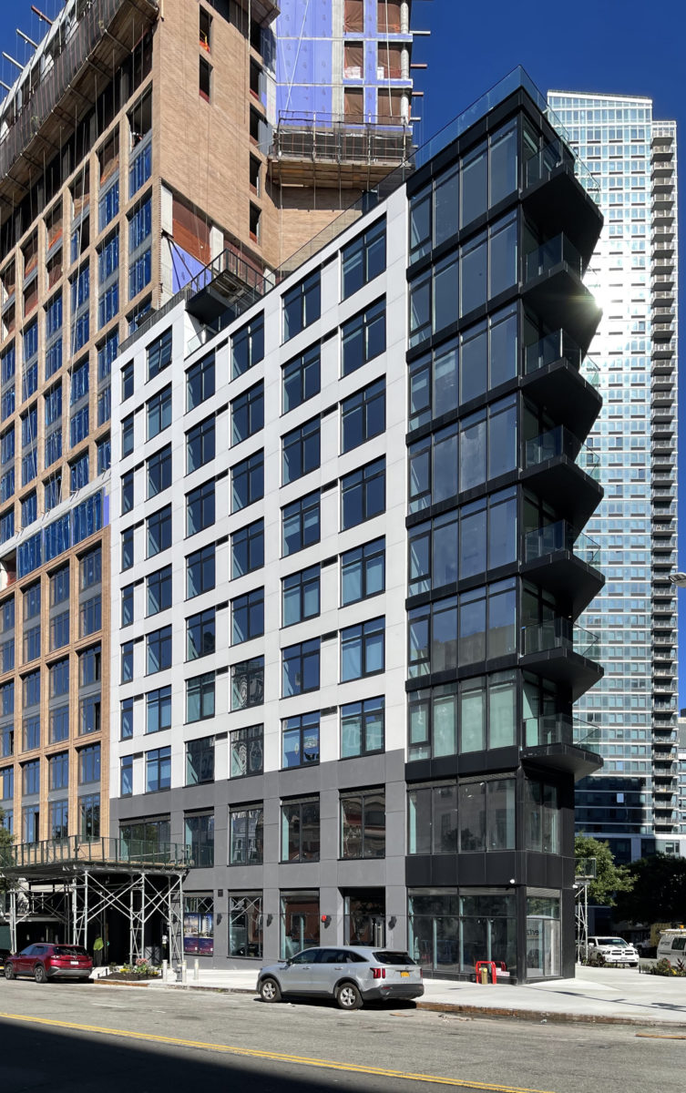
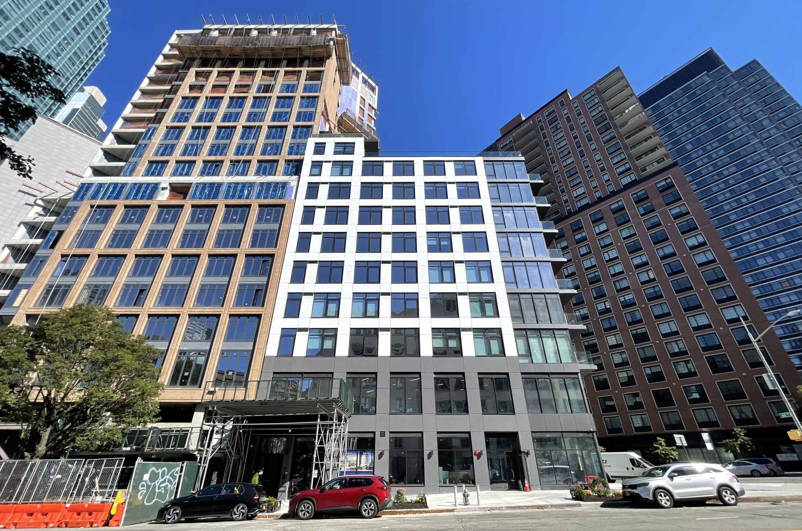
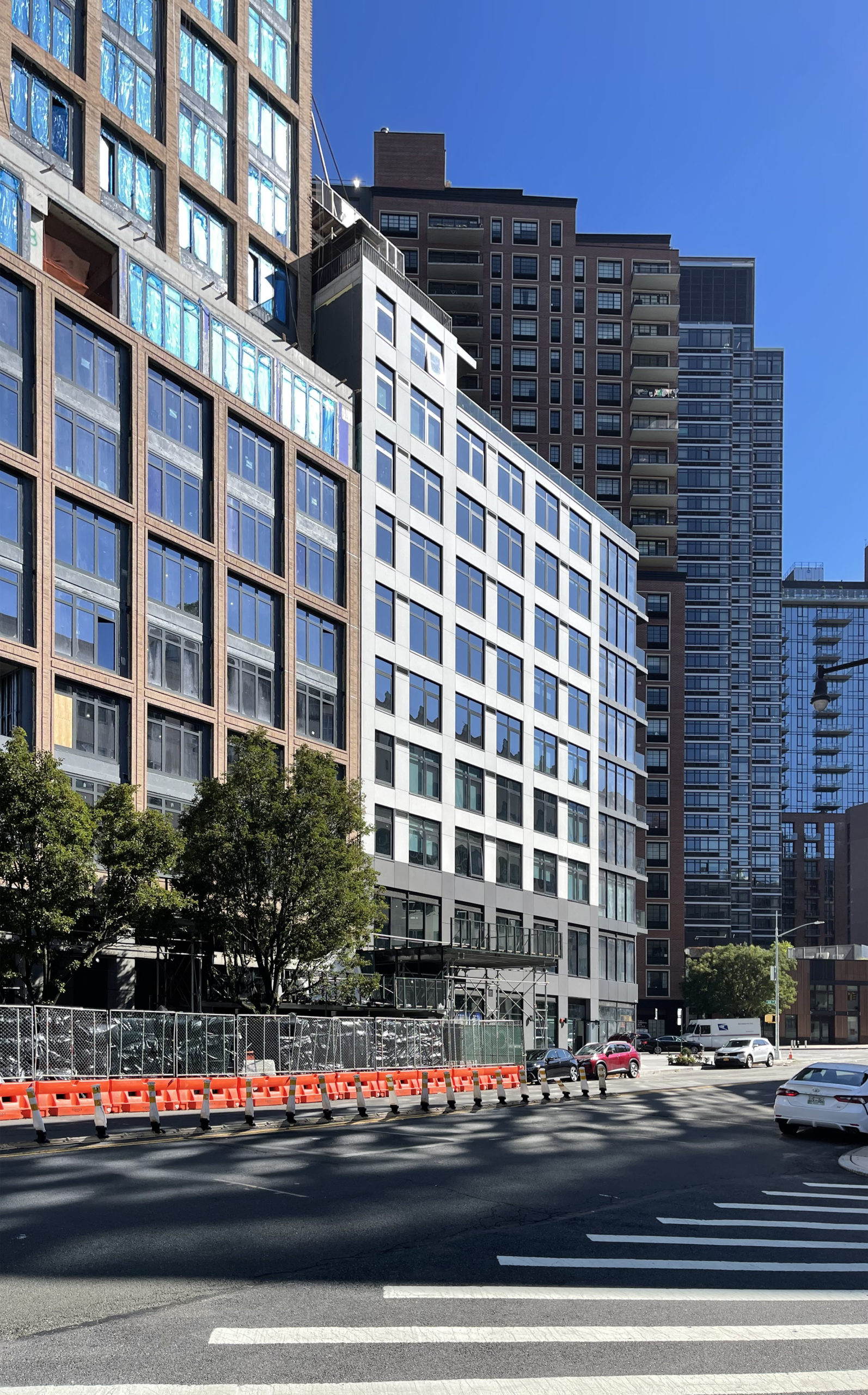
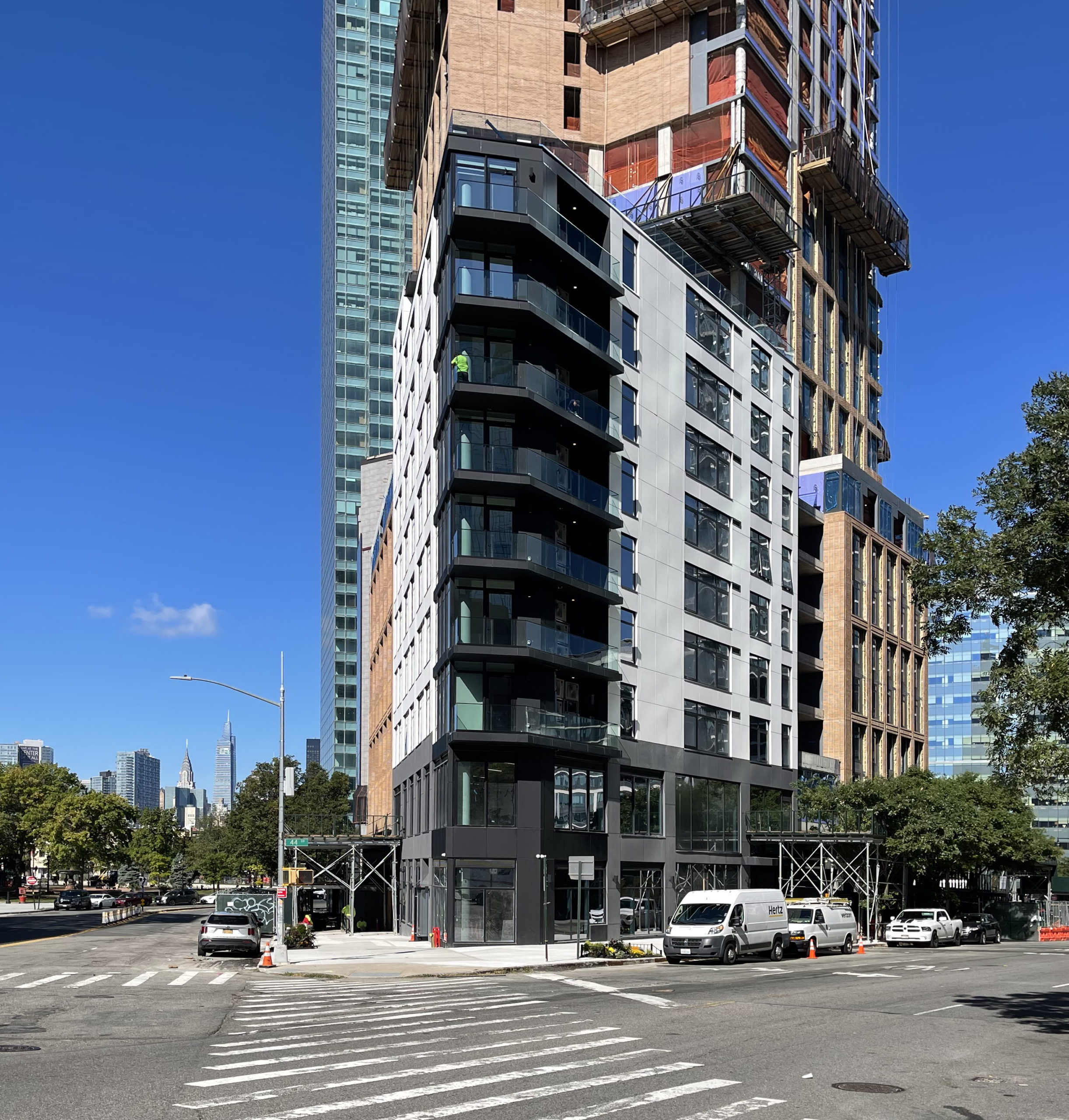
Construction is complete on Trio, a ten-story residential building at 27-19 Thomson Avenue in Long Island City, Queens. Designed by MY Architect PC and developed by Thomson Development, the 116-foot-tall structure will yield 30 units spread across 23,012 square feet, as well as 5,039 square feet of ground-floor retail space. Warner Construction Services was the general contractor for the project, which is located on trapezoidal plot bound by Thomson Avenue and 44th Drive.
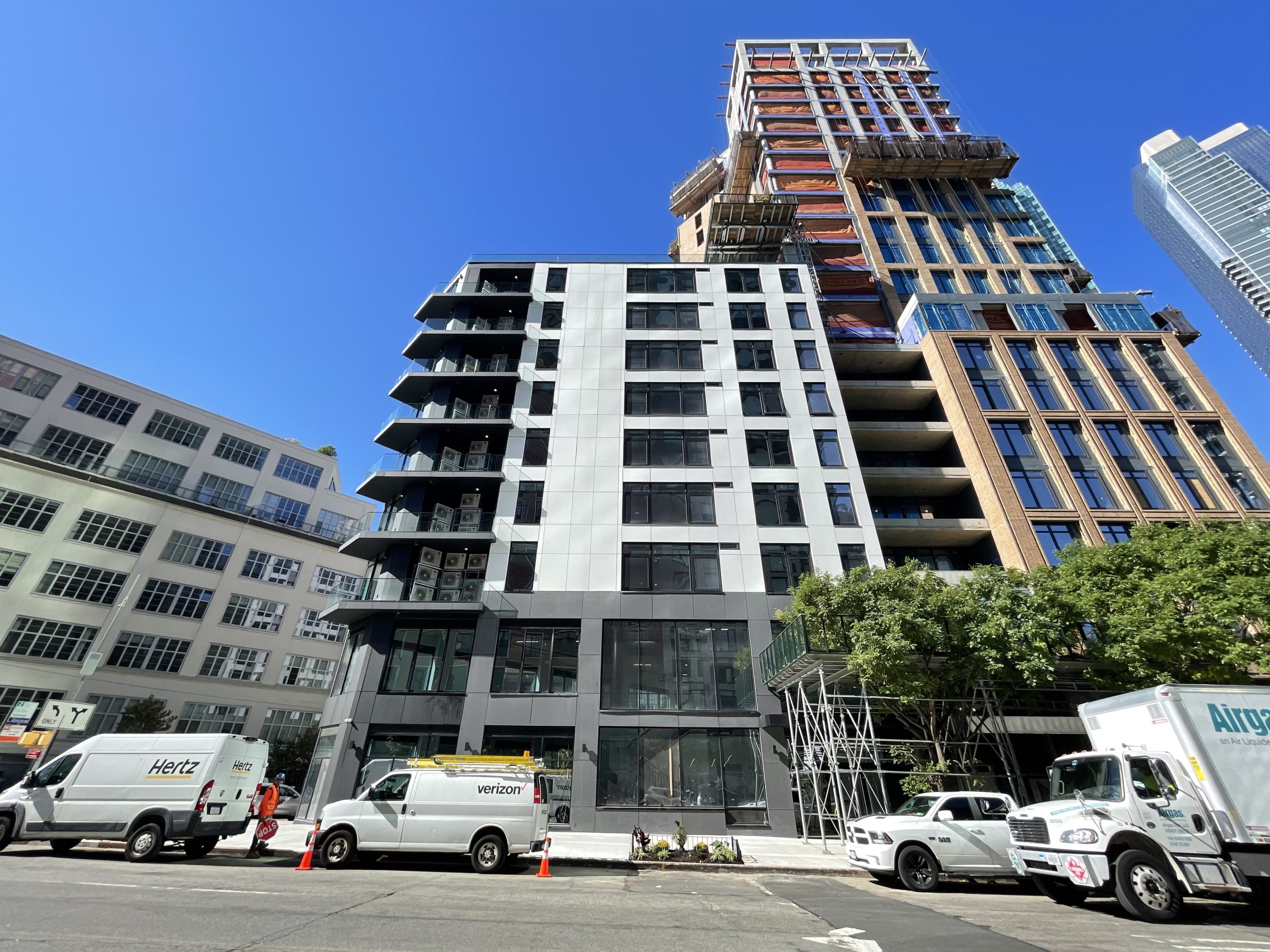
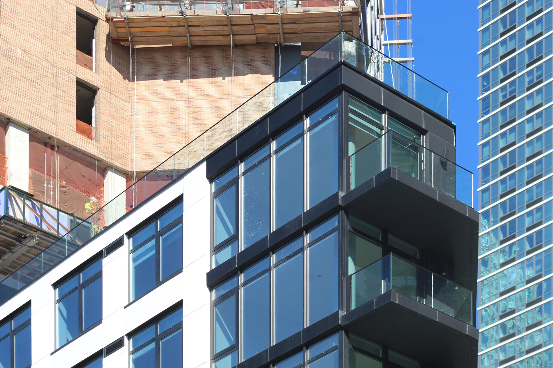
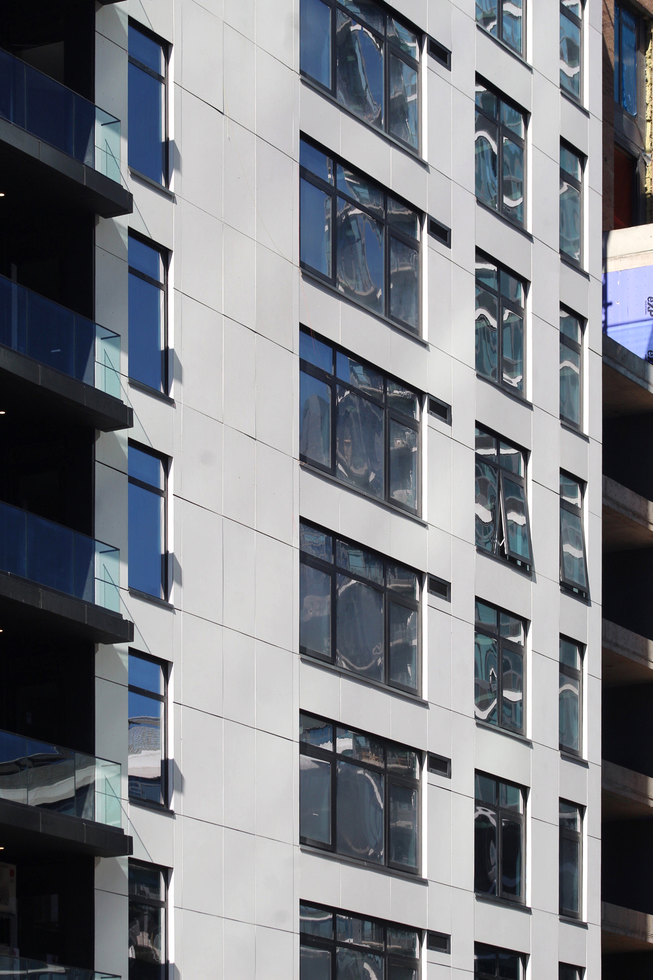
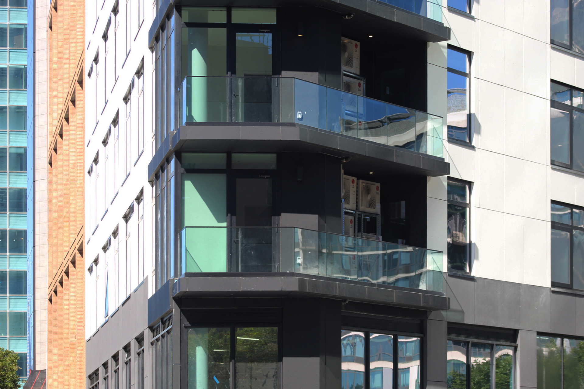
At the time of our last update in March, the reinforced concrete superstructure stood topped out with exterior work progressing behind scaffolding. Since then, all of the windows have been put in place and surrounded by its façade of white, black, and gray metal paneling. The corner of the structure features a stack of balconies with glass railings, which also line the roof around the upper terrace.
Units come equipped with a dishwasher, air conditioning, hardwood floors, charging outlets with USB ports, smart controls for heating and cooling, washers and dryers, name-brand kitchen appliances, countertops, and finishes, and a patio or balcony.
Trio is pet-friendly and features bike storage and package lockers, a doorman and concierge, a gym, media room, recreation room, common area with Wi-Fi, and multiple outdoor terraces including a rooftop terrace with BBQ grills and lounge areas.
The nearest subways are the 7 and G trains at the Court Square Station to the west, which provides free transfer to the E and M trains at the Court Square-23rd Street station. Also nearby are the E, M, and R trains at Queens Plaza and the N, W, and 7 trains at Queensboro Plaza.
Subscribe to YIMBY’s daily e-mail
Follow YIMBYgram for real-time photo updates
Like YIMBY on Facebook
Follow YIMBY’s Twitter for the latest in YIMBYnews






Before coming to colors that I have seen, as I was looking at the exterior which is beautiful. All of them stand out especially black that is located on the edge, including the balcony and glass railing that go together very well: Thanks to Michael Young.
The exterior is not beautiful, and, if you take a moment to look at the floor plans, the “designer” who laid out the kitchen doesn’t mind dripping water across the floor between the far off dishwasher – not next to the sink. The plans really suck.
So bizarre. Everything about this building looks like it’s supposed to be taller. Like they ran out of money or something. Comical.
I rather like it. It appears to be two buildings, but the lower pointed part desperately needs a cornice.
It is two buildings. That’s a separate project.
Although completed less than two years ago, the building already has a new scaffold up! Most likely waterproofing issues (just a guess, but very, very common for new buildings). I do not like the exposed air conditioners on the “balconies” ~ gives it a very Hong Kong look, and not in a good way.