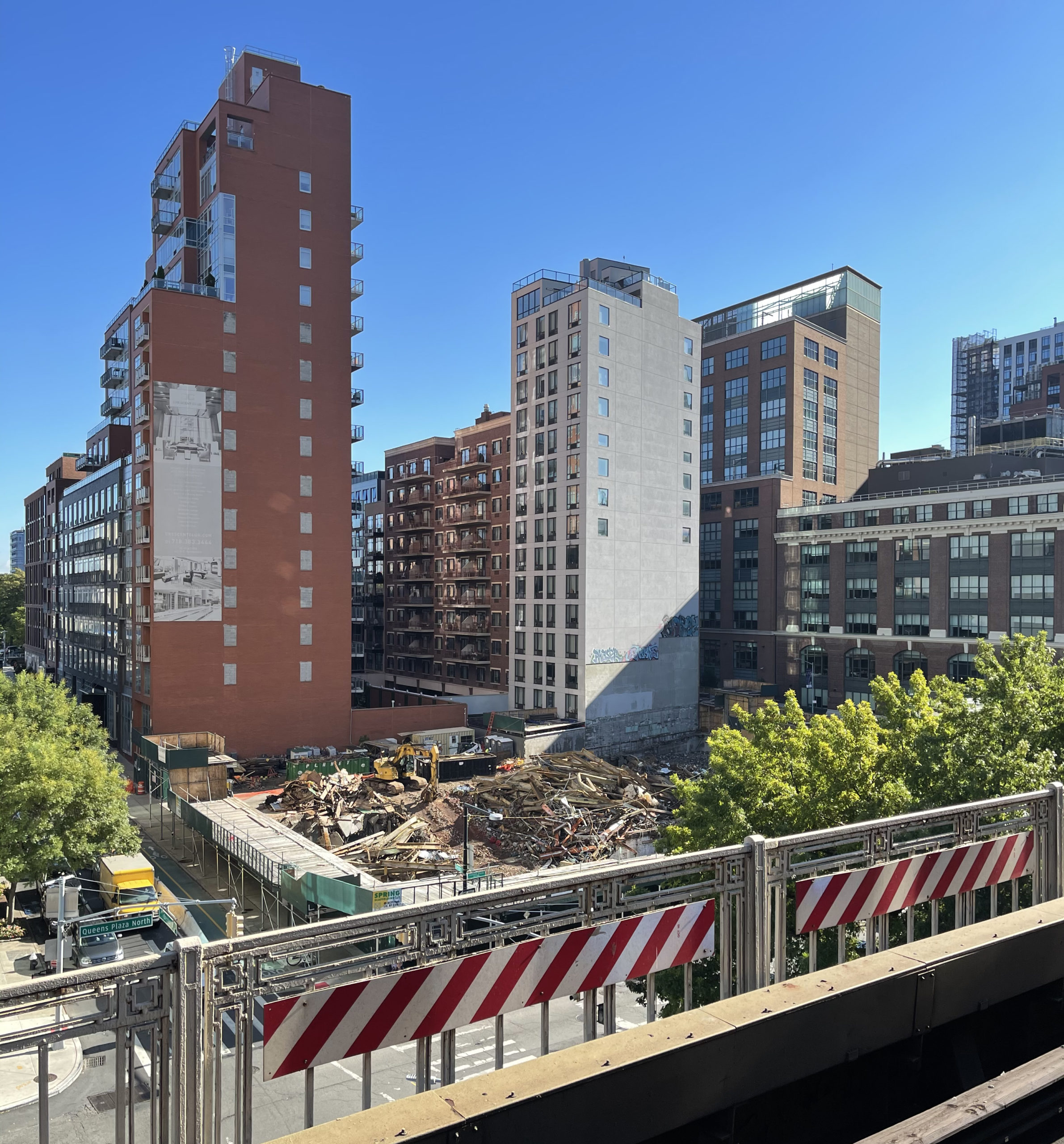
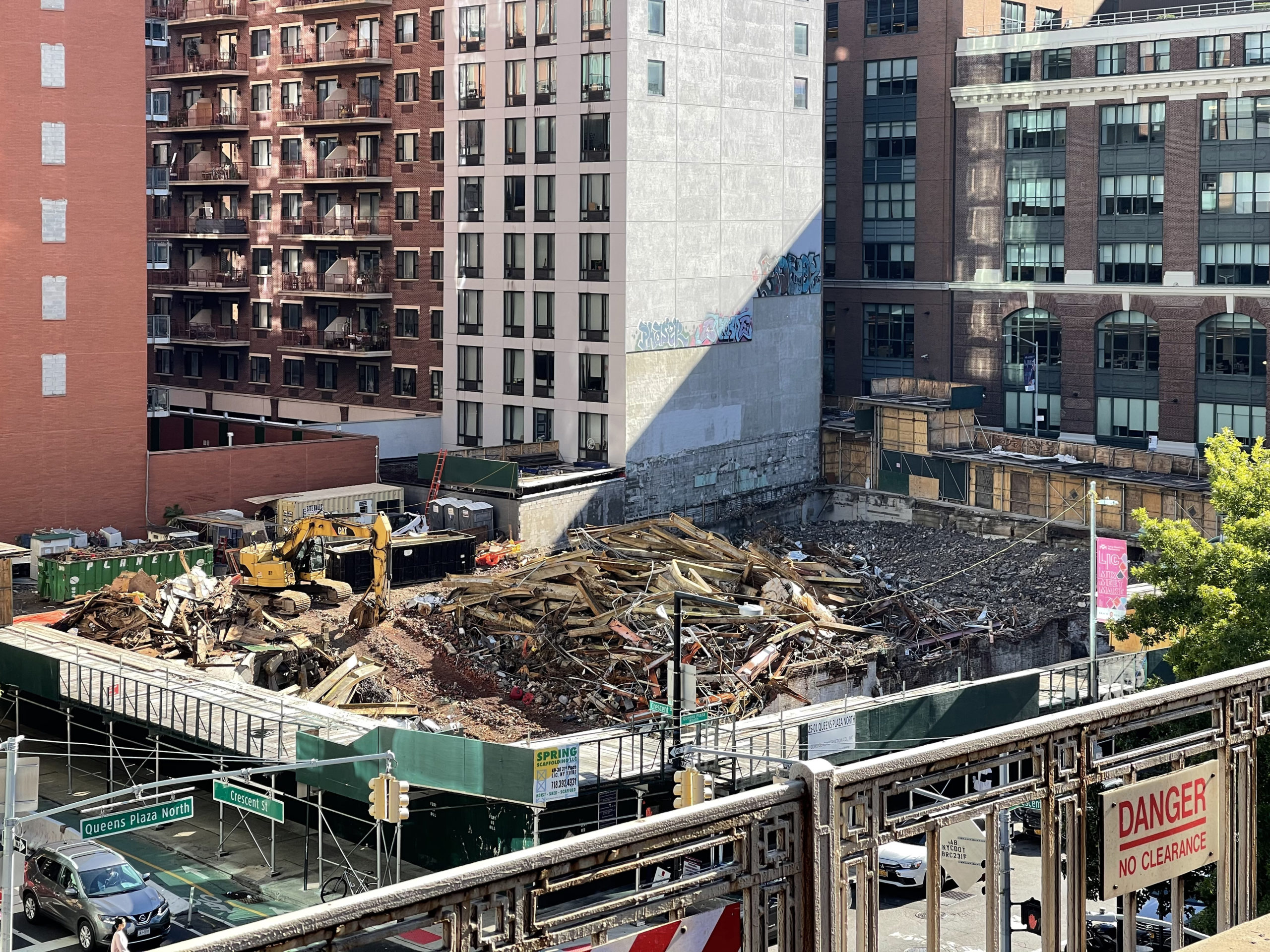
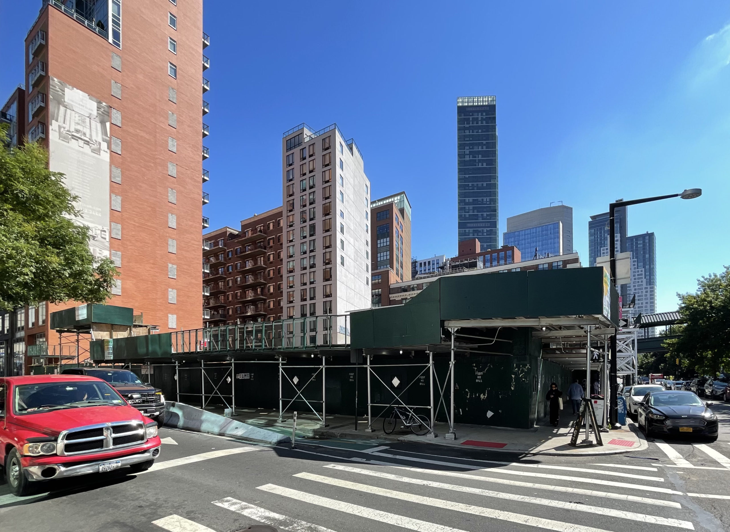
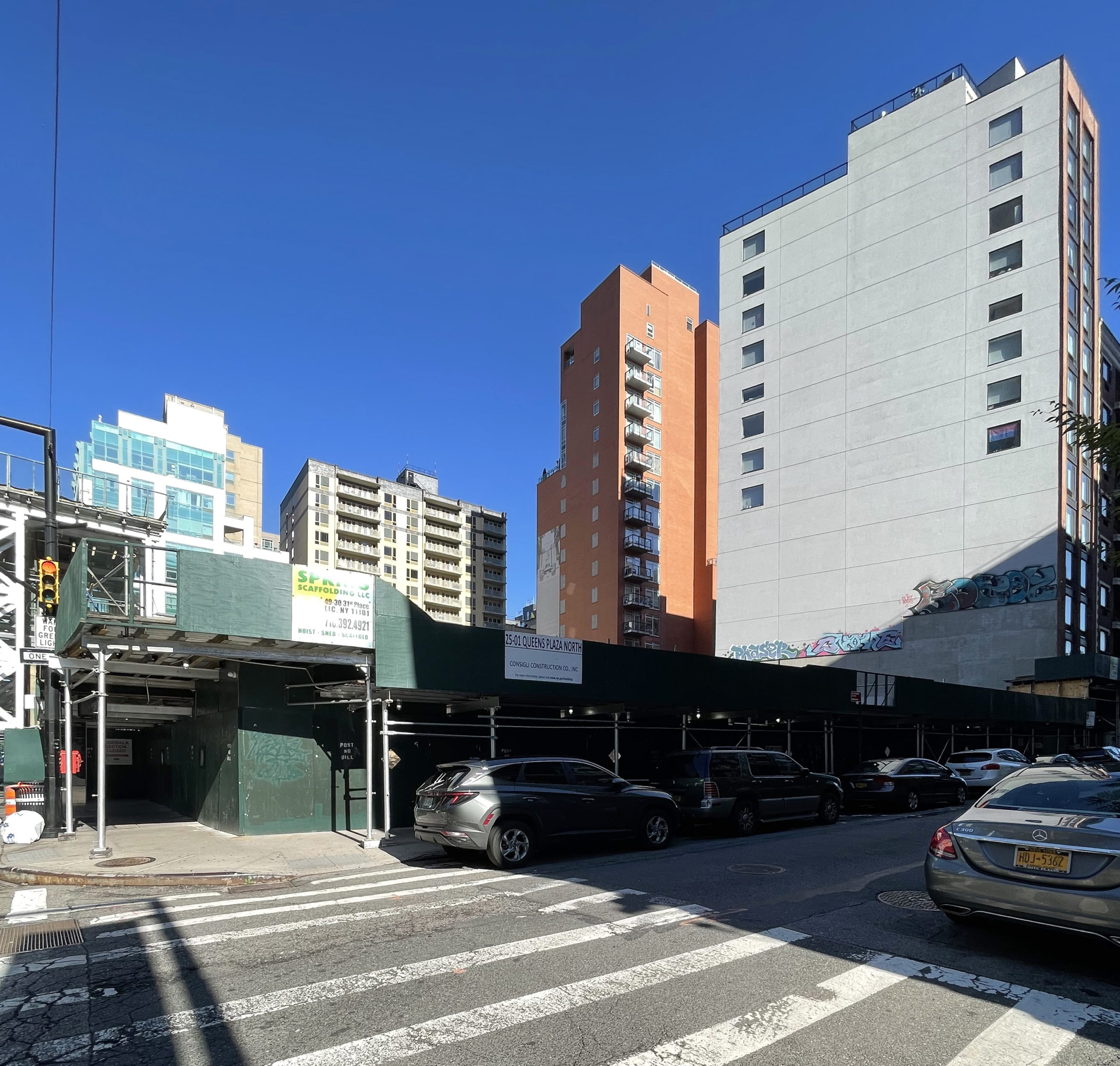
Demolition work is wrapping up at 25-01 Queens Plaza North, the site of a 26-story residential building in Long Island City, Queens. Developed by Grubb Properties, the 311-foot-tall structure will yield 417 units with 124 dedicated to affordable housing, and 7,600 square feet of ground-floor retail space. 25-01 QPN Consigli Construction is the general contractor and King Contracting Group is installing all the brick and CMU for the property, which is located between Crescent and 27th Streets, directly adjacent to the elevated Queensboro Plaza station servicing the 7, N, and W trains.
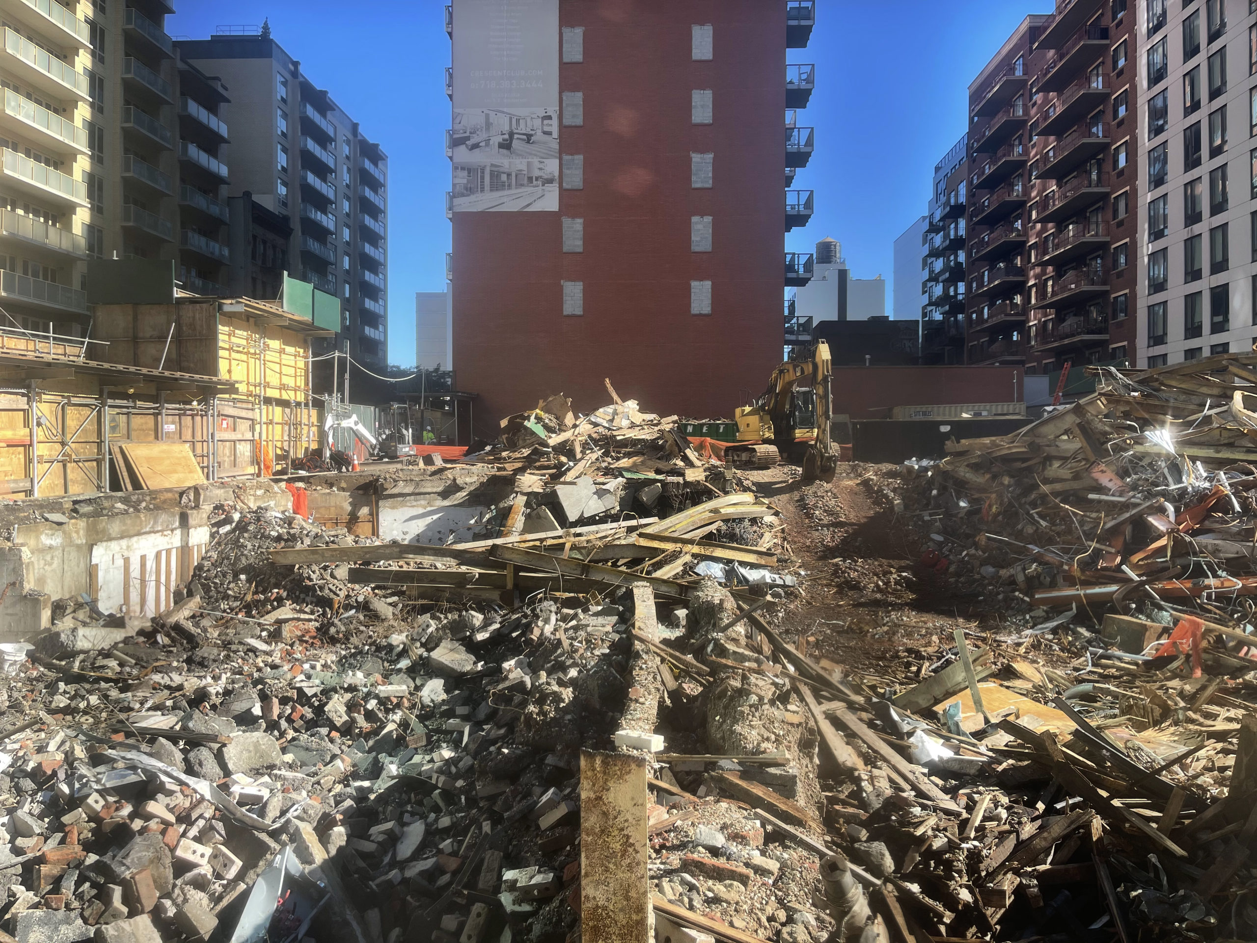
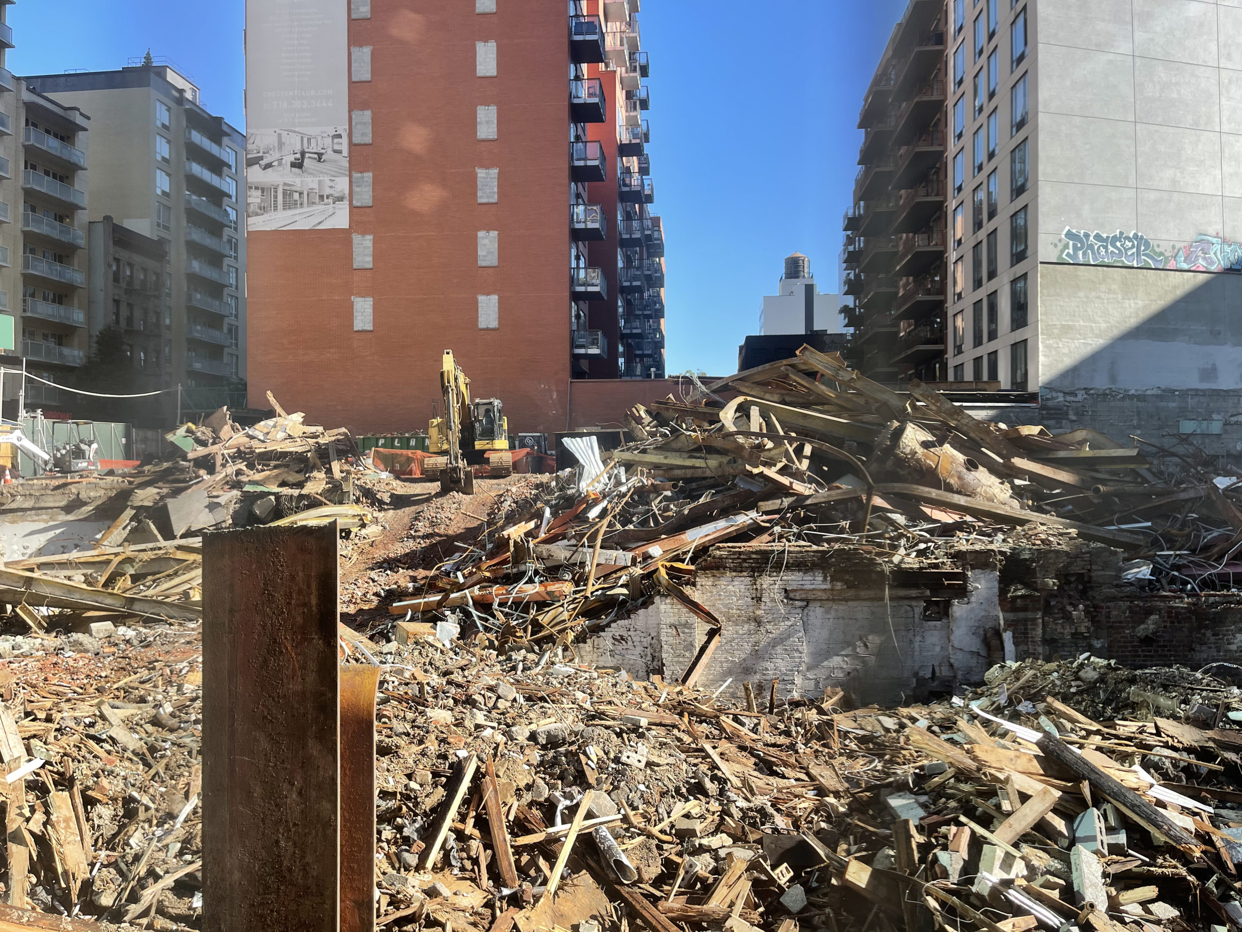
Recent photos show the former two-story occupant fully razed and machinery clearing the site of debris. Portions of the plot have already been dug below street level as excavators work around the edges of the property. Excavation should be in full swing by the end of autumn, followed by the start of foundations.
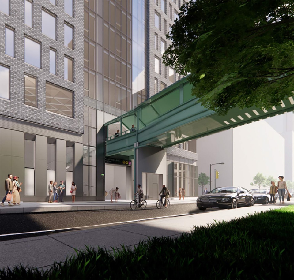
The rendering in the main photo is oriented looking east and shows the massing composed of a full-block multi-story podium rising into to a broad tower. The façade is composed of a dark brick façade that envelopes all four sides of the podium and the wide elevations of the tower. The narrow ends of the upper levels are clad fully in glass, with a column of stacked balconies. These western-facing balconies will provide occupants with prime views of the East River and Manhattan skyline.
In exchange for a 20 percent floor area bonus, Grub Properties will replace the old subway entrance on the northern side of the Queensboro Plaza station, expand the staircase, and install a street-level elevator for ADA accessibility. The MTA is also installing two additional elevators, one that connects to the station’s mezzanine and another that will provide access to the mezzanine and the 7 train platforms directly above. Below is a close-up rendering from the City Planning Commission of these improvements.
25-01 Queens Plaza North is slated to be built in one phase over the course of 42 months from demolition to completion.
Subscribe to YIMBY’s daily e-mail
Follow YIMBYgram for real-time photo updates
Like YIMBY on Facebook
Follow YIMBY’s Twitter for the latest in YIMBYnews




That new subway access looks so much better!
The rendering suggests its likely to be a little too utilitarian in its design though.
I like the design because it’s not the typical LIC glass box.
It’s about time the city incentivizes developer-funded subway improvements. It’s been done before, but not nearly as much as it could be.
its ok and surprized its so small actually.
Beautiful development. I am waiting to be call for one of the apartments.