An updated rendering has been released for Project Commodore, an approved 85-story supertall skyscraper at 175 Park Avenue in Midtown East. Designed by Skidmore Owings & Merrill and developed by RXR Realty and TF Cornerstone, the 1,575-foot-tall mixed-use tower will replace the Hyatt Grand Central New York hotel and yield 2.1 million square feet of Class A office space, 500 Hyatt hotel rooms spread across 453,000 square feet on the upper floors, and 10,000 square feet of retail space on the ground, cellar, and second levels. The development will also include a 25,000-square-foot elevated public plaza surrounding the tower and abutting the adjacent Grand Central Terminal. If built to its current scope, Project Commodore will also wrest the title of tallest building in the western hemisphere by roof height from Central Park Tower. AECOM Tishman is going to be the general contractor and RWDI Inc. is the structural engineer.
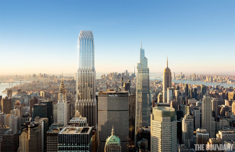
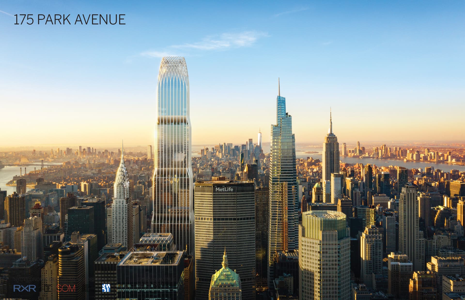
The new rendering, above, shows several subtle changes from the previous iteration, below. The massing now features one fewer setback and a reduction in the number of perimeter columns that run the height of the tower to its decorative lattice crown. Diagonal columns have also been incorporated into the setbacks, making for an appearance similar to Foster + Partner’s 425 Park Avenue.
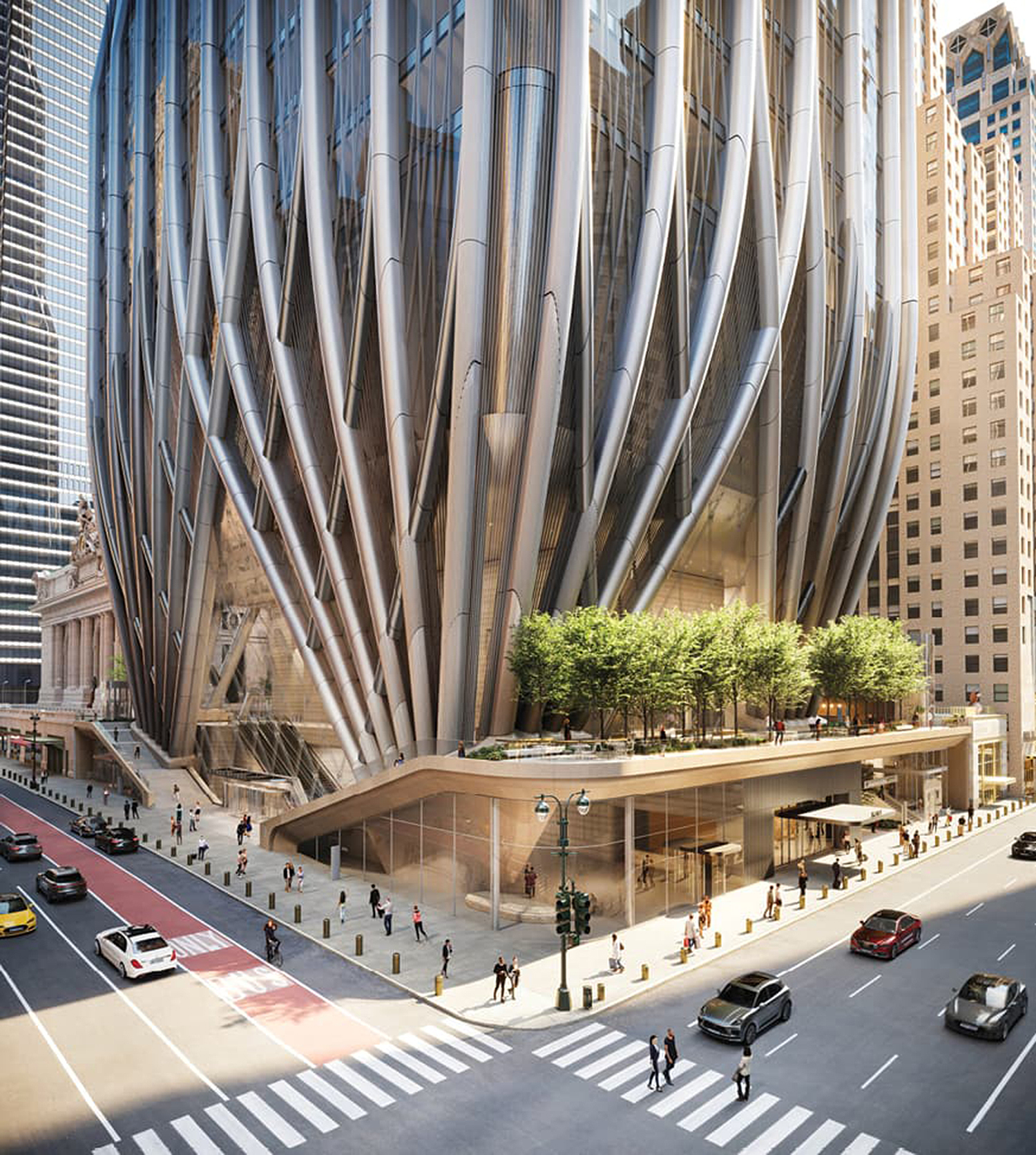
The below rendering of the southern corner of 175 Park Avenue at the intersection of East 42nd Street and Lexington Avenue shows how the tubular perimeter columns fan out in a lattice pattern from corner anchors at the base. Visible in the illustration is the elevated public plaza along the eastern side of the property, which can be accessed by an outdoor staircase along East 42nd Street. The main lobby will feature a soaring atrium framed by the inward sloping triangular glass façade.
175 Park Avenue will become the tallest skyscraper in Midtown East, surpassing other recent office buildings that stemmed from the 2017 Midtown East Zoning initiative like One Vanderbilt, 270 Park Avenue, which is currently under construction, and the future rise of 350 Park Avenue. Work on the building itself will commence after the demolition of the Hyatt Grand Central New York is completed.
A recent report and interview between Leaders Magazine and RXR Realty’s Scott Rechler anticipate the completion of 175 Park Avenue by 2029 or 2030.
Subscribe to YIMBY’s daily e-mail
Follow YIMBYgram for real-time photo updates
Like YIMBY on Facebook
Follow YIMBY’s Twitter for the latest in YIMBYnews





Nope, not tall enough!
Looking forward to a 4,000 ft.
“SUPERDUPERMEGAGIGA” tower!
height of supertall skyscrapers is mentioned in meters. A skyscrapers doesn’t have feet!
What kind of statement is that? In America, we use the Imperial System of measurement for everything! What do you mean by skyscrapers not being measured in feet. And to think the United States invented the skyscraper in case you forgot
Several subtle changes like the massing now features one fewer setback, and a reduction in the number of perimeter columns that run the height of the tower to its decorative lattice crown. The inward sloping triangular glass facade, including this part I think the tower is elegant for visibility on street level: Thanks to Michael Young.
Looks like an improvement to me. Unexpected.
It looks less clunky and lighter in appearance without so many columns
This is a great revision. It is less busy and more elegant. Definitely something to look forward to over the next (ugh) 6-7 years!
Do you think the hotel will be closed at the end of 2023 and begin being demolished next year?
Yes, most likely. Hyatt and the hotel owner almost certainly want to have that new hotel in business ASAP.
Next to One Vanderbilt it looks like a complete joke. Ghastly tumor slapped onto the skyline, essentially wipes out the Chrysler building from existence – All for a bunch of office space nobody can afford, and 1/3 of the hotel keys than are there today which we actually do need. Laughable.
Laughable comment. I’m guessing billion dollar companies aren’t coming to you for office advice?
So what you work for SOM or something? Looks like you’ve been triggered bud I’m so sorry – going nuclear on this comment section lol chill everyone knows this building is absolutely hideous XD
It feels dystopian. If it were at a site that could accommodate its street level massing, fine. But not here. It’s another Pam Am building; I was 16 years old when it opened in ’64. Other than the convenience it provides to commuters who take the train into Grand Central and work in the tower, it’s still a monstrosity. But then, again, more is better. Right?
Well, is this a joke???
How this monster next to iconic Chrysler building and Historical Grand Central Terminal will be better suited even at street level!??? This a joke, a laughing joke, not a architecture, and NYC shouldn’t be looks like Dubai… That’s clear sign of corporate big cat’s greed if it’s not a more, that’s a fascist type architecture… Totally ignoring what’s should be need, it’s a monster, not elegant, unless you are totally drunk and watching Avatar Sequel 5.0…
“This a joke, a laughing joke, not a architecture, and NYC shouldn’t be looks like Dubai… That’s clear sign of corporate big cat’s greed if it’s not a more, that’s a fascist type architecture…”
Are you a machine?… Because you sound like a machine.
My head hurt when I tried to read jack’s response above: Its like David : Sent From Heaven 2.0
The base is as ugly monstrosity as it can be, making a crushing mockery of the Grand Central next to it, the way the rest of it laughing at the Chrysler building.
So you like the black glass box currently blocking all views of GCT from the East… Very interesting.
Lamenting the loss of views of the elegant Chrysler Building on the Manhattan skyline.
I hope you size queens are happy, because this behemoth will now define the Manhattan skyline. The laughable rendering showing the tower almost ghost-like is a sad joke. It will be unmissable as a big, boring box in the sky.
And the base? It’s actually interesting, but from the sidewalk, all you’ll see are the cantilevered stairs and huge overhang above the boring glass storefront. Not many people will see it from a 6th floor as the rendering shows.
SOM, you have failed.
That’s totally dystopian, from old time comic books…
Except using modern materials…
Who designed this laughing joke, maybe 18 year old??? We are not a Dubai yet, and should never became a such…
Why we shouldn’t be like Paris, London, not to scare tourist and visitors with this all levels Monster who overwhelm not only Chrysler Building but also elegant One Vanderbilt, tall modernist and well suited, Commodore is sure to destroy everything in our skyline built before, this monster size seeing far away from it’s location, destroying visual NYC icon Chrysler, Empire State, Freedom Tower, One Vanderbilt, One Bryant Park, and for what, for office space we currently don’t need, for hotel space in city who may scare new visitors by crazy vagrants on the streets or excessive stupid crime in our Subway…
Now this building, who will seat empty, but to built this monster takes probably over decade, and destroy one of remaining historical for New Yorkers still elegant city block!!!
Malfunctioning machine noise. Sounds like this comment was translated from Japanese to English then to German then back to English.
That is the tackiest, ugliest super-tall ever proposed for this city. Super Yuck! (imho)
Is this a serious comment? Central Park Tower more your thing?
Central Park Tower is an infinitely more elegant design so yes
No buddy it isn’t
I think there is an SOM bot at work here. I never mentioned any other building. So no, neither Central Park tower nor the black thing to the east are “my thing”. So, bot, lean how to argue with the points being made and yes, I am serious and I stand by my comment this is the tackiest, ugliest super-tall ever proposed for this city.
Ugly behemoth. Not meant for beauty but for maximized square footages.
It is a business venture, not art. Of course they want to maximize square footage. They are doing that elegantly. Cities change with time. Get over yourself.
What kind of comment is this? Of course it is a business venture- and as with so many business ventures, there’s a blatant sense of failure built into it. But it sounds as if you’re implying that architecture is a subject without art and that is one of the most bizarre concepts I’ve ever heard. There are many buildings that lack architectural (i.e. artistic) qualities, but I don’t think any city should be greenlighting any project of this scale without any thought put for on style or scale. There are a handful of cities known for their architecture and interestingly, they often debate the merits of any new buildings. I think it’s a good thing people are expressing their thoughts about this massive project- hopefully SOM, the developers and the financiers will read these comments and think about some of the concerns mentioned. It is their prerogative to do as they wish, but if they want an iconic design that can maintain tenants for a long period of time, they might want to make some changes. Otherwise, they risk being the ‘it’ building for a few years before people turn on them. The payoff for projects of this scale don’t occur in years but decades so best to design something with lasting attraction.
The rendering doesn’t show Chase’s new HQ on Park and I think another super-tall by KPF is planned nearby on Madison. Is that even the end of it? Clearly there’s still much confidence in the city’s ability to absorb large amounts of very prime office space. Horrifying thought: the base looks like a giant lamprey sucking out the juices of the city…
Agree 100%!!! Dystopian looks of NYC… Avatar Gotham City after this built… Size Super, no XXXXXL Queen…
What language is that?
Great point, I’d love to see how the area will look with both this and Chase’s building completed. While the building might look appropriate someplace else, next to Grand Central and the Chrysler building I think it’s a shame.
Why not design something better suited for Grand Central Historical Neighborhood??? We can built modern skyscrapers tall and at same time elegant, like One Vanderbilt, One Bryant Park, 425 Park, new Chase Building perhaps, Manhattan West towers, they all suited well, even controversial Freedom Tower, but this building going to replace ugly Hyatt box is not an improvement, it’s monterous size destruction, should be open public discussion before releasing this type scale new construction in historical parts of our Great City??? That’s NYC, and it’s only One on Whole Planet, let’s not replace it with ugliest replica of Dubai…
Your circuit board is smoking.
well said!
@nyyimby: you’ve put the wrong tag on the article. should be 175 park, not 270 park.
Lets go higher!! 90-100+ floors! Its 2023 & NYC! Everything in excess..
The way it’s ALWAYS been.
I’ll second an upward in height! Why not 2,000 feet?
Wow – you’re really emotionally invested in defending this ugly building and the concept of building bigger just for the sake of it. Stop gaslighting the rest of us real New Yorkers who believe in true democratic process – and who believe corporations are NOT citizens. Bigger for the sake of bigger is NOT what makes NYC special.
Oops – I was talking to NFA.
When a city’s buildings stop growing taller it starts dying.
There can never be any such thing as a building tall enough for Manhattan!
Looks great.
WoW and there goes the Chrysler Building from the skyline. This gargantuan tower just dwarfs the majestic Chrysler Building.
Maybe a recession will stop this.
I’m waiting to read more of the ‘YIMBISMs- ‘Yes, build it taller, bigger is better, progress, etc.’ I am so thankful many commentors commented on the dystopian and comical nature of this tower. The base is powerful- fascist is a good description. It is absolutely Gothamesque, the problem is the childish architects, bankers and ‘leaders’ behind this design did’t think about what Gotham represents in the comic book series- a lamentable, failed city that needs saving. The scaling on this building is so utterly inhumane as to encourage an entire generation of people to say- for purely aesthetic reasons- Why would you want to move to NYC?
I love the exoskeleton, I love the powerful base and I love the crown, but I am not a fan of the way the building ascends- it looks cheap and the angular setbacks take away from the crown. This design proves a couple things: executives really aren’t smarter than us plebs- they are simply children that play too much golf and… architects really need to grow up- the last thing the world needs is more churlish babies progressing the world toward this dystopian dreamscape.
Final thought- the upper level of Grand Central has been some of the most underused real estate in Manhattan for decades. If this building were designed on a more human scale, perhaps people would use the upper level of this design- but in what world are these dreamers living? NYC has had so many failed upper gardens like this- people don’t often walk up several levels of stairs in a windy city or on a cold day so I worry that while it is a worthy endeavor to find a way to utilize this space- it has once again been conceived in a way that is so austere, so monolithic, so fascist that few are likely to want to partake.
i’m interested in all the hate for this building. I actually think the new design makes the building more consistent from top to bottom. And whether we need this building. Companies always seem to want to move to the newer and shinier location.
Those set of triangular columns and outlines around the setbacks tie in with the design of the lattice crown more and make it look more coherent as a whole
So sad that this building is going here, allowed to overwhelm its neighbors Chrysler and GCS. In lower Manhattan, the west side, or above 46th on Park it could fit. Here it is a monstrosity. GJL
I can’t believe how they’ve blatantly copied the grid pattern from 425 Park! A little architectural plagiarism?
Yes i like it thank you
The new rendering looks like an improved design to me, but it’s weird that they cropped the photo in such a way that you can’t see the Park Avenue Viaduct that carries vehicular traffic on Park Avenue from 40th to 46th Streets around Grand Central Terminal and the MetLife Building — which is how this building can technically claim a Park Avenue address while pedestrians (and even most auto traffic) will access the building from 42nd and Lexington. Do they have a rendering showing what the side facing GCT will look like? The staircase on that side is interesting and a welcome addition since the roadway around the station is currently a deadzone (by design since there’s no continuous sidewalk!) and a huge missed opportunity for the block. It’d be interesting to open up pedestrian access between this building and Grand Central from the upper level there. As a pedestrian the only (legal) way to walk around up there is during “Summer Streets” in August when Park Ave is closed to traffic.
There are depictions from that angle in the projects thread on SSP.
Makes the Chrysler Building look like a walk-up.
Should have taken two of them added 50th floors, and dropped it at the Trade Center Site.
I think I maybe liked the previous version better. Seems taller looking because of the vertical columns going straight to the top.
That’s my beef! Straight lines up to arched crown, or (425 Park rip-off) isosceles triangles up to arches? Makes no sense, design-wise!
PS—everyone else is bent about the height, the base, the locale—what about the design?!?
I like this redesign a bit better, particularly with the crown. However, I still get the feeling that the building is too bulky.
Wow, this looks amazing! What an upgrade to the dreary Grand Hyatt that’s currently there.
That dark stupid 80s glass facade and still on the building today has got to go!
The building’s crown calls to mind the old Art Deco GE building on Lexington and 51st.
NO, NO, NO! This thing gets uglier and more offensive with every update. I can only imagine the bribes that got this monstrosity approved. It will bury our most beloved tower, the Chrysler Building, forever. A ghastly sellout to developers, forever memorialized as a big ugly dildo rammed into the skyline, visible from 50 miles away. And we don’t even need more office space!
the word is Monstrosity
Were are the trees at the top of the building?
I guess “175 Park Avenue” sounds more impressive than “1 Depew Place”, but I think that is a more accurate address for this building, at least for anyone entering from street level.
Not Tall enough we need to beat the Burj Khalifa!
Yes. And Burj Khalifa should have been built in NYC, not Dubai where skyscrapers make no sense with all the plentiful available flat desert land there.
Love, love, love it. Yes, I’m one of the very, very few YIMBY’s, the rest of you are pure trolls.
The setbacks are now more defined, so it appears more slender and refined. The height reduction from the original is acceptable. And the improvement to the street level is just so refreshing. I read these comments and wonder if anyone has ever really taken a look at the Hyatt. If you all really hate glass towers, you should all be jumping for joy, not moaning. And as for Chrysler, this building embraces Chrysler and GCT by allowing people to have a better view to take it all in from ground level.
Total win for NYC. Let’s get with it and tear that Hyatt down!
Honestly this is a much better building than seeing the tacky and ugly black glass of the Hyatt hotel today.
Exactly! Everyone in NYC should be excited to see that building torn down.
I just don’t like the base. I am not a fan of the organic rising shapes of the columns and do not think it will age particularly well. If anything is clunky about the design it is its relationship to the ground.
I like the base. It’s an interesting solution to the limited placement of foundations due to the train tracks.
I can currently book rooms in the Hyatt Grand Central for Christmas of 2023. It does not appear that they have any intent to close the hotel anytime soon, much less begin demolition. They are fishing for an anchor tenant with these renderings, and given the state of the economy and the quantity of trophy buildings going up right now, I question whether they will find one anytime soon.
Regarding the renderings, I think it is an interesting building but I am unsure if this is the best location for it. This development would probably be better near Hudson Yards, or even downtown. It just looks kind of awkward between Grand Central and the Chrysler Building. Then again, the Hyatt is also a blemish on the area. I suppose it is an improvement, but I wish the base wasn’t so modern.
Honest question… Why do you suggest a different location? Is this a game of SimCity? Is Manhattan a boardgame?
RXR owns this plot of land and to the best of my knowledge, they don’t own any land near on within Hudson Yards. Also, the Hyatt is part of this development and I’m sure they like this location near GCT. So why do you suggest they build this elsewhere? How exactly would they do this?
Sorry to sound rude but I read these sort of comments all the time and wonder what’s in people’s mind to suggest a development by a specific developer just, “move” the project to a different block, as if that’s possible.
The loss of views of buildings is part of life in NYC. Seeing the Empire State from Fifth and 42nd vanished some years ago and now it’s the poor Chrysler’s turn. A place where buildings become increasingly larger is always going to have this situation. Some European cities have height restrictions. When you take the train into Philadelphia, you can still see many church steeples rising about the low row houses. This sort of thing vanished from NYC long ago. The Pan Am/ Met Life building was probably the greatest view blocker.
Great points. I also view this as an improvement over the large back glass block (Hyatt) that does nothing to embrace GCT or Chryler. Forget height, the view people will have walking out of and into GCT will improve with this development. And that includes their view of Grand Central and Chrysler. Let’s focus on that.
I like this, though not a fan of the narrowing base. Like with Chase’s new tower, it looks like its base would be the weakest part of the structure. Not the strongest.
I can’t believe on a site called YIMBY there is so much hate for building in the comments. If you don’t like skyscrapers move to DC or LA. NYC is meant for density and building tall. We should be building a thousand of these skyscrapers. The skyline is lacking these days.
Ditto!
Don’t hate skyscrapers, only this one. It’s very inelegant. I think 1 Vanderbilt is quite excellent. This is the right part of town to build a tall building because of transportation and no one will miss the grand Hyatt. Just because this is a pro development site doesn’t mean that opinions on the architectural quality should be discounted.
It looks like the top was cut off. Why doesn’t the lattice at the top continue into a spire, like the Chrysler building? It’s certainly hinting that it wants to.
At least the hideous Grand Hyatt will be gone.
Nice, makes the WTC look like an unfinished, half complete complex with a cheap developer… Oh wait, it is! Thanks Larry!