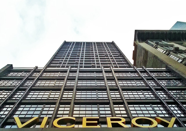
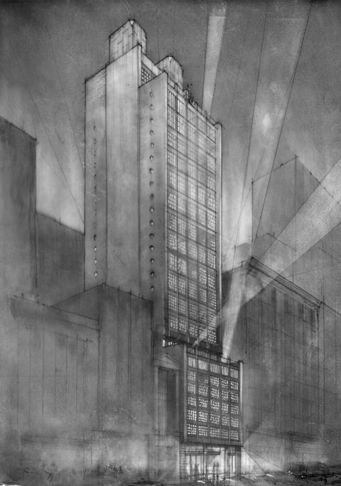
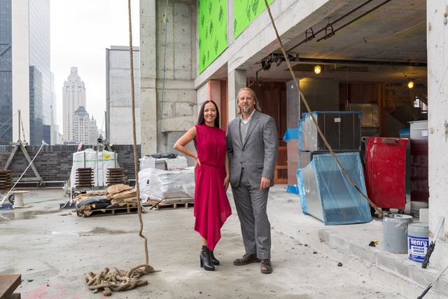
The Viceroy New York opened earlier this month, and after tracking its construction over the past two years, YIMBY discussed and toured the project with architectural designers Stephen Alesch and Robin Standefer, of Roman & Williams. Partially responsible for turning NoMad into a booming neighborhood by way of the Ace Hotel, the firm has anchored 57th Street with a structure that speaks to the craftsmanship and quality of old New York, and ultimately screams what every new building on this island should: Gotham City.
YIMBY: So the project began four years ago; that would have been in the midst of the recession?
Stephen: It was in the middle of the recession.
Robin: Right at the most spectacular bottom – the heat of it. Lehman fell in October of ’08, and we got the call in December. I mean the phone had stopped ringing; there were tumbleweeds in the office. And then we started the project, and saw it all the way through.
S: Next thing you know we’re sketching a 29-story tower. It was pretty fun.
R: And it was a big deal because the Standard and Ace hadn’t totally opened – so we were really hired pretty cold. First we got called for the interiors, then we got the building – so it all happened for a reason. It was amazing.
S: First it was just an interiors thing, then a couple of sketches from me ended up on the table. It was an opportunity and we stepped up. It showed [Ark Partners] we could do it. And I think that’s how we built a lot of our career.
YIMBY: What influenced you in designing the Viceroy?
S: Well we sort of had an agenda when we came here – we always loved coming Uptown, being fancy, I mean we had our moments. Robin lived nearby as a kid, and as much as we’ve lived Downtown, we’ve always liked it up here. So when we had the chance to do the building, I think we had a fully-loaded brain of what we wanted to do – the casement windows, the brick.
YIMBY: How did you come to the decision that the exterior brick would be black?
R: Because we just wanted it to be like a giant, Gotham shadow. It’s our black beauty.
YIMBY: Gotham is the overarching theme here, yes?
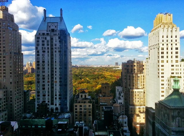
R: Definitely. Because that’s what Uptown is – I mean, it all is. I grew up in New York, in a very particular relationship with neighborhoods, and to me, 57th Street is such a remarkable crossroad. It’s so particular because it is a neighborhood now, and it used to not be. It was like a thoroughfare. And it still has some of that, where it’s still a very unique and very important cross-town street, so for me it was beyond this idea of a sort of style or something thematic; it was about the block. You know – adding something that did right to New York. And the experience of the view – you know this is a very unique site, because it’s an opportunity to see the park and see the buildings. I mean, phenomenal.
S: You see a plot of dirt, and your mind automatically starts thinking – what could work here. I don’t like seeing character-less buildings popping up in New York City – we love this city more than anything – and I think the buildings that go up, they have to have character. If someone else isn’t going to do it, we have to do it. I do think there’s a group of young architects – I don’t know who they are yet – that are more detail-oriented.
YIMBY: Well you are young for architects, relatively speaking, yes?
S: I think so – we got the break for this building earlier than we ever expected.
R: This project in particular, we’re pretty young to have done. I mean, I don’t think that’s the case with every single one – I think our firm hit a very emotional chord with people, and I think what we were doing was very much in keeping with the movement that was happening in the country, so I do think that’s a gift, but I think this project is unique. We’re ambitious, but mostly we’re just such hard workers, so we said – OK, we can do this. And just that I’m standing inside here, and we designed this 30-story building – it’s still like an out-of-body experience. I stand in front and I look up, and I’m still mired in the details; I just can’t get out of it to really step back.
S: People who went to school in the 90s came out with a severe ‘blah’ problem. It’s sterile; it’s almost medical. So what’s happening now is we’re seeing people coming into the office who went to school in the mid-2000s, and their thesis projects are really inspiring. I’m seeing brick, I’m seeing muntins, I’m seeing articulation. These kids have so much attachment, and it’s such a strange thing. The most desperate and negative word in my whole life is detachment , which has always been the goal for everything, and that’s the 80s and 90s – all that architectural education was about detachment. And now I see so much more scale – now, people come to my office with personal experience in historical character, instead of us having to teach them.
R: For us, we use history as a reference, but we believe “here we are – we’re in today.” We’re not pretending this building is old – that’s contrived. We’re just inspired by things from a lot of different eras. There are stylistic references in [the hotel rooms], from classic 30s to completely contemporary, and they have a big range.
YIMBY: The tastemakers in this room are very good at assembling things.
R: I’m modest about many things, but Stephen and I know how to mix those things. And it is a slippery slope – if you try to do that and don’t know how.
S: We always wonder what the future holds if we keep doing this. People can practice architecture and design until late into their lives. So what will make it from the 90s into our collection to choose from; what from the 90s will have passed the test of time. Will there be something that lasts? I think there will be, but we don’t really know what it is right now, because it’s too soon. It’s like in 1938, I doubt they cared about what was happening – you know, things had to pass a certain test.
YIMBY: What about authenticity – I read you think the term is over-used?
S: I think it’s over-fetishized. I mean, I love authenticity. It gets a little over the top with how your shoes are made, and we make all the jokes about hunting it, and how you tanned it. I think that some of the historicism that we do, it’s not nostalgic, it’s meant to be a better version of it, and meant to be very of the moment; I always think of the concept of living in the now, and it’s a very important time for me, because I’m alive – it’s the only thing I know, so everything I do is really about right now. I’ve no time machine, I’ve no desire to have a time machine, so it’s very much the present – if we can just bring some of the beautiful things from the past into the present, it makes me feel better and happier – I’m more visually satisfied.
YIMBY: The Ace is very millenial-friendly; wide-open spaces, collaborative working environments. What about the Viceroy?
R: I think it’s kind of similar; it’s for young people who want to re-invent themselves. I think there’s a community now that wants to see a jazz night, and look at the city – they’re not afraid of some glamour.
S: I actually think it’s kind of like a headquarters for someone from Downtown who wants to get the Uptown experience. For example, look at us – my birthday is coming up in two weeks, and we’re coming here the night before, having a drink, and going out to dinner. Then the next morning, taking a walk in the park – going to the Met – it just sounds like so much fun, to wake up on Saturday and just spend a day here. And then by Sunday run back Downtown from this world – which is a little over the top – but for us to come up here and have a place to stay, and pretend to live Uptown, is a fun occasion.
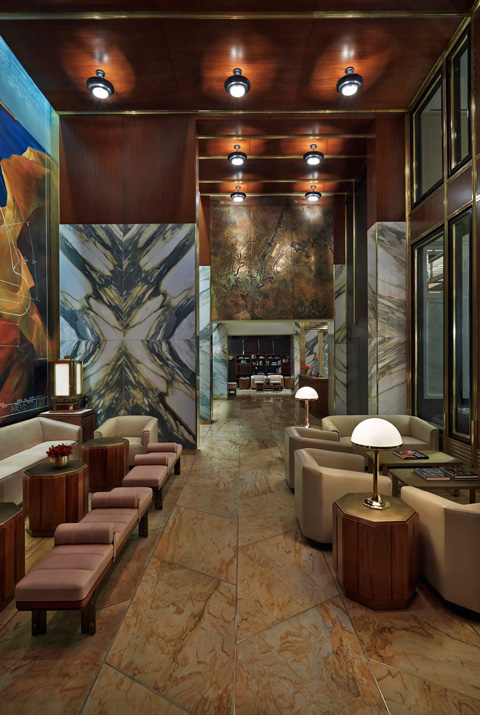
YIMBY: What’s the stone in the lobby?
R: Paonazzo.
YIMBY: And the wood is?
R: Iroko. from South America.
S: And then we have the giant glass block.
R: An incredible Italian hand-blown glass block.
S: It makes the 80’s glass blocks look ridiculous –
R: It’s more proper 30’s – which was the original glass block, and in the 80’s people really dumbed it down. And so this is it in all its glory – it’s beautiful, isn’t it? I love it, especially the black – it’s so chic.
YIMBY: What are your favorite things about the rooms?
S: It’s really hard to get a hotel with a piece of millwork this big –
R: Oh yes. We love the closets.
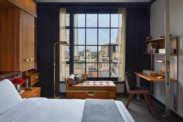
S: The fridge? It’s off the floor. We’re so happy about that. It’s so civilized. We’re so proud of the windows. That was a huge victory. We were fighting for muntins – they have no function, they’re just for looks. So to fight for them is really difficult. We had to do a lot of testing. We refused for them to just be a stuck-on grid.
R: All of the fixtures, all of the furniture – the lights – we designed. And you can’t do that when you don’t have a project that has enough time. So because it was ground-up, and it takes a long time to get a building out of the ground, we could start to fuss with making all these things by hand. Fancy, right?
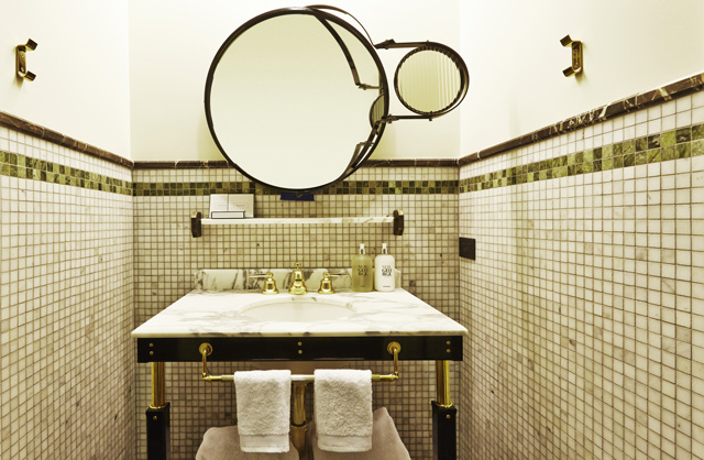
S: The bathroom is kind of meaty, and the color of money.
YIMBY: A good color!
R: It is! A good color. And it feels appropriately Uptown.
S: And it’s funny because in 2008, there was no money –
R: And we were like – let’s use those colors!
YIMBY: So you would say most of the inspiration comes from the 1930’s?
R: Not only.
S: We sort of make a joke that it’s the last day of pre-war. Just that last period where people still had attachments to things like crown moldings and baseboards – that’s definitely pre-war, and they were used everywhere. If you didn’t have a baseboard and crown, you were insane – after the war those things kind of disappeared, so we always thought that’s what the hotel represented. In a funny way, we’re still living in a post-war emotional state; so much of our modern world is a result of World War II. Leaving the farm, moving to cities, technology, being unsentimental, modernism – it’s all a post-war kind of mentality. I mean how many years has it been?
YIMBY: So you think this is getting rid of the post-war mentality?
S: I think so. Sometimes we say it’s a warming of the heart again, after the collective heart was made cold by the war. It broke so many people’s hearts. I think our work represents warming up and becoming re-attached.
R: Well it’s also a certain kind of romantic; a certain aspiration to things, even using aluminum with brass. It’s not about style, it’s almost a machine-age decision, like leaders of industry, and all of that has a big sense of American aspiration. So there’s some of that to this. There’s that moment of the world of men coming to the city and making good. And I think there’s some of that narrative in here.
S: We don’t like hyper-modernism – it’s like you’re protecting yourself from everything. I don’t like that about hyper-modern architecture. It’s not that I’m anti-modern, I just don’t like being closed up. Robin and I both love romantic things, and [hyper-modernism] is just not romantic.
R: There’s also something about seeing the city; I find seeing it through the grid the ultimate. I don’t want to just have clear glass. I want to see this frame and the grid – this makes it human, meaning this got built. I don’t want to pretend I’m floating in the sky. This trend towards windows that are just glass – I think Stephen and I feel like they’ve become a bit overrated.
S: I don’t want to get too heady, but a big piece of plate glass? It’s an existential thing; it’s about looking as far away as possible, it’s like you don’t want to be here, you don’t want to see this – you are looking away, and want to be anywhere but here. That’s what it represents to me. It’s always looking outwards, and it’s part of the modernist tradition – which is great – but it’s looking afar, and asking how far can I go? But there’s this other world that I think people forget about sometimes, that’s just right here – my family, my friends, right here. A five-foot circle around me; that’s the most important place to be. You could call it an old-fashioned way of thinking, but to us it feels cutting-edge, when this afar thing has predominated for our whole lives.
R: It’s about learning to embrace a big continuum of experience, as opposed to feeling alienated from it. I think that’s very important, and I do think there’s a big – I mean you can tell by our constituency, but there’s a big young community that wants to embrace that.
YIMBY: Would you say most of your fans seem to be younger people?
S: It seems to be the case, and we love it.
R: We’re super happy about that, and it’s not everyone who hires us, but I’m talking about fans.
S: We’re a natural for kids; that devotion, that kind of love of being in the present moment. And with people our same age, it seems they have to work a little harder to snap out of this trance they’ve been set into from the 80’s and 90’s.
YIMBY: Given the Viceroy’s roots in classic Gotham, what do you think of the current landmarks trend – everything is being preserved regardless of quality, and solely based on age.
S: We have trouble with historic boards because we’re a continuation of that era that just dropped off the Earth for some reason; in the post-war it just stops.
YIMBY: The de-humanization of humans.
S: That’s right – we kind of re-lit that fuse. Landmarks is a problem. We would fly through landmarks if we built a glass box. Once we start adding details on it, they get confused – like, “what are you doing, you’re re-creating something.” Well yes, it’s a continuation. We’re still building the arguments because these people are still stuck in the 70’s.
YIMBY: The mentality seems incredibly dated.
R: Exactly, and they’re doing it as a hobby, and it shouldn’t be a hobby.
S: A lot of people make errors in their age and their math, like they’re from the pre-war era – they’re really from the 70’s, which was like ‘2001: A Space Odyssey’ everywhere. So the people who are in their seventies right now are so obsessed with modernism that they can’t even comprehend a crown molding – something like this is like a breakthrough right now.
YIMBY: Final question: if you were going to design the tallest building in New York, what kind of qualities would you incorporate?
S: It would not have a flat roof, it would have a spire – because I think it’s a lost art, because of those helicopter pads. Whatever code killed the spire, challenge it – I’ll build a helicopter pad sticking off the side of the building, three of them, and then you would have the spire on top. That’s the missing link, that’s aspiring architecture; that’s the spire. That beautiful, tall, verticality.
R: It would be stone.
S: Stone. Stone and aluminum.
For any questions, comments, or feedback, email newyorkyimby@gmail.com
Subscribe to YIMBY’s daily e-mail
Follow YIMBYgram for real-time photo updates
Like YIMBY on Facebook
Follow YIMBY’s Twitter for the latest in YIMBYnews

