In 2013, Fosun International Ltd. bought One Chase Manhattan Plaza. They have re-branded it as 28 Liberty Street and now they want to re-develop the landmark. The proposal includes ground floor retail and major changes to the plaza, and was presented to the Landmarks Preservation Commission on Tuesday, but the commissioners had issues. So, the team will have to re-work their plan before they get the go-ahead.
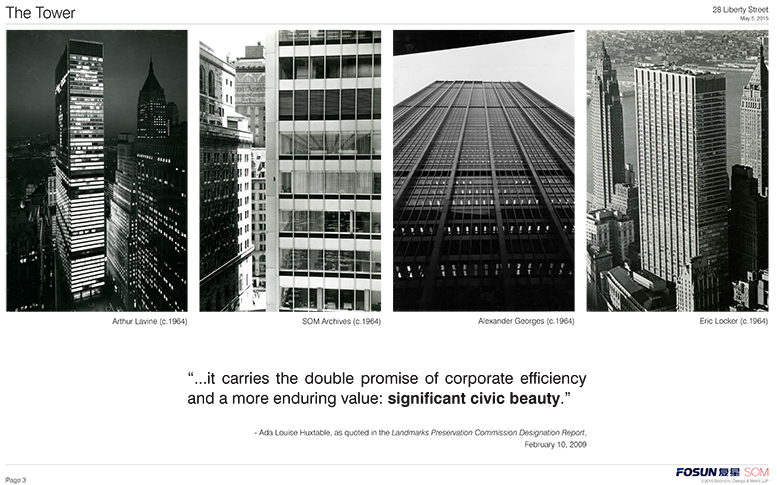
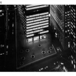
One Chase Manhattan Plaza was designed by the legendary firm Skidmore, Owings & Merrill (SOM) and completed in 1964 on the block bounded by Liberty, William, Pine, and Nassau streets. The 60-story building is considered a monument to the International Style. The lobby was renovated in 1993 and the plaza in 2002. It was declared an individual landmark in 2009. The designation report called it “among the largest and most important 20th century skyscrapers in New York City.” JPMorgan Chase sold it in 2013 and no longer resides there.
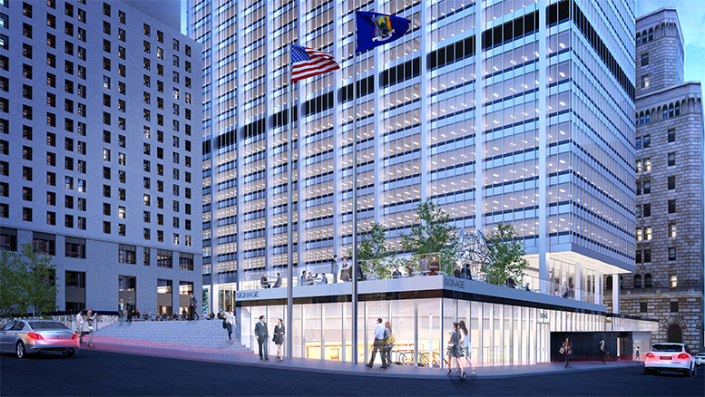
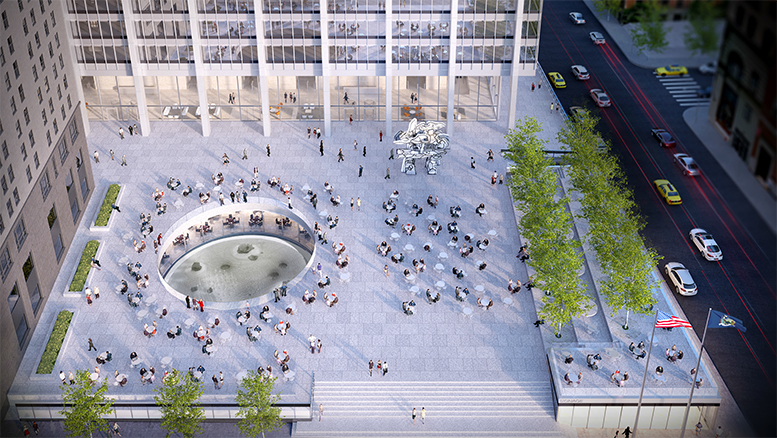
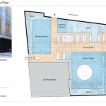
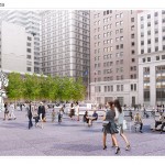
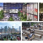
Fosun wants to continue operating it as an office building (and is planning no work on the tower’s façade), but they want to make adaptive re-use of the ground floor and three basement levels. The want to re-invigorate the area and also plan to have cultural offerings on the plazas. Fosun’s Erik Horvat introduced SOM’s Frank Mahan, who presented their plan. It’s quite a big plan. So, here are the some of the big points.
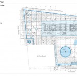
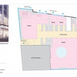
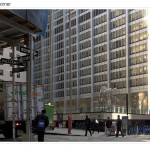
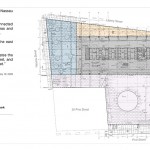
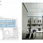
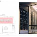
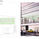
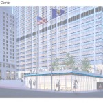
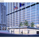
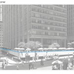
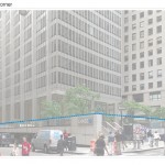
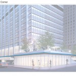
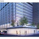
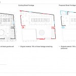
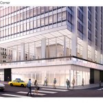
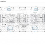
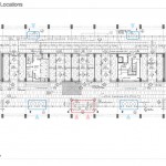
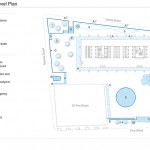
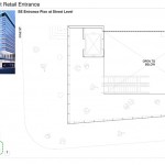
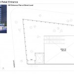
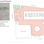
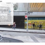
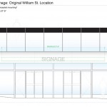
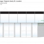
The original ground floor plan had office areas, meeting rooms, and the branch bank. The new plan calls for five retail spaces.
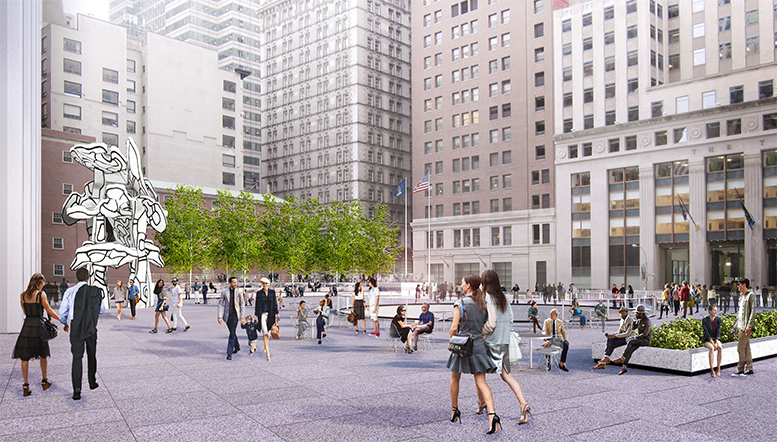
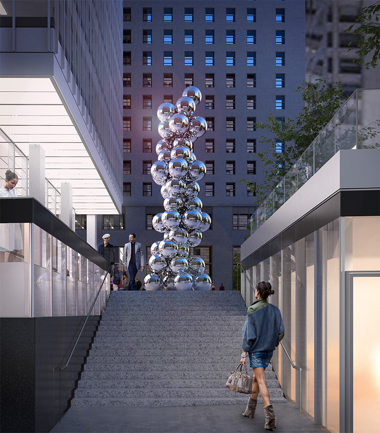
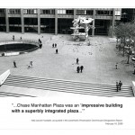
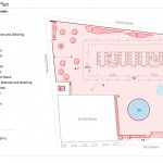
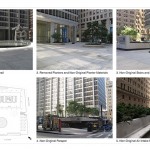
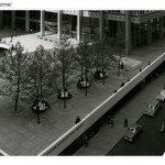
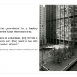
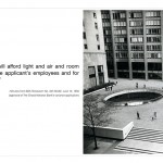
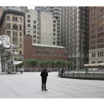
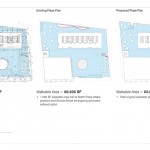
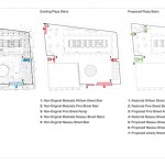
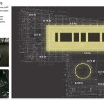
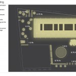
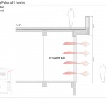
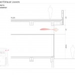
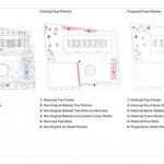
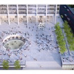
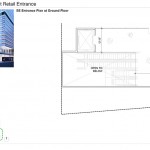
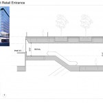
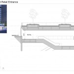
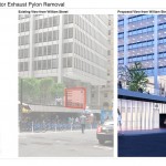
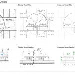
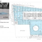
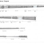
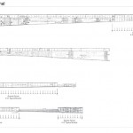
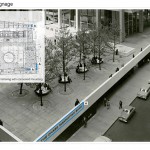
Originally, the walkable area on the plazas was 62,000 square feet, but 1,500 square feet of that was lost to air intakes on the north plaza and an emergency generator exhaust pylon on the William Street side. Those would be removed, restoring the original 62,000 square feet. The plazas were originally accessed by three stairs (on William, Pine, and Nassau). Those stairs were then replaced with new materials and a new staircase was added on the north end of Nassau Street and a ramp was added along Pine Street. The proposal would restore the original stairs, modify the ramp along Pine Street, add a new ramp next to the original stairs on Nassau Street, and create new stairs along Liberty and Nassau to replace the non-original one on the north end of Nassau.
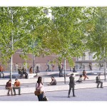
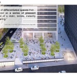
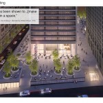
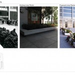
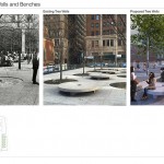
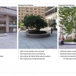
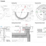
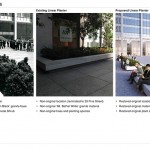
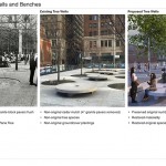
The plan also includes two elevated areas on the plazas, planters restored to their original design, and tree wells would be restored to their original cobblestone condition.
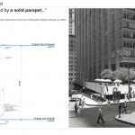
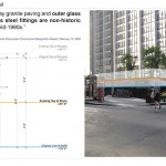
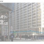
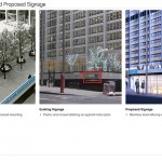
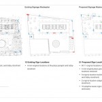
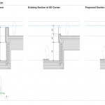
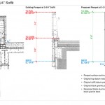
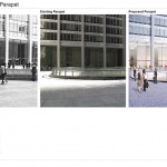
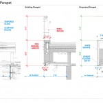
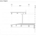
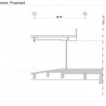
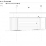
The parapet surrounding the plaza would be raised and changed both for style and to accommodate new retail and the raised areas on the plaza. Also, new signage would be applied.
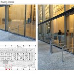
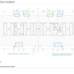
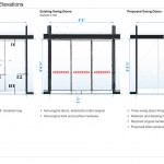
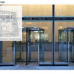
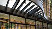
Additionally, non-original doors would be removed and a new continuously illuminated ceiling would be installed on the tower’s lobby. Originally, the ceiling continued from the interior to the exterior.
The commissioners weren’t entirely opposed to changes on the plaza, but there were issues. “The parapet is key,” said Commissioner Frederick Bland. Chair Meenakshi Srinivasan said enlivening a street is important, but it doesn’t always mesh well with an architectural masterpiece. She said some of the work proposed felt like a “wholesale removal.” Commissioner Adi Shamir-Baron was worried about “disposing of the qualities of the style here that are distinct.” Commissioner Michael Goldblum was among those who saw the plinth as a floating element. He agreed with testimony that suggested using Lincoln Center as a reference point. He was also concerned with the illuminated ceiling. Commissioner Kim Vauss was also concerned about the amount of glass proposed. Due to the complicated nature of the proposal and the variety of issues the commissioners had, no clear direction could be given to the applicant. Fosun and SOM will just have to try again.
Community Board 1 generally supported the proposal, but had issues with the changes to the parapets and concerns about the brightness of the new ceiling. After all, lower Manhattan has a lot more residents now than it did in 1964.
The Historic Districts Council did not support the proposal. “This Individual Landmark is the future generation’s Empire State Building and should not be irreversibly altered because of a change in ownership and taste,” HDC’s Kelly Carroll said.
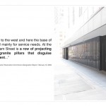
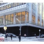
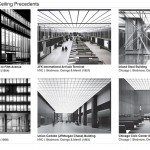
“None of these proposed alterations to accommodate perimeter street-front retail use enhance, or are respectful of this core concept; the proposal is akin to carving out retail booths and reconfiguring the unified and elegant marble plinths of the Seagram Building which similarly compliment its setback tower on a restrained, minimalist public plaza,” said Theodore Grunewald. “The proposal’s removal of so much of the podium’s ground floor band of black granite, and its replacement by a clear glass skin and a light-colored mullion vocabulary mimicking the aluminum and glass cladding of the tower drains the podium of Bunshaft’s intended contrast with his setback tower.”
There was one additional speaker who was opposed to the project and two who supported it, including a representative of the Alliance for Downtown New York.
The presentation was quite long. If you want to check out all of the slides, here they are:
Evan Bindelglass is a local freelance journalist, photographer, cinephile, and foodie. You can e-mail him, follow him on Twitter @evabin, or check out his personal blog.
Subscribe to YIMBY’s daily e-mail
Follow YIMBYgram for real-time photo updates
Like YIMBY on Facebook
Follow YIMBY’s Twitter for the latest in YIMBYnews



































Stairs, stairs, and more stairs. Is it too much to suggest that the plaza should be truly accessible on all sides, and to wall levels? At the Rockefeller Center Plaza they put in two little elevators from ground level to the concourse/rink level. Would one little elevator here be too much? Now that I’m 70 and my arthritis is acting up, I’m paying more attention to this issue. LOL.