An over century-old little building on the Upper West Side will officially bite the dust. On Tuesday, the Landmarks Preservation Commission approved the demolition of the three-story building at 466-468 Columbus Avenue, and the construction of a new mixed-use building in its place.
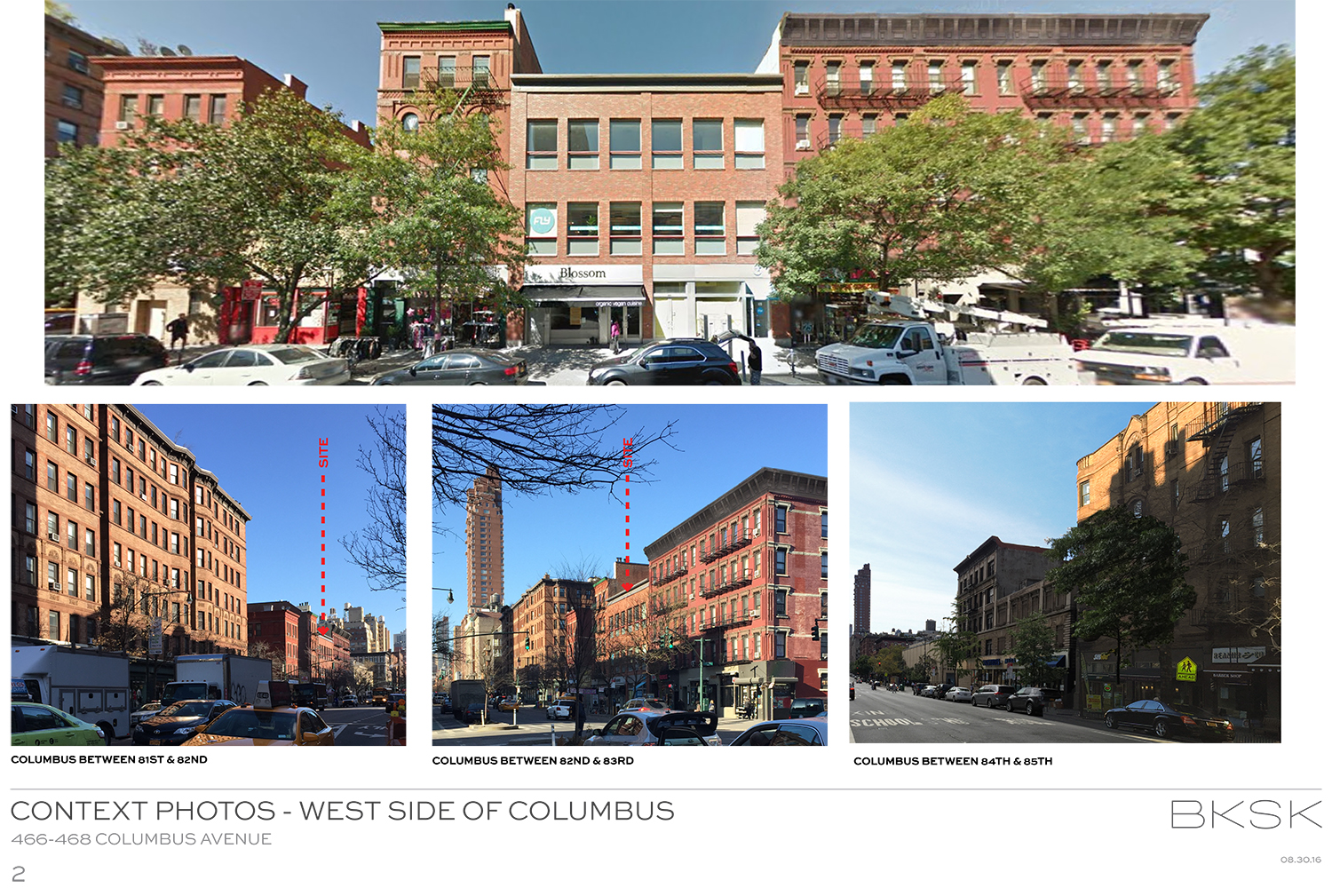
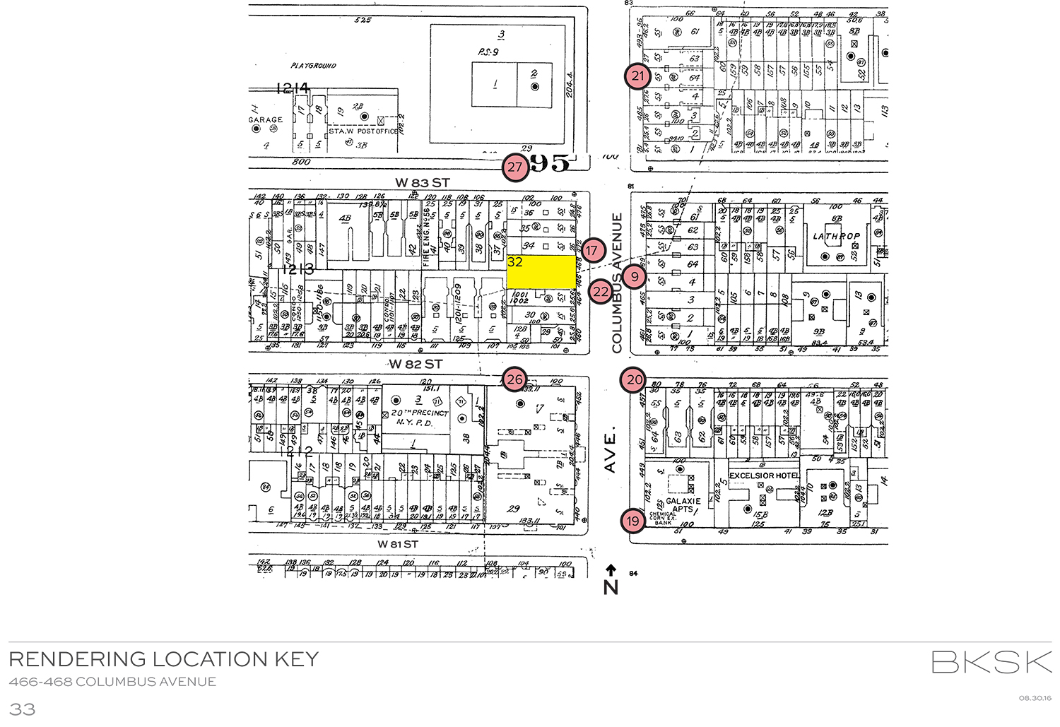
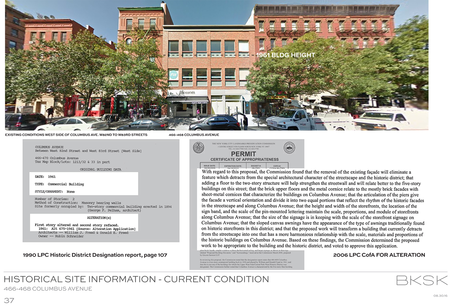
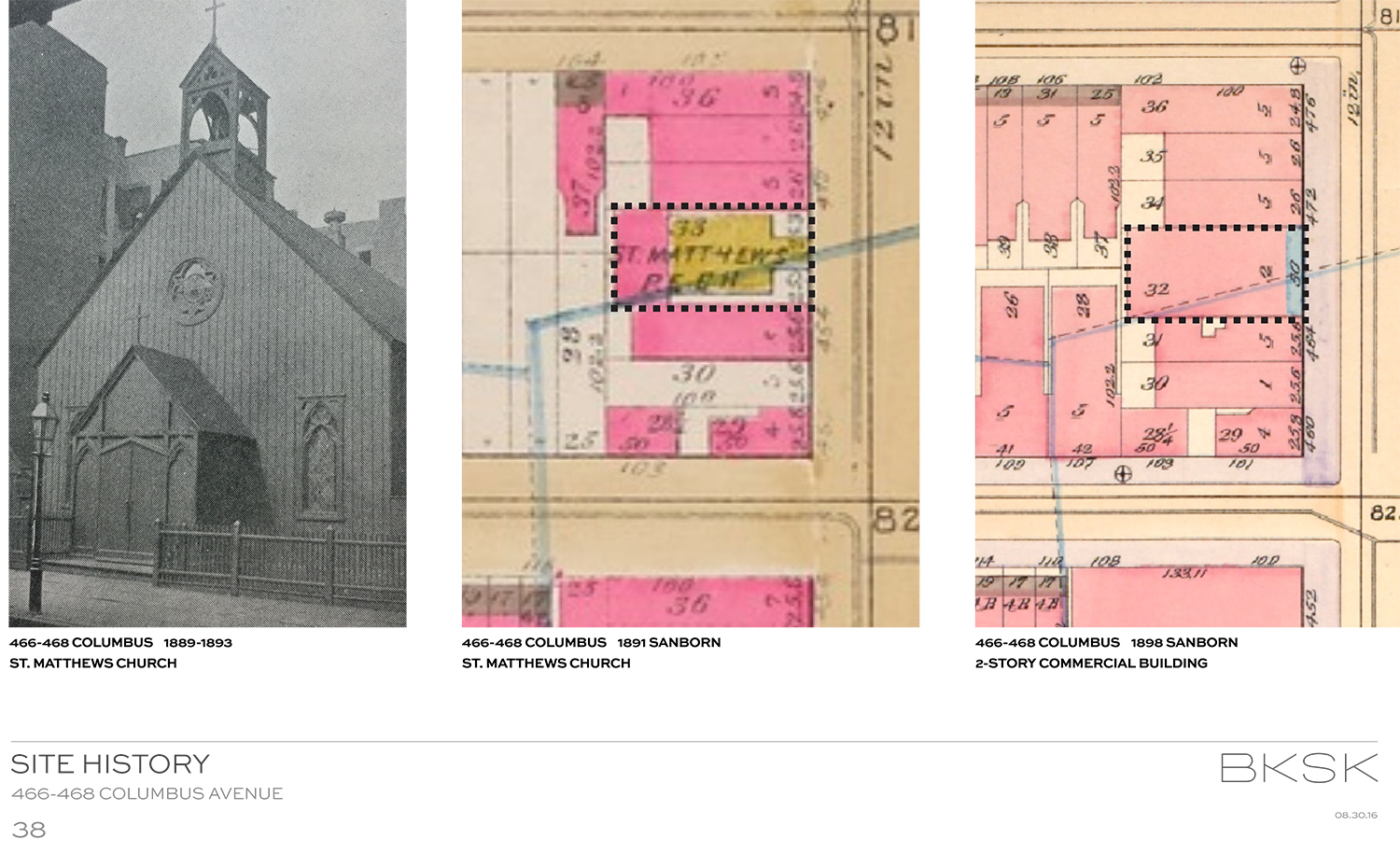
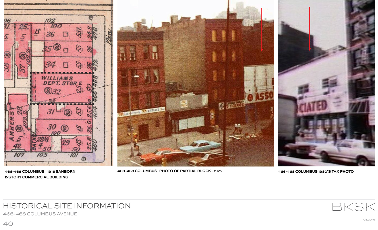
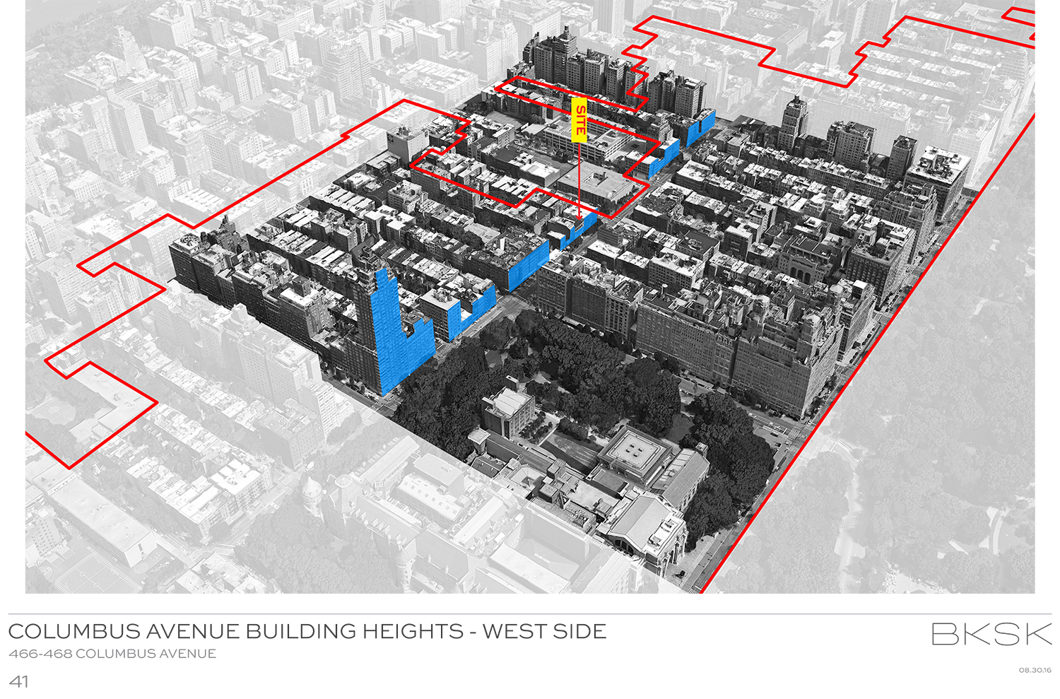
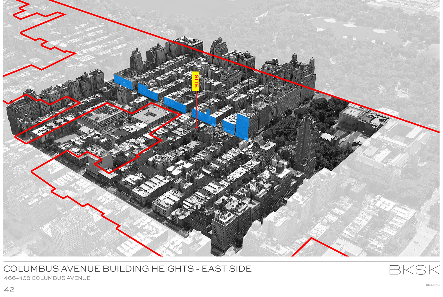
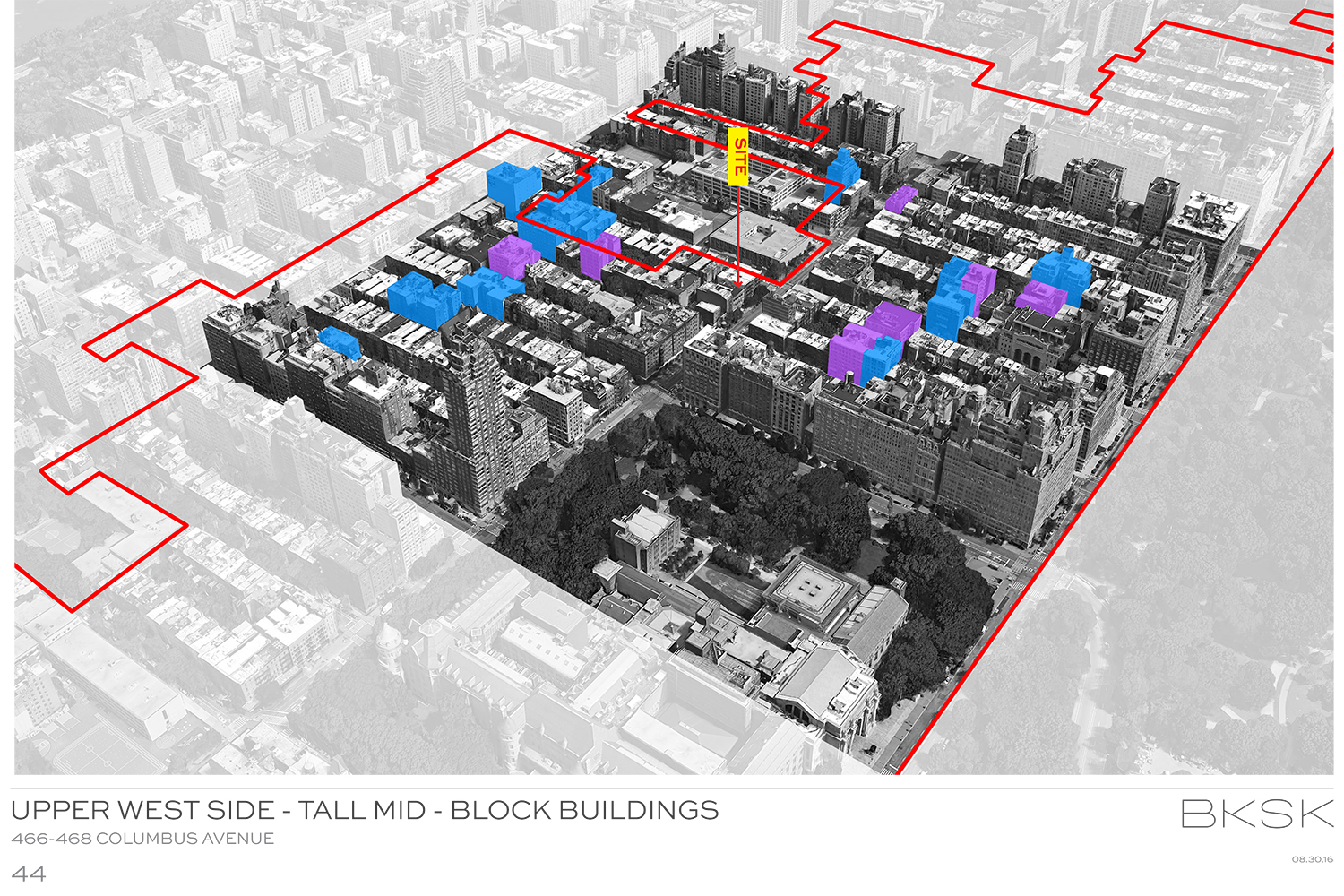
466-468 Columbus Avenue is on the west side of the street, between West 82nd And West 83rd Street, in the Upper West Side/Central Park West Historic District. The site was, from 1889 to 1893, occupied by St. Matthew’s Church. By 1898, a two-story commercial structure had been built. It was home to the Williams department store and an Associated Supermarket. The district was designated in 1990, and, in 2006, a third story was added. Recently, tenants included a vegan restaurant called Blossom and the Flywheel spinning chain.
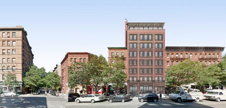
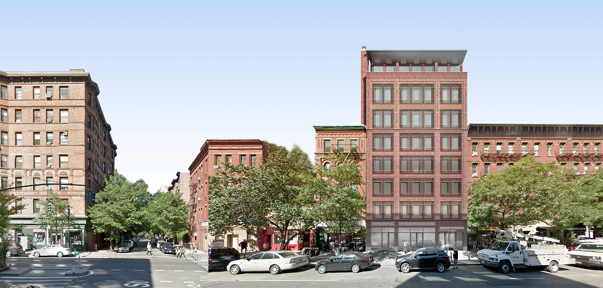
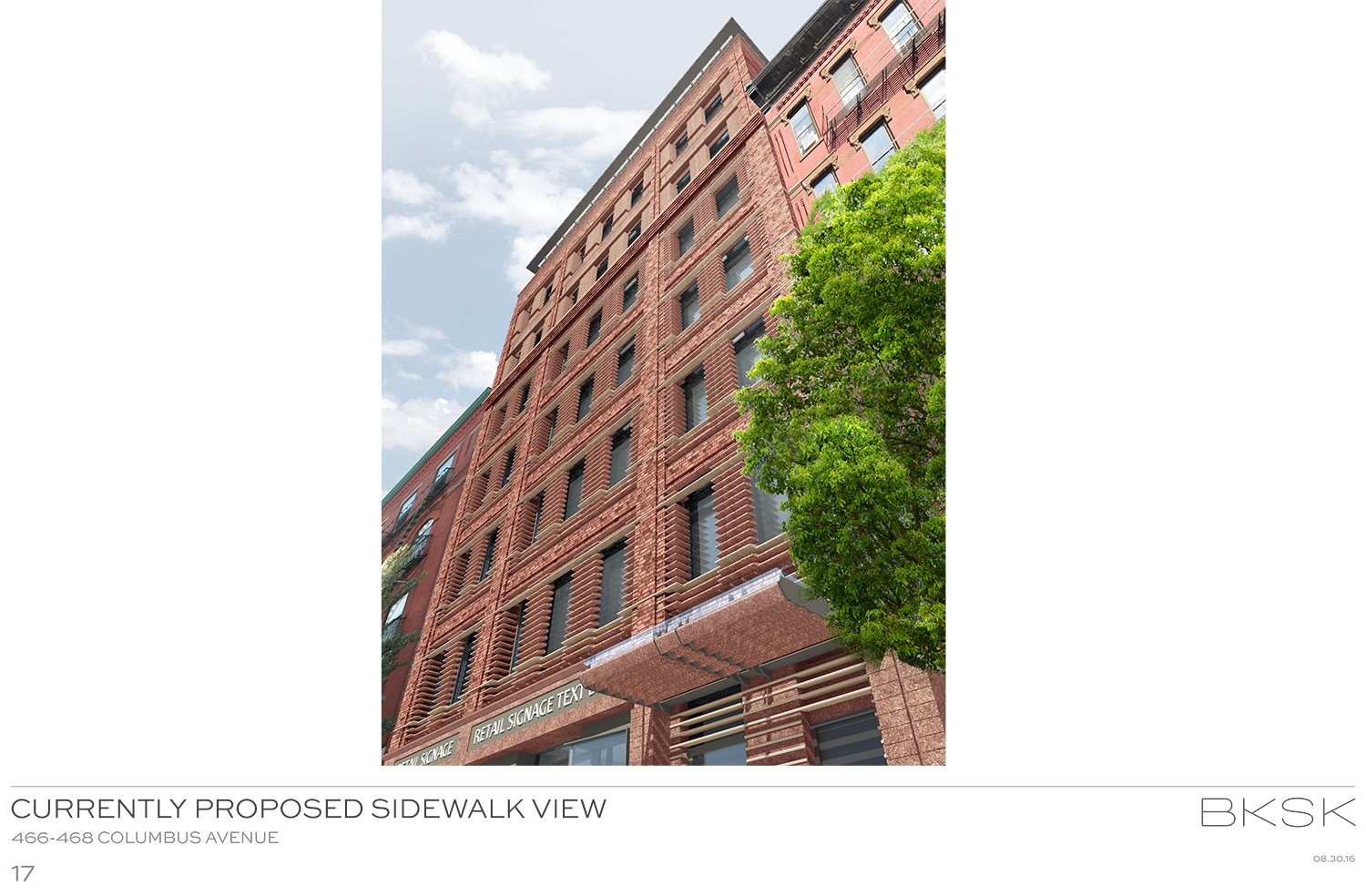
In its place will rise a building developed by the Roe Corporation. Designed by BKSK Architects, it will rise eight stories and house both residential units and ground floor retail.
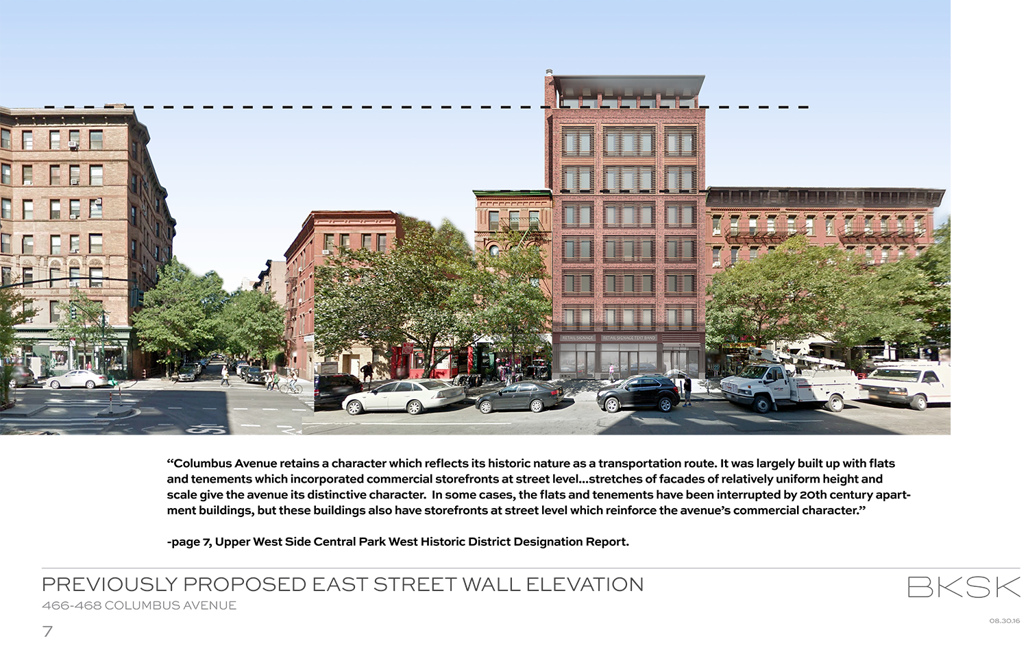
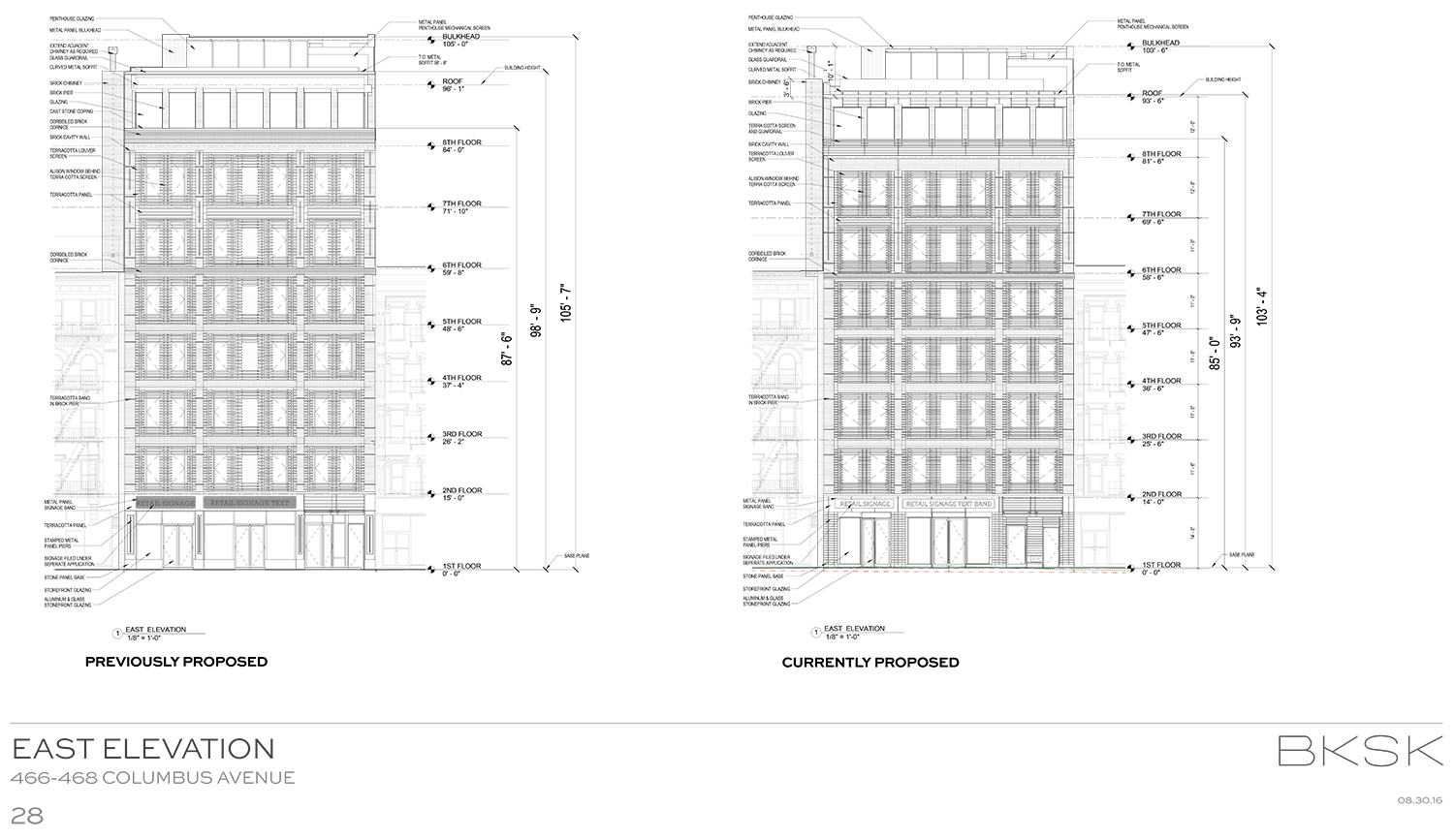
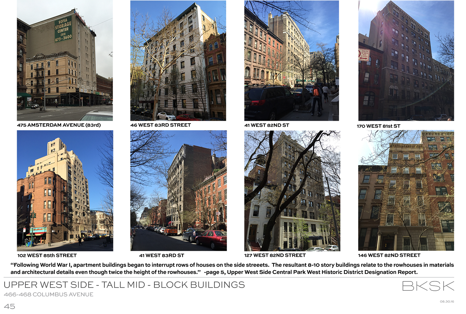
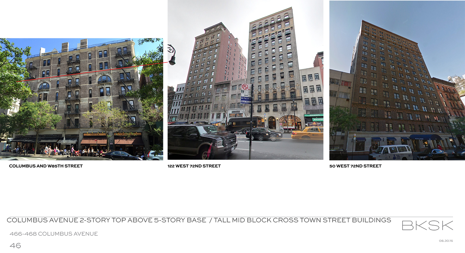
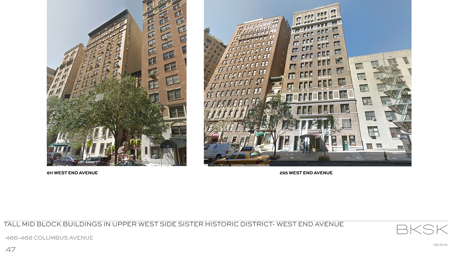
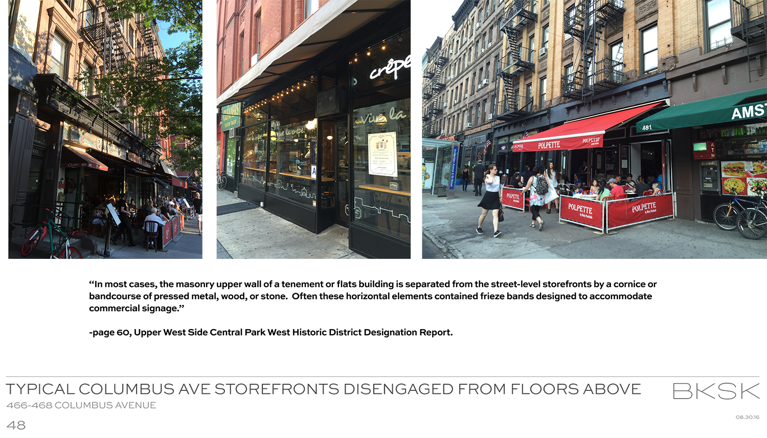
When the proposal was first presented in August, there were a couple of very big sticking points with the commissioners and the public – chiefly height and the treatment of the storefronts. With BKSK’s Harry Kendall and Todd Poisson having made modifications to the design, it can now go forward.
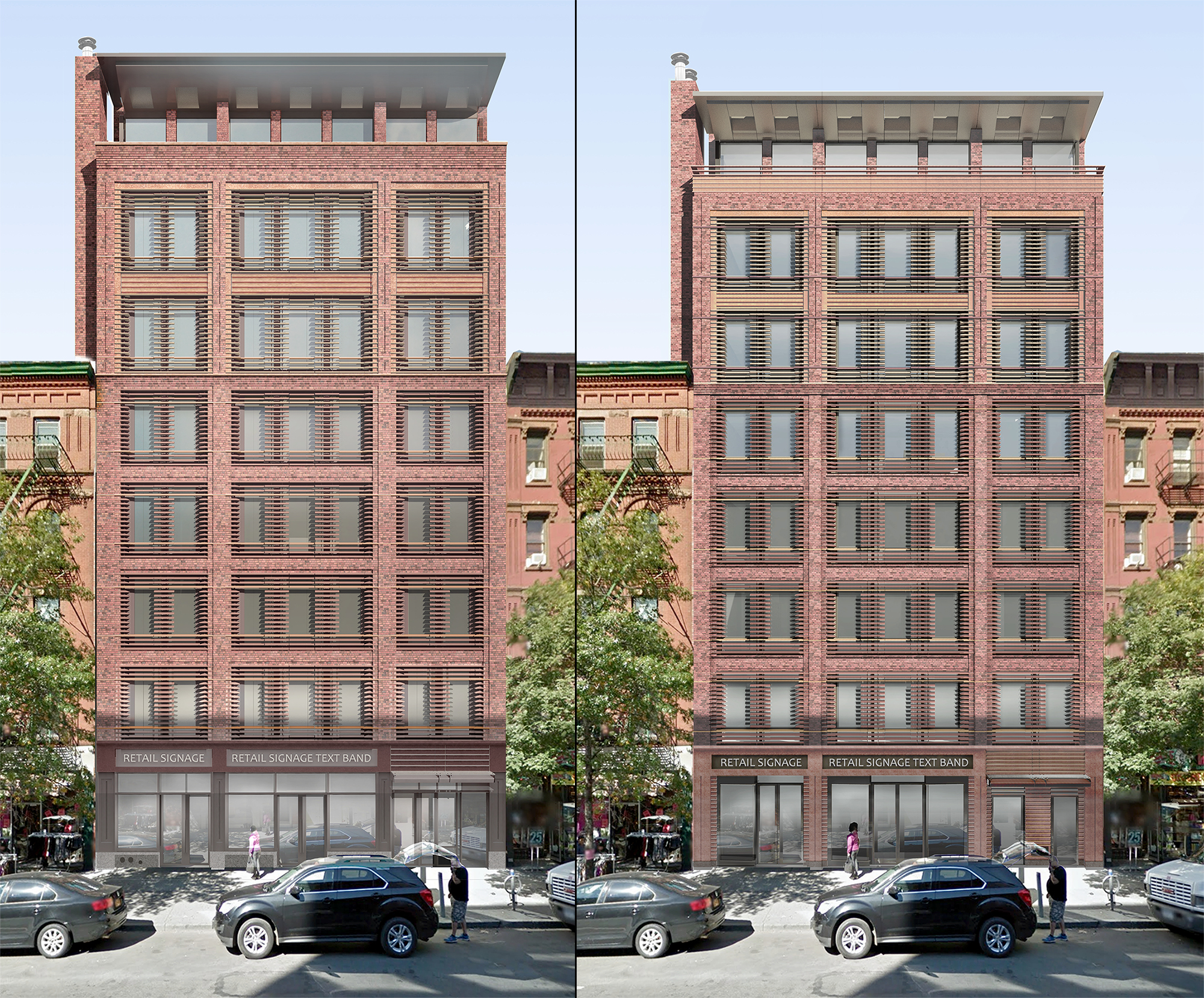
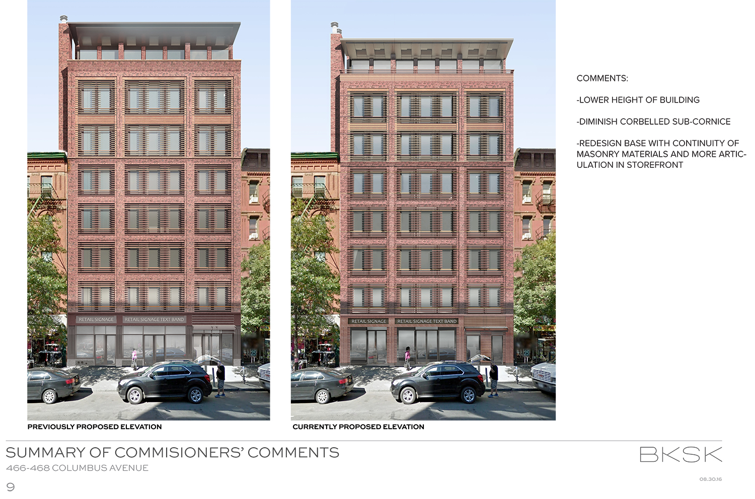
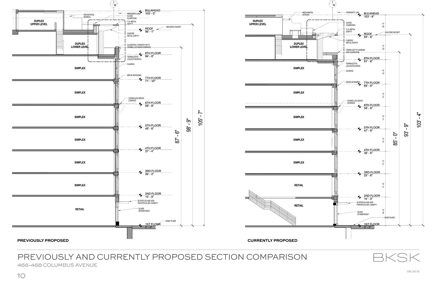
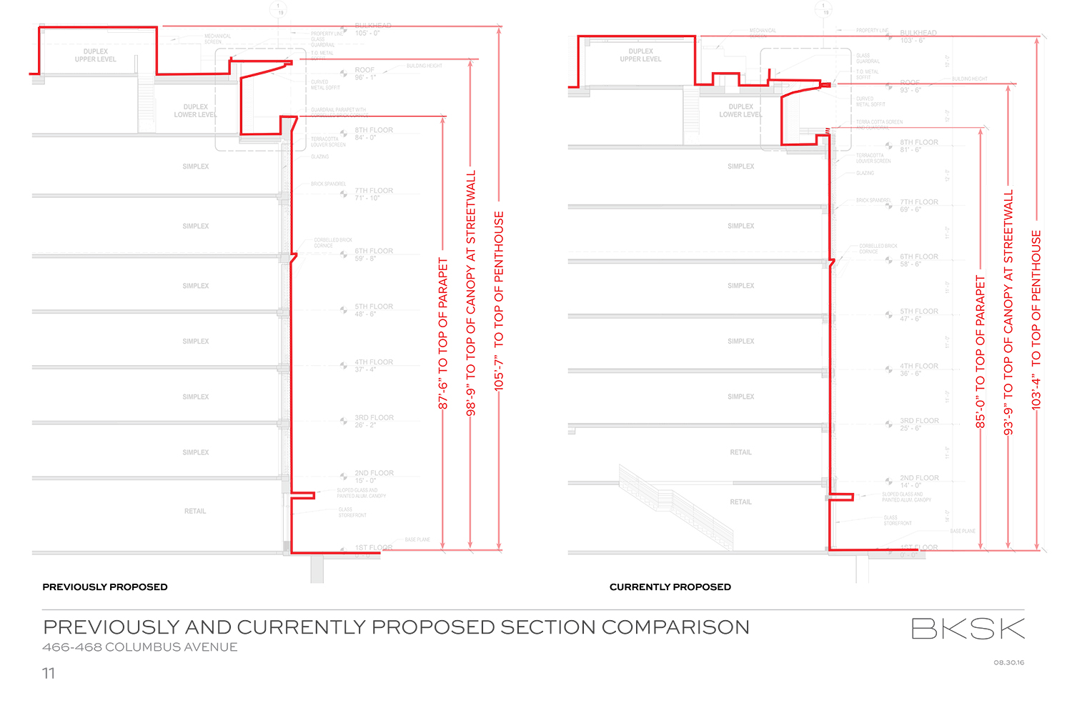
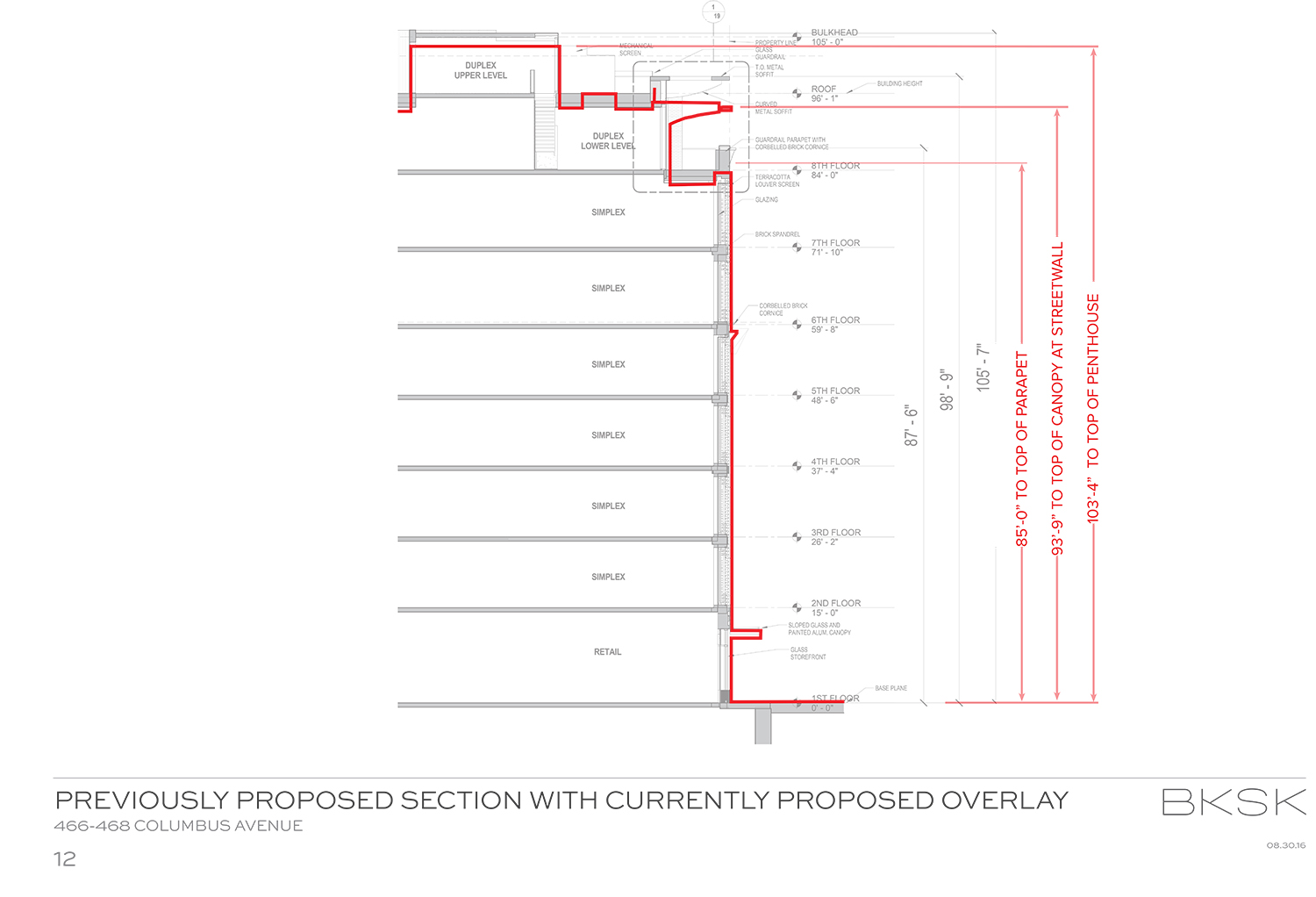
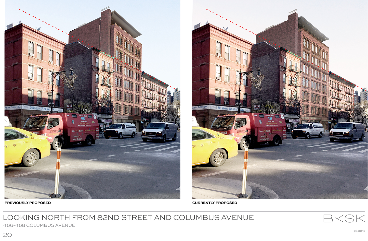
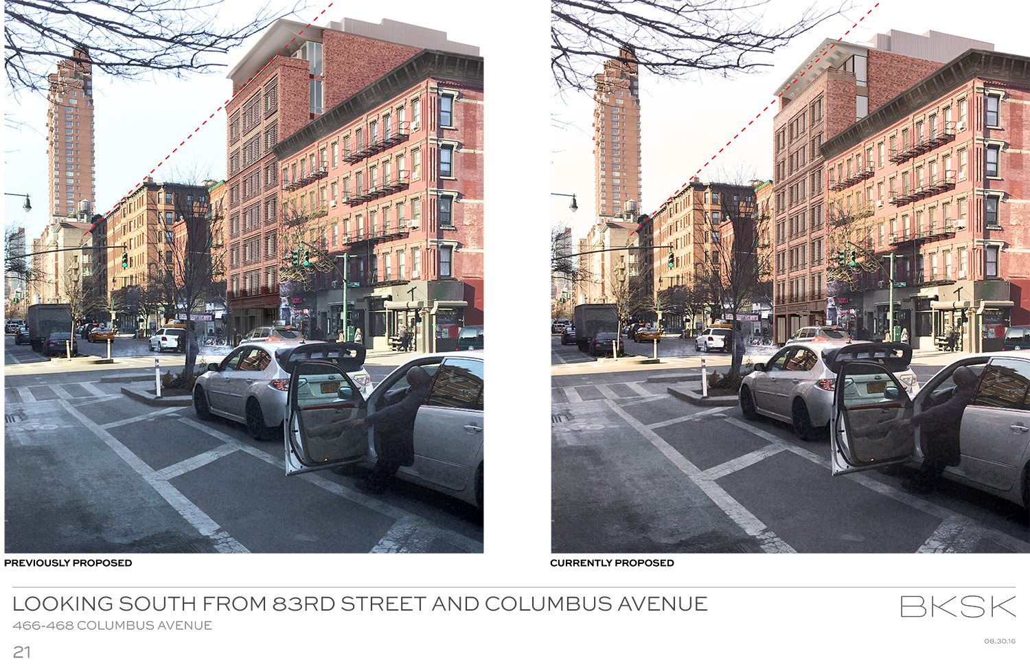
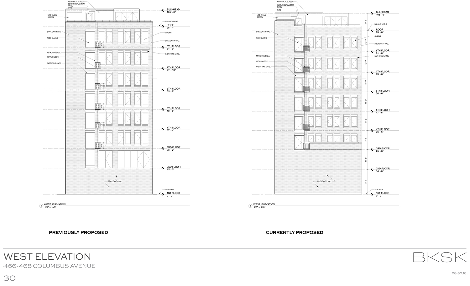
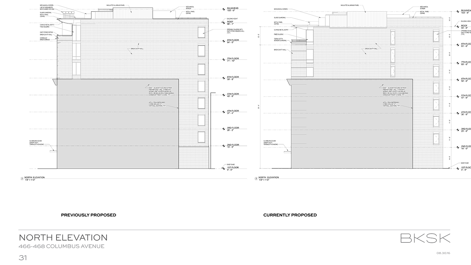
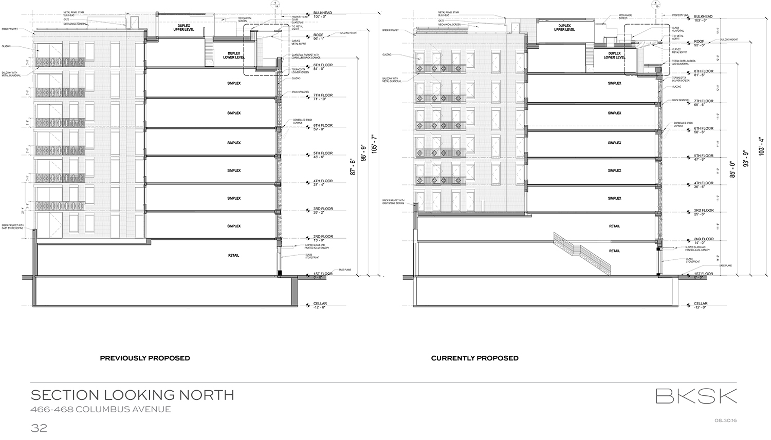
The building’s overall height has been reduced by two feet, three inches from 105 feet, seven inches to 103 feet, four inches. However, the height to the overhang at the penthouse terrace has actually been reduced by a full five feet. This has been achieved by reducing the upper floor heights.
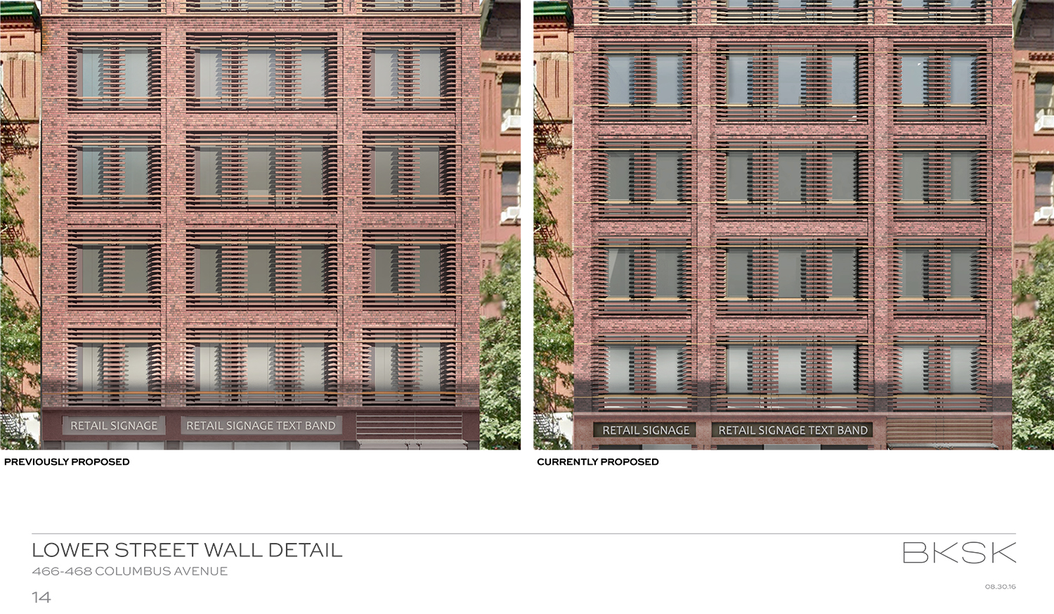
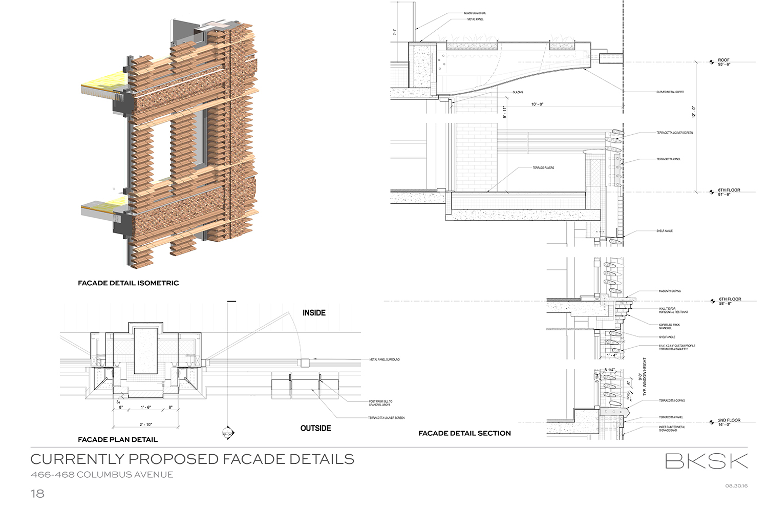
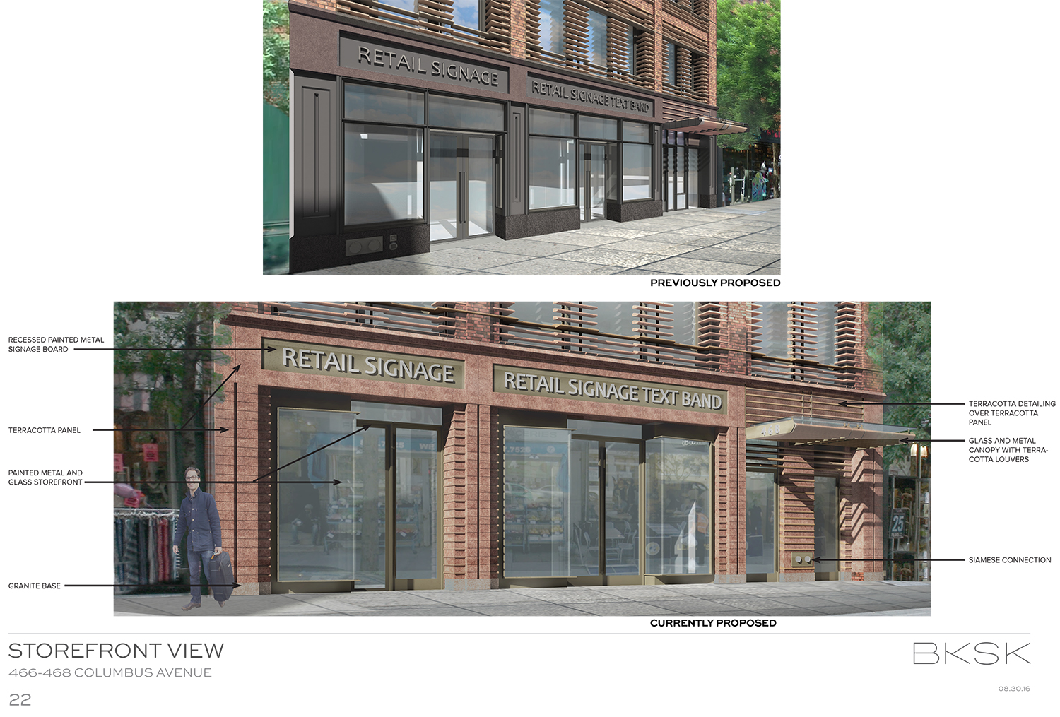
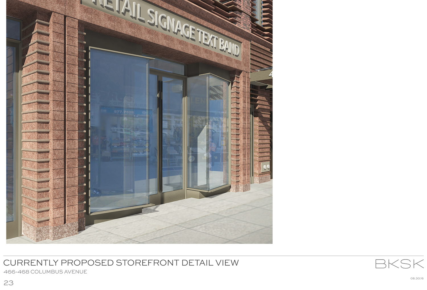
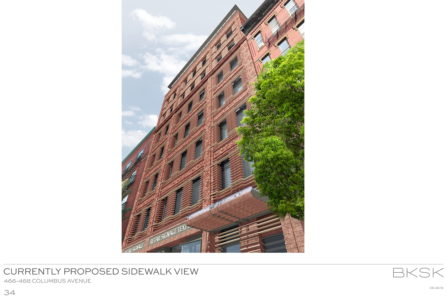
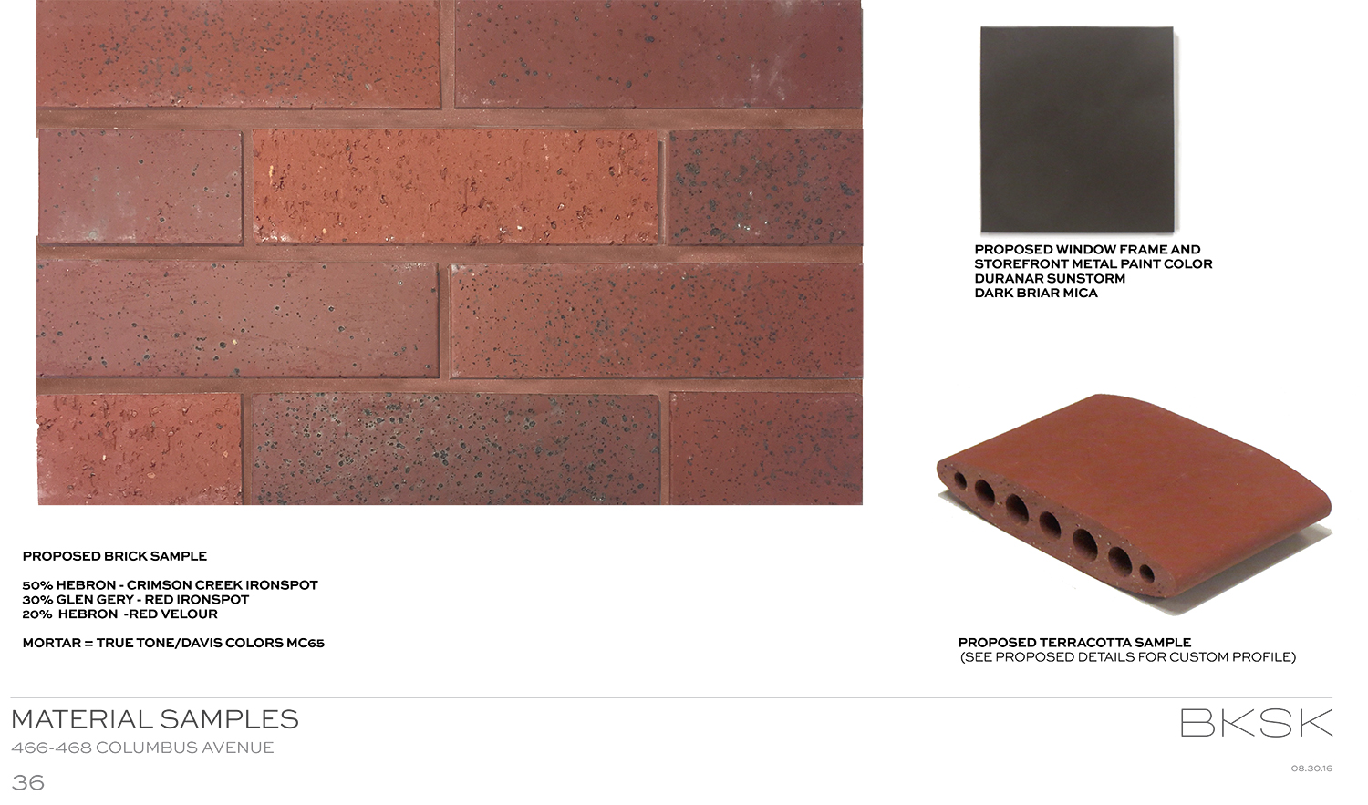
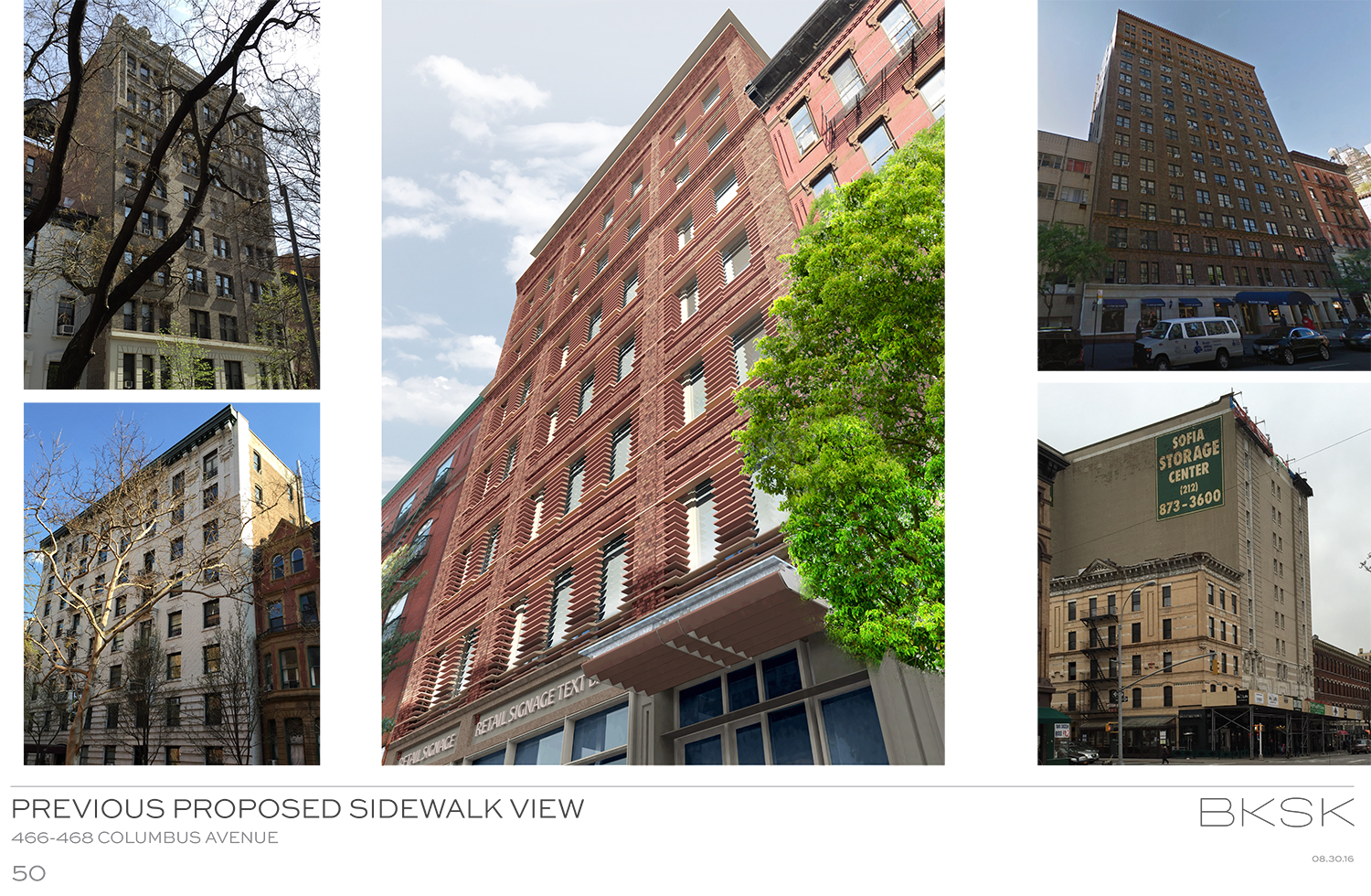
As for the storefronts, one of the criticisms in August was that the masonry did not extend down to the street level. Originally, they were to be treated in metal, glass, and granite. Now, they will be terra cotta. Also, the center bay will feature angled windows.
Moving back up the building, the subcornice has also been diminished and had corbelling added. This makes it look less like there are two cornices competing. Those would be the overhang and the subcornice.
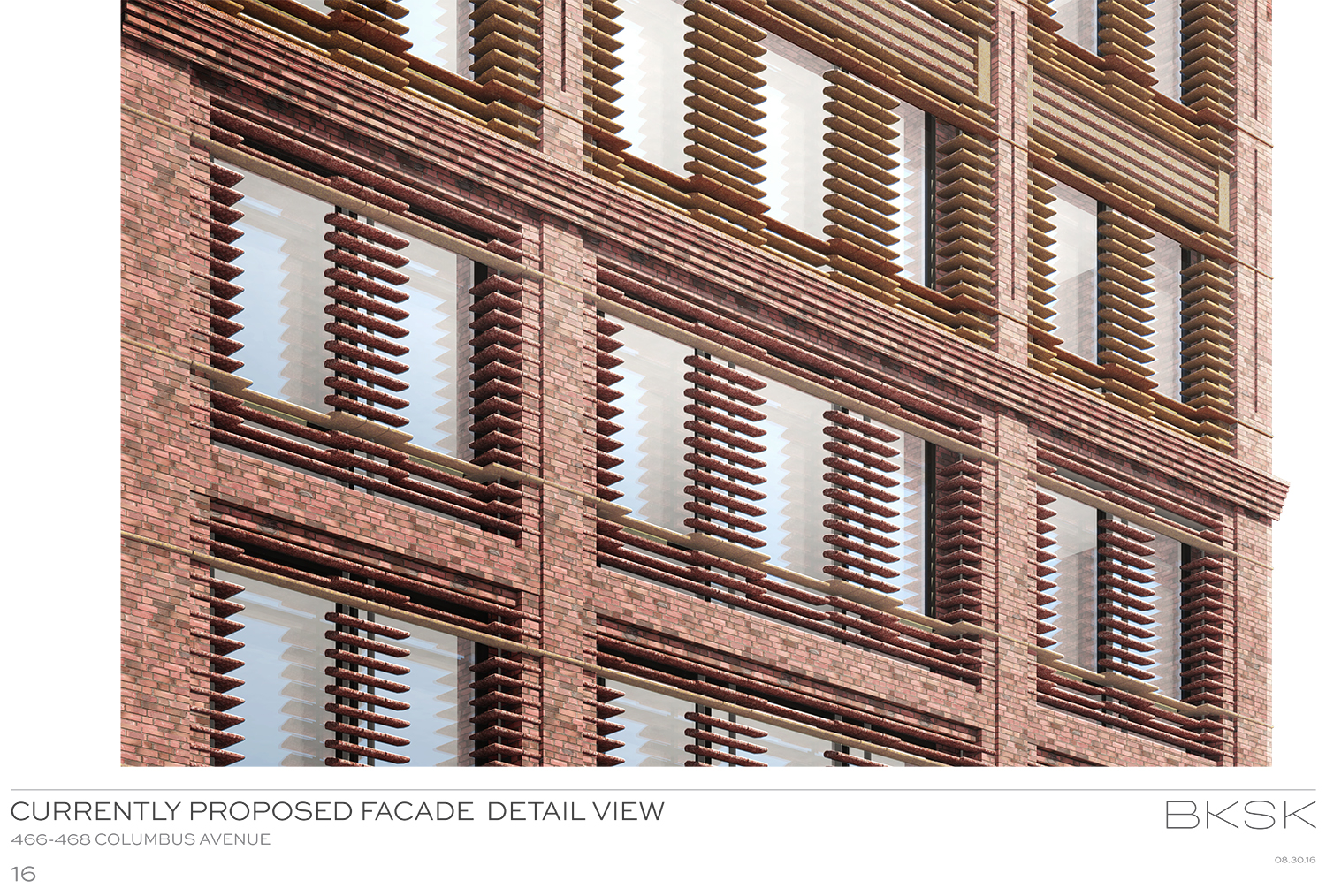
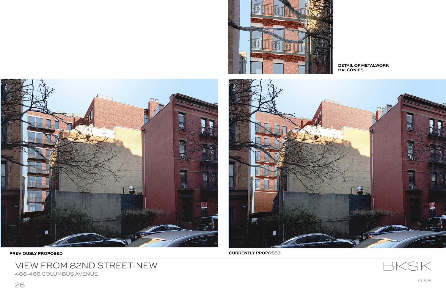
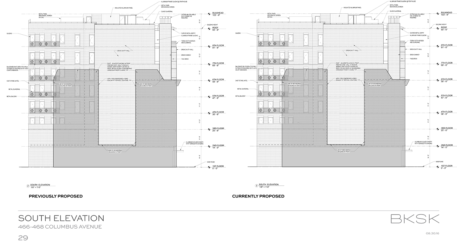
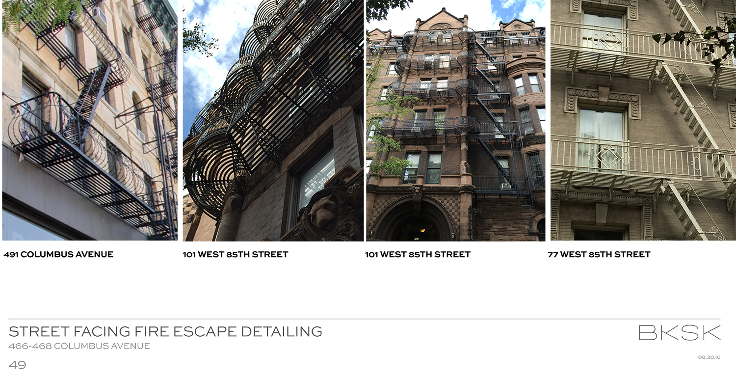
The L-shaped building will still have balconies (which face south), but they been modified. Instead of one large opening with a sliding glass door, there will be two punched openings. Additionally, only five floors have those balconies, whereas there were previously six floors with balconies. The second floor will also not even have the punched openings.
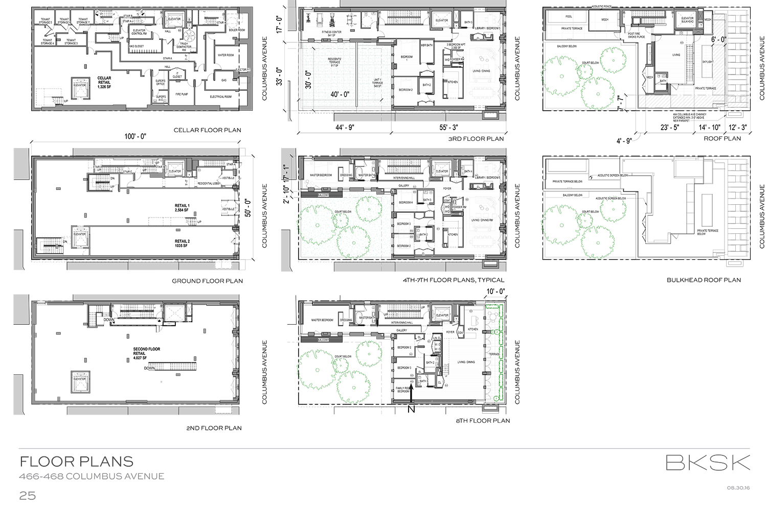
The program could end up being the same – ground floor retail with residential units above, but the developer is now considering making both of the first two floors retail.
LPC Chair Meenakshi Srinivasan said the applicant had moved in the right direction, though there was room for more tweaking and the design was still “a little strained.” She suggested possibly reducing floor heights even more.
Commissioner Adi Shamir-Baron said she was fine with the height. She said the baguettes proposed throughout most of the building will be wild, perhaps too much, but she was still excited.
“I buy it,” said Commissioner Michael Goldblum. “The more frenzy, the better.”
“A glass box this is not,” said Commissioner Frederick Bland, who noted that many people are currently railing against the proliferation of glassy buildings. He did say it could come down another foot or two, but it wasn’t necessary. “[It] fits in very nicely,” he added. “A really exciting building.”
In the end, the commissioners approved the revised proposal, without modifications.
View the full presentation slides here:
Subscribe to YIMBY’s daily e-mail
Follow YIMBYgram for real-time photo updates
Like YIMBY on Facebook
Follow YIMBY’s Twitter for the latest in YIMBYnews



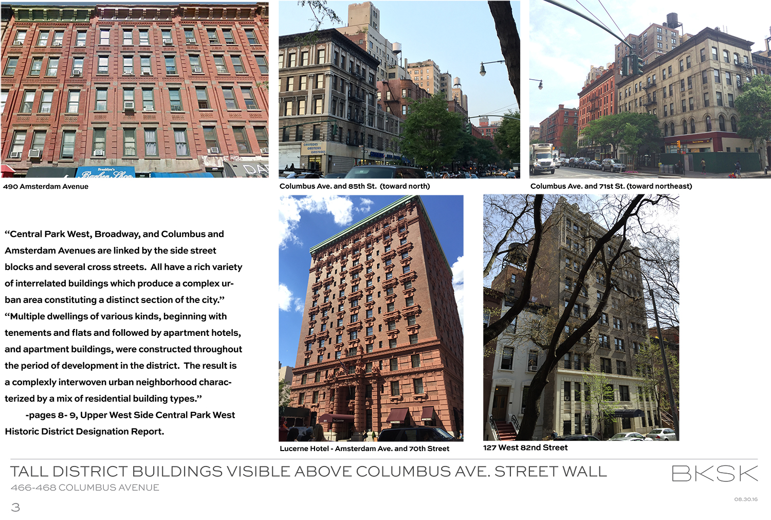
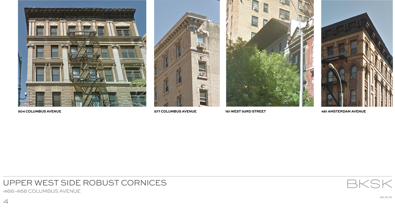
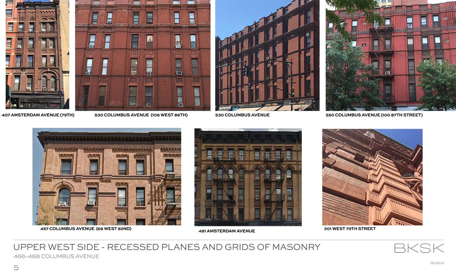
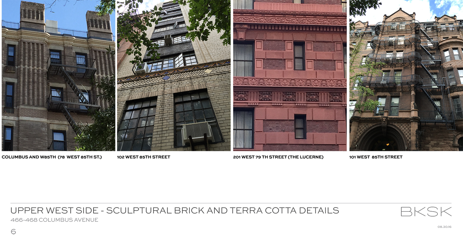








Currently proposed higher level on the top, much more than facade is the most interest point.
Interesting detailing on the front. But each of those “slats” will provide a perfect roosting/nesting platform for our avian friends. Not a wise design choice IMO.
@Carol
Thought the same thing. Beautiful but impractical.
Actually, neither beautiful nor practical. The plethora of projecting ‘brick slats’ illustrates just how deeply in the thrall of off-point formalism (“prairie house” meets “look Ma! No hands!”) those who produced this design are. The building will indeed become “pigeon central”, perhaps meriting being renamed The Rookery.