Construction is wrapping up at the 63-story residential tower at 19 Dutch Street, formerly known as 118 Fulton Street, in the Financial District. The last time YIMBY covered the structure, it had just topped-out. Now, work is nearly complete, with the façade almost entirely installed. For now, the exterior hoist remains up, and installation of interiors is ongoing. Carmel Partners is responsible for the development.
The 725-foot tall structure yields nearly 600,000 square feet of space, including 8,100 square feet of retail stretching from the cellar to the second floor. There will be 483 rental units, and residents will have access to a 24-hour attended lobby, fitness center, lounge, children’s playroom, and a sky lounge, with access to an outdoor terrace on the top floor.
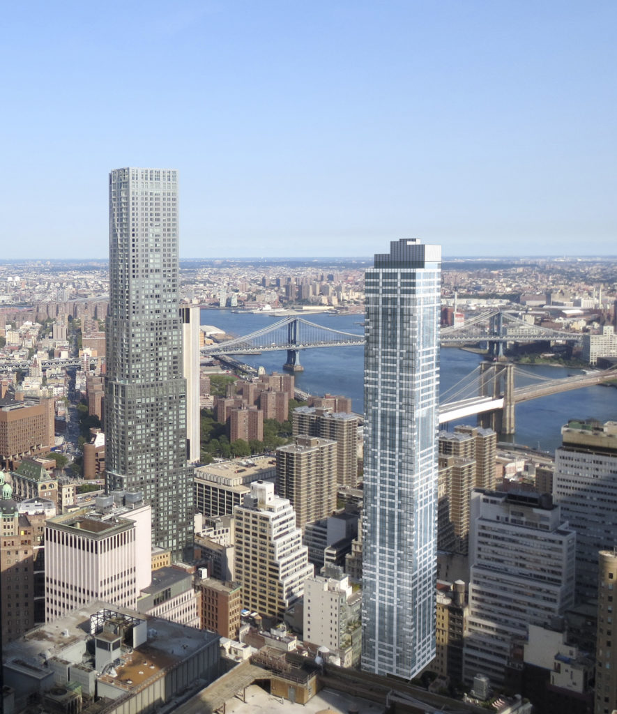
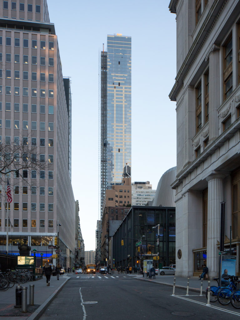
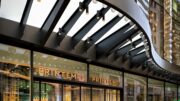
SLCE Architects is the architect of record, with exteriors by GKV. The glass-clad tower incorporates geometric elements to break up the monotony of design. The white lines illuminate in direct sunlight, and disappear in the shade, effectively becoming a different building depending on the weather. The photograph below was captured during yesterday’s hazy sunset, which explains the slight orange glow.
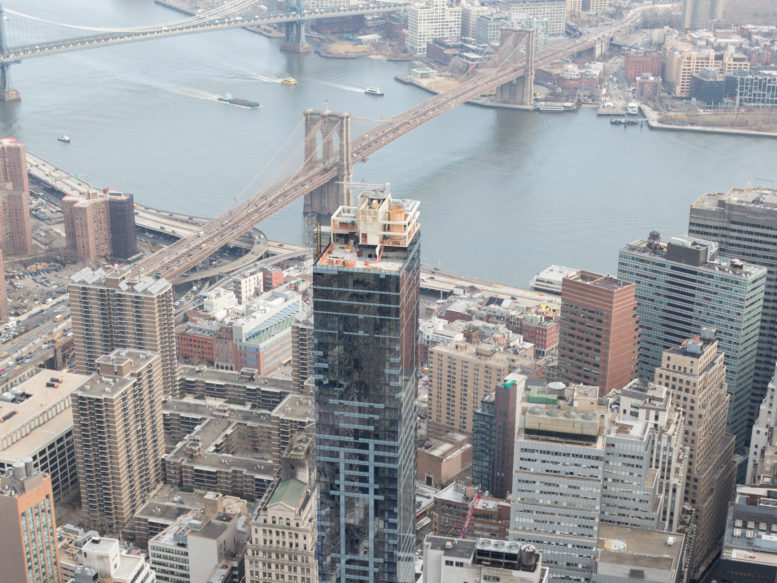
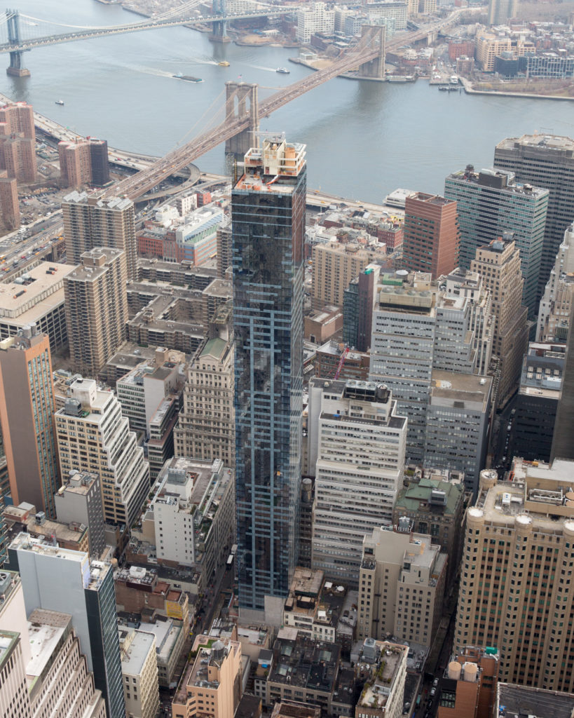
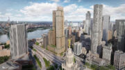
Our other photograph was captured from the rooftop of 3 World Trade Center (during a site-tour we will cover early next week). Despite being over 700 feet tall, 19 Dutch does not protrude beyond the existing skyline. It does benefit from being further north than most downtown skyscrapers, giving it comprehensive views of Midtown Manhattan, Brooklyn, and the East River.
Leasing is expected to launch this spring. Details about pricing are not yet available.
Subscribe to YIMBY’s daily e-mail
Follow YIMBYgram for real-time photo updates
Like YIMBY on Facebook
Follow YIMBY’s Twitter for the latest in YIMBYnews



Please pardon me for using your space: How about thick underline on the tower?
“geometric elements to break up the monotony of the design”…..says it all.
why do we settle for monotony? (lack of variety and interest; tedious repetition and routine)
don’t the developers and the architects of any building, let alone one of this size have a responsibility to enhance our visual environment…..what would lower Manhattan have been with a series of monotonous boxes….no dreams, no aspirations. SLCK/GVC failed.
Architects do what the developer pays them to do and that is to maximize profit from tax shelter housing. A simple box with imported glass walls at full footprint gets back the most money. That’s why we see so much of it in Manhattan. Brooklyn seems to be trying harder.
And yes, this testament to our current culture is a terrible design failure.
Some typos in the above. I don’t think the writer intended for the word ingratiating to be used. Was the intention perhaps to say “. .incorporating views of Midtown. .” or “. .integrating it with views. .” Also, in the annotation for the third image down, Dutch is spelled Dtuch
Thank you, updated!
Clive: Great that you caught typos…too bad you could not red-line the drawings before the building went into the ground!
My general take on life is that if I don’t have the power to personally change something, then I don’t worry about it.