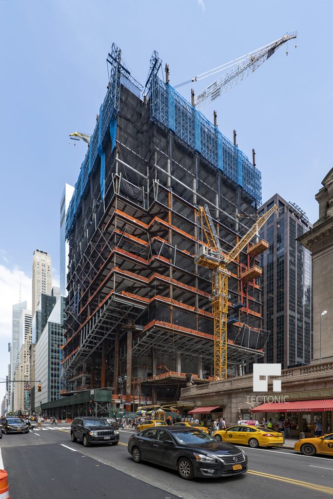
Right across from the iconic Grand Central terminal in Midtown, construction is moving along for the commercial supertall One Vanderbilt. Our last update in March showed that the building had reached two floors above the distinctive retail podium. We can report that the structure has more than doubled in height over the past three months, now standing 17 floors above street level. The building will eventually top off 1,401 feet above street level, and SL Green is developing.
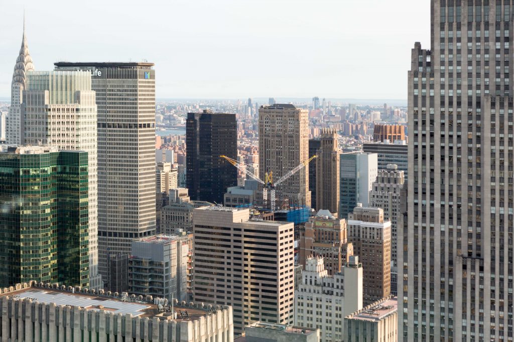
Cranes and top of construction at One Vanderbilt visible from 53 West 53rd Topping Out Ceremony, image by Andrew Campbell Nelson
The latest photos from Tectonic show that the structure is currently an estimated 380 feet tall, meaning it stands about 80 feet taller than the Statue of Liberty, and is just shy of the height of the Park Row Building, the tallest commercial building in Manhattan from 1899-1908. Over 1,000 feet remain before topping off.
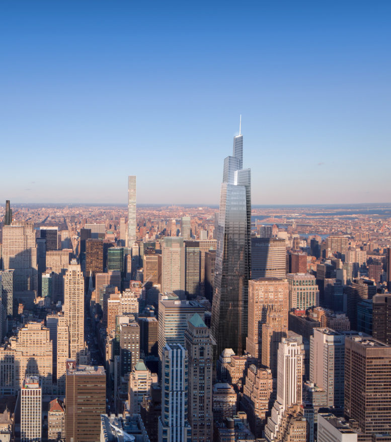
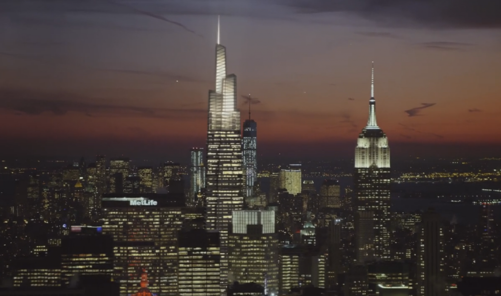
The 58-story building will add 1.6 million square feet to the area. It will open up as the fourth-tallest building in the city, overshadowed only by the Steinway Tower, Central Park Tower, and One World Trade Center.
$220 million from the project will be put toward transit upgrades, which includes a link to the Grand Central terminal and an additional 4,000 square foot waiting area. This comes as part of the MTA’s plan for a multi-billion-dollar connection on the LIRR from Sunnyside Yards to Grand Central.
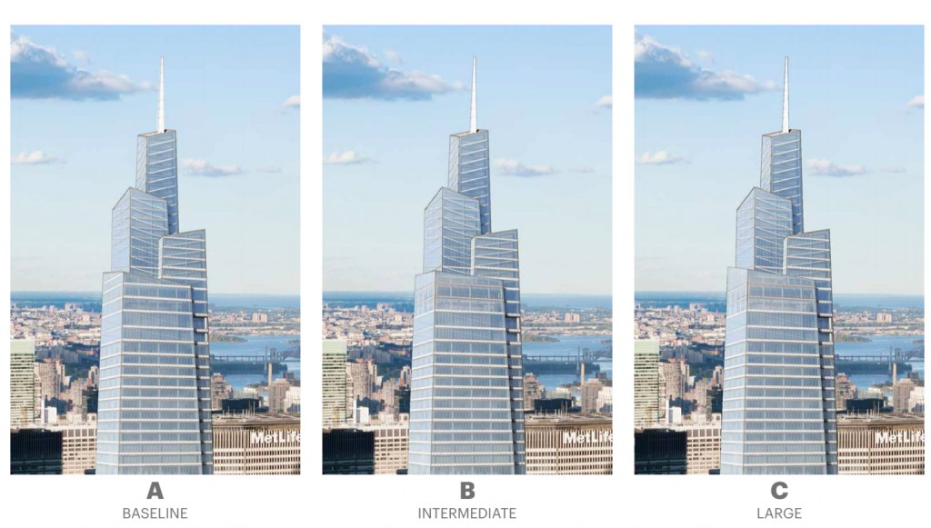
Kohn Pedersen Fox is responsible for the design, making this their second supertall in New York City and fourth in the USA. While One Vanderbilt doesn’t have a dramatic angular observation terrace like 30 Hudson Yards, the three-tiered rooftop should offer a distinctive, 100-foot tall crown.
Since construction passed the 13th floor, the rate of rise has increased from two floors per month to three. At this pace, steel will reach the 34th floor by the end of 2018, and the 58th floor will be reached by August 2019.
Façade installation is expected to start this July. Completion is expected by 2021.
Subscribe to YIMBY’s daily e-mail
![]()
Follow YIMBYgram for real-time photo updates
Like YIMBY on Facebook
Follow YIMBY’s Twitter for the latest in YIMBYnews




Please pardon me for using your space: New fame for future progress. (So exciting, looking again so exciting).
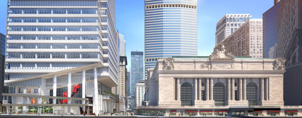
Honestly, the all-important base facing 42nd street looks like it was designed by an inebriated third-rate architect. This street-level base has no sense of proportion, nor balance nor cohesion.
Instead, it’s a skewed hodgepodge jumble of conflicting forms, angles, shapes and voids
It attempt to look “modern” but only winds up looking confused & ridiculous.
All in all it’s an ugly and incongruous neighbor to stately Grand Central Terminal,
and looks all the worse by being in close proximity to such an iconic building,
How do these hideous building schemes ever get past the drawing board?
Perhaps it’s not only the architects who are apparently inebriated and third-rate… 🙂
They would have been much better off if they had simply extended the rhythmic building elements
above the base all the way down to street level – while perhaps expanding the spacing between the lowest levels to allow for a genuinely more airy feel in this congested part of the city.
Too late now.
Yeah I don’t know why they didn’t simply omit the tilty elements from the 42nd Street side. (The northern 80% of the Vanderbilt side looks fine, just the 42nd side is weird.)
Question:
Isn’t 58 floors a very low number for a building of this height?
What’s the reason?
High floor-to-ceiling heights!
Tell StanChaz that there was no Drawing Board, merely a computer screen, All the suggested remedies have come too late to avoid an unexpectedly strange end product from the architects.