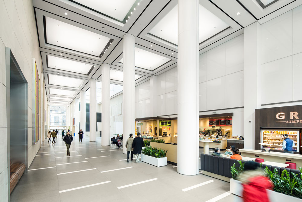
Oxford Properties Group has unveiled a luminous revamp of an interior public plaza within Manhattan’s Olympic Tower. Originally constructed in 1974 by Skidmore, Owings and Merrill (SOM), the plaza was reimagined by MdeAS Architects who oversaw the $30 million overhaul.
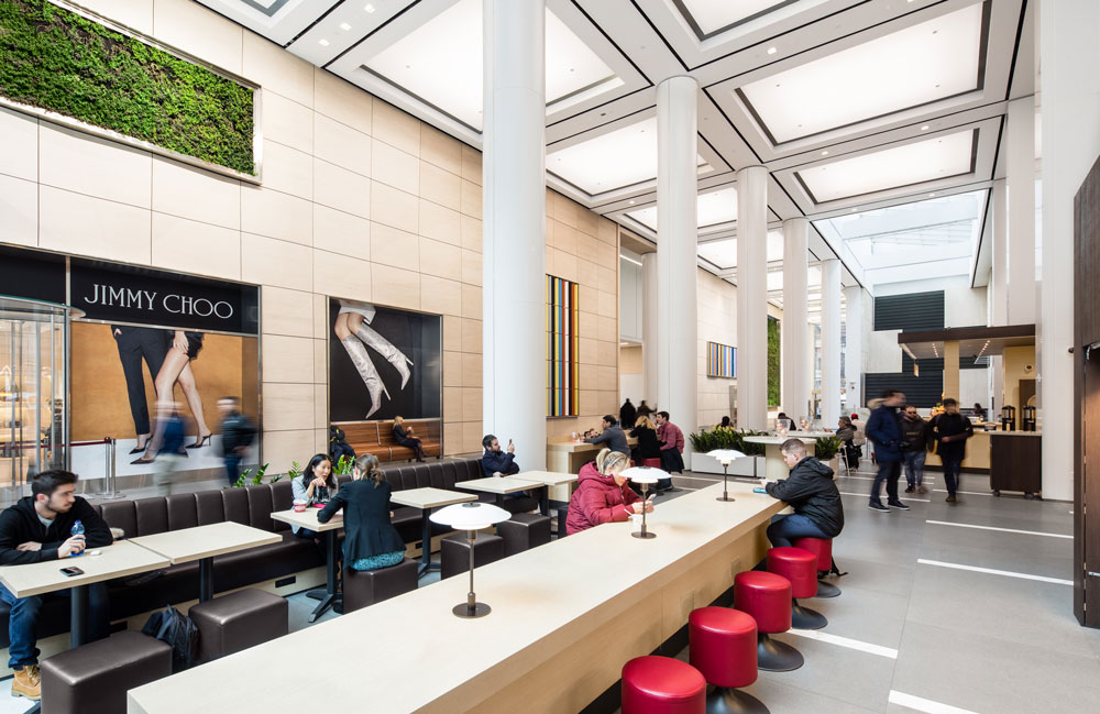
Located at 645 Fifth Avenue, the 51-story Olympic Tower was the first mixed-use property established on the avenue and includes residences, luxury retail, and commercial office area. Today, the refurbished plaza spans 10,500 square feet and includes a new cafe concept from Ignanzio Cipriani, a circadian lighting system that responds and reacts to the time of day, and green wall tapestries.
“Oxford immediately recognized its hidden potential, and has been dedicated to improving the customer experience, culture, and community since acquiring the building in 2015,” said Kevin Egan, Head of New York at Oxford Properties. “This latest investment enabled us to fulfill our vision of Olympic Tower as a premier Midtown office destination.”
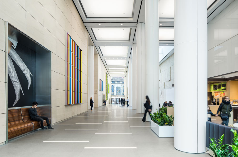
The ground floor space also features a commissioned series of installations by British artist Liam Gillick. Entitled Triangulated Passage, the artwork is comprised of multi-colored, aluminum panels and is meant to create a kinetic energy within the corridor.
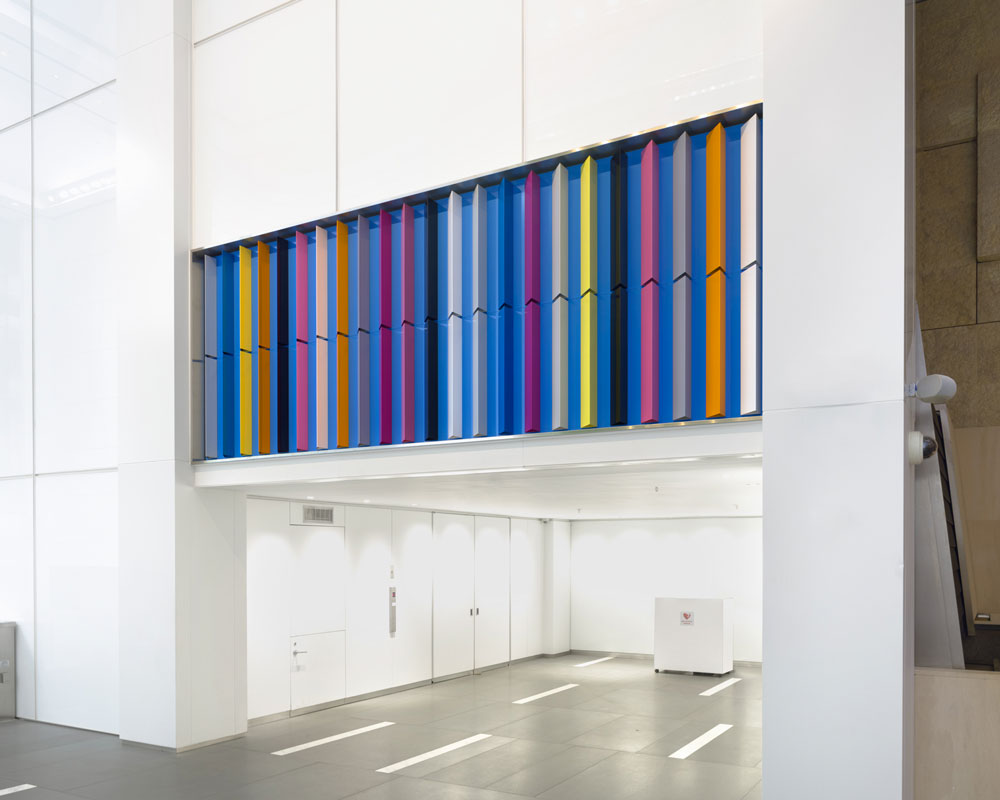
Liam Gillick, Triangulated Passage, 2018. Olympic Tower, New York. Courtesy the artist and Casey Kaplan Gallery, New York (Photo: Lance Brewer)
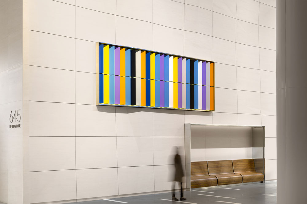
Liam Gillick, Triangulated Passage, 2018. Olympic Tower, New York. Courtesy the artist and Casey Kaplan Gallery, New York (Photo: Lance Brewer)
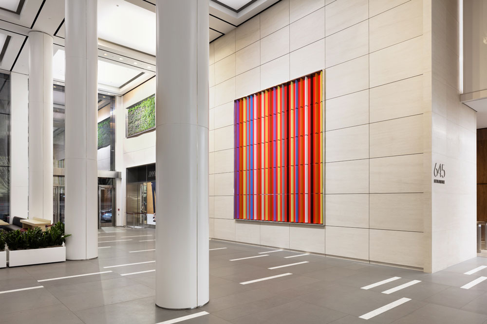
Liam Gillick, Triangulated Passage, 2018. Olympic Tower, New York. Courtesy the artist and Casey Kaplan Gallery, New York (Photo: Lance Brewer)
Subscribe to YIMBY’s daily e-mail
Follow YIMBYgram for real-time photo updates
Like YIMBY on Facebook
Follow YIMBY’s Twitter for the latest in YIMBYnews



Please pardon me for using your space: Live for today not tomorrow, not about design that you showing on details. I’m not allergic on colorful. (Thank you)
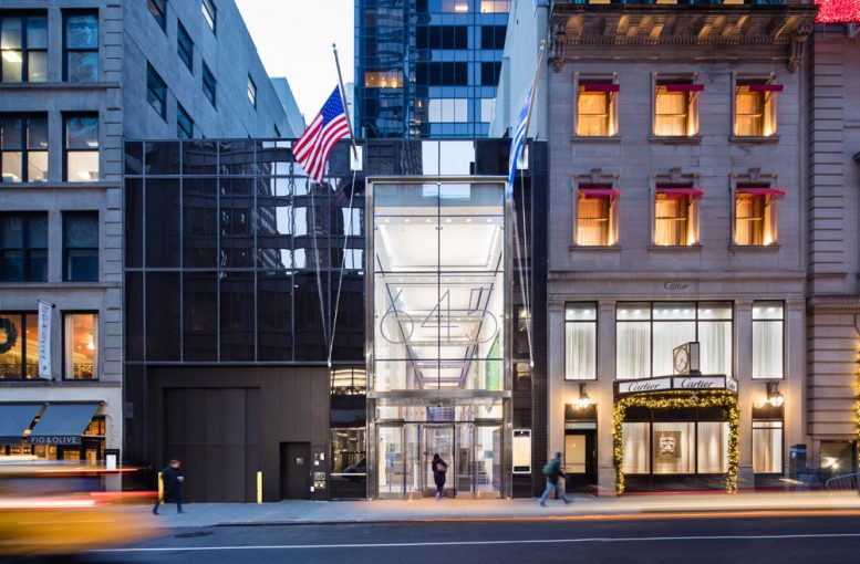
Not a single mention that this entrance is on 52nd street, NOT 5th ave. Confusing.
The writing on this site is typically quite good. However, they should have an editorial policy to list corners or cross streets in every article along with any confusing issues with the lot configuration. This article should include the fact that Olympic Tower is at the northeast corner of 5th Avenue and East 51st Street with a through-block indoor public plaza, the subject of this article, that extends from East 51st to a three-story wing of the building on East 52nd Street. This kind of detail would obviate the need to consult Google Maps for two-thirds of the site’s articles.
Is this off the set of Star Wars? Or was the design team just influenced by the need to encourage people to move through this space quickly and not be moved by the space?
Nevermind – the results speak for themselves.