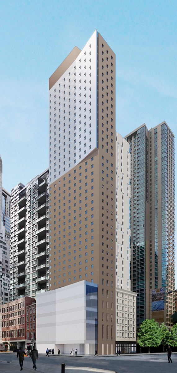
Gene Kaufman’s upcoming Marriott Courtyard and Residence Inn at 215 Pearl Street is steadily getting closer to the finish line. The project is a 396-foot-tall and 39-story hotel in the heart of Lower Manhattan’s Financial District. 320 suites are expected to be created inside the 165,655-square-foot reinforced concrete structure. Rooms will begin on the fifth floor, and terminate on the 37th floor. Nobutaka Ashihara Architects is the architect of record, while Lam Group is the developer of the project. The site is located at the intersection of Pearl Street and Platt Street.
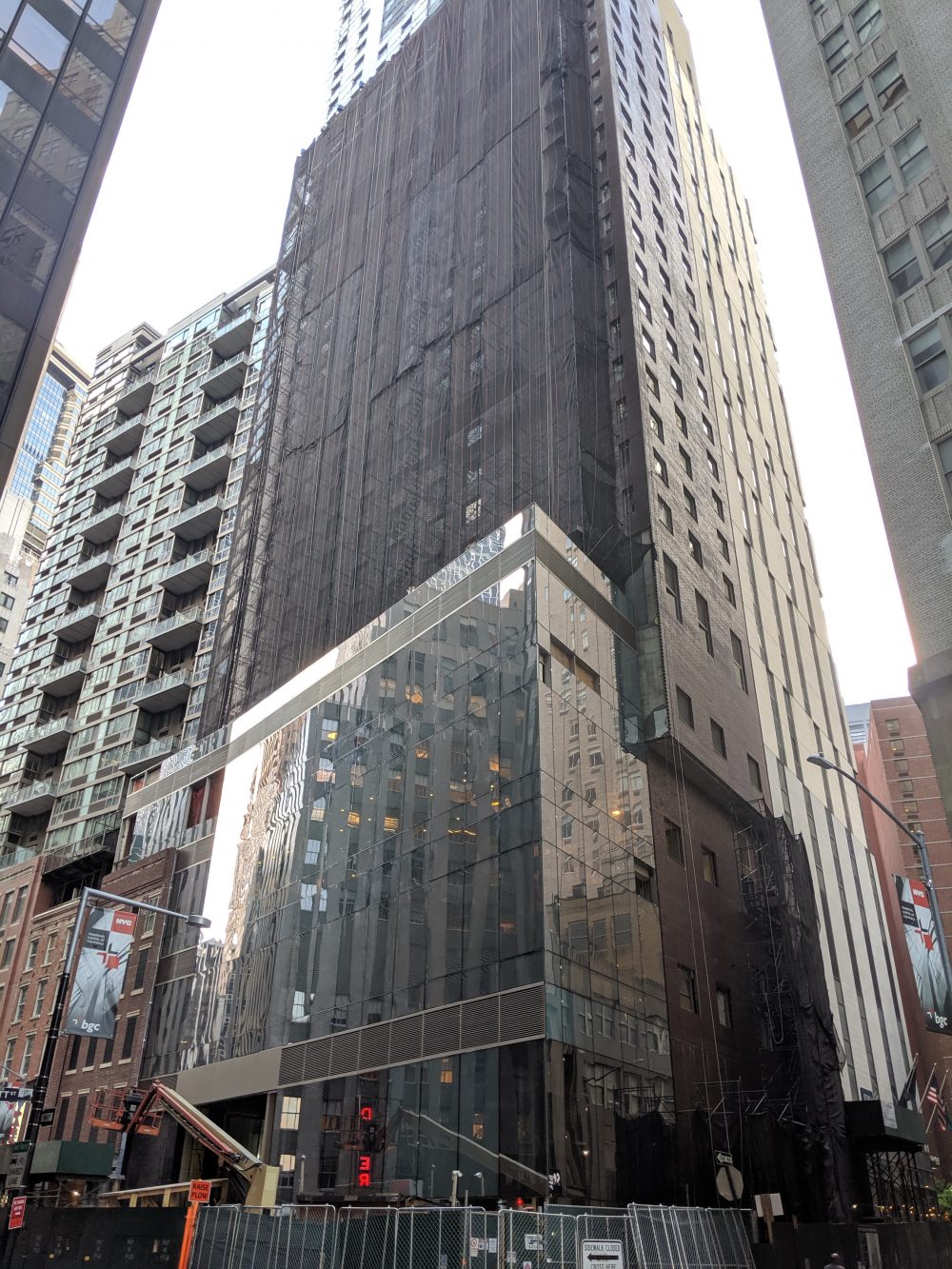
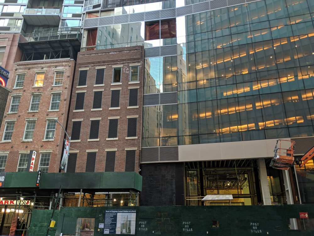
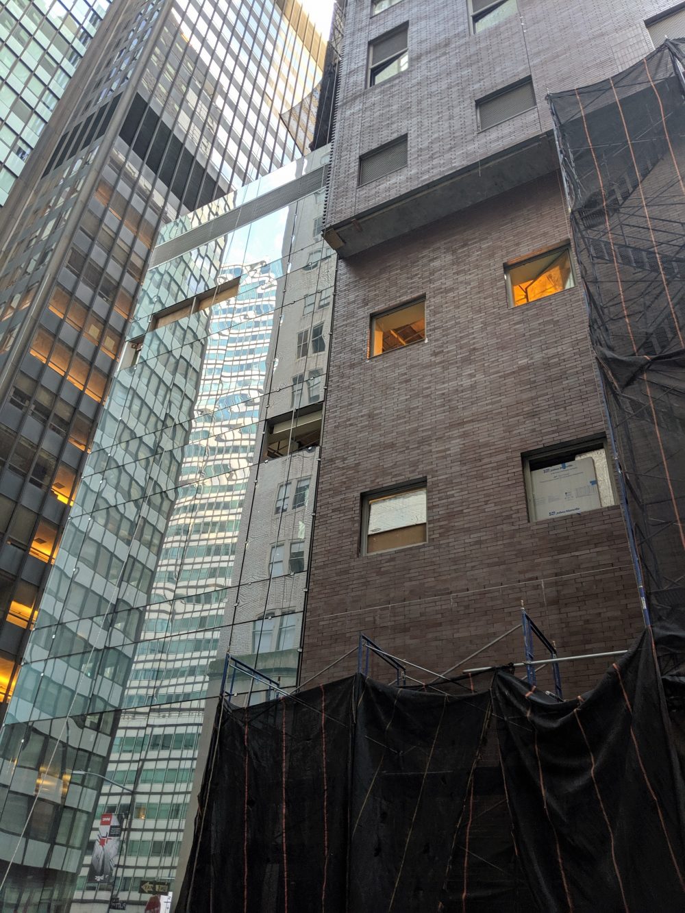
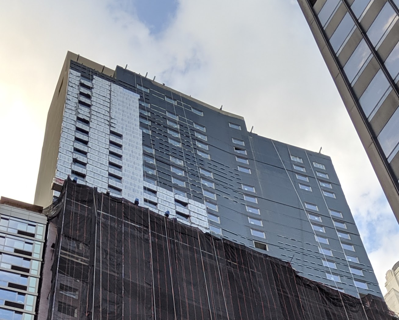
Recent photos from YIMBY user rbrome show parts of the exterior now complete, while some parts also remain under construction.
A tall exterior framework of scaffolding and black netting still shrouds a major portion of the main eastern façade. Meanwhile, the cladding on the upper floors of the building is nearly finished, while floor-to-ceiling glass panels on the first few levels are also mostly installed. Red-colored brick runs up the northern side of the high-rise, and will also cover the portion behind the black netting.
215 Pearl Street will have a general grid of square windows on the main elevation that are scaled and spaced out from each other. This would be a relatively tall tower if placed in another neighborhood, but it will keep a low profile among the neighboring skyscrapers that make up the Financial District’s iconic skyline.
There will be a main lobby, offices, dining rooms, bicycle storage, a fitness center, and a rooftop terrace. The Courtyard will be made up of 200 rooms, while the Residence Inn will have 120 suites.
An official completion date has not been announced yet. The original timetable, which is still posted on the green construction fence, called for the hotel to be finished in the summer of 2017.
Subscribe to YIMBY’s daily e-mail
Follow YIMBYgram for real-time photo updates
Like YIMBY on Facebook
Follow YIMBY’s Twitter for the latest in YIMBYnews





Bright; in the way of new progress on views reported, there are connected with glass and brick so beautiful. Go after Michael Young when you have been showed it about its tower design by day, no need to set a billboard to tell people that’s hotel. To take with construction underway but endlessly to think onto completed structure, so wilfully thought on your comments respectively followed. I hope that I was not jailed for long run, I would like to tell you I fall in love with windows. (Thanks to Michael Young)
What does this word-salad mean?
Thank you, David, I couldn’t have said it better myself. What a mediocre POS.
Kaufman always makes other buildings look so good. At least this should be energy efficient if wall insulation was enforced.
This man’s work is a blight on the Manhattan landscape. One has to make a concerted effort to design buildings so brutally ugly and soulless. I understand value engineering. This is something far worse. It’s an added insult to the people of New York.
Agree. This is another in a long line of Kaufman projects that fail to achieve mediocrity. As my dad (a non-architect) used to say, “so they all knew what it would look like yet they built it anyway?” Blame the developers for choosing a hack: Gene just can’t do any better.
This is brilliant building for Gene Kaufman, is this for location of New Manhattan Jail???
At least it’s compete with “no glass Skyscraper, no mad farting cows” laws by Herr Bill Der Blasio.
This is stupid. And you know it.
I guess that nobody can beat this structure as the most ugliest highrise hotel structure in North America.
Gene Kaufman’s 5 year old son can do better design.
Interesting that the moderator rejected my posts, which were no more critical of this building than any of these other comments. What gives?
They were approved, just awaiting moderation!
This is already one of most densest place in Manhattan, and architect still thinking to put another big FU for surrounding.
At least hotel guests who lost in direction to get to this hotel, when asked for directions, just mention where are ugliest hotel building here, and get it right!!!
Bland and Ugly, creme and beige exteriors, why such colors, why not use white and red, or white and blue, at least colors of our flag, why use creme and beige. Gene Kaufman maybe liked cappuccino too much, btw at least name this beige monster as “cappuccino tower”!!!
The Donald J Trump of architects. He keeps getting work, but has no talent. And is a sleaze. And destroys the character of our city.
With one caveat if I may, I don’t really think that Gene should be arrested and tarred/feathered and thrown on the ash heap of history. That would be going too far.
I think it is fair to say that NYC gets the architecture that it deserves. Whatever criticism, however valid, one might have for 215 Pearl Street, the fact is that the aesthetics of this building are a fair representation of the moral and ethical value system that defines NYC and those who run it and control it.
That is a truly idiotic comment. What about this building embodies the value system of NYC?
I love the design. I think its revolutionary and adds to the character of the neighborhood. A blend of old world and new world in perfect harmony. The rendering doesnt do it justice. I believe the actual is far better.
Not much of a fan of this building, but:
1. Kaufman’s renderings are consistently worse than reality.
2. “Form follows function” : lots of little hotel rooms = lots of little windows.
3. Not another boring silver box.
4. Great example of Internet piling on.
Agreed
Tombstone City
One look and I know what was truly important here: money. Design a building that has no character or class. Window upon window upon window. So what.? Smashed up against the small older buildings this monster of a design is a tribute to what really counts in today’s world, money. I hate it.