Amidst the ongoing evolution of the Manhattan skyline, one of the most notable recent changes has been the completion of the Midtown East rezoning, which has already resulted in the rise of One Vanderbilt. Now, with 270 Park Avenue and other projects already on the development boards, Vornado and Rudin Management’s plans for 350 Park Avenue have been fully revealed, depicting yet another supertall that would rise almost 1,500 feet to its pinnacle. While the architect has not been confirmed, YIMBY is strongly suspicious that the design is by Foster + Partners, the firm responsible for the nearly-complete 425 Park Avenue.
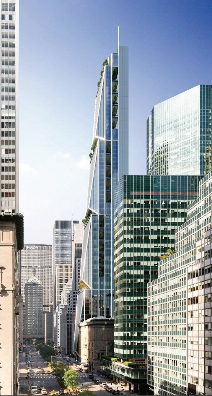
350 Park Avenue, rendering from Vornado / Rudin Management
The plans were leaked thanks to a mysterious brochure created by both Vornado and Rudin Management. The multi-page prospectus contains dozens of images for the project, featuring both interiors and exteriors, offering a surprisingly comprehensive early look for something that is likely still at least a few years from the start of actual construction.
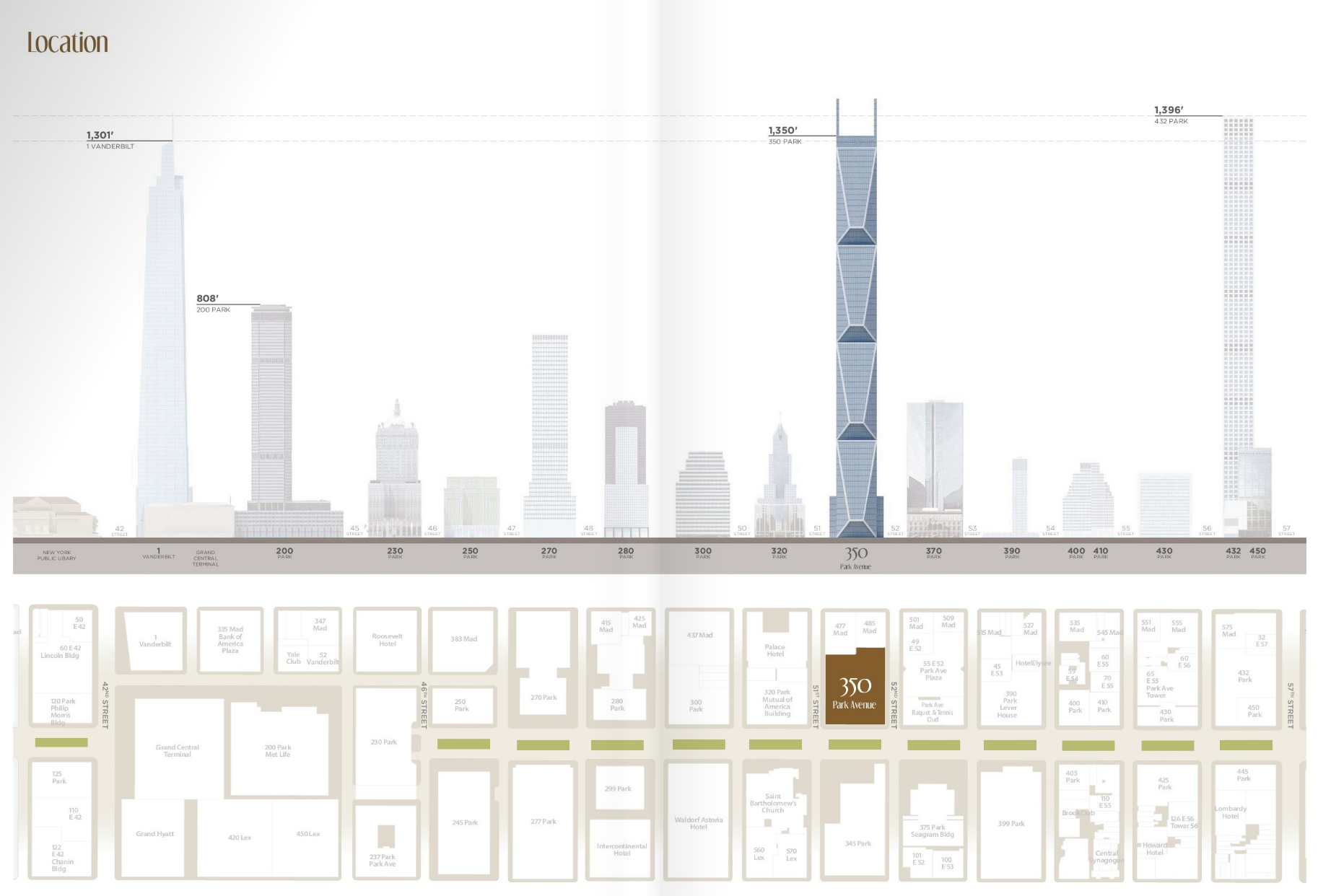
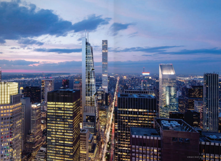
350 Park Avenue, rendering from Vornado / Rudin Management
Architecturally, the design for 350 Park Avenue would be a dramatic departure from both historical and contemporary stylings that currently predominate the Manhattan skyline, featuring a striking mix of classical massing proportions and an ultra-modern facade that is very reminiscent of Foster’s Hearst Tower. With staggered setbacks progressing inward from Park Avenue, the envelope would shrink substantially from the street level to the rooftop, appearing similar in silhouette to a cheese grater.
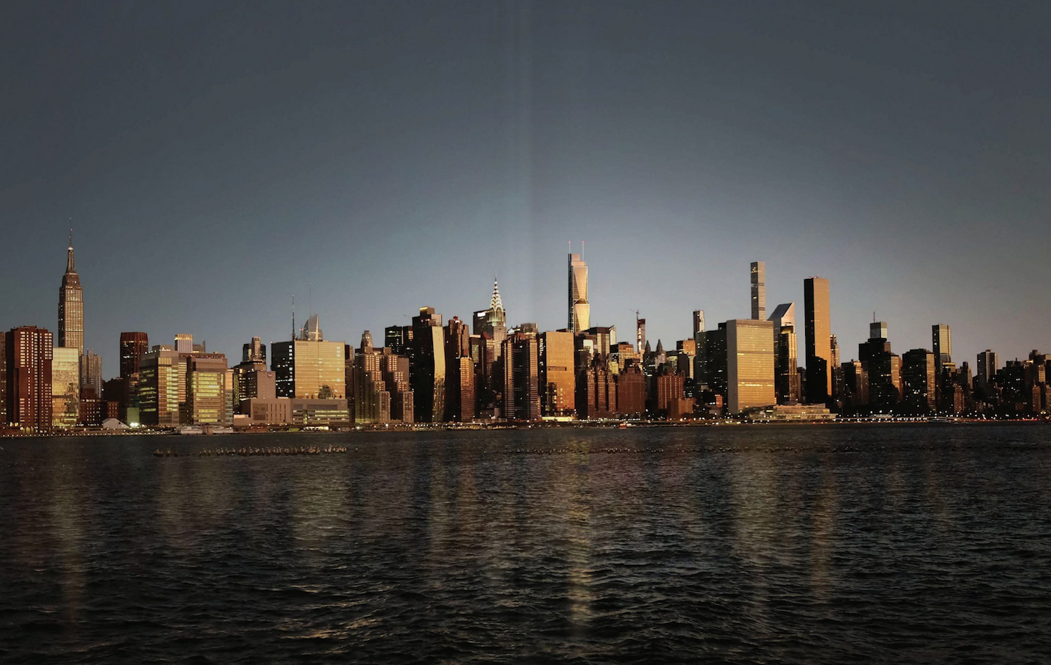
350 Park Avenue, rendering from Vornado / Rudin Management
While a 1,500-foot tower would be out of place in most neighborhoods, the plans for 350 Park Avenue are most definitely within the norm for Midtown East. With 432 Park Avenue and One Vanderbilt already mirroring the 1,400-foot mark, plans for towers including 270 Park Avenue and Harry Macklowe’s Tower Fifth will only add further to the supertalls already in existence. Surprisingly, 350 Park Avenue will only be middle of the pack for the area, though it will most certainly hold its own on the overall Midtown skyline.
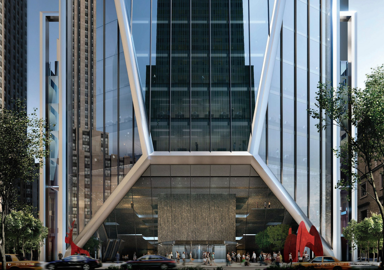
350 Park Avenue’s front, from Vornado / Rudin Management
The site for 350 Park Avenue sits between 51st and 52nd Streets, and Lois Weiss of the New York Post was the first to report on the potential assemblage a few weeks ago. Construction would require the demolition of Vornado’s extant building on Park Avenue, and a 23-story tower owned by Rudin Management next door.
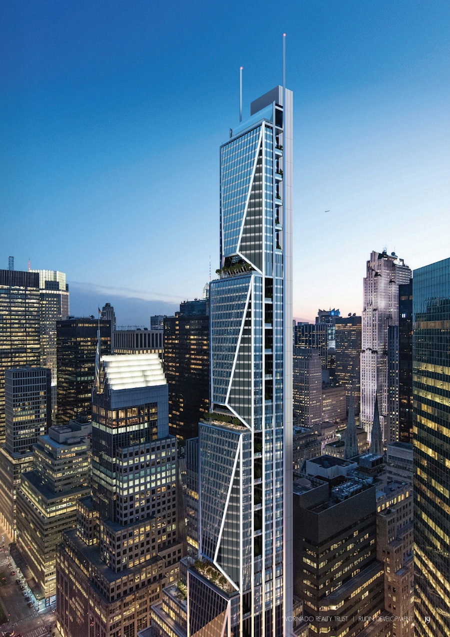
350 Park Avenue, rendering from Vornado / Rudin Management
No completion date has been announced for the site, and with no demolition permits filed for either of the extant structures, it appears significant paperwork must still be dealt with before 350 Park Avenue officially enters the development pipeline.
Subscribe to YIMBY’s daily e-mail
Follow YIMBYgram for real-time photo updates
Like YIMBY on Facebook
Follow YIMBY’s Twitter for the latest in YIMBYnews



Please pardon me for using your space: Its complexion on amazing design, so beautiful that I think you are compliant. Complicated structure but comprise by prominent corners. (Thanks to Nikolai Fedak)
Please pardon me for stinking up the place: It has my okidoki.
What a Mishmash
Horrendous design.
why?
This is beautiful and just the kind of contemporary architecture that staid Park Ave needs to offset all the boring modernist glass boxes.
agree completely – this looks thoughtful and well-integrated. the midtown east rezoning is looking like the best rezoning of the century thus far.
The elevator/service core here, with its own unique structure and materials is similar to the 425 Park core, very Foster and one of the few elements of the design that I like.
Wonder what the west side of that looks like.
Oh. That’s probably why they don’t show that. It could have some slot windows for elevator lobbies or fire stairs but it doesn’t look promising.
While nothing is particularly special about the current mid-century building there, there is also nothing green about destroying a perfectly functional and well-located office building. It’s just wasteful vanity for the already wealthy.
“nothing green about…”
what does that actually mean to suggest? the construction of a skyscraper inherently involves using natural resources to construct a place of habitation for humans. why would we stop improving our human spaces to meet a vaguely-defined fantasy of nature that only exists in theory and which has no essential dignity?
good point, might be a little much
iPhone doesn’t need a cheese grater?
I think this tower is a bold and handsome structure. It will look wonderful on the skyline while it suggests one large mathematical puzzle in a way no other has. Superb!
If the west facade is a concrete slab, it will be a gargantuan blight on the skyline when the building is seen from the Westside.
As much as this looks like the new xfinity remote control you’d think Comcast was the anchor tenant.
It would be far more elegant and significant if the silly look-at-me white geometric edging disappeared. The edging creates distraction from the building. Needs a lot of fine tuning..
So what is the view of the building from the west, a flat blank wall?
As a life-long New Yorker it always continues to amaze me (and often disappoints me)
as to how most architects never cease trying to make their modern-day building boxes look unique, or different.
Face it – you can put lipstick on a pig, but it’s still a pig.
I REALLY like this design – unique way to do the setbacks. And imagine those views from the corners , where you’re not looking straight out at the street or at a building across the street, but rather diagonally. I just wish the design was on both sides, not flat on the back side.
wow! park avenue not gonna be the park avenue we know now very very soon
The current Park avenue is incredibly boring and feels like a hangover from decades long gone. The revitalization of this core part of Manhattan is a welcome change from the tone of the past 10-15 years.
I like this building. The interior spaces look exciting, and the shape will be iconic like Chrysler and Citi.
I note that the location diagram shows the existing 270 Park Avenue rather than the planned one which will probably be the tallest of the bunch.This is certainly a dramatic time for this stretch of Midtown.
Looks sort of similar to Oceanwide Tower going up right now in San Francisco.
Finally, somebody is bringing some “WOW!” to the party!!!
Yay!
For sure, this building really shows just how boring, insipid and unimaginative the garbage in Hudson Yards is!
Bravo! Here’s hoping this exciting design brings on even more desperately needed “Wow!” for other buildings to come in NYC!
Looks like a bunch of stacked backpacks.
Foster’s buildings always look like inflated multi-storey carparks. An intrusion on the skyline, not an ornament.
The renderings are totally out of scale. On the side elevation, Park Avenue Plaza next door between 52nd and 53rd appears less than half the height. On the 2 Park Avenue renderings Park Avenue Plaza seems to approach at least 3/4 of the height. Are they allowed to get away this? Or are artists impressions allowed to completely distort the perspective?
Park Avenue used to be known for its elegance. This design belongs in another part of town or, better yet, in a different town.
I wish they would go taller…
Beautiful. I totally love it. I just wished they would add fifth stage to the top, similar to the lower 4 stages. It would then become around 2000 feet high and pleasantly so.
Looks like a series of stacked backpacks. Disappointing effort from Foster + Partners.
It’s too industrial looking. If the isosceles triangles were pointing up… it would be more graceful and lead your eye up. Think of all the great possibilities for a 1500 foot skyscraper. I think there are more elegant solutions.
It would be so cool. And it would match the Wills Tower officially not by roof hight.
I really enjoy the angles playing off of the Hugh Stubbins Citicorp Center. It is a good design. Cannot wait to see it completed.
I love the design. Refreshingly involved and textured for a supertall. Really nice
Does anyone else feel like this was ripped out of Hong Kong, circa 1974?
I think it’s pretty darn fantastic design. As for the back side that arouses so much concern – with surface finish / texture and at night – LIGHTING – it could be wonderful. But yes, it would be nice to see what the proposal is for that backside. The Park Avenue side is awesome. I understand the one person who said they’d like to see the facade broken into five elements / motifs instead of the four, but the greenery – PARK Avenue it’s called – does have five layers. I LOVE IT.