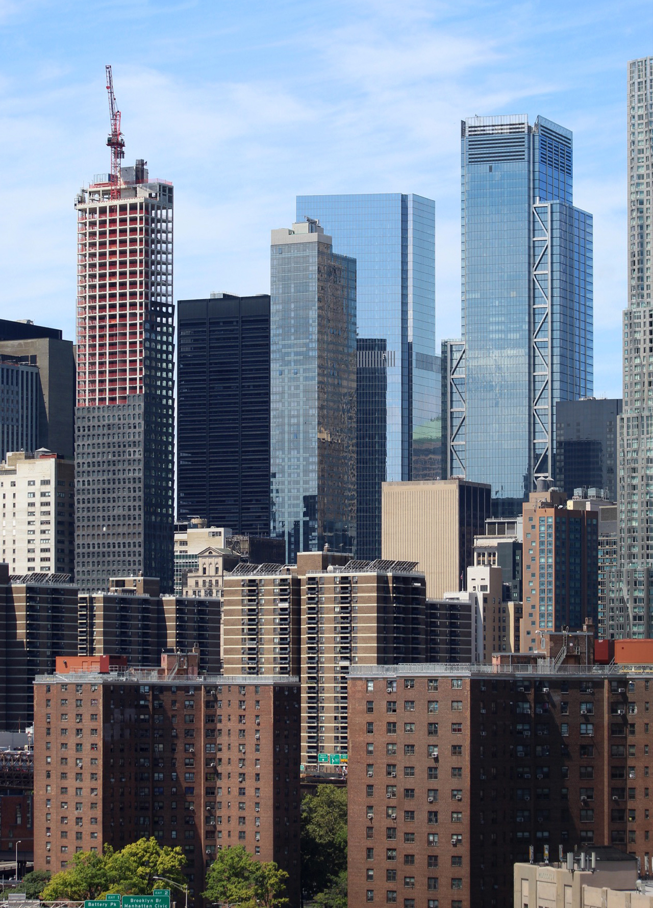
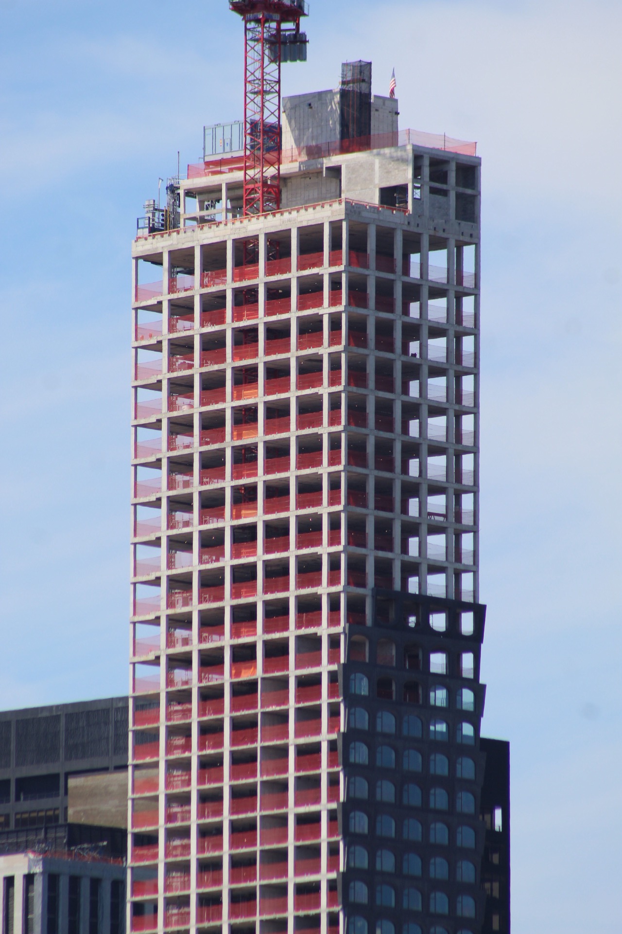
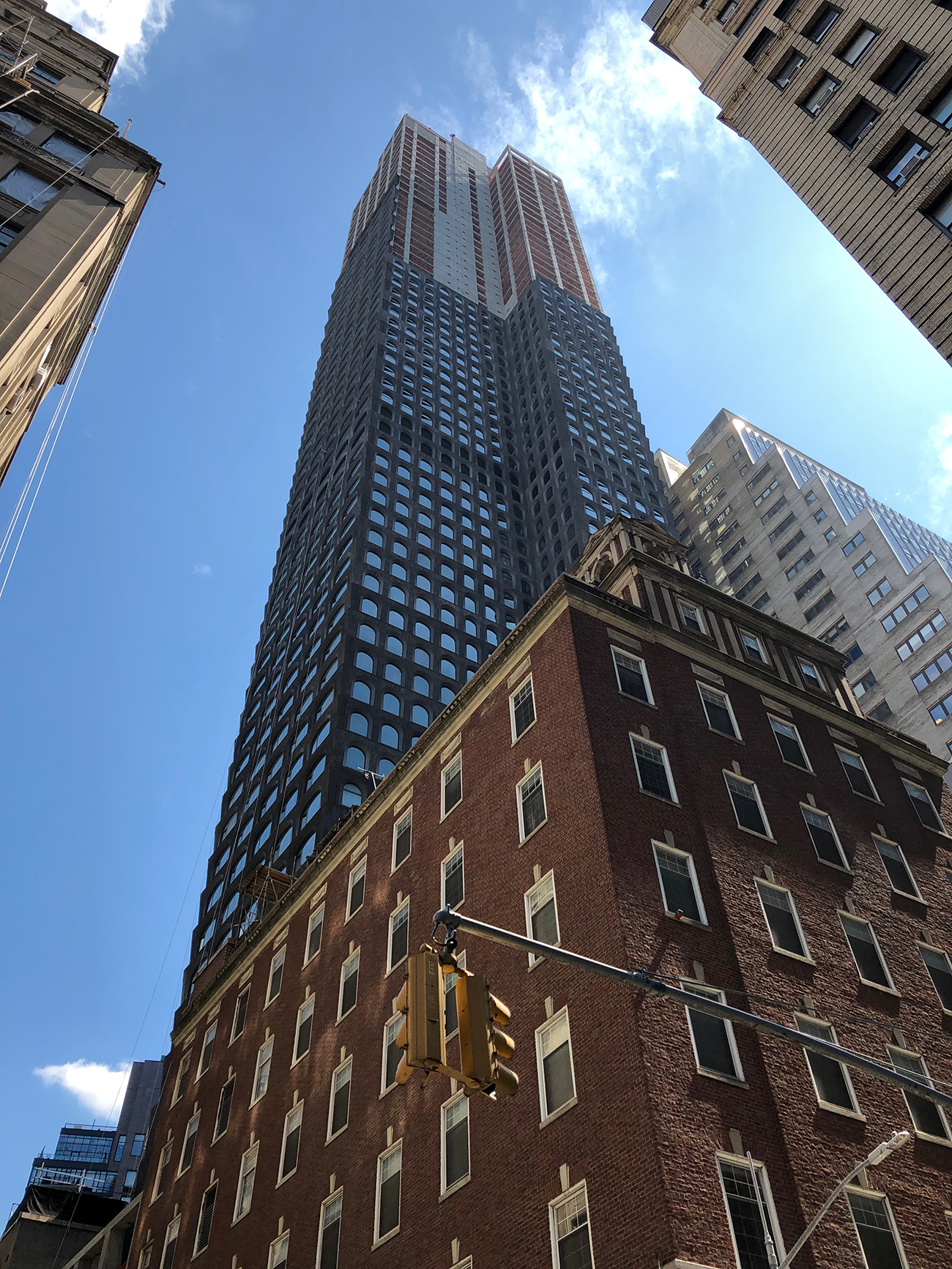
The unique curtain wall of 130 William Street has climbed past the halfway mark of the topped-out 800-foot-tall skyscraper. Located in the Financial District, the reinforced concrete tower is David Adjaye’s first high-rise in New York City. Hill West Architects is the architect of record, while Lightstone Group is the developer of the 66-story residential project. Unit prices for the 242 residences range from around $1,300,000 for a one-bedroom to $20,000,000 for a four-bedroom, full-floor penthouse. Corcoran Sunshine Marketing Group is handling sales and marketing of the homes.
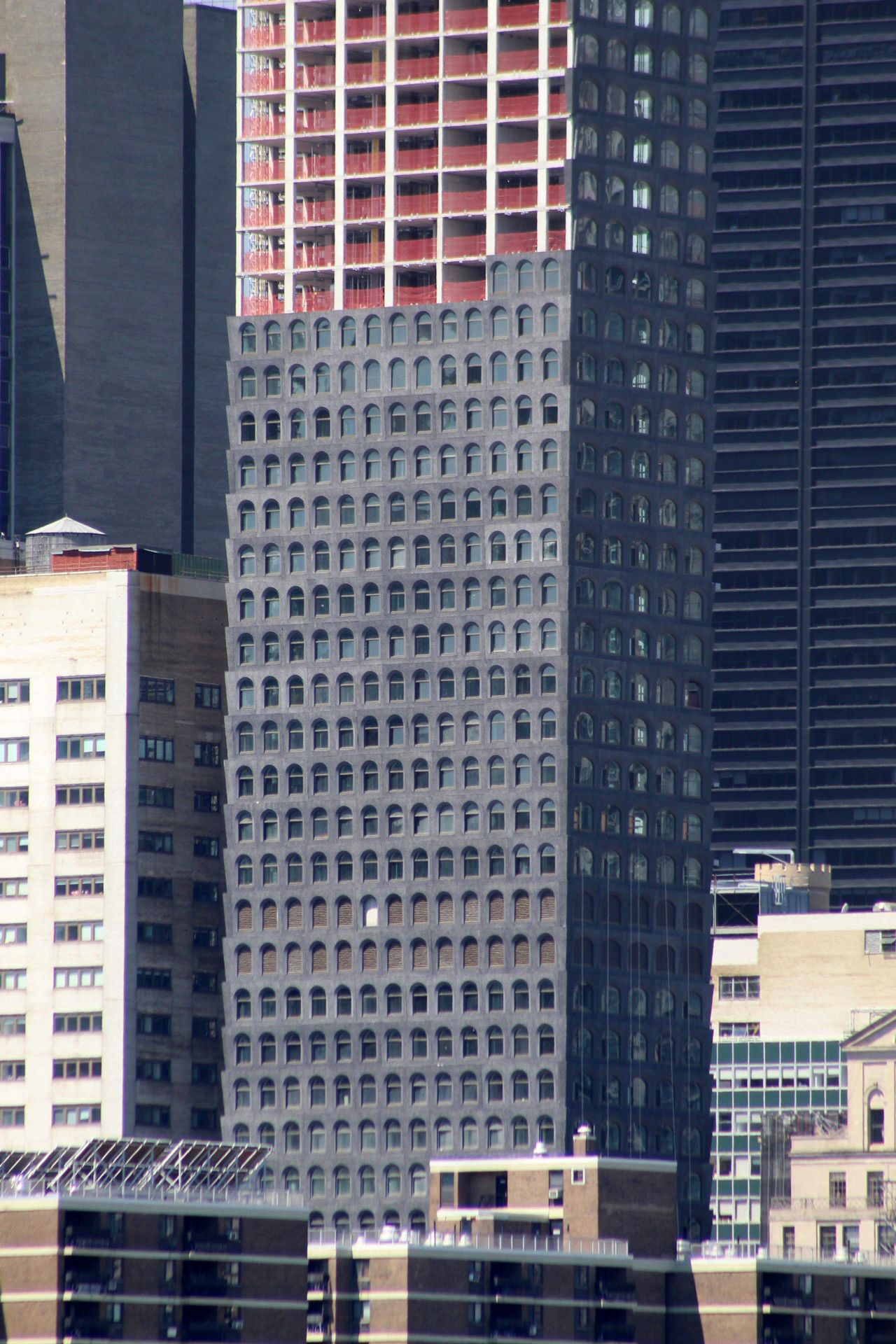
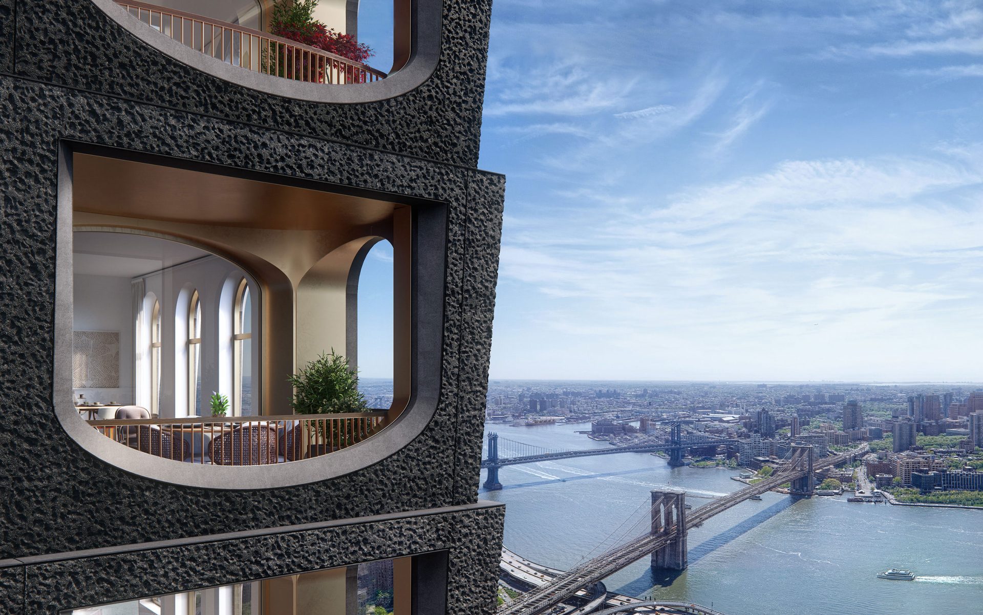
The dense array of charcoal-colored, concrete-cast arches and inward-pointing panels on every floor make for a striking contrast with the surrounding architecture, which is dominated by glass curtain walls and grids of rectangular-shaped windows. The textural quality of the panels is best seen up close. The sharp edges of the corners also create an interesting silhouette against the Financial District skyline.
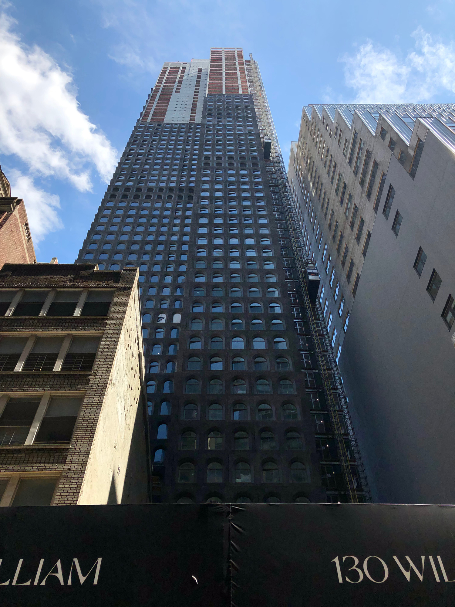
The last ten floors on the northern and southern elevations of the skyscraper will have the largest set of arched openings. Except these will be oriented upside-down so that the curve of the arch is on the bottom and creates a more gentle and visual appeal for residents that have private loggias.
The curtain wall on the northern elevation is rising the fastest. The first few floors of the inverted arched openings are now in place.

The north elevation of 130 William Street with the upside-down arched panels beginning to go in. Photo by Michael Young
The smaller arched windows on the western façade facing the World Trade Center are also going in at a steady rate.
Completion of 130 William Street is expected next year.
Subscribe to YIMBY’s daily e-mail
Follow YIMBYgram for real-time photo updates
Like YIMBY on Facebook
Follow YIMBY’s Twitter for the latest in YIMBYnews





It’s kind of weird and that’s… refreshing.
Personally, I think the panels are ‘outward’ pointing
Yeah it’s gotten a lot of flak from commenters on this site but I quite like it.
I agree. Its quirkiness seems offset by the somber color. To me it comes off as a “serious” building at home in the financial district.
Great tower. When will they be installing the Eye of Sauron at the top?
Lol! Exactly. Dreary and depressing, it seems to take the purpose of brutalism (deliberately striving to corrode social cohesion to help shelter the ruling elite from uppity citizens) and give it a unique African spin, as per the architect. That is, the building already looks old and decayed even before it’s finished.
Then again, it’s just ahead of the curve. Since America is unstoppably on its way to being a third-world style nation, might as well just start out with buildings that look like they’ve been neglected for decades, since that’s how everything else is going to look eventually anyway.
OK, lunatic.
What a drab and dreary-looking building. It has the appearance of a Victorian-era prison except that it’s 800 feet tall. What were the architect and owner thinking? It will, however, make a great home for Manhattan’s birds, nesting, perching, and yes, doing the other thing on all those ledges. With avian droppings and general weathering, maintenance of those heavily textured exterior panels will be something of a nightmare. What’s the betting it will have a new facade within ten, fifteen years tops from completion?
You’re right…the building is ugly as sin. What would Stanford White ( McKim, Meade, White) have thought if he saw this monstrosity built in his time ?
I’m also betting that in the next 20 yrs, they’ll replace the facade … too bad they won’t do it now. I wouldn’t pay $1.3 million for a 1 bedroom in this structure. In fact, i wouldn’t live there for free!
Good God. This is one depressing, dreary surface for a building. What is it supposed to be: Brutalism cum Ugliness?? uggghhh. Why would any sane person, valuing beauty, want to live in THAT?? Unless he/she wants to show off by brandishing the designer’s ethnicity!!! And why is the ethnicity of the architect (or the gender, for that matter) an issue? Artists and engineers should be evaluated per their work not their genetics!
I’m sorry but I find this tower to be, quite frankly, horrendous. Sometimes things are so ugly, they’re not. That is not the case here. The color, materials, and repetition of forms does it no favors. What a waste of a developer’s time and $.
Ready for resurfacing soon. The structure seem to be sound. The facade/surface can be–SHOULD BE–replaced soon, with the Eye of Sauran toppled from it. Something clean and elegant should be a proper replacement for this travest
R.I.P. “Here will rest the ones that reserved the tombstone”
I think this is really a refreshing and beautiful building with a great texture that’s meant to age naturally and beautifully. Can’t wait for it to be finished and see the effect of the bronze window frames. The arches will really look airy from the inside. I wish I can live there!