The first stages of excavation are underway at the site of Gene Kaufman Architect‘s future commercial office building at 76 Eighth Avenue. Sang Lee is the developer of the 120-foot-tall structure, which is located on the border of the Meatpacking District and the West Village at the busy corner of Eighth Avenue and West 14th Street. The development will contain 30,000 square feet of office space in addition to ground-floor retail area, and has seen an update to the design since YIMBY last covered the project.
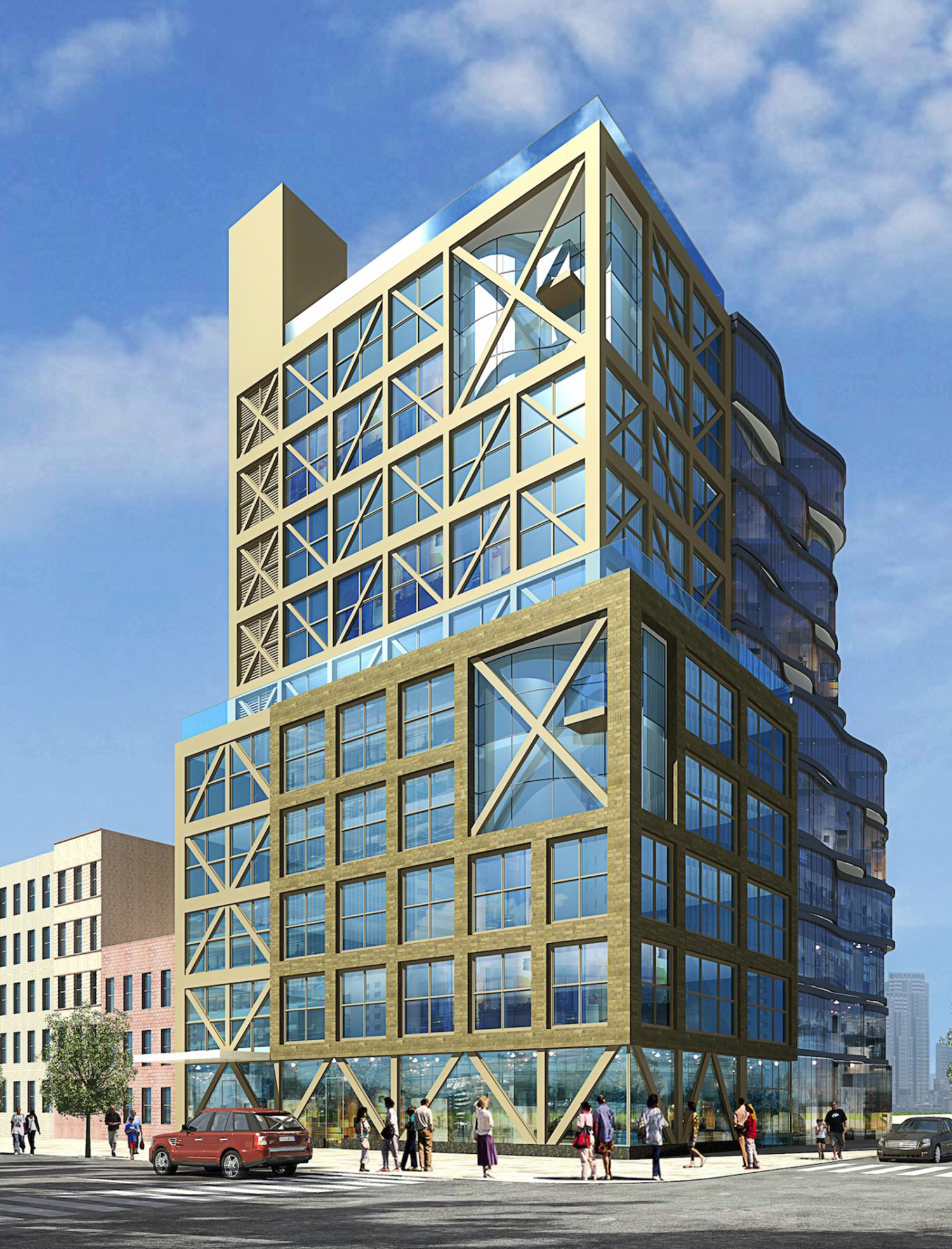
76 8th Avenue, old design, image by Gene Kaufman Architect PC
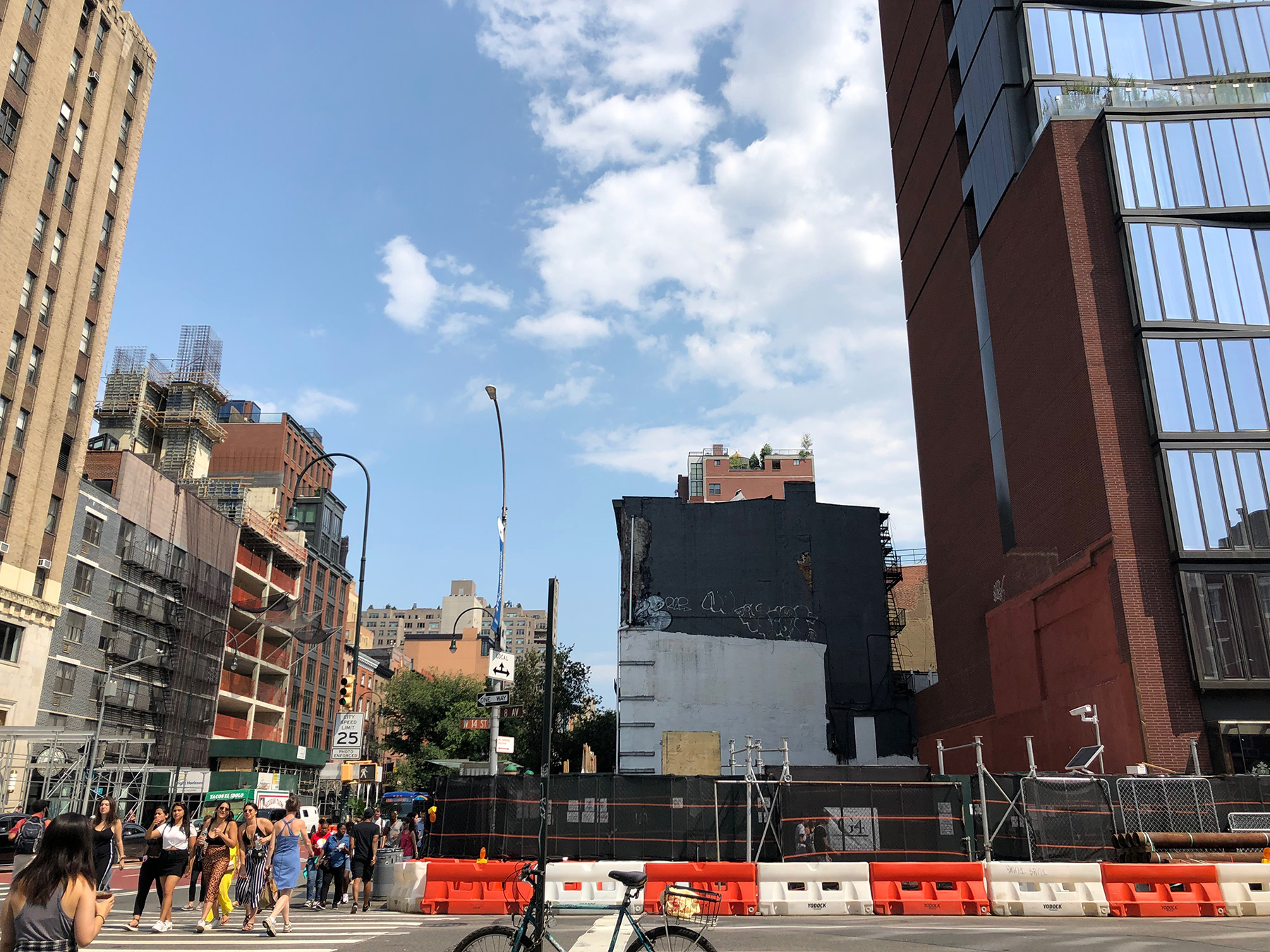
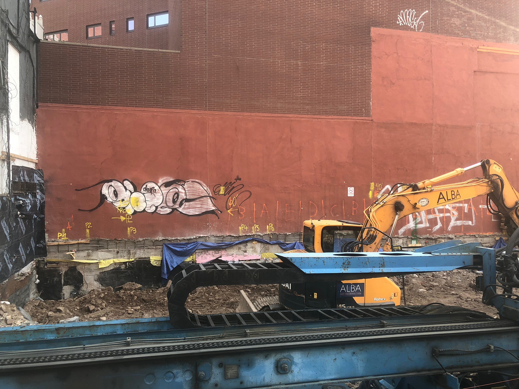
Photos through the windows on the construction fence show excavation getting underway. Most of this phase should be finished by the end of the year, followed by foundation work and the rising of the superstructure, conceivably in the first half of 2020.
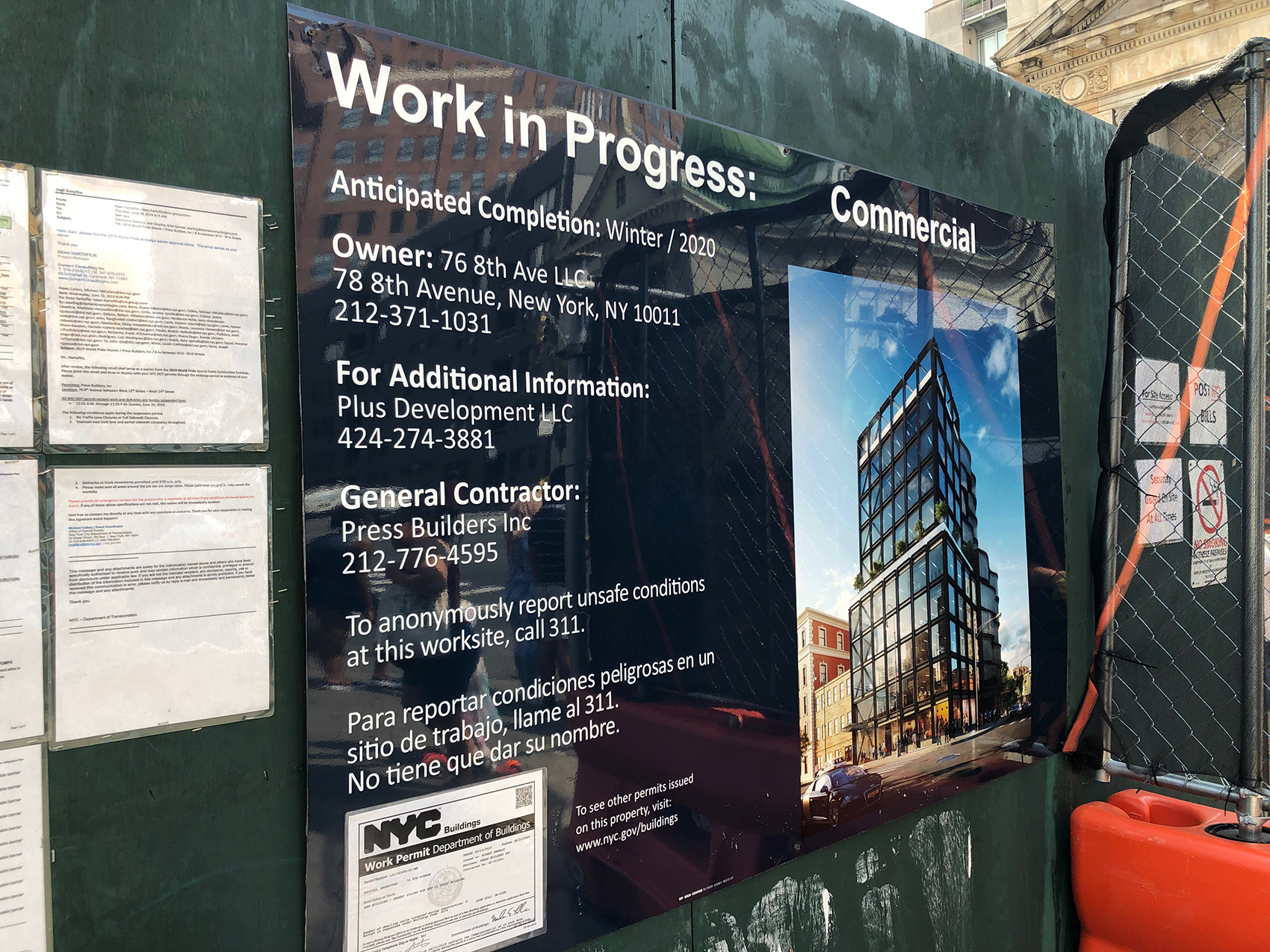
The rendering shows an exterior of brick and bronze framing a grid of large windows, some of which will be two stories in height. The structure’s most distinguishing feature is the metallic cross bracing that covers the retail frontage, the majority of the windows on the northern elevation, and the slimmer western face. The building’s sharp geometric lines will strike a contrast with the curvilinear architecture of the adjacent One Jackson Square, aka 122 Greenwich Avenue.
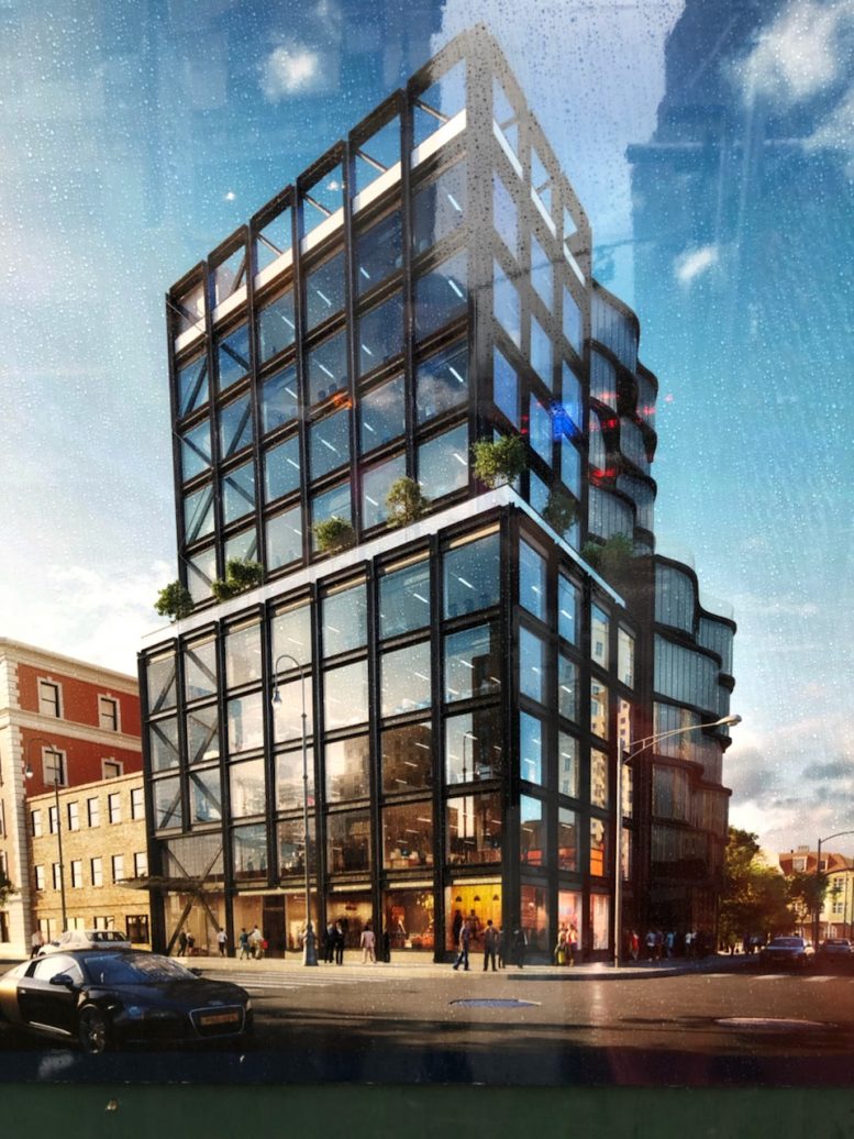
A sixth-floor setback will push the superstructure upward and culminate at the tenth floor. The main rendering shows a rooftop terrace, indicated by the ribbon of glass panels that lines the perimeter of the parapet and main setback.
The anticipated completion date of winter 2020 has been posted on the construction fence.
Subscribe to YIMBY’s daily e-mail
Follow YIMBYgram for real-time photo updates
Like YIMBY on Facebook
Follow YIMBY’s Twitter for the latest in YIMBYnews





Vast improvement. If only the hackitect did all his eyesore hotels up to this quality level, there’d be no complaints.
Um…your third paragraph is a description of the outdated rendering. This new version is far superior, but the finished product will still probably end up looking like a cheap knock-off of a Morris Adjmi building…
So which new hire is actually responsible for this much improved version?
You’re right. The style is totally different. The weird Gene Kaufman propensity for ugly appendages on top and kooky geometric shapes are gone from the new version. It’s from a different person in the same firm.
That was my thought – Gene finally got someone capable to help him. I suppose that person is already gone.
Regardless, the revised version is 10 times better. It’s actually good!
Gene isn’t bad when he’s not with McSam.
No, this is NOT on the border of the Meatpacking District and anything else. Neither in fact or spirit did the Meatpacking District ever or now extend this far east. This IS on the border of West Village and Chelsea, and if you want to go back not so many years (only 30 or 40) it was at the heart of Little Spain.
AGREED!! THIS IS IN NO WAY MEATPACKING. Thank you Steve for correcting the author.
More crud from NYC’s worst architect.
Well, it’s a bit less cruddy, at least.
Hopefully the “white” banding is just renderor’s depiction of clear glass pannels (as seen in part of first rendering). If really white, it’s jarring and odd.
My error… text states they are ribbons of glass.
This is the best thing I’ve ever seen from Gene Kaufman. Not bad actually. The first version not so much
No way this is a Gene Kaufman design. It’s actually somewhat interesting!
After 24 hours i feel the need to bring everyone down to earth and be ready for the bait and switch. That sexy large pane glazing? Be ready for that not be in the finished product. That slick black anodized aluminum/black steel looking structural elements? Be ready for that to be ill fitting segmented pieces with big gaps or even dark masonry. I’m just going by precedent here, don’t shoot the messenger.
This is shockingly inoffensive. I mean, the ground level doesn’t have a setback and is built to the street wall! A revolution in Kaufman’s work. I wish more mainstream design media attention was focused on the architectural crimes this guy commits all over city and less on, say, the constant drumbeat of complaints over the “sterile” Hudson Yards…
Although the article doesn’t mention it I have on good authority that Raad Studio authored the facade redesign and interiors.
raadstudio.com
If you’re wondering, the facade was reworked by RAAD