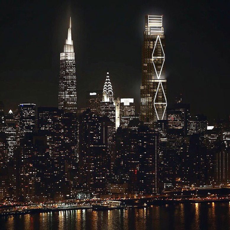
A new set of unofficial renderings by Siniaevart illustrate evening views of 270 Park Avenue in Midtown East. The JPMorgan Chase headquarters is expected to top out in excess of 1,400 feet above ground, introducing a dominating new form to the Manhattan skyline.
Designed by Foster + Partners with Adamson Associates, the skyscraper will replace the existing 707-foot Union Carbide tower. A majority of the structure should be dismantled by the end of 2020. When complete, 270 Park Avenue will stand as the third tallest building by roof height in Manhattan.
As previously reported by YIMBY, trading floors will occupy the lower levels of the building, with mechanical floors, landscaped terraces at setback levels, and amenity floors above. The setbacks continue up to the apex of the structure. In sum, the building is expected to yield around 2.5 million gross square feet.
A completion date for 270 Park Avenue has not been announced.
Subscribe to YIMBY’s daily e-mail
Follow YIMBYgram for real-time photo updates
Like YIMBY on Facebook
Follow YIMBY’s Twitter for the latest in YIMBYnews

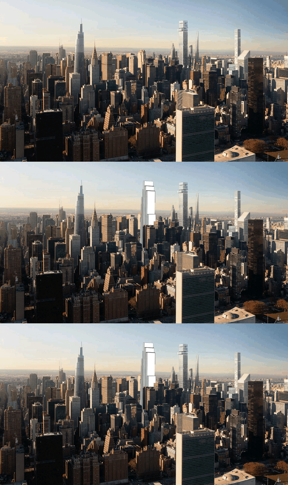





That’s not an exclusive reveal. These are fan-made renderings that have been passed around on the forums for weeks. Looks like we’ve hit a new low around here. smh
Language fixed! Apologies.
Really. how dare they.
Destroying a renovated mid-century modern 2.4 million square foot tower for a Greed Era 2.5 million square foot stretched trophy to shady profits.
That’s… progress?
So wanting a modern up-to-date office space for its employees so it can remain competitive is now considered greed? Boy, you Leftists won’t be happy until the U.S. fall to the level of a Cuba or a Venezuela, where everyone is poor and everything is decrepit.
ok boomer
Except I am not a “boomer.” Leftists are judging people anonymously on the internet and getting it wrong.
OK BOOMER
Lol!
Cuba is not a Leftist Country, They Persecute Leftists and Liberals.
Communism is not Leftism, it is a Rightism Ideology.
Your square footage comparisons are far from apples-to-apples.
The new building is a far more efficient use of the space and inspiring in scale rather than boring.
Yes.
If the skyline never changed, we would all be huddled in lower Manhattan readying for the next Sandy. I like that design above you feature better than one vanderbilt. life goes on
To be charitable, this is not Foster+Partners’ best design. To be honest, this thing looks like something an ambitious sixth grader designed. If SOM’s Union Carbide was being replaced by a superior, taller building, I’d be all for it. But for it’s awful design, all this eyesore adds to the skyline is height.
You people are idiots! Previous tower was outdated and old…its the firm’s right to tear it down and replace it with something more modern. Greed has nothing to do with it! And how are their profits shady? Their financials are publicly available online…anybody can view it.
Its better then the egg he designed in London, but nowhere as good as Union Carbide.Fosters designs vary from excellent to ridiculous. Please take a look at the London Skyline
I love that our skyline is adding a new, higher layer! Here’s hoping that we can keep filling in the 1000+ ft skyline.
From Union Carbide to Chase Carbuncle.
This is awful. Chase is the official bank of “Ok Boomer”.
How can knocking down a leed platinum be enviormentally beneficial?
I’m confused by these renders. I thought they were fan made images but the renderer claimed on Instagram that he was commissioned by Foster to produce these images and no one called him out on it. So are they the actual design or not?
I wish these renderings also included the proposed Vornado-Rudin 350 Park (which is straight east of “Tower Fifth” between 51st and 52nd Streets,and straight north of 270 Park and south of 432 Park).
People will be looking out of windows taller than any in the ESB into other people’s windows a block or three away.
(and let’s not forget the Grand Hyatt replacement between One Vanderbilt and the Chrysler).
A new eyesore.