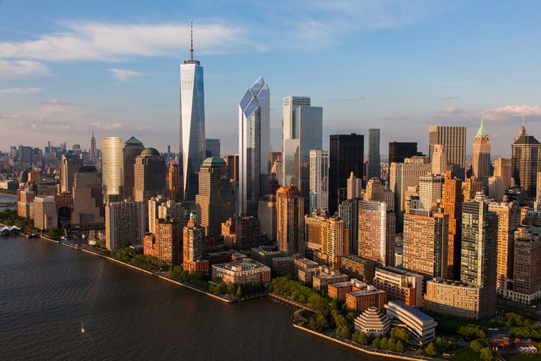
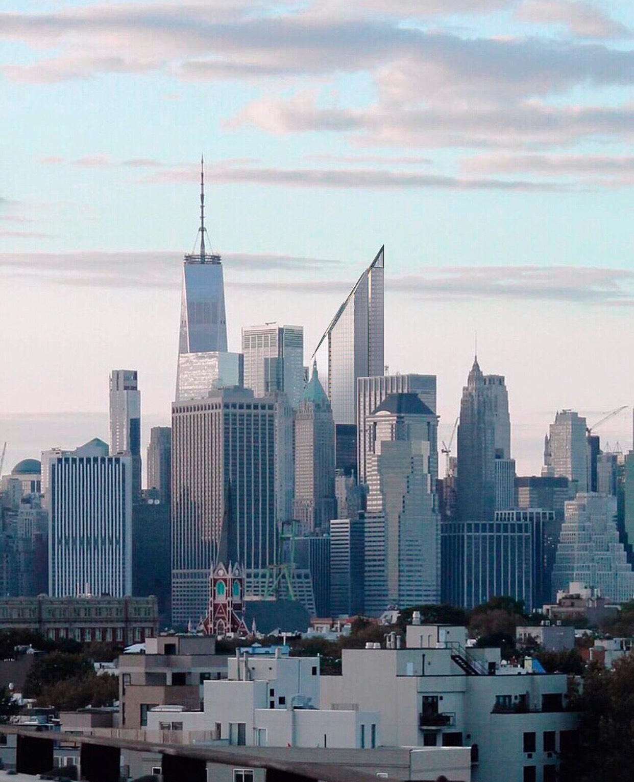
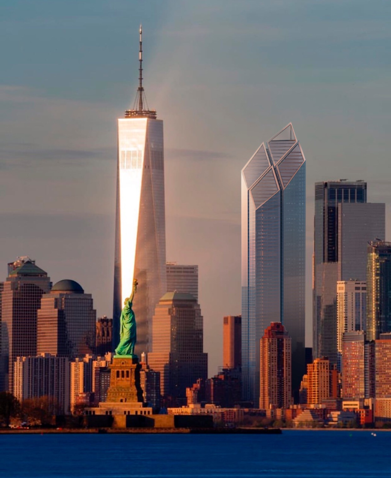
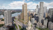
YIMBY and Instagram user Sinaevart has created a new set of renderings depicting how Foster + Partner’s original 2006 design for 200 Greenwich Street, aka Two World Trade Center, would look among the current skyline. The renderings come on the heels of the reports that Norman Foster is in the midst of revamping the design after developer Silverstein Properties returned to him to complete the final component of the World Trade Center complex. Work on the project has been stalled since the early 2010s.
Below are four renderings showing new perspectives of the British architect’s unbuilt icon. The first one shows a dramatic angle of how the four diamonds point downward toward the 9/11 Memorial, as previously intentioned by the architect.
The second shows a morning view from Midtown, with the steel and glass structure completely obscuring the view of 3 World Trade Center.
The third is a golden hour sunset view looking northeast at the World Trade Center complex, with the four diamonds visible from the New York harbor beyond the Statue of Liberty.
The last rendering is from Hudson Square and shows the skyscraper clad in an identically hued glass as the curtain wall of One World Trade Center. The dark centerline of the skyscraper is especially pronounced from this angle, and runs up from street level to the edges of the sloped roofline.
Subscribe to YIMBY’s daily e-mail
Follow YIMBYgram for real-time photo updates
Like YIMBY on Facebook
Follow YIMBY’s Twitter for the latest in YIMBYnews




It’s interesting to see skyscraper nerd renderings and not professional ones. They show awkward angles that the architects would never show, which is a relief.
This is encouraging news. Anything but the Bjarke Ingels’ monstrosity for WTC2.
I dislike it about evenly as I ever have.
Stop Dallasing New York!
Could have, would have, should have.
It’s a very large building that attempts to slim down with the angled top.
Still FANTASTIC!!!
The only problem I have with this tower is that it’s facing NJ instead of BK.
Horrible. Both 1 and 2. I love the original twin towers and they still look more futuristic, aesthetically pleasing and awe-inspiring. This area – in fact all the recent skyscrapers built in Manhattan just looks awful.
The minimal facade glazing and massing/form are too similar to 1 WTC which detracts from it’s presence. Something more subtle I believe would be more appropriate.
As much as I like the Foster tower (wish it was taller, though) I’m thinking 2 WTC will never be built, especially now that Hudson Yards/Manhattan West is now the new darling, with old Midtown east’s re-discovery also emerging. WTC 2 should’ve been constructed alongside 1 WTC, way back in 2008-2012. Instead, they simultaneously constructed the SHORTEST tower, 4 WTC, which left a big gap between the two towers. Since then, only 3 WTC has partially filled the gap. Larry Silverstein has hinted he might start construction on speculation, which is not an uncommon occurrence. Downtown is much more attractive now than it was in 2001. Just build it. Silverstein won’t get any 2 WTC tenants to sign and move in if there’s no 2 WTC tower to move into.
I dunno… it looks like the Adventures in Babysitting building.
This is great news.. & it can rise on the foundation already built for it. Let’s finally get it done.
Build it before the next Great Recession.
Is anyone else concerned with this design that the light that’s supposed to reflect off the tower and onto the reflecting pool is going to fry anyone in the plaza?
Wished it was 1/3rd taller. Then it could be seen from all around the city, and hopefully overshadow that “freedom tower” thing–its donut and toothpick rooftop, its fortress-garage facade at the bottom, and all that embarrassing jazz.
i mean they should just make a twin it looks lonely
Make it a true 1776 ft Tall, from the ground to the top of the roof!
Very glad that Foster’s original design concept is back to being front runner status for WTC2. Hope that the updated design, currently being worked on, doesn’t take too much away from what Foster had first imagined for the building!
I prefer the Foster design to Big, but the no brainier was just to build a twin for WTC1.