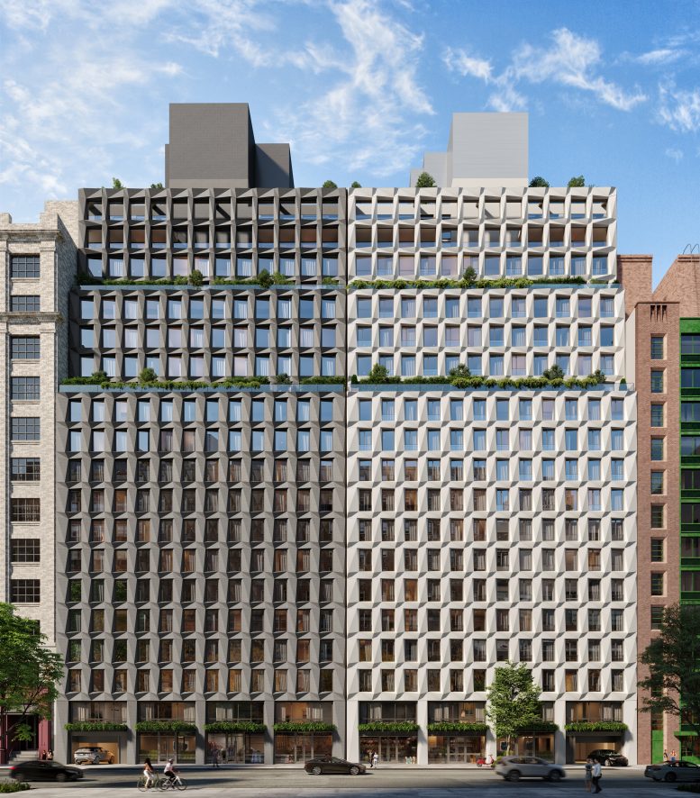
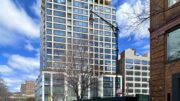
Maverick’s distinctive charcoal and white curtain wall panels are rising up the 210-foot-tall residential project at 215 West 28th Street in Chelsea. Located between Seventh Avenue and Eighth Avenue, the development consists of an identical pair of topped-out, 20-story buildings. The project, which is alternately addressed as 215-219 West 28th Street and 221-229 West 28th Street, is designed by DXA Architects and developed by HAP Investments and will yield more than 300,000 square feet.
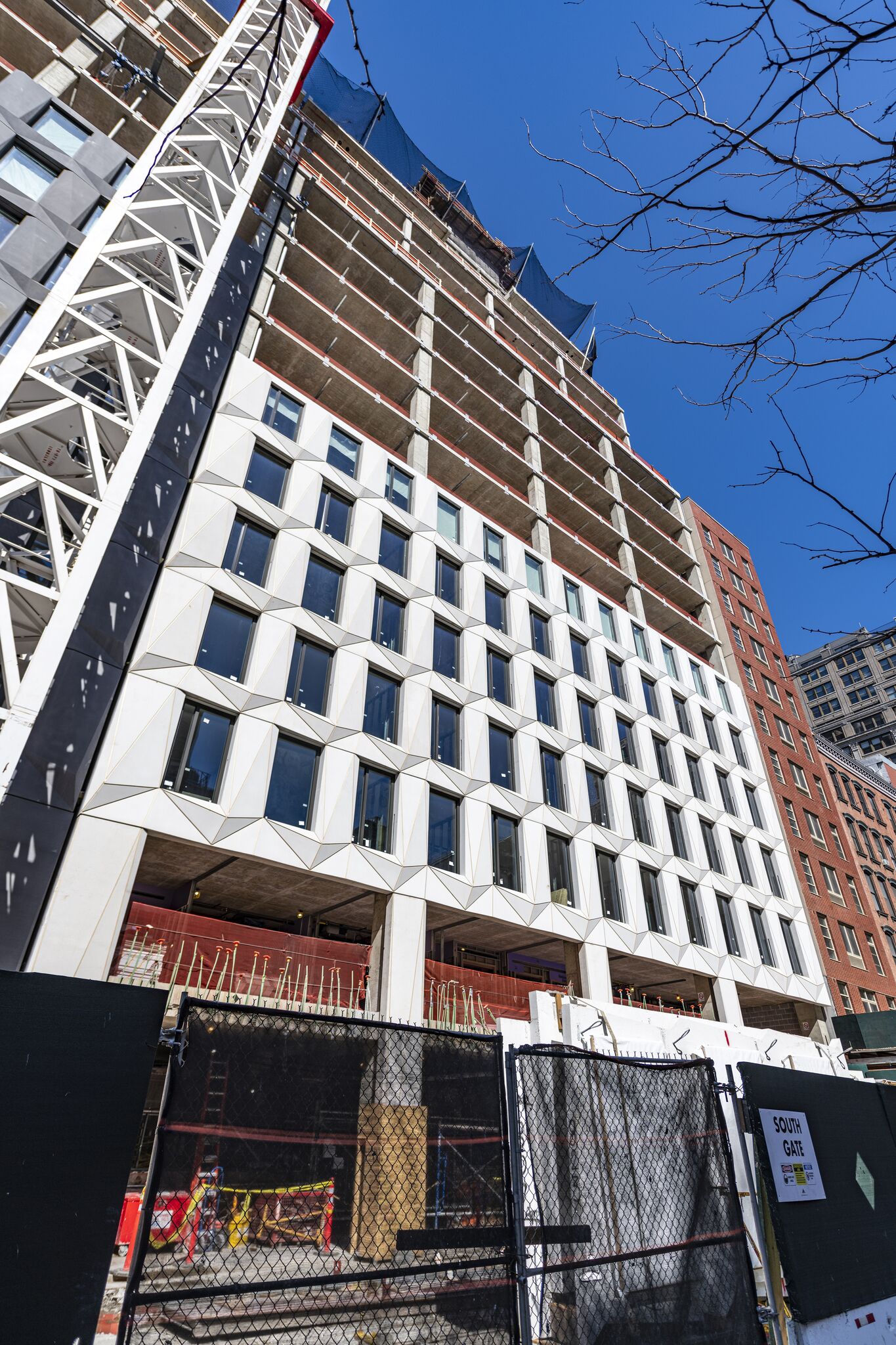
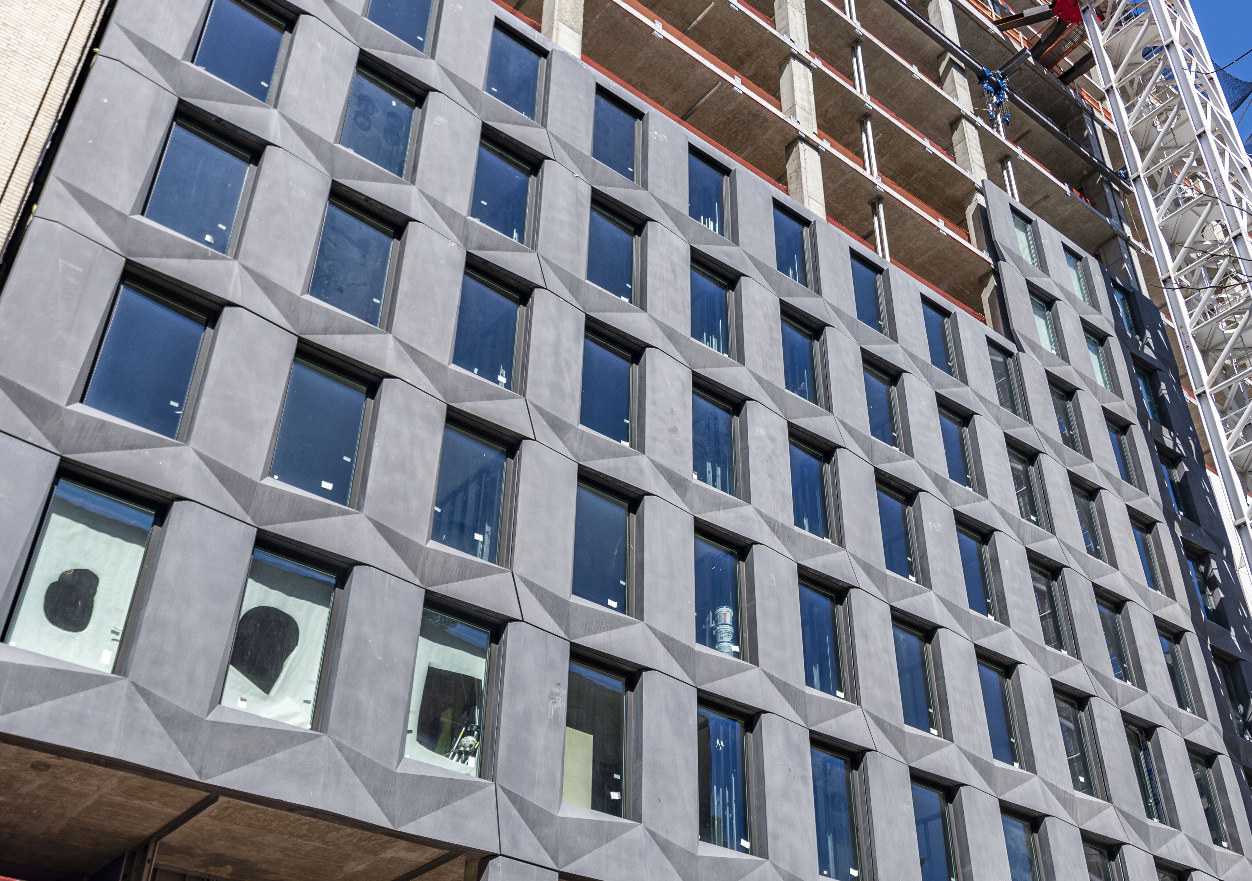
Recent photos from Tectonic show the façade extending more than halfway to the first setback. The curtain wall panels feature a repeating geometric pattern of undulating triangular surfaces reminiscent of a cut gemstone. Theses surfaces create an interesting play of light and shadow, giving the building’s exterior a distinctly modern texture. The fenestration on both halves of Maverick consist of a tight grid of windows from the bottom to the very top.
The main rendering shows the last two rows of the curtain wall standing in front of a wide stretch of open-air loggias and a landscaped rooftop terrace. Mechanical extensions rise from each section and will be covered in their respectable dark and light palettes. Inside will be 112 rental units and 87 condominiums, with amenities such as a fitness center and spa, a rooftop deck, and bicycle storage. The combined ground floors of both buildings will house 20,000 square feet of retail space.
The closest transit options are the local 1 train at the 28th Street station to the east and Pennsylvania Station six streets to the north.
Maverick looks like it could likely be finished in early 2021.
Subscribe to YIMBY’s daily e-mail
Follow YIMBYgram for real-time photo updates
Like YIMBY on Facebook
Follow YIMBY’s Twitter for the latest in YIMBYnews



Oh. The charcoal color is lighter than the rendering. This most curious design may confuse people into thinking there is a newer duplicate addition on the right, and the uncleaned original on the left.
When do auctions start?
“Respectable” dark and light paletts…maybe. But probably “respective”.
Dont know. The siding different. Perhaps tuck more into exterior facade.
Get more for normal interior. Their contemperaries r probably flat fronts or cookiw cutter enclosures.
So to tell a hot lover hey im on the 18th fl of the building with the odd design is cool.
Sign me up. Rentals or owned….
Prib 50 50. Get the bang bang run tenants and the hold and occassionally visit owner.
Very nice origami pattern which references FIT’s De Young, Moscowitz & Rosenberg faceted aluminum building across the street. Looks much better than the photos. Gives a feeling of half the building being in shadow.