Exterior work is getting closer to completion on 425 Park Avenue, an 897-foot-tall office skyscraper in Midtown East. Designed by Norman Foster of Foster + Partners and developed by L&L Holding Company LLC with Adamson Associates as the architect of record, the building stands 47 stories tall and will span 666,996 square feet.
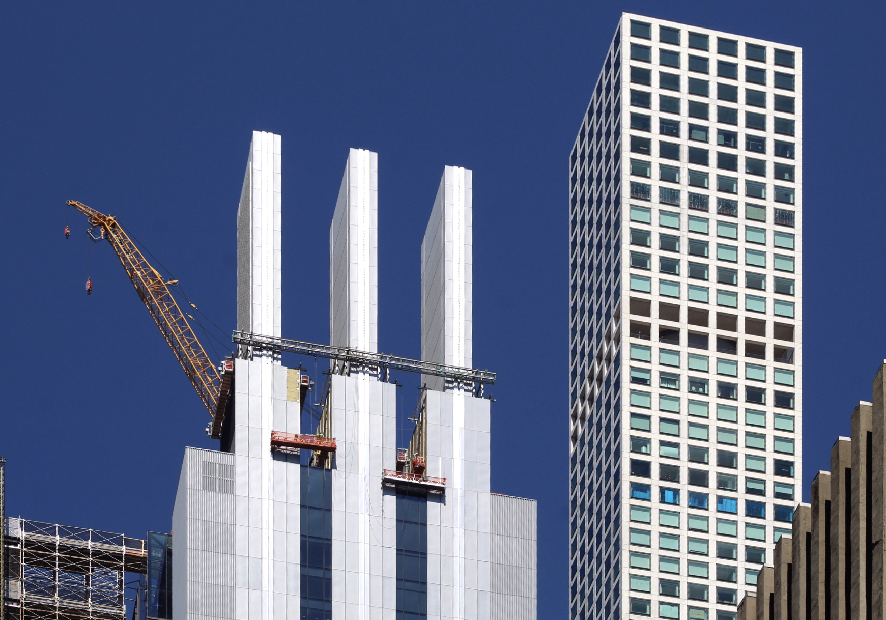
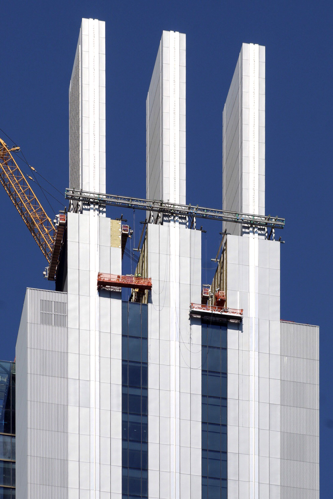
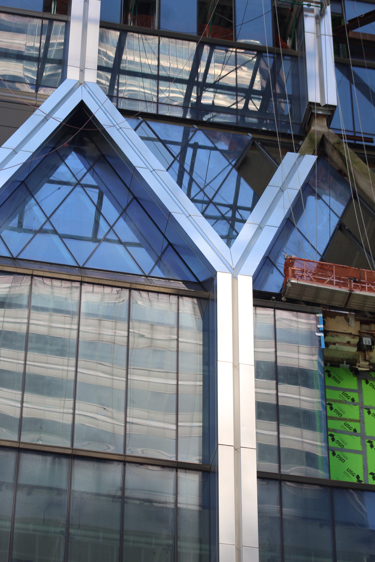
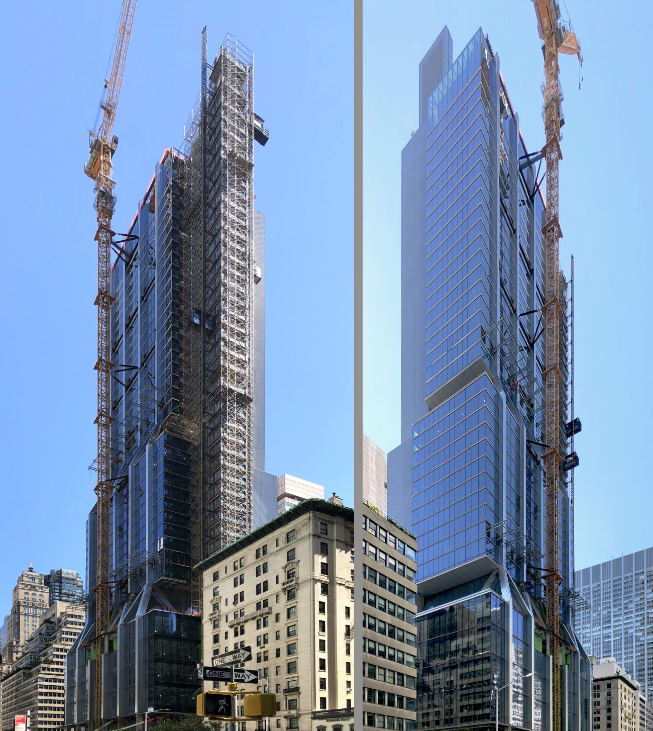
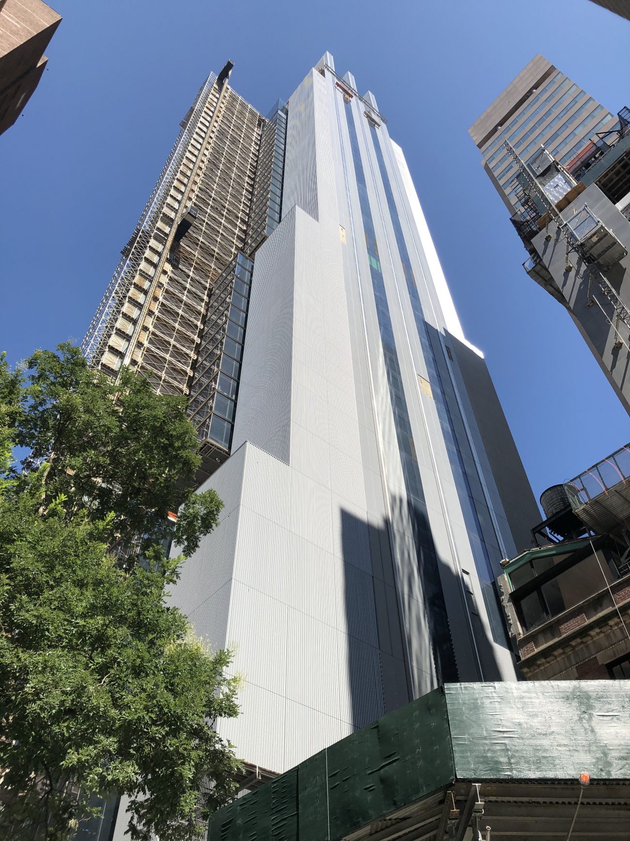
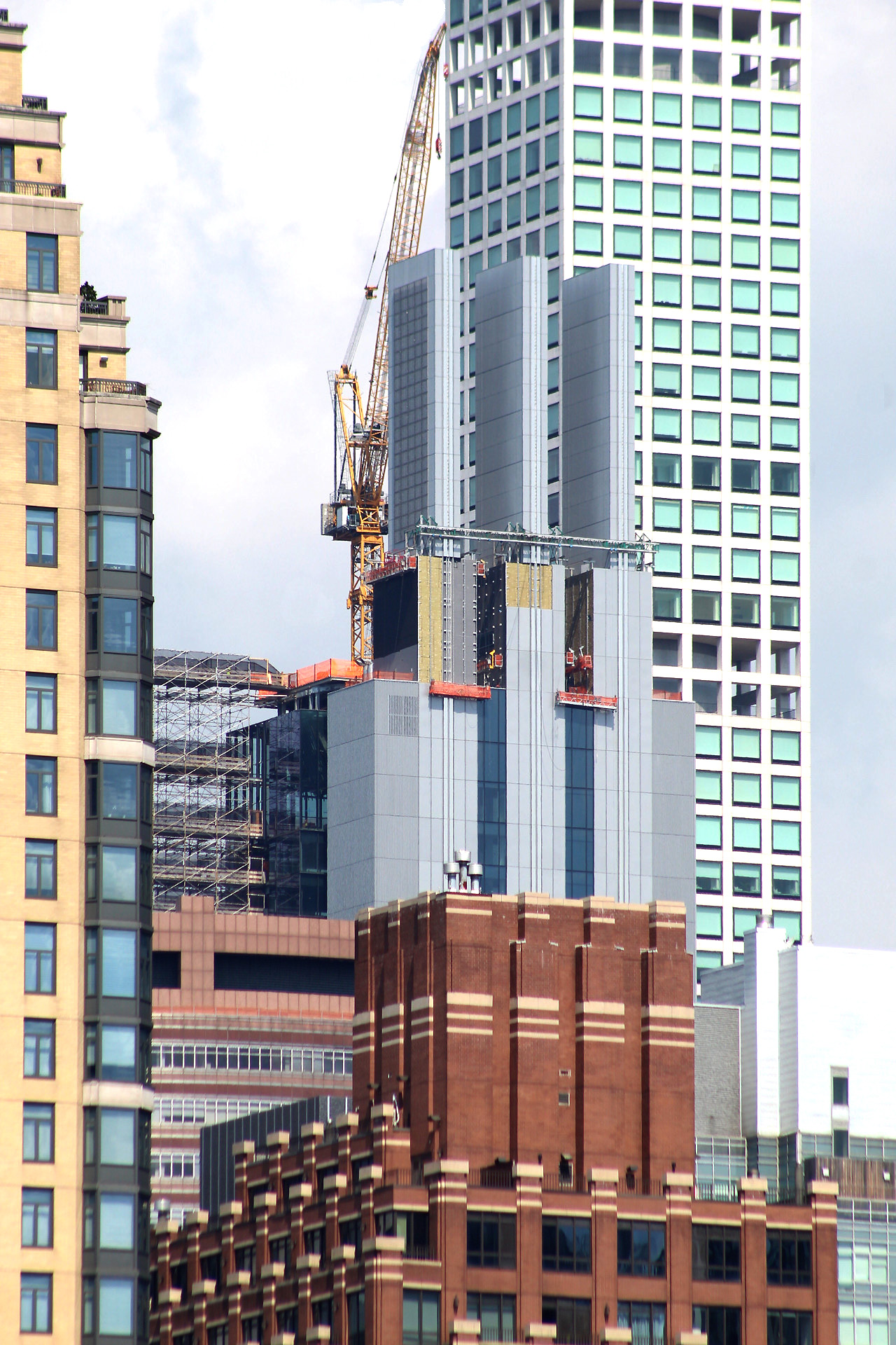
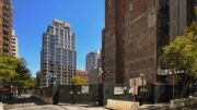
Recent photos show the state of progress on the tower, which is located between 55th and 56th Streets. The signature trio of fins atop the roof parapet appear to be substantially finished, with only some minor touches remaining to be completed on the backside where they connect to the building.
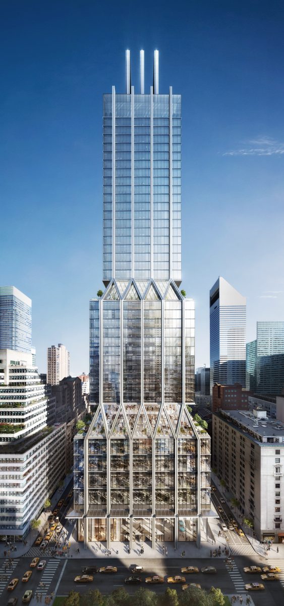
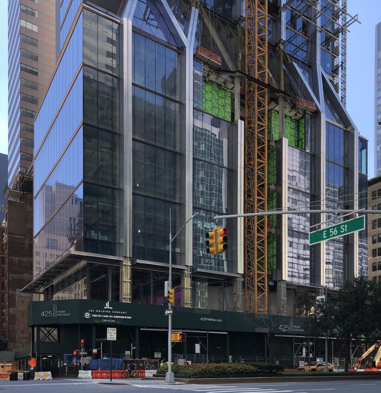
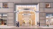
The portion of the exterior furthest from completion is the lower floors of the podium. Large glass panels that enclose the ground floor’s high ceilings are already installed on the northern elevation along East 56th Street, as well as on the side facing Park Avenue. The main rendering shows a large metal canopy cantilevering over the sidewalk just below the start of the first office floors.
The lower section of the construction crane is still occupying a portion of the lowermost massing, which will eventually be enclosed in glass and metal once the upper floors are completed.
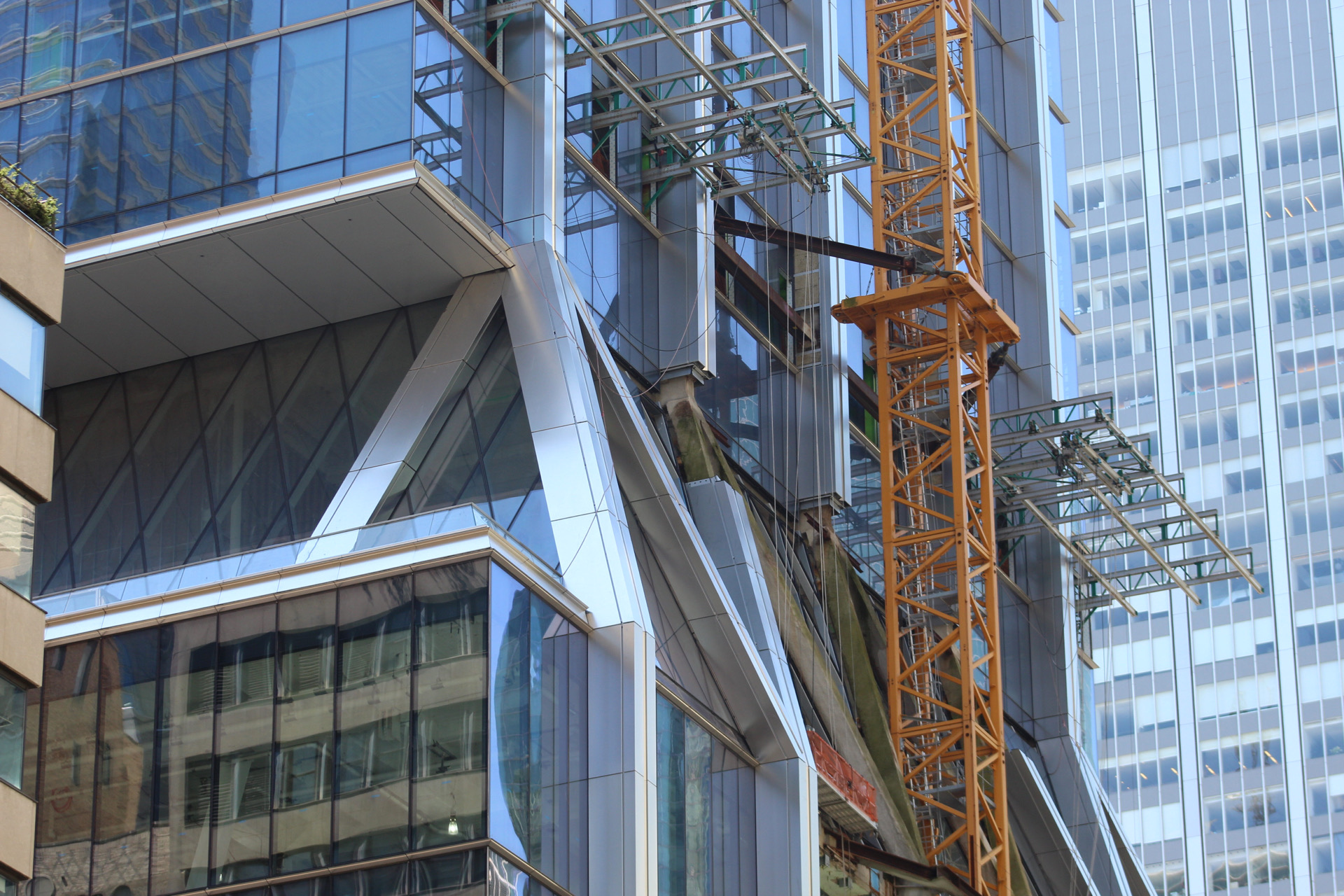
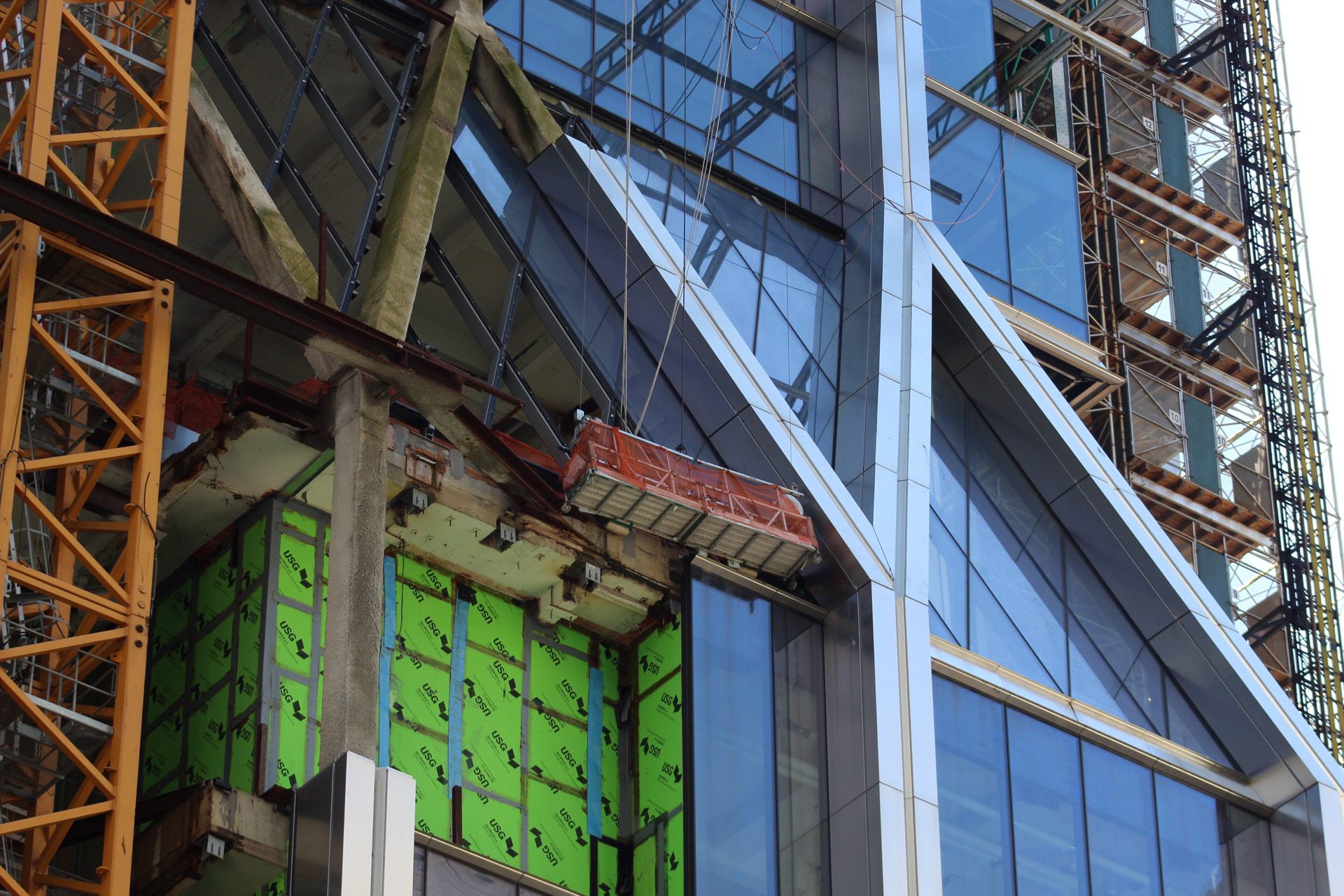
The building’s two main setback transitions are smoothed by diagonal columns and angular glass surfaces with diamond-shaped mullions, an interesting touch that sets the skyscraper apart from other contemporary projects. These areas will host amenity spaces with abundant natural light exposure and views up and down Park Avenue.
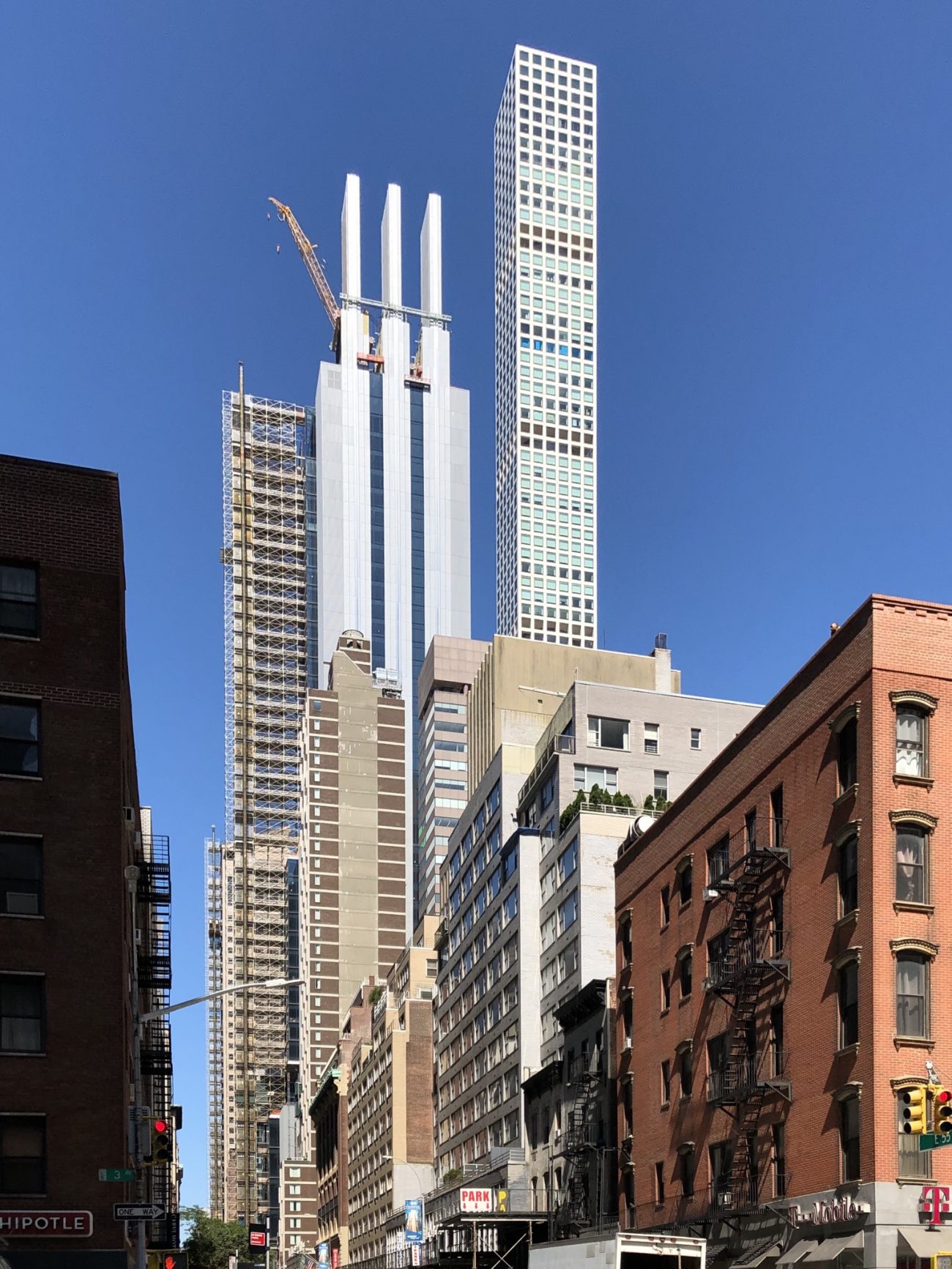
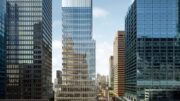
From afar we can see the scale of the fins that rise among the Midtown skyline. The panels that cover the reinforced concrete walls on the rear elevation were installed quickly over the last few months.
425 Park Avenue will likely be completed sometime in 2021.
Subscribe to YIMBY’s daily e-mail
![]()
Follow YIMBYgram for real-time photo updates
Like YIMBY on Facebook
Follow YIMBY’s Twitter for the latest in YIMBYnews

Wow. The back side looks as good as the front.
Yes, the two strips of ‘windows’ on the usually blank, elevator bank backside makes a big difference.
Great architects do make a difference, sometimes.
Maybe even better! Didn’t see that coming.
While I have issues with the its west side, I hope JP Morgan takes up the challenge and builds something this interesting down the street.
While I have issues with its west side, I hope JP Morgan takes up the challenge and builds something this interesting down the street.
Very nice.
Curtain Wall contractor is doing a fine job, who is it ?
As a now “retired” NY trial lawyer, this building looks like the modern equivalent of the “Tombs” (Criminal Courts Building) on Centre St. At least the “Tombs” is ArtDeco.
It looks like a “TRANSFORMER”!
Wonder what it turns into?
Awkward to the max Pastiche. Rife with I’m sure unintentioned non-sequitor historicism. A blot on our Park Avenue. Inept design.
The same was probably said of the Seagram Building and Lever House..
Nice job
The Seagrams Bldg has a serenely elegant, Classically-inspired presence and establishes a harmonious / provocative dialogue with the McKM&W designer Racquet Club / Palazzo opposite. Welcome on Park. Lever house, although rather coarsely detailed and bearing the rather outré imprint of LeC in Rio, is still an elegant urban presence.
This wildly awkward and screeching Gothik-meets-deco-meets-Miesian Epigony of Modernism number Is not to be ‘waved-in’ to acceptability by the malaprop citing of inapplicable ‘precedent’.
designed, epigone
Excellent facade work by Permasteelisa!
Another ugly assault on the City!
It looks like trash I’m my opinion