Construction is now complete on 180 East 88th Street, a 50-story residential tower and the tallest building on the Upper East Side above 72nd Street. Designed and developed by DDG with HTO Architects as the architect of record, the 100,242-square-foot structure yields 48 half- and full-floor homes, averaging 2,088 square feet apiece. Global Holdings Management is also part of the development team for the project, which is located along Third Avenue between East 87th and 88th Streets, directly across from a Whole Foods Market and a short walk from the 86th Street station, servicing the 4, 5, and 6 trains.
Recent photos show the completed look of the Kolumba brick masonry walls, which are made by Denmark-based firm Petersen Tegl. The final cladding now encases the two sets of signature arches, giving them a much cleaner and smoother appearance than they had at the time of our last update in June. A cantilevering canopy has been installed over the sidewalk along Third Avenue with a gold-colored finish and elegant curved shape that matches the arches above. A secondary entrance can be found along East 89th Street with the same architectural language expressed in the gated entryway and northern ground-floor entrance.
180 East 88th Street’s homes feature 14-foot-high ceilings, and the property offers 10,255 square feet of amenities spanning eight stories, including a half basketball court, one of the city’s only private indoor soccer pitches, a children’s playroom, a game room, a residential lounge, and wine storage. The lower levels will contain 1,093 square feet of community facilities, and the building will feature a 24/7 attended lobby and a private gated entry on East 88th Street.
Subscribe to YIMBY’s daily e-mail
Follow YIMBYgram for real-time photo updates
Like YIMBY on Facebook
Follow YIMBY’s Twitter for the latest in YIMBYnews

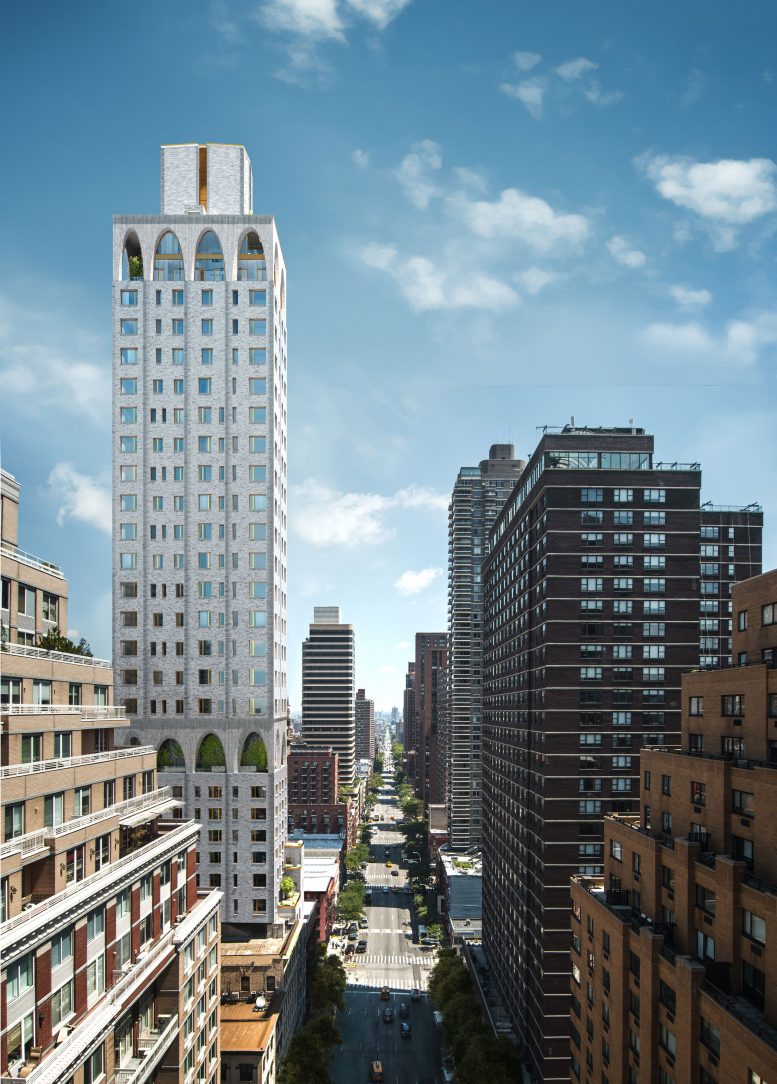
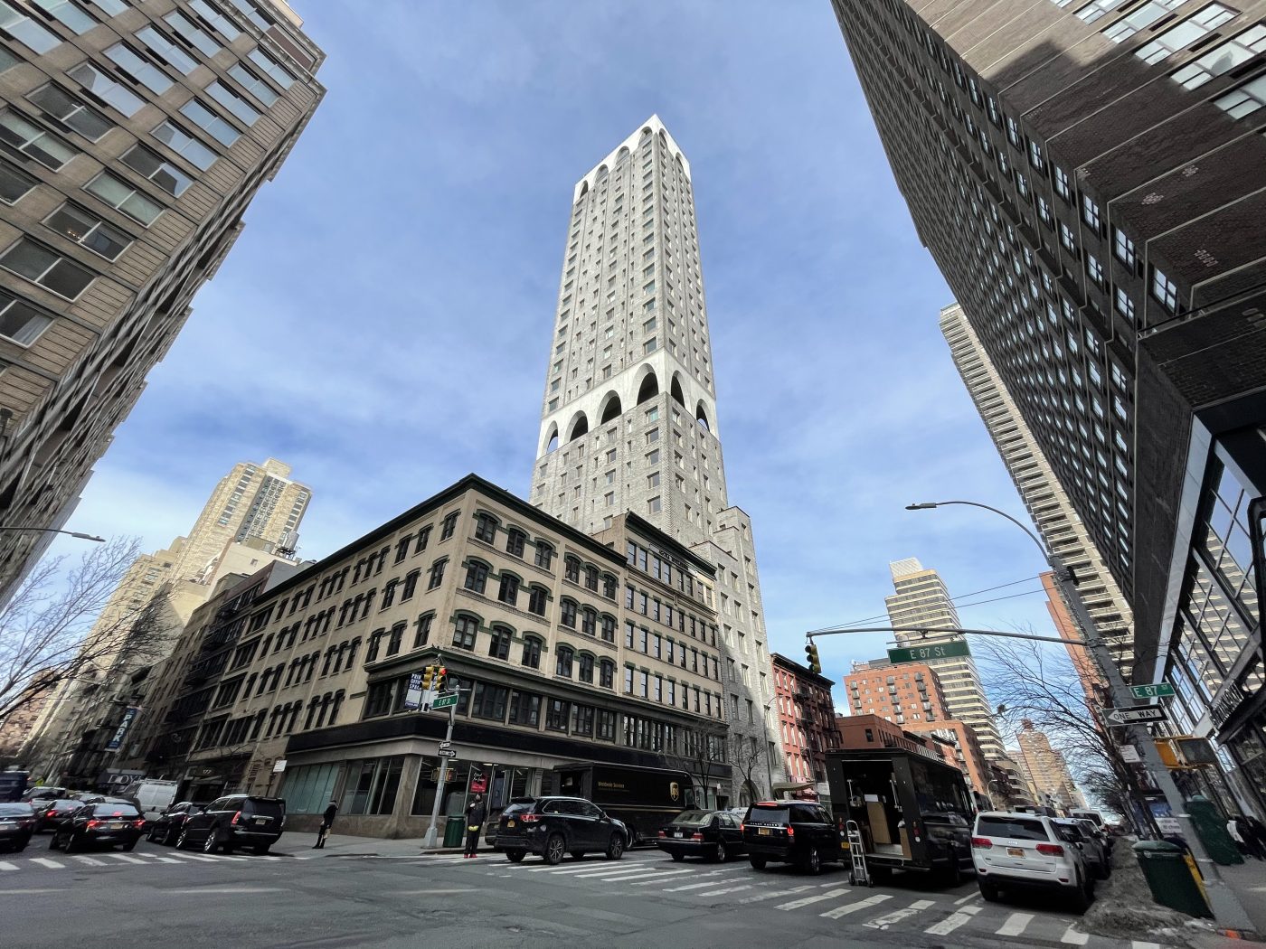
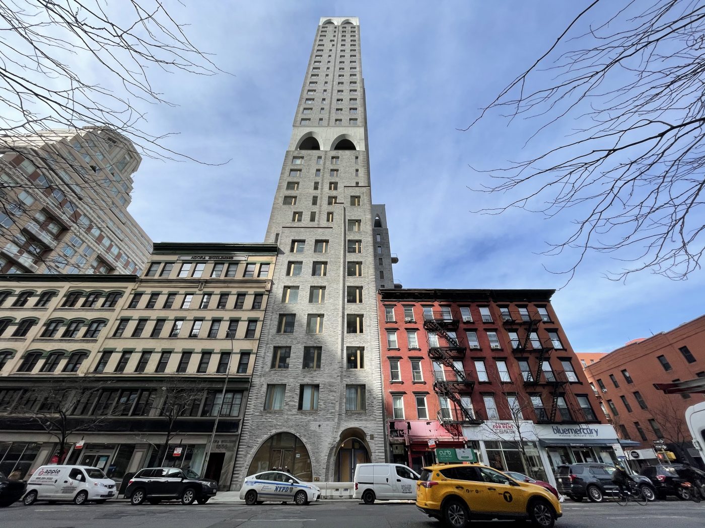
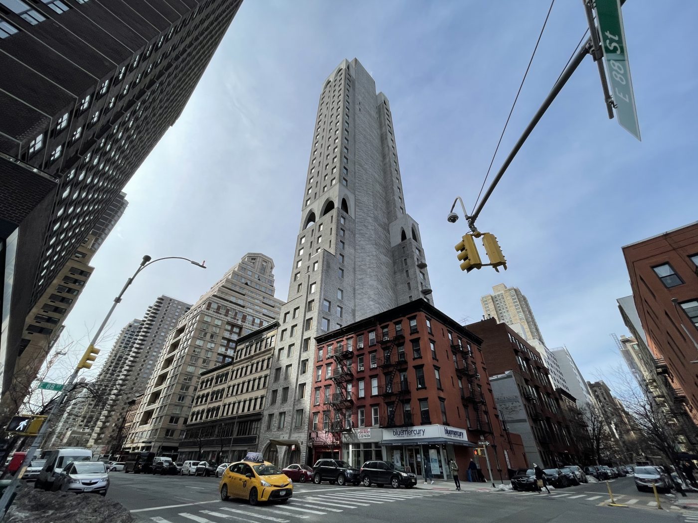
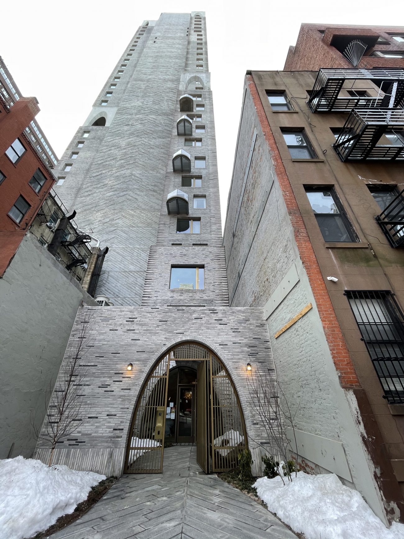
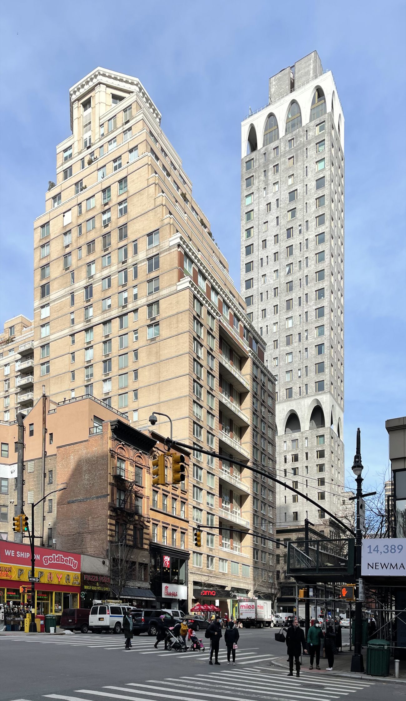

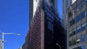
“The final cladding now encases the two sets of signature arches, giving them a much cleaner and smoother appearance than they had at the time of our last update in June.”
Ummmmmmmmmmmm. I don’t think so.
I love it. Nothing else like it, it could be from any decade. It’s nice to see something truly unique and timeless.
easily the ugliest building on the UES. A visual vomitorium
It’s not between East 88th and 89th Street It’s between East 87th and 88th, hence the 180 E 88th address which is on the South side of the street. As a nearby resident, I have lived with this construction for many years. Part of the delay was caused by a stop work order because the developers pulled some sneaky moves to make the building the tallest building on the Upper East Side. Something to do with the side entrance on E. 88th Street. I don’t remember exactly the detais.
It has an erie “Gothic” look to it, and during a “dark and stormy night”, I would expect flocks of bats to fly in and out of those arches! ?
I dubb thee “Catacombs on 88th”!
As for the elevation facing the corner… that massive brick facade and random balconies, seems as if the architect lost interest? It’s horrible.
I would rather live in either of the terraced buildings nearby.
One of the ugliest buildings I have seen. So sad
Totally agree with above comment. Building looks like an innocuous Kaufman designed hotel with no regard for its neighborhood context
Innocuous and Kaufman designed is an oxymoron
So many of these new ues projects are constructed with stone and masonry that is very unappealing. They look like monolithic
prisons or factories
not residential bldgs.
I actually like the service core 89th street side here more than most ‘service core’ blank wall sides in other buildings.
yikes, the mismatched color of the arch sections compared to the rest of the cladding looks abysmal
Only in NY would a “gated entry” be next to a tenement. I used to live on the other side of the tenement, years ago. Though the value of my unit has quadrupled, I’m not sure I could have lasted through construction. (I was a pioneer of work-at-home….)
That is one of the most God-awful, ugliest buildings I’ve ever seen. Hideous textures on the outside, randomly-sized windows far too tiny for their location, blank walls of concrete, a cartoonishly oversized box sitting on top of it all: just jaw-dropping in its design choices. I cannot imagine willingly paying the prices one will likely be required to pay for something in that monstrosity.
Agree with Steven
Totally out of place
And what makes it more of an eyesore it’s position with other buildings budding up to it at that location
Big UGLY doesnt belong in NYC or any other U.S. city, would look good in a RUSSIAN CITY
Hideous building, awful aesthetic, bad proportions, tiny front entrance on the side street.
I don’t know but I count 31 floors – the article states 50 stories. Besides, this is still the homely stepchild of the UES.
‘Equivalent of’ 50 average floors.
This article’s author does indeed say “…a 50-story residential tower…” where no interpretation is required or needed. There is no correct equivalency where the difference is 19 floors, a 38% discrepancy.
To be honest, I think it’s very unique and different and the design is actually quite elegant. I like it.
I agree.
This building is so ugly and a blight on the neighborhood. The cladding looks unfinished. I have endured construction here for over five years. It is a monstrosity and does not belong in this neighborhood. It is incongruous. Most days very little was done on the construction with crews standing around smoking and blocking access to both East 88th Street and Third Avenue. An absolute horror. And a gated entrance on 88th Street next to a tenement that is unoccupied except for its owner who I have not seen in over a year? Come on. NYC can do better than that.
Iconic reminds me of (2) buildings: Plaza Tower in New Orleans and Velasca Torre in Milano. I am not sure iconic is a good thing in general. (Eiffel Tower being the one exemption that Paris did not like when built.) Let us see.
For me, IMO, in 2021- looks like the fenestration is awkward and out of sorts with its neighbors….. like someone walking down the street trying to make a fashion statement.
Ugly and gaudy. It looks like something all the characters in the DC Comic franchise would reside in
Viewed from a distance it has a cartoonish look.
Ugly. Has nothing to do with 89th street. Entrance is on 88th. Not 50 stories. 14 foot ceilings makes it the equivalent of 50. Hence the stop work order. Does not come near 89th street. Sneaky developers tried to get over and got caught. Had to change the average 9/10 foot ceilings to 14 feet. Apartments will probably be around 2 million plus.
Most cities tear down slums. They don’t build new ones.
I like it…something different than a glass box. Hope they illuminate (softly) the arches
Hope you happy with this one as much as developer did in designing it, because yes the arched where I could clearly see: Thanks to New York YIMBY.
An absolute architectural horror. A middle finger sticking it to my neighborhood, and I have the misfortune to live just a half block away from this monstrosity looming over my part of the Upper East Side. I have learned to avert my eyes as I am forced to pass it. There are no words sufficient to describe how profoundly ugly this heap of slag is.
This is a beautiful building. I remember when the construction started, walking by everyday wishing only if I could afford to live there.
There is no way that you really feel that way, unless you have a very odd understanding of the word “beautiful.” Do you work for the developer or perhaps the “architect?” Did you get paid to post something nice in this one-sided onslaught on this abomination? Posts by “David” don’t count: he’s just a terrible faux-poet crying out for help on the wrong site.
The building is profoundly awful. Even if you like the arches – as oddly proportioned and unequal as they are – everything in-between fails to achieve even a Kaufmann-esque level of meh.
The arches are the only thing I like. It’s just a different looking building, compared to all the ugly ones being built in the city the last few years.
Anyway, doesn’t matter, not like I can afford to live there anyway.
I’m in the minority, but I like the design. Mainly because of the arches, but seems out of place for this neighborhood. Still, it’s better than the hideous all gray structures that have been going up last few years.
When you try and copy David Adjaye by putting up arches…it doesn’t work. Be original or you get stuff like this…
Ugh. At least it is not a mirrored glass box, but man is this thing awful. I am trying to find the good side and it just does not exist. Horrid.
A need a application my num
9173495195
Where to get an application
I live across the street and this building captivated me in its earlier stages of construction. It has so much promise! The arches. The height. It seemed like it was going to be an instant success. But as construction has wrapped, there’s something very ‘off’ about it. It feels like it was rushed? The windows look cheap. There are random pieces of plywood on the Third Avenue side. The balconies look like an afterthought and the unfinished (?) undersiding makes them look so cheap. I don’t know – this looks off.