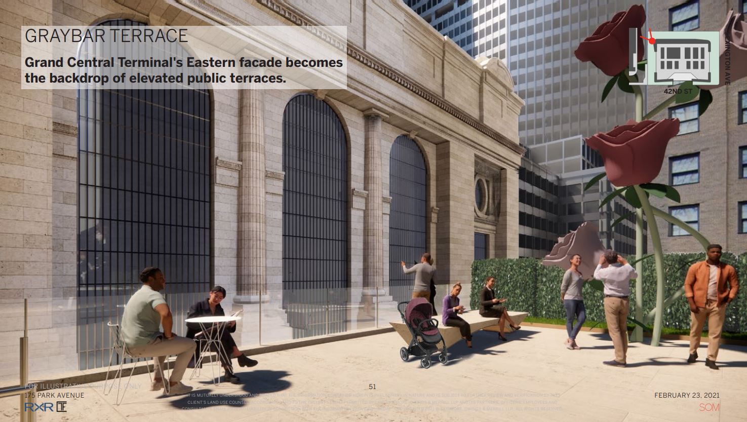
The Landmarks Preservation Commission approved Project Commodore, a proposed 1,646-foot supertall skyscraper in Midtown East, at a public hearing and vote on Tuesday, February 23, 2021. New renderings further illustrate the 83-story project, which would replace the Grand Hyatt at 175 Park Avenue and rise between the 108-year-old Beaux Arts Grand Central Terminal and the 91-year-old Art Deco Chrysler Building at the corner of East 42nd Street and Lexington Avenue. Skidmore Owings & Merrill is designing and RXR Realty and TF Cornerstone are developing the project, which is set to yield 500 Hyatt hotel rooms on the upper floors spanning 453,000 square feet; 10,000 square feet of retail space on the ground, cellar, and second levels; new elevated, publicly accessible plaza space overlooking the surrounding Midtown neighborhood; and 2.1 million square feet of Class A office space.
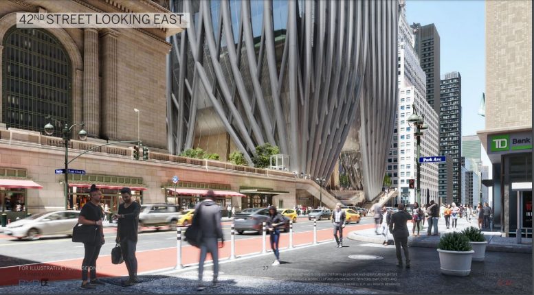
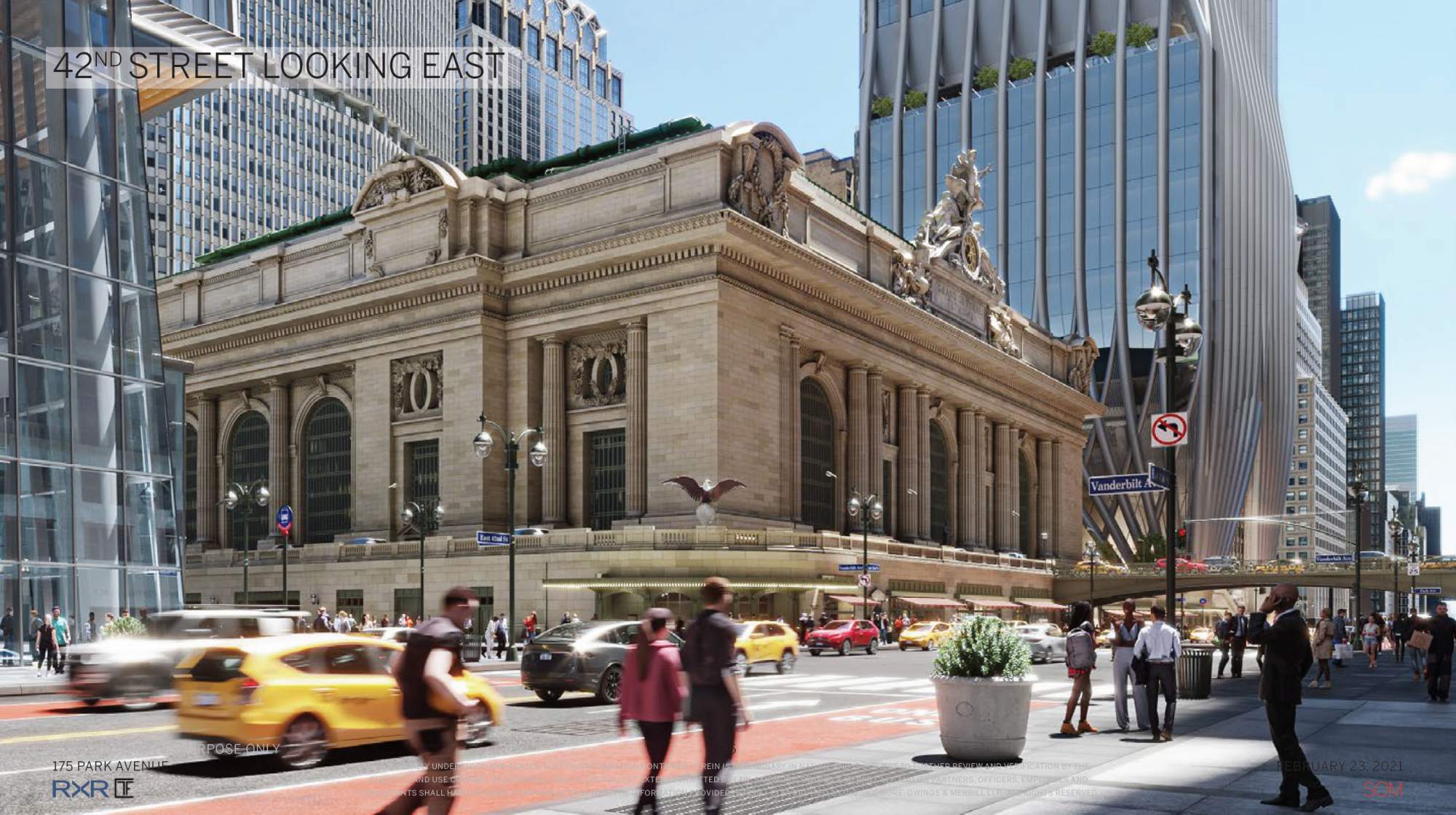
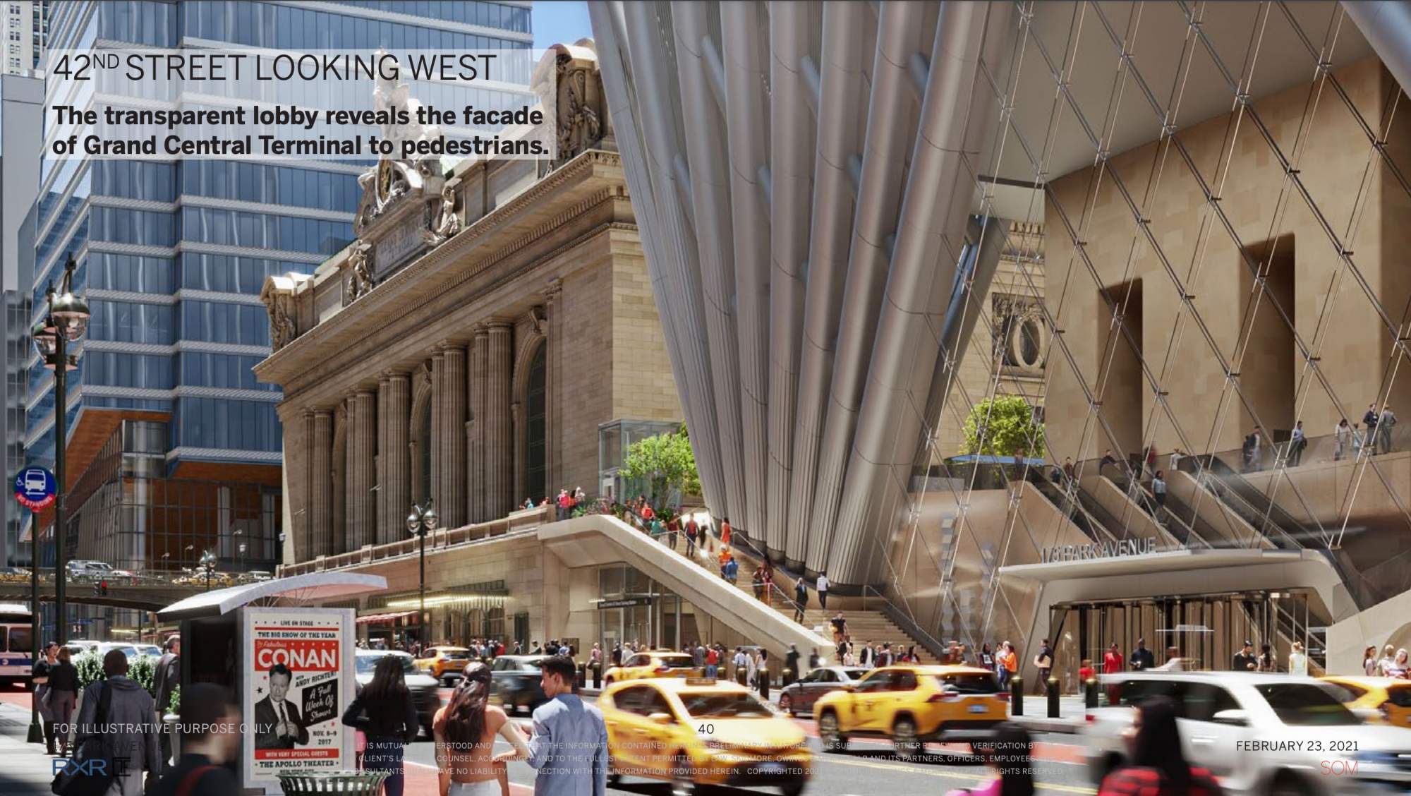
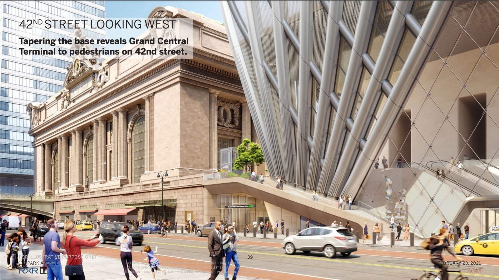
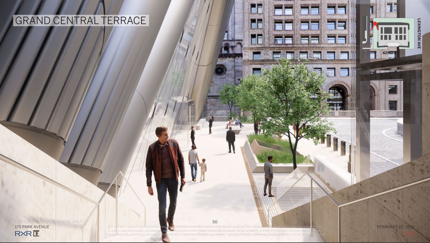
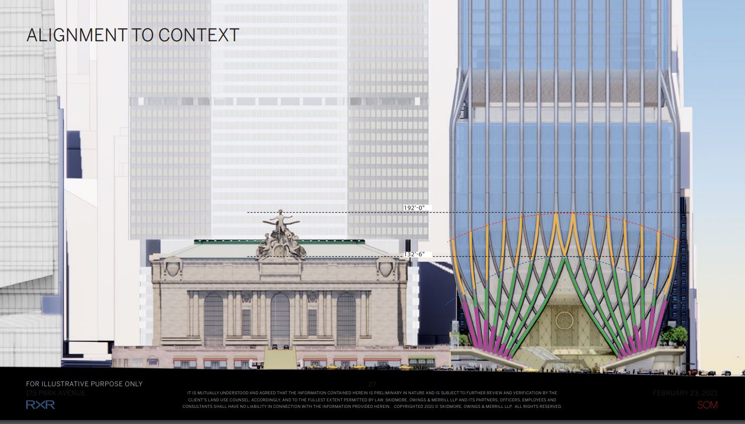
The new renderings from the hearing can be seen below.
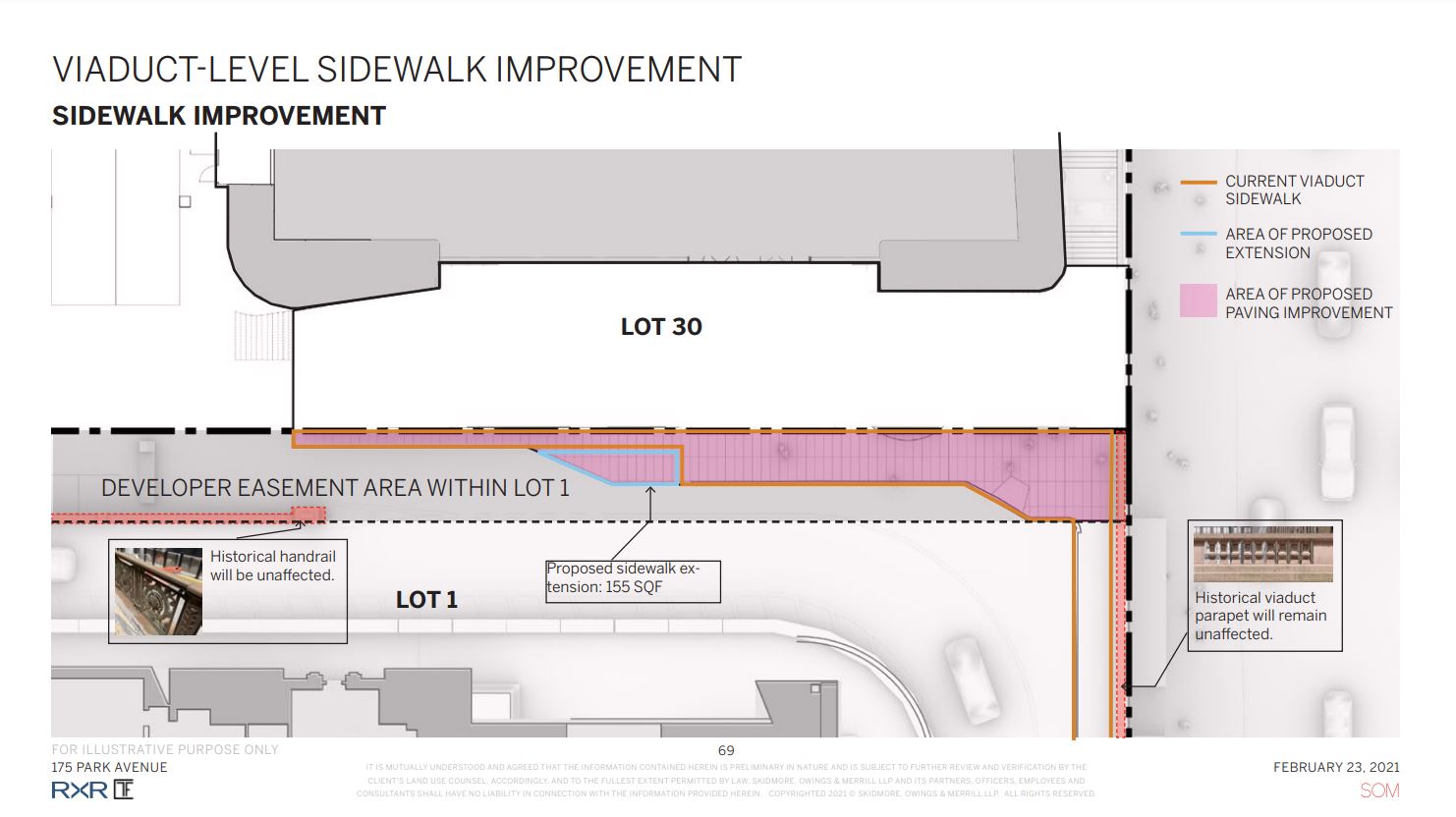
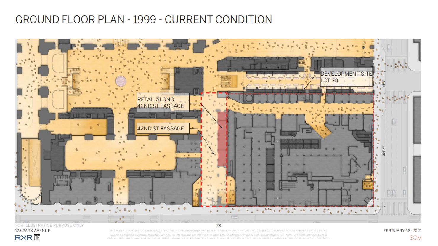
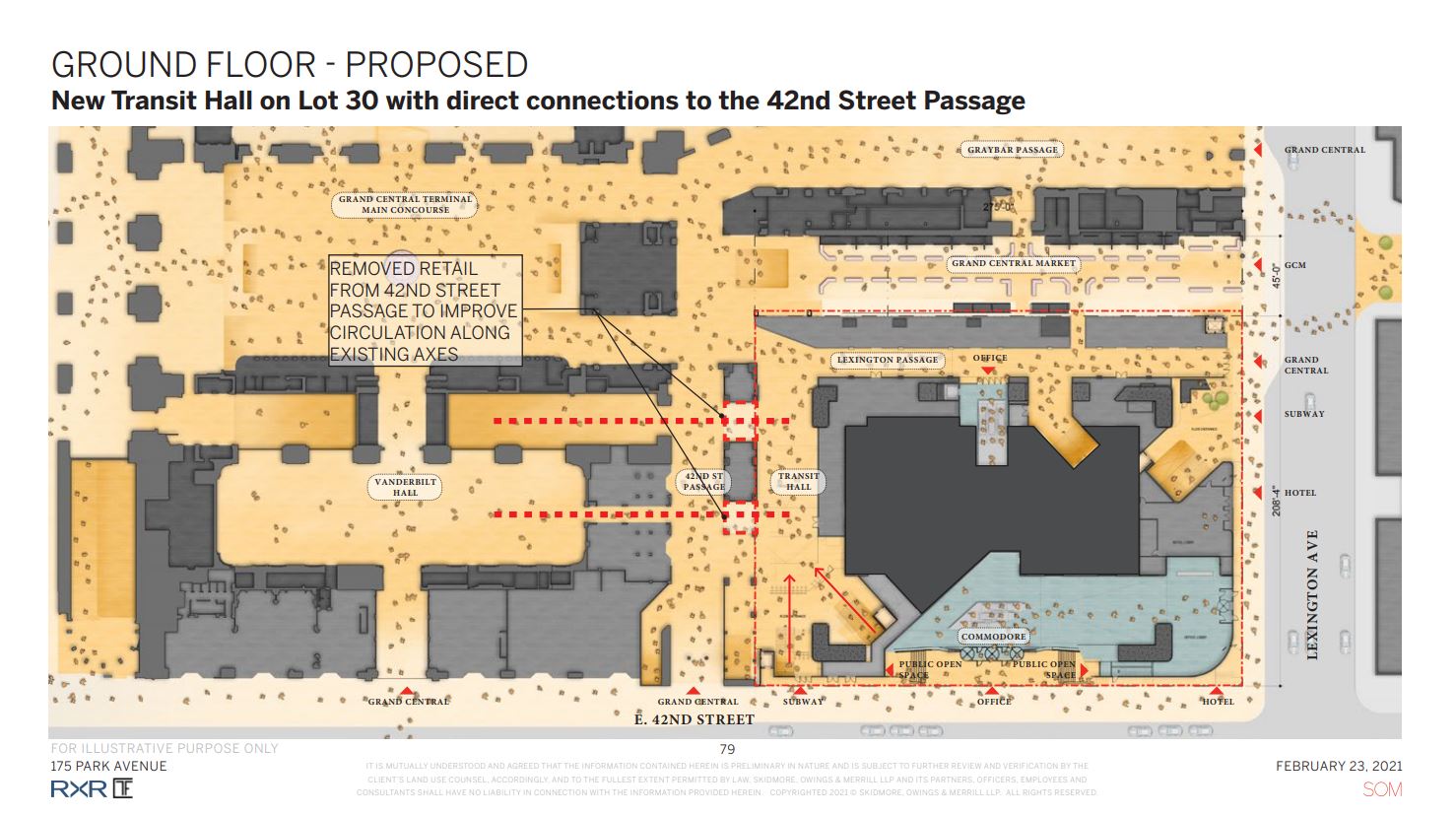
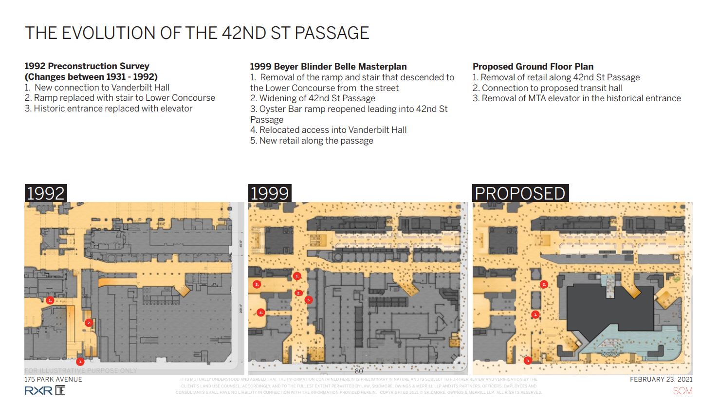
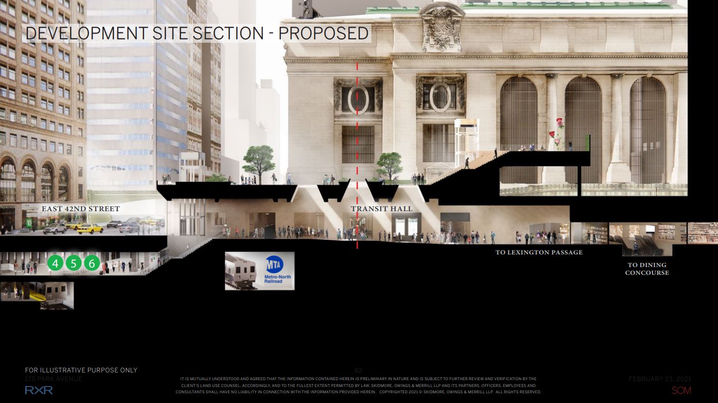
The plans for the supertall successfully passed through the Landmarks Preservation Commission earlier this week in swift fashion, with its approval largely based upon two critical advisory reports in the development of the project: an 8-2 vote on the architecturally “harmonious relationship” of the edifice with the adjacent Grand Central Terminal and a unanimous 10-0 vote on the improvement to viaduct passageways and the proposed 42nd Street passage that would help to more efficiently enhance the circulation of commuters walking among the ground floor, sidewalks, and subterranean levels of the complex.
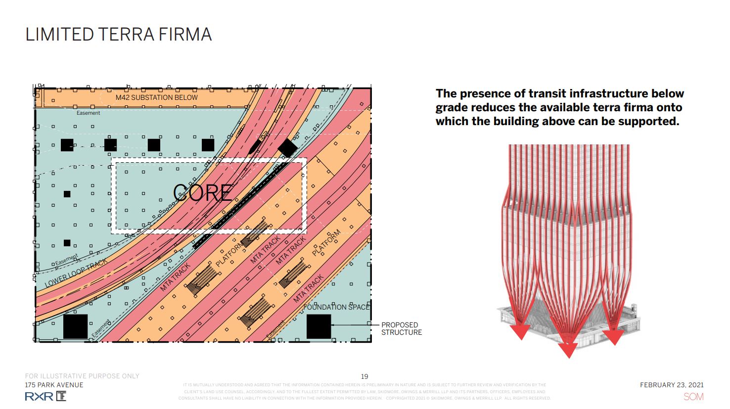
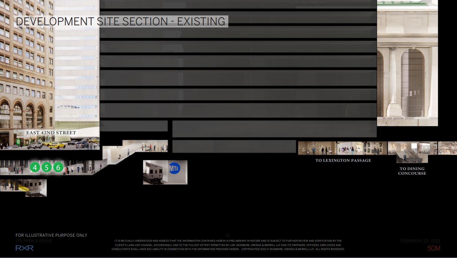
This last aspect also would go hand in hand with the viaduct sidewalks and partial reconfiguration of the limited terra firma in which the base of Project Commodore would rest upon and rise from. Right now there is tight grid of steel columns are currently spread across the below-grade floors, reaching down to the subway platforms and supporting the Grand Hyatt New York hotel above. The new rectangular concrete core for Project Commodore will be surrounded by four huge corner columns that will act as anchors for the superstructure. All of these critical structural components would have to be squeezed within the layout of this dense space upon the demolition of the 41-story hotel.
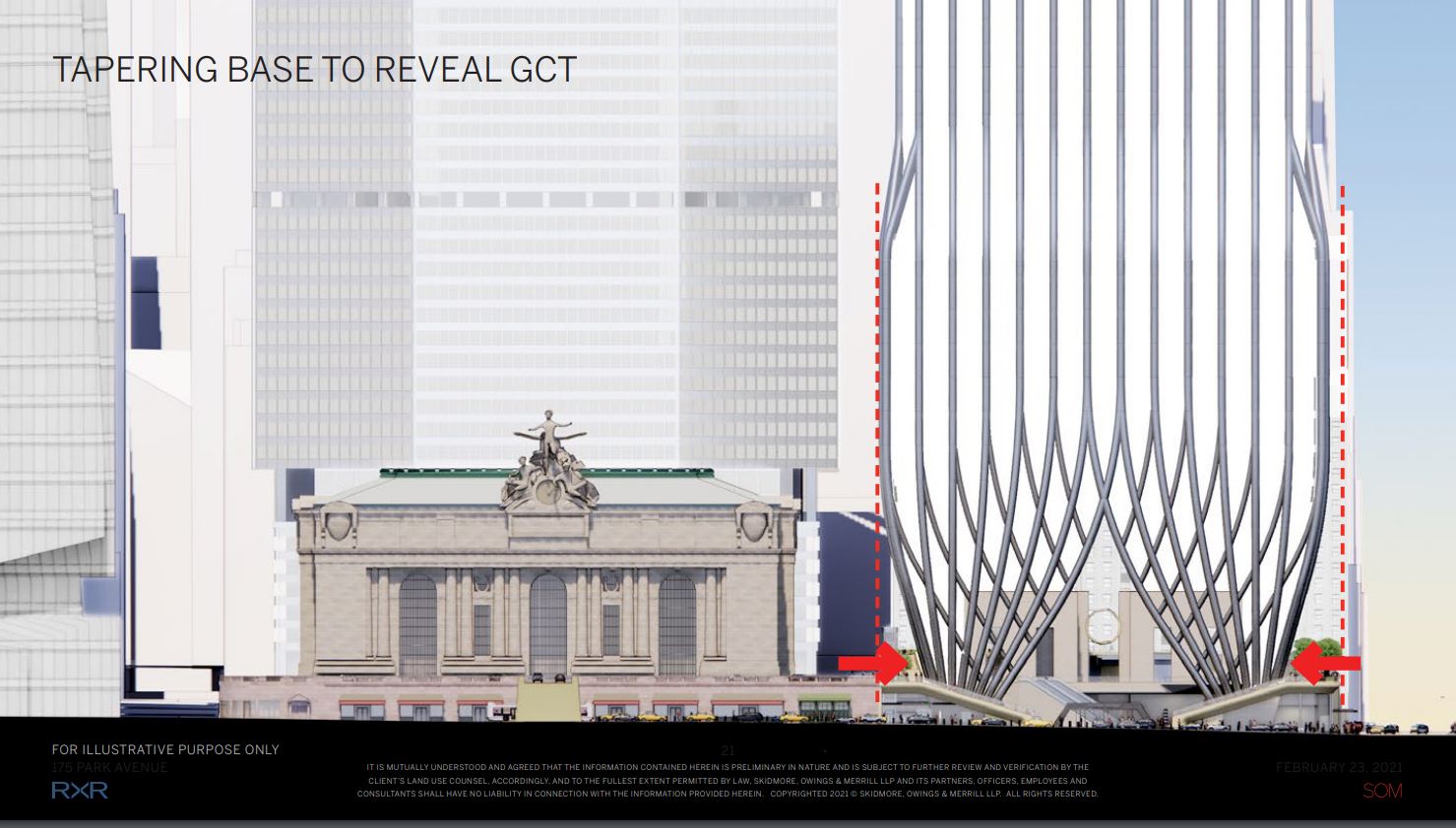
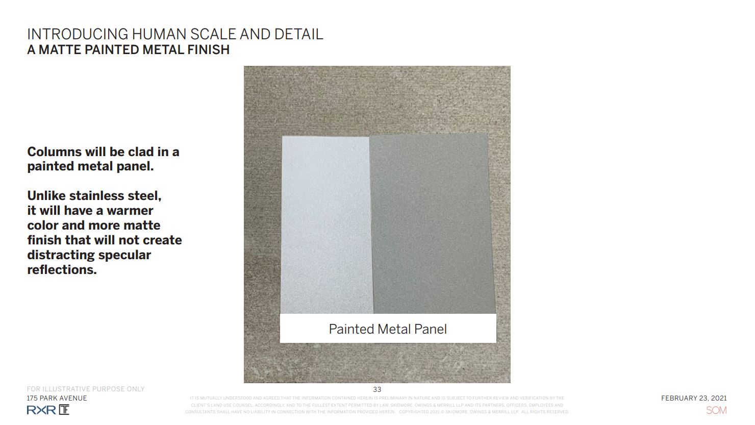
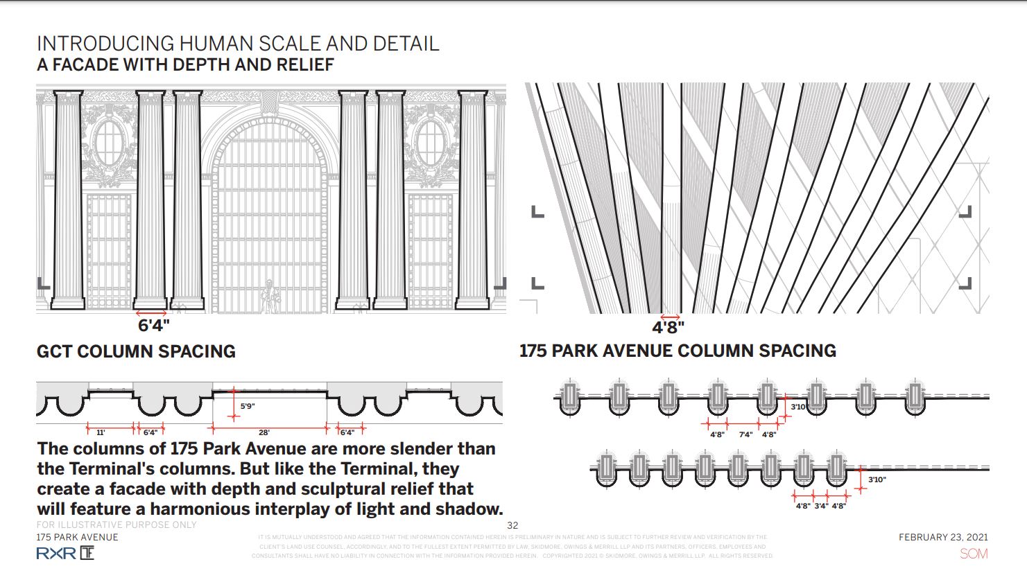
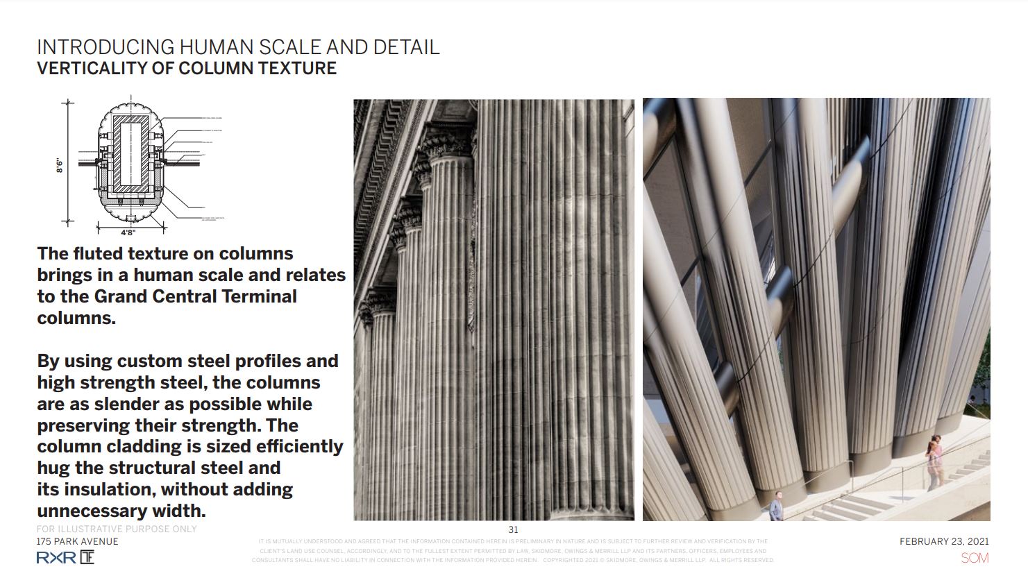
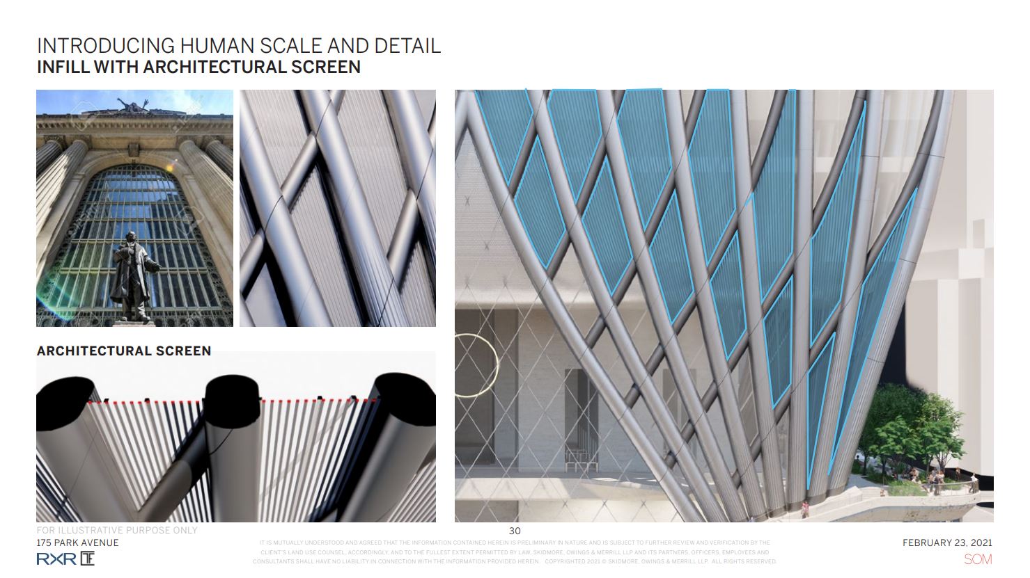
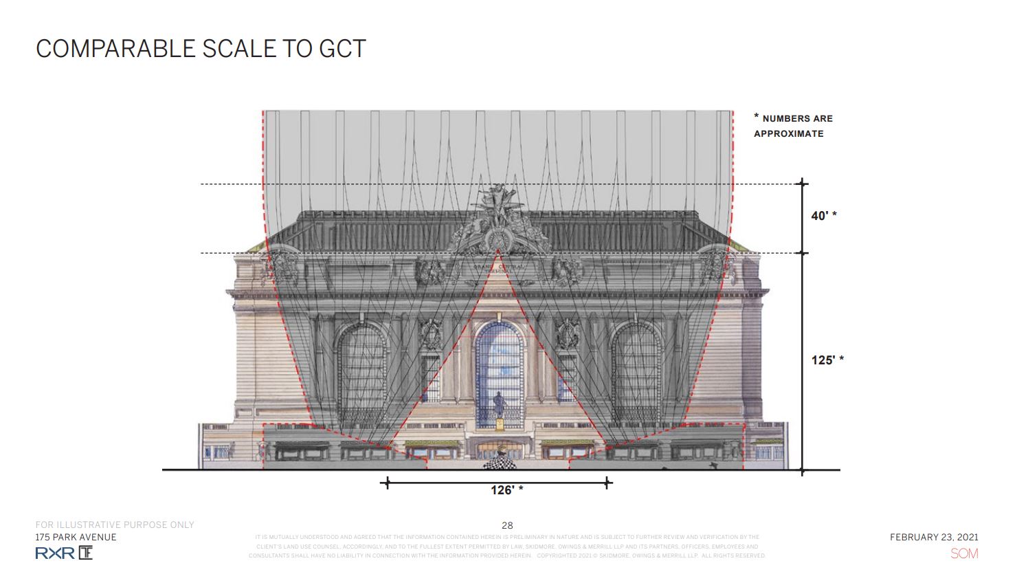
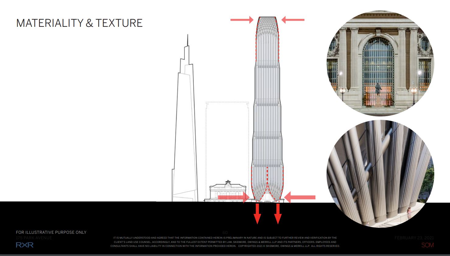
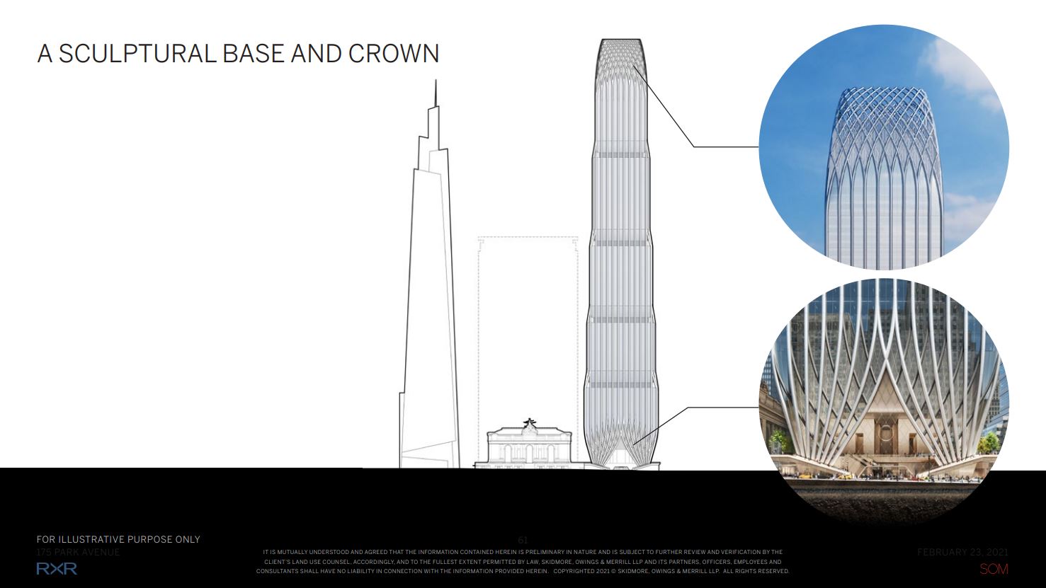
Many of the textures and the choice of exterior materials for Project Commodore derive from and respect the architectural quality of Grand Central Terminal’s proportions, ornamentation, and iconic stone and glass façade. This can be seen in everything from the inspired appearance and spacing of the fluted columns, the height of the base and convergence of the columns lining up with the tip of the train station, and the selection of a matte finish for the metal panels so as to not create an overpowering reflective appearance. The base also tapers inward from the property line in order to fit the second-floor public plaza space and give extra breathing room between the footprint of the tower and Grand Central Terminal.
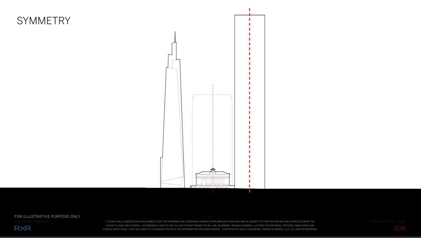
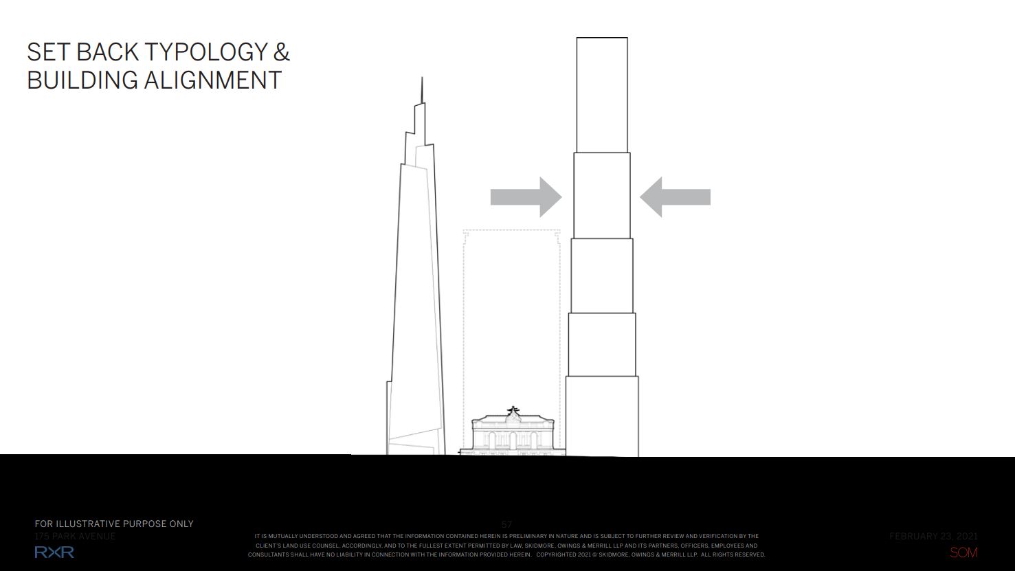
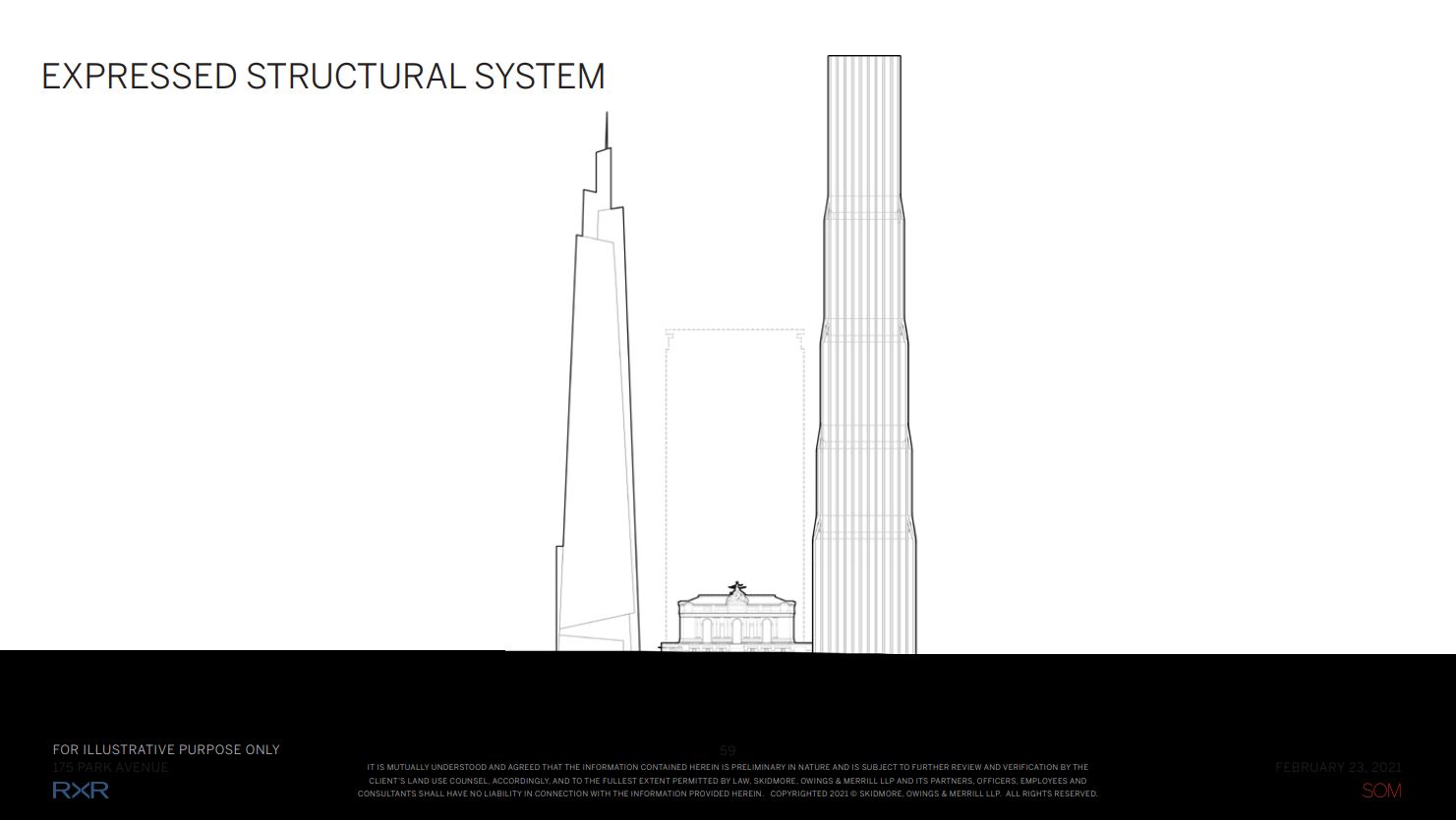
The building massing diagram below shows how the array of evenly spaced setbacks would function as outdoor terraces for future occupants and sit behind the vertically expressive structural system of columns stretching to the sculptural crown, which is designed with interwoven steel and gently rounded corners.
The following floor plans give us an overview of what the layout of the ground has been since since 1992, 1999, and what the new rearrangement will look like.
A set of clerestory windows would shine light down to the 42nd Street passageway, almost reminiscent of the arched clerestories on Grand Central Terminal. New storefronts, floor surfaces, and wall surfaces are also part of the renovation process.
Overall, the increased momentum and approvals are a good sign for the future of Project Commodore, with a realized vision hopefully coming to fruition by 2030. The next key step is a Uniform Land Use Review Process, which is expected to occur at the end of 2021. If all goes well, an 18-month-long demolition of the Grand Hyatt would follow suit.
Subscribe to YIMBY’s daily e-mail
Follow YIMBYgram for real-time photo updates
Like YIMBY on Facebook
Follow YIMBY’s Twitter for the latest in YIMBYnews








Kind of overpowers Grand Central just a ‘tiny bit’..don’t ya think?
It’s a skyscraper next to a train station, what would you expect?
I didn’t feel that way about ‘One Vanderbuilt’ but this second tower really pens Grand Central in, and changes the dynamic..for me anyway.
As if the Hyatt doesn’t pin Grand Central in already? As a former Metro North commuter, this will be a big breath of fresh air. I log the additional space provided between the two and the added public space.
I agree. I was 16 y/o when the Pan Am Bldg opened in ’64. Awful. One Vanderbilt, although modern/futuristic, complements Grand Central because it is wonderfully tapered and soaring. This new one, however, is not only grotesquely massive but dystopian, like the buildings in the first Batman movie.
More ugly architecture. No class. No elegance.***SIGH***
I wish there was an architectural director who makes sure nothing after Art Deco is allowed in NYC.
I rather like the building – especially the base and crown as proposed. However, I fear that the poor Chrysler building, a favorite of nearly everyone, will largely disappear behind such a large and tall mass.
Scars on my beautiful skyline.
No tall buildings in Manhattan!
I think that ship has long sailed – over 100 years ago!
NO LIMIT to the height of buildings in Manhattan!
This is insane-clearly these renderings lie-even now Grand Central is never bathed in so much light-it makes it look so happy and illuminated-it will never look like this. They also still neglected to show the Chrysler Building. Ungh.
Awesome!
Not objected to its height but perhaps a tapered spire and less bulbous(?) base would be more respectful to both grand central and the chrysler building…and 1 vanderbilt even
Just what we need another tapered skyscraper in NYC.
You can’t help but to be impressed by the stunning presentation put together by SOM. Every detail so carefully thought out…wow!
SOM usually does great presentations, but on one occasion (for submission of drawings and renderings for the 2003 AIANY award ) they neglected to include a naratitive and the judges almost threw their submission out! Fortunatly, the videographer happened to be familar with the project and convinced them to leave it in, which is good because they won it!
For those who think this may overwhelm GCT, consider how claustrophobic that east side of the terminal is right now with the brooding, dark mass of the existing hotel. While the existing hotel is much shorter than this proposed tower, it is a very bulky and dark structure that hides the terminal. I actually think the relatively open pedestal and many setbacks would make the east side of GCT more visible (or at least not less so) and more inviting.
Looks like something I found in your mom’a top drawer
It’ll be the most phallic building in the city so at least it’s got that going for it.
Simply stunning.
At age 73, I hope to live long enough to see this come to fruition. The tower is elegant, non-gimmicky, and proportional to its height. It exhibits RAMSA characteristics but on a commercial tower w/o the limestone facade.
WOW! What a spectacular project. I do hope that it’s lattice top will be skillfully lighted at night and visible for miles. What a landmark this tower will make.
The presentation makes it hard to argue against. Yes it’s tall next to Chrysler, but the benefits and additional public space are a worthy gift to the city in exchange for the additional height.
I typically try not to use this word a lot, but this project is quite simply awesome. I believe the LPC had it right with this one, for sure. And what a great presentation too. Truly amazing.
Wow that base and crown rendering looks horribly phallic. Redesign needed.
It’s fair to say most skyscrapers look phallic. Not a hot take.
Lots of dirty minds out there. Aren’t almost tall towers phallic?
Love the inspiration for the base — striped harem pants!
Exactly!
They still don’t include the poor Chrysler Building in their renderings. Almost like they’re ashamed of what they are doing to our skyline’s loveliest icon…
And to the people who argue that this project is simply maximizing space next to a transit center, how do you justify the 20-foot-high floor plates? This thing isn’t good urban planning; it’s an obscene monument to greed.
Perhaps SOM excluded the “poor Chrysler Building” because they’re presenting their proposal, not an architectural competition. The Chrysler will endure by virtue of its iconic uniqueness. It’s inevitable that she would eventually get a tall neighbor to her west and that being the case she’s getting the best. Moreover, the Chrysler is most famously and commonly viewed from the east.
I think the close-up views of the Chrysler Building from this towers upper terraces will be amazing.
I feel it’s a beautiful building in every respect. I wish it were not on this particular site dominating by girth its neighbors, GCT and the Chrysler building especially. One Vanderbilt is also very tall but so graceful. On Park in the upper 40’s this new entry would be the belle-of-the-ball.
Finally, a project tailor- made to engulf and destroy the visual inspiration New Yorkers have so long cherished—our beloved Grand Central Station and Chrysler buildings. Cherish it while you still can—the heart-lifting view of the exquisite Chrysler building, viewed at night, glittering unchallenged in the sky. This monstrous edifice being built is an obscenity unparalleled in the grubby legacy of architect egos and developers’ greed.
Great design presentation and loads of new amenities including open pedestrian/circulation space in and around GCT, however it’s sheer overwhelming bulk eliminates the classic views of the more elegant, architecturally distinguished and beautiful profile of the Chrysler Building forever. Pity this design couldn’t have been dropped in the Hudson Yards or downtown or anywhere else for that matter.
Overpowering, disorienting, ugly monstrosity. A “harmonious relationship” with Grand Central? What in the world does harmony mean?
You said it! If this is harmony then the word has lost all meaning.
It’s a huge monster meaningless, and it’s a shame to think about it so close to one Vanderbilt.
For a moment there I thought you were dishing One Vanderbilt which, IMHO is a blight compared to Project Commodore (175 Park).
It looks like there is a warm stone base similar to GCT behind the steel anchors. If so, that would be a nice nod to the old girl next door.
I don’t think there is another building in NYC with as much thought and care in it’s design as it relates to another building. Seriously, the scored column bases, the geometry that would make DiVinci proud. I’m really impressed with the entire team.
Well done RXR and SOM
MontMan, I couldn’t agree more. But don’t forget, there’s plenty of time for everybody to screw this up big time.
This hulking edifice looks like a very tall ballerina balancing on four very fat legs.
And the upper portion & crown (not pictured here) unfortunately reminds me of the former World Trade Center’s distinctive columnar exterior.
Well, what do you expact from an outfit called Skidrow, Owings & Merrill, he said in jest.
another addition to the worlds greatest skyline. I love it. but the chrysler building and the empier state building will always be number one and two in my book.
This brings a lot of improvements at the base with better connections to the GCT, but the overall massive design is just too tall and too overwhelming.
Keep the ground floor plan with its better connections to the terminal, but the entirety of the mass above that needs a serious scaling down.
Yes, well expressed Sir Chet NYC..In One Fell Swoop, this giant succeeds in crushing both Grand Central Station and the Chrysler Building, no simple feat.
Glad to see more towers going up, but couldn’t they have made this one a little bit less ugly/chunky? This just makes me sad (whereas most of the new towers in midtown in recent years have made me happy).
I am looking forward to the brief period of time when the current hotel is demolished, and new building hasn’t reached street level when we will be able to see GCT and the entire Chrysler Building together next to each other. I hope some of our talented photographers manage to capture the moment for.
For how well designed the base of this tower is in relation to GCT, it’s really a shame that the massing is so bulky. This building wouldn’t be such a detriment to the Chrysler (and the iconic nature of the skyline as a whole) if it was a little more slim. I don’t necessarily mind the height so much, as the vertical details and the lighting scheme are clearly attempting a nod to NY’s art deco tradition, but why so massy and bulky so close to one of the most important architectural landmarks in our country? Trim the sides down a bit and make a stronger taper towards the top, and this wouldn’t be such a bad tower. The same could be said of the relationship b/w the Empire State Building and “Penn15”. Unfortunately, the bulk trend doesn’t seem like it’s going anywhere anytime soon, as tenants appear to like these massive floorplates and high ceilings.
Regardless, I’m getting tired of seeing one SOM and Norman Foster project after another with little of the original elegance or craftiness of their early buildings. These legacy firms need to go so we can get some fresh air in skyscraper architecture – 9 DeKalb serves as a nice model for a new standard.
I will qualify this by saying that the ESB is also getting somewhat enshrouded by the new developments on the west side, such as Manhattan West and Hudson Yards, and it looks like we are one project on the Con Edison site away from the same story on the east side, so what the city needs now more than ever is a statement project; Something that can serve as a replacement building for the ESB more than anything else. Something taller, equally iconic, and most importantly Art Deco. Get those three things, and you’ve got a win. And please make it at least 2,000 feet high cumulatively. Maybe rebuild the core of the MetLife North building and tack on the 70 or so additional floors that are missing?
Lower part of the building is very much like the old WTC. Has that same vibe.
Yeah, but the Twin Towers (Should have been rebuilt, I don’t care what anyone else says) had each set of doors surrounded by two columns which were extruded around each door and then down. This basically extrudes all of the columns onto the four corners of the site and then down, consolidating the doors into the midline of each elevation to this tower. Similar structural concepts, just done a different way.
It distressing that there in no mention that the Chrysler building, when you look east from 42nd Street will be completely gone from the streetscape and will forever be dwarfed by this over-scaled monstrosity. Even on the street-level it obliterates any sense of human scale or context.
Slim it down by 25% and take one section off the top. Way too overpowering for the space.
Drawing: Unlike any other building in New York, this one bulbs out for 150 of the final 175 feet of its base, and does so right into GCT plaza.
Text: TAPERING BASE TO REVEAL GCT
Verdict: Orwell would approve.
Yuk. GCT was always a favorite. I worked in the Chrysler Bldg for 35 years.(I have a picture of the Chrysler Bldg on the wall in my office. YUK!