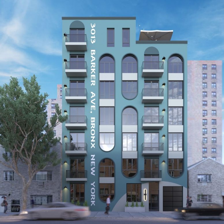
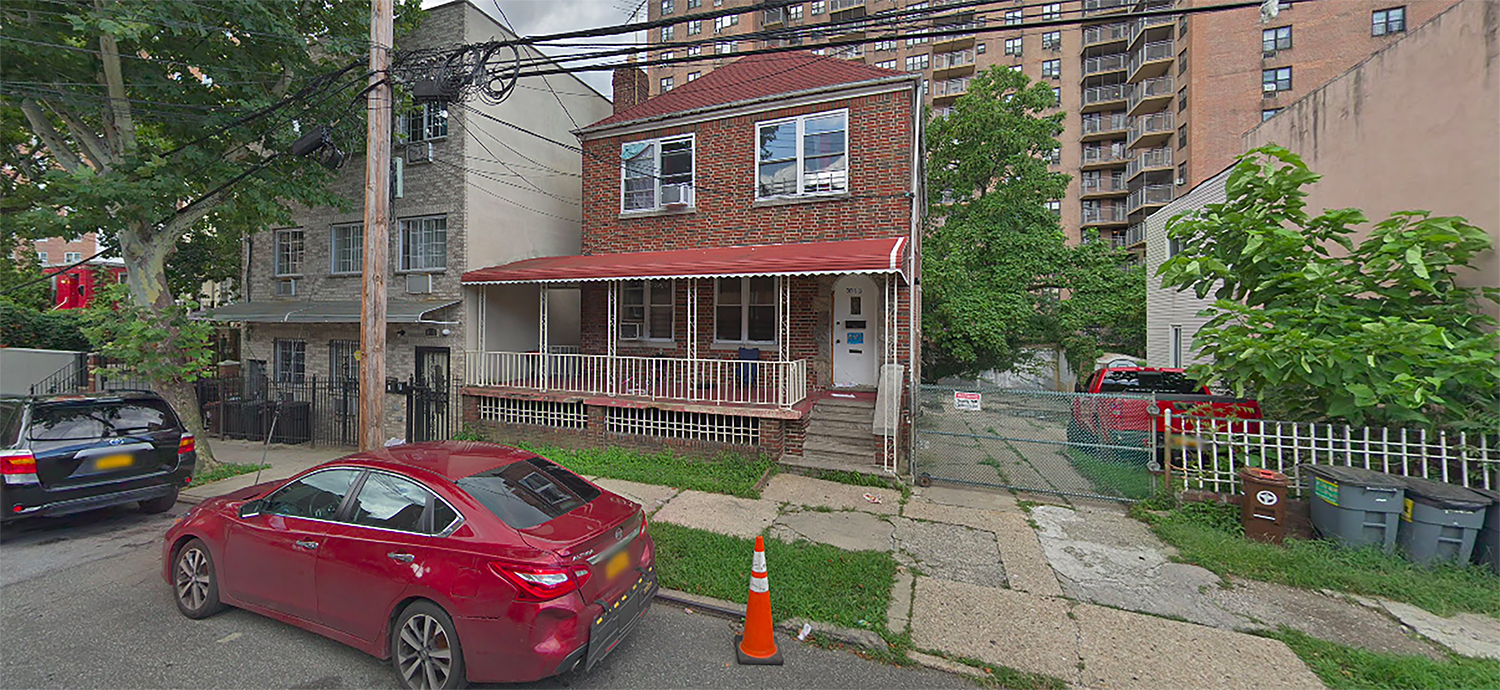
CSTERN Design has revealed the first architectural renderings of a seven-story rental building at 3013 Barker Avenue in Bronxwood, The Bronx. Designed by Aharon Machlis of AM Architecture, the property will replace a two-story multifamily building and yield 29 apartments.
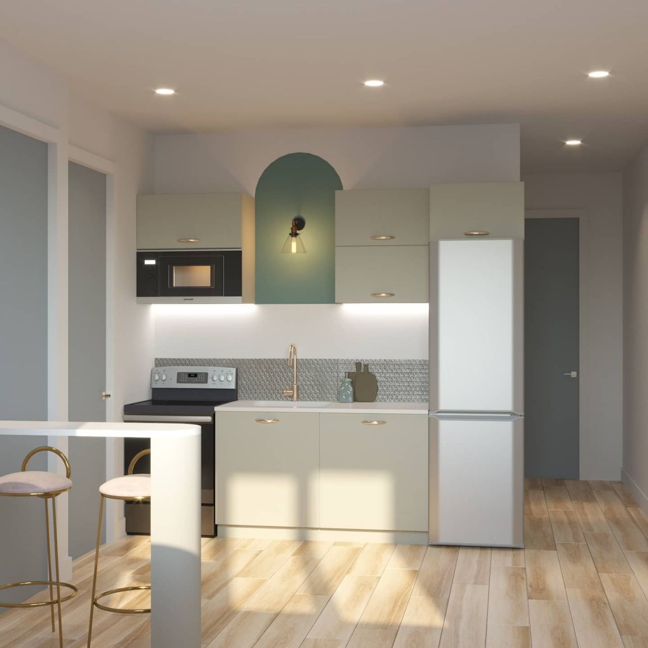
Chaim Stern’s CSTERN Design will serve as interior planner. SKMF Queens Management is listed as the owner behind the forthcoming development.
Total built-up area will measure 22,744 square feet, with 21,773 square feet designated for residential use. Renderings from the architect appear to reveal a roof terrace, but it is unclear whether this will be reserved for a penthouse unit or for communal use. Permits filed with the city’s Department of Buildings also do not specify plans to construct any residential amenities.
The building’s vibrant teal façade is perforated by large arched windows, a combination that some critics say resembles an Art Deco-inspired vertical submarine. Along Barker Avenue, the building’s address will be pinned or painted onto the façade from the ground floor to the roof, making it hard to miss for passersby. At this elevation, the building will also feature a series of private residential balconies.
An estimated completion date has not been revealed.
Subscribe to YIMBY’s daily e-mail
Follow YIMBYgram for real-time photo updates
Like YIMBY on Facebook
Follow YIMBY’s Twitter for the latest in YIMBYnews


I’m speechless, and not in a good way.
How do you detail to drain the rain that collects in the upside-down arches?
Or is that not really an issue?
I don’t think it will collect, the rounded sill should still be angled slightly down towards the outside as is standard
Hi how u doing today i have voucher for $1.265 with city feps & i’m looking for a 1 bedroom apartment & this looks like a perfect place to start over please can u help me
Did not realize we were living in south beach. Im all for trying new styles but this does not fit into the neighborhood at all.
I rather have this then some terrible Badaly box with rectangular windows punched in it.
Awful. Looks like something out of Woody Allen’s Sleeper.
The fact you’re associating Sleeper with something awful is what’s awful.
It’s………………….ambitious?
We’ll see. Those silly graphics likely won’t actually be on the building and who knows how those arched windows will look like in reality. I’m just thankful it’s not another creative black hole from Badaly.
Yeah, it’s unusual and that’s not all bad. But please, don’t paint that YUGE address on the side. That is a big step too far.
Well I sure hope they don’t own cars. There is absolutely no street parking. Gives us garages not more silly buildings that are being squeezed into tiny places.
LOL. Yeah absolutely not precedence for building a building in New York City without parking. Do you have eyeballs?
I’ve got to give these guys credit for not overly ***ing up these renderings. This project might just end up looking this mediocre.
Oh my gosh…
Please don’t take the Losh’s name in vain.
It is an exemplary kindness that you reported, and disclosed the design: Who has seen it? Thank you.
I like the color and love the unique window arches. We need more bold, interesting design like that. The balconies are fine. But the lighting is stupid and the giant lettering is horrendous.
When will they start renting out units?