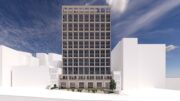
Exterior work is approaching completion on 212 West 93rd Street, a 14-story condominium building on Manhattan’s Upper West Side. Designed by Eran Chen, head of ODA, the 65,000-square-foot project is being developed by Landsea Homes and Leyton Properties, which acquired the 9,000-square-foot plot from the Shaare Zedek Congregation for $34.3 million. The property will yield 20 units designed by GRADE New York and marketed by The Lindsey Stokes Team, a division of real estate brokerage Compass. Homes will range from one- to four-bedroom layouts with some full-floor penthouses. The property will also contain the Shaare Zedek Synagogue, which will have its own separate entrance on the first floor.
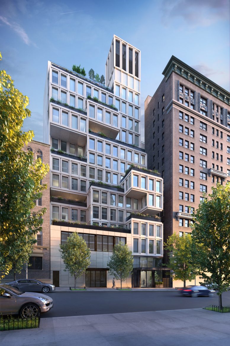
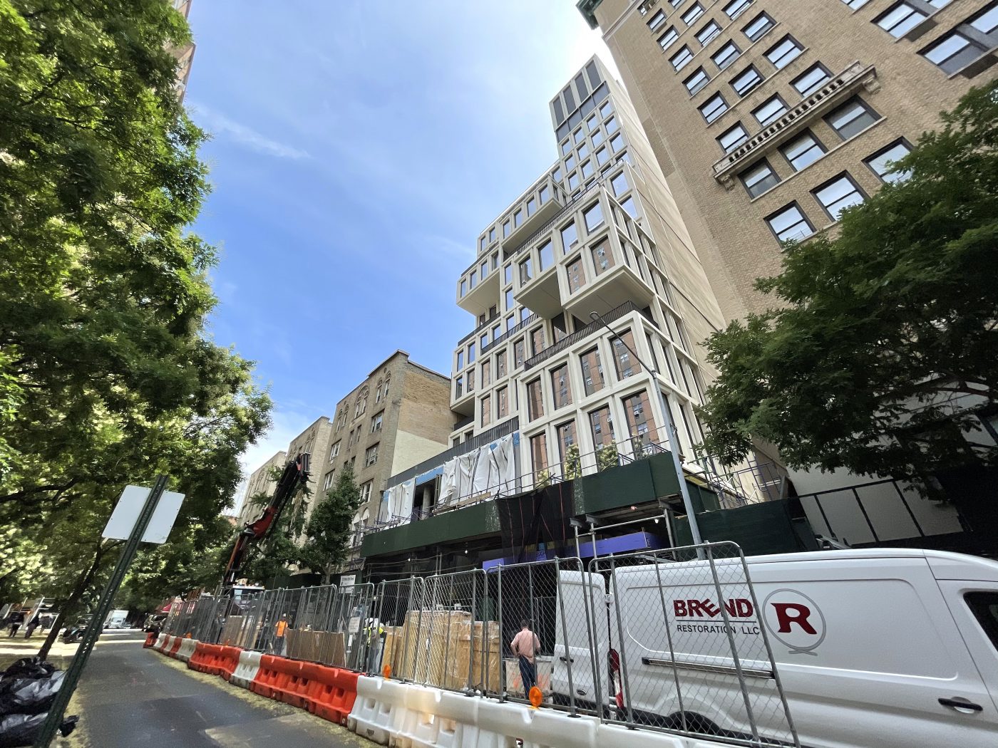
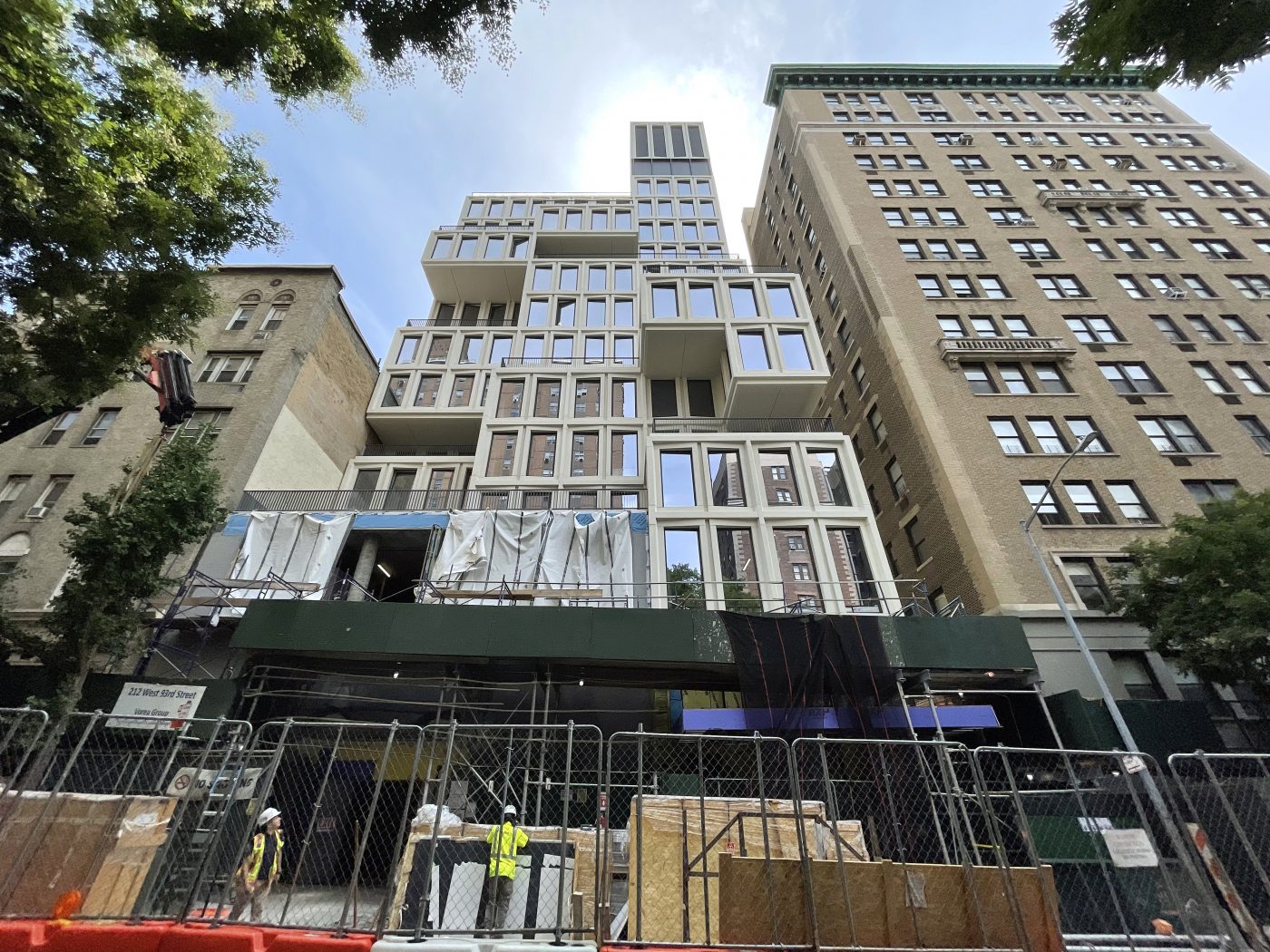
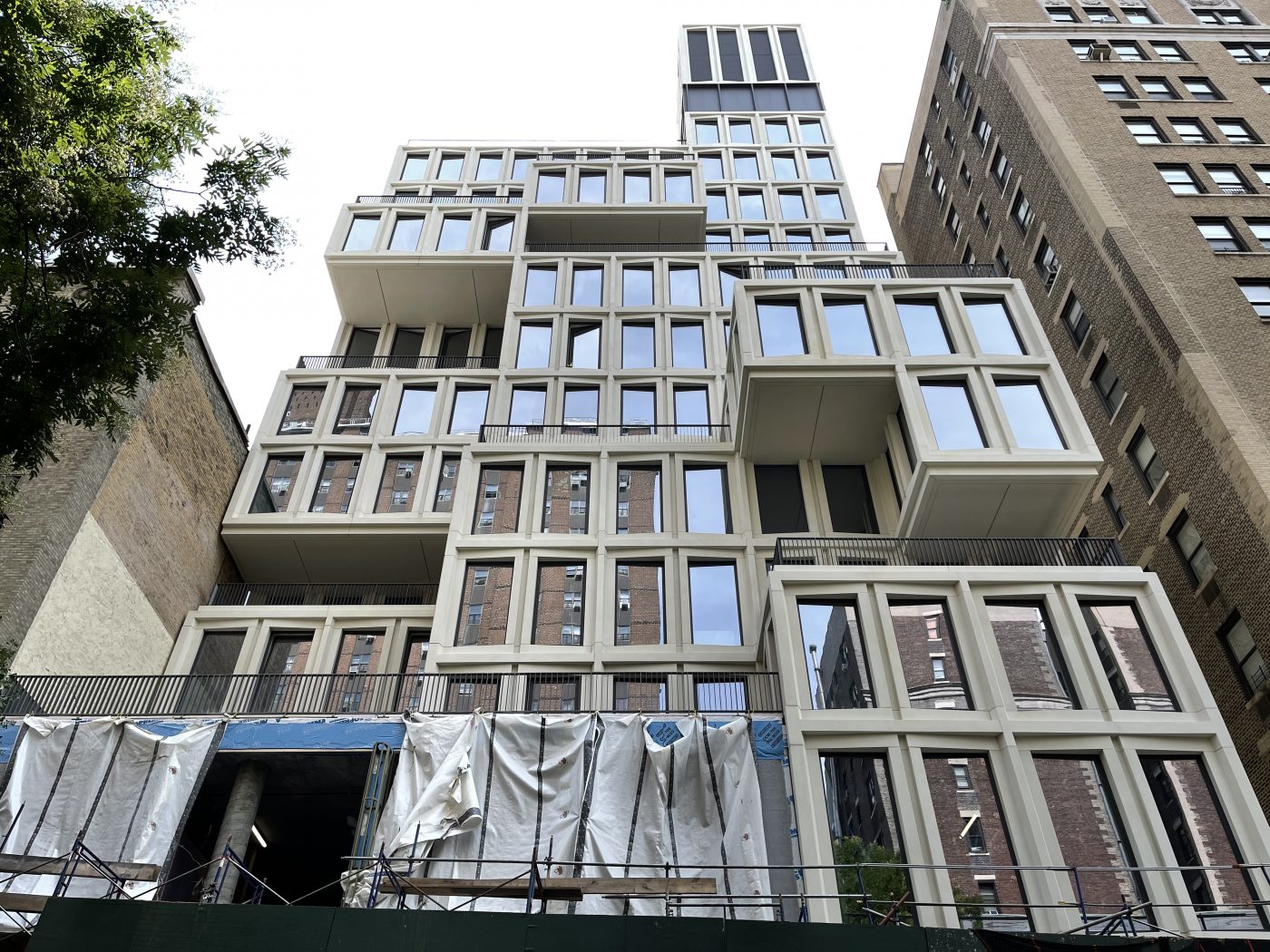
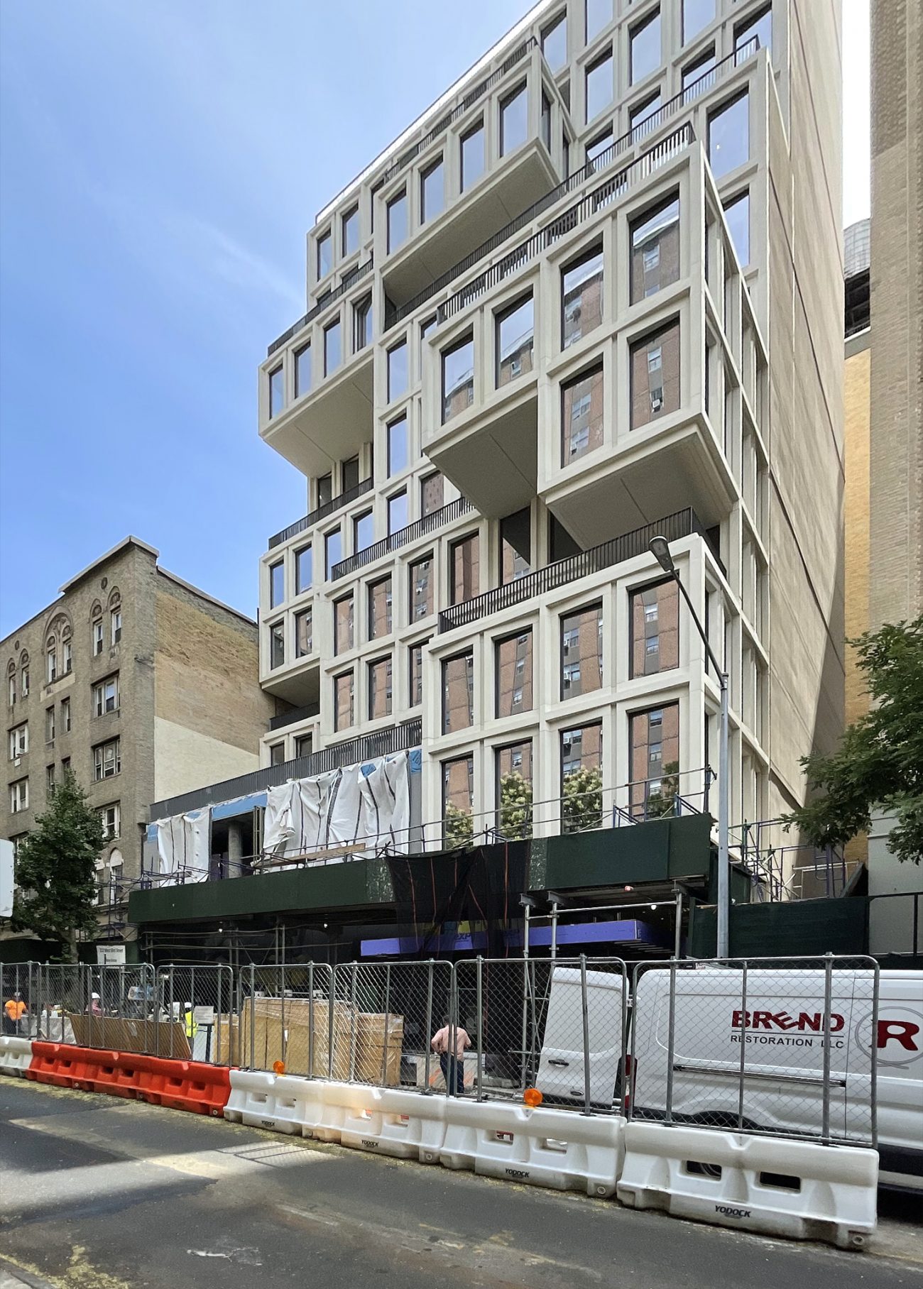
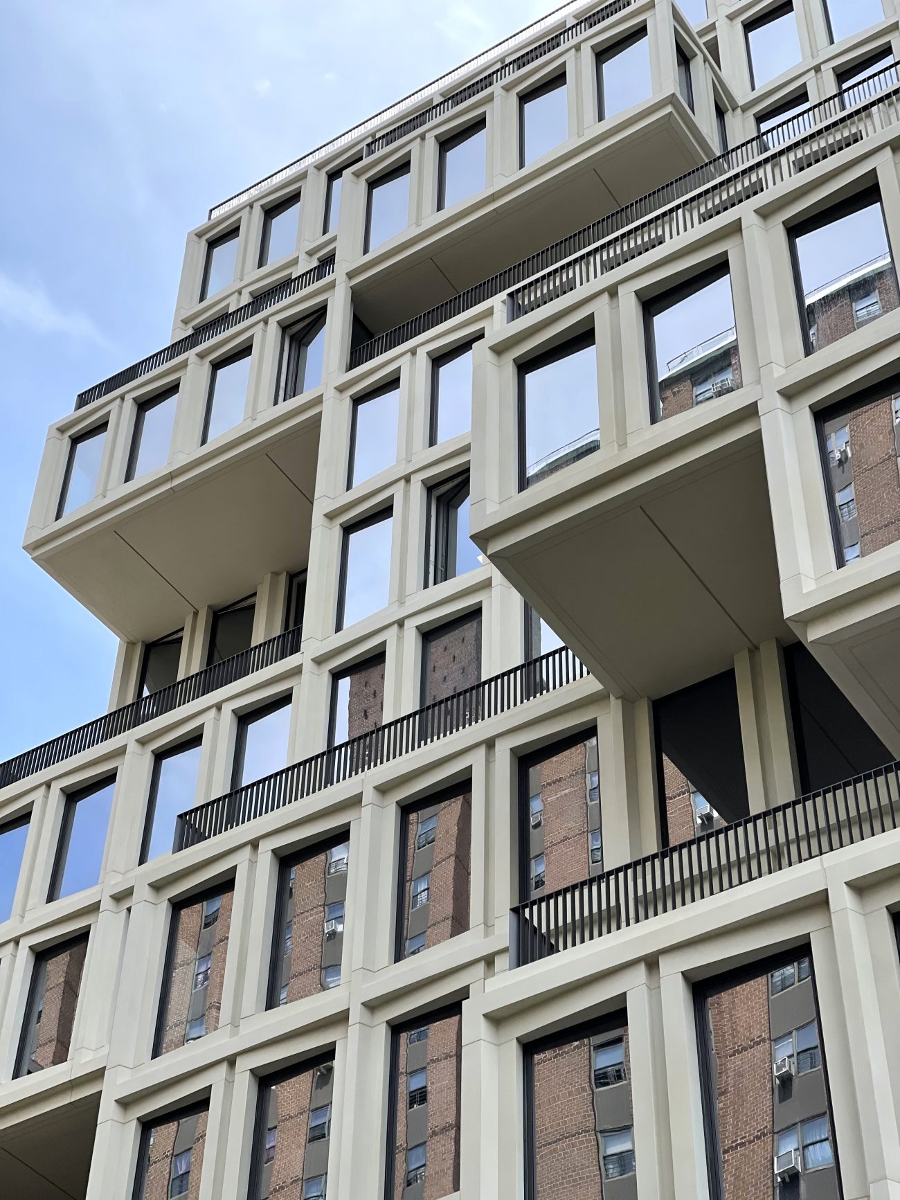
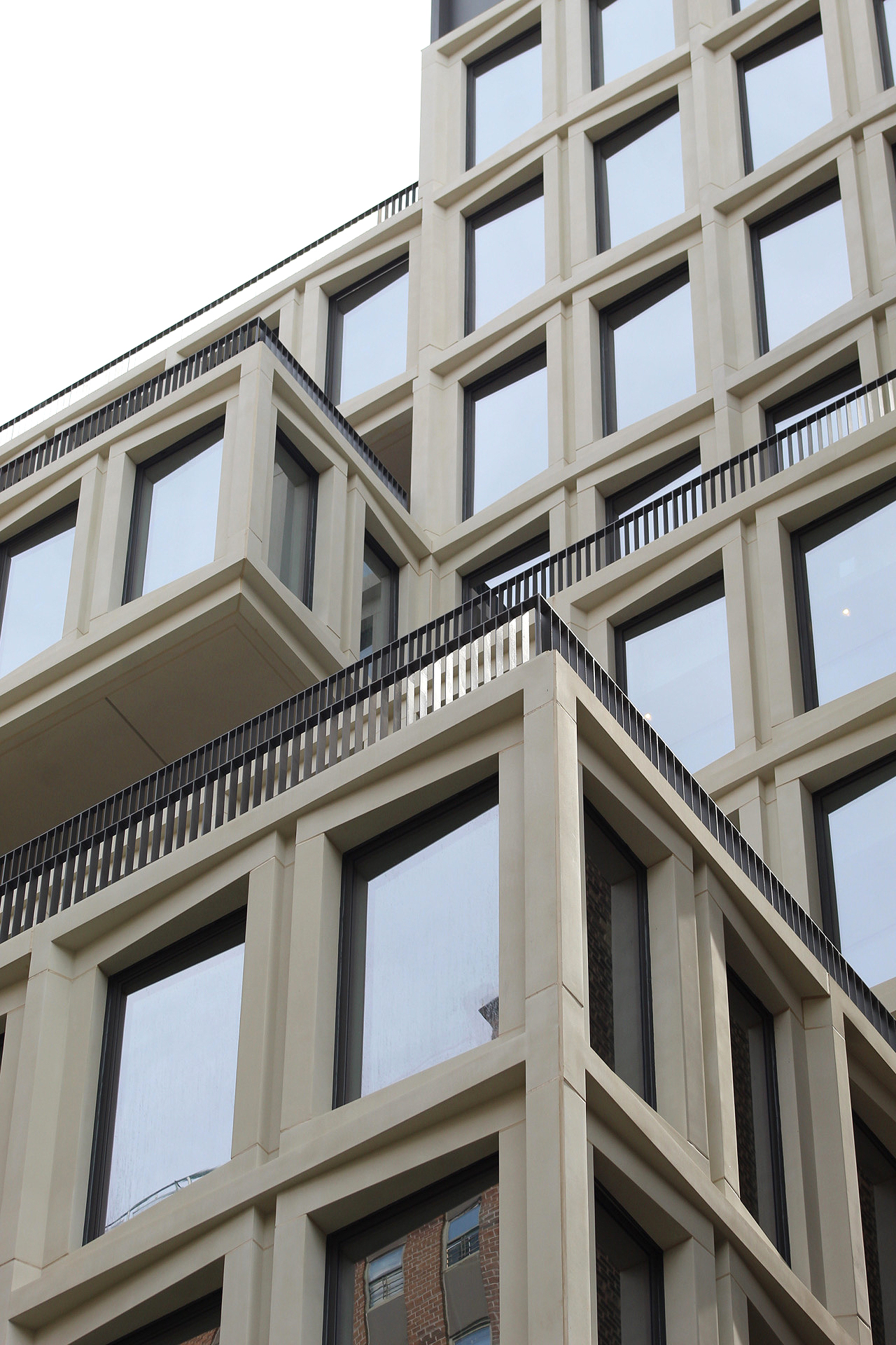
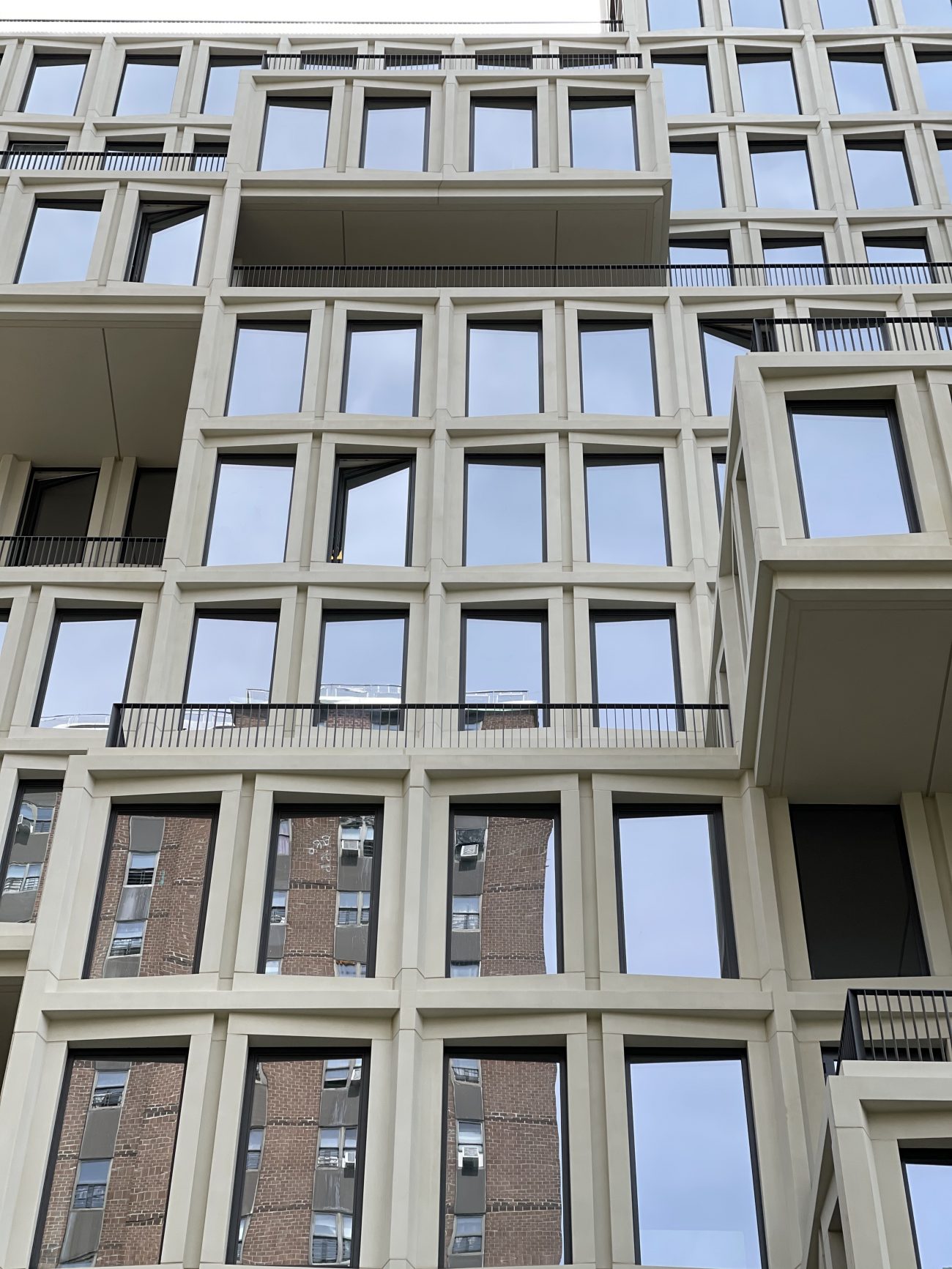
Since our last update in June, the thick scaffolding and netting that enshrouded the structure has been dismantled, revealing its modern massing of stepped and cantilevering volumes, oversized floor-to-ceiling windows, and light-colored beveled frames. Only the bottom two levels remain to be completed.
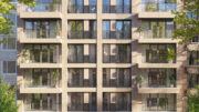
Dark metal railings line the terraces and contrast nicely with the white façade panels. Overall, the building’s design is a significant departure from the surrounding architecture of the Upper West Side, making it stand out despite its modest height.
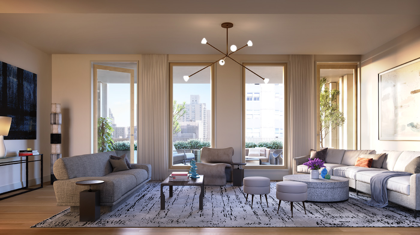
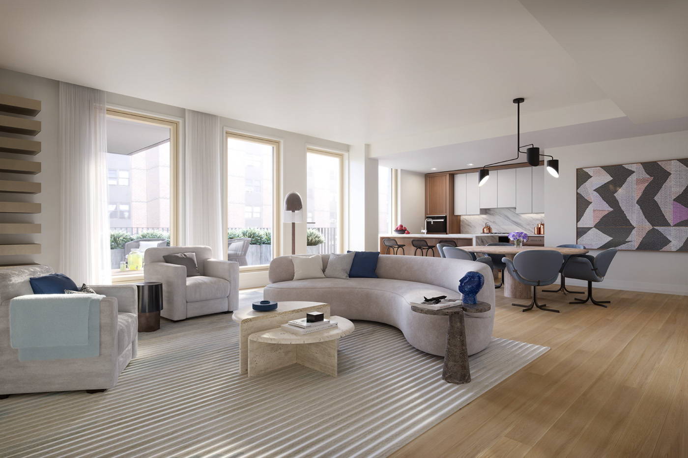
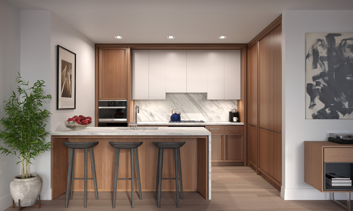
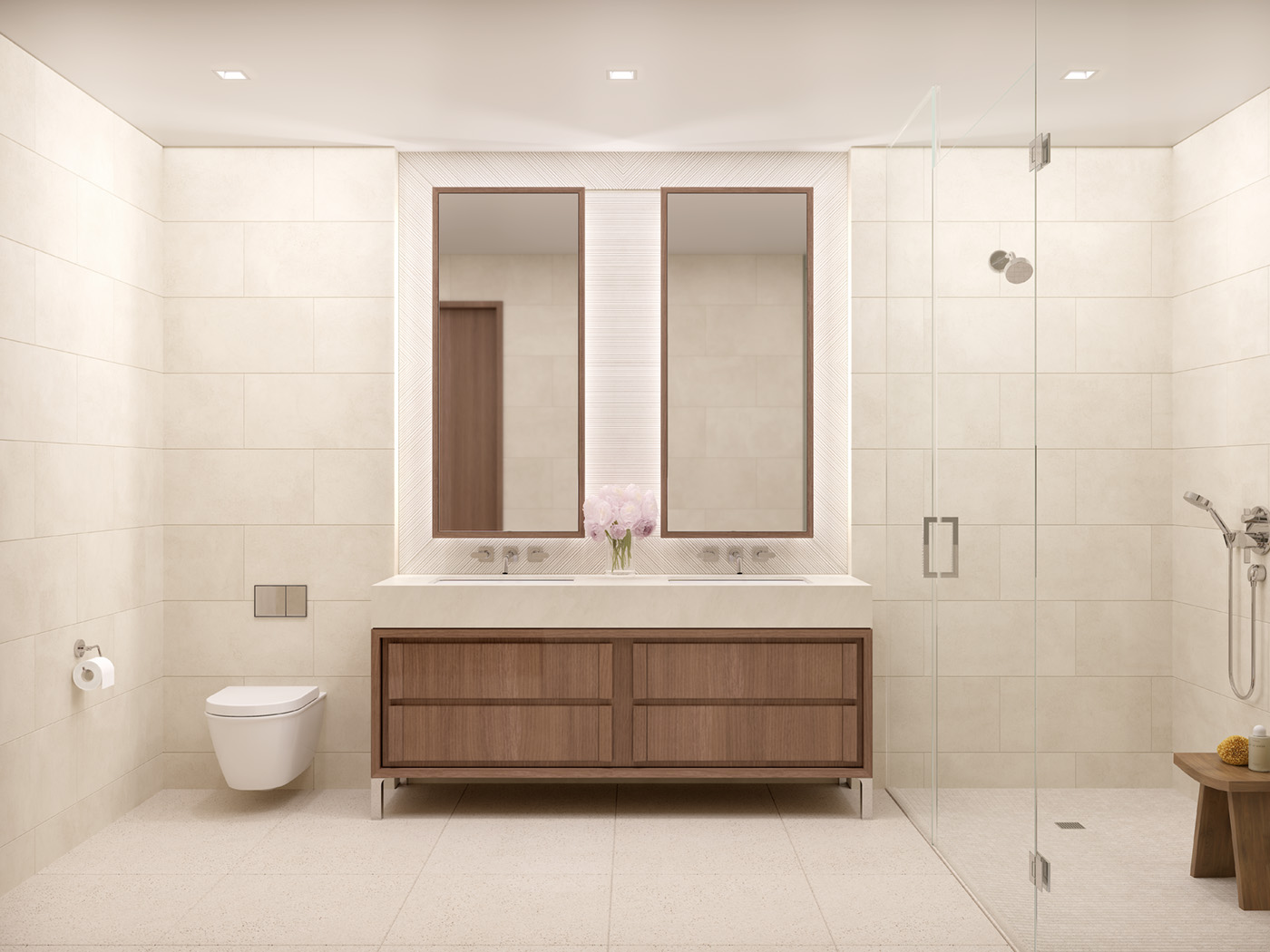
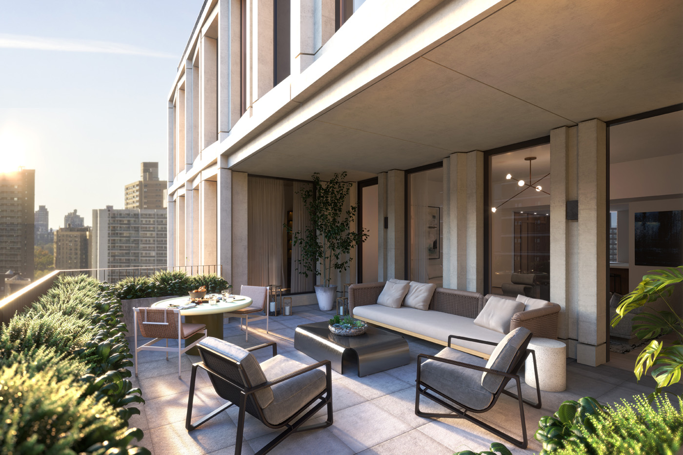
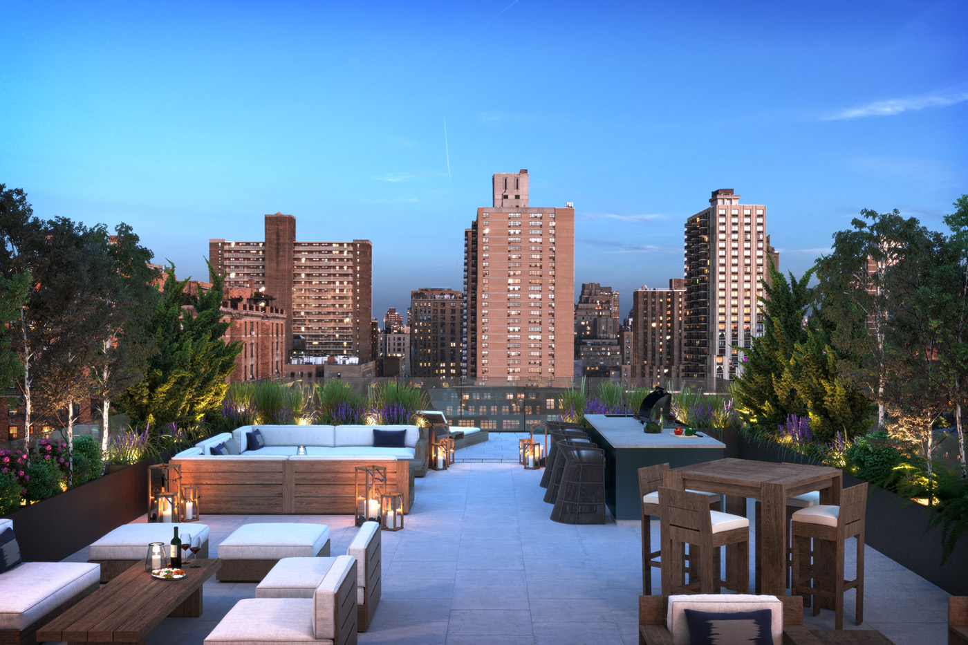
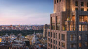
Each unit will have white oak floors, oak-clad floor-to-ceiling windows, an open-style kitchen crafted with custom-stained Ghiaccio gray-lacquer cabinetry, Volakas marble slab countertops and backsplash, and bathrooms with custom millwork and Italian Lymra limestone. Amenities include a 24-hour attended lobby, a landscaped rooftop with al fresco dining and a fully-equipped outdoor kitchen, a fitness studio outfitted with Technogym equipment and The Mirror, a children’s playroom, a pet spa, and private storage space for purchase. New renderings, courtesy of 212 West 93rd Street, can also be seen below.
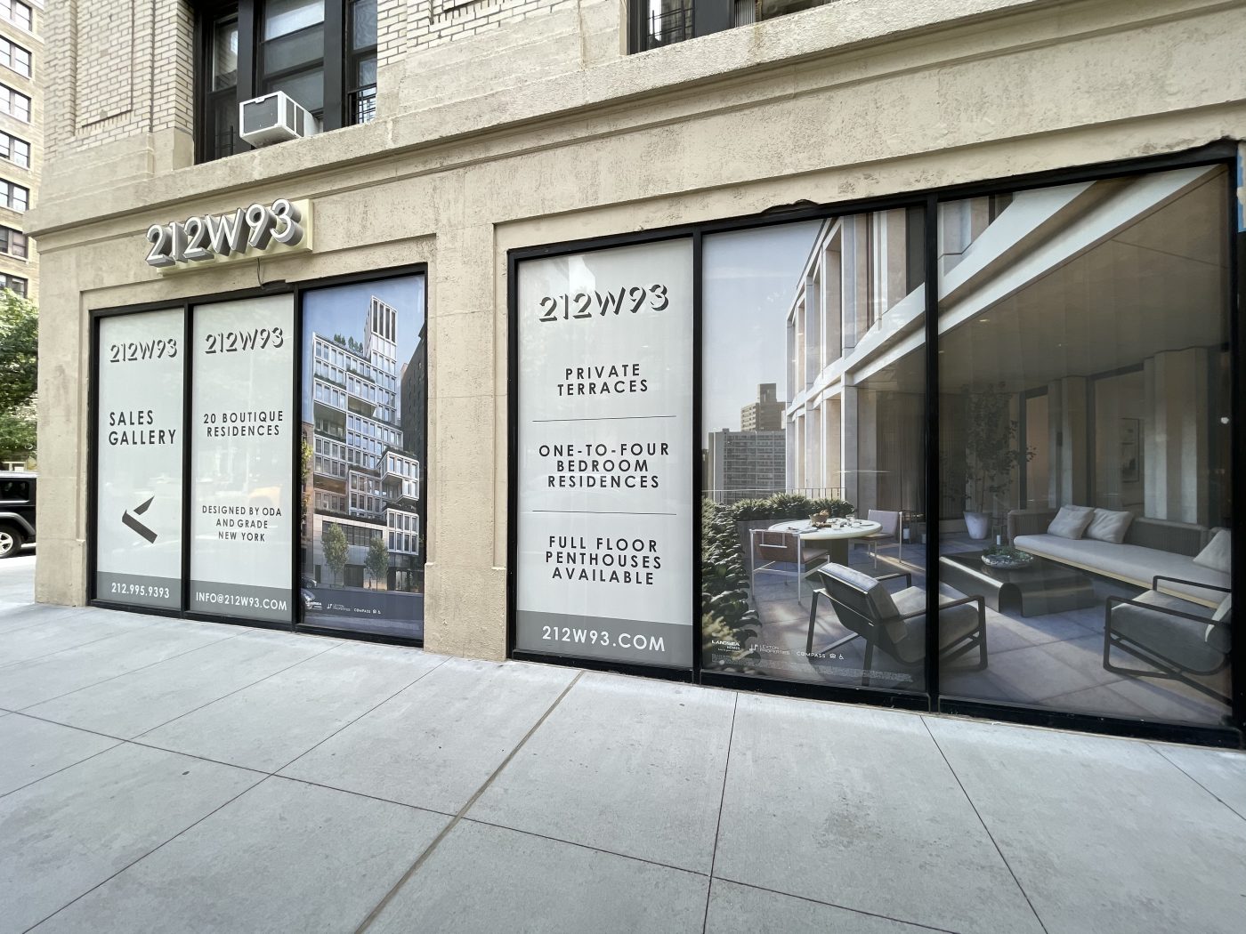
The sales gallery for 212 West 93rd Street can be found to the north on the ground floor of 240 West 98th Street. Available homes currently range from a one-bedroom, one-bathroom unit measuring 828 square feet on the eighth floor for $1.875 million to a four-bedroom, four-and-a-half-bathroom unit measuring 2,762 square feet with a private 489-square-foot outdoor terrace for $6.59 million.
212 West 93rd Street is expected to be finished before the end of the year.
Subscribe to YIMBY’s daily e-mail
![]()
Follow YIMBYgram for real-time photo updates
Like YIMBY on Facebook
Follow YIMBY’s Twitter for the latest in YIMBYnews


A very interesting design that falls apart at the street level.
It’s unique. I like it.
The jingle jangle upstairs is fine, if the terraces don’t become storage areas for old bikes…..the floor plans for larger apartments are rather spacious and some of the apartment plans offer laundry closets – not bad in NY for $3m. Take a look at the once proud beautiful architecture of Shaare Zedek Synagogue and now they get a rather anonymous store front facade. I don’t like it.
Looks like how the building on the right might look after a tumble in the dryer?! ??
Nice as an object but the interaction with the building to the “left” could have been dealt with better.
Agree with GC the from elevation looks great. The side elevations are another story.
PLEEESE always indicate the cross streets! Thank you ?
The interior renderings are quite nice. The exterior is OK, kind of a cantilever-meets-brutalism mishmash. The terrace railings aren’t good. They clash with the architecture.
Nonsense.
Finally UWS gets some nice designer buildings.