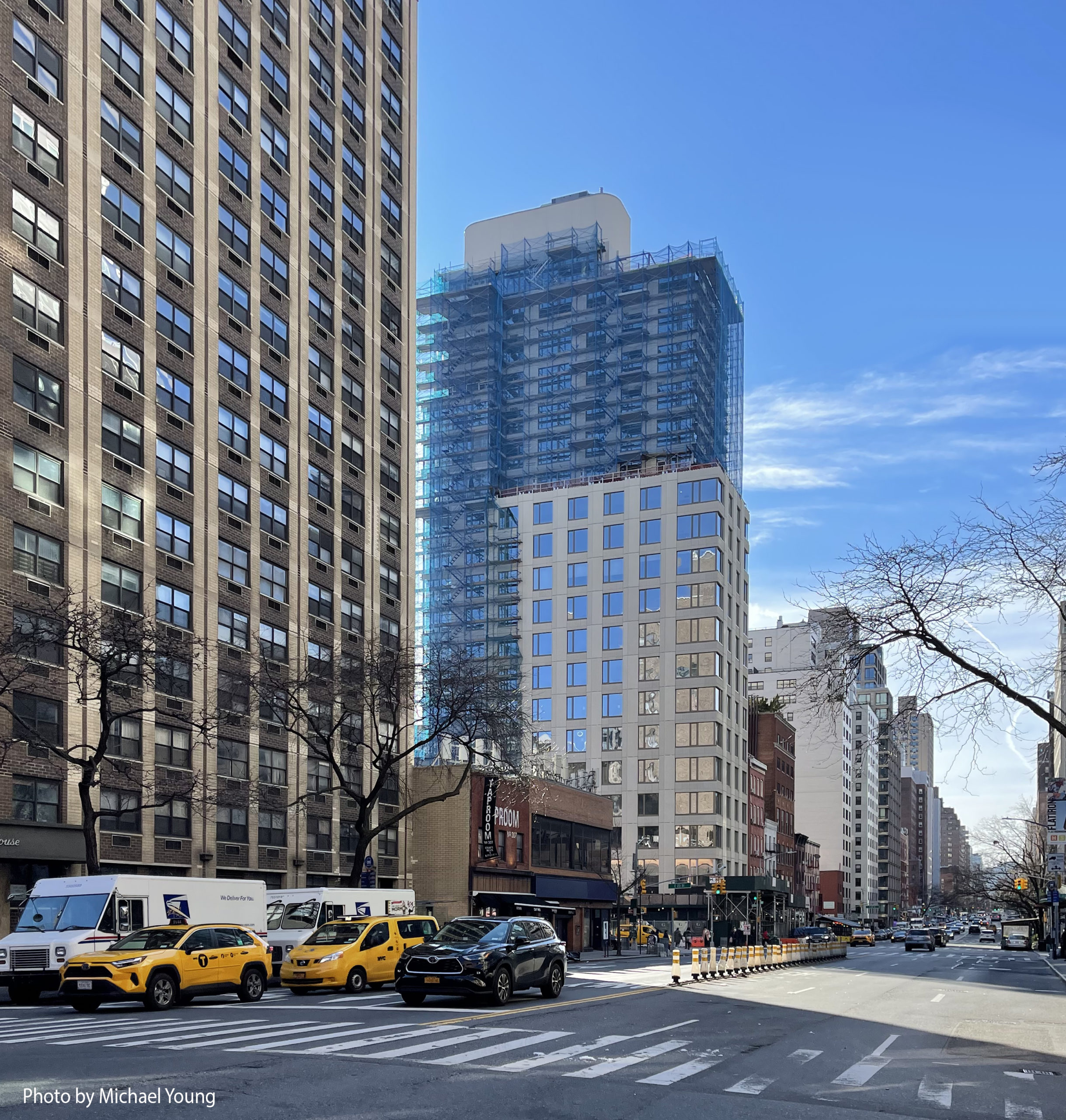
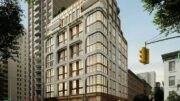
Façade installation is nearing completion on Gemma Gramercy, a 20-story residential building at 202 East 23rd Street in Gramercy Park, Manhattan. Designed by Hill West Architects and developed by SMA Equities, the 233-foot-tall structure will span 95,000 square feet and yield 108 rental units in studio to two-bedroom layouts with marketing by REAL New York. Twenty-eight of the apartments will be designated for affordable housing. KSK Construction Group is the general contractor for the project, which is located at the corner of East 23rd Street and Third Avenue on the border with Kips Bay. The property is being constructed to Passive House standards.
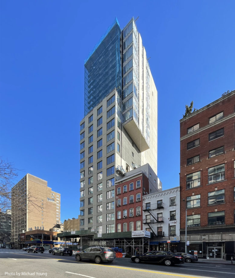
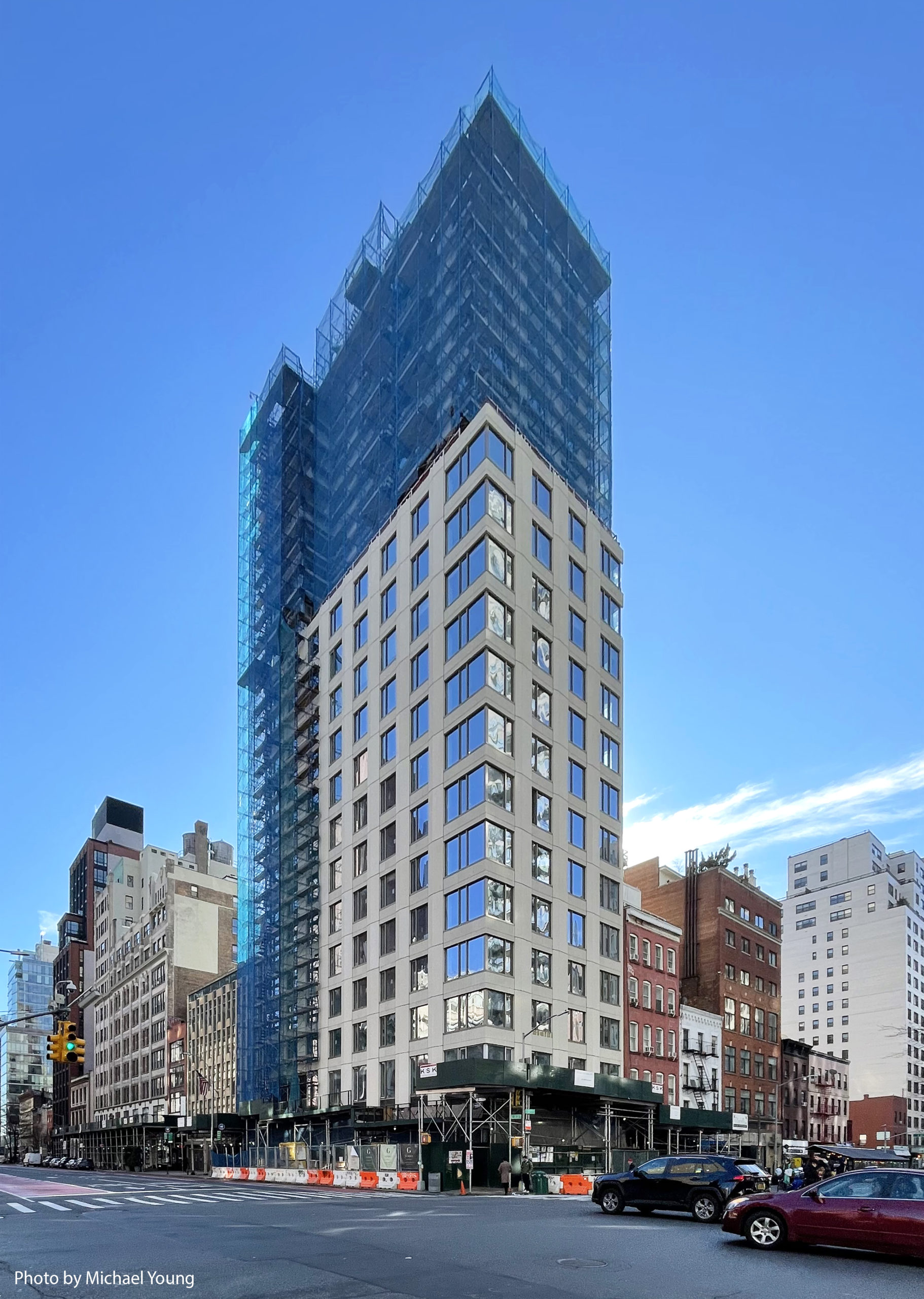
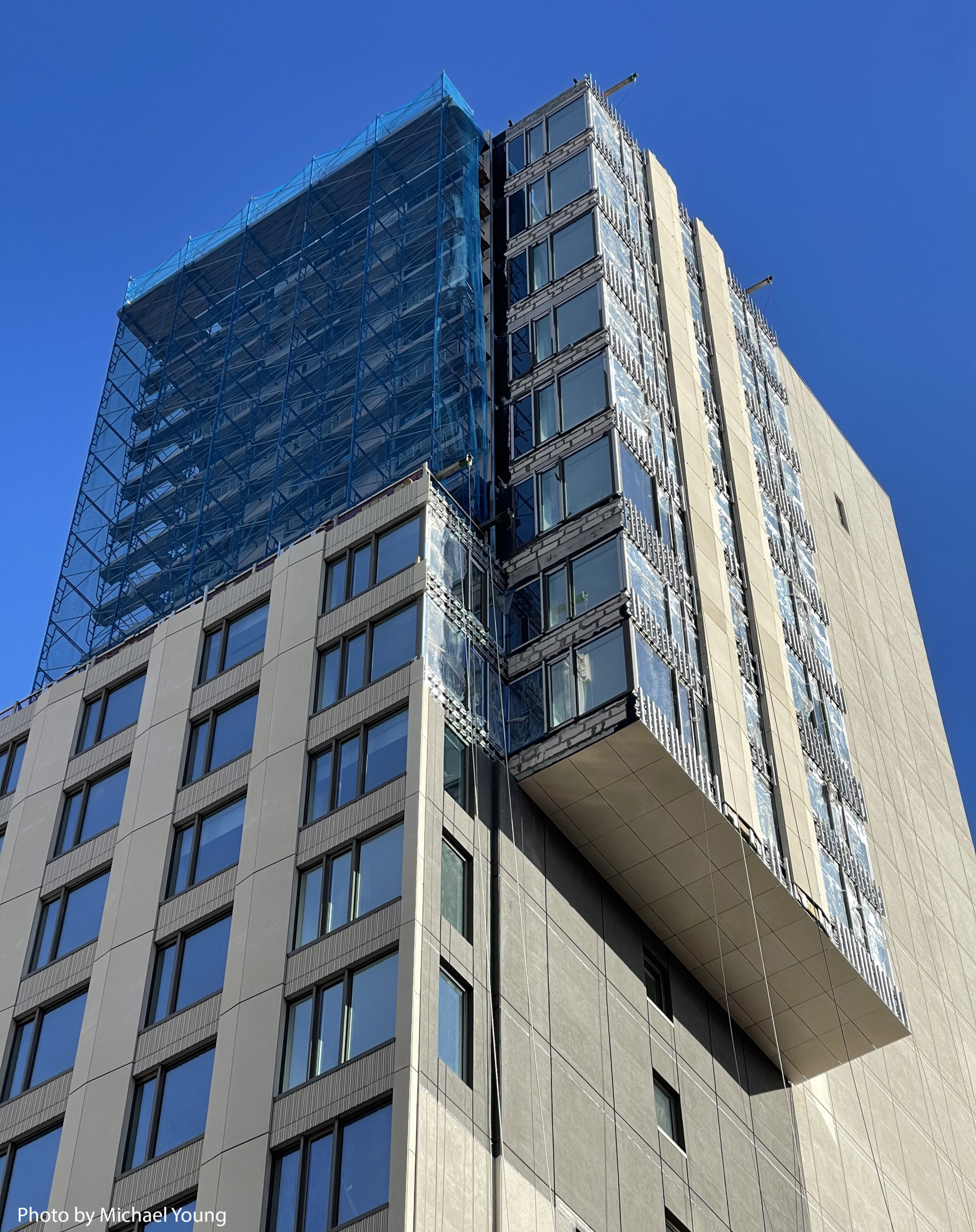
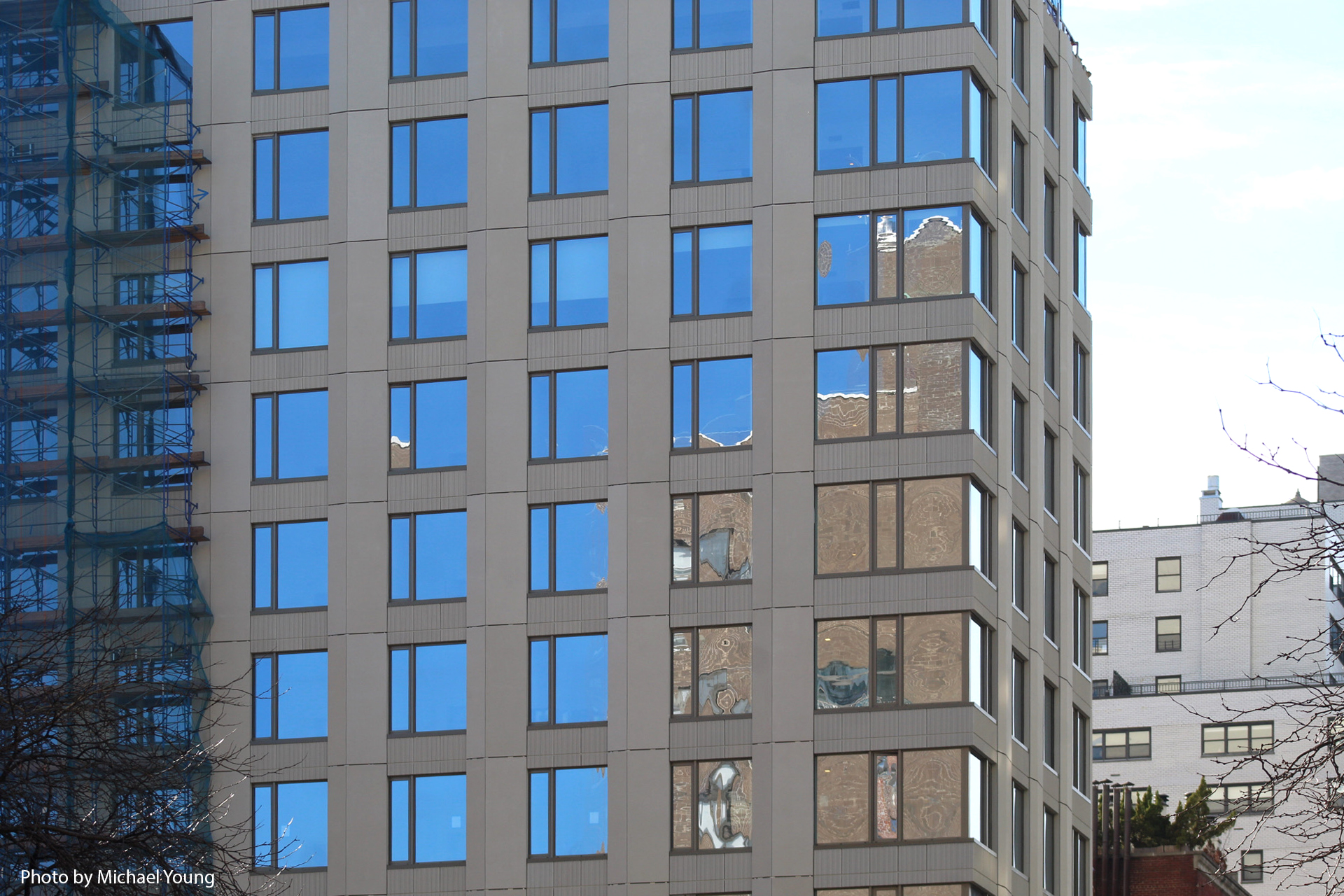
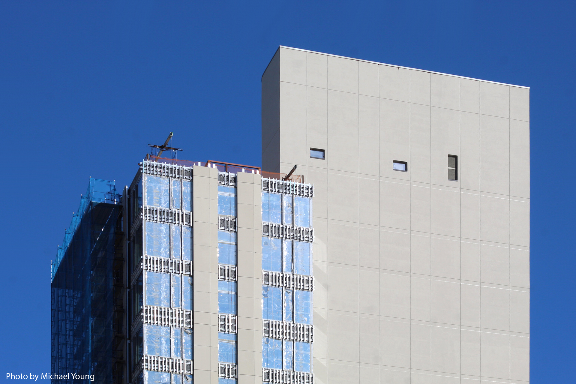
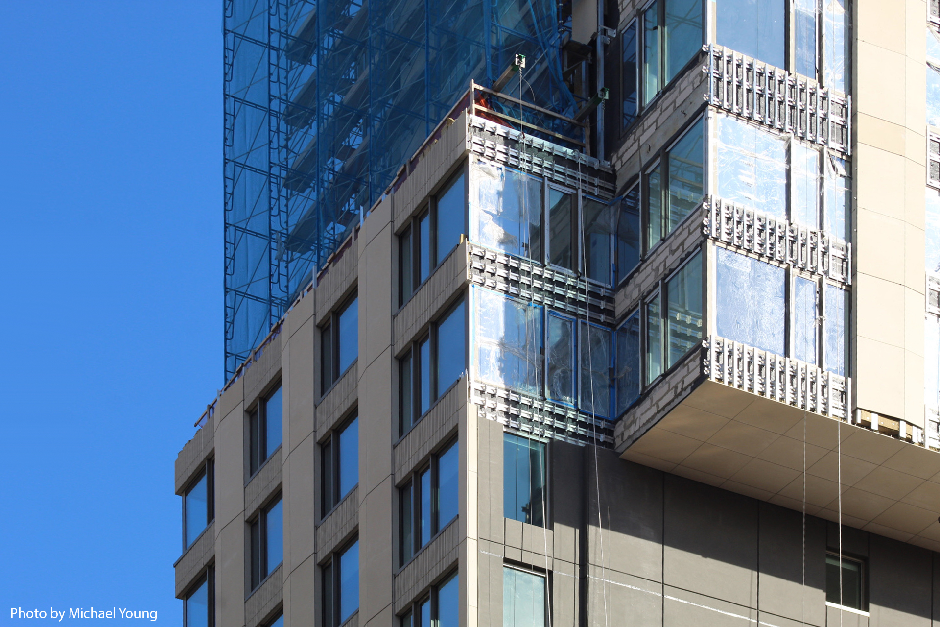
The envelope of warm-hued paneling and floor-to-ceiling windows has made its way to the roof parapet since our last update in May 2022, and the network of scaffolding and blue netting has shifted to the uppermost levels as exterior work finishes up. Only a few sections remain to be enclosed, such as the cantilevering volume on the southern elevation.
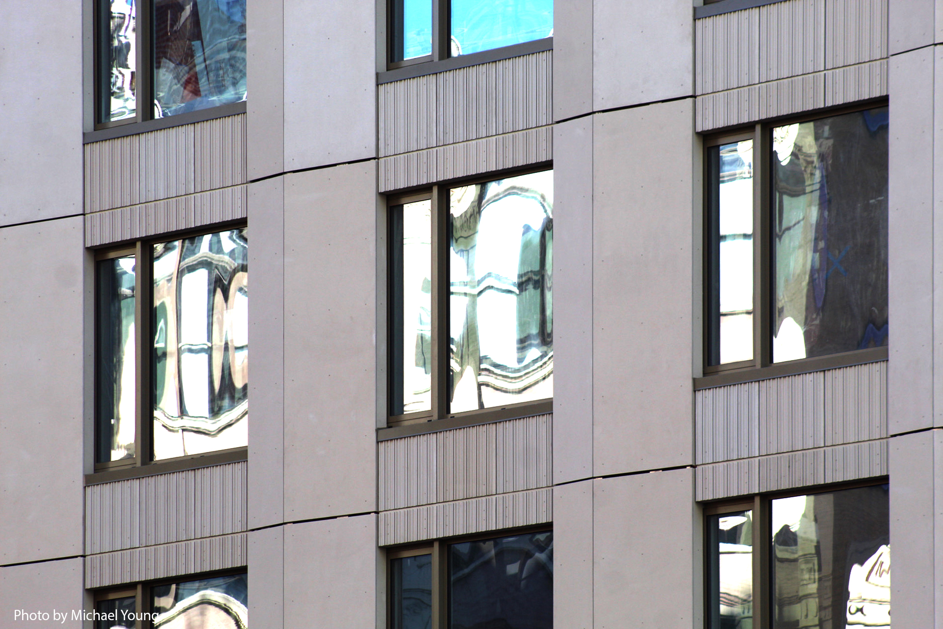
The following close-up shots show the details in the façade paneling, which includes a subtly protruding geometry on the vertical columns and light fluting on the horizontal bands between the windows.
The horizontal panels have yet to be installed on the cantilevering section and its windows remain covered in protective film. The wraparound sidewalk scaffolding should be taken down sometime this spring once the façade is fully complete.
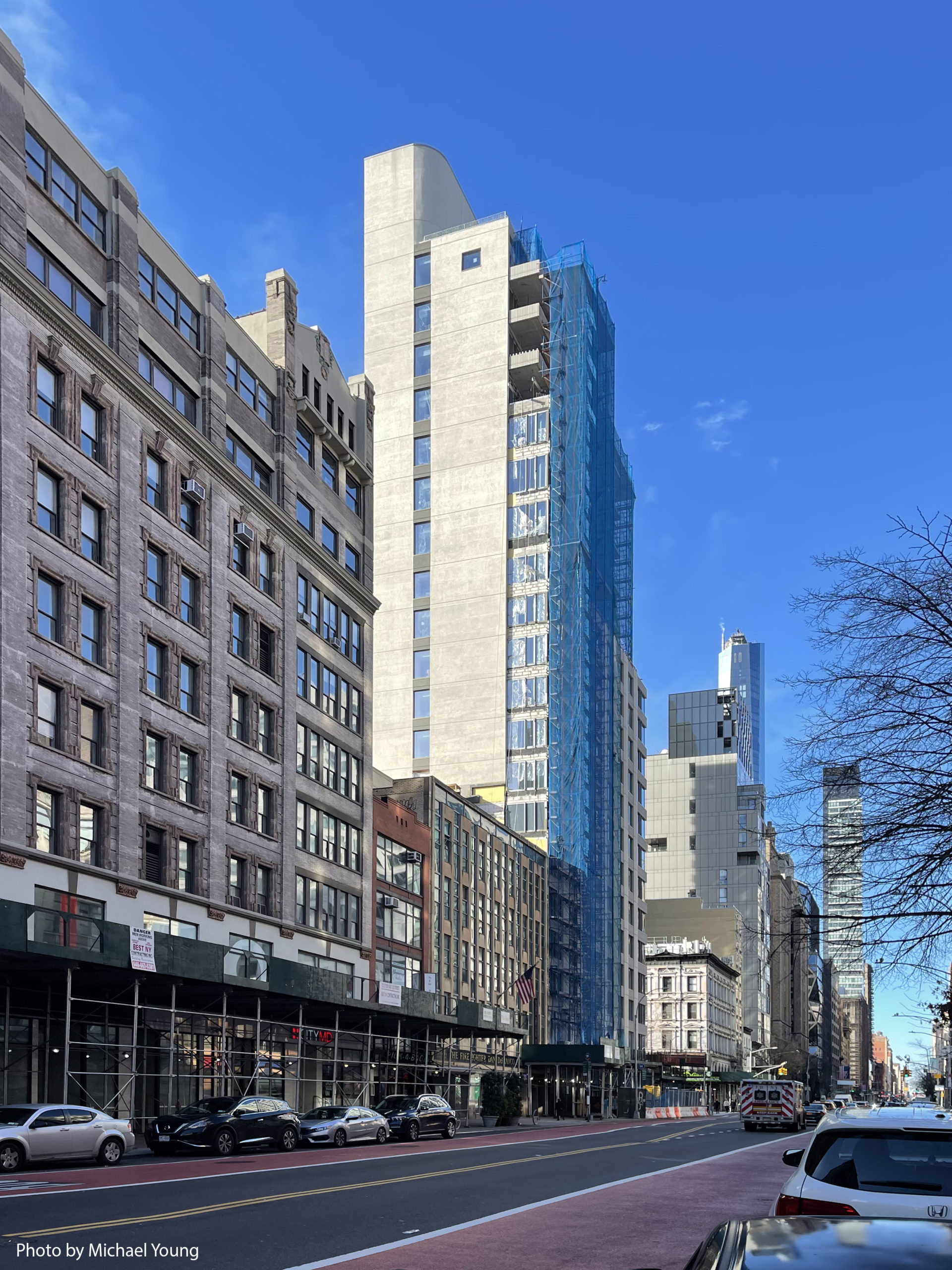
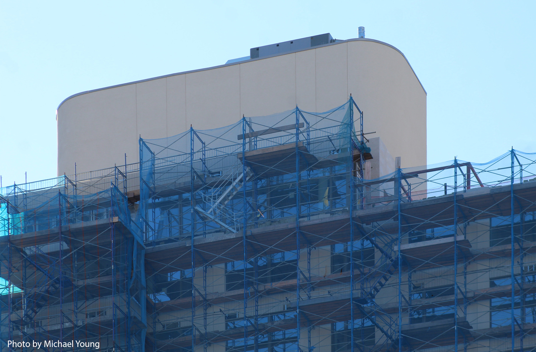
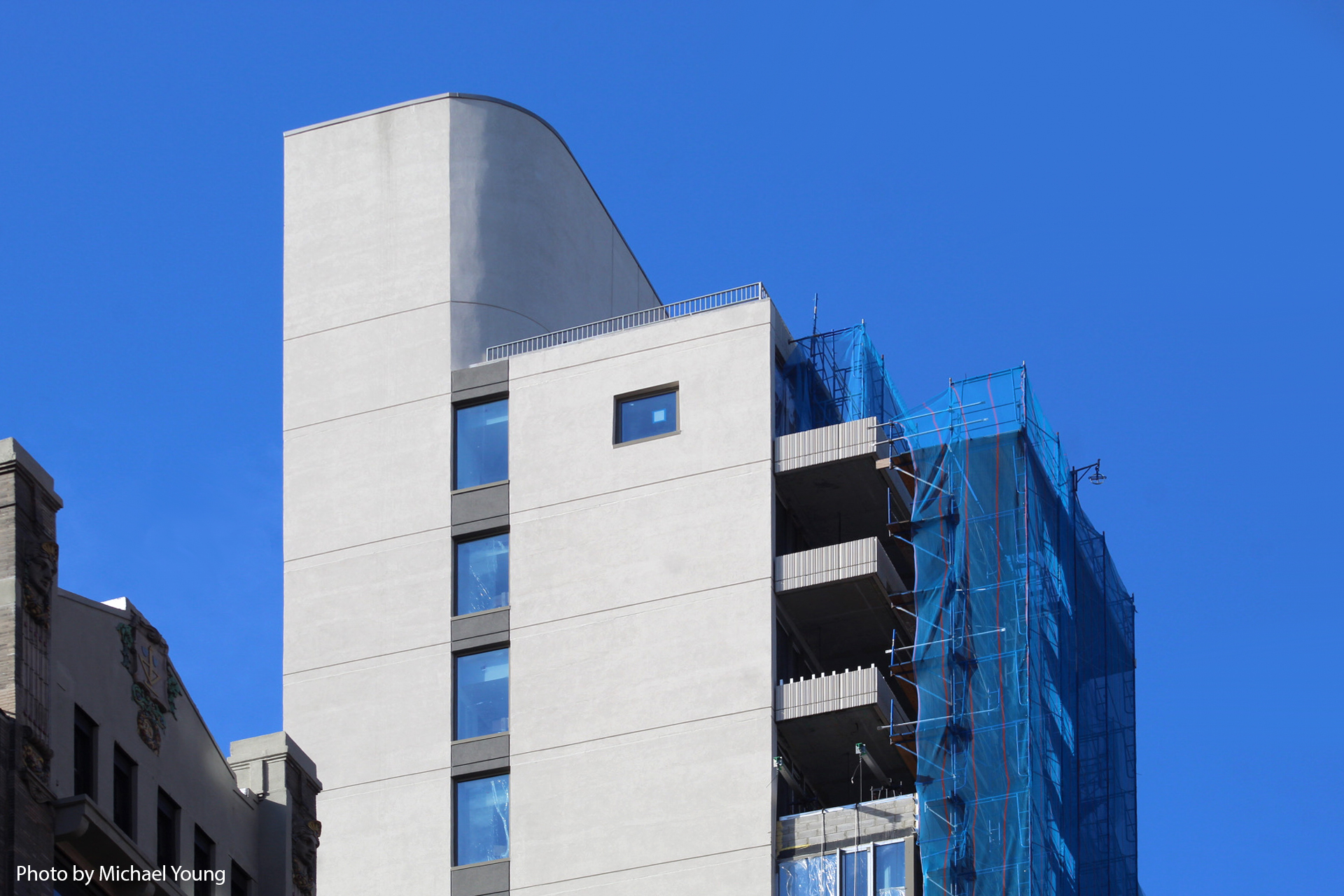
The mechanical bulkhead features rounded corners on its northern face, adjacent to a rooftop terrace.
Units will come with 10- to 12-foot ceiling spans. Residential amenities will include a fitness center, a communal lounge, coworking space, bicycle storage, and an outdoor rooftop deck with views over Gramercy and surrounding neighborhoods.
Gemma Gramercy is scheduled to reach completion this spring.
Subscribe to YIMBY’s daily e-mail
Follow YIMBYgram for real-time photo updates
Like YIMBY on Facebook
Follow YIMBY’s Twitter for the latest in YIMBYnews







Make it stands out on the building by protruding, that I must look in the direction in which it is installed. And rounded corner with a high angle that must look up, it helps create corners that are not too square: Thanks to Michael Young.
The corners all look very square to me.
David, Casey Stengel couldn’t have said it better.
“…corners that are not too square.” I was thinking Yogi Berra, but yes—almost brilliant from the robot?
I’m not too sure how I feel about this one so far.
I’m not sure why we haven’t learned to incorporate cantilevers in an artful, blended manner – why they must look like inelegant appendages. It doesn’t have to be this way.
The scientific term is “cantilever fever”! Why do they have to be square?
How much is a studio? 5000 a month.. lol
Great design for 23rd has those old buildings from
Baruch facing Toll brothers condos . Lol
CUNY facing luxury
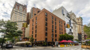
I like how the “elbow” is protecting the little brick building on the right! At least nobody will demolish it!
Ah, the little red tenement and the great gray building—it seems only the very front part of the tenement was preserved. I am not certain why as it is hardly distinguished.
I just…
The most positive aspect is the passive construction standards.
This is not Gramercy
Yes it is Gramercy! The neighborhood is outlined by 14th St, 23rd St, 1st Ave and Park Ave South/Irving Place.
Why else would they have the neighborhood in the name of the building? Kips Bay and Rose Hill are across on the north side of 23rd street just so you know
Dude the name Gramercy is in the name of the building. I’m pretty sure the developers are not that stupid and picked the wrong neighborhood
An ugly new building amidst old ugly buildings, so kudos for symmetry…
When is the hideous cantilevered building trend going to stop??! I’ve never seen it done well. Enough!
Facade like a pole barn.