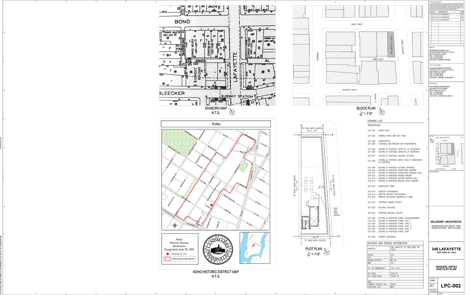
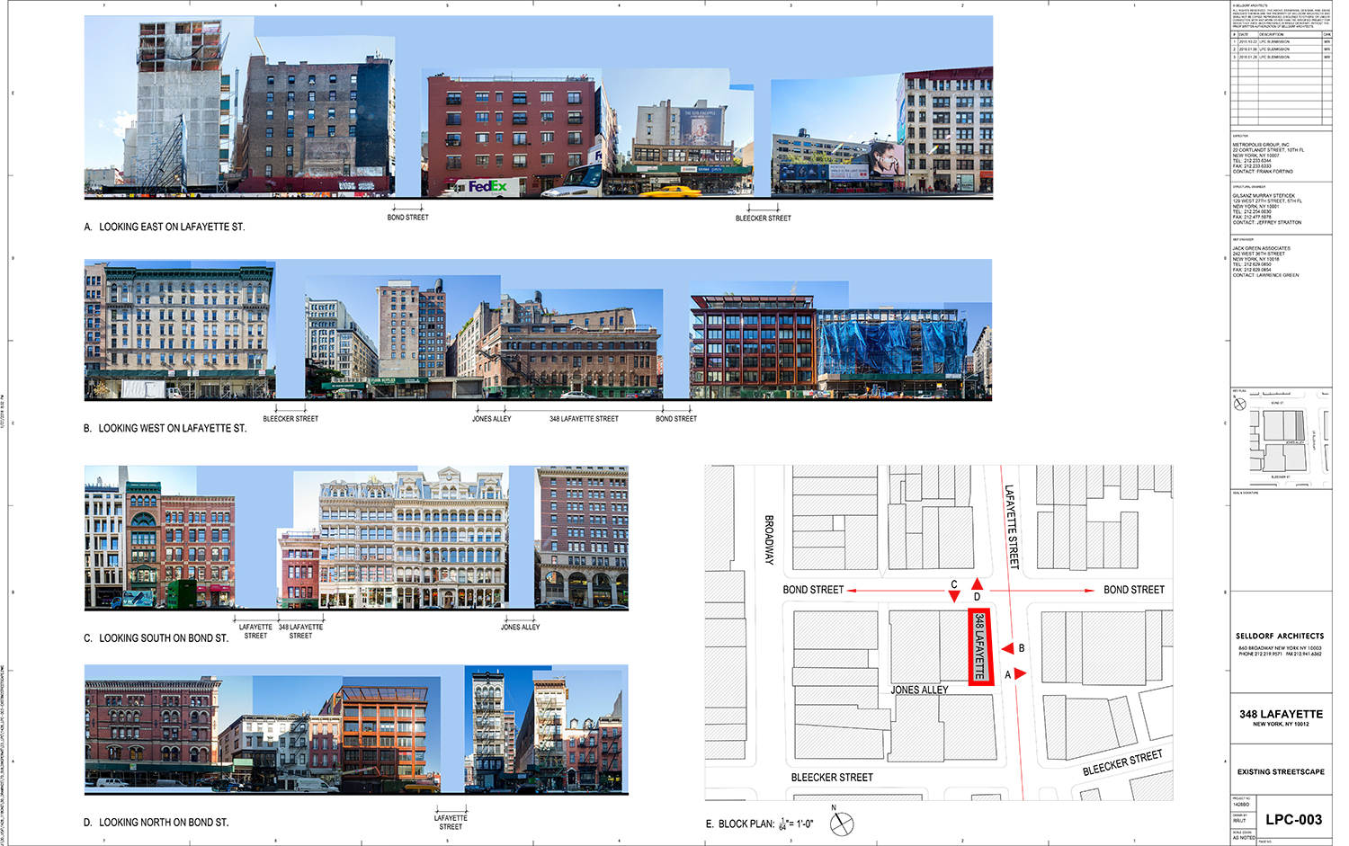
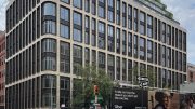
The proposal to renovate a commercial building in the NoHo Historic District didn’t fly with the members of the Landmarks Preservation Commission on Tuesday. The LPC rejected the proposal presented for 348 Lafayette Street, located on the southwest corner of Lafayette and Bond streets.
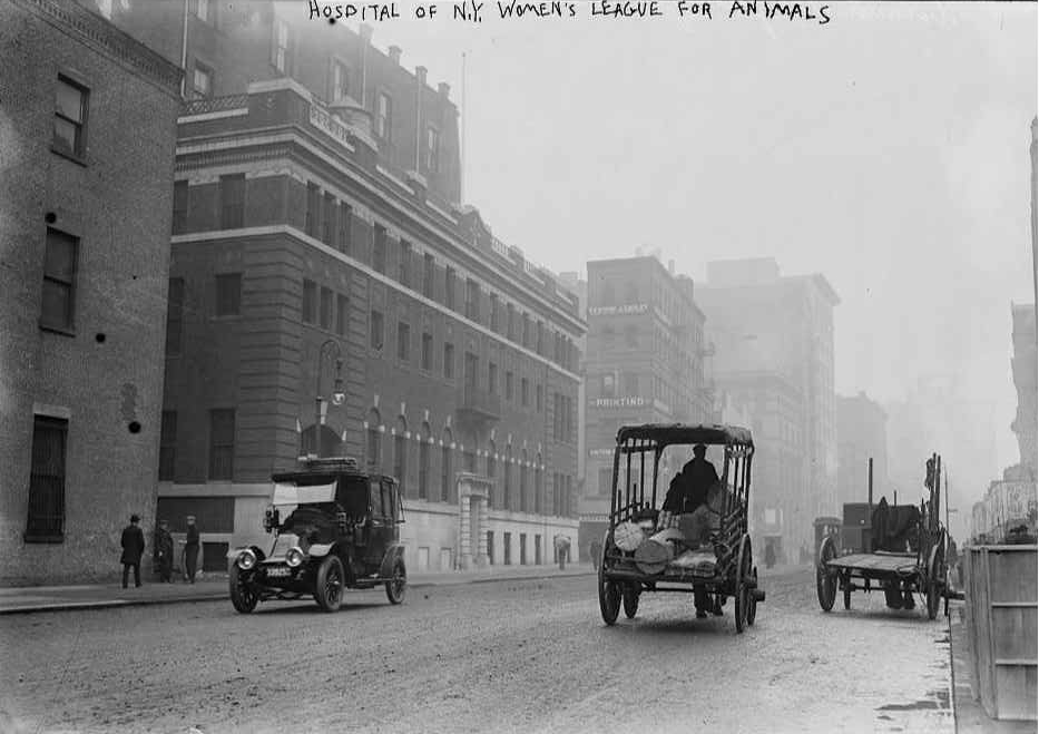
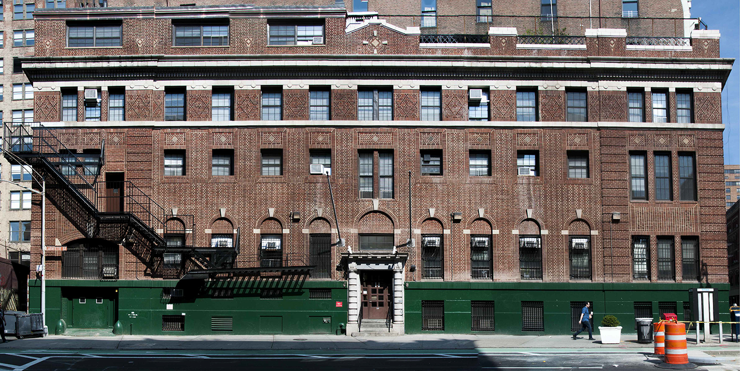
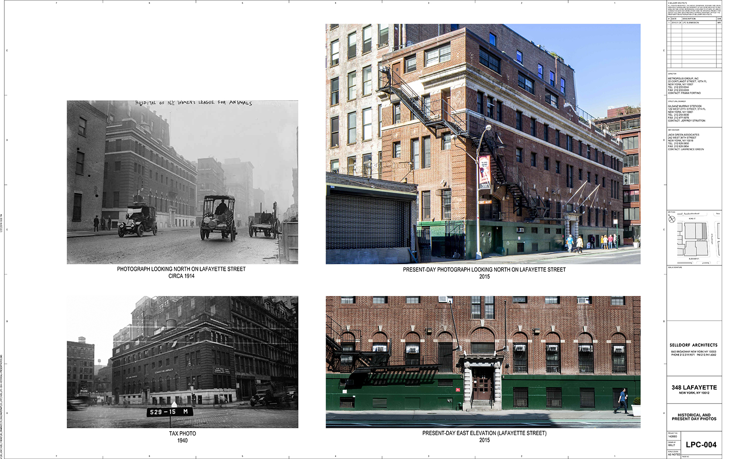
The building in question occupies 348-354 Lafayette Street as well as 11-13 Bond Street. It is a Colonial Revival style building designed by Elisha H. Janes and August W. Cordes and was built in 1913. It was once an animal hospital and currently a commercial structure.
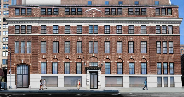
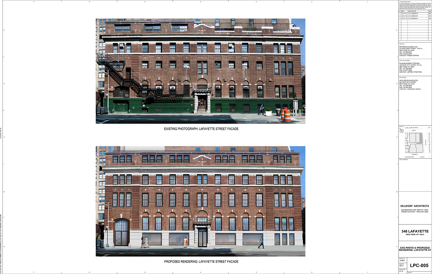
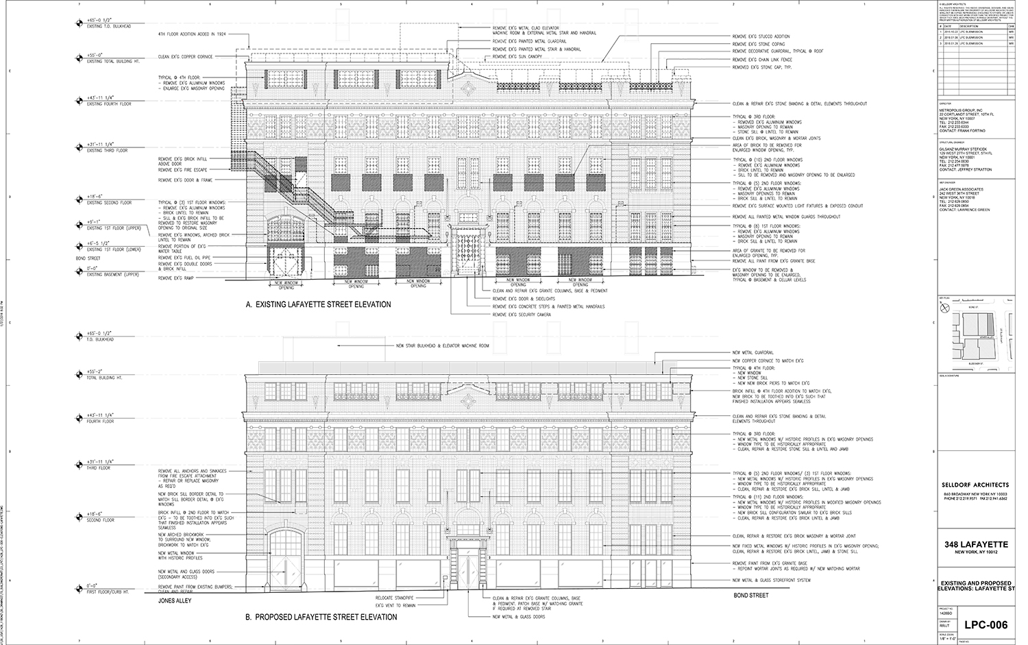
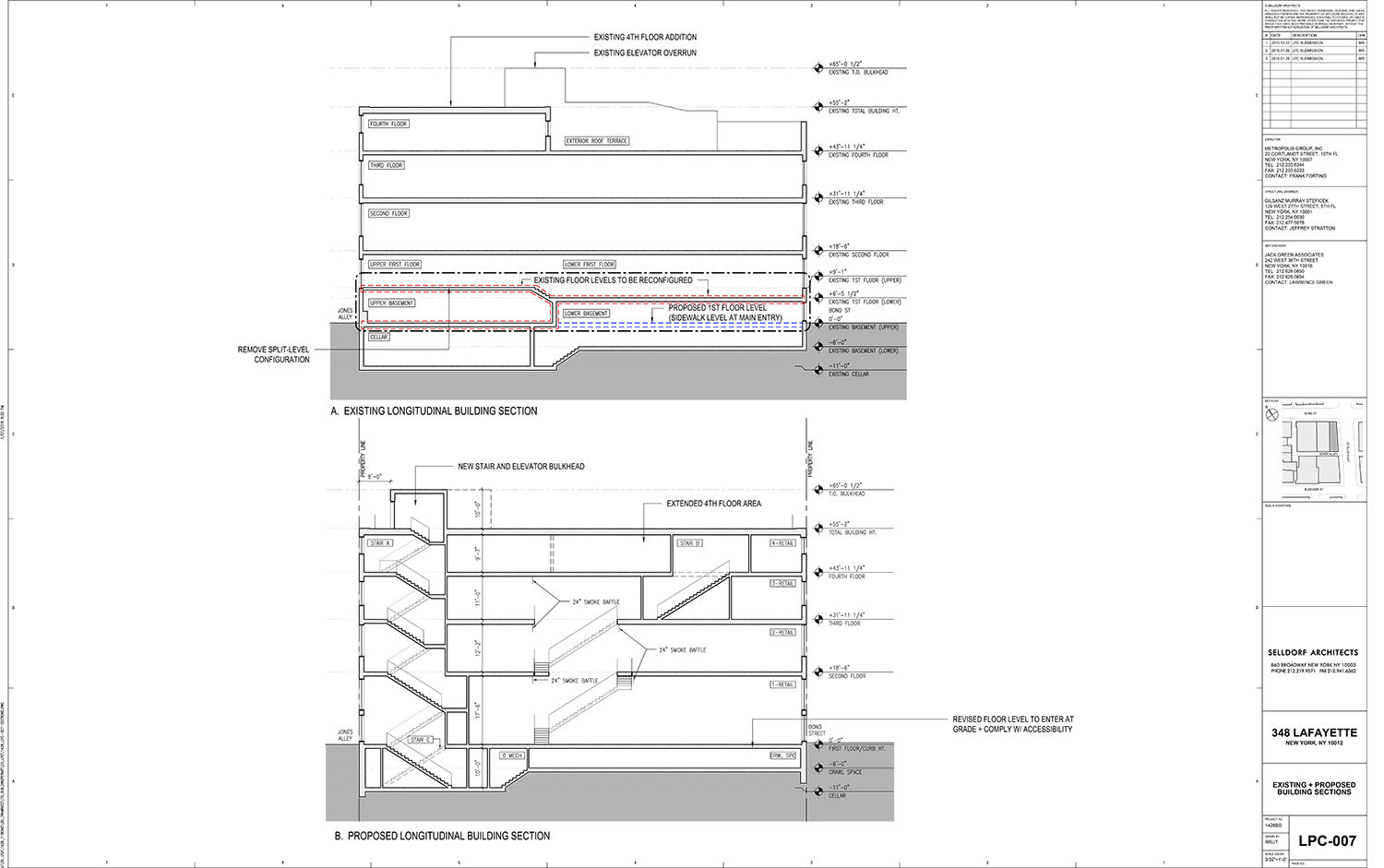
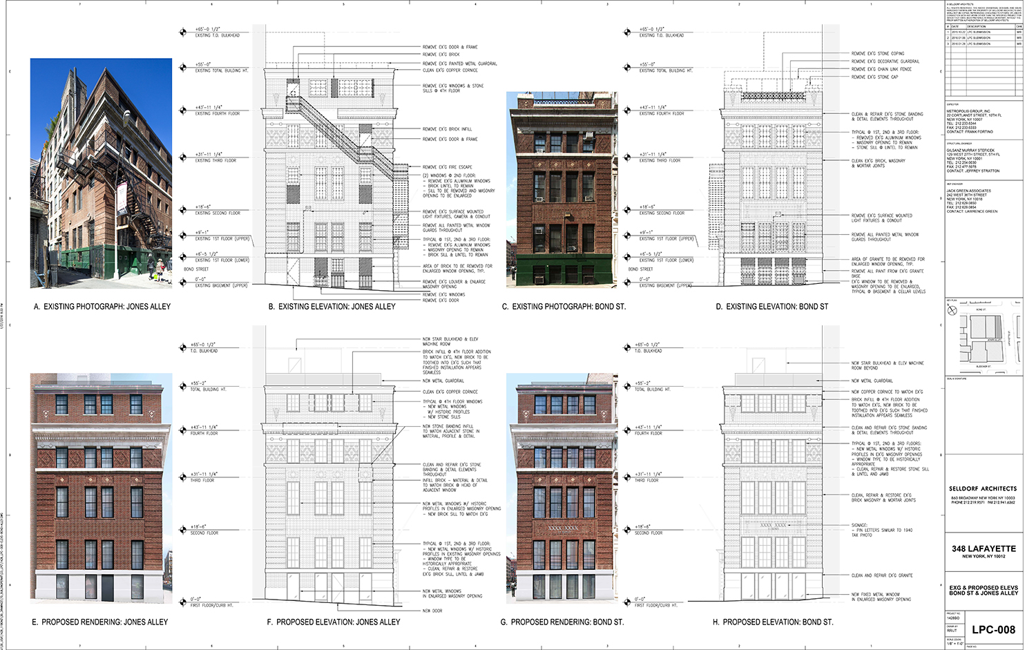
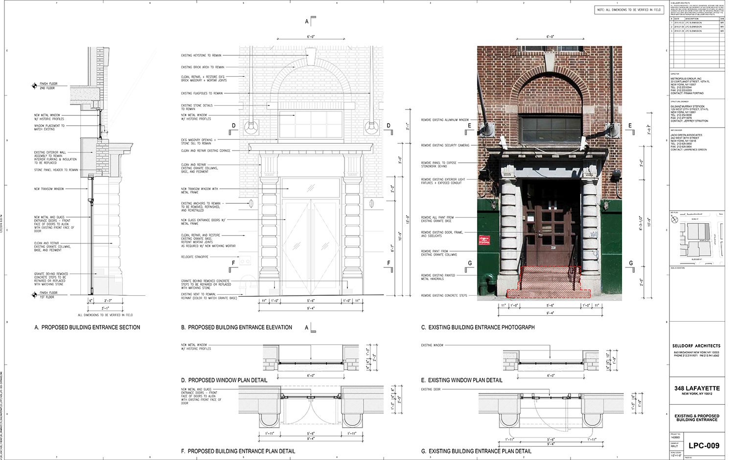
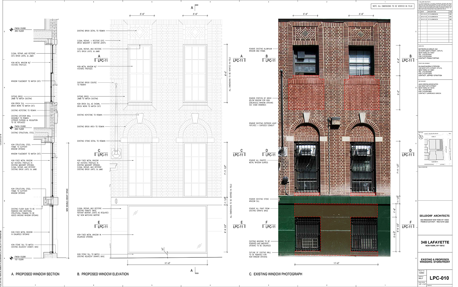
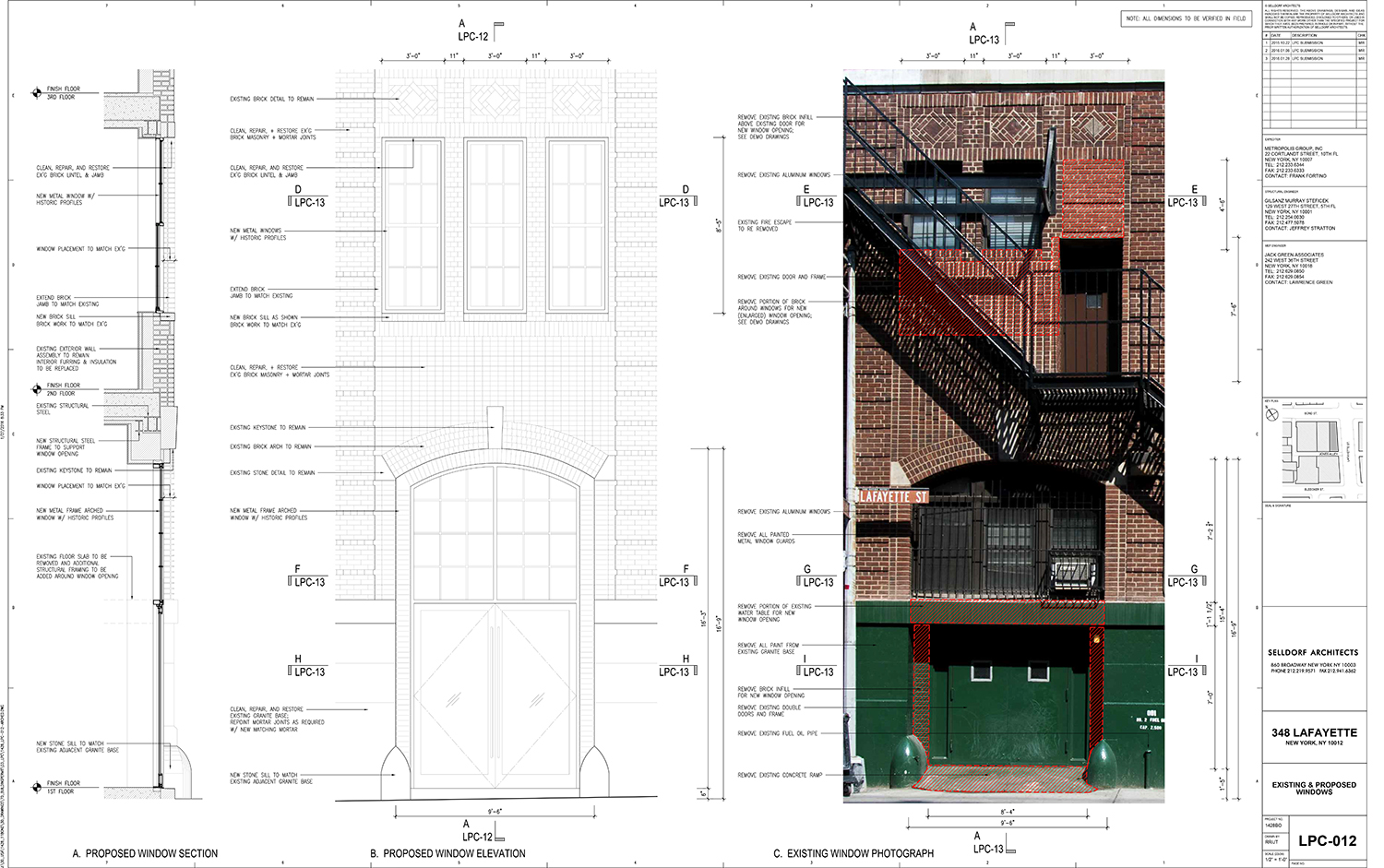
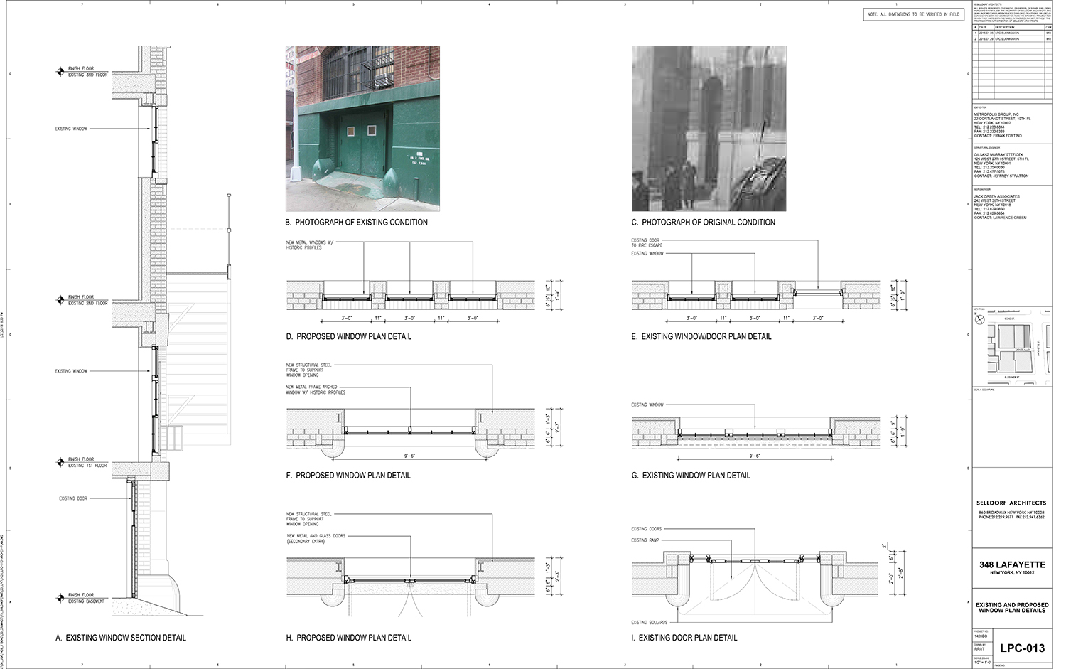
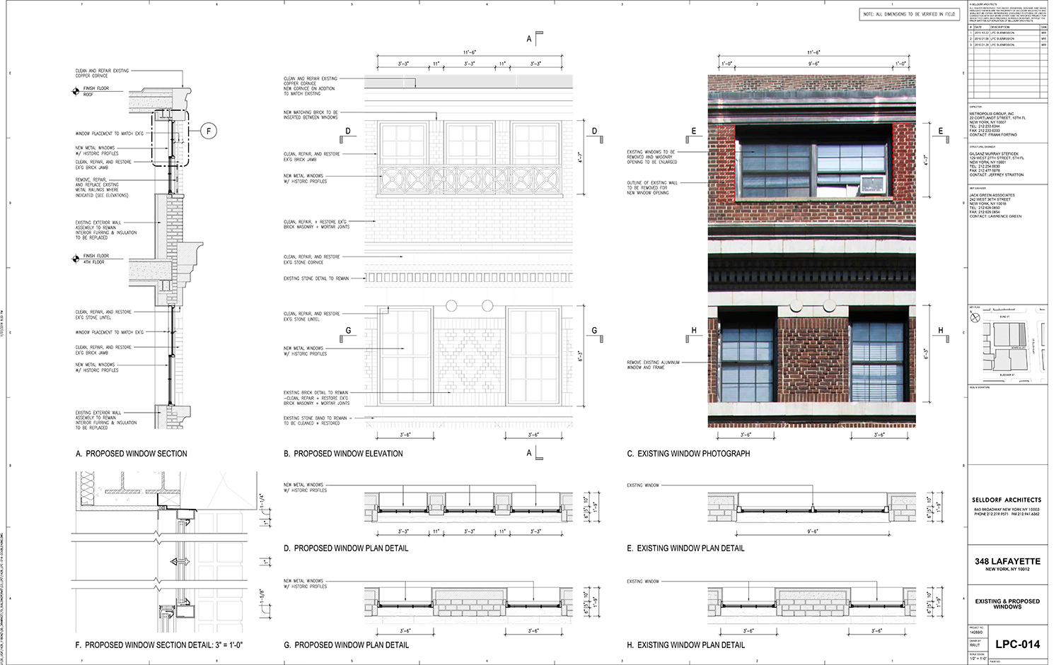
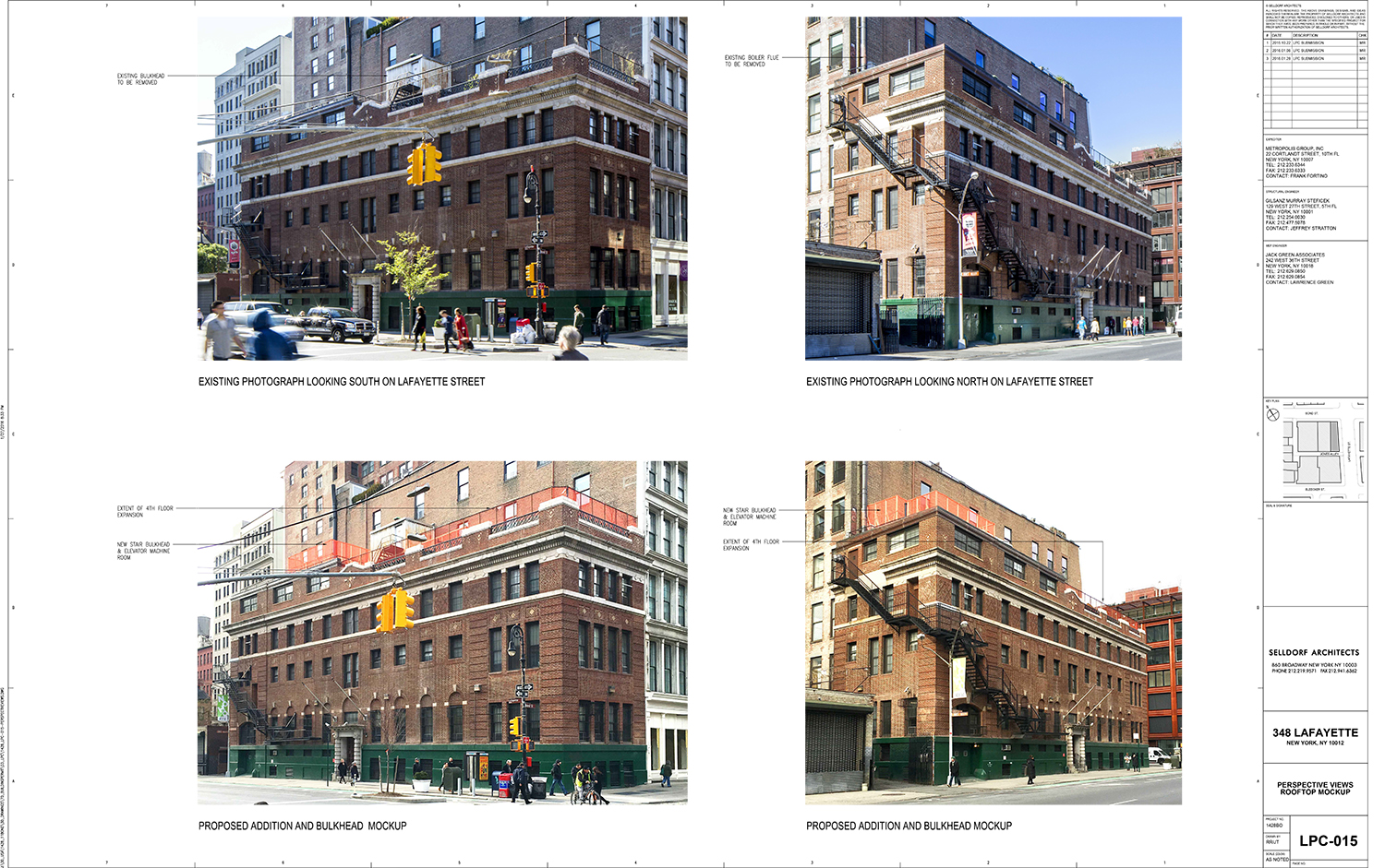
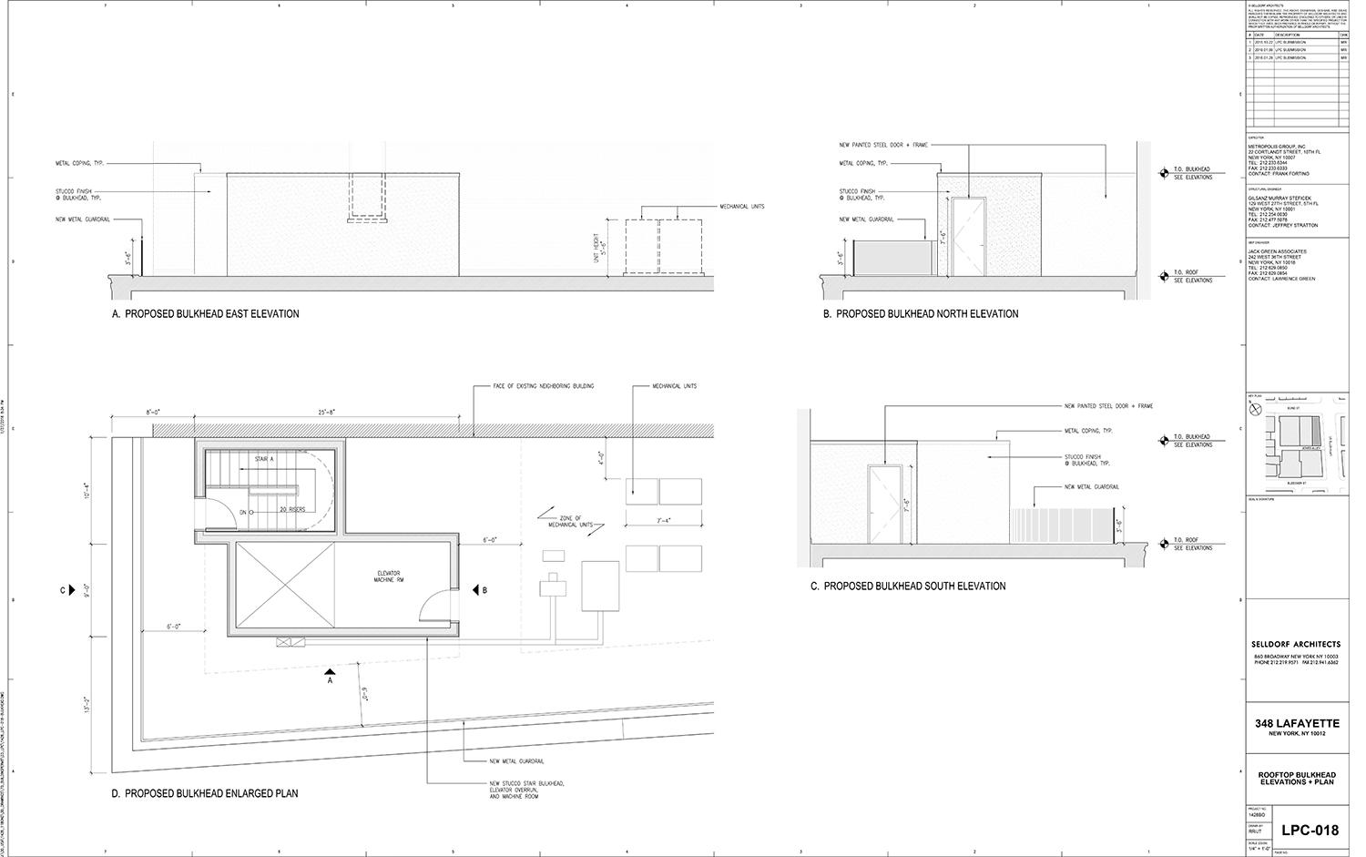
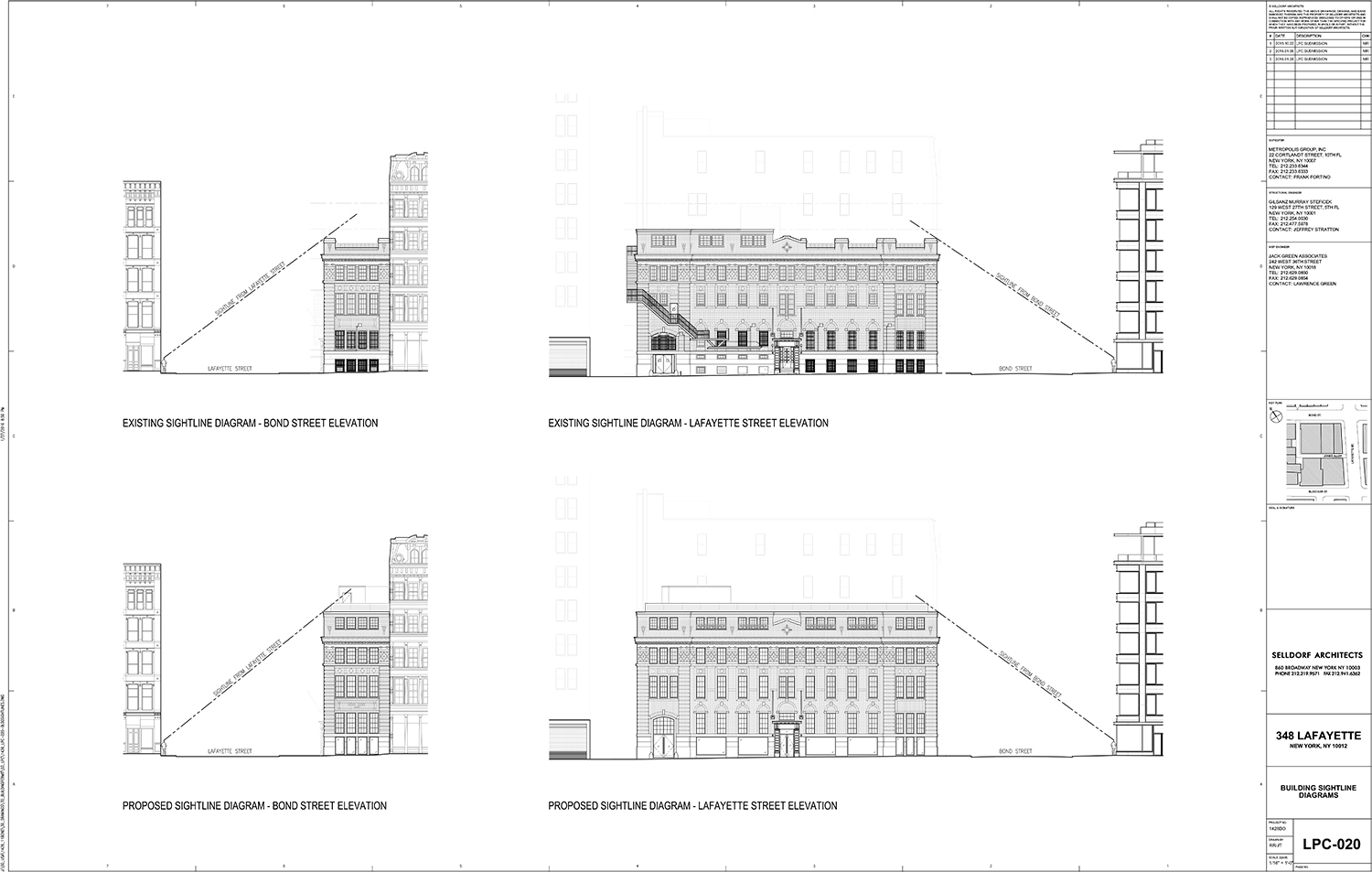
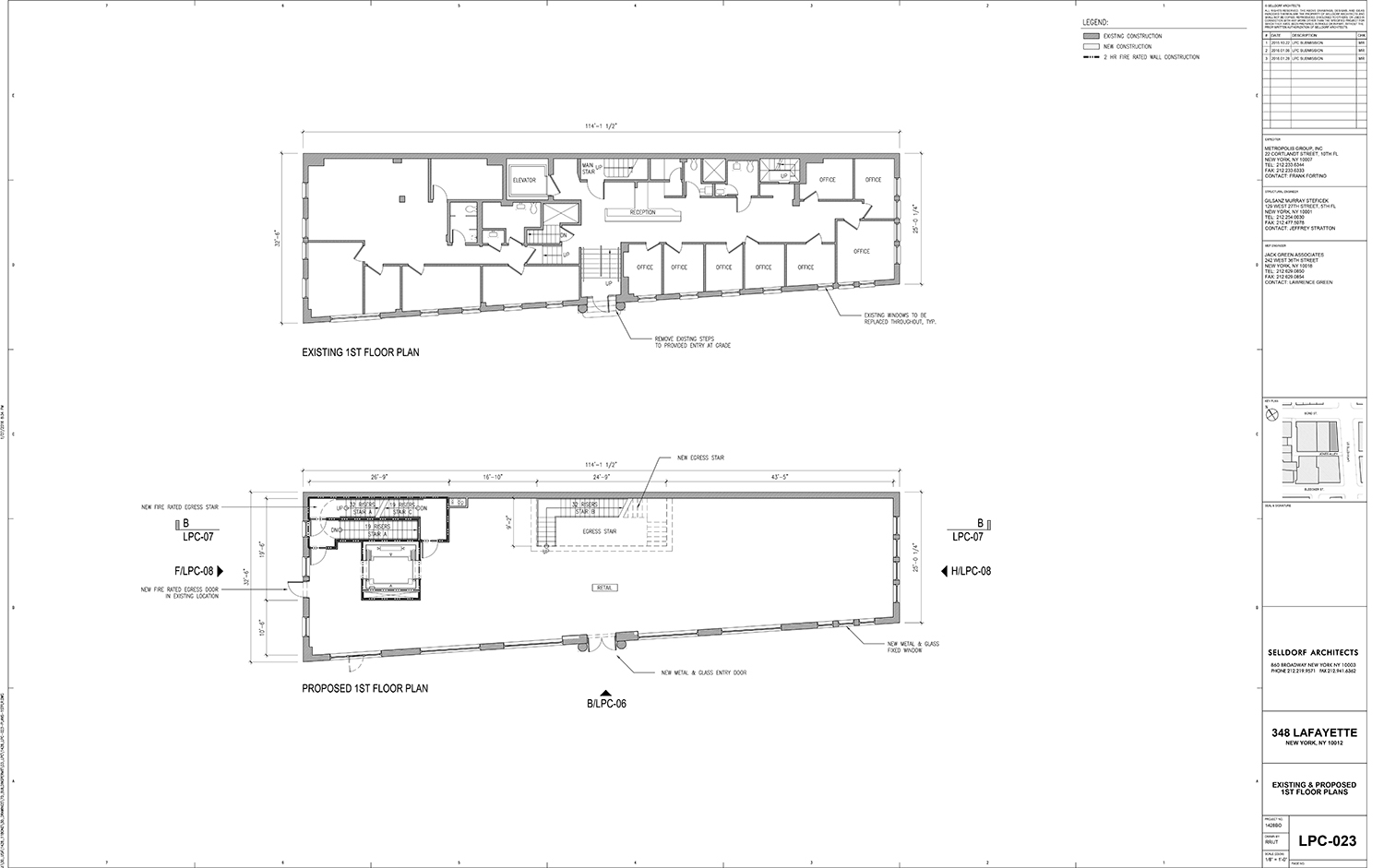
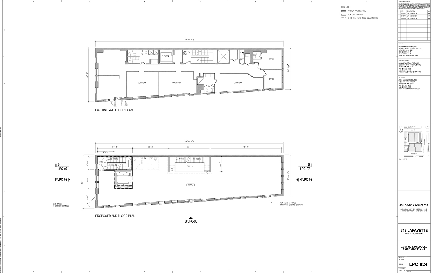
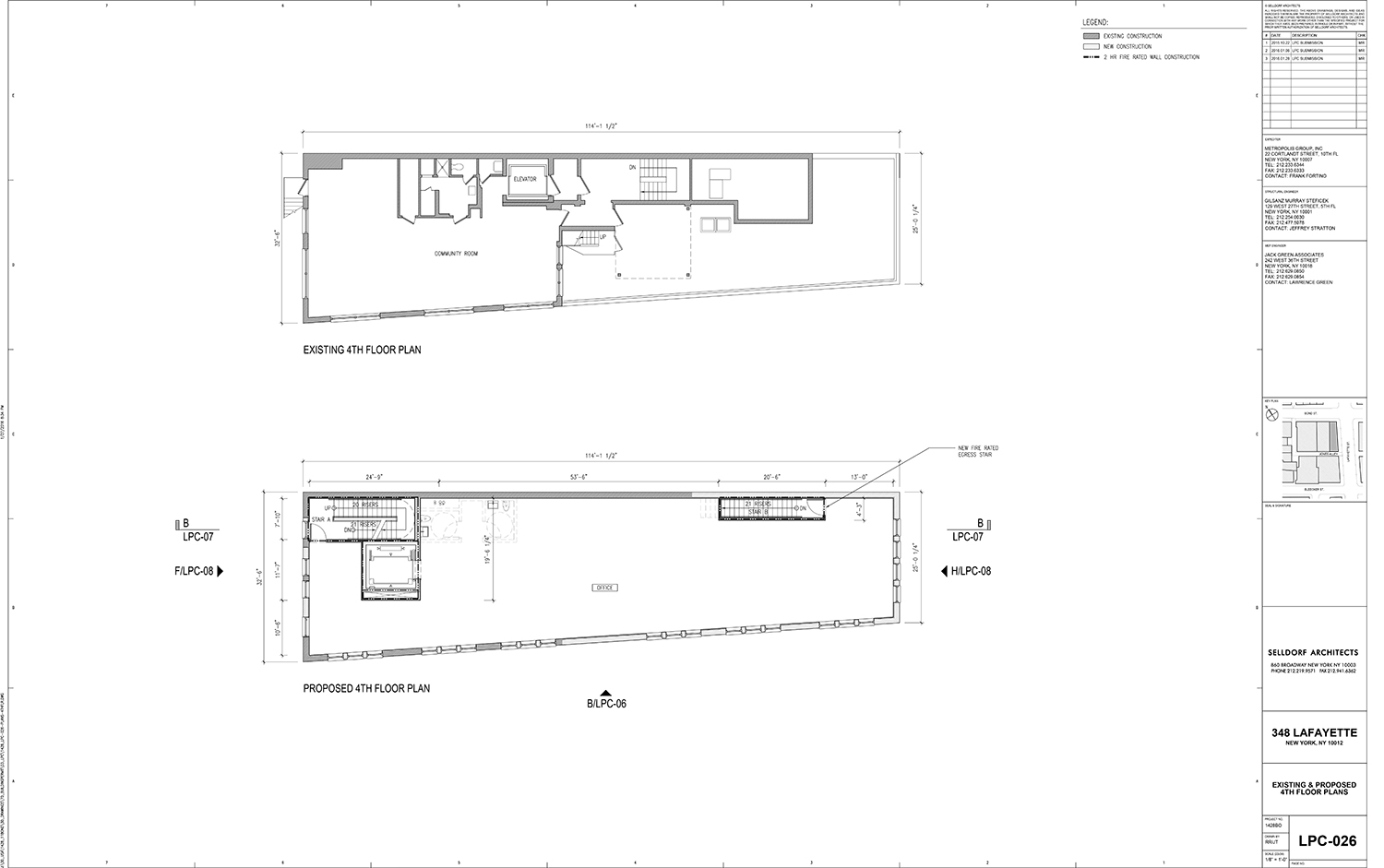
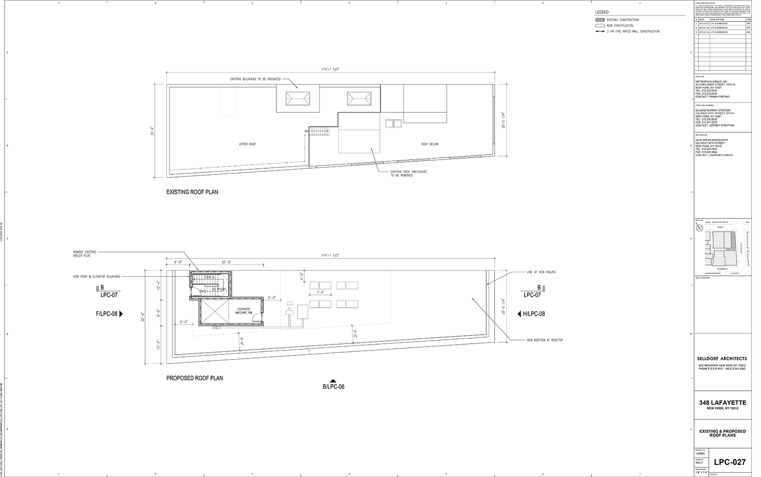
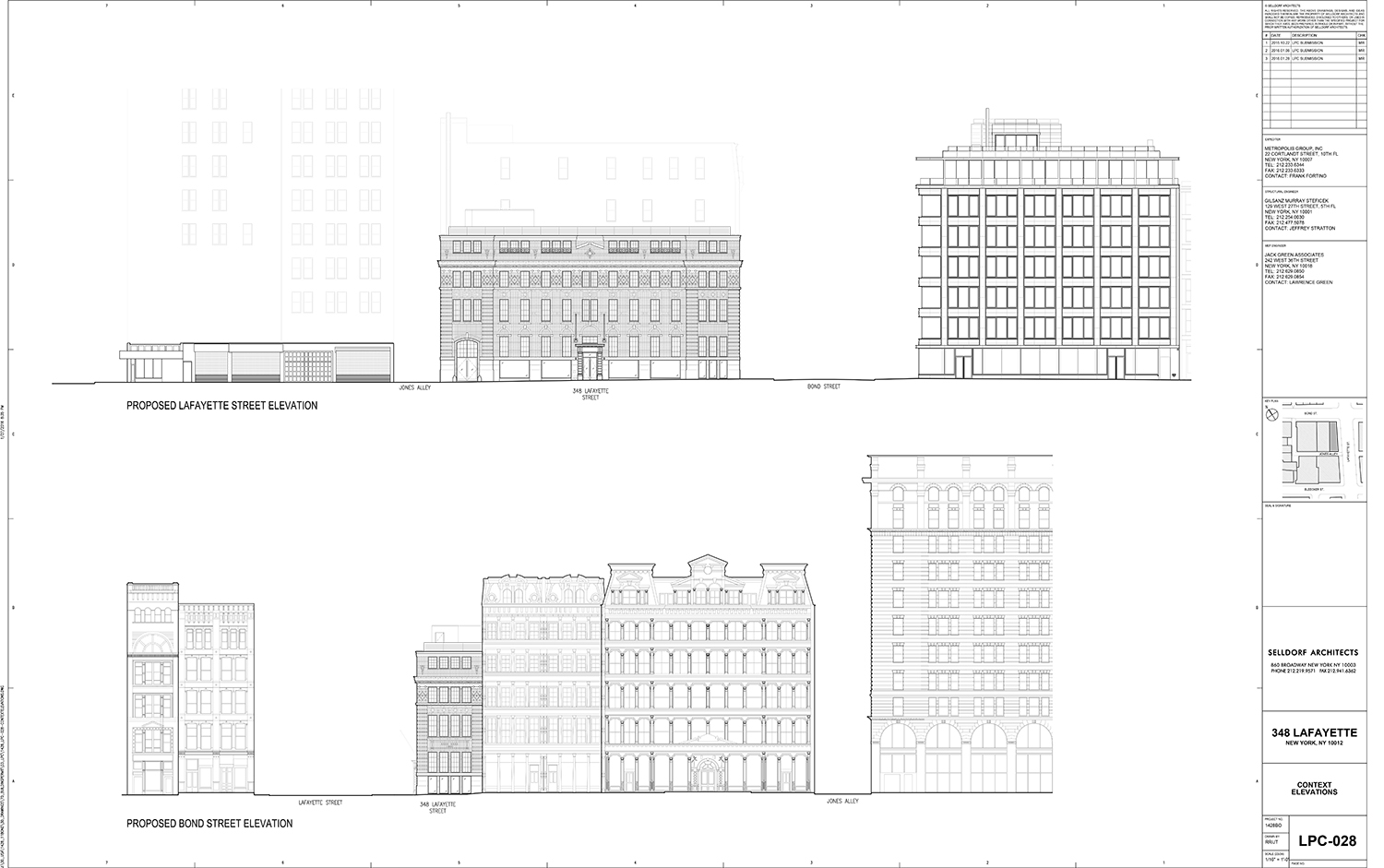
The proposal, presented by Julie Hausch-Fen of Union Square-based Selldorf Architects, called for extending a 1924 rooftop addition on the left side of the building over to the right side of the building, while also changing the fenestration pattern. Fenestrations would also change on the third and second floors. The first floor would be brought to grade and add oversized retail storefronts. The Board of Standards and Appeals would have the approve the base retail. The stable entry (horses were cared for there) on the left side of the building would be changed to an accessible entry. Additionally, the fire escape would be removed and a new bulkhead would be added.
The commissioners were open to change, but had issues. Commissioner Frederick Bland wondered why add to the right side of the building instead of subtract from the left. He did, however, note that there is a long history of “attic floors” being constructed even if they are a “reasonably radical departure.” He was troubled by the size of the proposed storefront windows.
LPC Chair Meenakshi Srinivasan said it was overall a “good project” and “sensitive” and she wasn’t bothered by the rooftop addition or its scale. However, she could see it set back a bit.
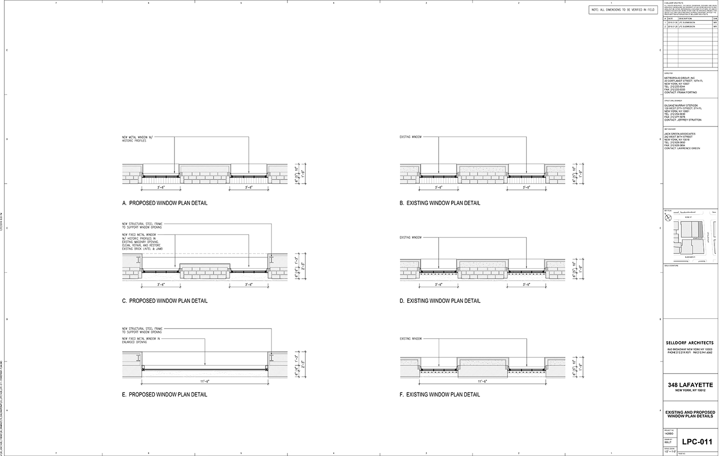
Commissioner Adi Shamir-Baron objected to window enlargements and the oversized storefront windows. She said the building would be come one with a “homogeneous face” not in keeping with the area.
Commissioner Michael Goldblum said it was a “great project” but wanted to keep remnants of the animal hospital past.
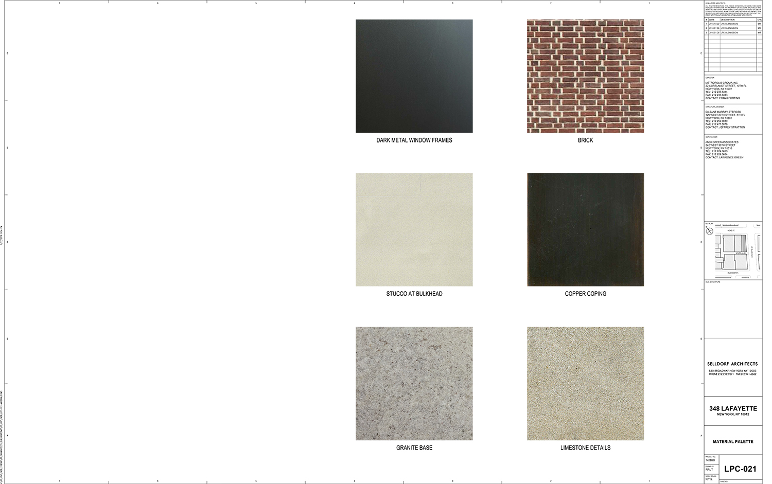
Community Board 2 approved of the renovation, in part. However, it objected to the use of aluminum windows and the removal of stable elements.
Zella Jones, president of NoHo-Bowery Stakeholders, lent her organization’s blessing to the project, noting that it is unlikely to be returned to use as an animal hospital.
Sarah Bean Apmann of the Greenwich Village Society for Historic Preservation, on the other hand, wasn’t ready to bless the proposal.
“GVSHP objects to the rooftop addition, the enlargement of third floor windows, the lowering of the doorway (unless required by ADA), the single-pane windows at the second floor, and the enlargement of the ground floor windows. These windows could be make taller, but should not be widened and combined. It is this combination, along with the blank plate glass that is dissonant with the existing building,” Apmann said. “The architect should find a way to either retain the masonry verticals between pairs of windows, or repeat the width of the brick as a metal muntin. On the Lafayette Street elevation, the horizontal continuity of the granite water table is an important element. It should not be removed at the rounded-head window at the south side of the Lafayette Street elevation.”
“In short, the design needs to be re-thought. This is a quirky, charming building which contributes to the story of NoHo, and the changes would too fundamentally change what the building is. There are ways of fixing this up and making it a retail space without losing all these key features.”
Christabel Gough of the Society for the Architecture of the City told part of the story of harpsichord maker John Challis who came to Lafayette Street after his Detroit home was knocked down under eminent domain to construct the Chrysler Freeway. His New York manufacturing center became known as “Challis’s Palace,” Gough said.
The Historic Districts Council’s Barbara Zay didn’t entirely object to the restoration, but had some critiques.
“HDC does not object to the extension of the top floor, as it presents an opportunity to bring back the symmetry that is this building’s hallmark. However, we would prefer to see the top floor set back, even just slightly, so as to prevent the strong cornice line from getting lost, bring back the crenellated roofline, and give the decorative central pediment – a signature feature – some breathing room. As presented, both the cornice and the pediment are lost.”
“Considering all of the added bulk to the top floor, HDC finds the very large bulkhead to be excessive. To maintain the building’s symmetry, perhaps a mechanical well could be installed at the back and some of the mechanicals could be incorporated into the top floor to avoid this very visible intrusion.”
“Concerning the base, HDC asks that rather than inserting wide expanses of glass, the storefront windows be redesigned to reflect the triple-bay strategy employed at the corner bays of this building.”
In the end, the commissioners decided not to approve the proposal, asking for a rethink of the new windows, the storefronts, and the rooftop addition. The applicant will have to return and try again at a later date.
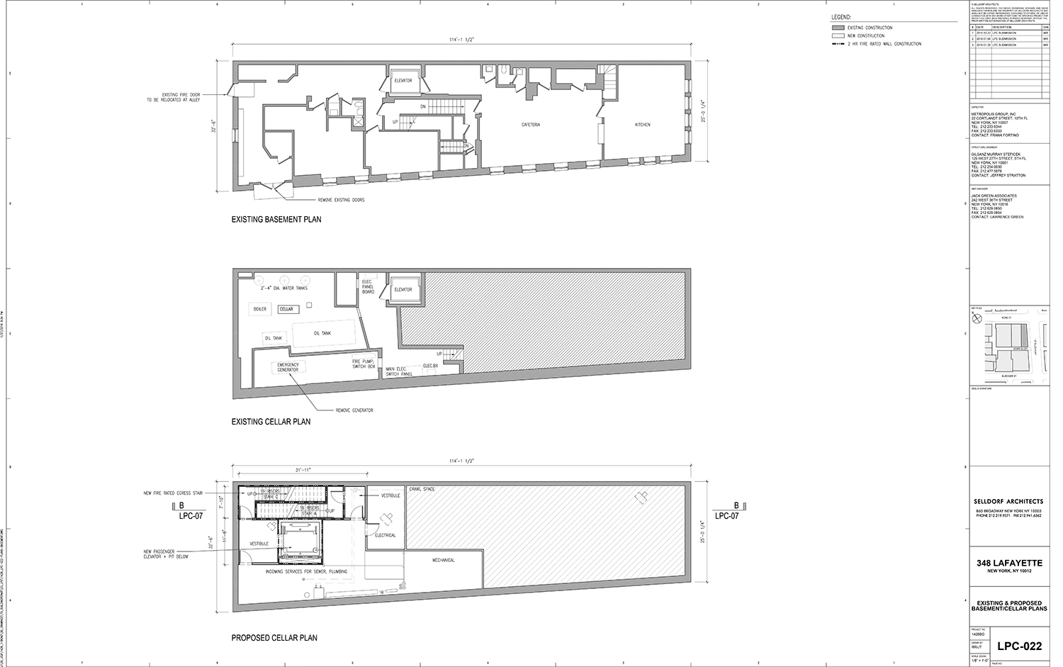
View the full presentation slides below:
Subscribe to YIMBY’s daily e-mail
Follow YIMBYgram for real-time photo updates
Like YIMBY on Facebook
Follow YIMBY’s Twitter for the latest in YIMBYnews




Glad GVSHP and NYC rejected this. Way too much of a change.