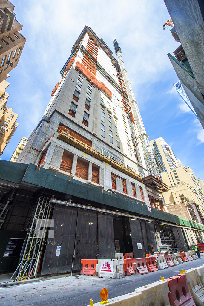
It’s been a few months since we last checked in on the Robert A.M. Stern Architects-designed 116-unit residential project going up at 220 Central Park South. Back in February, the tower portion had risen to about 15 stories. Now, as seen in photos supplied to YIMBY by photographer Tectonic, the tower has risen past 25 stories, on its way to 70, with more of the Alabama Silver Shadow limestone cladding in place.
The floor count has actually gone up since our January construction update, but the unit count has gone down, based on numbers from the latest Department of Buildings permit.
Vornado Realty Trust is developing the project and SLCE Architects is the architect of record. The site is located between Columbus Circle and Seventh Avenue.
In addition to what will be a 950-foot-tall fronting on West 58th Street, there will be 10 “villas” fronting on Central Park South. Back in February, none of that structure could be seen. Now, about 10 stories of that 17-story section have been constructed. With 10 villas, including full-floor, duplex, and quadruplex units, spread across 60,644 square feet, the average villa should clock in at over 6,064 square feet.
As for the tower, the latest DOB info lists 106 units spread over 411,412 square feet. That works out to an average unit size of over 3,881 square feet. The lower residentially occupied floors of the tower will have up to 10 units apiece. Above that, however, there will be a maximum of two-and-a-half units per floor, and there will be a quadruplex occupying floors 40 through 43. The top two residentially occupied floors, 66 and 67, will be a duplex.
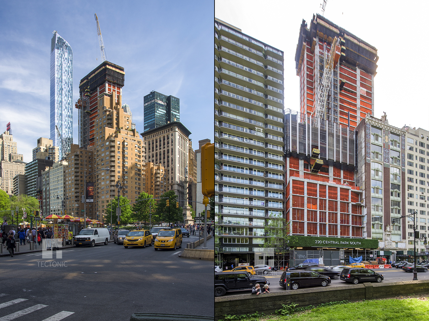
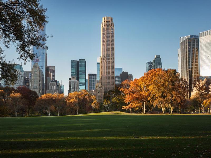
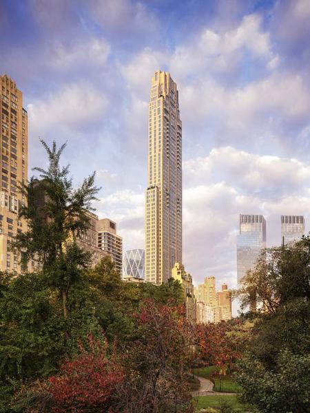
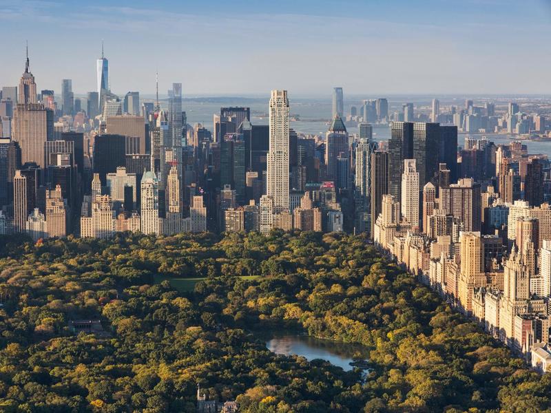
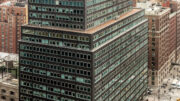
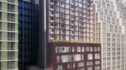
220 Central Park South, as seen from Columbus Circle and from Central Park. Photos by Tectonic for YIMBY
The new building permit lists 35 parking spaces, but the Schedule A lists only 24. Either way, there will be a limited number of parking spaces available. There will be about twice as many bicycle spaces, however – 62.
Other currently listed amenities include a yoga an Pilates room, a weight room, a children’s amenity area, a fitness room, treatment rooms, locker rooms, a juice bar, a swimming pool, a squash court, a basketball court, a golf simulator, a library, pre-function/kitchen, dining, and meeting rooms, a second floor terrace, a game room, and a screening room and pantry.
The building isn’t 100 percent residential, as there is a 409-square-foot retail unit on the first floor.
Subscribe to YIMBY’s daily e-mail
Follow YIMBYgram for real-time photo updates
Like YIMBY on Facebook
Follow YIMBY’s Twitter for the latest in YIMBYnews

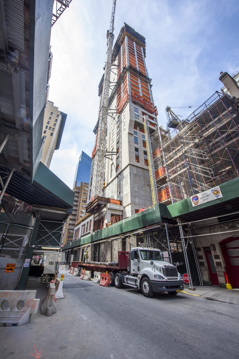
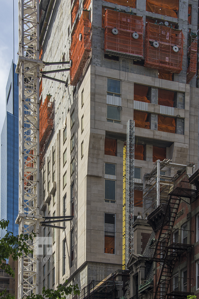
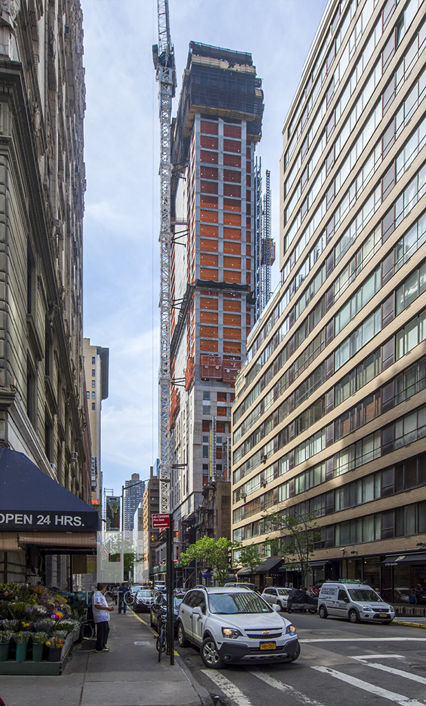

In the heart of city so cool, tower rising to the sky without limit on structure.
I like the original design much better. This one looks like Trump Palace. Still a nice design and a welcome addition to the area.
^ Original design?
That setback on the CPS frontage is atrocious. I don’t know what they were thinking trying to contextualize with that horrible 60s building next door which will probably be redeveloped in the next 20 years.
The revised top looks much better. But all that money for an apartment and most don’t even have a parking space but everyone is NEXT to a fire station. Obviously these tax shelters aren’t meant to be lived in most of the time.
Where’s the Nordstrom tower in these renderings?