The cores of dense cities work best when they mix a variety of functions, such as residential, commercial, or office. This mixing allows for a round-the-clock pedestrian presence, ensuring that the streets do not empty out at any point of the day. The concept is taken literally to the next level when two independent functions are stacked one on top of another within the same building, like roommates sharing a bunk bed. This effectively puts two buildings on the same plot without resorting to narrow towers with small floorplates. Although generally rare, mixed-use skyscrapers have made their mark upon Manhattan, starting with the famed Waldorf-Astoria, which combined hotel rooms at the bottom with apartments on top in 1931. Now, the city’s first major mixed-use tower has risen outside of Manhattan. The 31-story, glass-and-concrete slab at 29-11 Queens Plaza North in Long Island City, has seen construction virtually wrapped up at the time of this writing. Its lower stories house the 160-room Marriott Courtyard Long Island City hotel, with the 135-unit residential complex called the Aurora sitting within the top 15 floors. The combined property measures 240,000 square feet.
While it may not be the tallest building in the surging Long Island City community, it comfortably numbers among the top ten, and stands as the tallest building north of Queens Plaza. More importantly, it boasts one of the most striking designs in the whole neighborhood. More often than not, when combining distinct functions under one roof, the architects employ a singular, well-defined exterior aesthetic to keep the final product from looking like a jumbled mess. To use a local New York example, the architects at Skidmore, Owings & Merrill clad the exterior of the 2003 Time Warner Center at Columbus Circle in mirror glass, to evenly conceal the interior that contains a shopping center, a concert hall, what was the world’s most expensive corporate headquarters at the time, apartments (including the city’s priciest), and a hotel. By contrast, the single-use office tower at 7 World Trade Center, which was designed around the same time by the same team and completed three years later, employed a transparent, ethereal glass skin.
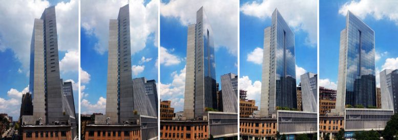
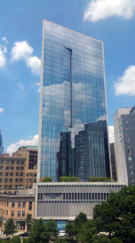
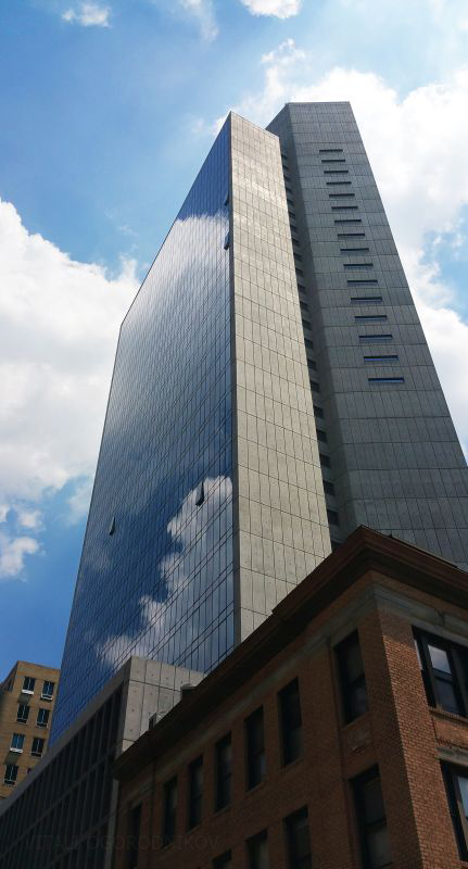
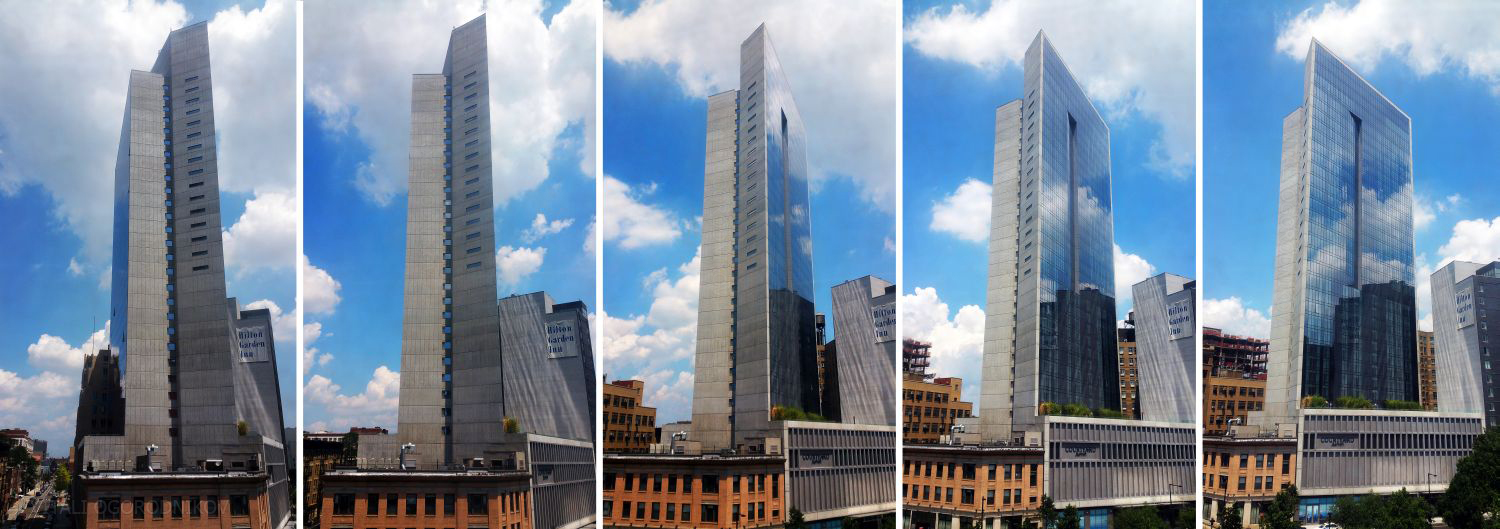
The designers of 29-11 Queens Plaza North stuck closer to the Time Warner Center approach of exterior anonymity. They sandwiched the building’s bulk within a sheer, setback-free slab faced with reflective, blue glass. The slab is encased within twin bands of exposed concrete that wrap around the top. They visually break the slab down into two staggered masses. The taller one faces east, overlooking Dutch Kills Plaza at the foot of the Ed Koch Queensboro Bridge and the seemingly endless blocks of Queens beyond. From the structural perspective, they act as shear walls that grant rigidity to the slender form.
The slightly lower one faces west, towards the bridge and the Manhattan skyline beyond.
The concept of a tower with windows upon the main facades and near-windowless side walls is usually used at mid-block sites, usually at hotels, and usually with aesthetic results ranging from mediocre to abysmal. When applied to a freestanding tower, the idea typically fares better, as seen in examples ranging from the 1951 UN Secretariat Building, a Modernist classic across the river, to rigorously-sculpted Torre Cespa, designed by Sir Norman Foster and built in Madrid in 2008, to similarly-sized apartment tower rising at 44-26 Purves Street just a few blocks away.
The Queens Plaza project had all the makings of the less fortunate approach of the two described above. After all, it is a hotel that sits at a mid-block site, in a neighborhood where most new hotel towers look less than spectacular, to put it nicely. In a pleasantly surprising twist, the architects exceeded expectations thanks to proper material choice and attention to detail. The mid-block project was approached as a freestanding tower, with high-quality concrete adding a touch of finesse to its mostly-blank lot walls. Connecting the two with a similar band across the top frames the composition like minimalist trim upon a monumental mirror. The angling and notching of the concrete bands adds a distinct sculptural quality to the slab, which enables it to exude a different character depending on the direction from which it is viewed. While it looks sedate and ordinary from some angles, its mass turns into a dramatic Brutalist monument when viewed from other directions.
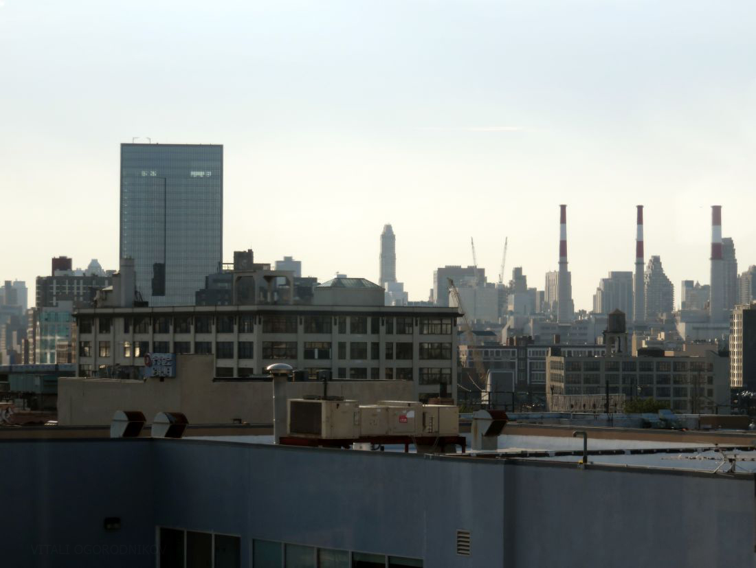
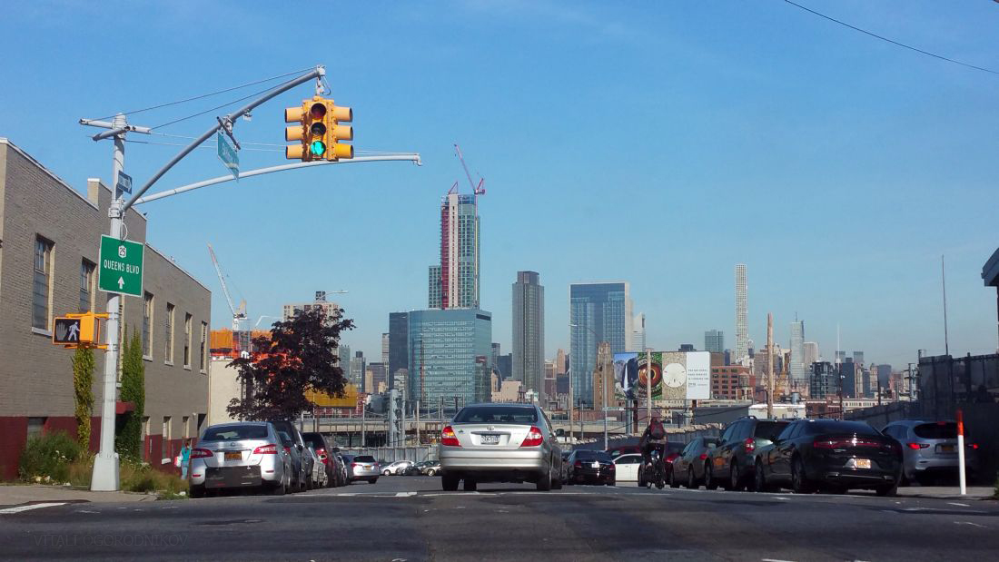
Looking west, with eastern LIC in the foreground and Ravenswood and Manhattan’s Upper East Side in the rear
The unified composition has few intentional signs that betray the dual function of its interior. On its front, plaza-facing east facade, an asymmetrical notch is cut into the smooth glass surface halfway into the building’s height, at the point where hotel rooms end and the apartments above begin. The notch runs uninterrupted to the building’s top floors, which feature common areas that boast sweeping skyline views and open onto a Manhattan-facing food deck. At the same level as the notch, the concrete flanks are perforated with narrow horizontal window slits. Otherwise, the only exterior giveaway of the dual function are the differences in window drapings, which are visible under certain conditions in the morning light: white vertical drapes in the hotel portion and horizontal blinds in the residences above.
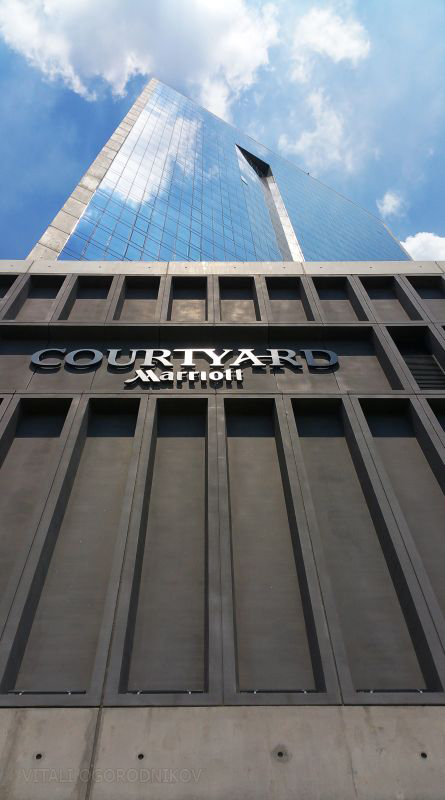
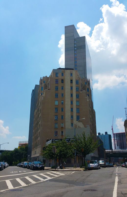
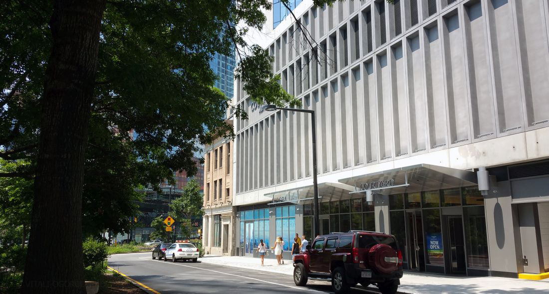
The least appealing aspect of the design is the hulking base. Rising sixty feet high with no windows above the ground level, it exudes an overpowering presence both upon the Dutch Kills Green plaza in front, and 29th Street to the west. The podium, which takes up the entirety of the irregularly-shaped site, houses parking and the bulk of the building’s mechanical services, with the hotel’s roof deck perched at the top. This arrangement is a trade-off in the architectural sense: by moving the building’s mechanical innards to the bottom, the top floors boast uncluttered space for communal functions. The architects took some measures to alleviate the heavy presence of the base, such as articulating its blank surface with concrete niches that go hand-in-hand with the overarching Brutalist theme. On another positive note, the base maintains the existing street wall, so it fits rather gracefully into its urban setting even considering its overbearing presence.
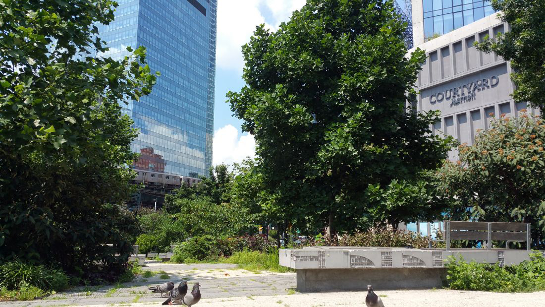
When viewed from the east, much of it is blocked from view by the green canopy of the Dutch Kills Green.
In the past, the site was occupied by a two-story, whitewashed stone building with a Neoclassical colonnade facing the future plaza. The building was demolished around 2007, a few years before construction of the new tower began. In a perfect world, the old structure would have been gutted and used as the base for the new building, even if it meant adding an extra level above the historic facade.

Long Island City Savings Bank at 29-11 Queens Plaza North (center), with the Bank of Manhattan Company Building on the right. Circa 1927. Looking north. Ewing Galloway. New York Public Library. Image ID 726210F
There is some consolation in the fact that the complex sits within the best-preserved pre-war commercial office district in all of Queens, particularly along 29th Street to the west.
To the northeast it faces the clocktower of the Bank of America Company Building. The 14-story edifice at 29-27 Queens Plaza North on the other side of the Green was the borough’s tallest office structure from 1927 to 1990 It was landmarked last year.
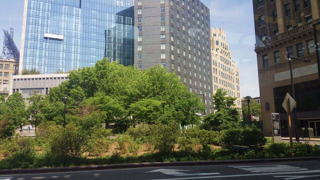
The tower’s dominant position looking over Dutch Kills Green, a verdant oasis at the foot of the Queensboro Bridge approach, sets up 29-11 Queens Plaza North at the most important gateway into the city’s largest borough. Its prominent siting will ensure lasting visibility and prominence that eclipses many of its larger and taller counterparts elsewhere in the city.
Both residents and hotel patrons benefit from living across the street from the largest green space in the public space-starved neighborhood, which grows ever denser as echelons of towers continue their skyward rise.
What was a dismal parking lot less than a decade ago is now a pleasantly landscaped pocket of greenery, adorned with millstones from the old Dutch mills near the site. Imported from the Old World around 1657, the circular stones are likely the oldest European artifacts publicly displayed anywhere in Queens.
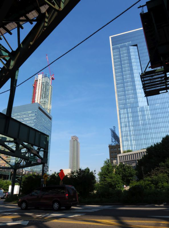
But even given the green oasis in front, the building’s siting may be a mixed blessing. The plaza marks the junction of the borough’s two most important street arterials – Queens Boulevard and Northern Boulevard, as they join together to funnel traffic onto the bridge. The steel trestles of the N, Q, and 7 trains weave above the complex interchange, with the E, M, and R trains rumbling beneath. Of course, living next to one of the borough’s most important transit junctions, coupled with minutes-long proximity to Midtown Manhattan by car, bus, train, bike, or even foot, has indisputable advantages. The location is just about as good as it gets for anyone wishing to live next to the nation’s largest office district without actually living in Manhattan. On the other hand, this convenience comes with an ever-present snarl of traffic, separated from the building only by the green plaza. During the morning rush hour, as motorists from all over the borough funnel onto the bridge approach, local streets come to a virtual stand-still. The near-90-degree bend of the N and Q train, which hugs the plaza on its south and east sides, is a visual delight to urban aficionados (such as ourselves at YIMBY), but just about anyone would get occasionally irritated by the loud screech of the trains negotiating the sharp turn.
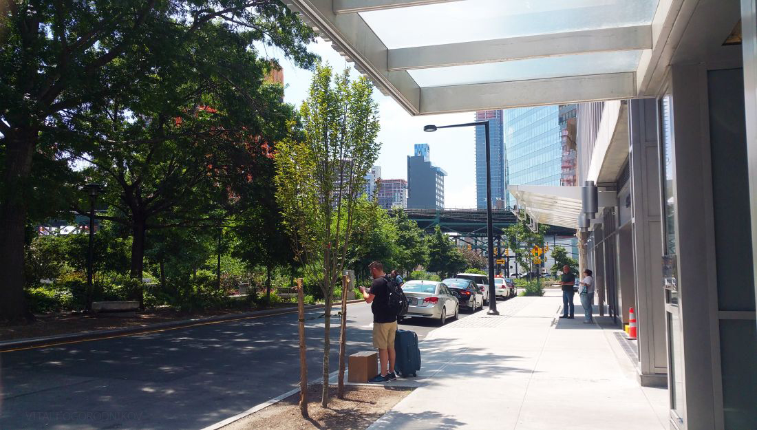
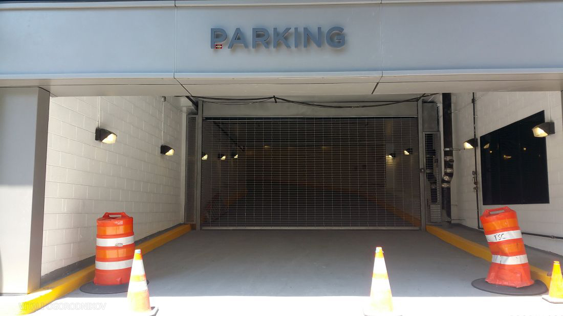
The narrow street of Queens Plaza North, which marks the north and west boundary of the Green, is the access point for virtually all of the building’s functions. Here are the twin canopies of the Aurora and the Courtyard hotel, the parking garage entrance, and the facade of the ground-level retail space that will be occupied by a yet-to-be-chosen tenant.
Only a service entrance opens upon 29th Street on the west side.
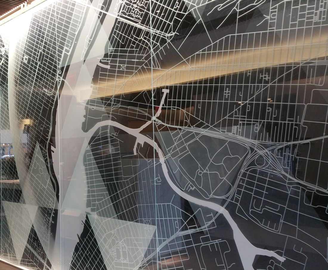
The Marriott Courtyard hotel, which opened on May 17, is the latest addition to the growing hotel district north of Queens Plaza, which we partially covered last week. Its lobby embraces a minimalist aesthetic like the tower itself. Aside from a water feature that doubles as a bench, the space is dominated by a stylized map of the metropolitan area. Stretching a few dozen feet, the street grid on display stretches from Flushing Meadows Park to the east to the New Jersey Meadowlands to the west.
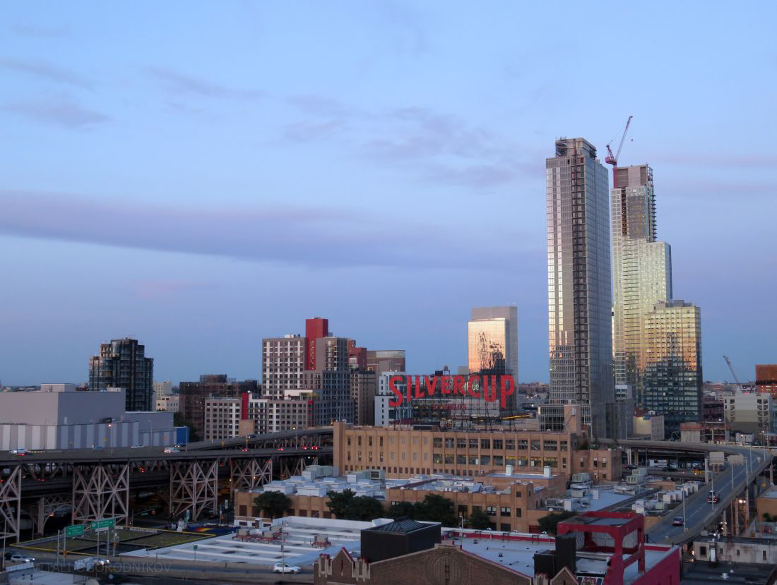
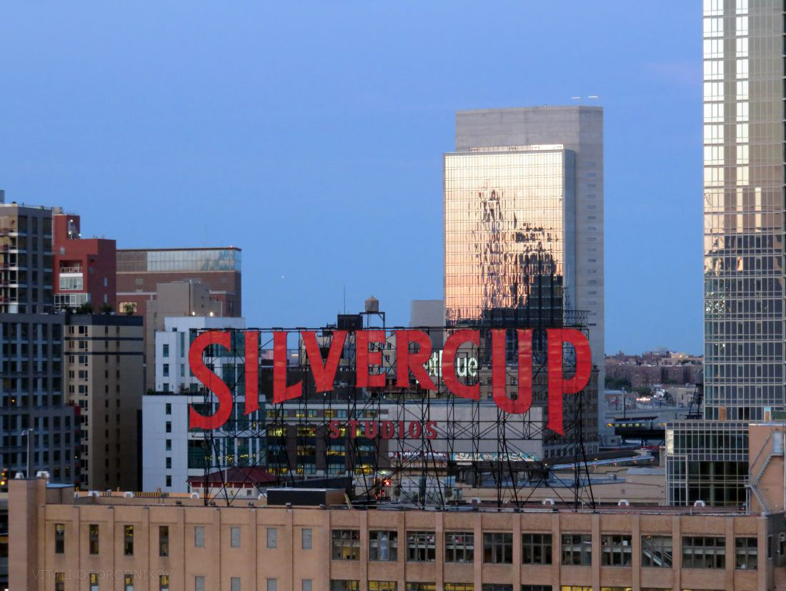
Next to the front desk, a smaller table boasts brochures for the city’s run-of-the-mill tourist attractions. See the Statue of Liberty! Ride a boat around Manhattan! Climb the Empire State Building! To our dismay, we could not find anything that promoted the hidden gems scattered across the hotel’s own Queens backyard. While the obvious mentions would be landmarks such as the Queens Museum, the World’s Fair grounds at Flushing Meadows, and the Gantry Park along the East River waterfront, other local destinations include Astoria, with its Kaufman Astoria Studios, the Museum of the Moving Image, and an active restaurant and nightlife scene. MoMA PS1 and the Sculpture Center, along with Silvercup Studios, sit a few blocks southwest.
The 43,000-square-foot, publicly-accessible Brooklyn Grange rooftop farm sits a few blocks northeast at 37-18 Northern Boulevard. Although completely lacking in visitor attractions, and somewhat lacking in general safety, the Queensbridge Houses a few blocks northwest are arguably the single most important location in the diverse culture of hip hop.
The next-door lobby of the Aurora apartment complex is much smaller, and its décor embraces a similarly minimalist approach. The rentals are brokered by Douglas Elliman, going from $2,500 a month for the smallest pads to over $5,000 for penthouse units. According to our sources, this portion of the building is more than 99 percent complete, with most of the work remaining revolving around the standard closing-out paperwork rather than physical construction. Future residents would find themselves within a neighborhood still transitioning from its commercial and industrial roots, so certain staple amenities, such as supermarkets and pharmacies, are still sorely lacking. The situation is likely to change as dozens of new projects are scheduled to be completed within the coming years, most of which carry a retail element along with their main function.
The lower portion of the building looks upon the street canyon of pre-war buildings lining 29th Street. The floors above face a dramatic Midtown panorama, though it is partially obscured by Karl Fischer-designed 41-21 28th Street, which nears topping out at 16 stories one block west. East-facing windows offer breathtaking panoramas of the borough of Queens, at least until they will be partially obscured by a 50-story slab of the QE7 tower rising on the other side of the plaza.
29-11 Queens Plaza North may not be the largest or tallest addition to the skyline, but it fulfills its role with finesse, standing at the vanguard of one of the nation’s fastest-growing communities.
Subscribe to YIMBY’s daily e-mail
Follow YIMBYgram for real-time photo updates
Like YIMBY on Facebook
Follow YIMBY’s Twitter for the latest in YIMBYnews








I pay special attention to panorama, tower immediately invited me on charm’s full of blue glass.