A proposal to add four stories of residential space to a single-story commercial building in Queens is still on hold. On Tuesday, the Landmarks Preservation Commission, for the second time, declined to approve the plan for 35-64 85th Street.
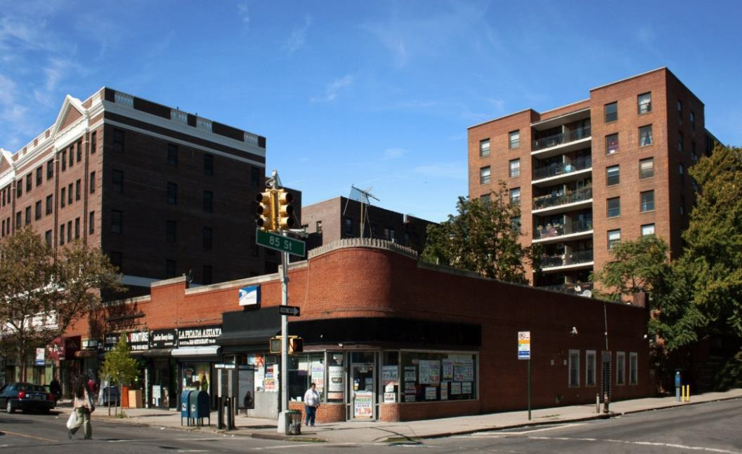
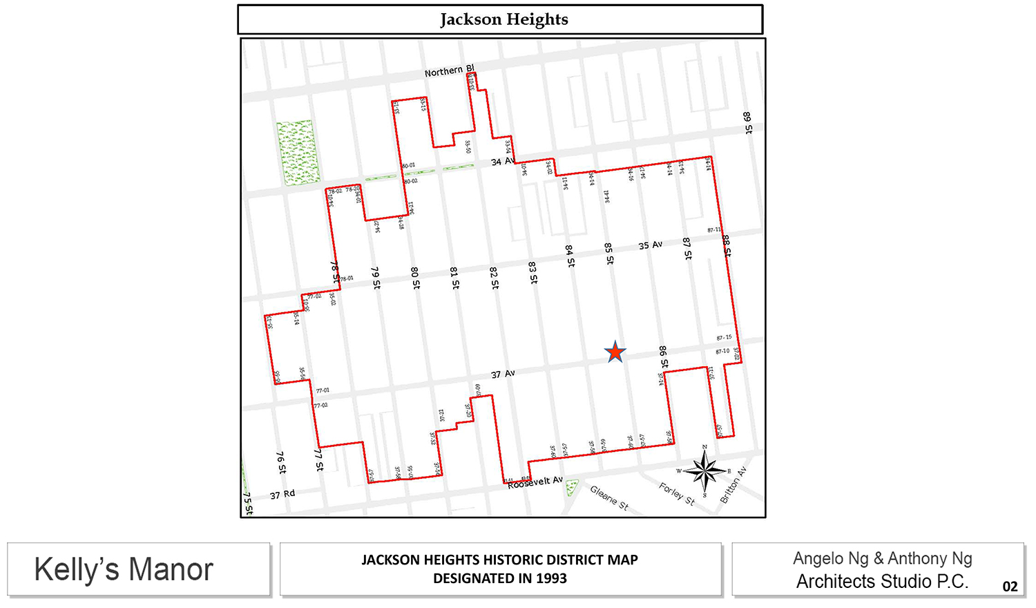
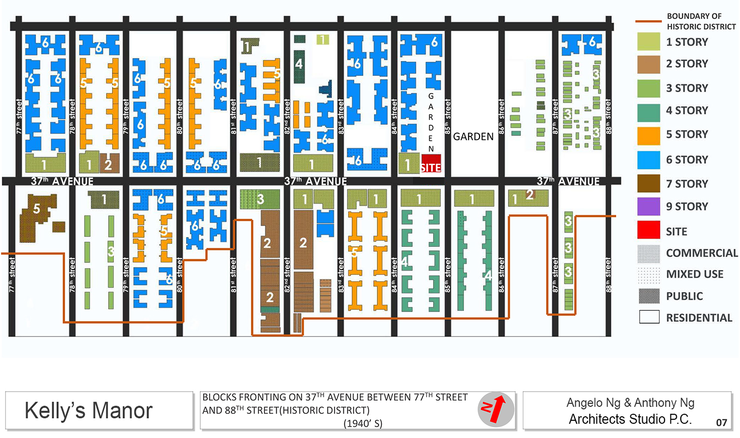
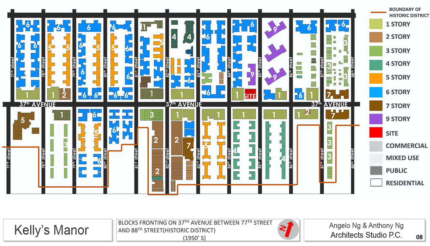
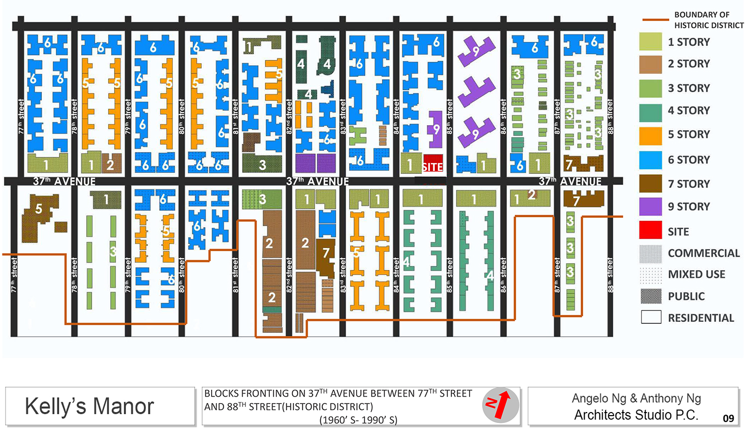
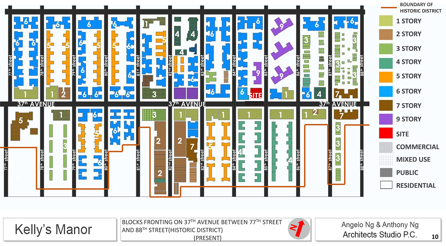
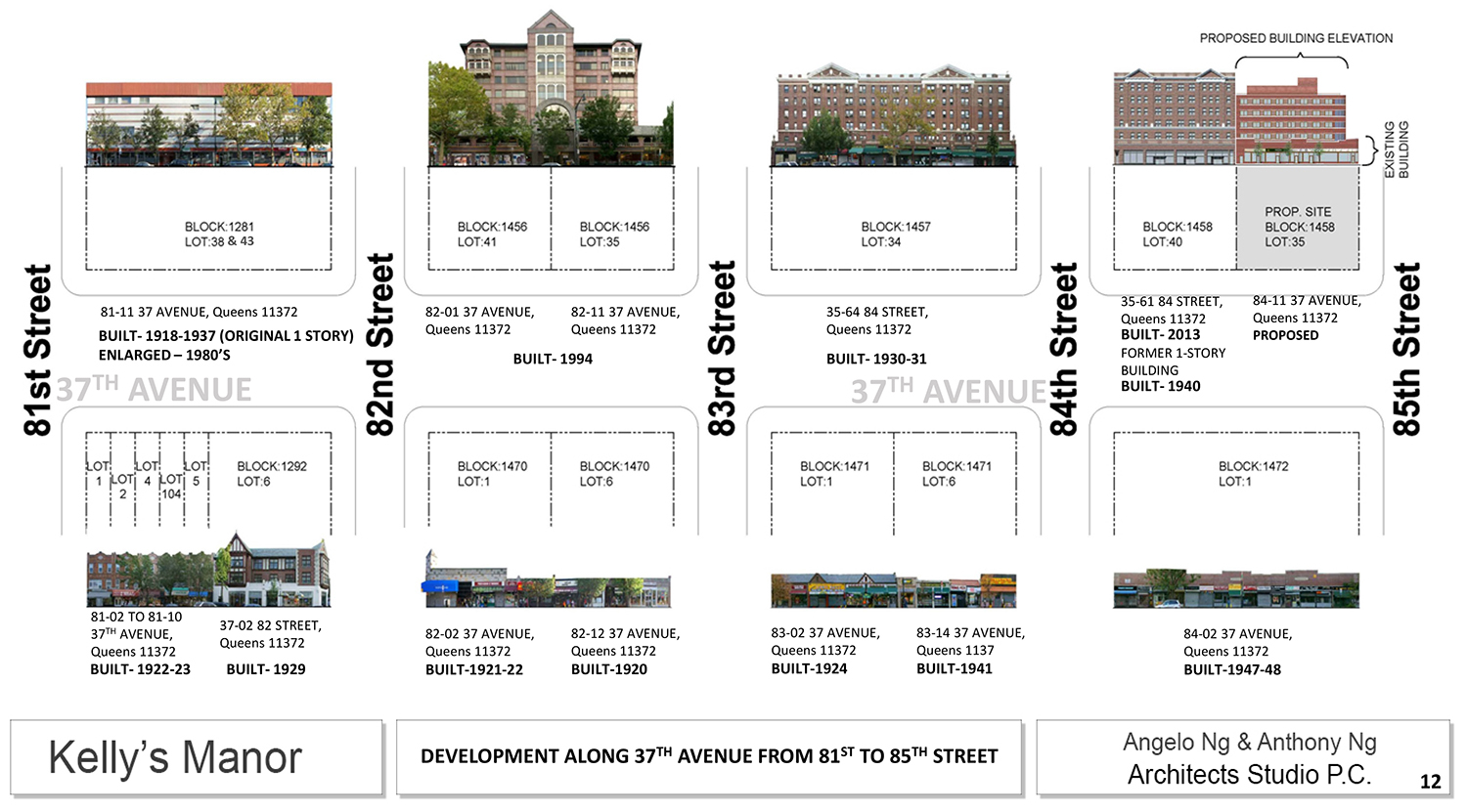
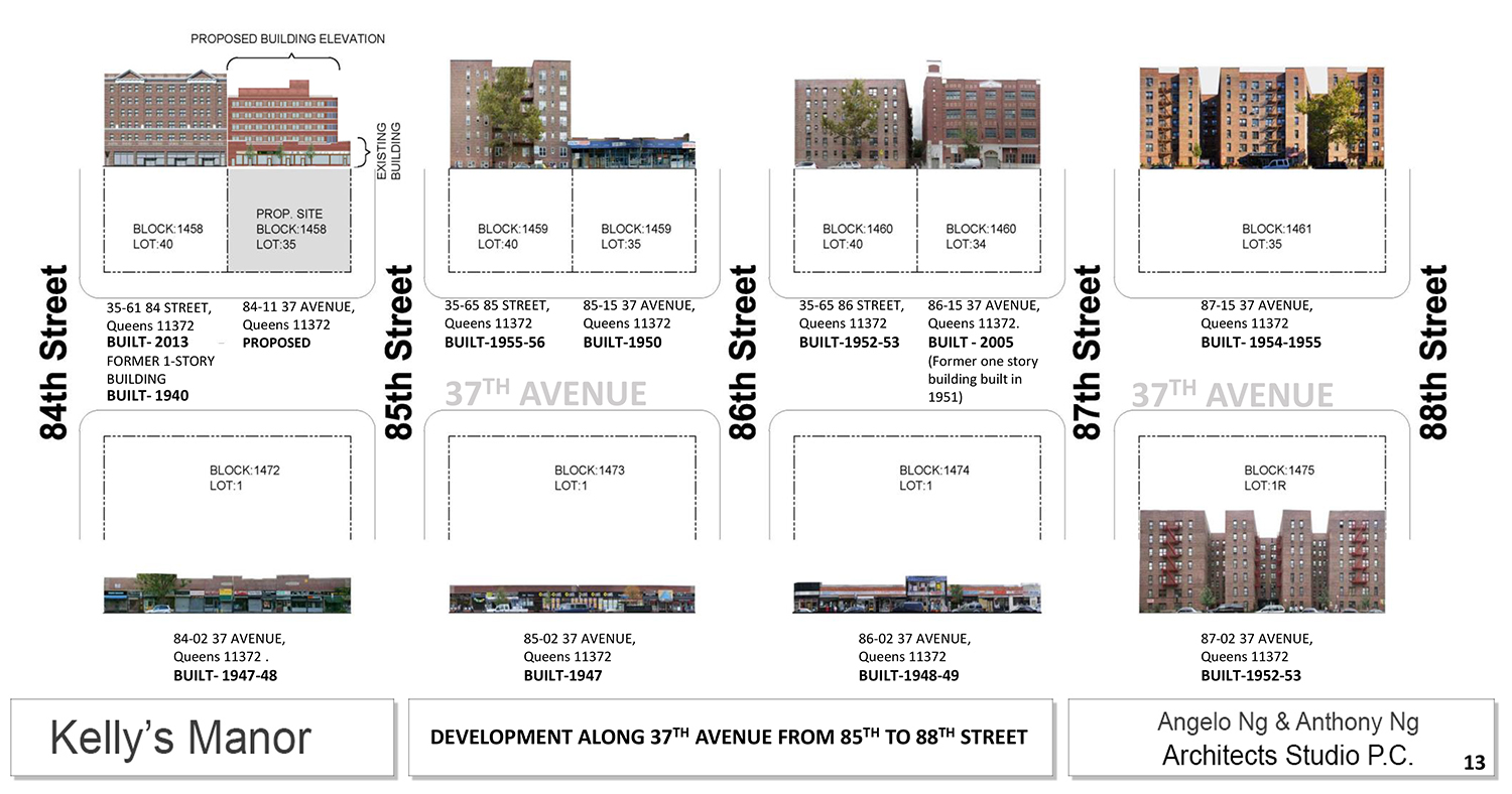
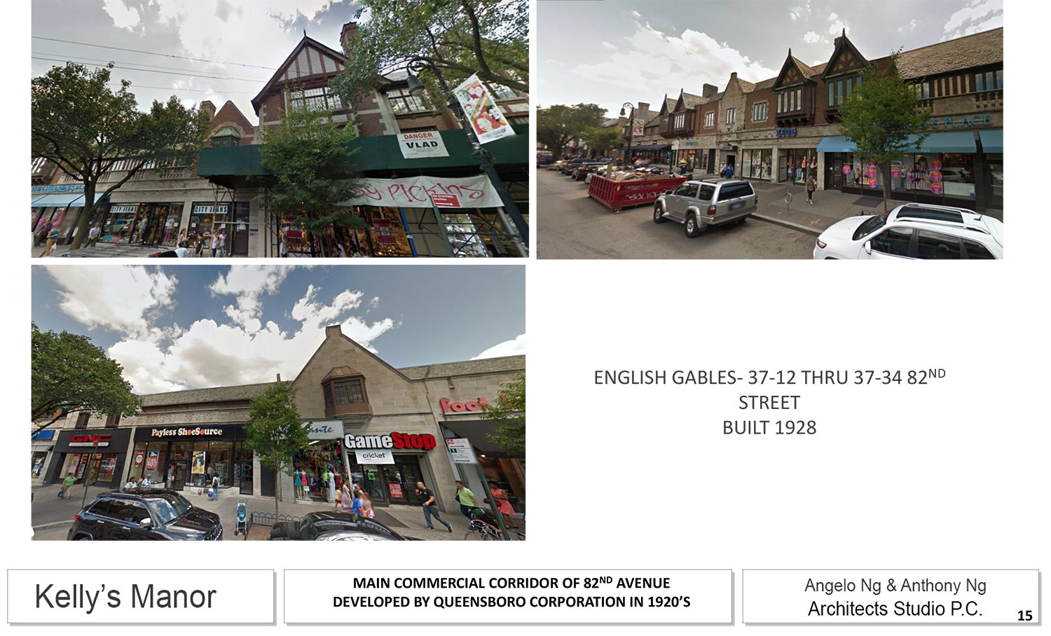
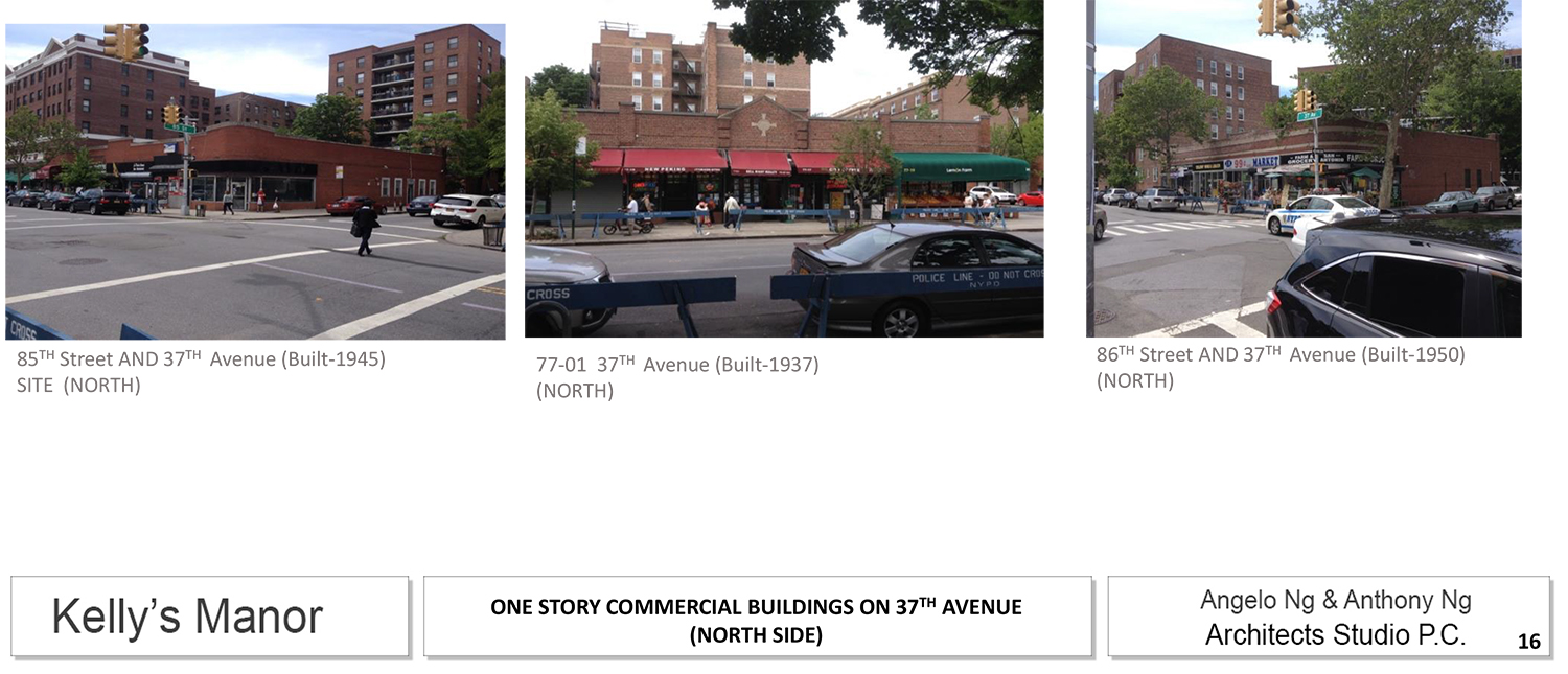
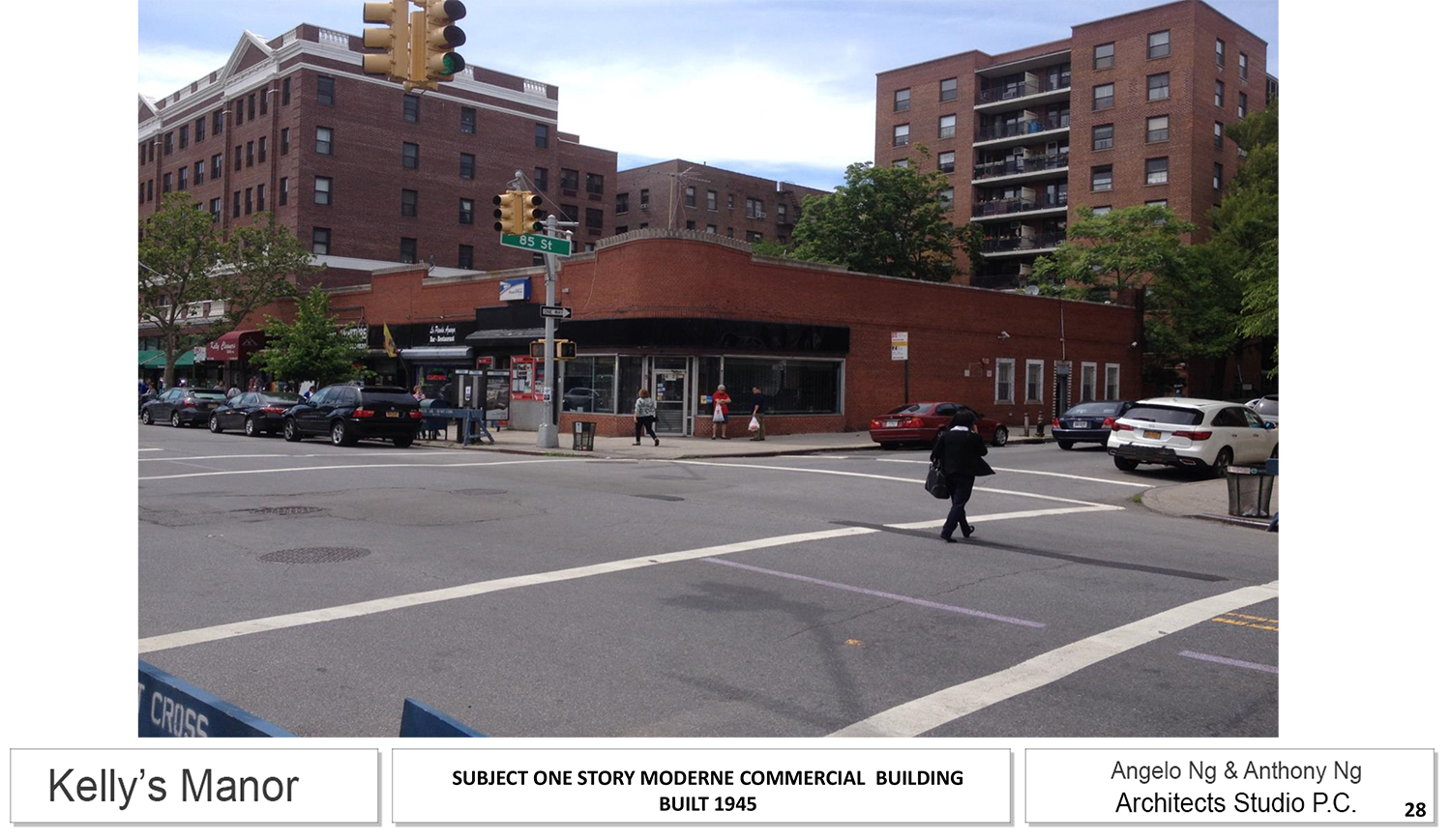
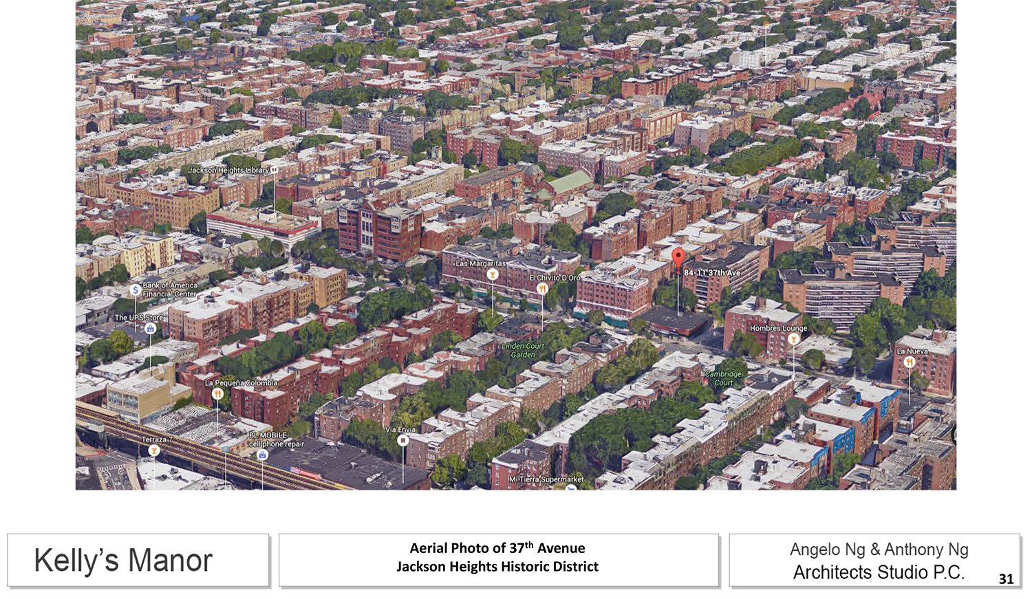
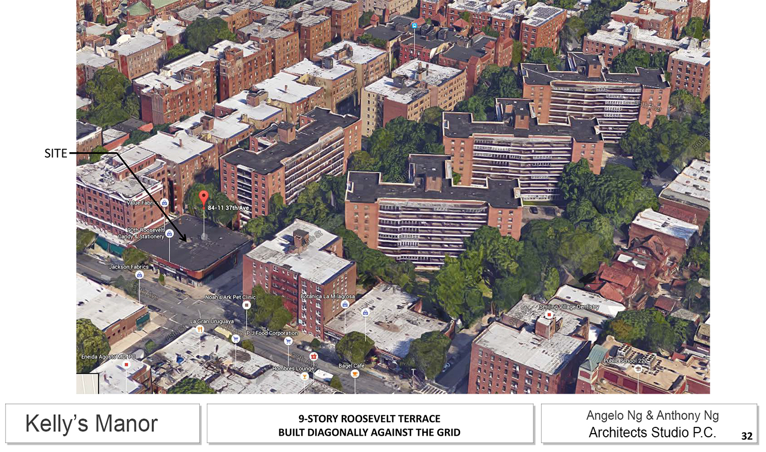
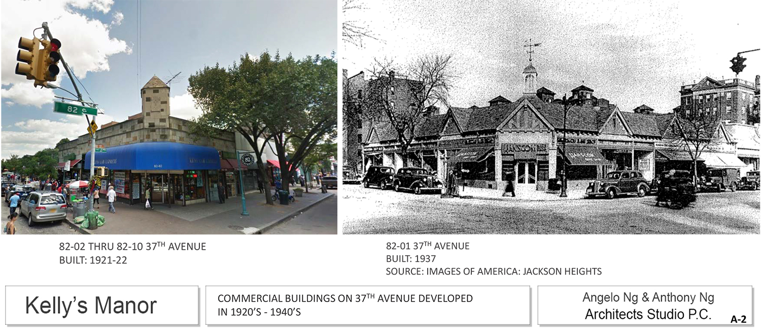
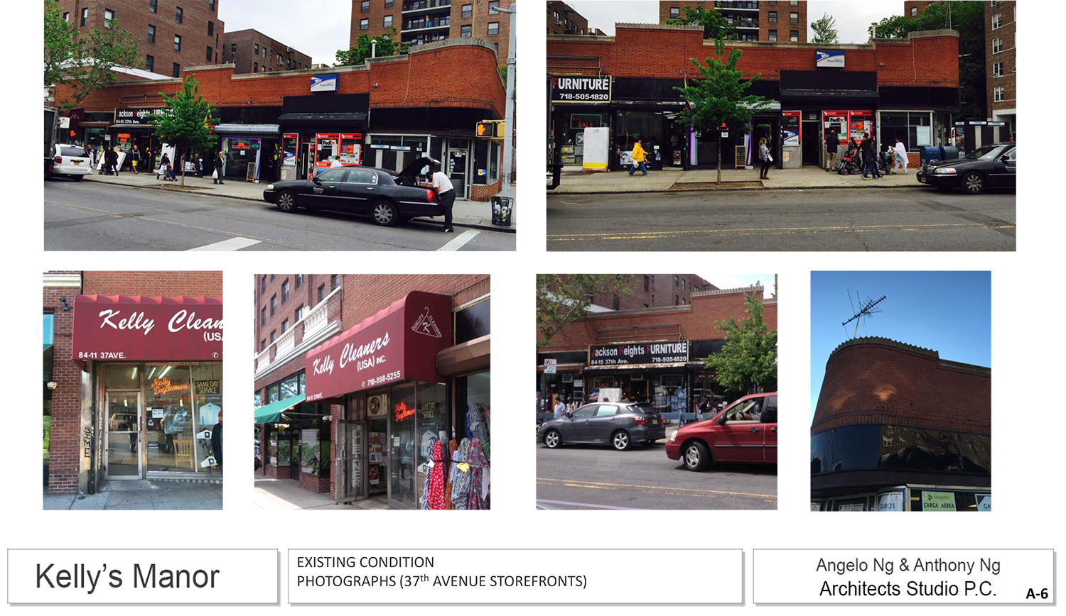
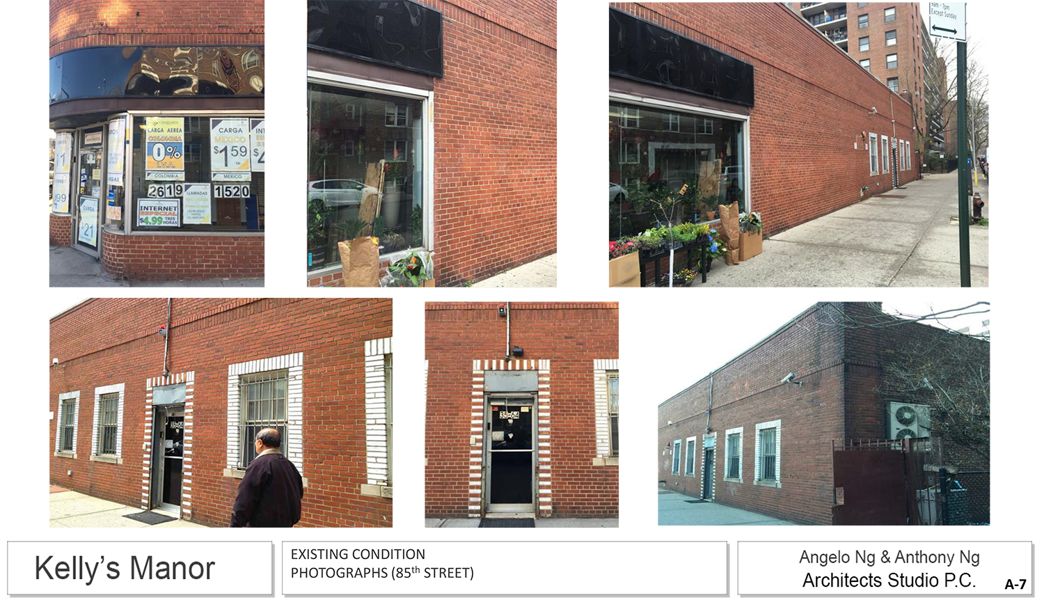
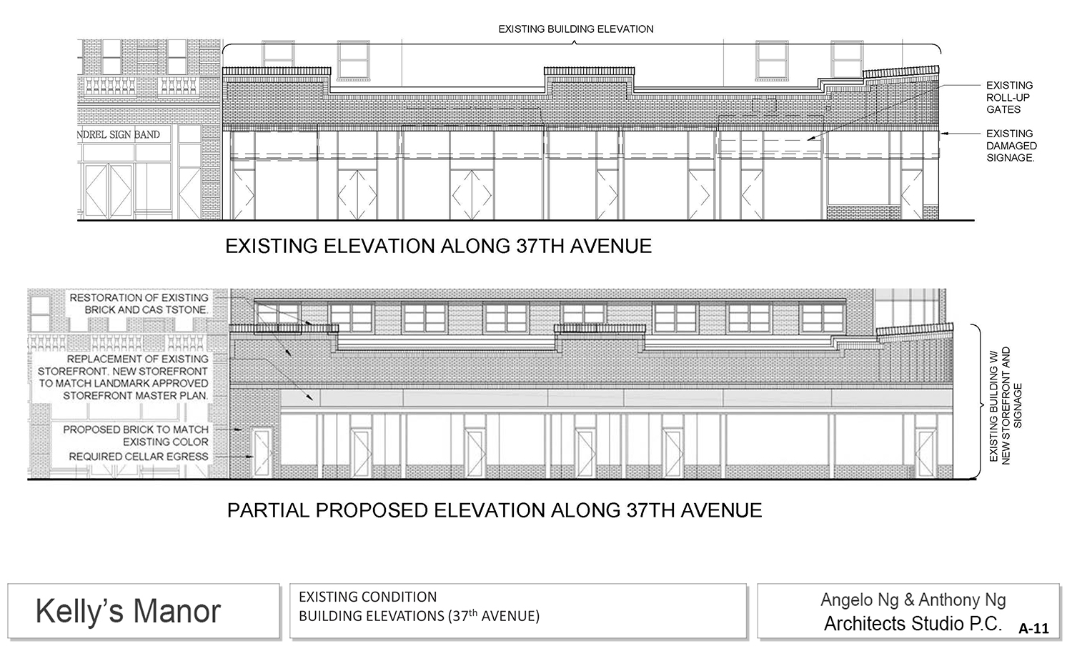
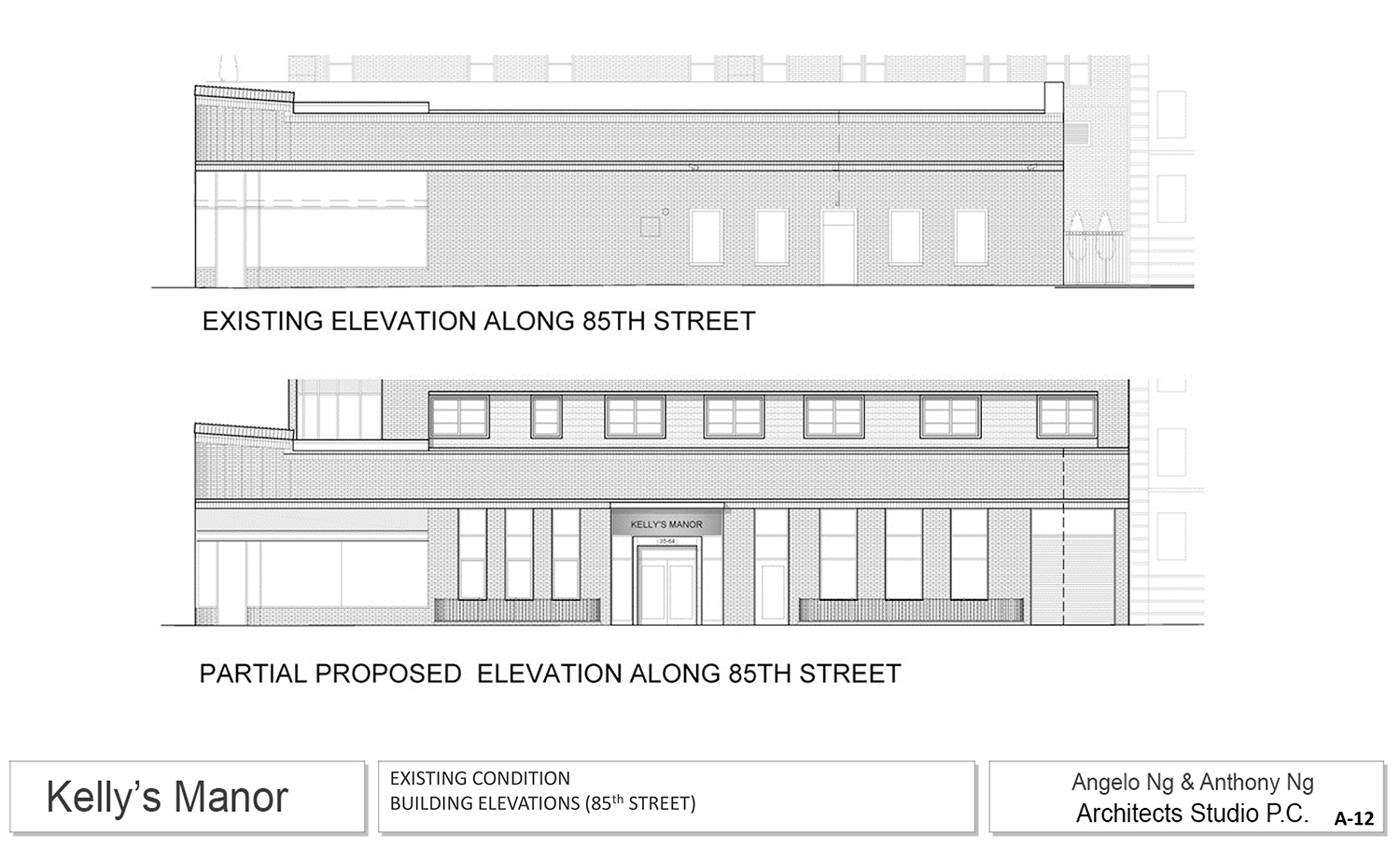
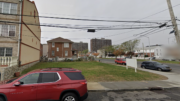
The site, also known as 84-11 37th Avenue, sits at the northwest corner of the intersection. That’s in the Jackson Heights Historic District, which was designated in 1993. The existing building is Moderne in style, designed by Boris Dorfman and built between 1945 and 1946.
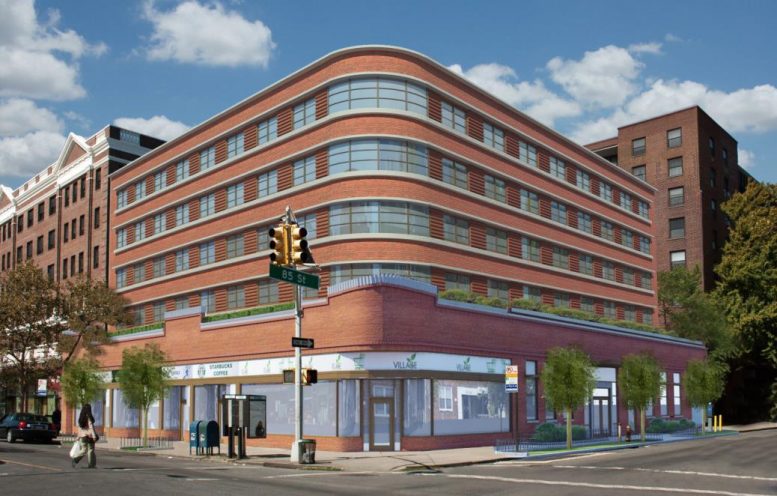
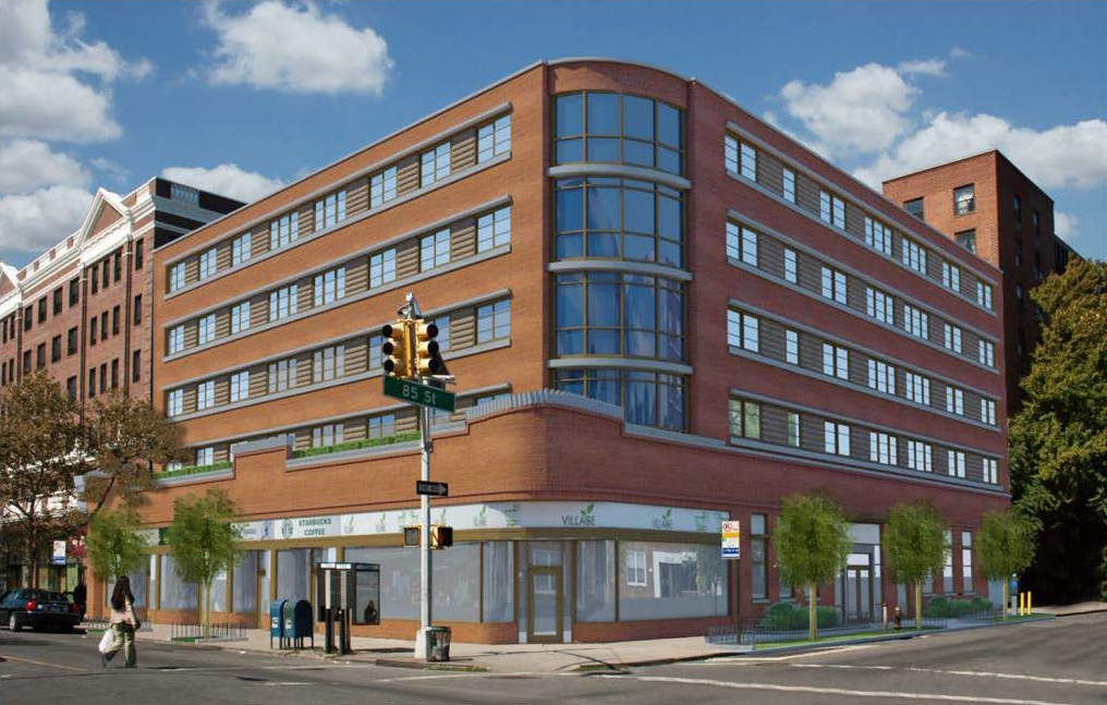
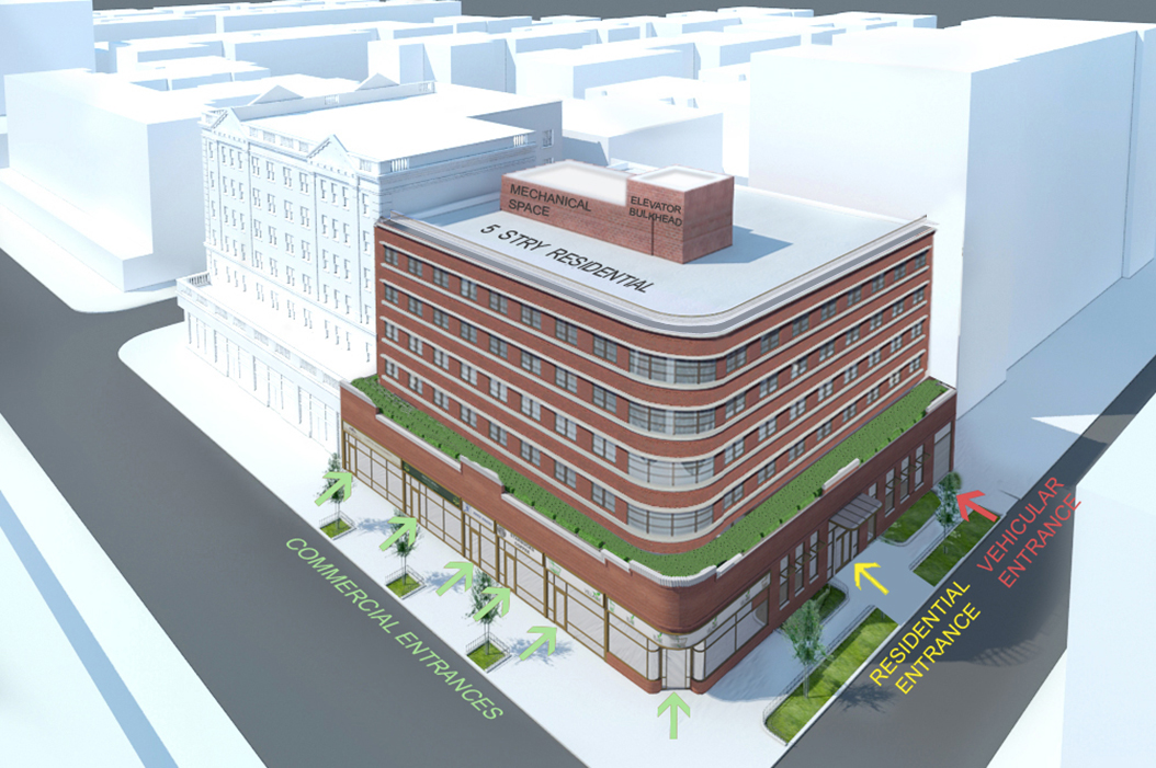
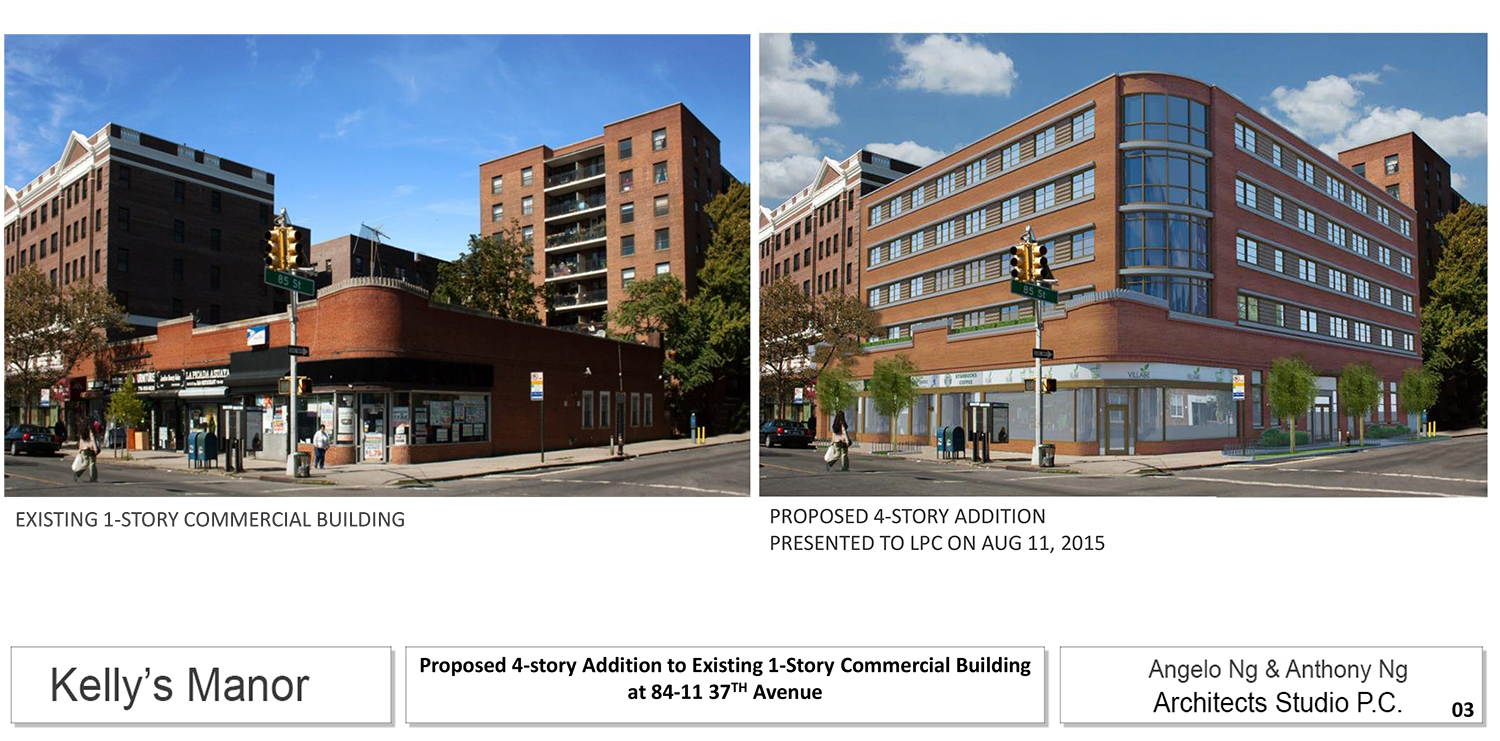
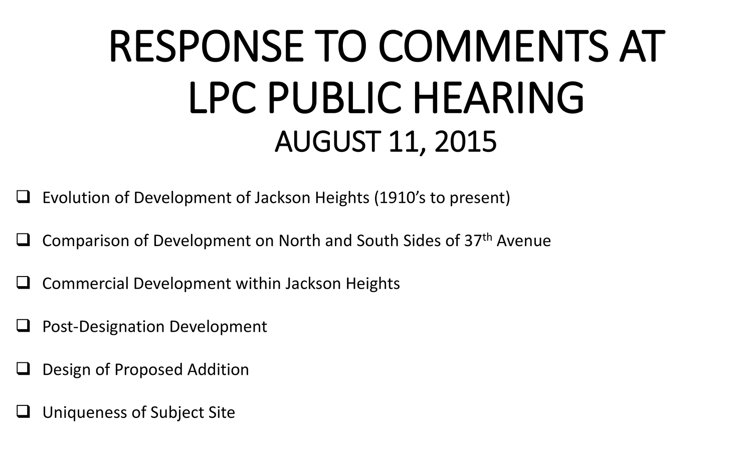
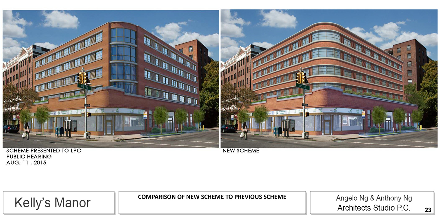
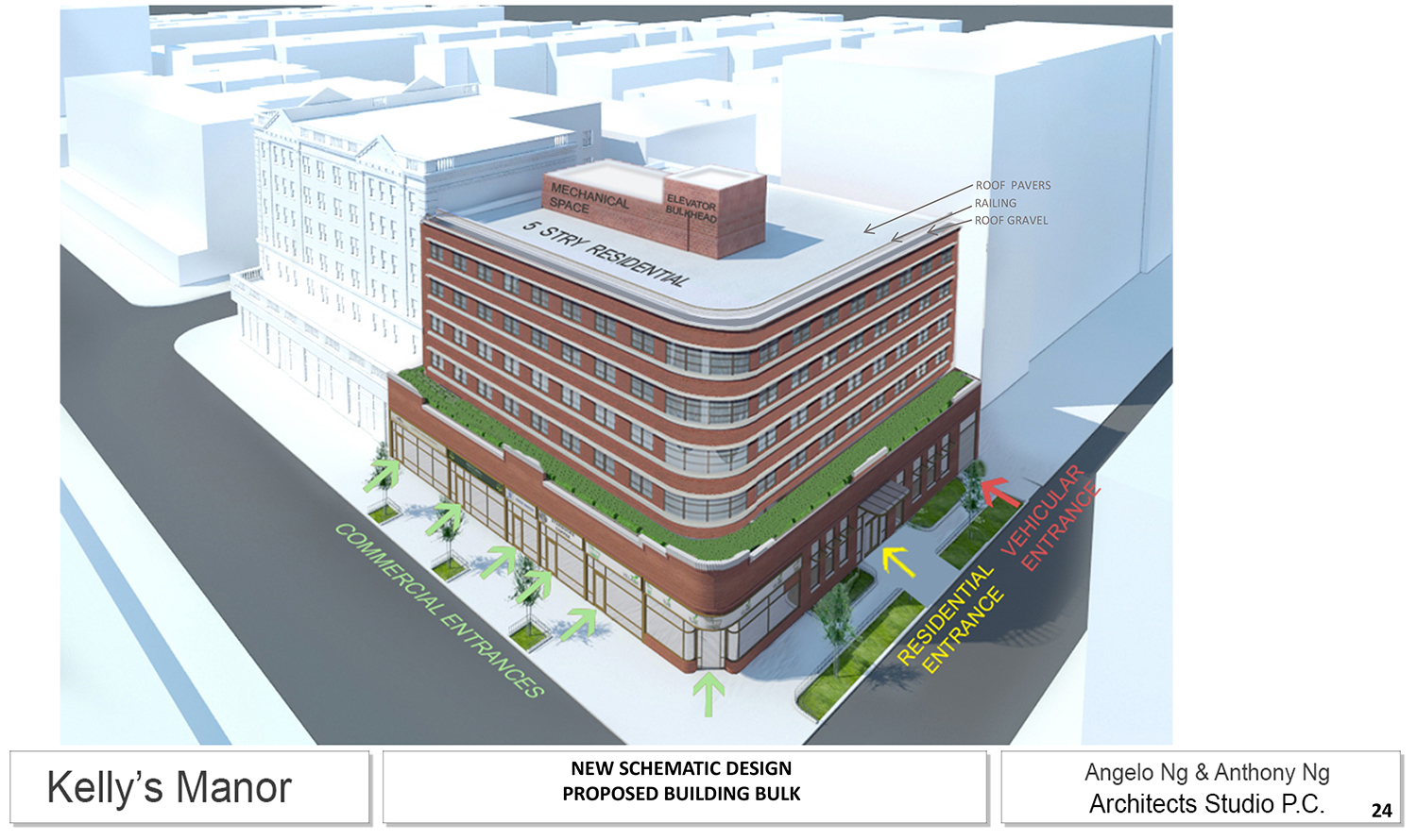
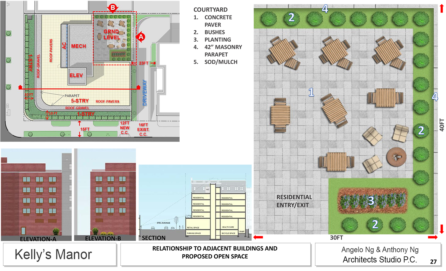
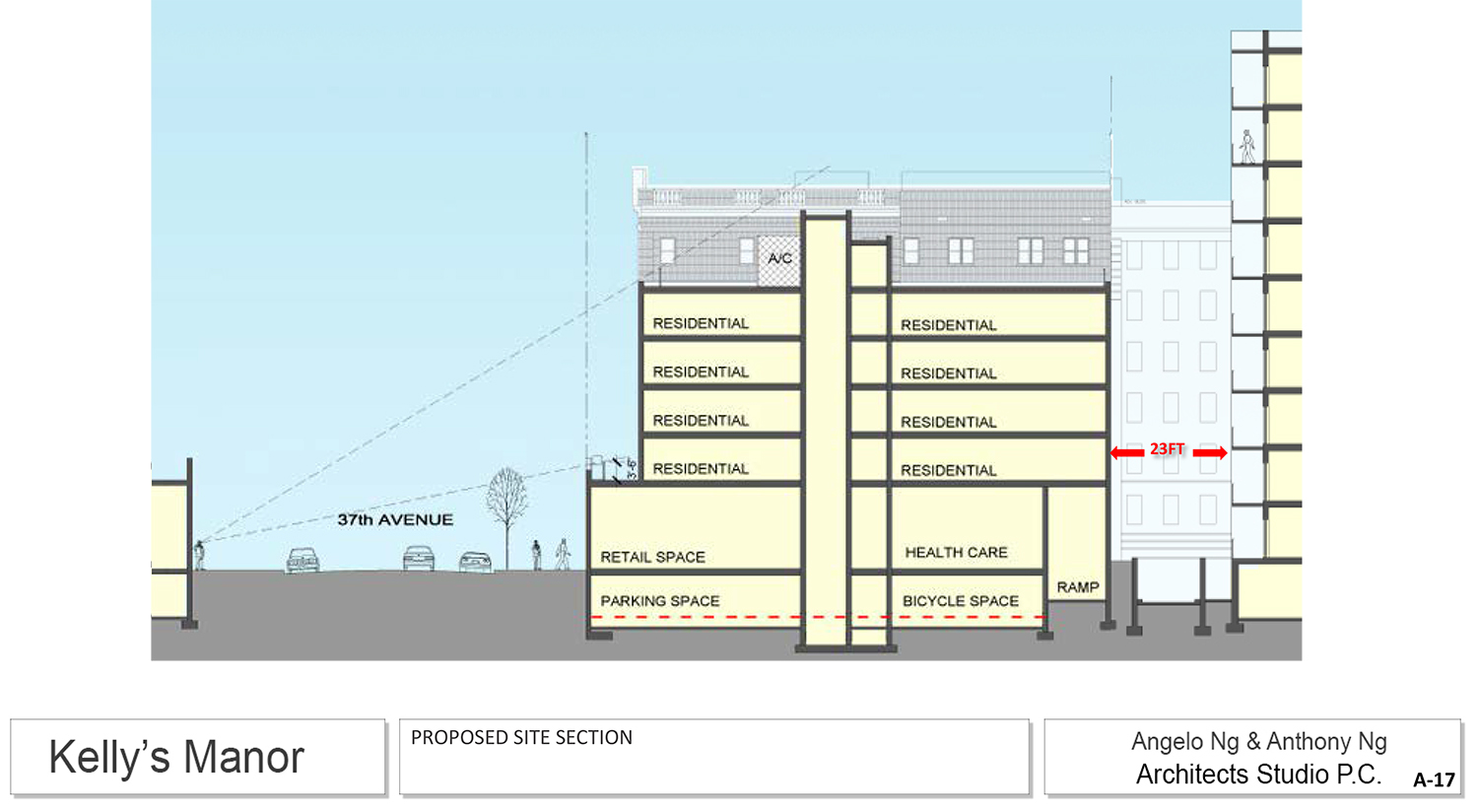
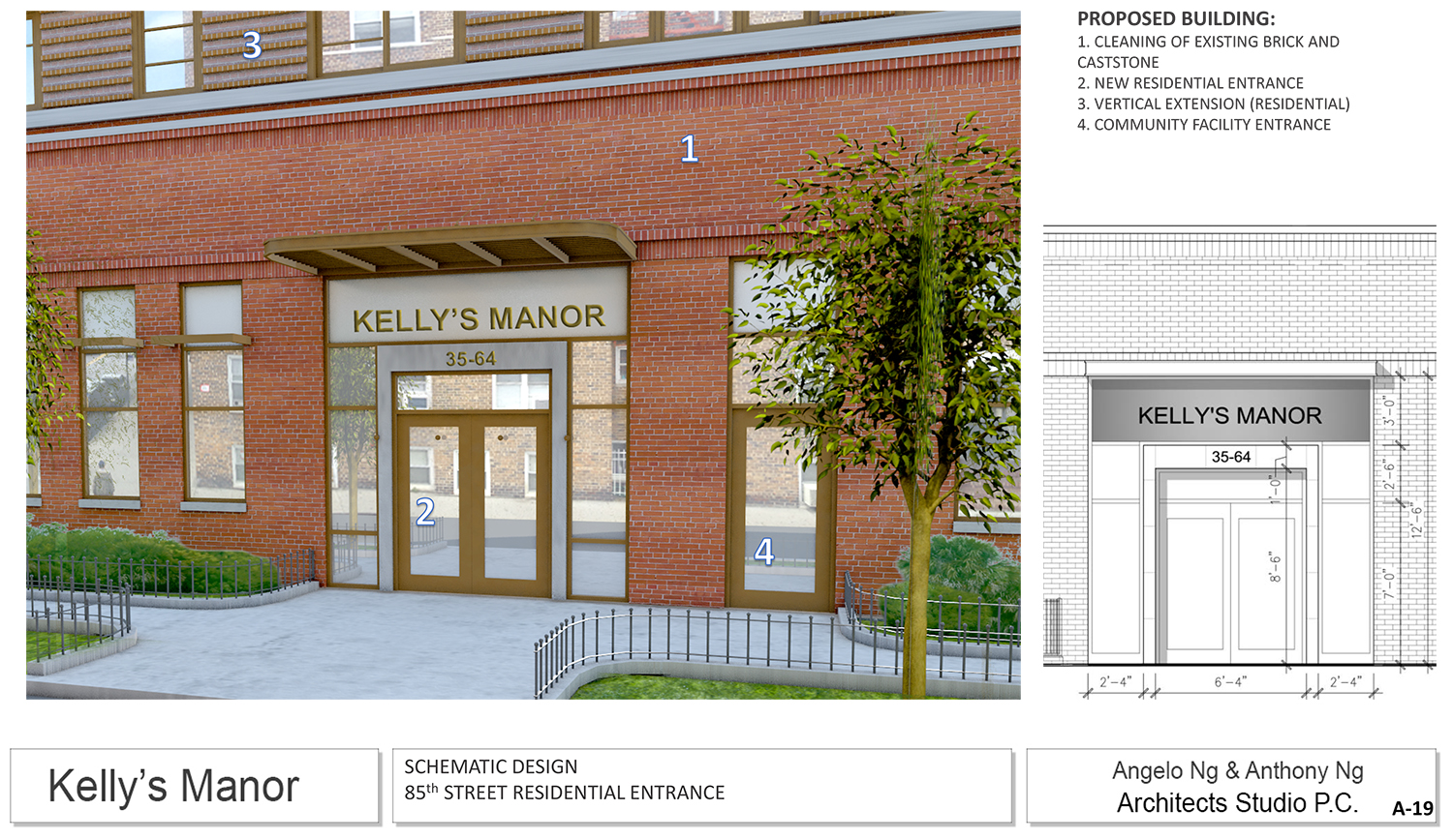
It was nearly a year ago, on Tuesday, August 11, 2015, that a proposal to add four stories to the building first went before the LPC. The program itself has not changed. Dubbed Kelly’s Manor, it would have retail and a health care facility on the first floor, followed by four stories of residential units above that. The cellar would have automobile parking and bicycle storage.
Kelly’s Properties was listed as the developer on a disapproved Department of Buildings application from 2012 (though that application was for what seven-story building). Angelo Ng and Anthony Ng’s Architects Studio P.C. is the architect. The new presentation was presented by land use attorney Nora Martins of the law firm Davidoff Hutcher & Citron LLP.
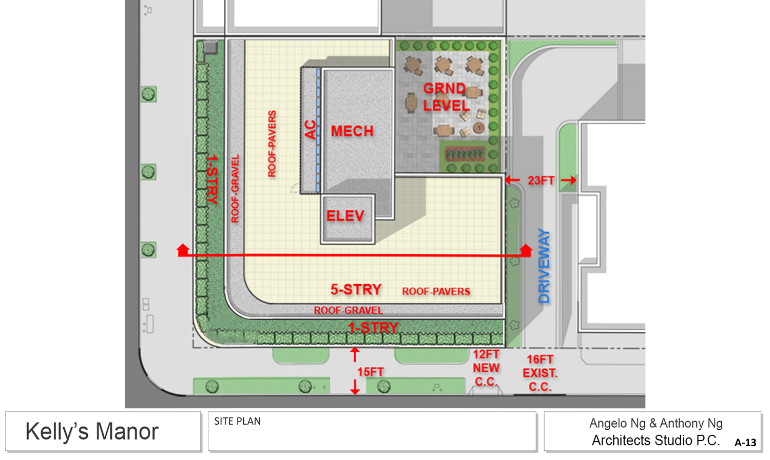
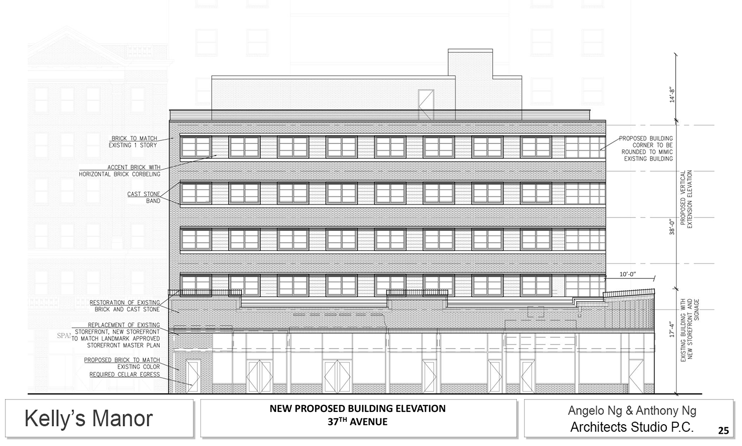
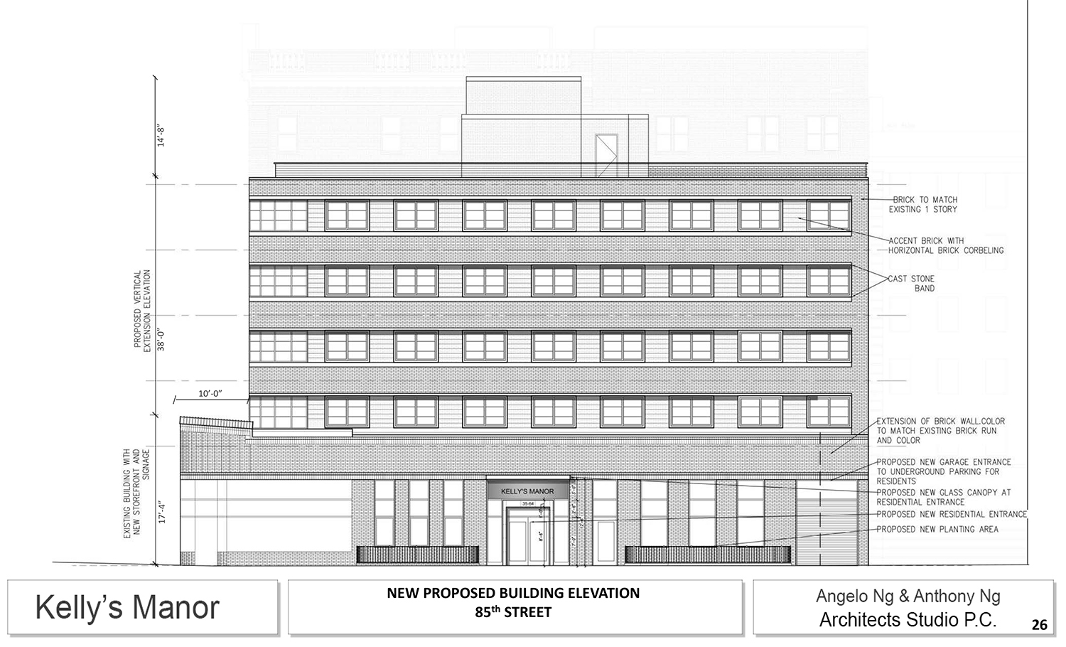
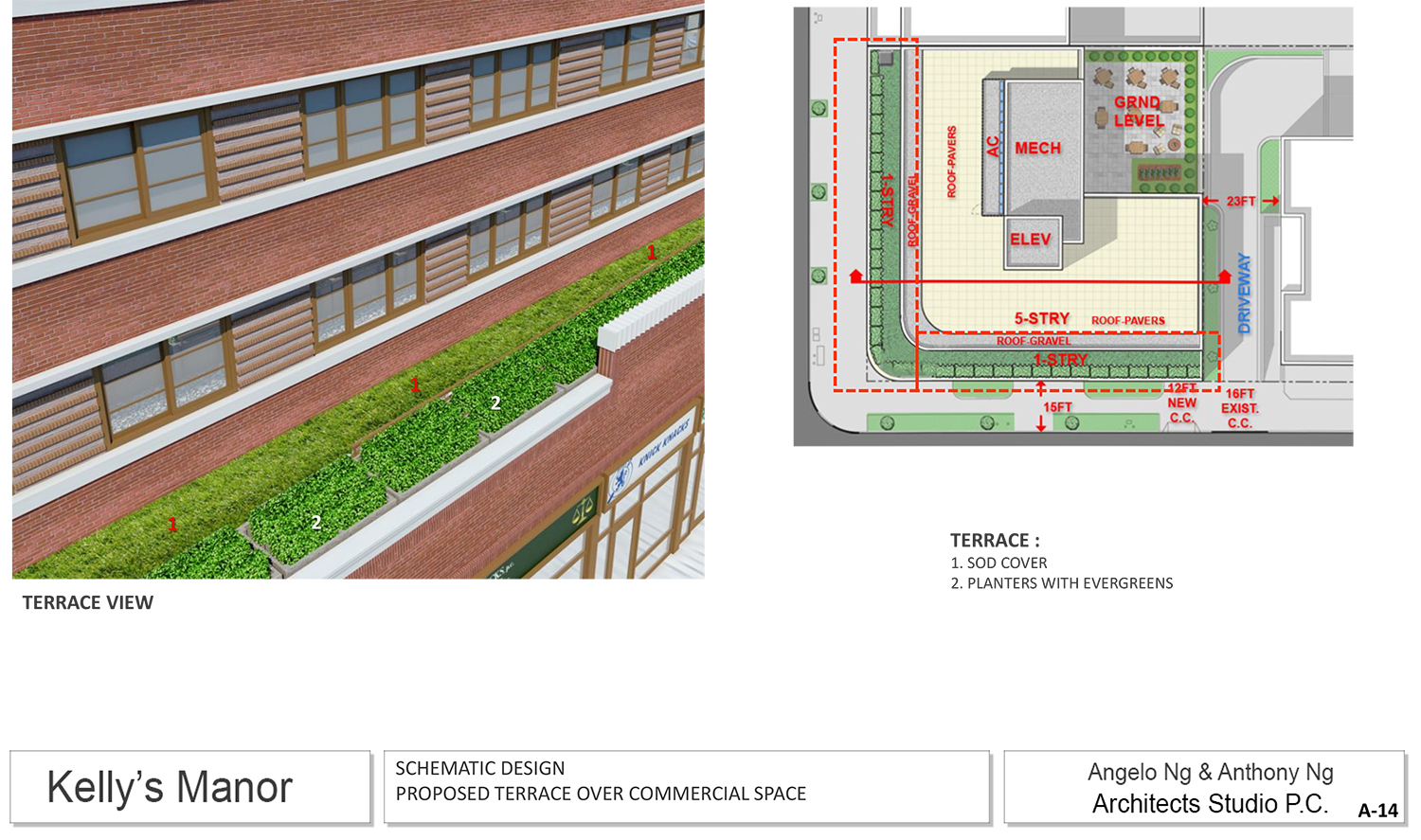
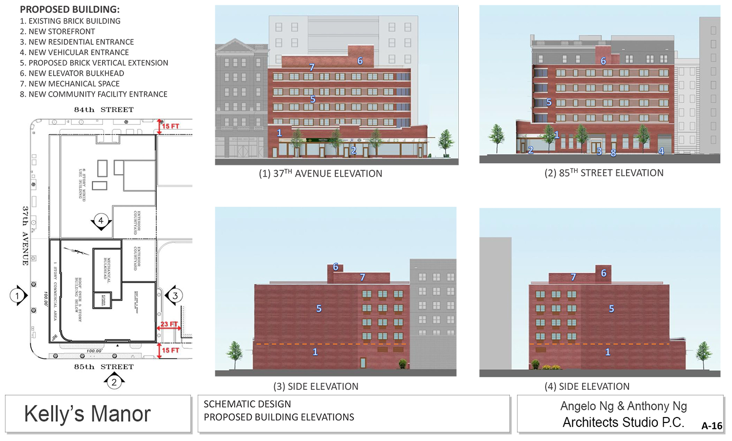
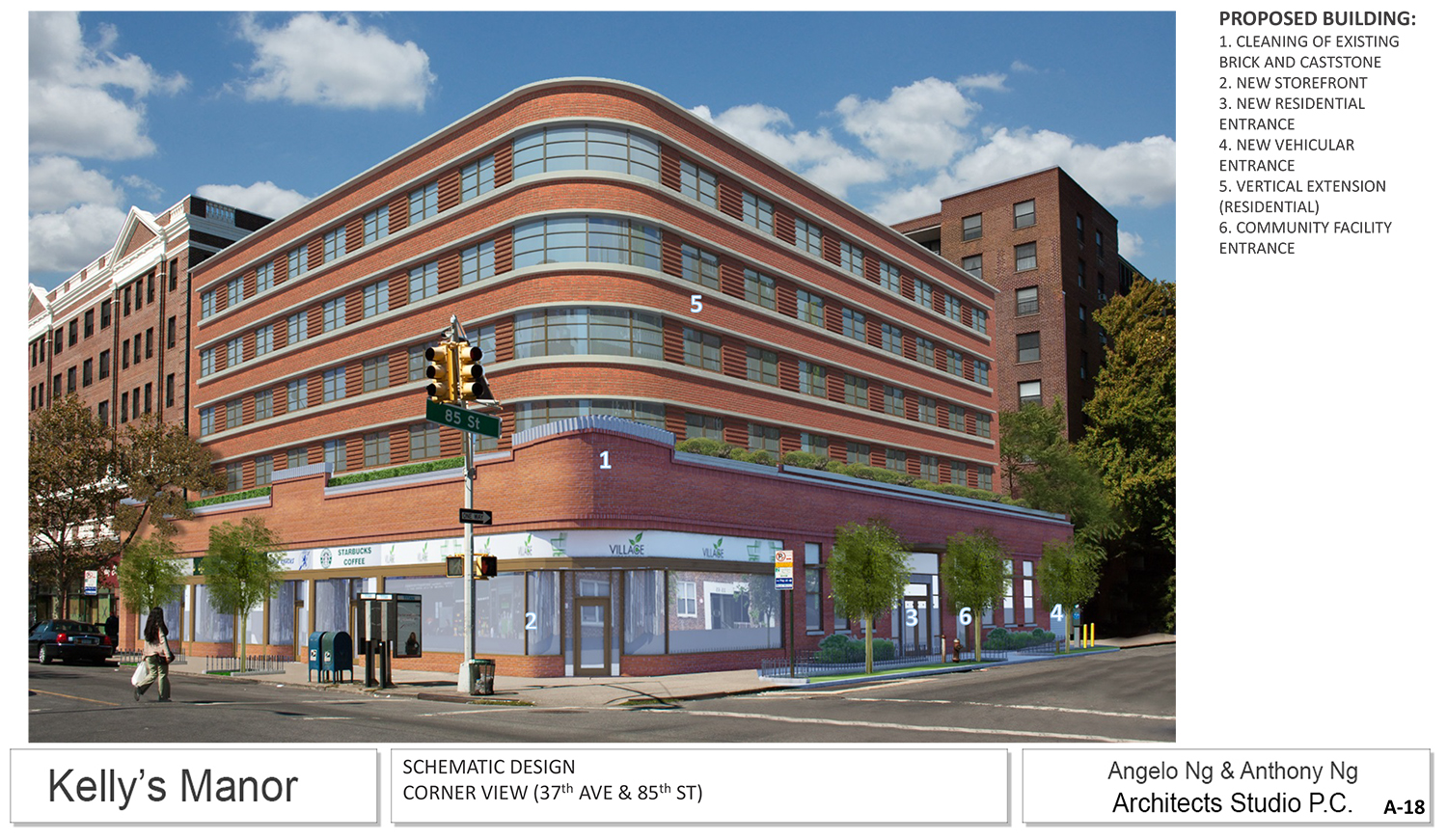
The key design change achieved over the year since the previous presentation is that the addition would be uniformly set back from both street fronts, at a distance of 10 feet, Martins said. That gives the structure a more symmetrical presentation than the somewhat awkward off-center design presented in 2015. Additionally, glazing on the corner has been reduced. She said that gave the building more streamlined appearance.
The innermost corner of the site would be cut out for a 30-foot by 40-foot ground floor courtyard, which would allow more light and air.
For the commissioners, there were to decisions to make. First, they had to be able to accept an addition to the building. Of course, this isn’t like any ordinary rooftop addition, for it is essentially stacking an entire new building on top of an old one. Second, the commissioners would have to approve of the design of that addition. They seemed to only reach a yes for the first of those decisions.
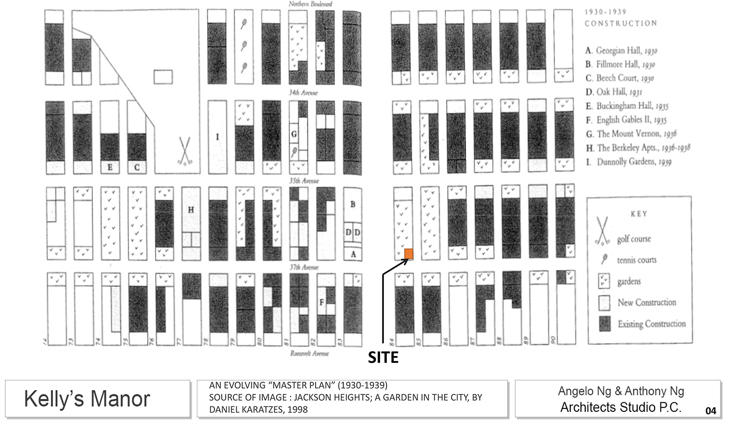
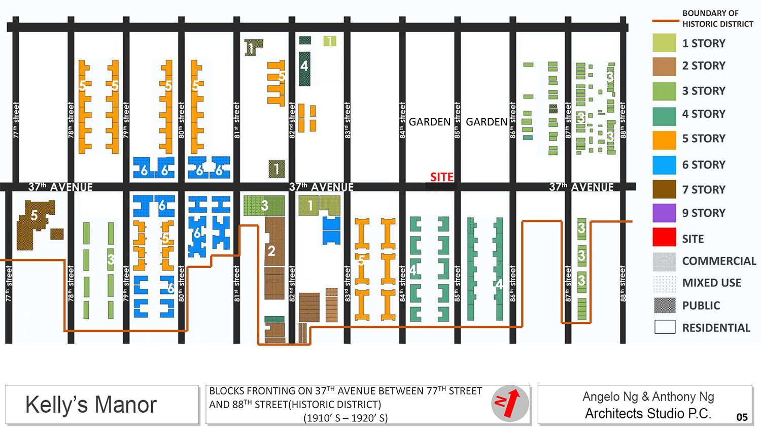
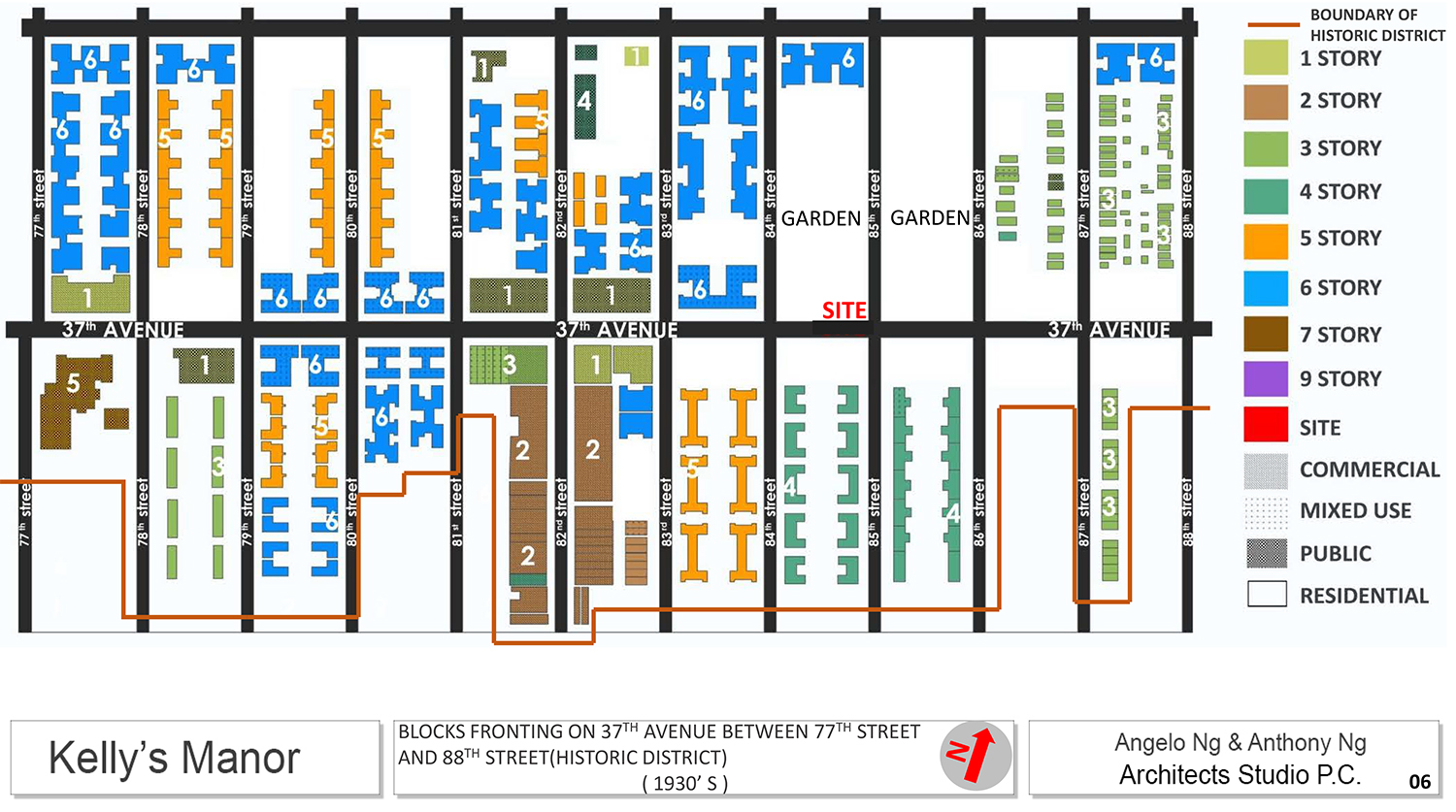
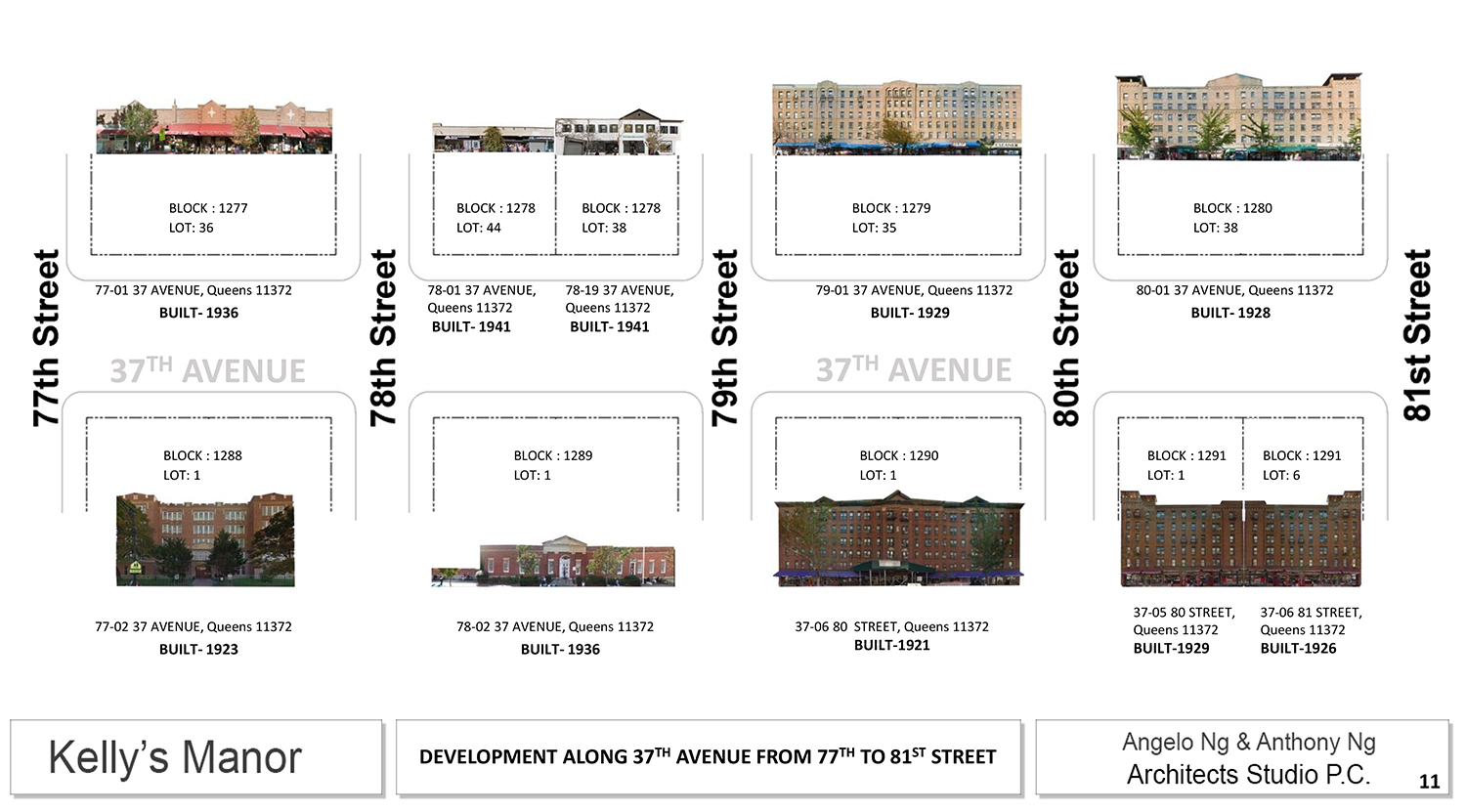
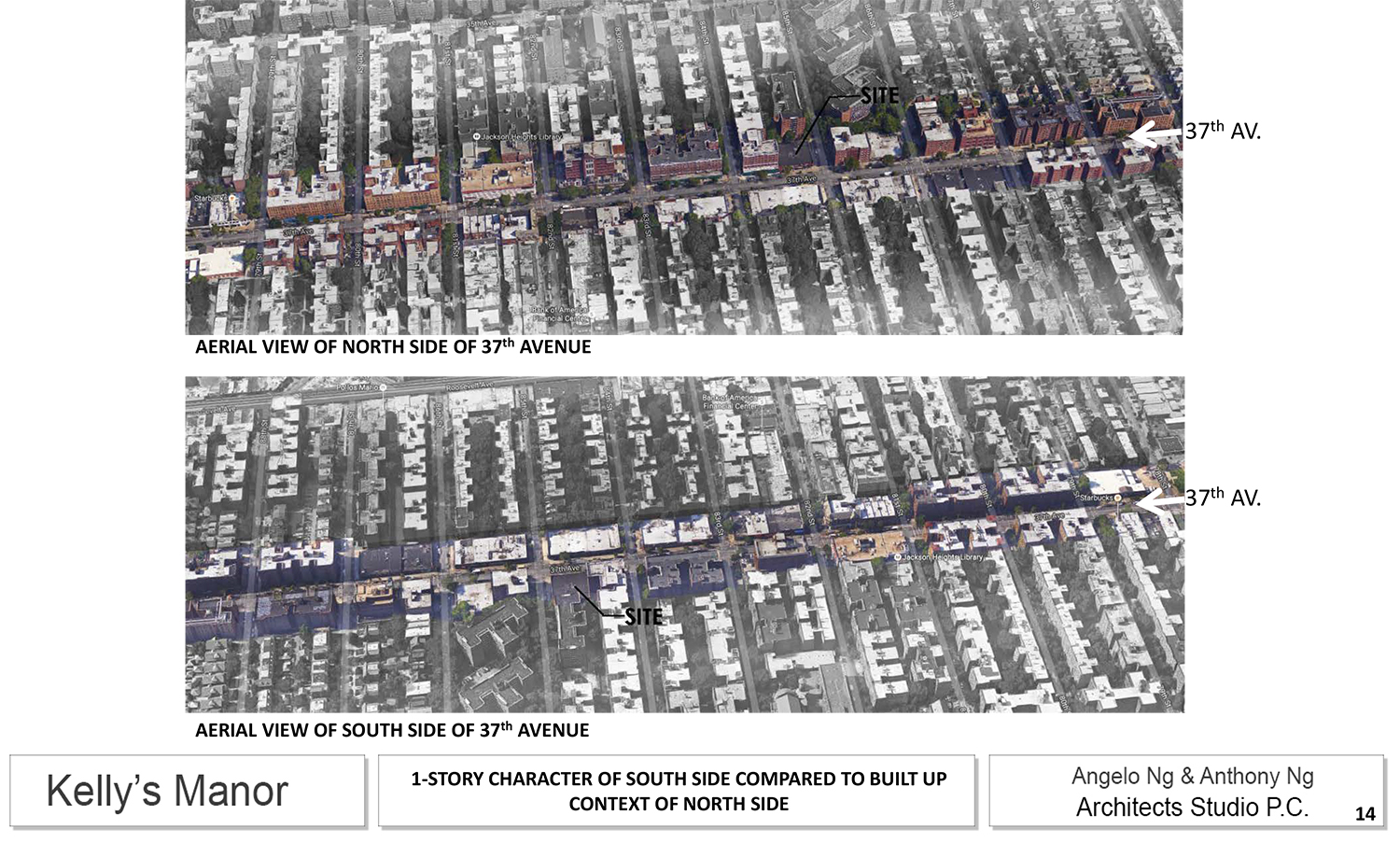
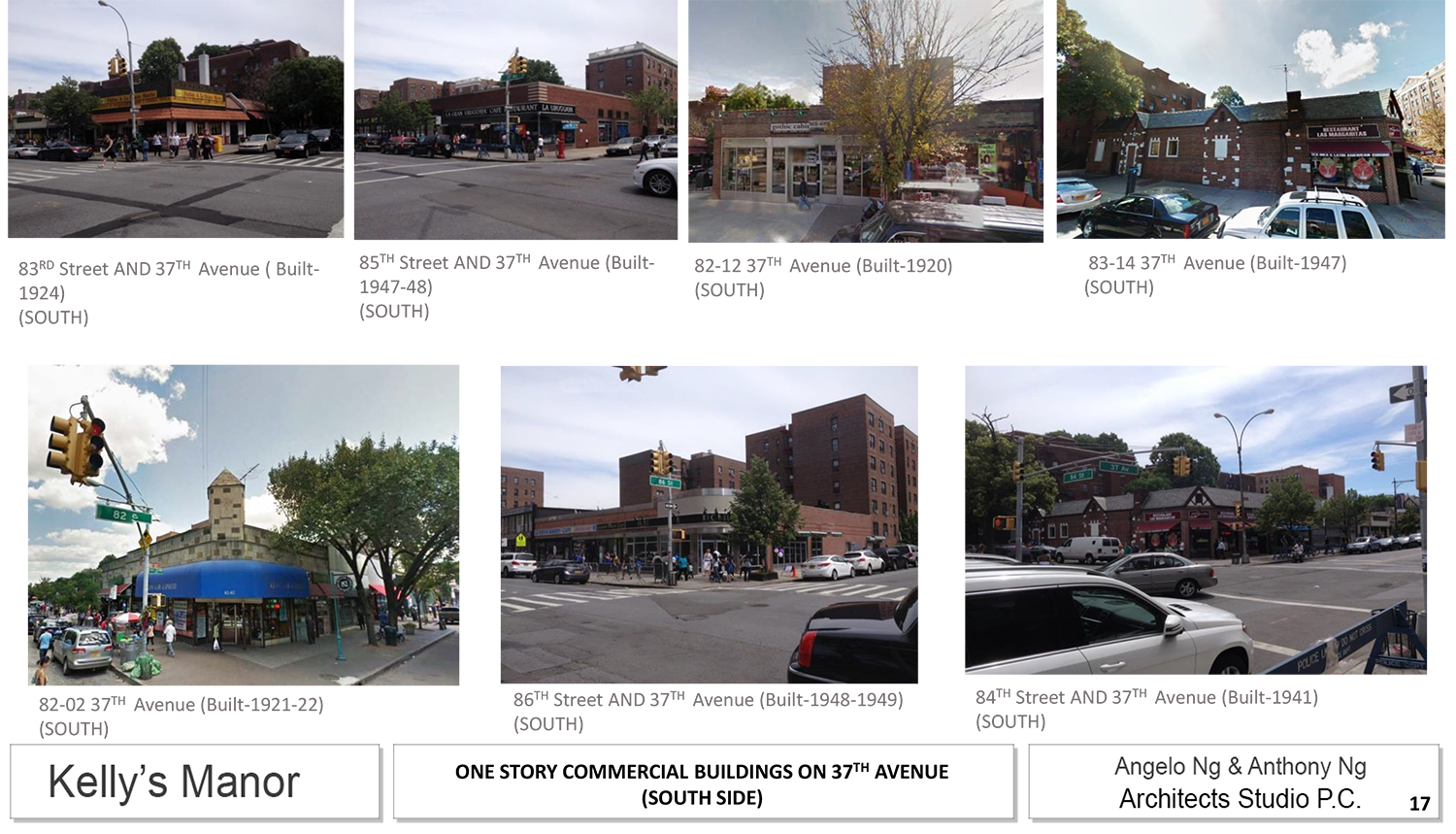
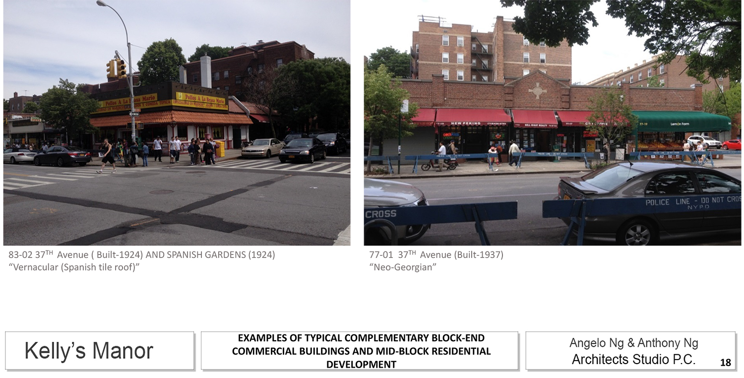
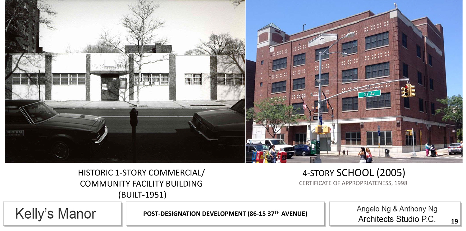
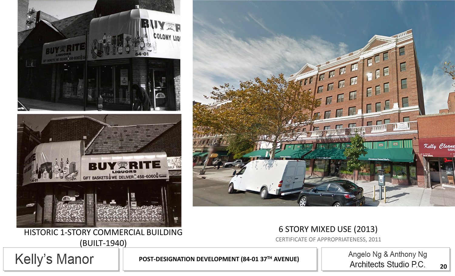
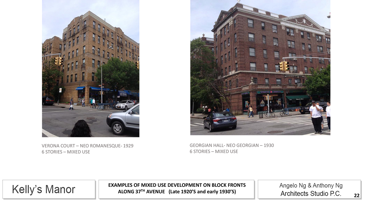
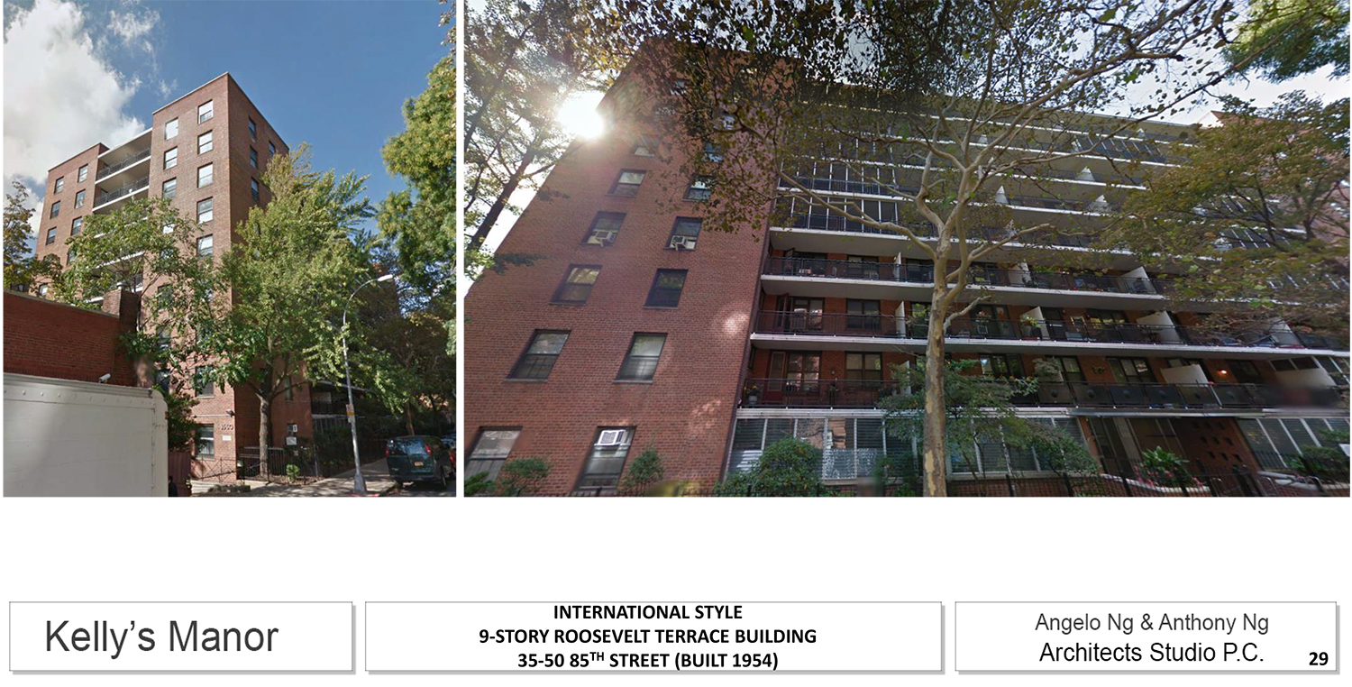
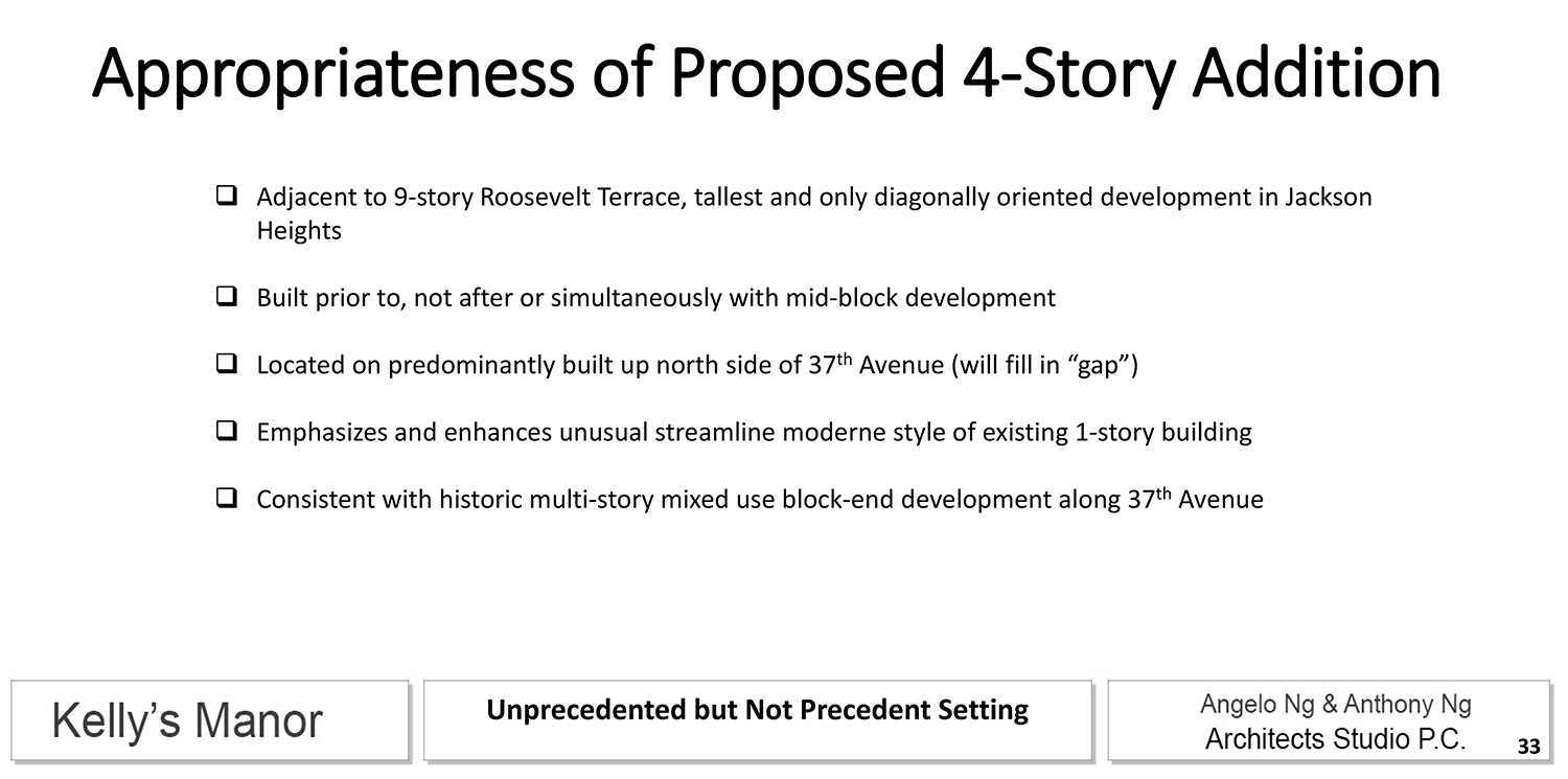
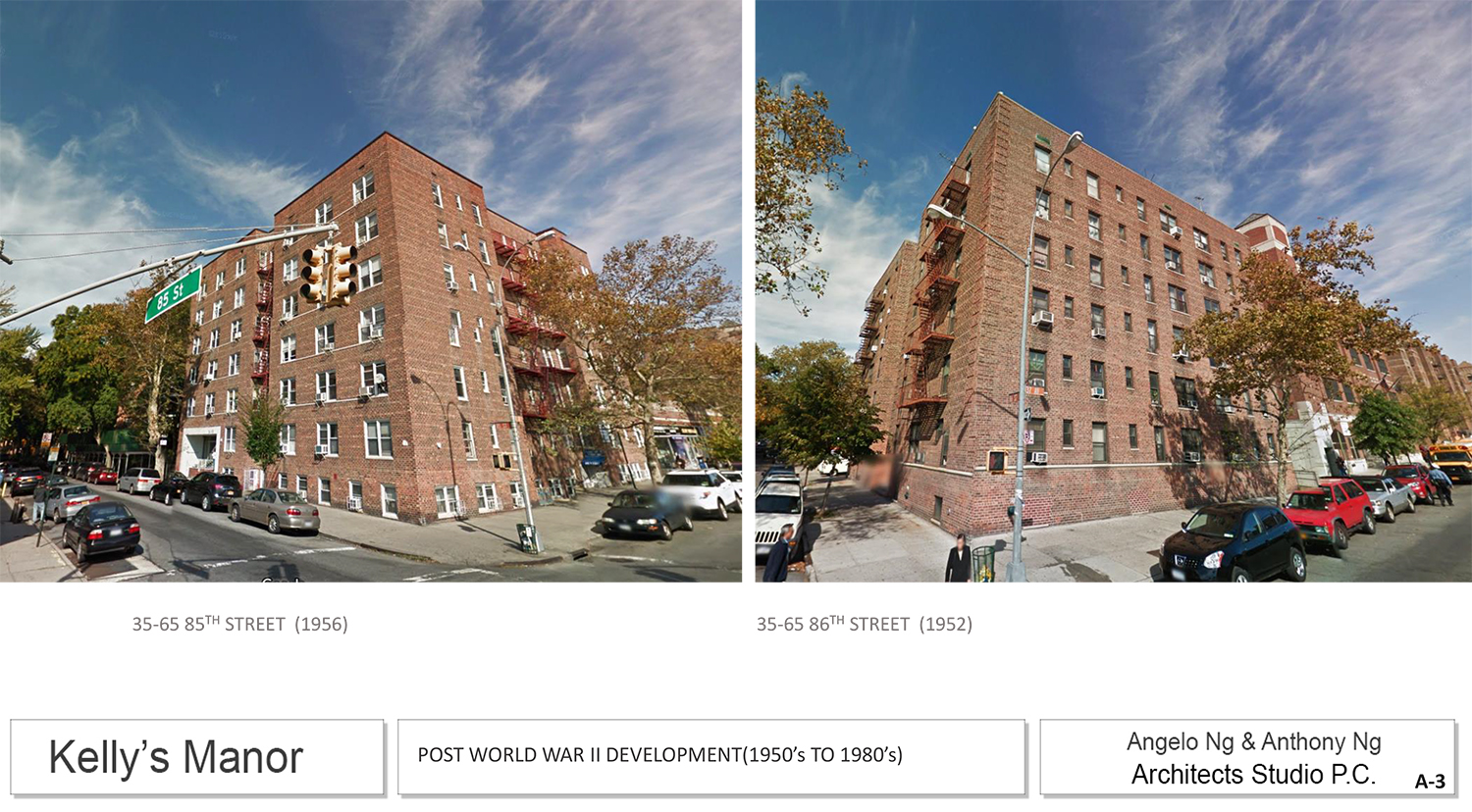
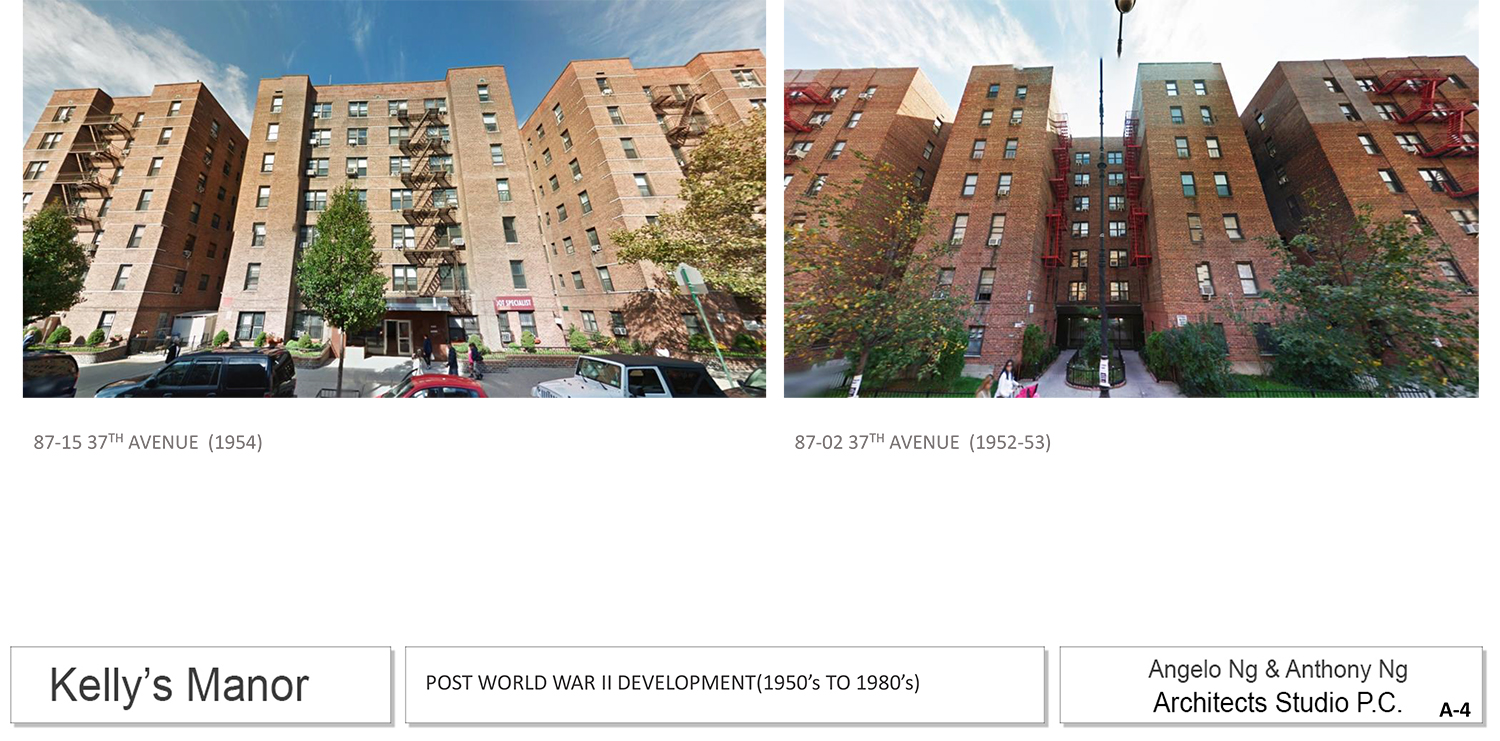
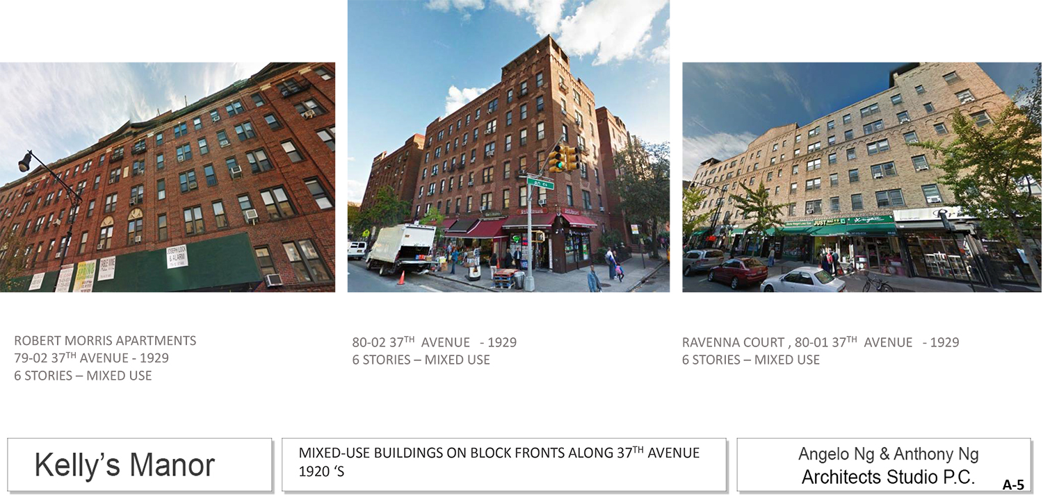
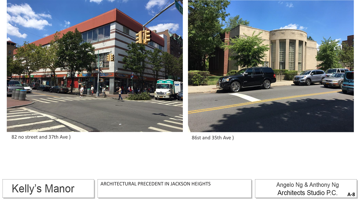
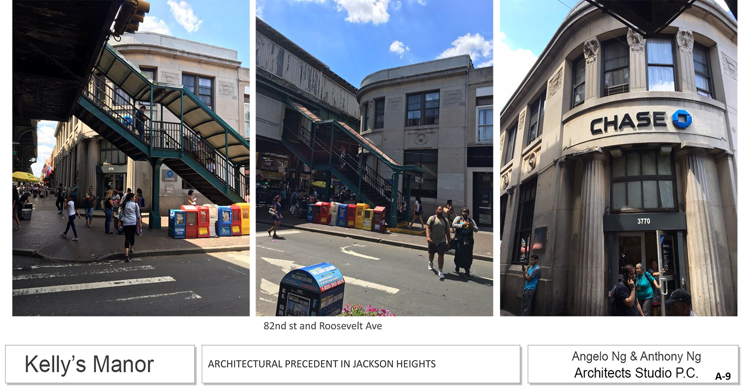
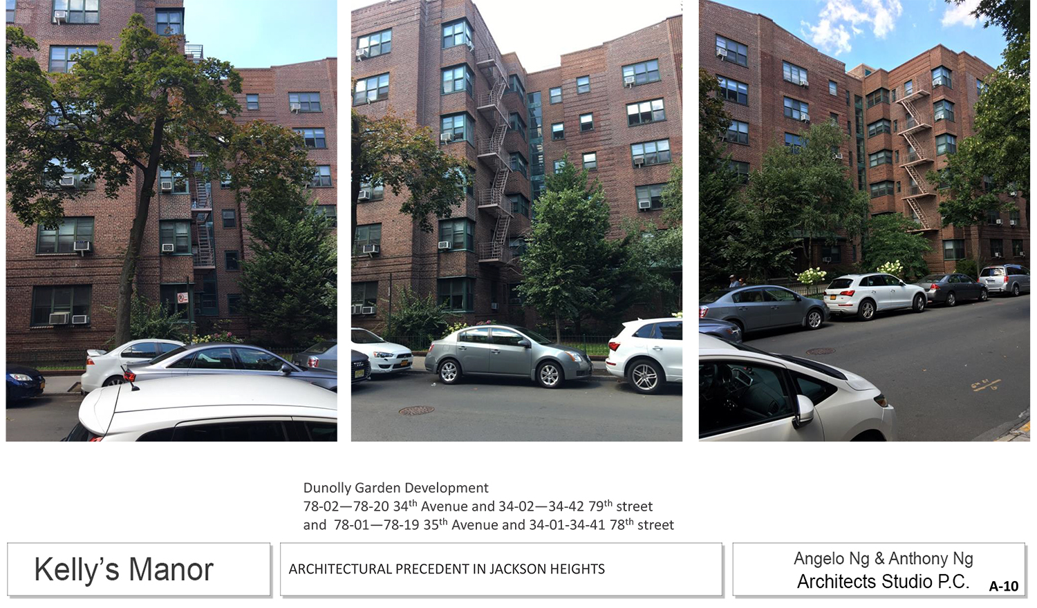
Though Martins established the north side of 37th Avenue is definitely more high-rise than the south side, Commissioner Diana Chapin, who represents Queens on the commission, was concerned about the addition’s approval setting precedent in the community. As for design, she wasn’t sure it presented as residential.
Commissioner Michael Goldblum said this was a debate between a found condition and the planned nature of a community. That said, he found the case for greater height on this side of 37th Avenue to be convincing.
Commissioner Adi Shamir-Baron suggested pushing back the 37th Avenue portion of the addition even farther to preserve the avenue’s history.
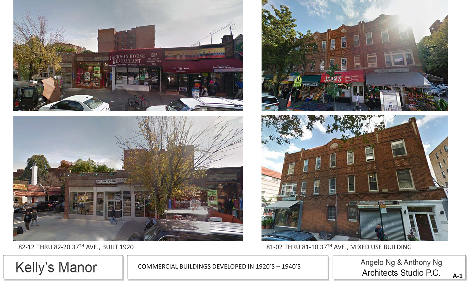
Commissioner John Gustafsson, of Staten Island, went to the neighborhood and walked the street from end to end. After doing so, he said he found it difficult to deem a four-story addition inappropriate.
LPC Chair Meenakshi Srinivasan said that she, too, was convinced of the case for an addition of this size and that the massing works. She also said that the original building would still read as historic (as compared to its new upper floors).
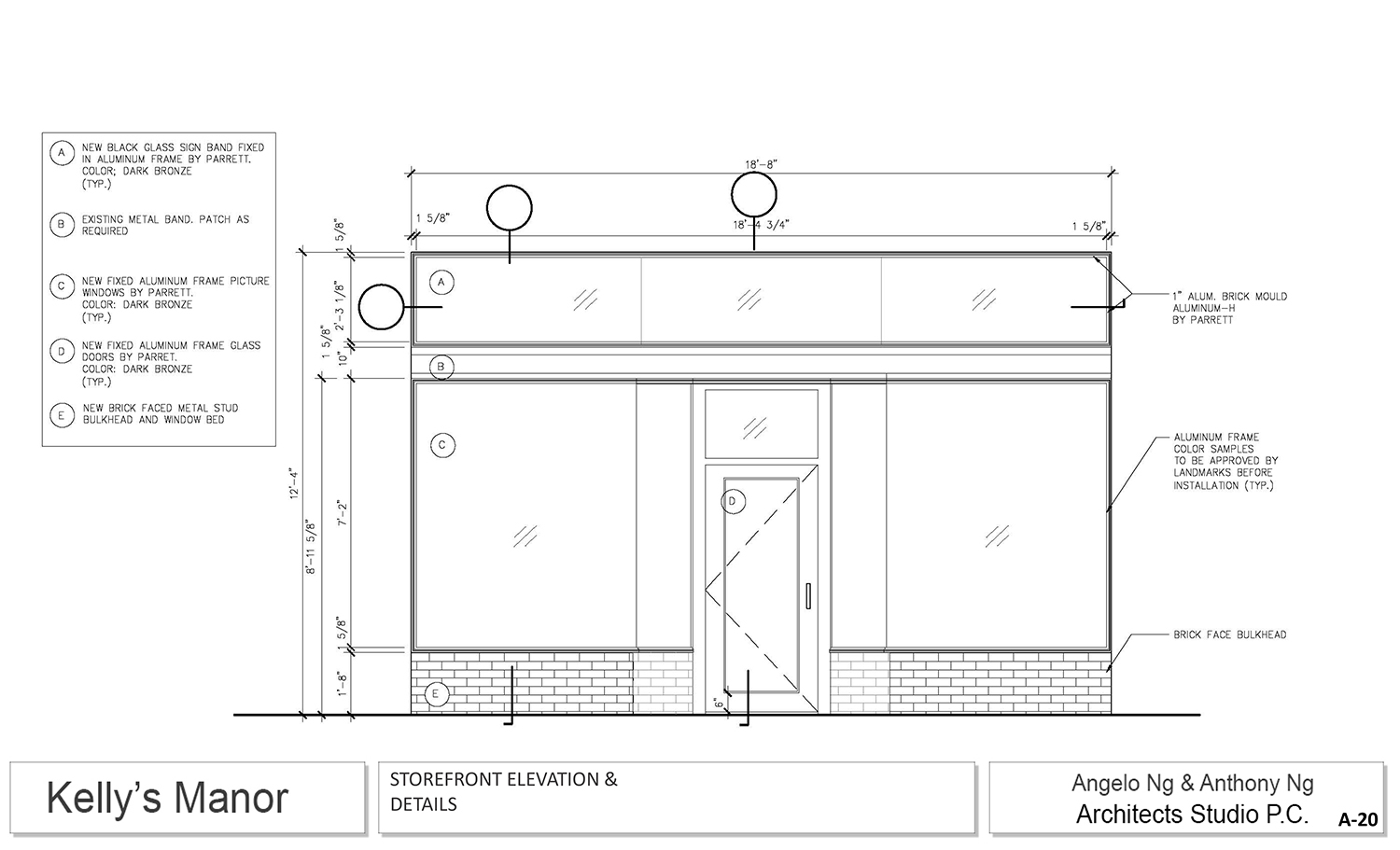
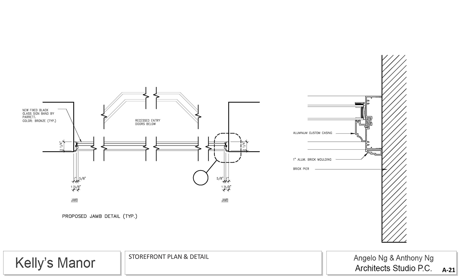
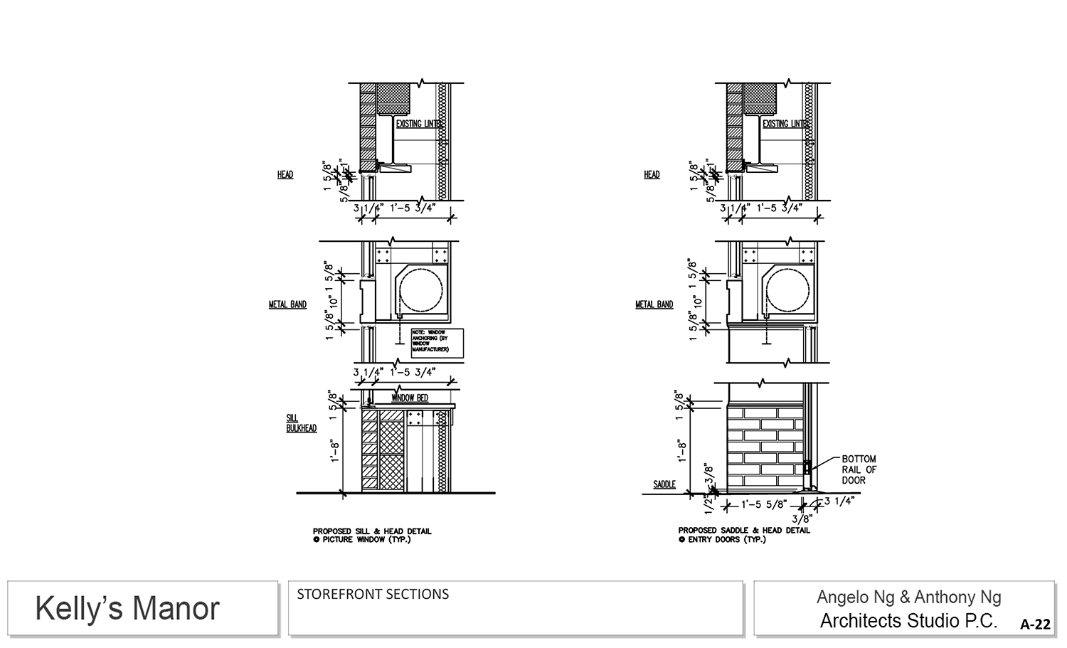
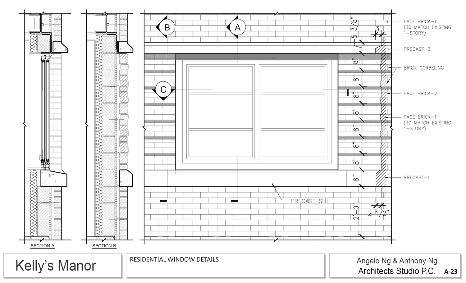
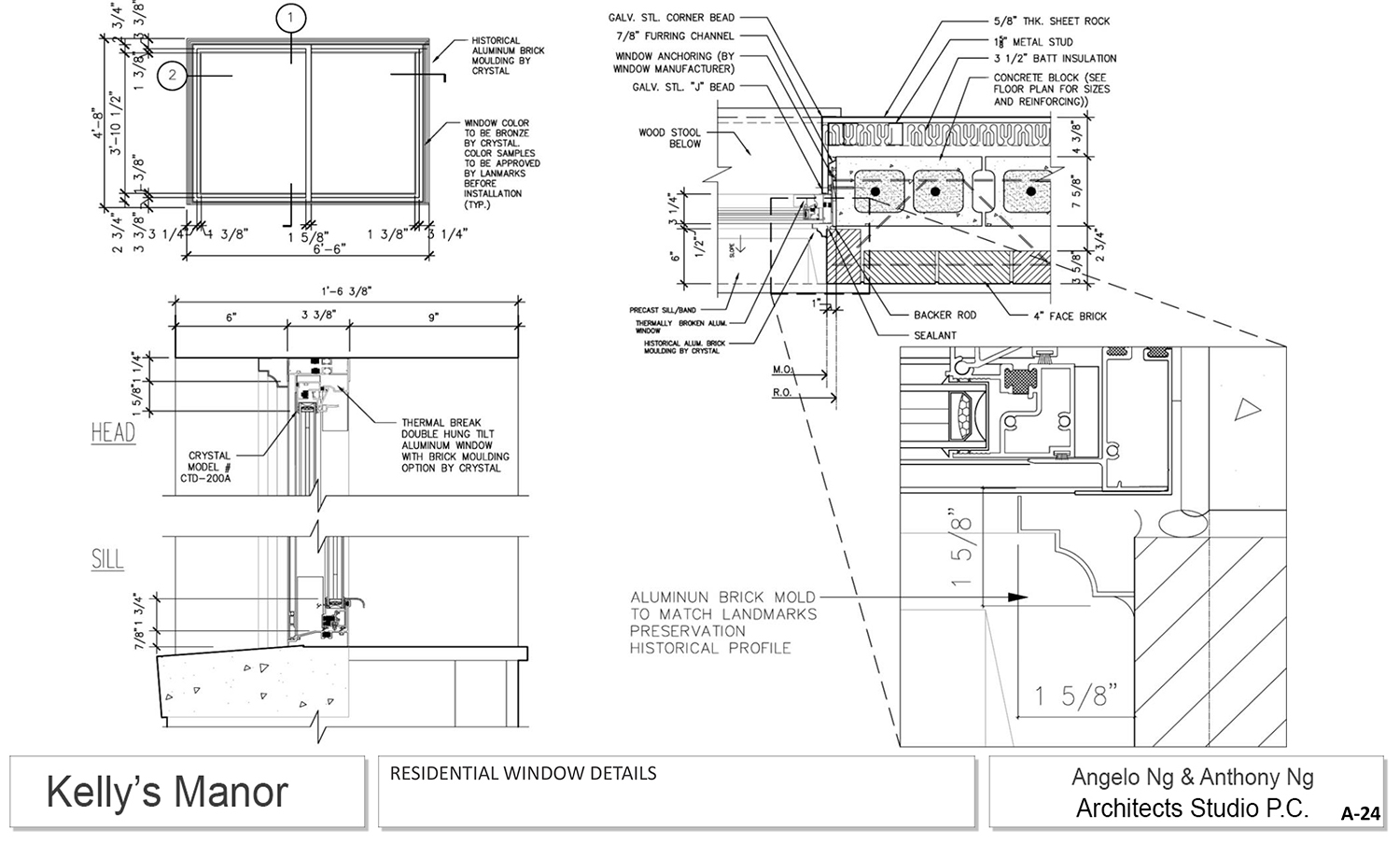
Commissioner Frederick Bland said he supported the idea and that the revised design was better than what he saw last year. However, it still didn’t meet with his approval. He said the proportions were not right, and noted a discordancy between the various presentations of the revised design. Indeed, the dimensionality of the building is hard to determine because the renderings and plans don’t quite match up with each other.
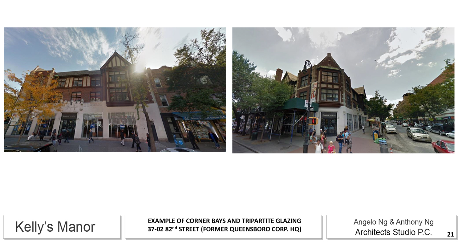
Commissioner Jeanne Lutfy said the massing was fine, but that the residential floors read as commercial and are “too cold.” Commissioner Chapin added more to her statement about the design, saying it doesn’t feel contextual or residential. Commissioner Goldblum also weighed in on the design, saying it needs more attention. “The devil’s in the details,” he said. Commissioner Bland commented that the “relentlessness of the horizontality” of the design might be a big problem.
Though she praised the idea and massing, Chair Srinivasan wasn’t sold on the actual design, saying it “has to be stellar.”
Despite the nearly year-long gap between presentations for this site, Tuesday’s session was still a public meeting, not a public hearing, and no public testimony was permitted. (That is standard procedure with revisions like this). Still, Srinivasan noted that City Council Member Daniel Dromm, who attended Tuesday’s session, and State Senator Jose Peralta, as well as many members of the community, were in opposition to the proposal, citing its scale and the idea of a master plan for Jackson Heights.
In the end, the commissioners seemed willing to allow a four-story addition, but were not ready to approve the actual design proposed. So, the applicant will have to continue tweaking the design and return to the LPC.
View the full presentation slides here:
Subscribe to YIMBY’s daily e-mail
![]()
Follow YIMBYgram for real-time photo updates
Like YIMBY on Facebook
Follow YIMBY’s Twitter for the latest in YIMBYnews









Not still a winner but I like bending to left and right, pretty building suitable the neighborhood too.