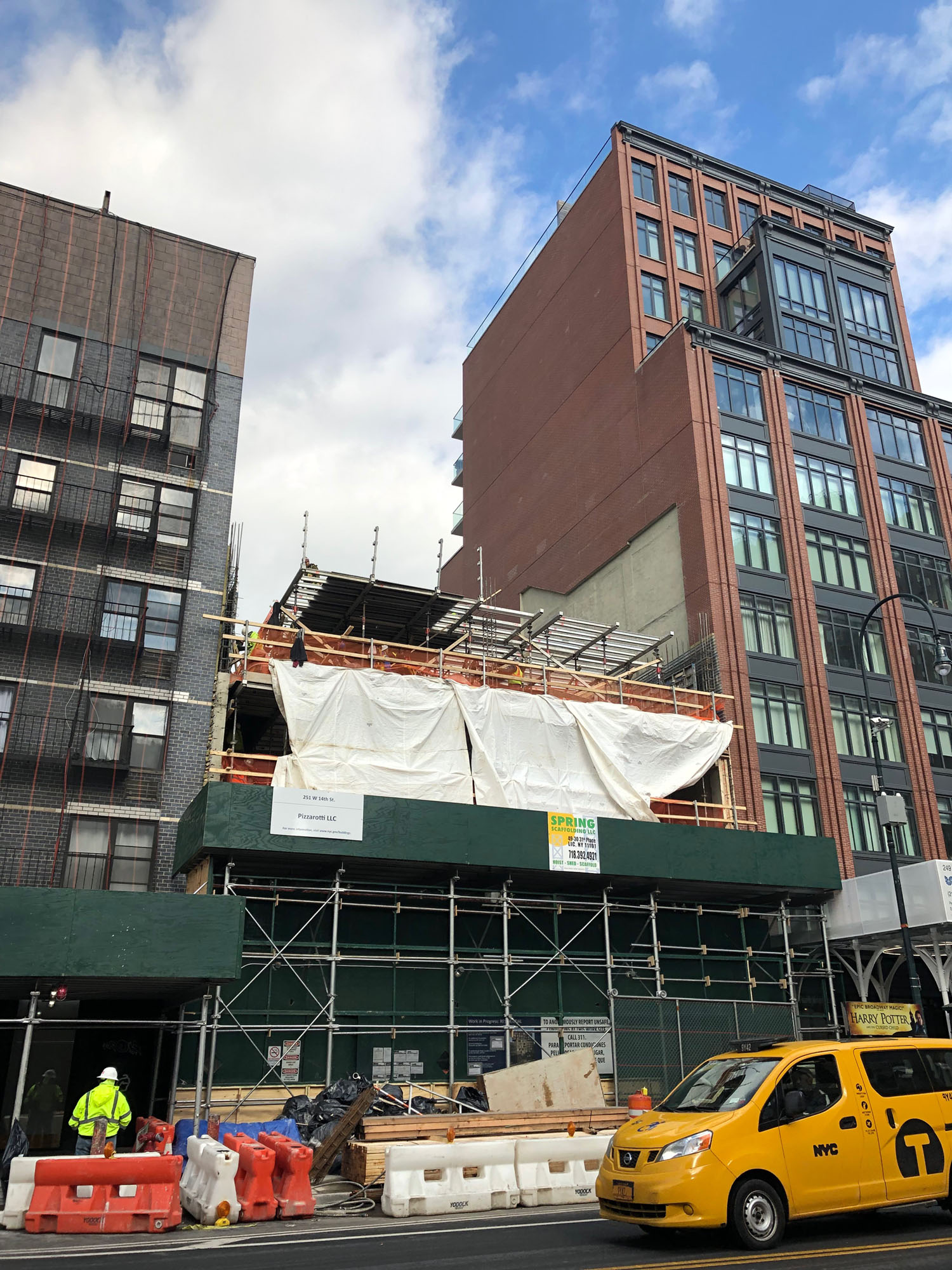
In Chelsea, 251 West 14th Street is now getting off the ground. Construction has climbed past the fourth floor and will soon stand eleven stories tall.
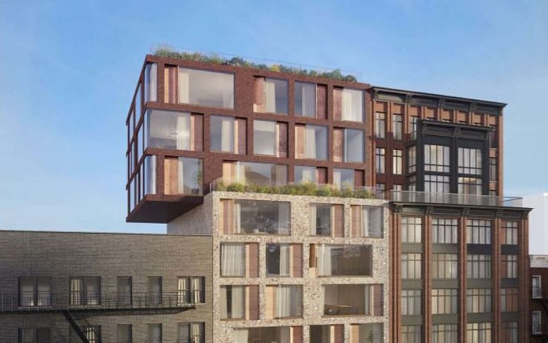
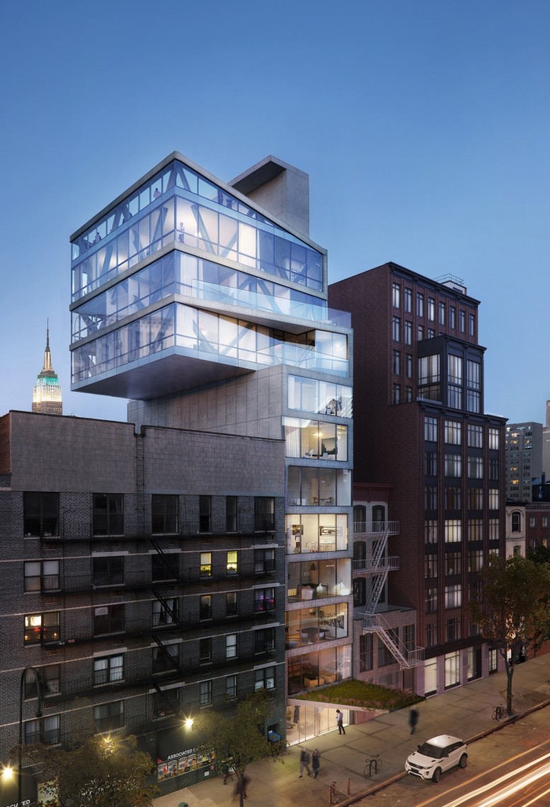
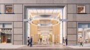
Originally designed by ODA Architecture, the new rendering shows the current iteration by Isay Weinfield in collaboration with FORM4 Design Studio PLLC. Pizzarotti is in charge of construction. The site will still include a cantilever on the western elevation but not as dramatic and extreme as ODA’s architecture. The color palette and material selection for the main facade have since been updated, and the footprint has been extended more to the east from the earlier plans. There will now be 25 condominiums, up from the original 11 units proposed from the first conception.
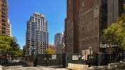
Recent photos show progress on the site and how fast things are now moving.
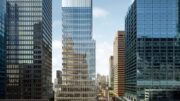
Looking at the new rendering, the glass curtain wall and interior diagonal columns have changed to a much toned down facade. There will be a mix of gray-colored stone slabs on the first eight floors with an asymmetrical arrangement of square and rectangular floor-to-ceiling glass windows. Darker colored panels will sit in between the glass on the upper three cantilevering levels.
Outdoor terraces will be found on the ninth floor as well as the top of the building. Based on the landscaping seen in the rendering, it’s possible this could be used as a rooftop deck for residents. The new roof line will also align perfectly with its adjacent eastern neighbor at 245 West 14th Street.
Completion of 251 West 14th Street is most likely going to happen sometime next year.
Subscribe to YIMBY’s daily e-mail
![]()
Follow YIMBYgram for real-time photo updates
Like YIMBY on Facebook
Follow YIMBY’s Twitter for the latest in YIMBYnews

Want to tell: I have V-shaped on my face with my sexual eyes, and then I have curved waist with my long legs. They said I was born on this way, according to my natural built. Design from Michael Young arms me to see clearing and stunning structure. (Thank you)
Do shut up!
Please pardon your space, David comments are deserving to be recorded in Guinness Book, by just commented almost every single article every day, as soon as it posted!!!
No matter what he/she said. “David” internet name was formerly “Michael”. YIMBY will loose a lot without him.
Original design was way better. Updated one just looks like a mistake.
Just constructivist Bauhaus movement revival in architecture, what’s made Socialist built cities ugly everywhere across the World. Constructivist, opposed to Art Deco was uninspired Communist New World Order Vision for architecture, they created unsightly cubes, later required to be painted with Diego Rivera style murals, depicting Lenin, Trotsky, Mao, Che, Fidel, and other communist parasites. May they must add Lenin Statue on the roof from LES “Red Square” condo.
Big rooftop podium, a future place for Lenin Statue on the roof of this Bauhaus inspired constructivist structure. Lenin Statue from original LES “Red Square” Condo from deceased Soviet Union Empire, will be look nice in this communist architecture inspired Bauhaus replica.
The original design was a Bauhaus inspired, but this one even more trash, belongs of provincial district of Russia at time of Kchryshev Thaw, btw why they scrapped original design, it was true Bauhaus inspired, but this one belongs to the slams of San Paolo. Pure Socialist inspired trash!!!
Looks like they replaced original design from 7 grader class student. Inspired by socialist cities trash!!!
Isay Weinfield’s own 7th grader kid architecture. From LEGO, instead of ODA.
Not a fun, since this shit is built for many decades, must be called as “millennia NYC building. Looks like 3 upper floors is on the verge of immediate collapse. Must put a LES Lenin rooftop statue from “Red Square” Condo.