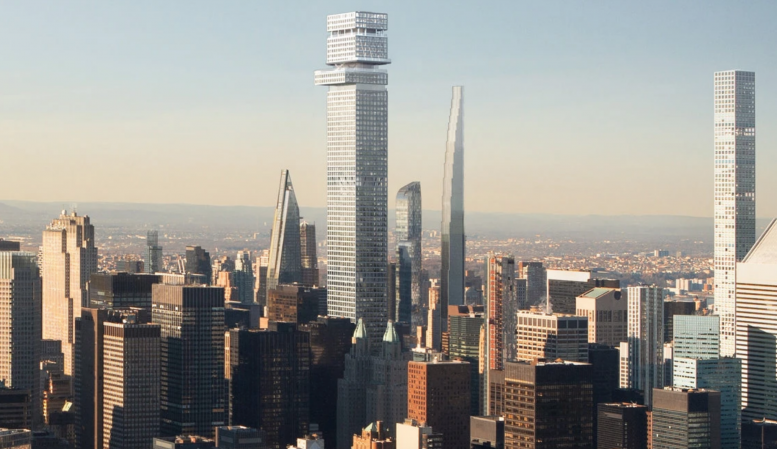
Demolition permits were filed last week for 5 East 51st Street, part of the assemblage that could give rise to New York City’s future tallest building by roof height. The future 1,556-foot-tall and 96-story Tower Fifth, is located in Midtown East, between Fifth Avenue and Madison Avenue. Permits were previously filed for this lot in April, but later withdrawn. Filings for the remaining structures within the footprint have also been trickling in over the past few months, hopefully indicating that excavation for the prospective supertall is imminent.
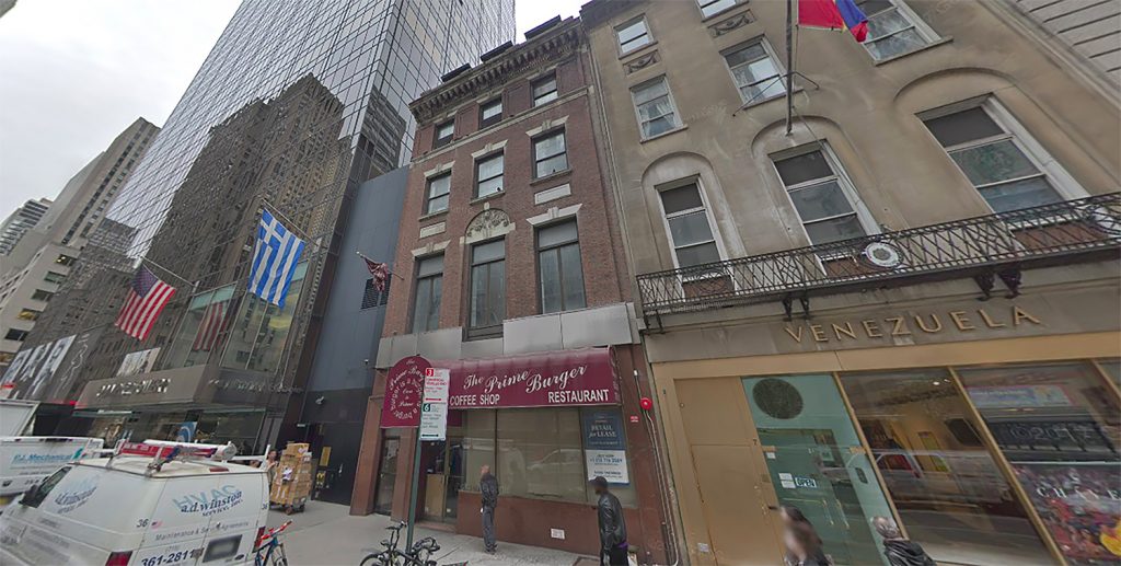
This particular component is currently occupied by a 70-foot-tall, six-story commercial building. Constructed in 1930, the structure has 14,708 square feet of space 30 feet of street frontage. Developer Harry Macklowe’s plans for Tower Fifth call for an office tower with the third-highest floor count in Manhattan, after the Empire State Building and One World Trade Center.
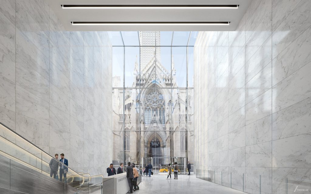
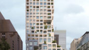
Macklowe finalized his $44 million purchase of this particular site in March, after announcing his plans for the supertall in January with a release of renderings. The images depict a slim profile with impressive floor heights and cutouts. The crown of the building features a crossbeam diagrid, while the base has floor-to-ceiling windows with a slight setback providing an unobstructed view of St. Patrick’s Cathedral across the street from the 85-foot-high lobby.
Gensler is the design architect for the building, in collaboration with Harry Macklowe, and the project features a closed cavity system that reduces solar heat gain by 70 percent. The massing of the structure is consistent for the bulk of the rise until it reaches a cantilevering observation deck consisting of multiple floors at the top.
Preliminary filings for Tower Fifth were submitted at the beginning of the year, but firm completion date has been announced just yet.
Subscribe to YIMBY’s daily e-mail
Follow YIMBYgram for real-time photo updates
Like YIMBY on Facebook
Follow YIMBY’s Twitter for the latest in YIMBYnews



Wish they did something about that cantilever, it ruins the tower!
I don’t know why everyone hates this design so much I think it’s acceptable. However I highly doubt this buildings will ever be constructed.
I believe your Google Maps photo is showing 5 WEST 51st, not 5 E, where the tower will actually be located.
No it’s not. That’s 5 E 51.
Ooh, I hope it happens. Quite vivid.
Google maps misled you. Macklowe’s building is adjacent to the Venezuelan consulate and across from St Patricks. It’s a brick row house that had any facade decorations removed.
There is nothing attractive, elegant, refined or unique about this clunky, hulking design. It truly is a horrible blot on the Midtown skyline. Hopefully it will not get built with the Trump Recession already baked in.
Too many super tall building being built in areas where they will block out the views and sunlight of other buildings. New buildings should be smaller in size and reflect what the neighborhood buildings look like in size and architecture.
Someone said that same exact thing in 1919. **yawn**
And in 1819.
and here we are in 2019 with that same reserved outlook.. development is good people
For Macklowe, perhaps. It’s not a case of a reserved outlook so much as it is wanting something more than “the biggest.” We’re tired of that.
A long way, you can finish step by step, and then you can’t reach without a foot
It’s midtown east, it’s a soulless neighborhood.
It looks so ordinary except for the top that seems to be inspired by jenga. Funny how their promo materials use the neo-Gothic finery of St. Patrick’s to help sell this uninspired building that is sure to be a carbuncle on the Manhattan skyline.
In the advertising world, people would label that glimpse of St. Patrick’s “borrowed interest.”
It looks like someone punched a poor man’s version of 432 Park upside the head.
The cantilever at the top just looks out of place.
What an ugly, out of date, uninspired peace of junk. When you look at what SHOP and other talented studios does, you see how that bulding is a thing from de past. With no rythm, no attention to his surroundings, no ideas of what it is to by integrated in a landscape : the skyline, and an history of architecture. There’s no dialogue with is neighborhood. It’s just a broken 432 Park Av.
I love super tall buildings but this building is just plain ugly, what an eyesore it will be.
This is extremely phallic in a very unappealing sort of way.
I like it
432 Park Ave looks better by the day.
New York was once known for its alpine-like pinnacles. Pleasing to the eye because we naturally like triangles (photography’s law of thirds). Now it’s a bunch of boxes. How sad.
Hear! Hear!
Spot on!
Yep, except for an exceptional few standouts (including those recently announced/proposed for Park Avenue), Manhattan’s once spectacular and iconic skyline that was the envy and inspiration of the world during the 20th century, is deteriorating into a vast collection of some of the ugliest “Supertalls” on the planet.
What a shame.
Perhaps it’s time to start thinking in terms of implementing design standards for buildings taller than 500 feet, or for areas where most buildings are substantially lower, any building that towers of the neighborhood and alters the skyline around it.
Separately, is it just me, or does anyone else think the lobby seen in the render looks like a lonely, cold, lifeless, mausoleum where all that’s missing are plaques with the names of the deceased’s remains entombed inside the drawers that line the walls
Just wondering.
America is home to free enterprise and NYC should be a shining example of this. Why are we trying to regulate the look of these buildings, why do things HAVE to be boxes or triangles.. Allow the market to create whatever buildings it will. The natural forces of the market will shape the buildings to the desire of the people. Lets not unnecessarily hinder the developers because Pam and her friends like box’y buildings or Charles and his family like Triangles..
To Richard:Nothing could ever improve the debacle of 432 Park.Macklowe sure has the Midas touch,it only gets worse and more worse.He has no shame or dignity,he needs a lobotomy real soon.
.
Good Luck!
If they remove that cantilever at the top it will look a lot better.
I thought this was a joke ahahahahahahahahahaha
Why does everyone complain about the look of EVERY building on here. Development is good, more people, more growth, more opportunity, grow the economy! We should push for all of these buildings to be built! Show your support for a strong city!
The rendering at the top omits the proposed 1,500-foot Vornado/Rudin 350 Park Avenue,which would be just a block down 51st Street and dramatically affect views from and of Tower Fifth.
(The 350 Park diagrams submitted in turn included the 707-foot old 270 Park rather than the planned 1,425-foot replacement,and renderings of the new 270 Park in turn ignore the new 350).
Let’s see the WHOLE prospective skyline.