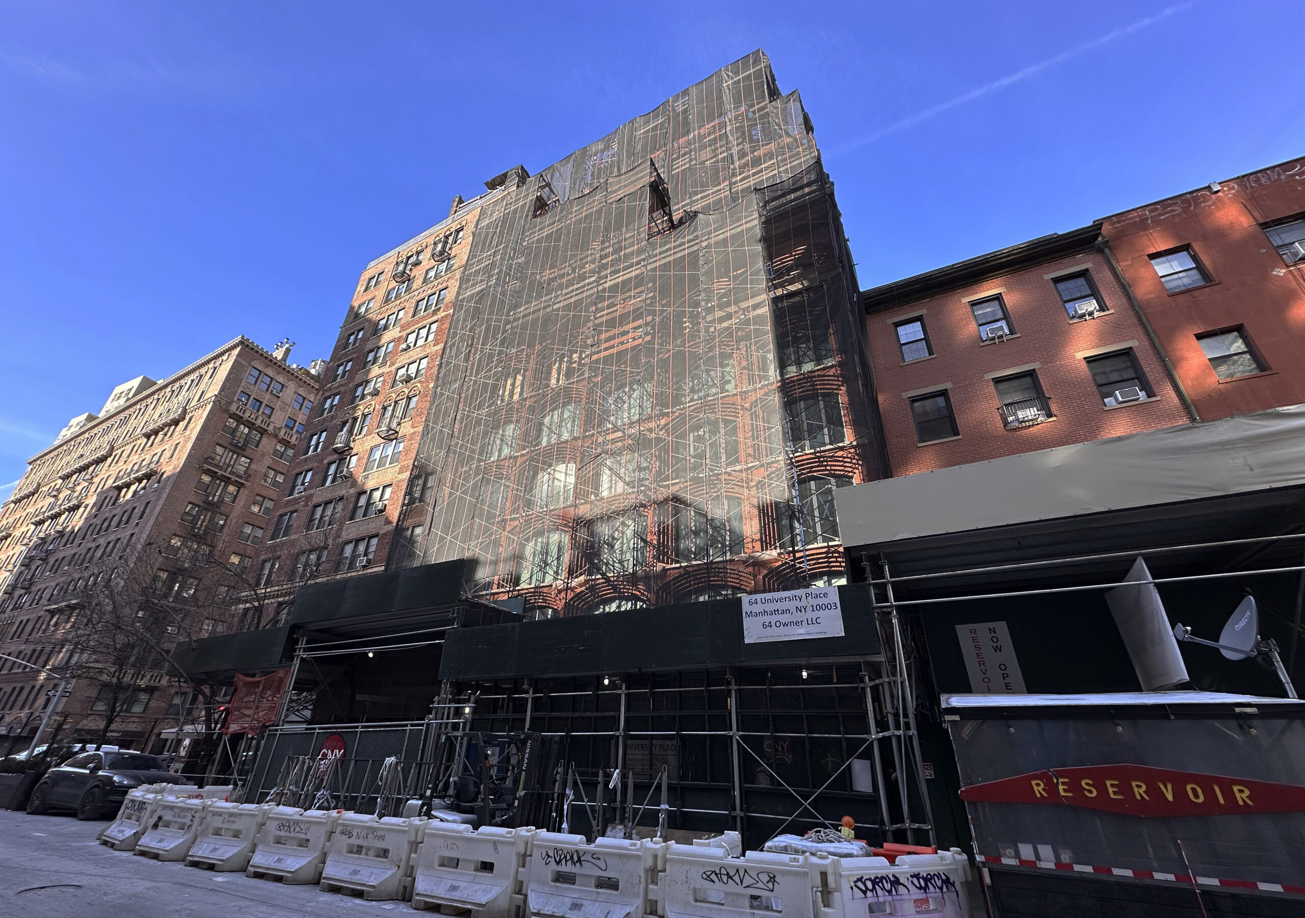
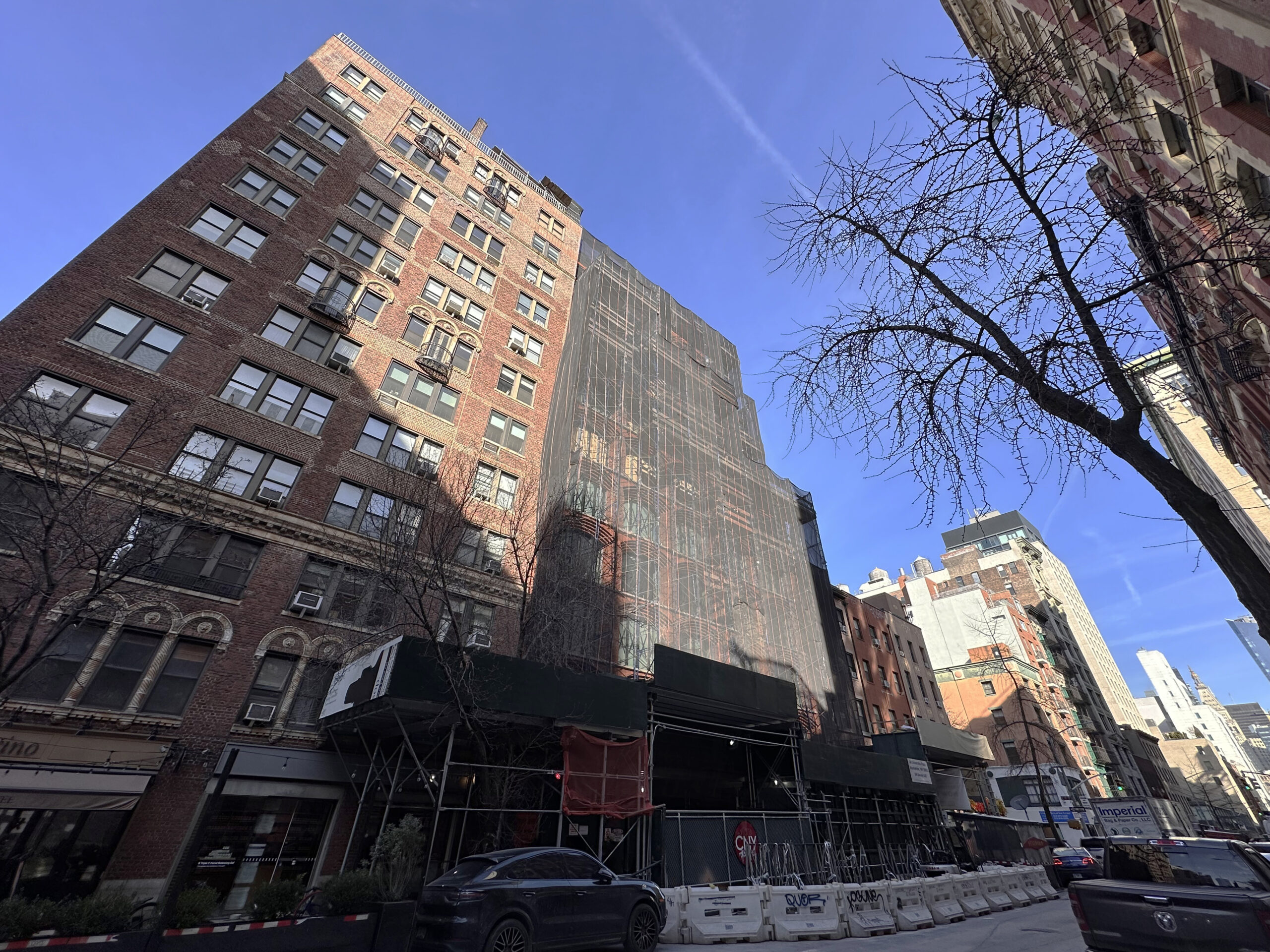
Façade work is progressing on 64 University Place, an 11-story residential building in Greenwich Village, Manhattan. Designed by Kohn Pedersen Fox and developed by Argo Real Estate and Bsafal, the 125-foot-tall structure will span 63,000 square feet and yield 28 condominium units with sales and marketing led by Fredrik Eklund and John Gomes of the The Eklund ǀ Gomes Team at Douglas Elliman Real Estate, as well as a community facility and ground-floor retail space. SPACE Copenhagen is the interior designer, Deborah Nevins is the landscape designer, and CNY Group is the general contractor for the property, which is located between East 10th and East 11th Streets.
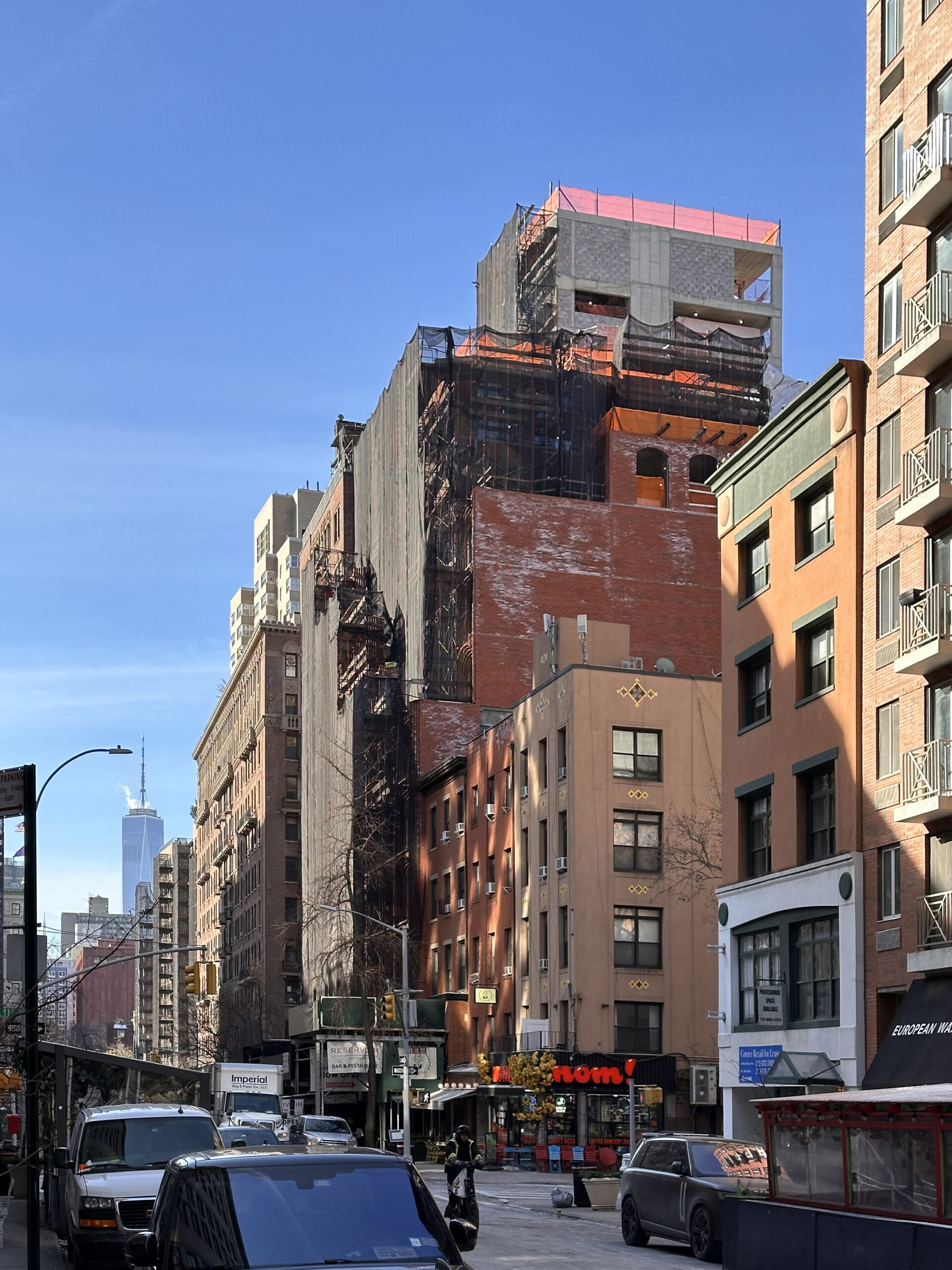
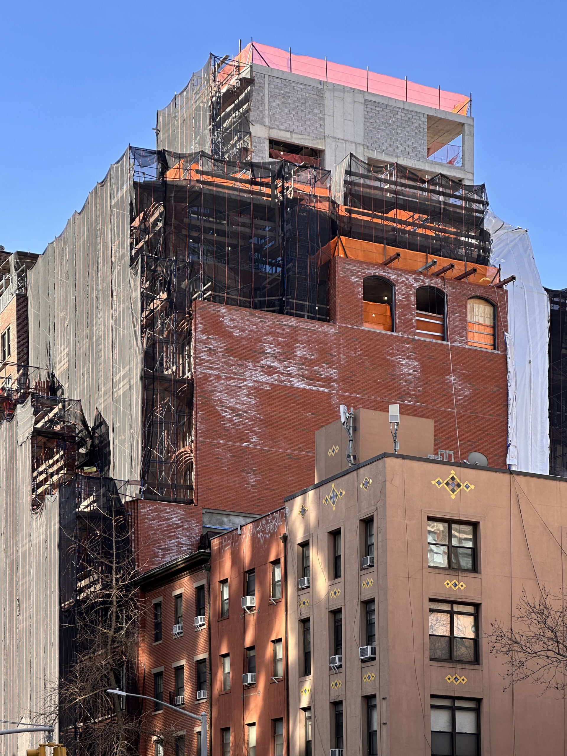
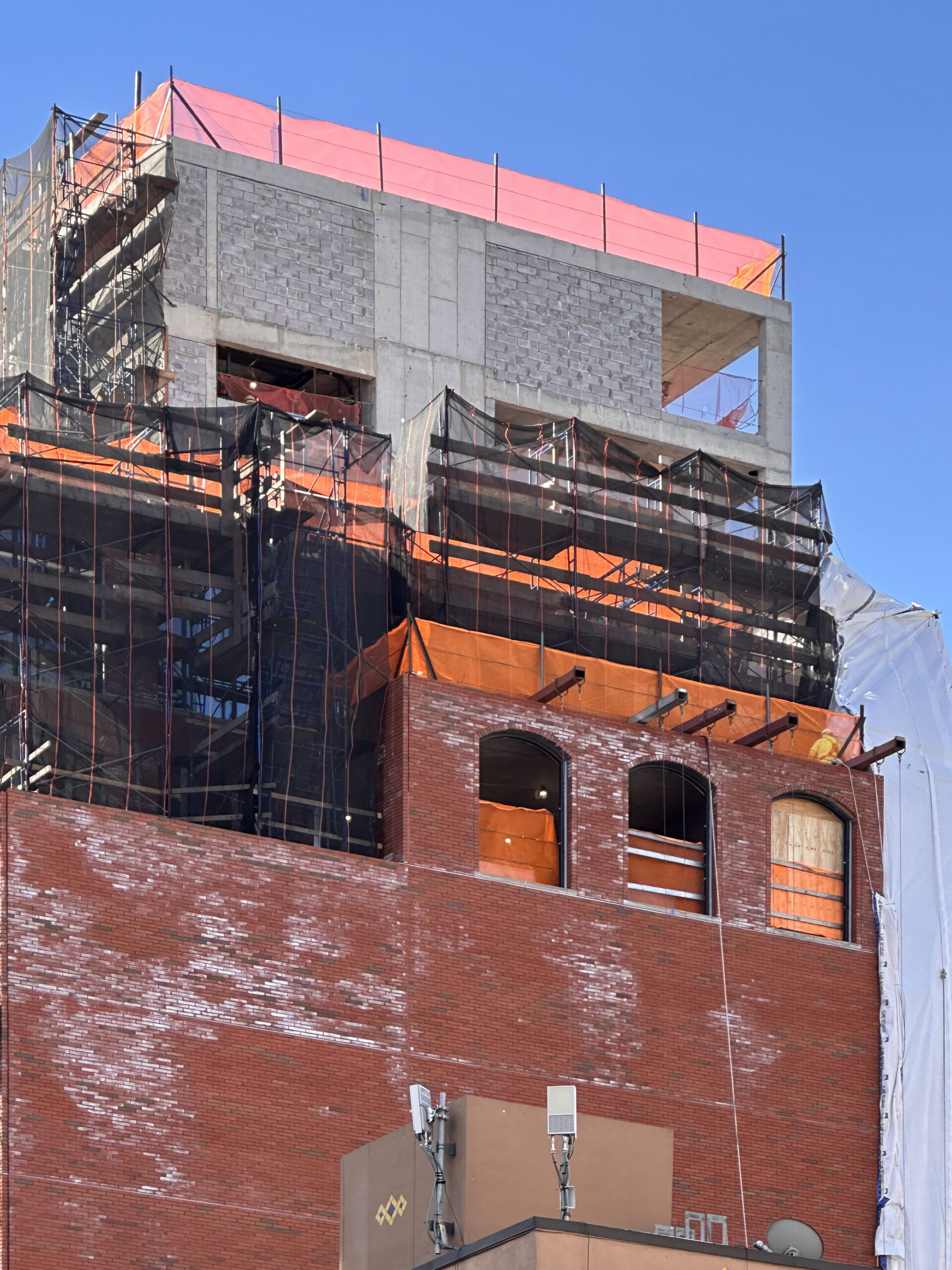
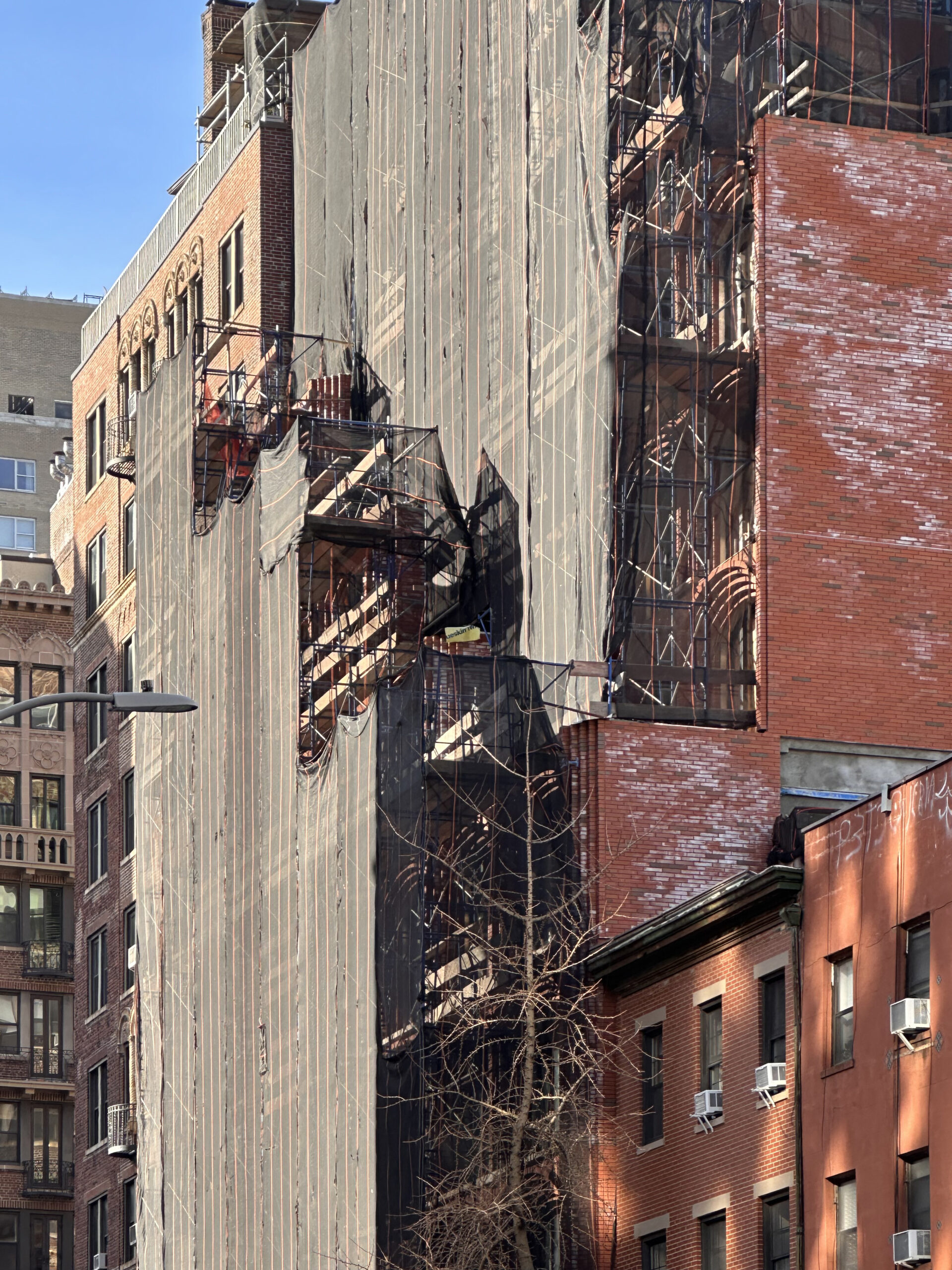
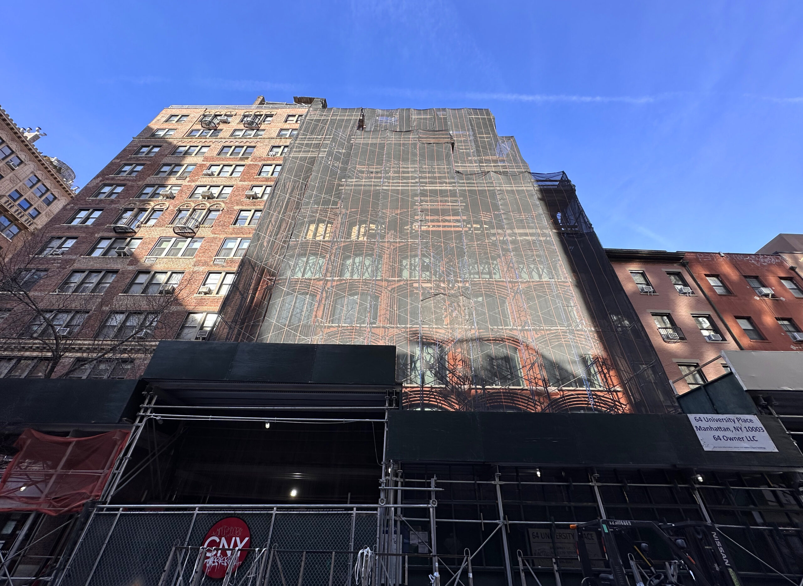
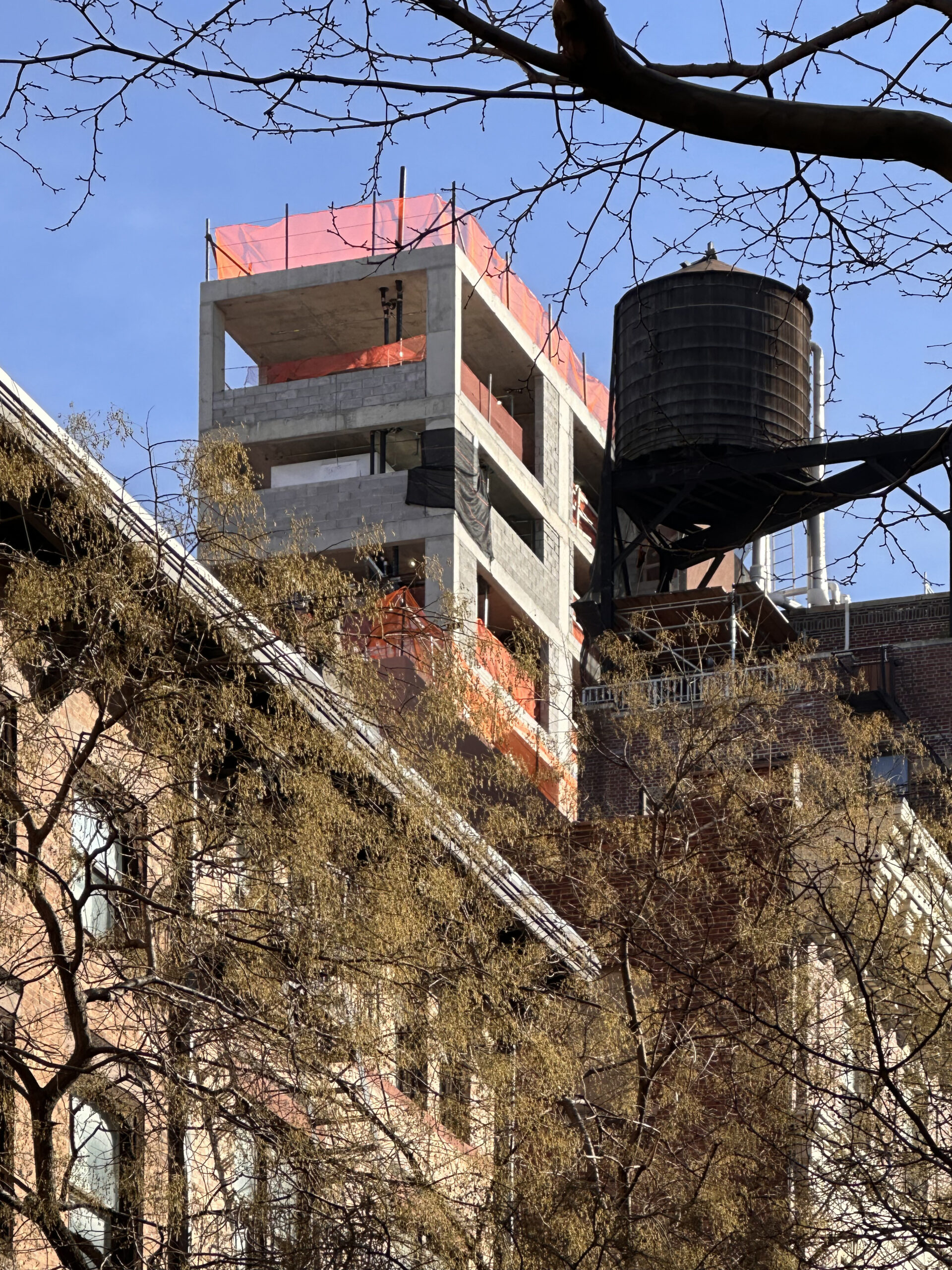
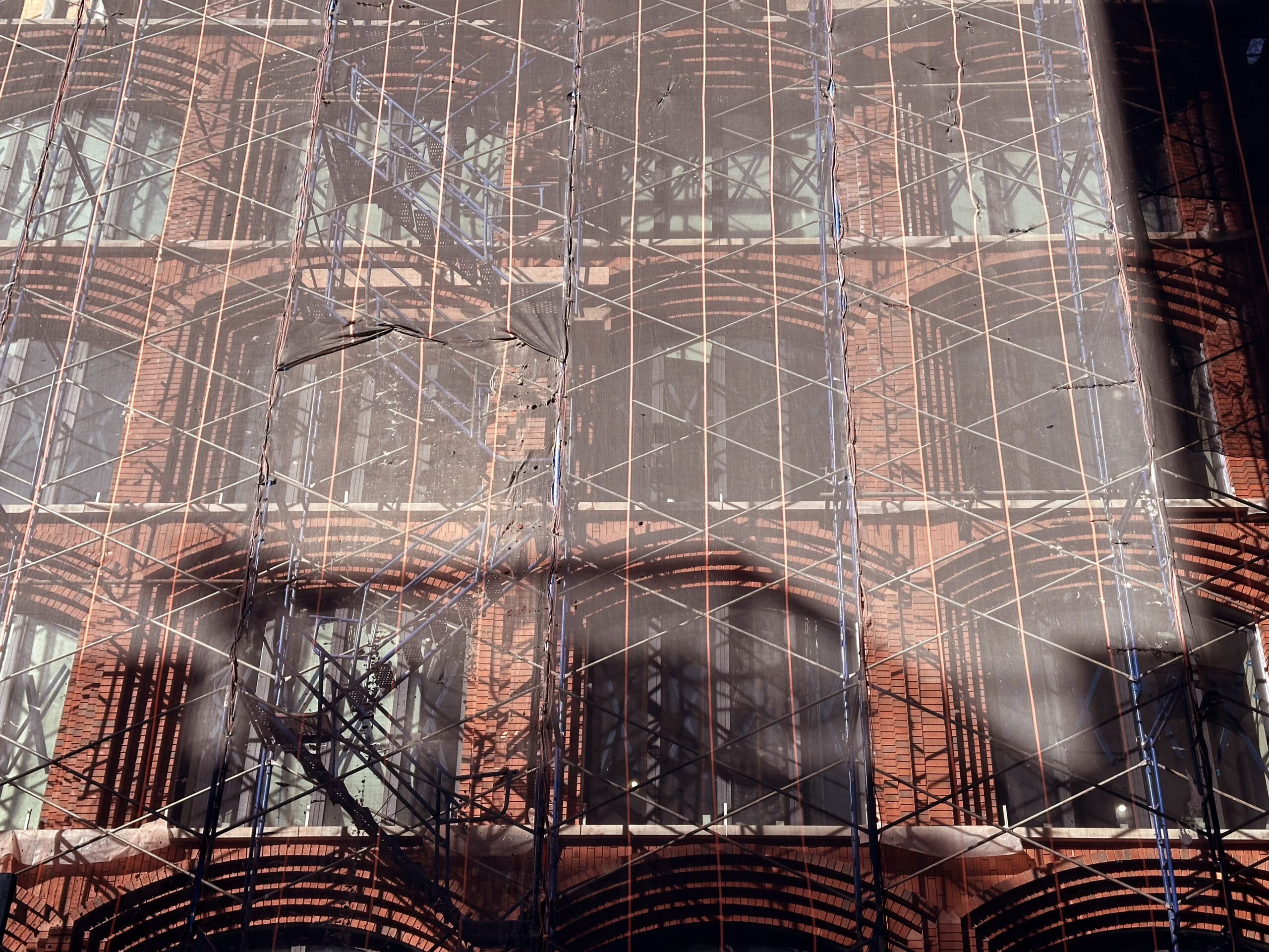
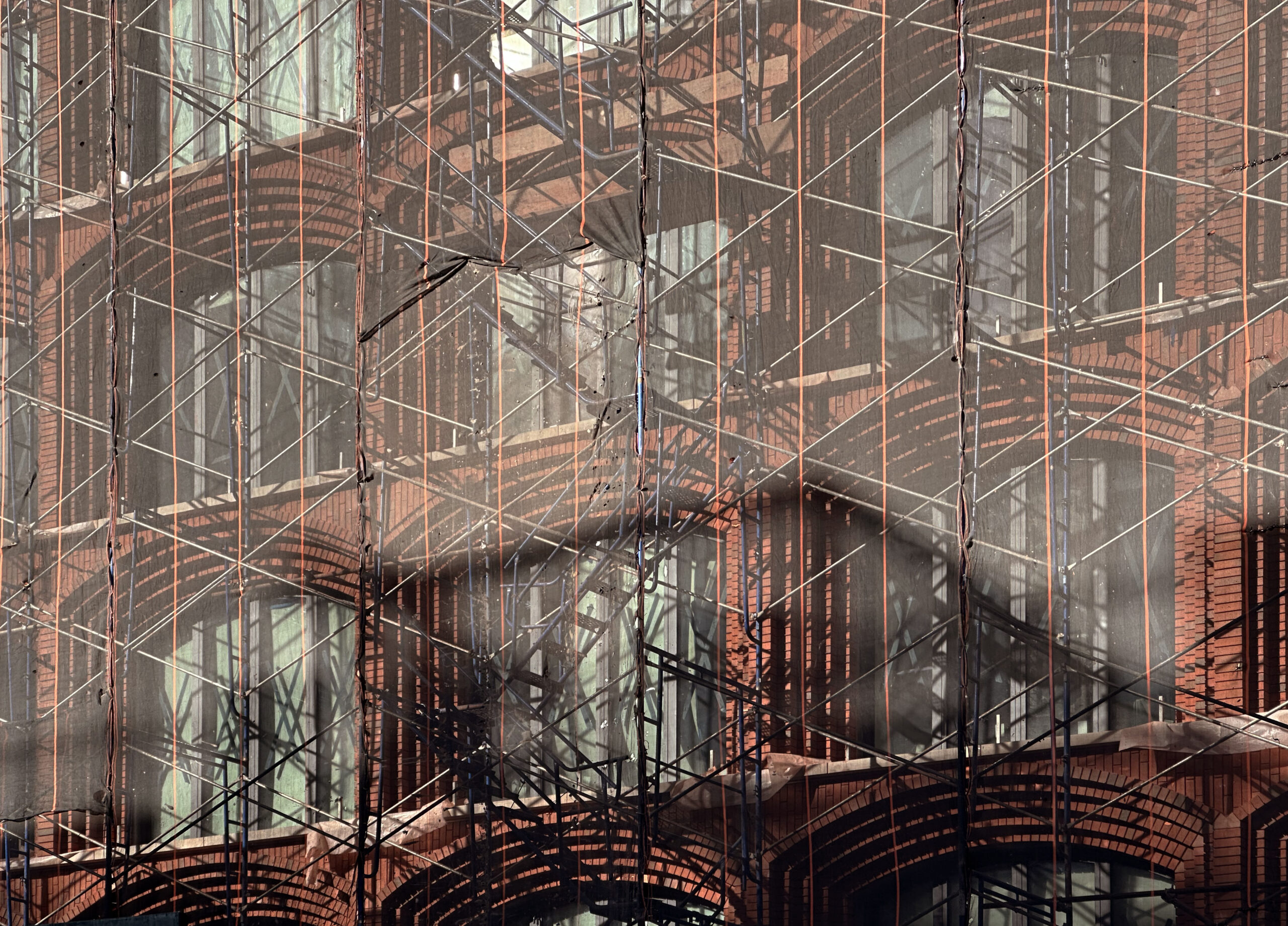
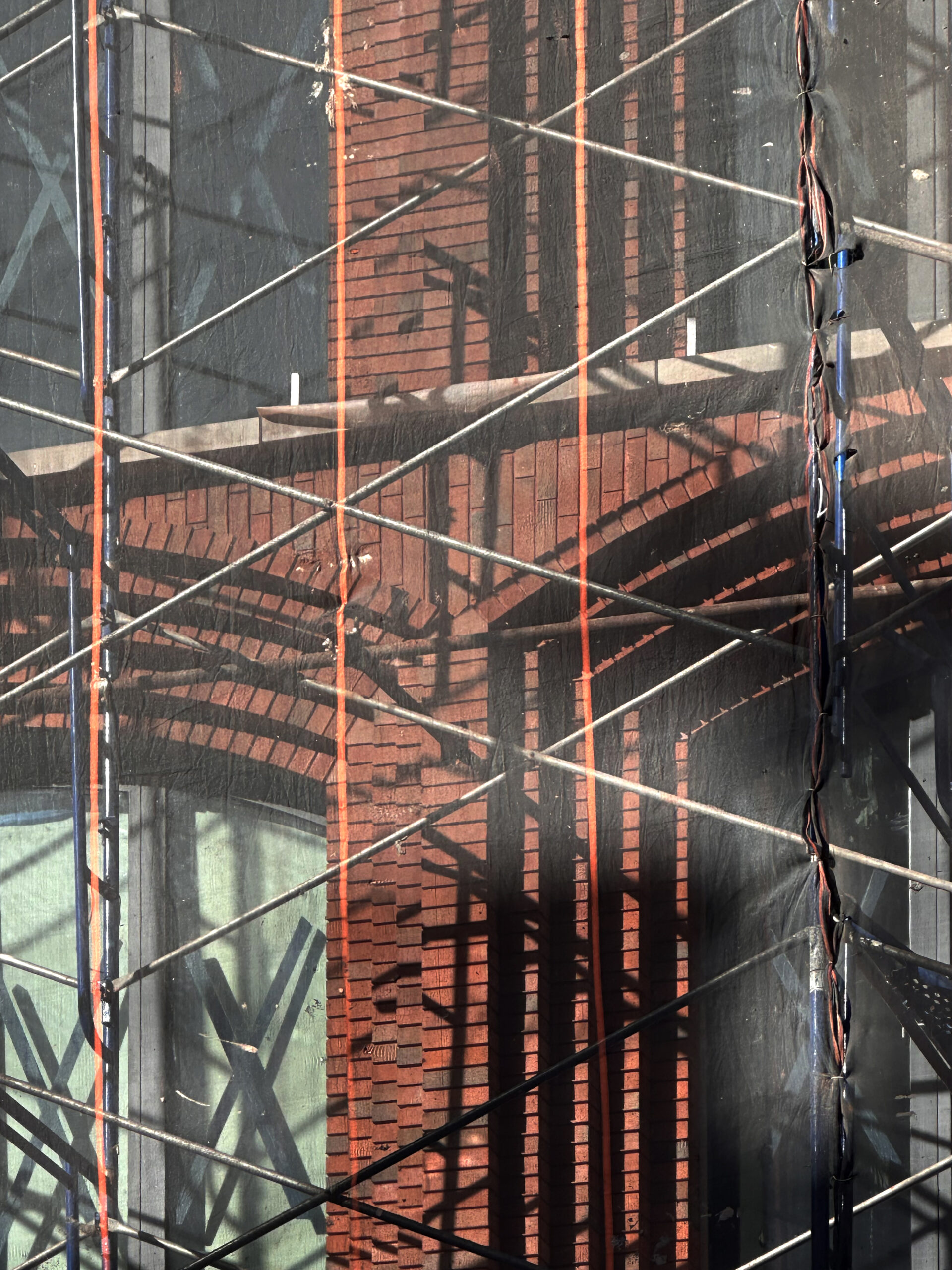
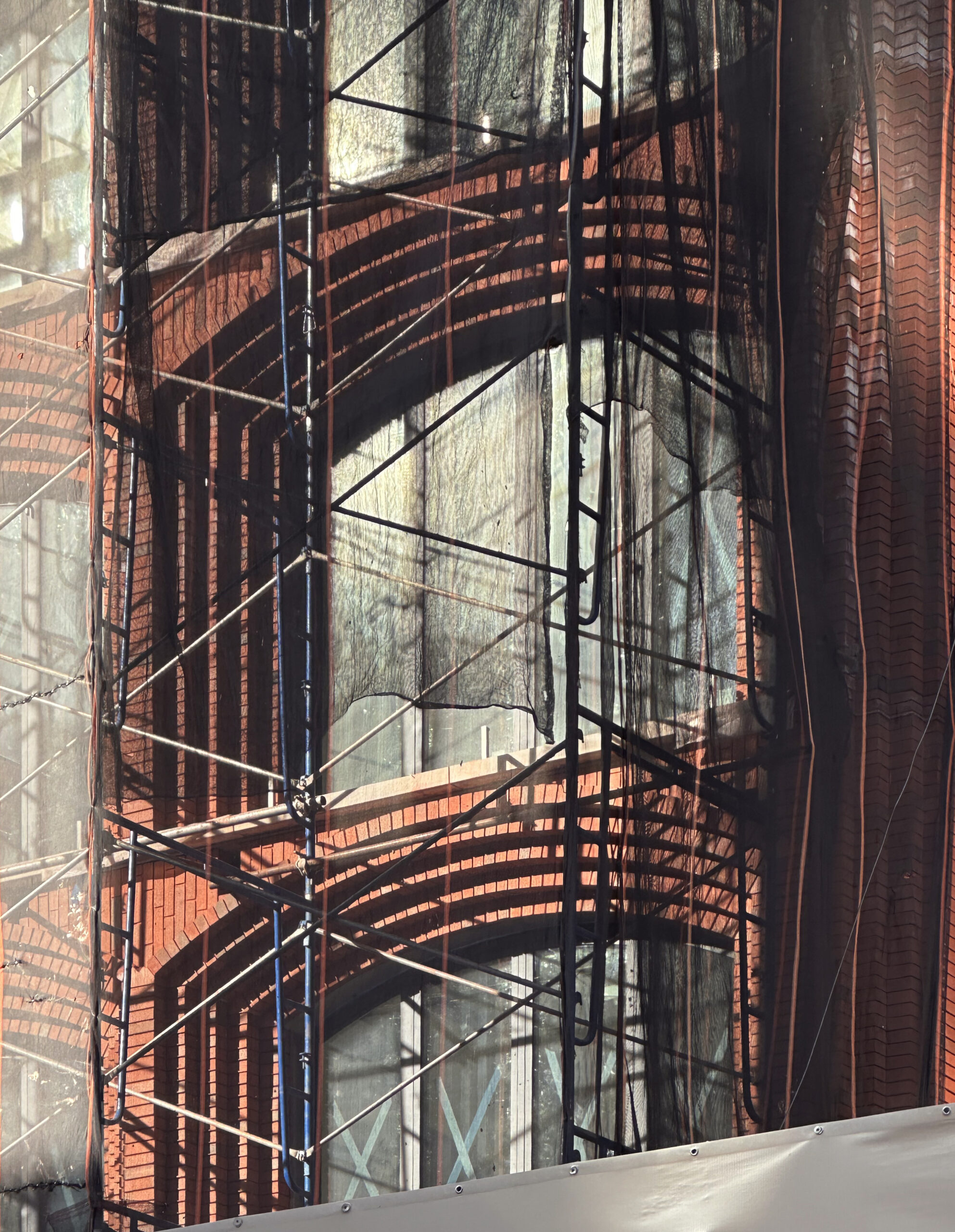
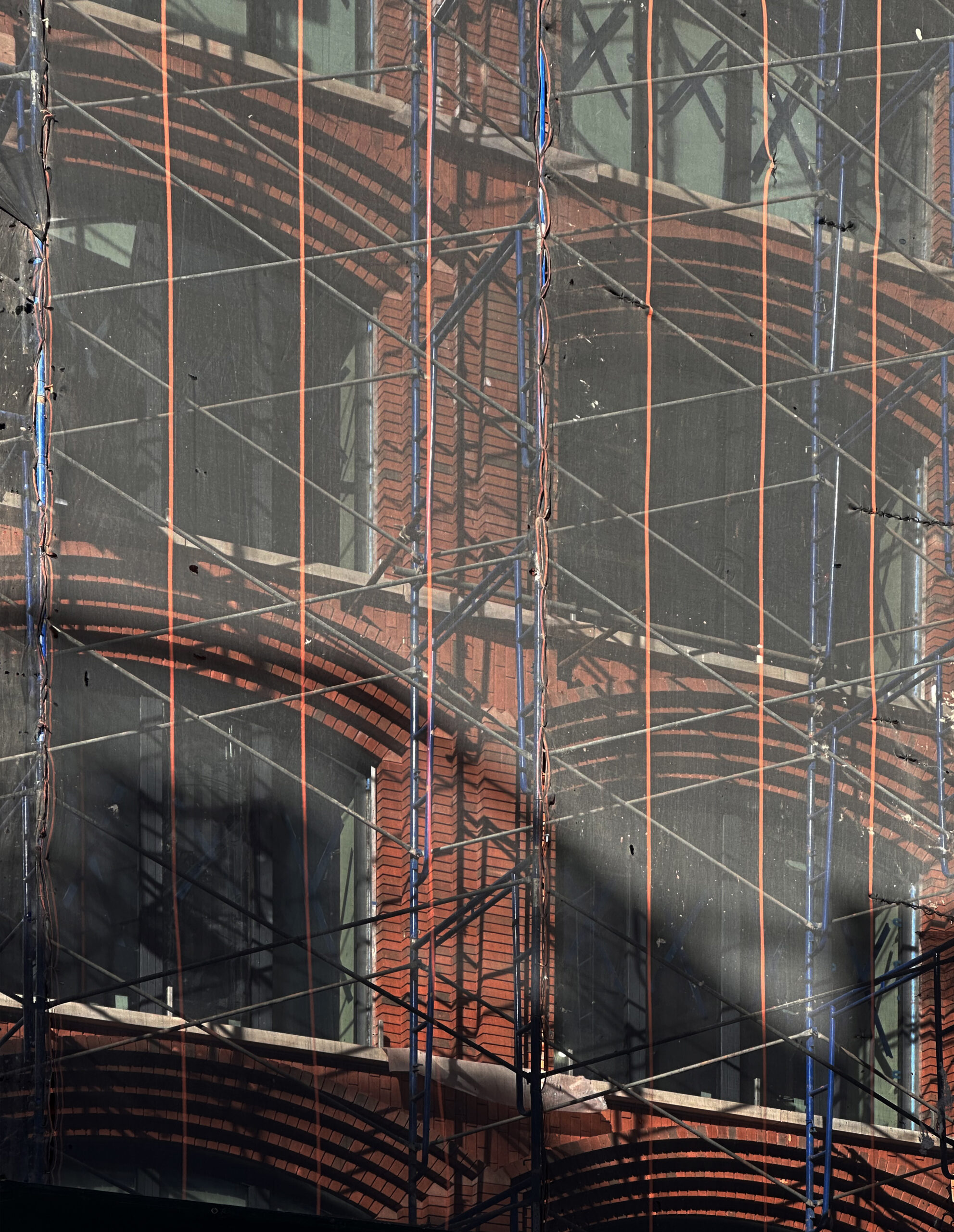
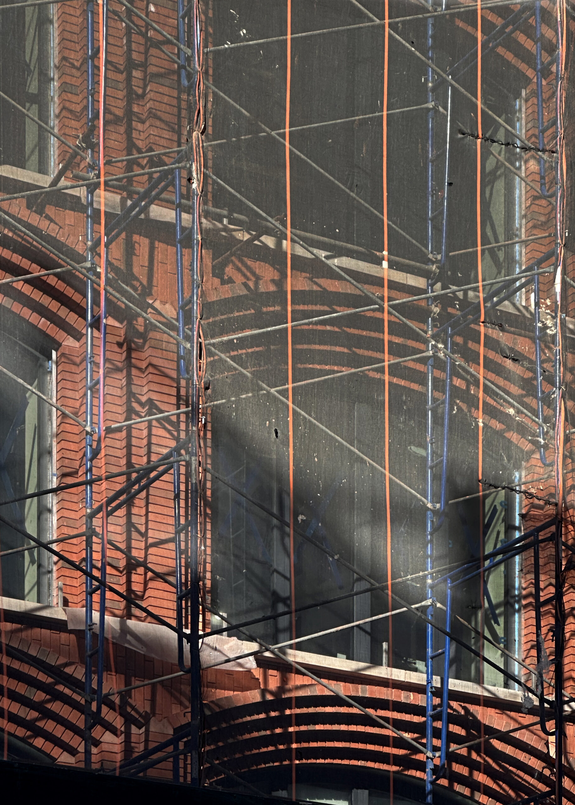
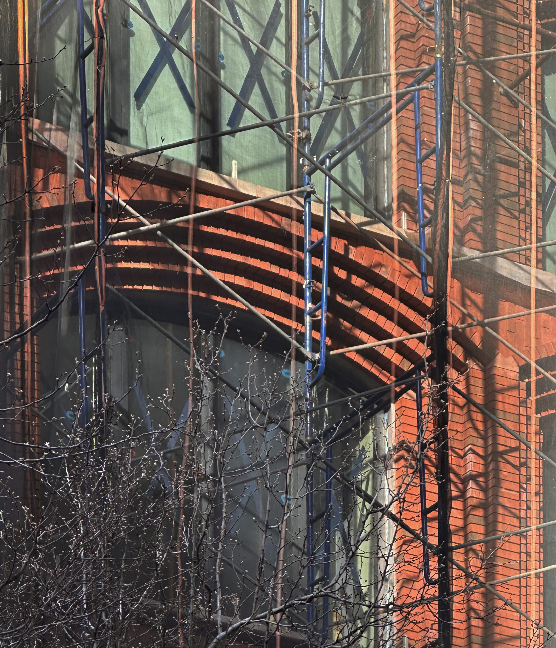
Nearly all of the hand-laid brickwork for the main eastern elevation was installed behind scaffolding and black netting since our last update in mid-July, when waterproofing and insulation was starting to go up. Recent photos show the red brick enclosing the northern lot line wall and some of the arched window openings on the upper floors below the mechanical bulkhead, which has yet to receive its contrasting gray paneling system.
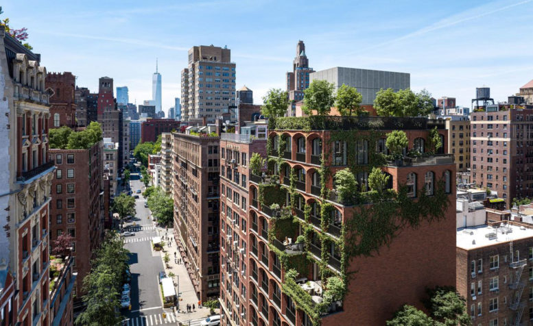
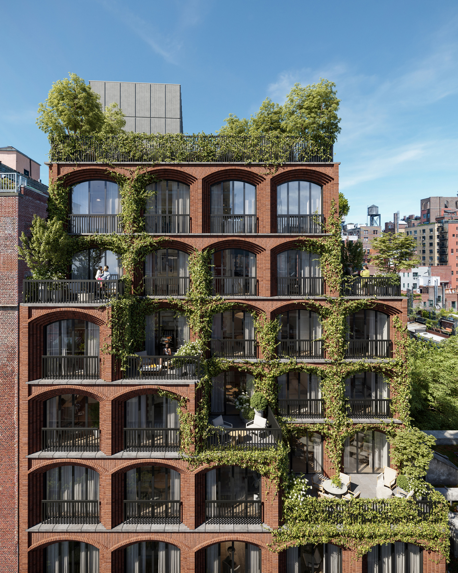
The main rendering looks over University Place, showing the cascading landscaped outdoor terraces and setbacks leading up to the lush roof deck.
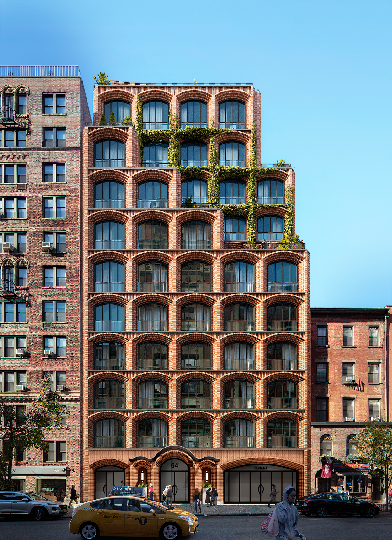
Below is the full eastern elevation of 64 University Place.
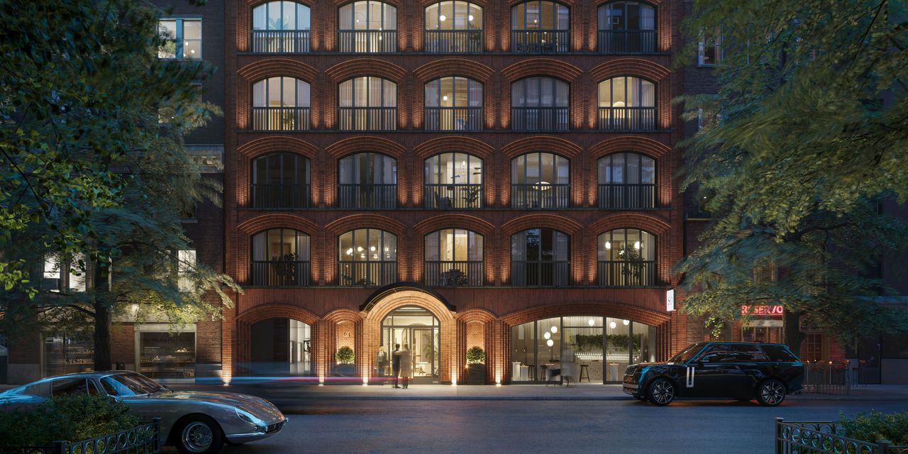
The following nighttime street-level perspective of the lower levels showcases the varying widths of the arched window spans and upward-firing spotlights illuminating the columns. A curved metal sidewalk canopy will protrude above the main entrance.
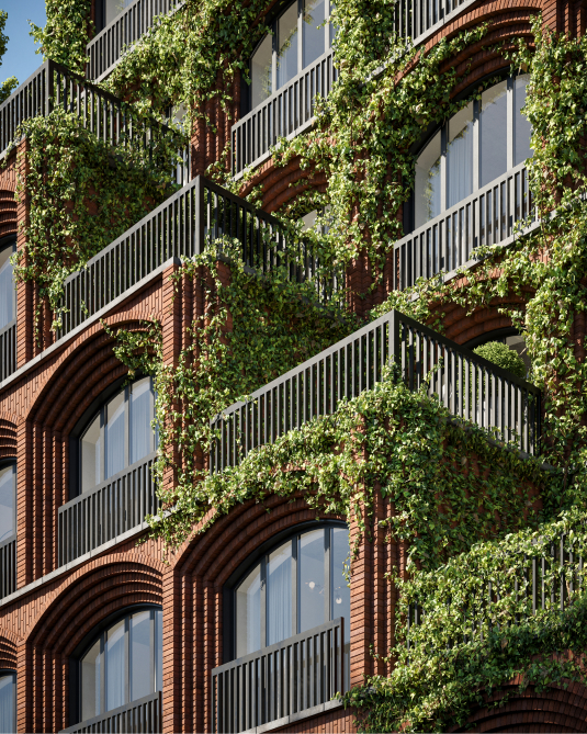
The motif of arched windows with dark metal railings continues up the building, with climbing vegetation adorning the stories above the stepped setbacks. The bricks feature a rusticated finish with various red and brown tones, and gray stone lintels line each floor plate.
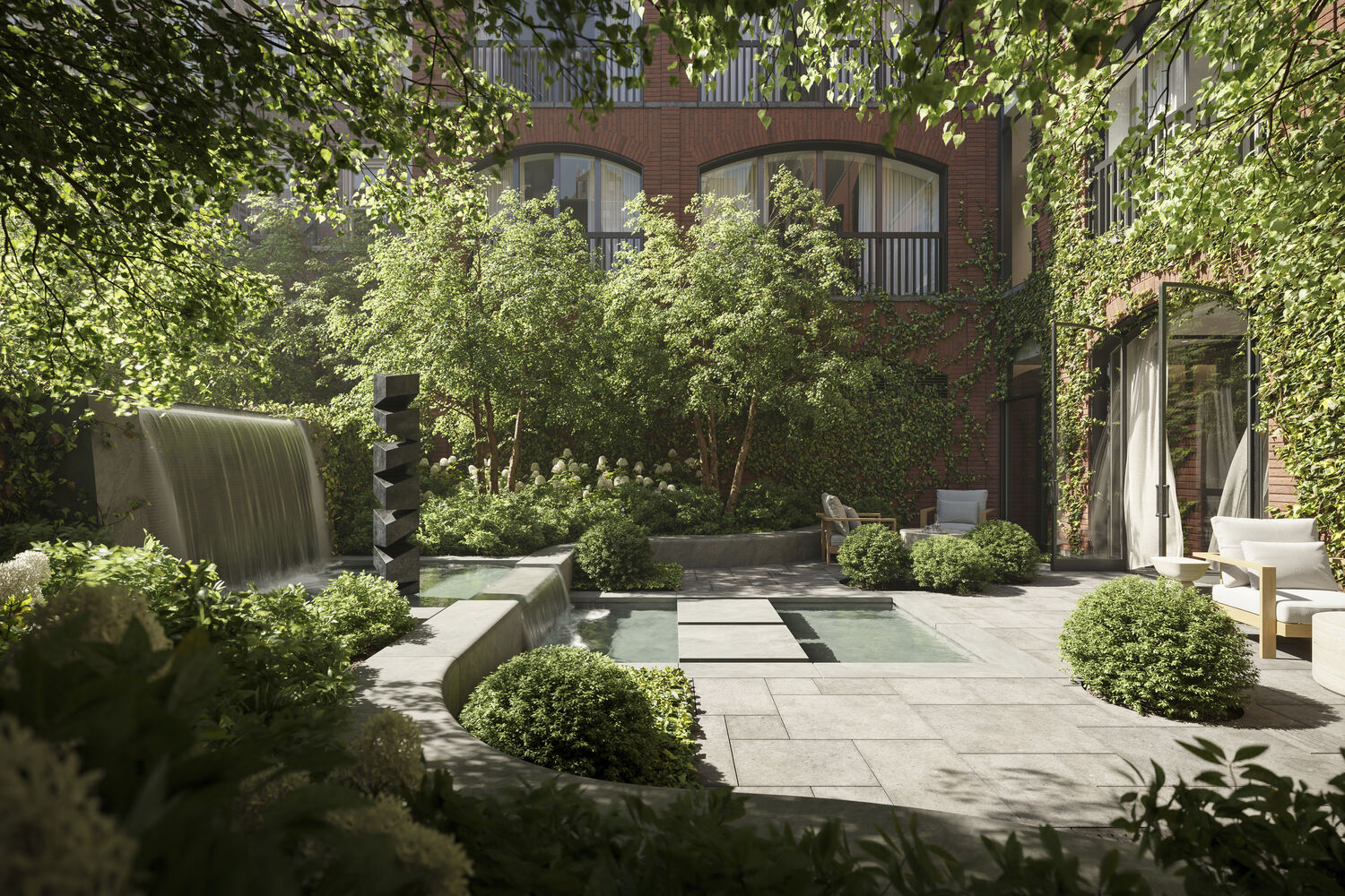
A private residential courtyard will sit in the back of the property.
The tiered brickwork around the arches creates an interesting play of light and shadow, which is enhanced by the presence of the climbing vegetation.
Residential amenities will include a fitness center and sauna, along with a reservable event space facing a landscaped interior courtyard. An extensive amenity list has yet to be announced.
The ground floor will contain retail and public gallery space.
The closest subways from the site are the 4, 5, 6, N, Q, R, W, and L trains at the 14th Street-Union Square station; the R and W trains at the 8th Street-NYU station; and the A, C, E, B, D, F, and M trains at the West 4th Street-Washington Square station.
YIMBY anticipates 64 University Place will finish construction sometime in the second half of 2024.
Subscribe to YIMBY’s daily e-mail
Follow YIMBYgram for real-time photo updates
Like YIMBY on Facebook
Follow YIMBY’s Twitter for the latest in YIMBYnews

Does anyone really believe the ivy will look like the renderings?
Only if this were built in Singapore! These lush green renderings never materialize in New York City.
There won’t be ivy. Ivy is beautiful and charming but in reality a bit of a nightmare to control, maintain, and prevent masonry damage from root and moisture invasiveness. This isn’t much different than how so many developments show trees on loggias and rooftops but never actually show up in reality, at least not as lush and generous as renderings depicted.
vines not roots oops
Those arches reminds me of KPF’s design for 520 Fifth Avenue too. Nice sneak peak at the arches in the photos!
You beat me to it, was going to make the same comment. This one is a better-looking design, though. Really nice, especially the arch details!
I agree. I’m glad they chose to use bricks and not go with a sterile and soulless glass box
The renderings look a lot better than the reality.
Goofball comment
This incessant obsession with the largest possible windows means there is no structure between the arches and sills above. It just looks pointless and wrong.
I hope you realize the whole building is also being held up in many other different sections.
What on earth are you talking about
How long before someone who doesn’t know what efflorescence is blames it on shoddy workmanship or the lack of a “cement foundation”? Gubster? You out there?
You miss me that much ?
I won’t dignify your comment with a response until you answer this.
why are people who make six figure incomes are being subsidized by NYS taxpayers at 130% AMI using the dead 421A program ?
Do you have a response to my question ?
Oh god, it’s you again with these copy + paste crap comments 😖🙄
Of course no YIMBY will answer my question.
Hey Alex can you answer my question and explain exactly what constitutes a copy and paste crap comment?
I really need your expertise on this .
BTW Blame NFA for asking for me
Well, you could’ve kept your mouth shut and didn’t have to answer NFA…
And why are you only attacking YIMBY’s? Im a NIMBY who also has a brain and mouth too you know…both of which I know how to control. Unlike you that can’t shut up without a using the word ‘Crap’ over and over again. That’s the one thing YIMBY’s & NIMBY’s can both definitely agree on
No use having anyone answer your questions, guesser. You might instigate a shouting match. Oh wait, too late. 😒
Guesser, NFA is pointing out your flawed understanding of basic construction methods and fear of public humiliation. Your predictably senseless responses don’t hide your incompetence and attempt to face criticism. They only make it even more clear to everyone that you gaslight anyone who challenges you and resort to shouting matches. You are afraid to admit your past mistakes and own up to them like an adult
Kudos to NFA
NFA, that’s the problem these days. People jump to conclusions way too prematurely
Love the interior courtyard with the water feature. Very serene.
Lovely photos! Hope we see another Yimby update when the scaffolding comes down, hopefully soon!!!🩷
Large trees planted in the ground have fallen over in storms. I wonder what the consequences would be for those on a lofty terrace. Perhaps the city should consider regulations for plantings.
“ Nearly all of the hand-laid brickwork‘. Is brickwork ever anything but “hand laid”?
Yes, it’s not unusual for the brick facades of large buildings to be composed of factory-made panels of brick “veneer”. There’s nothing hand laid about them.
I think they mean a traditional method to laying bricks by hand, not like a rainscreen that gives the impression of solid bricks. Does that answer your question?
Despite all the yappin, this is a pretty cool building
Planting plants on the building cannot destroy beauty of the arch, or am I wrong? Thanks to Michael Young.
“LIFE AFTER PEOPLE”! 🤔
What’s the white stuff on the bricks, mold? cocaine?
This looks great….even if the ivy never show up.