 |
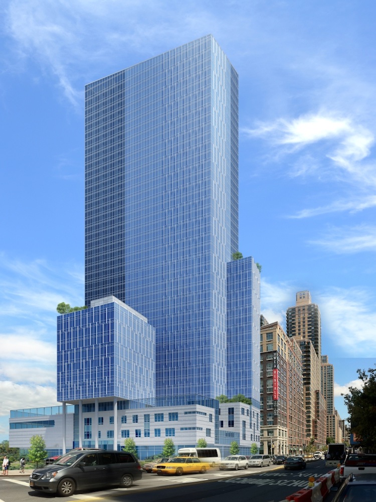
| Riverside Parcel 2: Image from Curbed |
Official renderings for the first Riverside Center tower have been released. Calling the building a disappointment would be quite nice–it’s actually just plain ugly.
The Riverside Center plan has been subject to intense scrutiny because of neighborhood NIMBYs who are apparently content living next to parking lots. Given the struggle between the project’s conception and eventual realization, one would hope the developers would actually put some effort into each and every one of the towers that will eventually rise on site.
That is obviously not the case, as the rendering proves. The tower will be residential with 616 units, and will also have a school occupying the first four floors. Combining community facilities with residences does not necessitate ugly architecture–just look at Frank Gehry’s 8 Spruce Street.
The main problem with ‘Riverside Parcel 2,’ which is the tower’s unofficial name at this point, is the overall shape of the building. A simple glass box is boring and monotonous, but it can’t be terrible. This new tower manages to break the mold of the glass box, with horrendous tumor-like additions stuck to the main tower. The form is ungainly and unsightly.
Perhaps the final design is a response to how drawn-out the NIMBY fight has been. Given the rendering, the NIMBYs probably should enjoy their time living next to parking lots rather than this monstrosity. The tower will be rising on West End Avenue and 61st Street.
 |
| Rough draft of the Riverside Center plan, Parcel 2 is Building 2 |
Subscribe to YIMBY’s daily e-mail
Follow YIMBYgram for real-time photo updates
Like YIMBY on Facebook
Follow YIMBY’s Twitter for the latest in YIMBYnews


What cross street is this at?
West End Avenue and 61st Street, edited to add the aerial of the preliminary site plan.
Thanks!