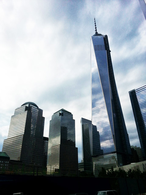
The saga of One World Trade Center, with one bait-and-switch after another, has left many disappointed with the final outcome. For some skyscraper fans, One WTC is notable largely for its high cost, and for the late-stage value-engineering that apparently shaved less than a percentage point off that cost. Perhaps there was a good explanation for replacing the spire with a glorified antenna, but eliminating the spire from the most expensive building being built in the world today seemed a little like accessorizing an Armani suit with a clip-on tie from the leftover bin.
Without a bona fide spire, One World Trade Center may not look as good from afar as people expected. But from up close, the spire isn’t in view, and the tower looks impressive, in large part due to a design that is extremely unusual in New York City.
How unusual? Putting aside architectural genres for a moment, say we classified skyscrapers in NYC according to their overall shape and most prominent details; in other words, according to the minimum number of things that an artist would need to draw in order for us to recognize which building s/he was drawing. If we did this, we might come up with a number of archetypes: the simple rectilinear box, the set of successively smaller boxes, the rectilinear box adorned with I-beams, the facades with rhythmic window treatments, etc.
Where would One World Trade Center fit here? With its facade of isosceles triangles that form an octagon at the center and a square on top, the design of One WTC is all about basic geometrical shapes. The basic geometrical pattern on One WTC is accentuated because the facade is an unadorned blue glass curtain wall. You could build a crude model of One WTC with two ‘square pyramid’ (tetrahedron) boxes if you opened up their triangular sides and fit them together. Though the building contains different shapes, the whole composition – with the unfortunate exception of the base – reads as a single shape.
This is very unusual for New York. Aside from the simple rectilinear boxes that dot the city – and there are certainly enough of them to form a category of their own – very few other towers in New York City appear as a single, unadorned geometric form. Most buildings are broken down into various massings or protuberances, or are otherwise adorned with prominent details that catch the eye visually as much as the overall form of the building.
One World Trade Center isn’t the only building in New York City designed with basic geometric forms other than the rectangle, but it takes this idea a lot farther than other buildings do. The MetLife Building is visually defined by its octagonal shape, but its facade is much busier and more varied, calling attention away from the basic geometric form of the building. 383 Madison – like One WTC, designed by David Childs – is distinguished by an unusual octagonal form as well. But again, the detailing of that building, and its prominent crown, make it less ‘purely geometric’ than compared to One World Trade Center. The facade of the Hearst Tower – ignoring the historic base – is all about interlocking triangles, and actually isn’t that far removed from One WTC.
The design of One World Trade Center may not be the showstopper we were hoping for, but at least it seems to be in a class of its own.
Subscribe to the YIMBY email newsletter and receive the latest new development news in your inbox., and follow New York YIMBY on Instagram and Twitter for information in real time.
Subscribe to YIMBY’s daily e-mail
Follow YIMBYgram for real-time photo updates
Like YIMBY on Facebook
Follow YIMBY’s Twitter for the latest in YIMBYnews


The “antenna” or whatever it is on top should have been left off altogether. It’s an ugly contraption on top of an otherwise sleek, if not very exciting, building. It does not fit the building below it. It remains as a symbol of a country unable to get beyond pointless arguments to ever achieve anything great – a spindly timid reach up to an irrelevant height.