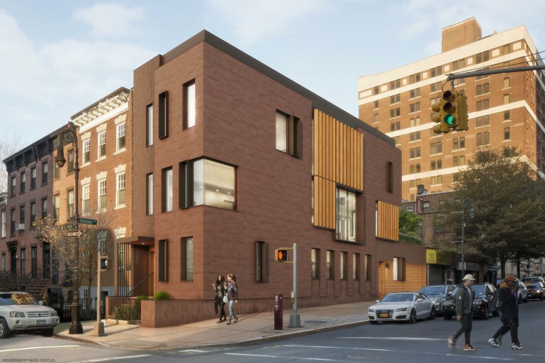
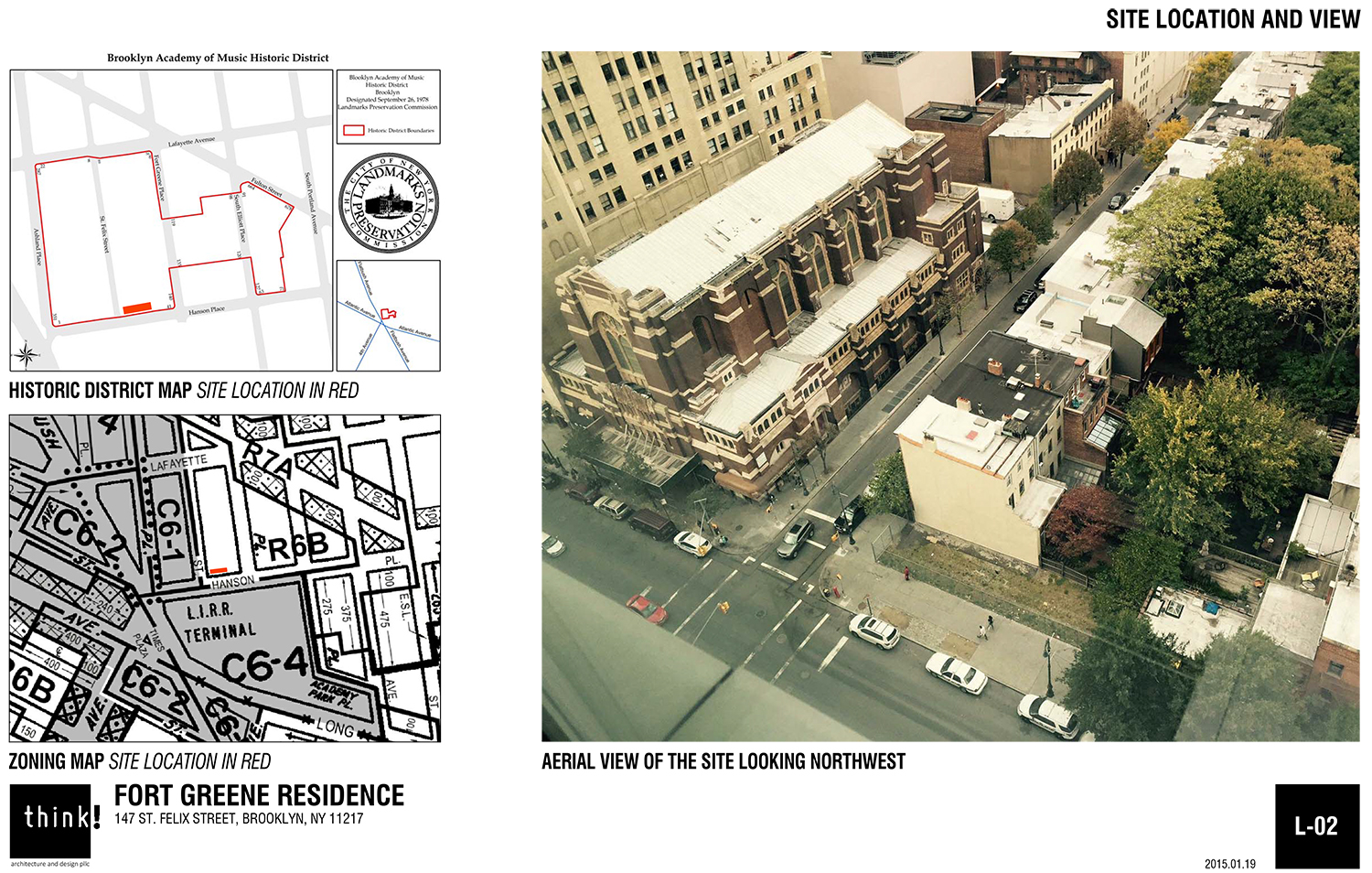
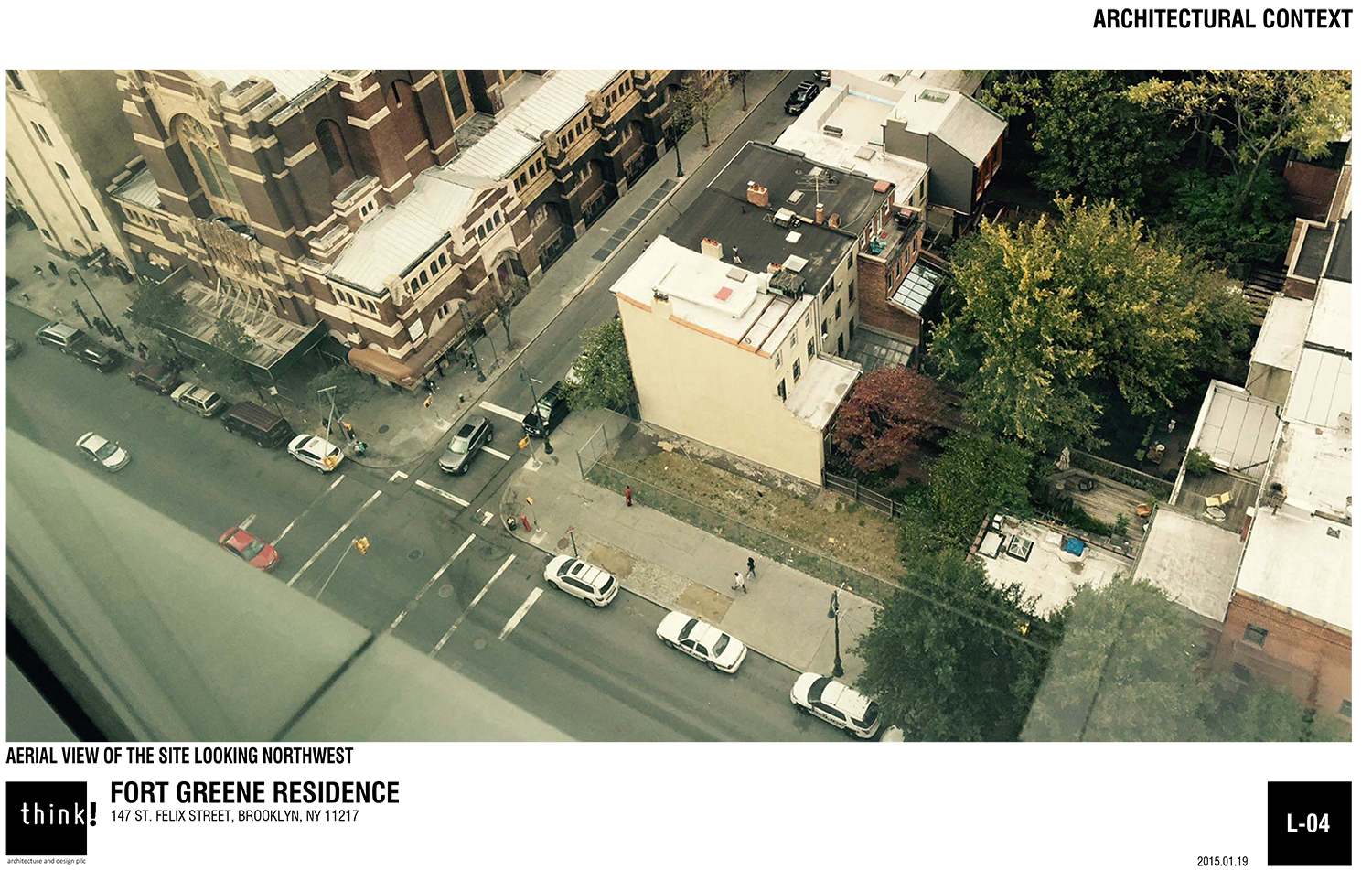
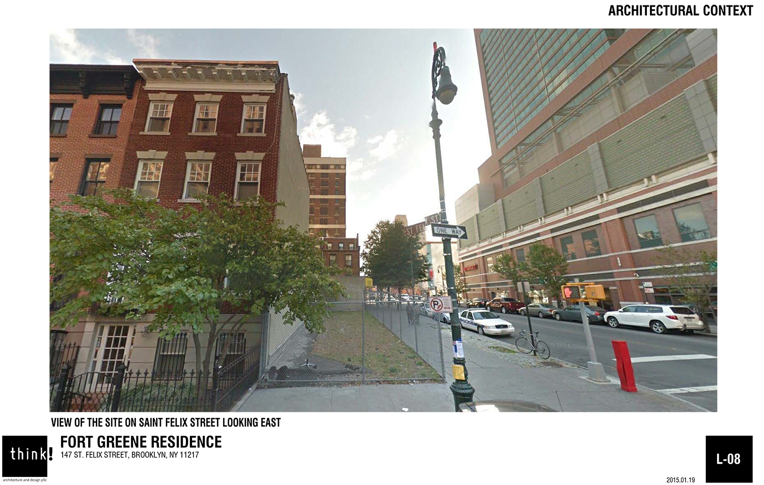
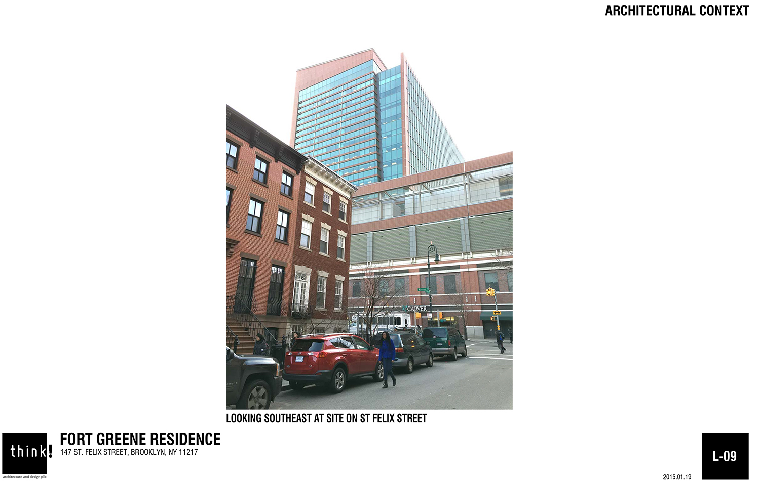
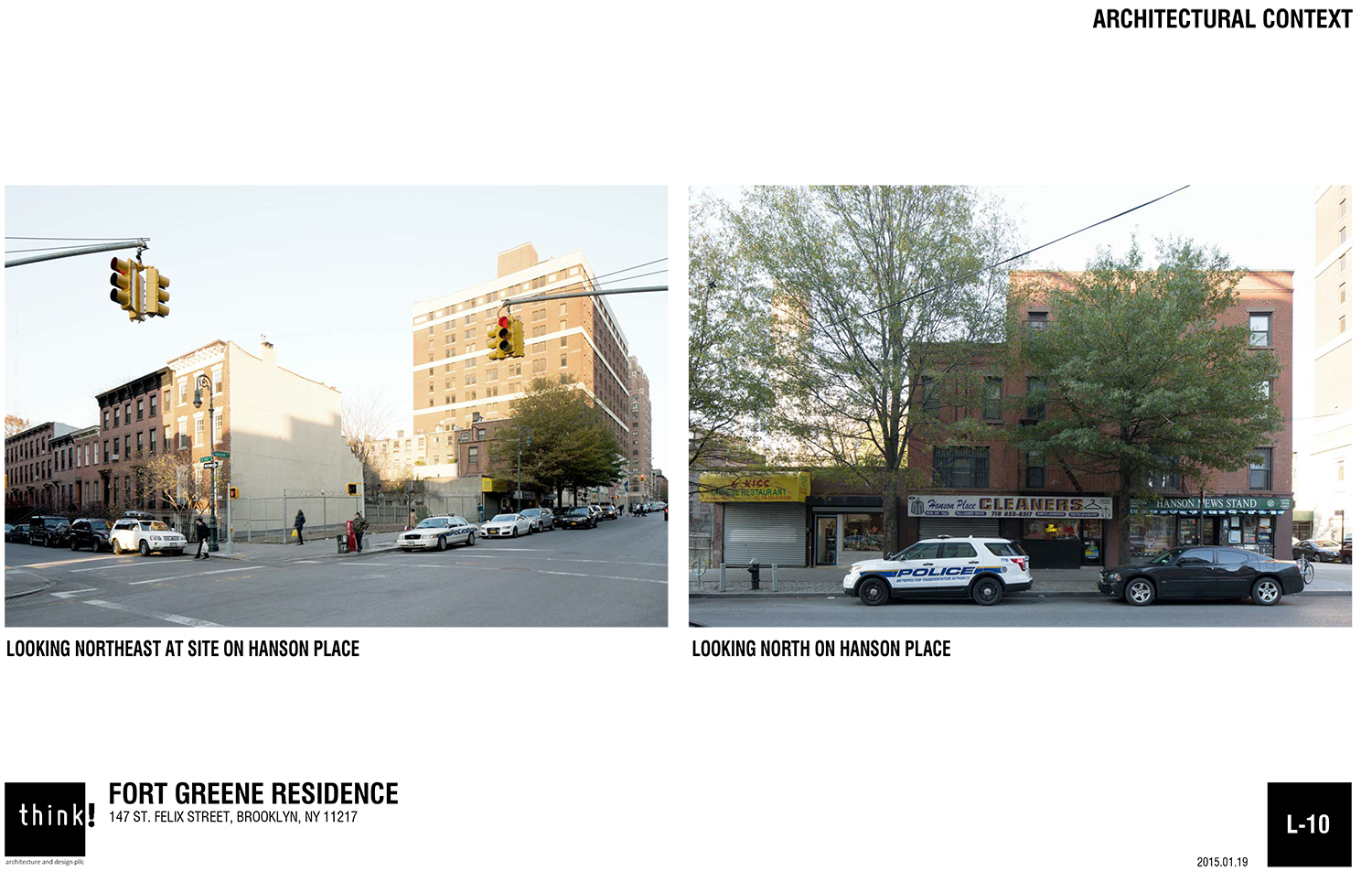
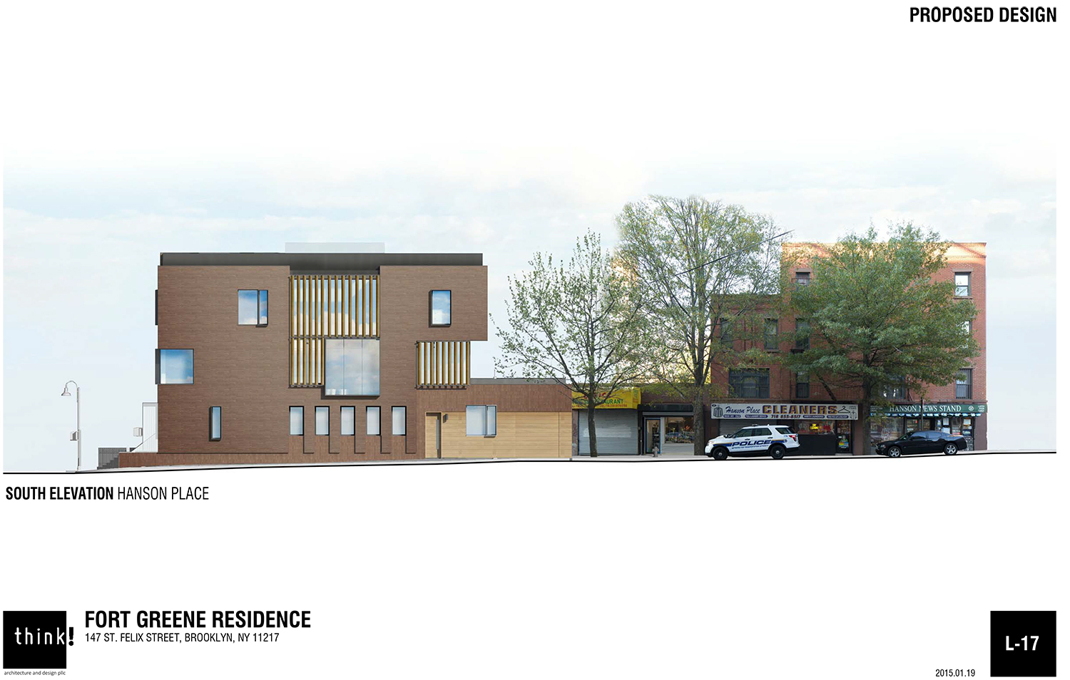
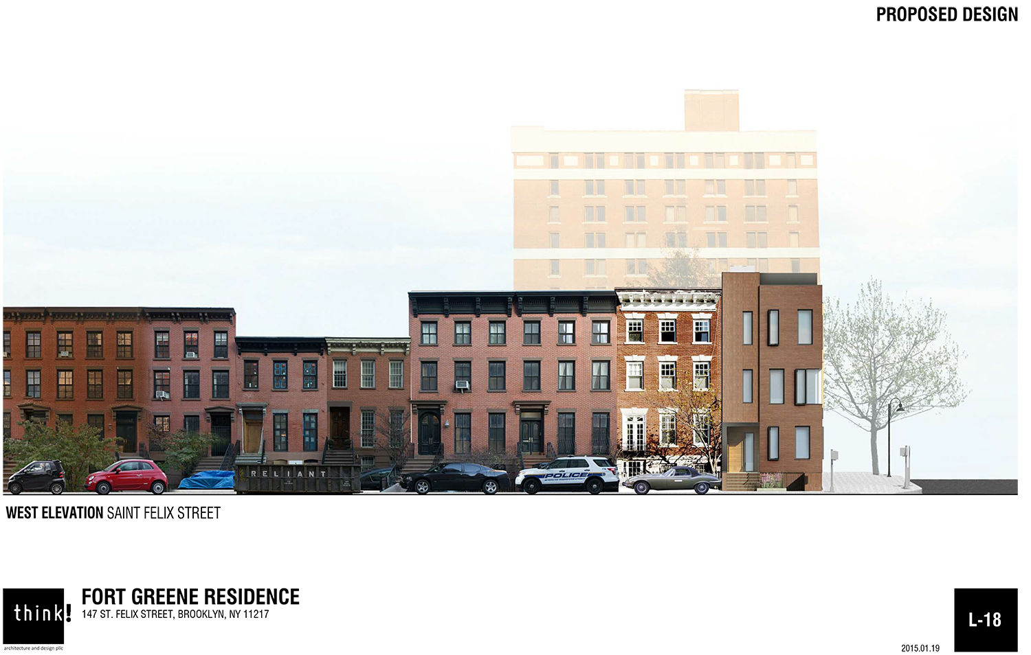
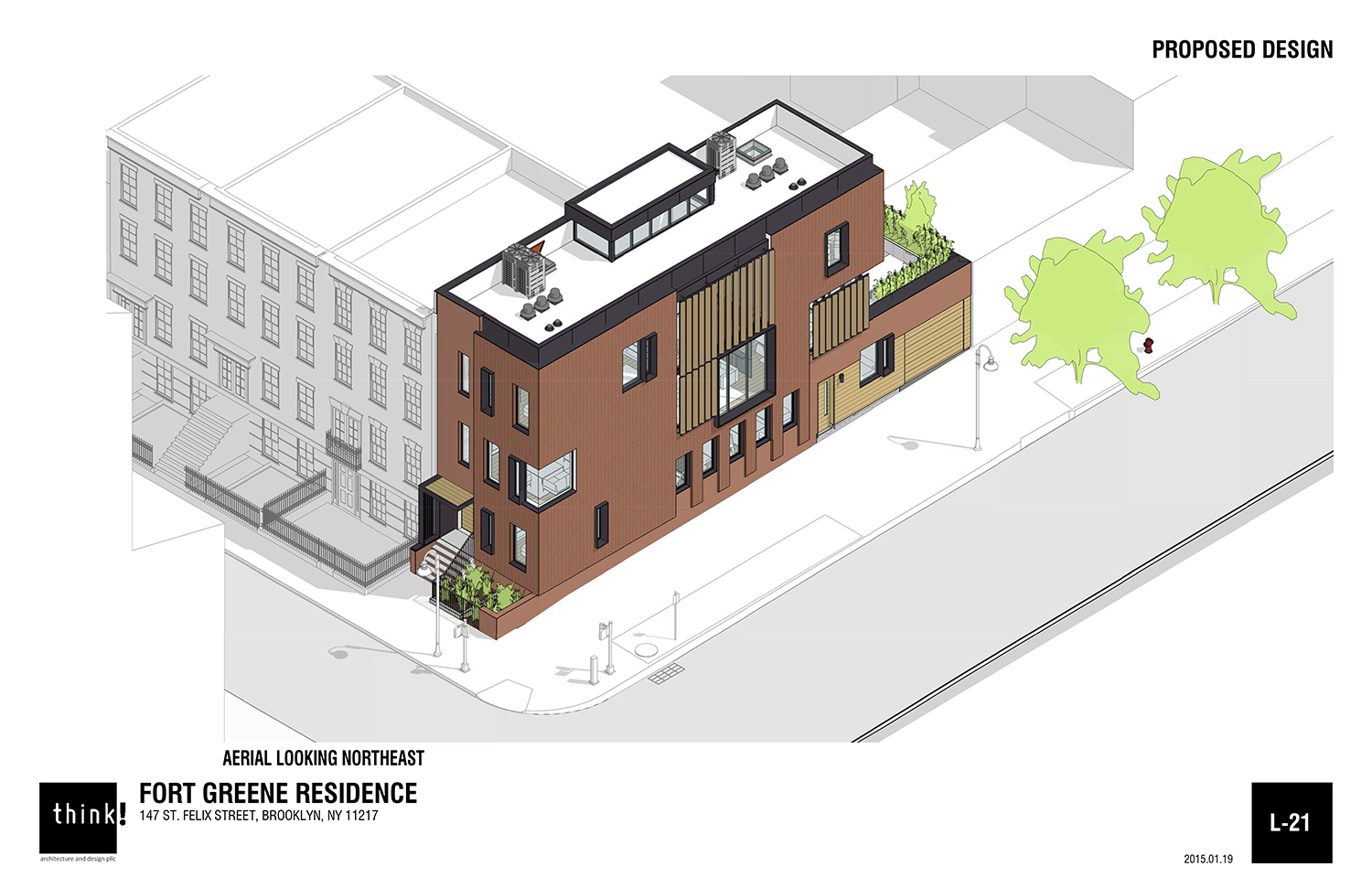
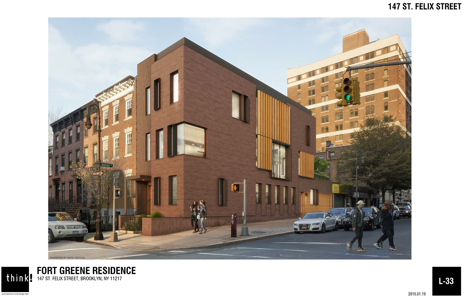
On Tuesday, the Landmarks Preservation Commission approved construction of a new two-unit house at the corner of St. Felix Street and Hanson Place in the Brooklyn Academy of Music Historic District. The new construction at 147 St. Felix Street, a lot vacant since 1999, will rise three stories and will hopefully fare better than the site’s two previous occupants.
The design was presented by architect Jack Esterson of Brooklyn-based think! architecture and design pllc. “[I’m] very very excited to be here,” he said of his chance to tackle this “really transitional opportunity.”
Esterson noted that one occupant of the site collapsed in 1917, due to subway construction below. Then a water main broke in the 1990s and the replacement building had to be torn down.
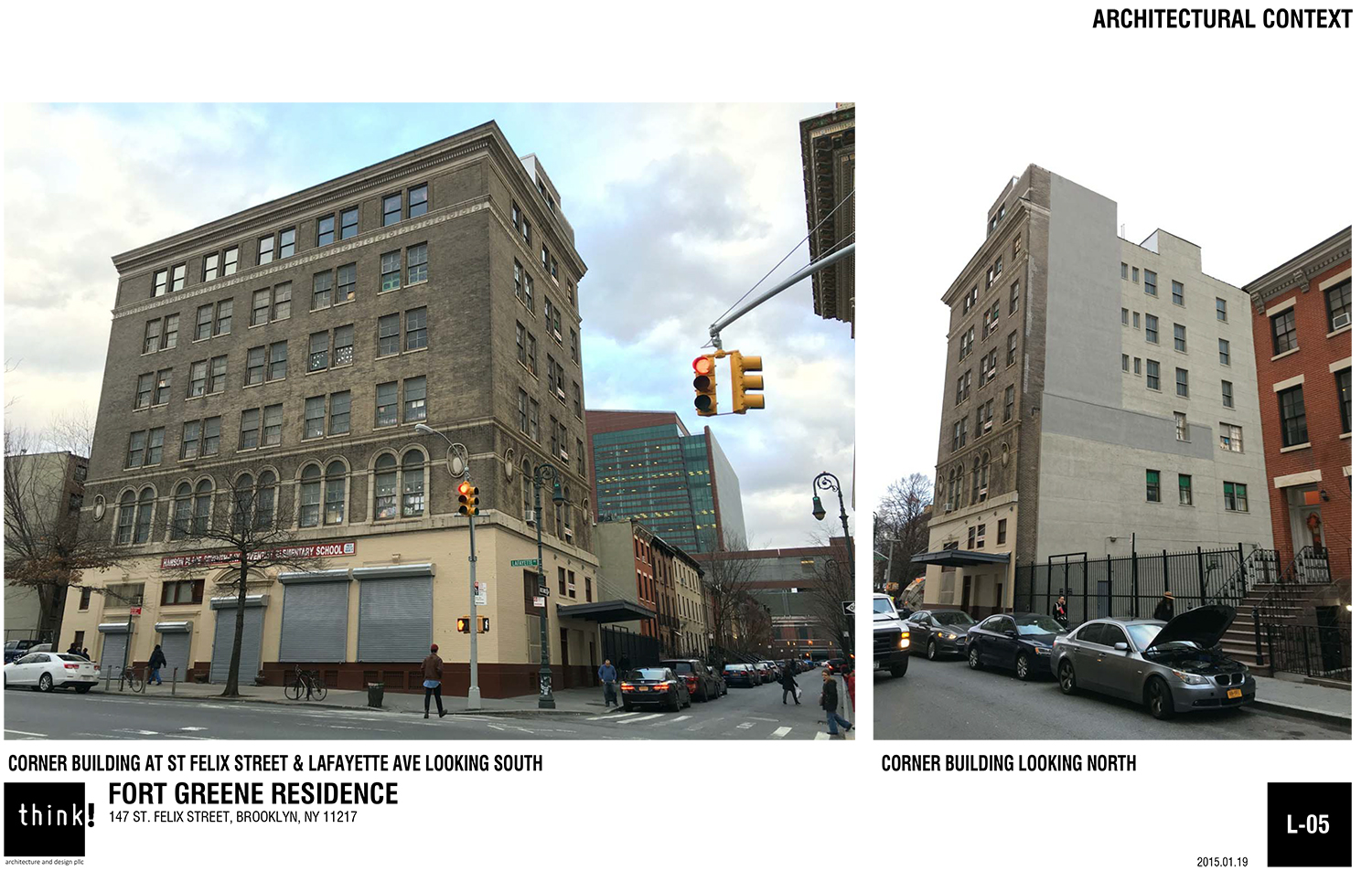
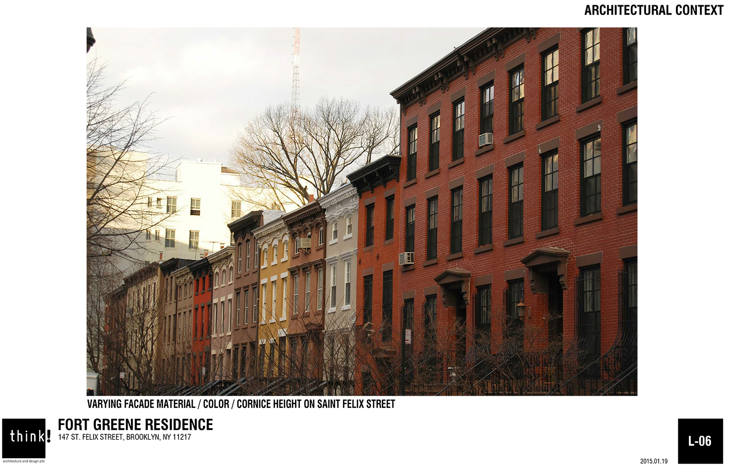
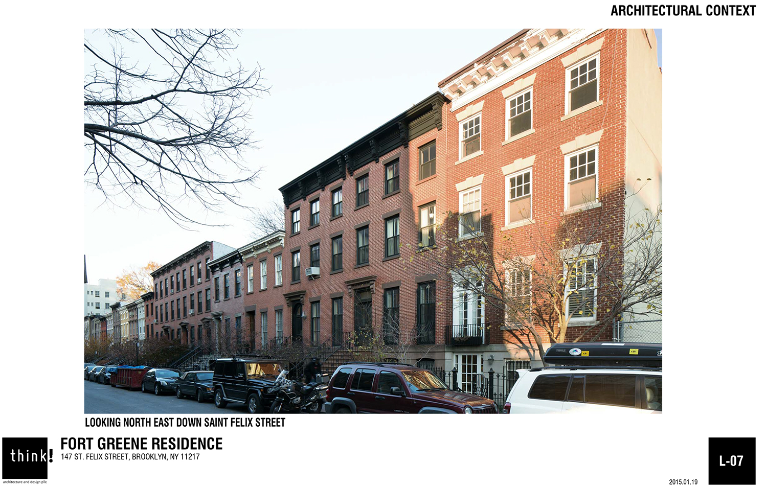
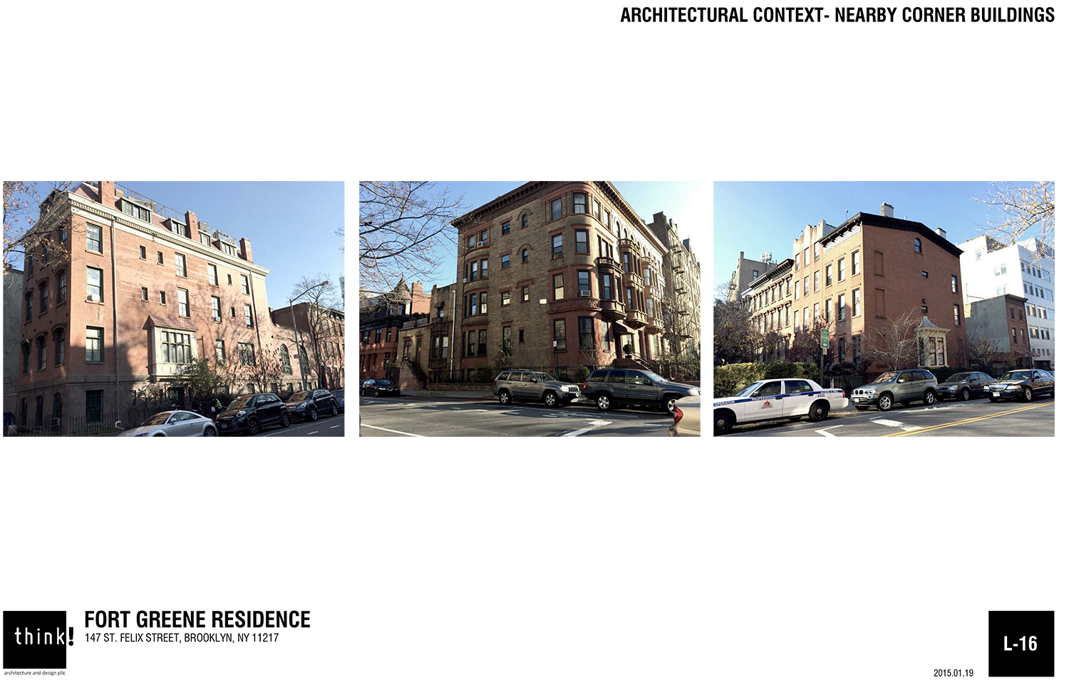
In defending his proposal, Esterson noted that corner houses in the area tend to fill their lots and be a bit taller than their neighbors. He said his design is “of its time, but also very sympathetic [to the neighborhood].”
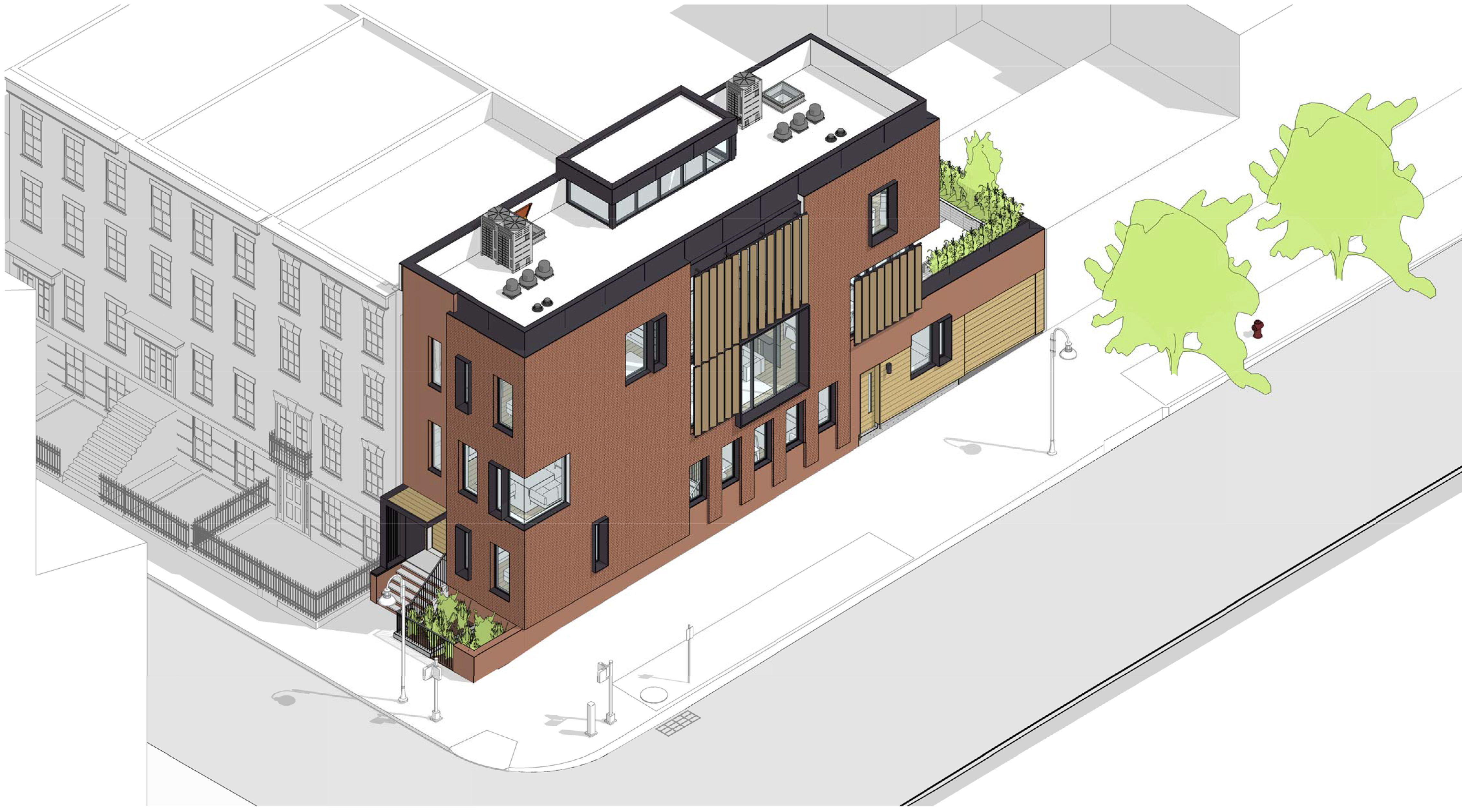
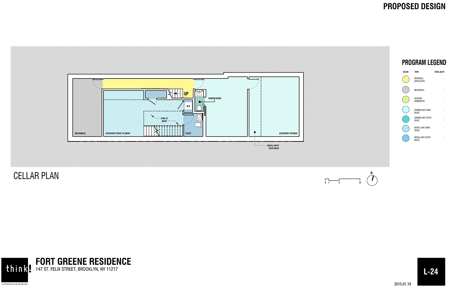
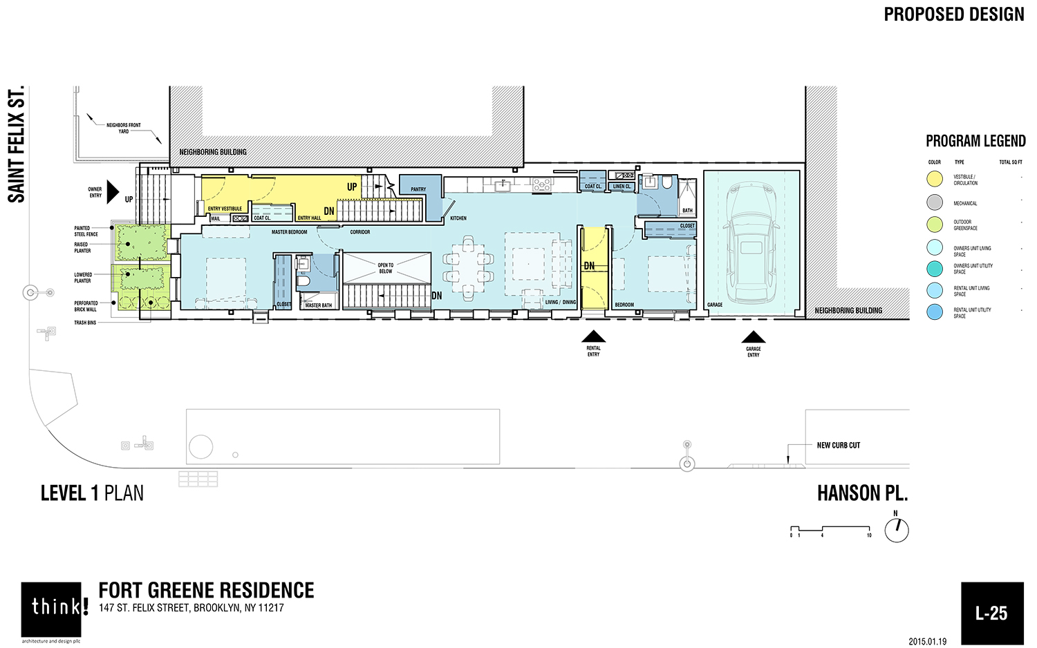
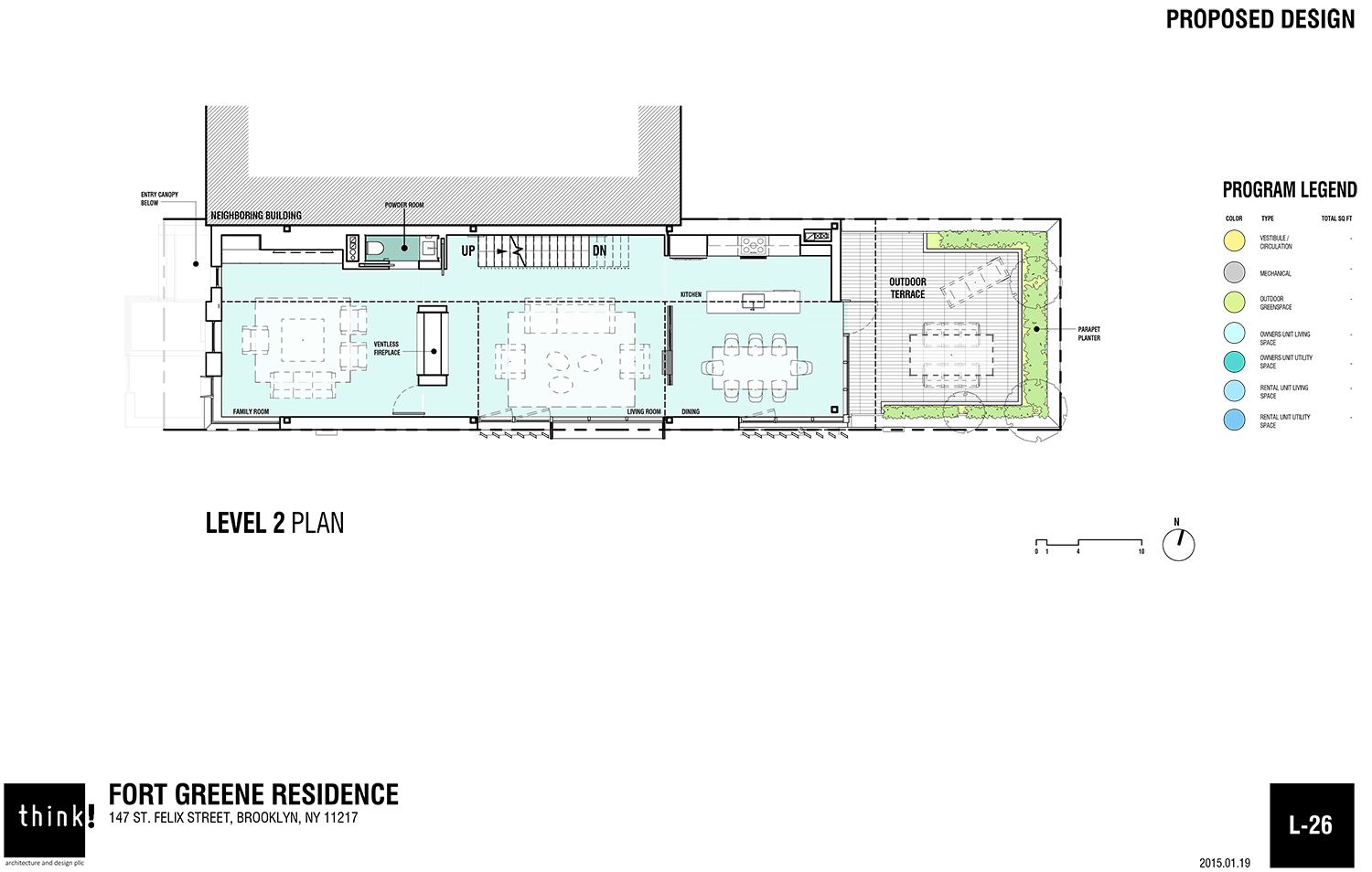
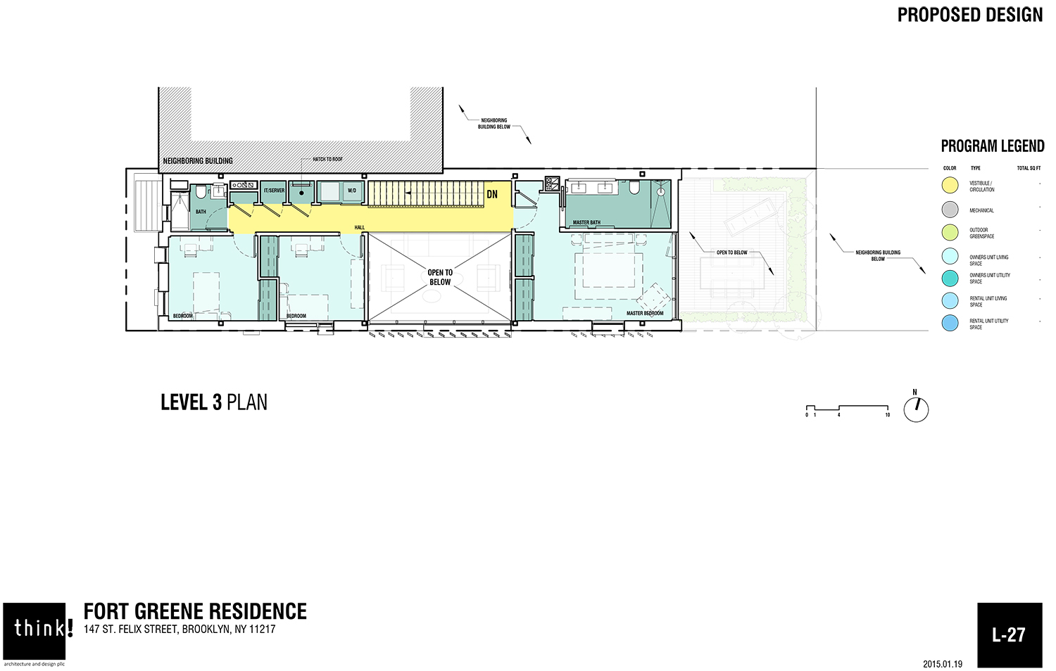
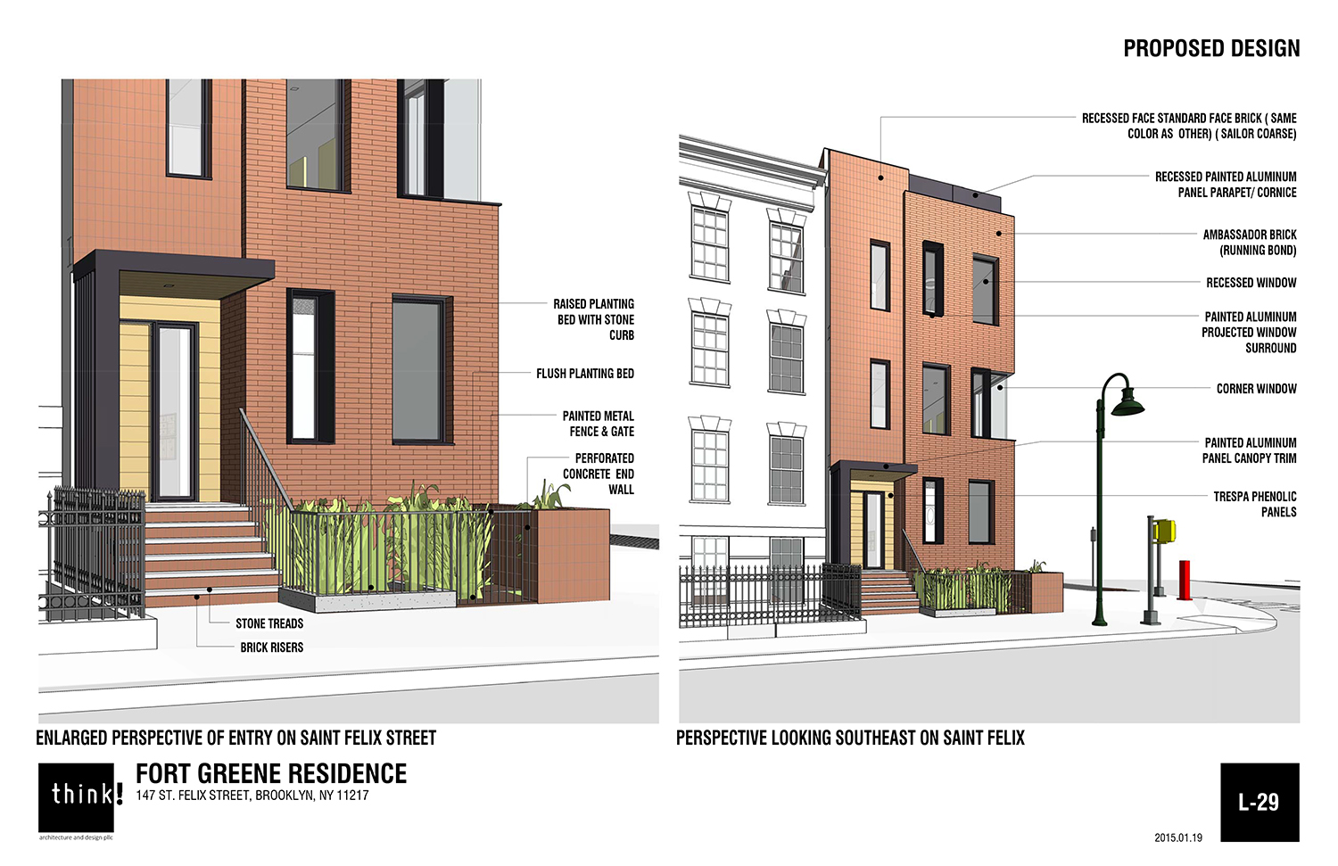
The layout of the building is a three-bedroom owner’s duplex over a two-bedroom rental unit. The owner’s entry is on St. Felix Street, while the rental entry is on Hanson Place, next to the single-car garage. The second and third floors won’t take up the entire lot, and the second floor will access a terrace over the garage.
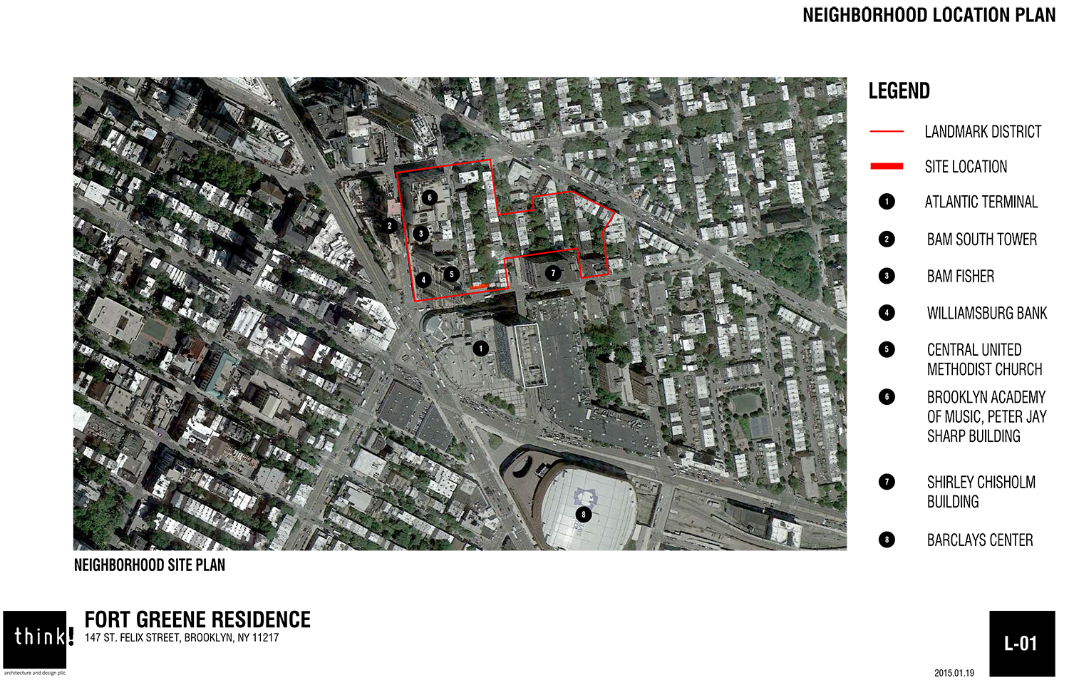
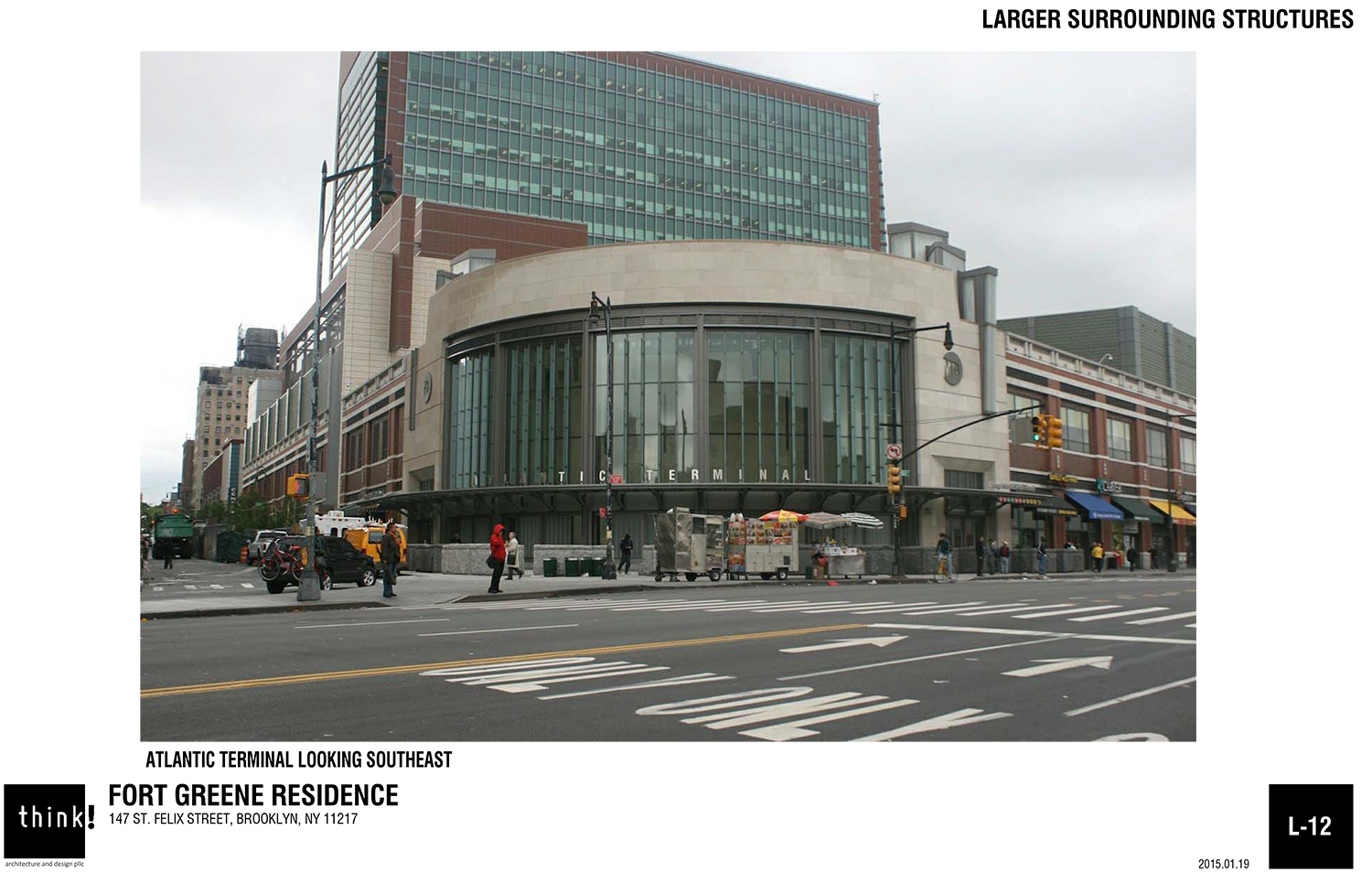
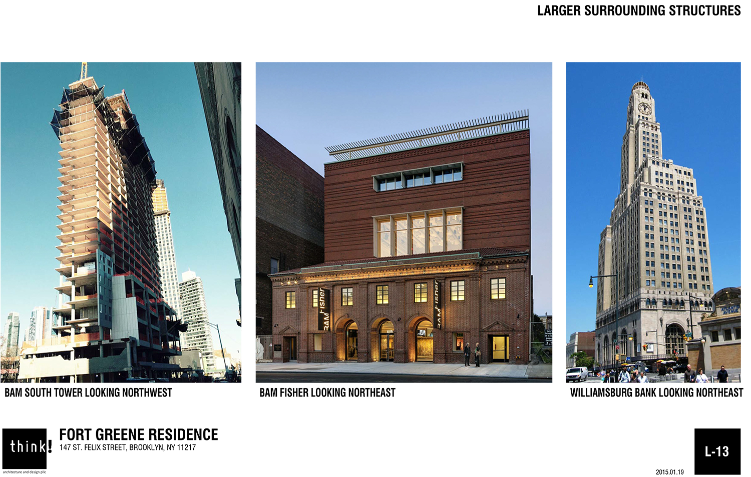
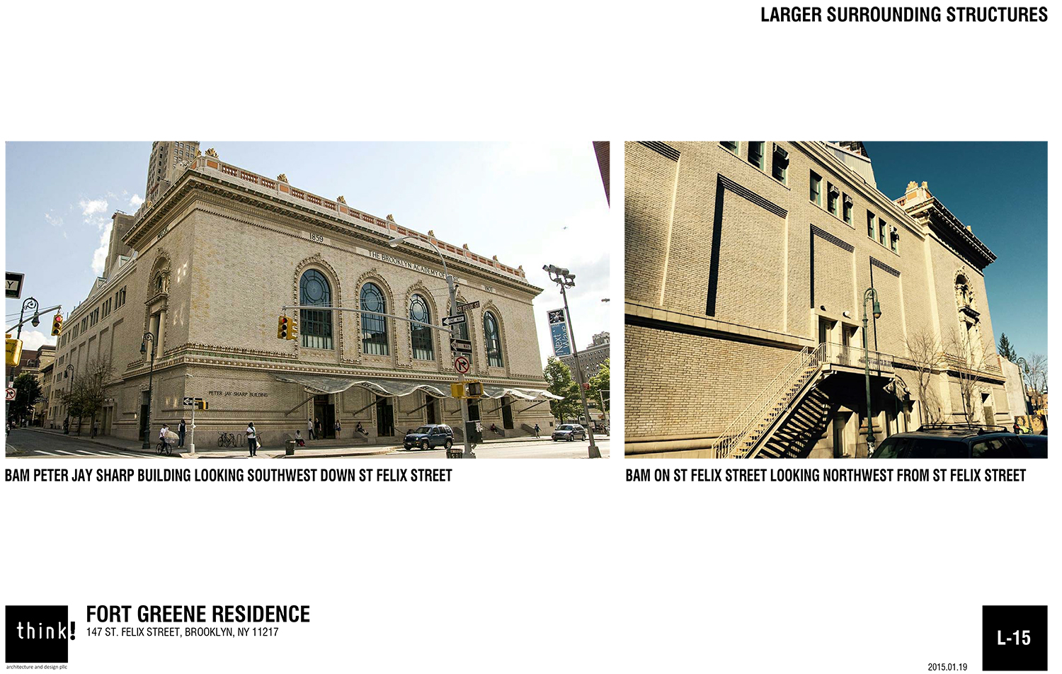
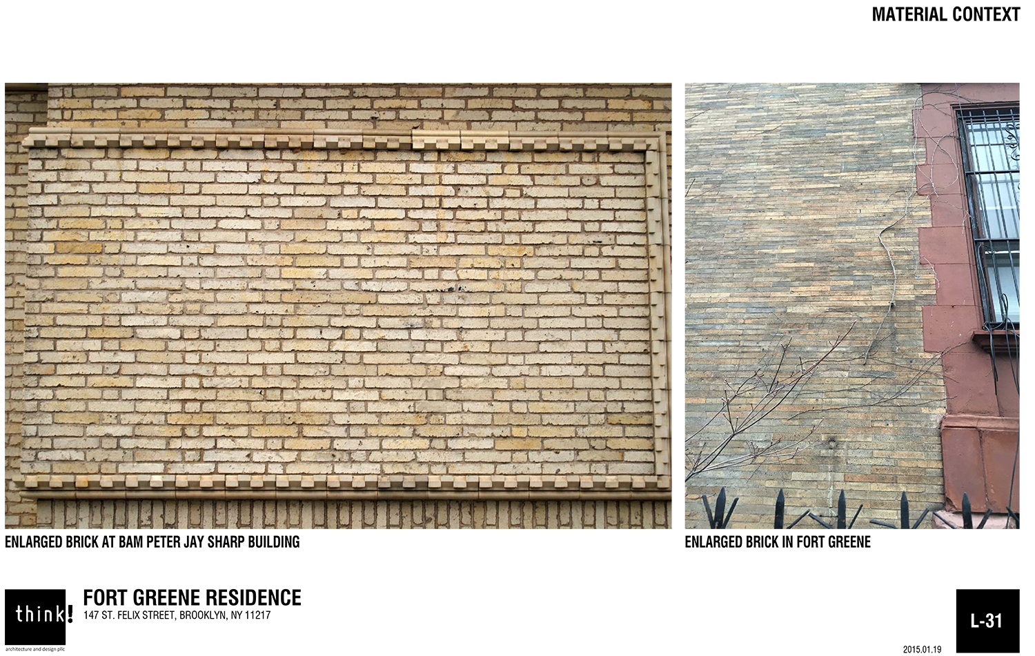
The essentials of daily living and commuting are close by, with the Atlantic Terminal right across the street. The BAM Peter Jay Sharp Building is around the corner and Barclays Center is around the corner in the opposite direction.
LPC Chair Meeankshi Srinivasan said the presentation was “quite compelling” and the area lends itself to a certain amount of “whimsy and playfulness.” She said it’s a “very nice building.”
Commissioner Frederick Bland, an architect who lives in Brooklyn Heights, called the proposal “extraordinarily successful,” noting that the edges of historic districts don’t just relate to the district, but to that which is over the border outside it. He said it is the “most successful townhouse riff” he’s seen in his time on the commission.
“Thank goodness it’s you and it wasn’t Frank Gehry,” Commissioner Michael Devonshire said to Esterson. “Thank you for an exciting, contemporary design.”
“Completely appropriate,” said Commissioner Diana Chapin. “Nice Stuff.” Commissioner Wellington Chen said the design was “logical.”
A representative of the Brooklyn Academy of Music testified in support of the project. Kelly Carroll of the Historic Districts Council supported filling the lot, but had some issues with the design.
“HDC appreciates the applicant’s considered design for the new building, which will finally complete this row of lovely homes. This corner site allows for the design of two facades, and HDC asks that the primary façade be brought into plane with the neighboring houses,” Carroll said. “There are a number of stylistic choices happening at once, including projections, recessions, crenellation, differing window sizes, and materials. If fewer of these design moves are featured, it would clean up an extremely busy primary and secondary façade. Further, the design references much of the new construction happening in this vicinity, when inspiration should be referenced from within the Brooklyn Academy of Music Historic District. Since this is such a tiny district cocooned from so much change around it, it should be aesthetically apparent as to whether this corner lot is a part of the district. This current iteration, at first blush, appears to have been carved out of the district.”
In the end, the commission approved the application without modification.
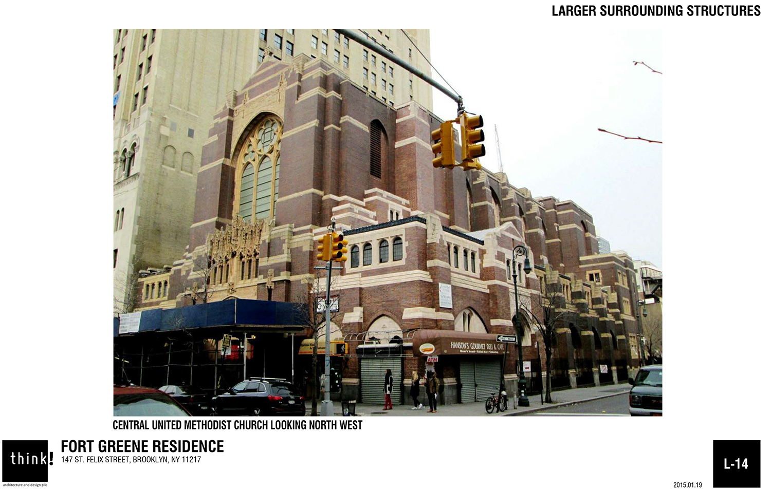
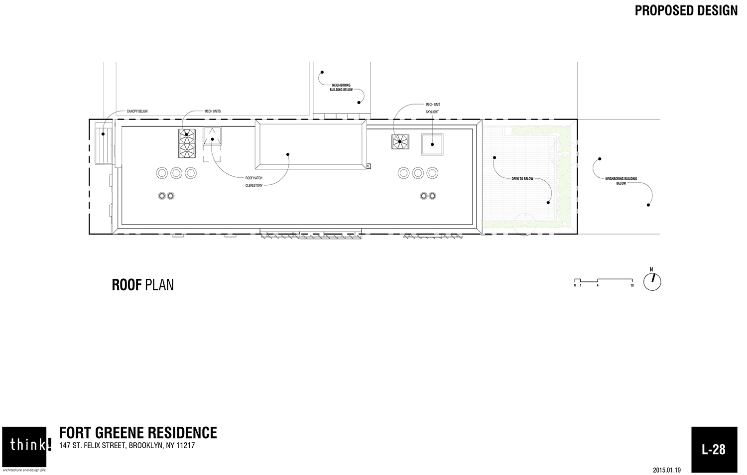
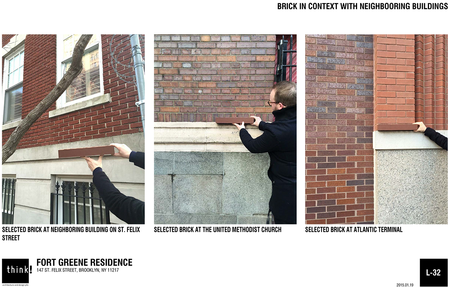
View the full presentation slides below.
Subscribe to YIMBY’s daily e-mail
Follow YIMBYgram for real-time photo updates
Like YIMBY on Facebook
Follow YIMBY’s Twitter for the latest in YIMBYnews













After ALL that and THIS gets approved? Is everyone blind? Magnificent architecture surrounds this site and this soulless nonsense gets the thumbs up? How does this boxy, silly bore get any accolades or worse yet approval by LPC? No one builds beautifully, it’s all a race to the ugly bottom.
Evelyn, what firm do you work for? In 50 words or less, your design approach to this site would have been what? Thanks, Reg.
LPC loved it, Evelyn: http://www.citylandnyc.org/23670-2/