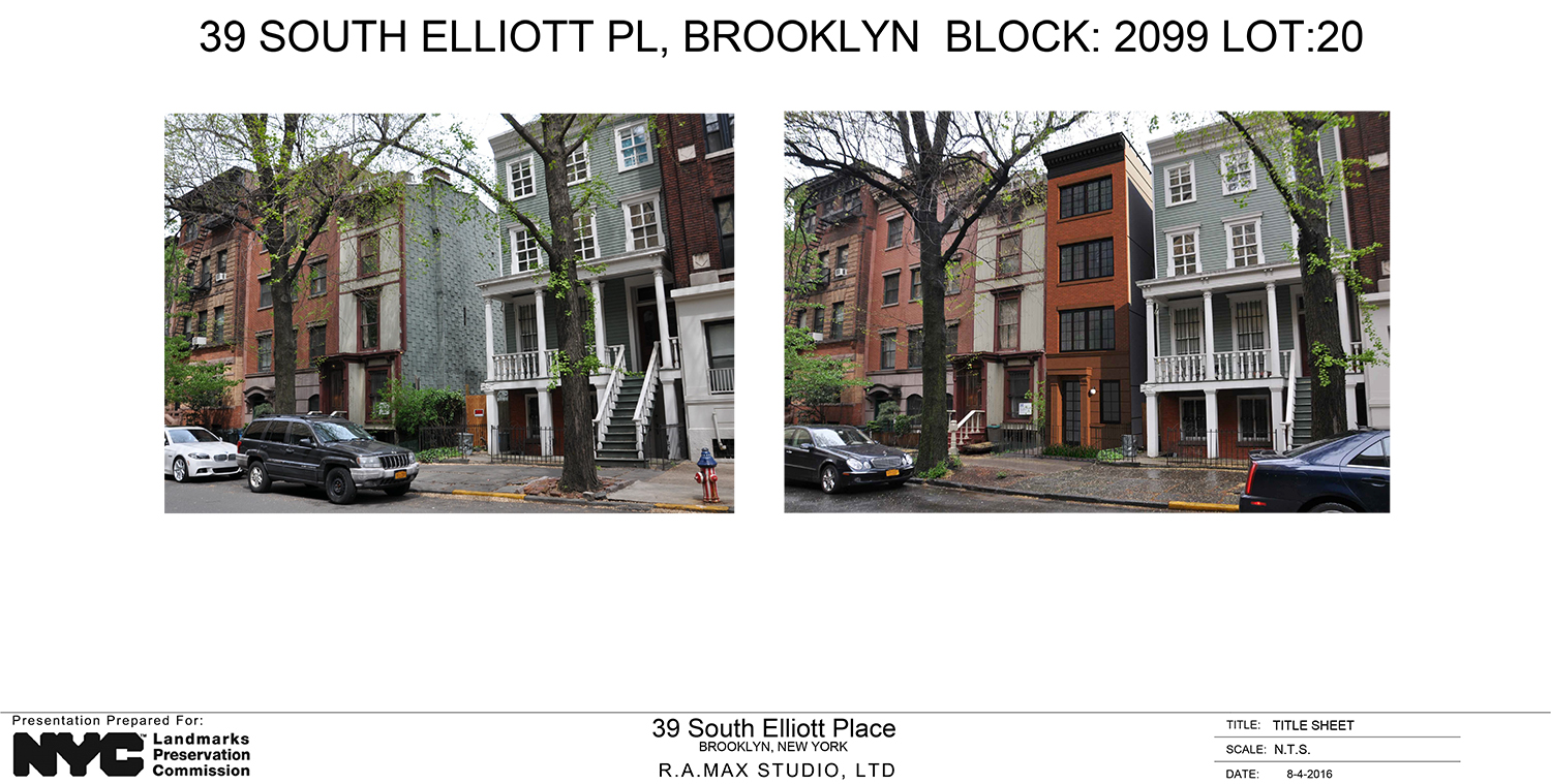
A new two-unit house is on its way to a vacant Brooklyn lot. On Tuesday, the Landmarks Preservation Commission approved the proposal to build such a structure at 39 South Elliott Place. That’s in the Fort Greene Historic District.
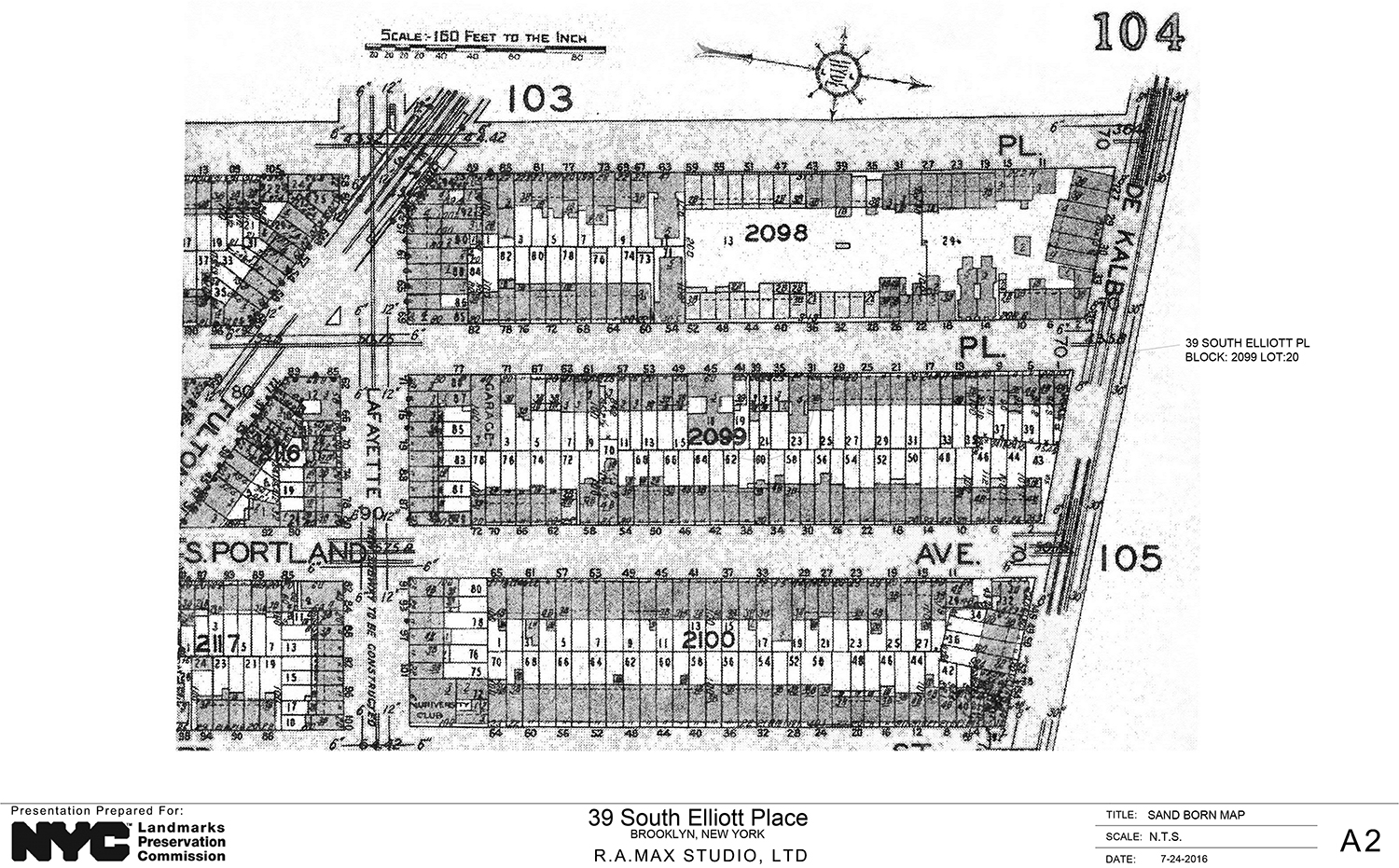
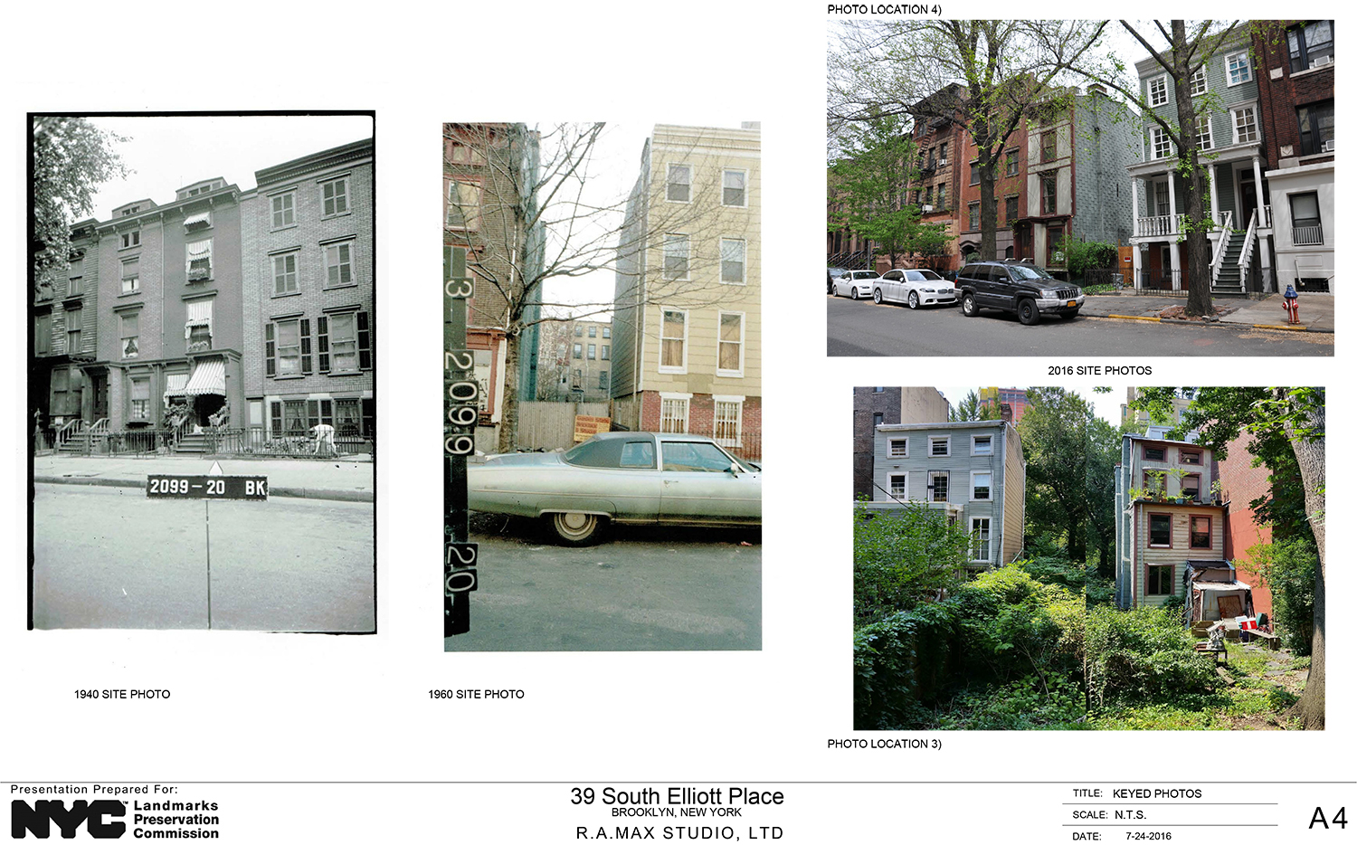
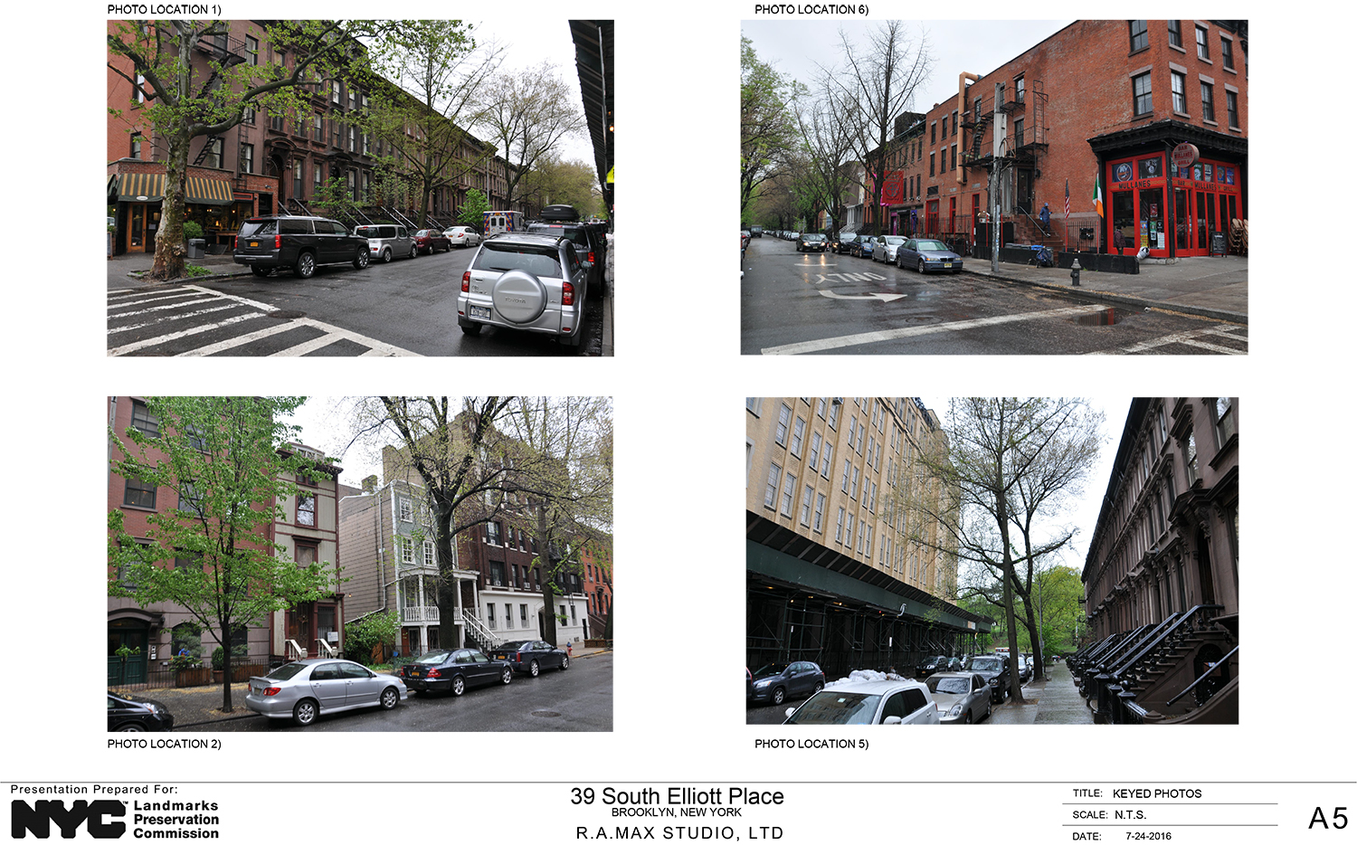
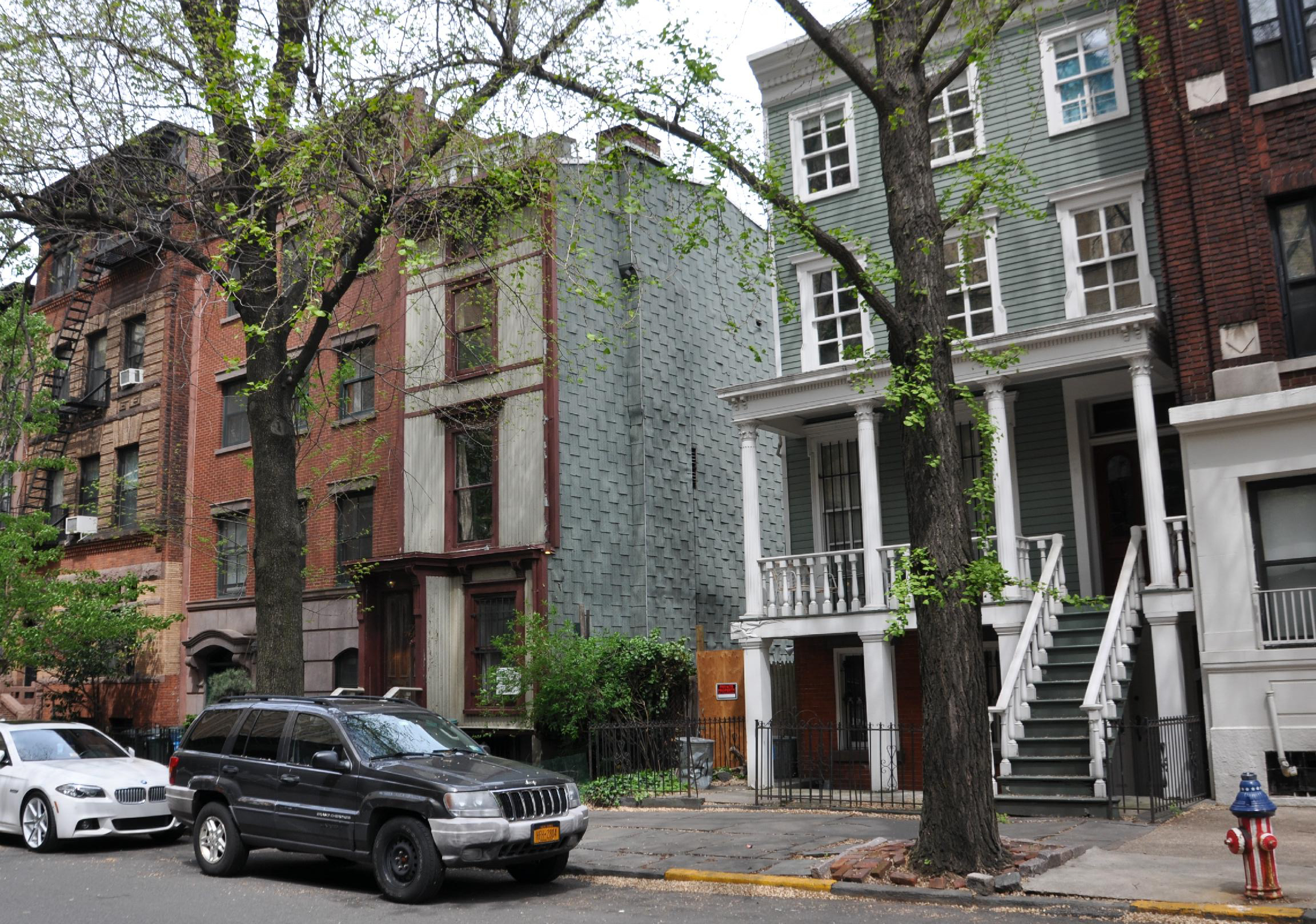
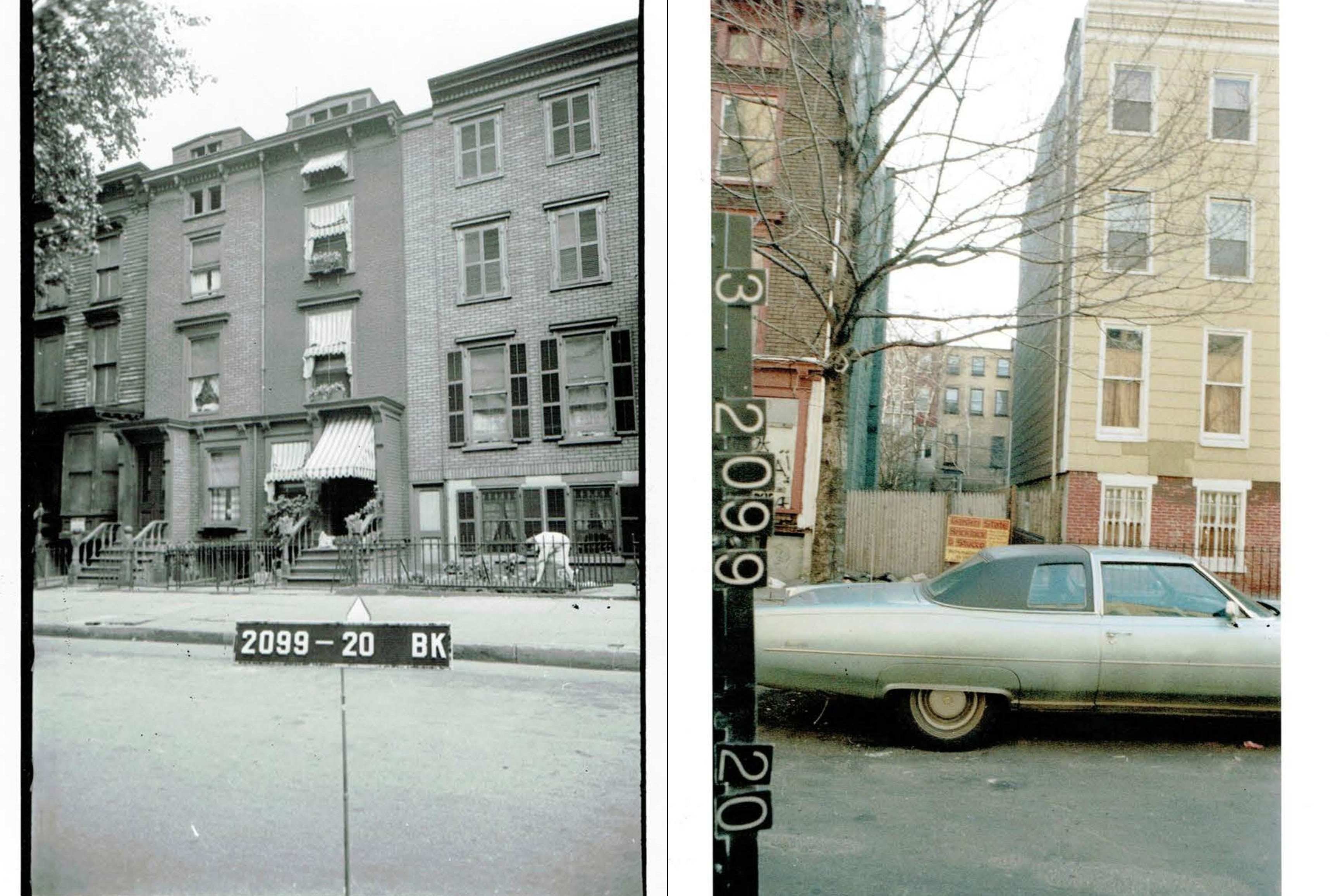
The site between DeKalb and Lafayette Avenues, and has been vacant for over half a century. What was there in 1940 was largely a mirror twin of its neighbor at 37 South Elliott Place, but the site was vacant by 1960.
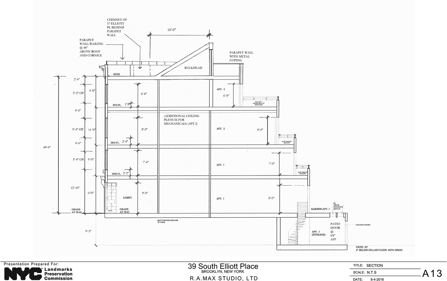
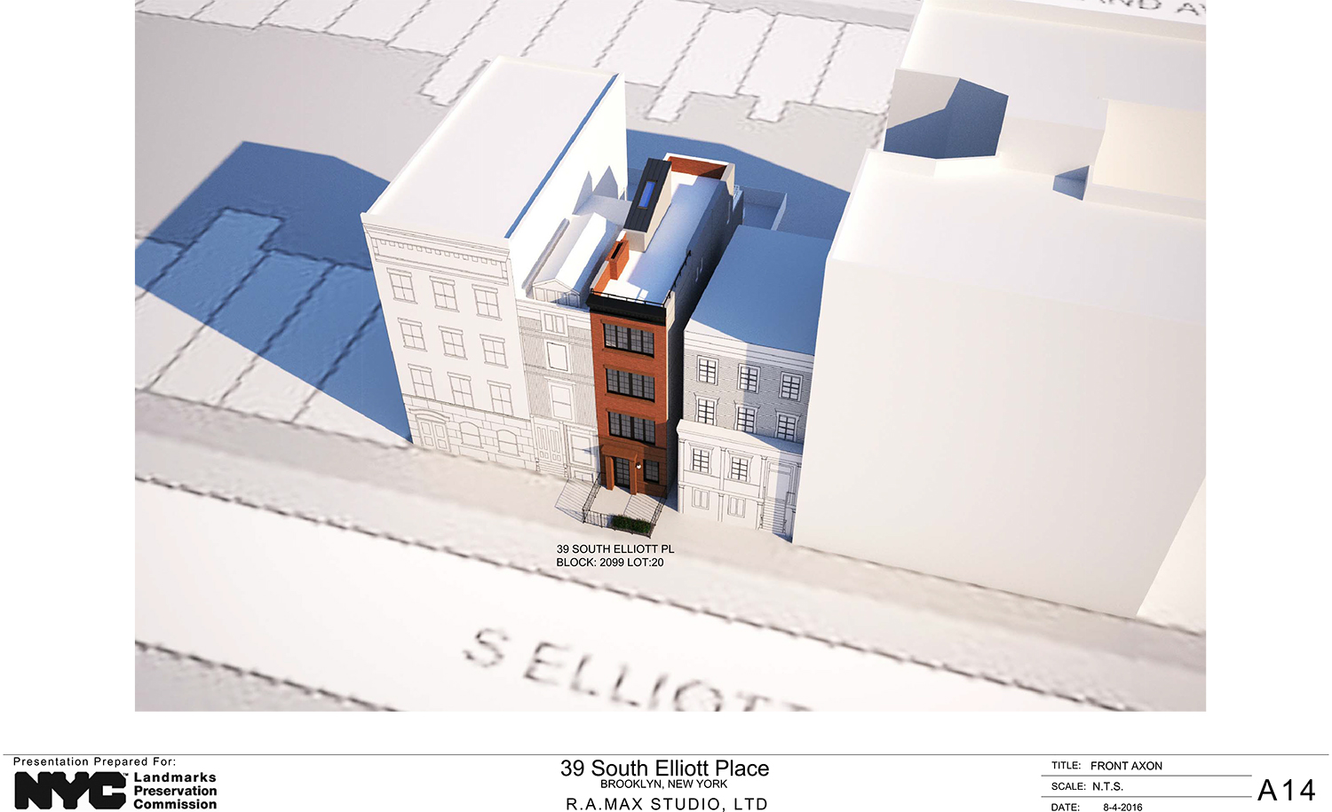
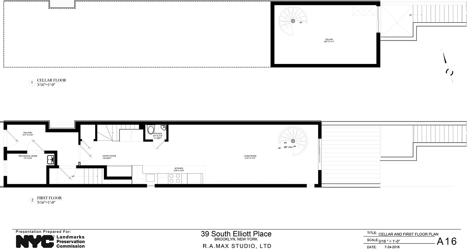
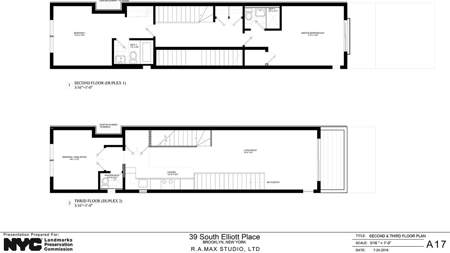
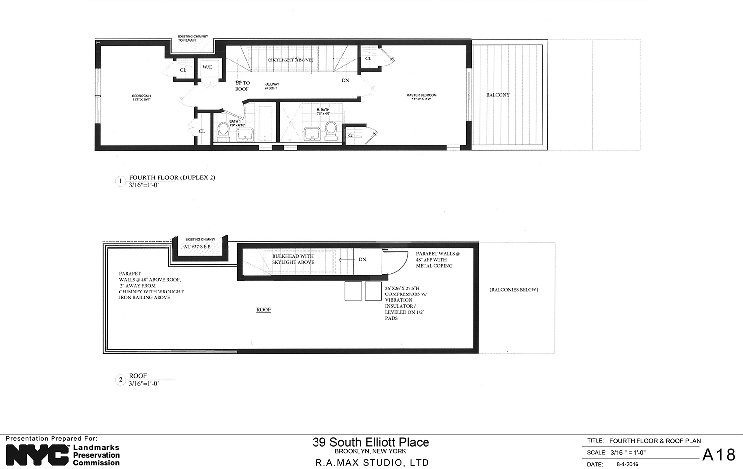
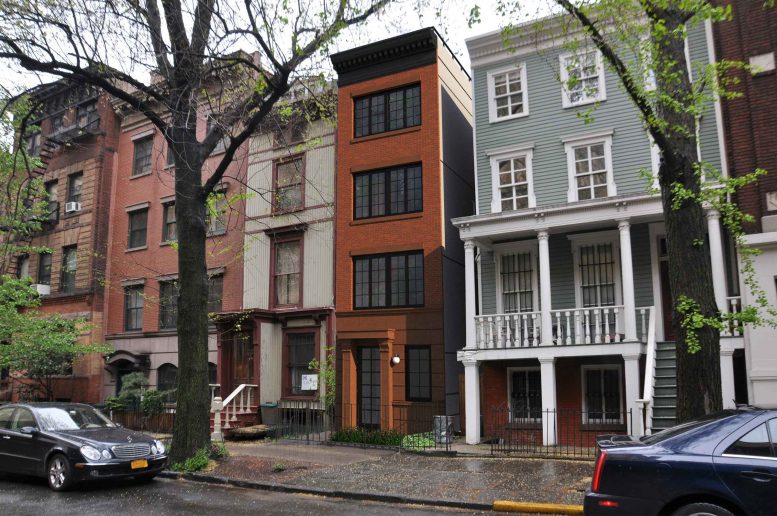
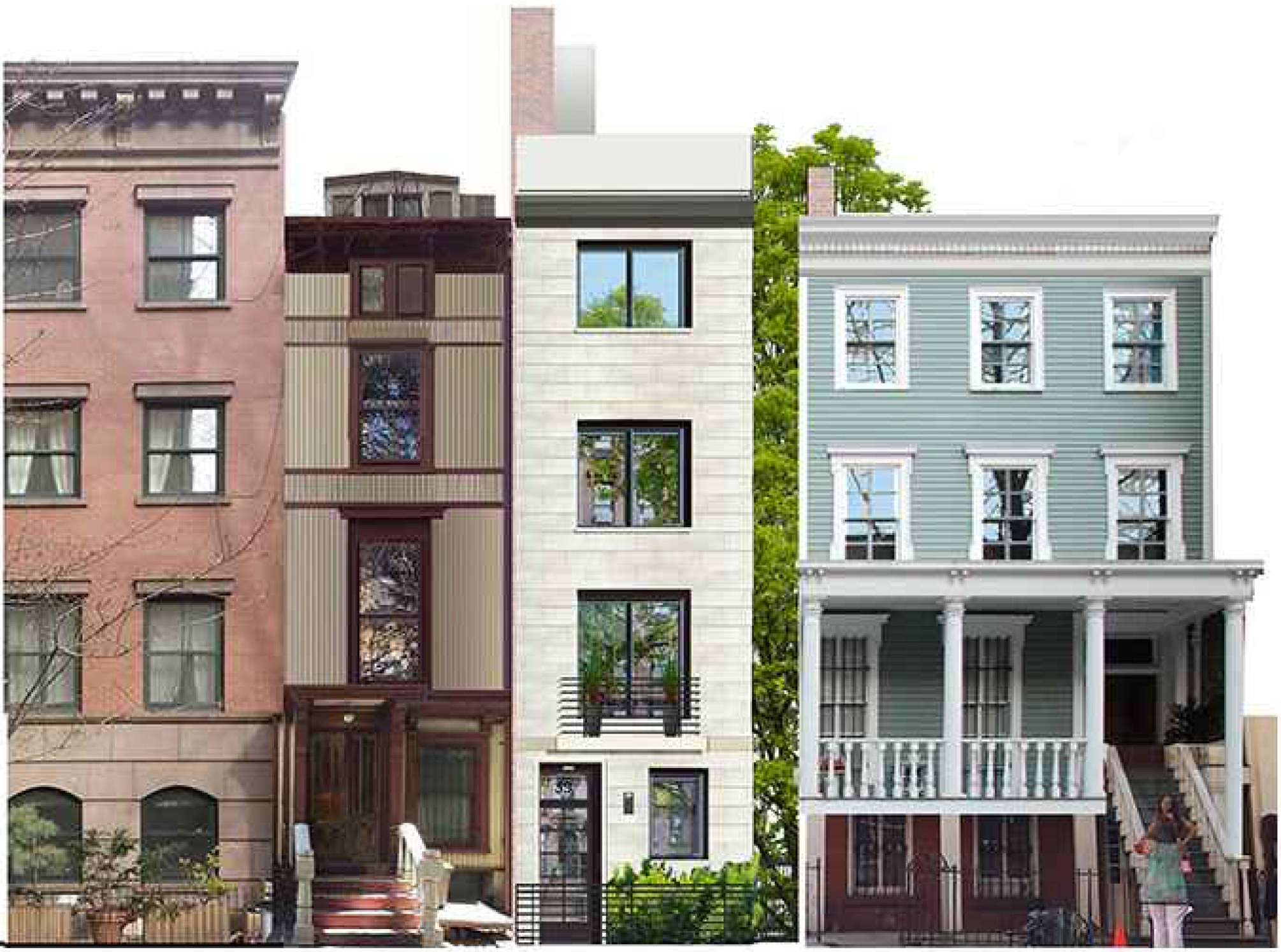
Now, the plan is for a four-story, two-unit residential building. It is being designed by Ana Eskreis of Manhattan-based R.A. Max Studio, LTD. Both units will be duplexes, with the lower one having two bedrooms and the upper one having room for three bedrooms.
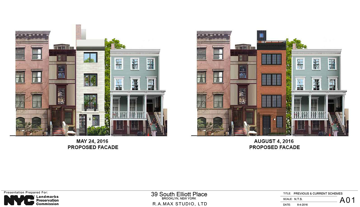
Those pieces of the plan are unchanged from when it was presented to the LPC in May. However, the way it will be executed is dramatically different from that proposal, to the delight of commissioners.
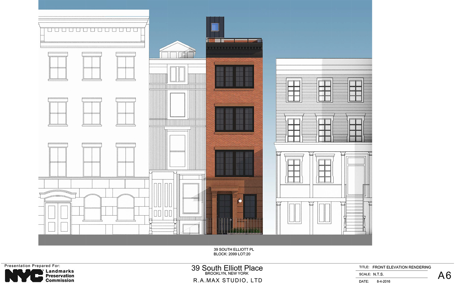
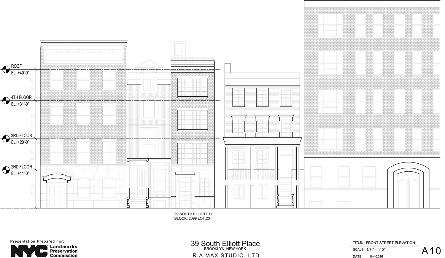
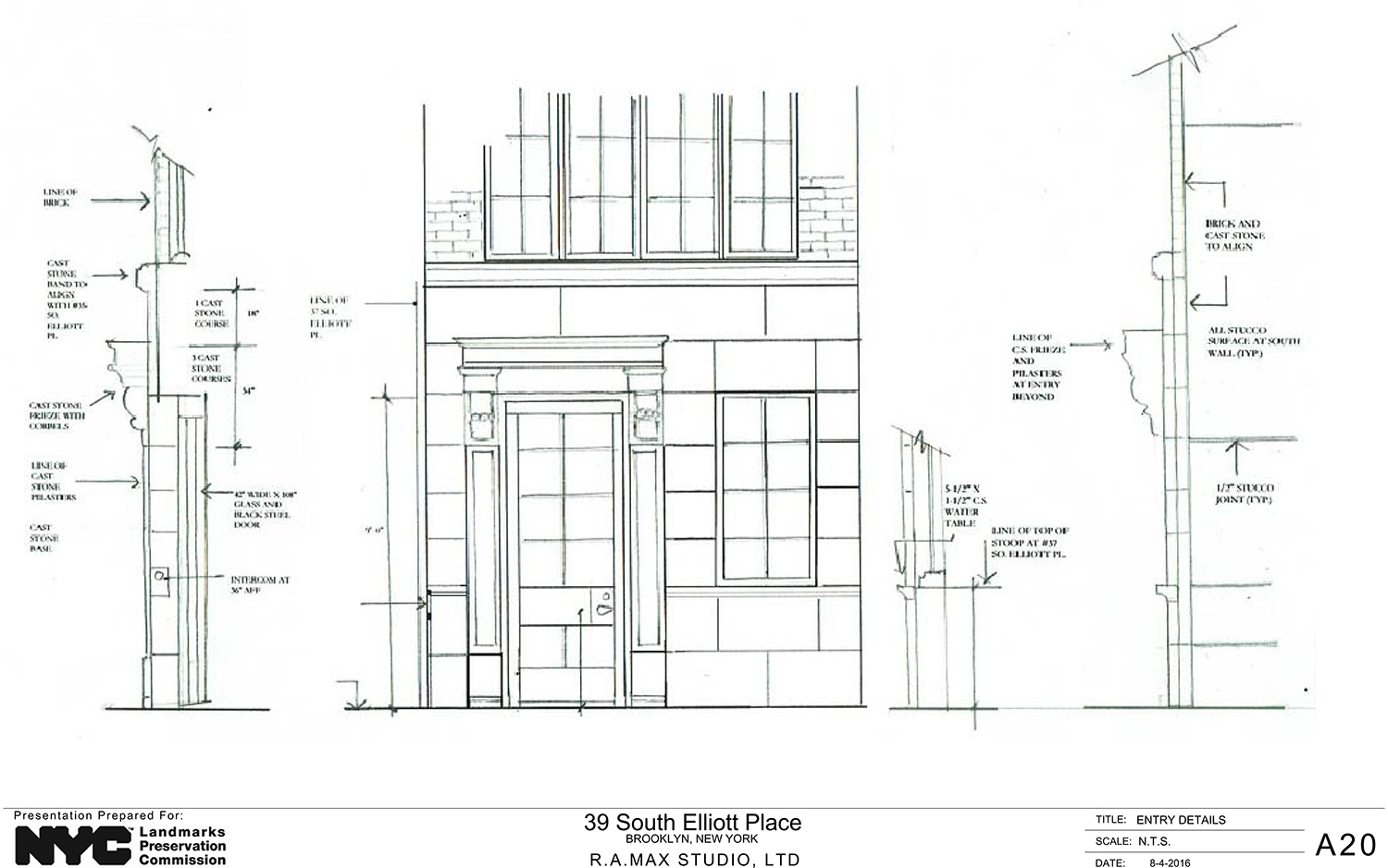
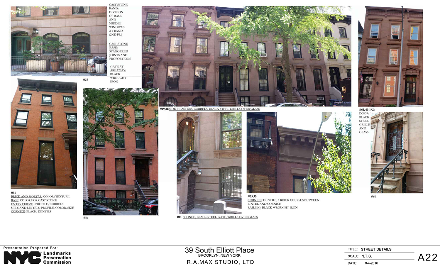
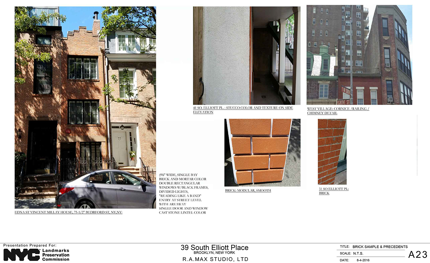
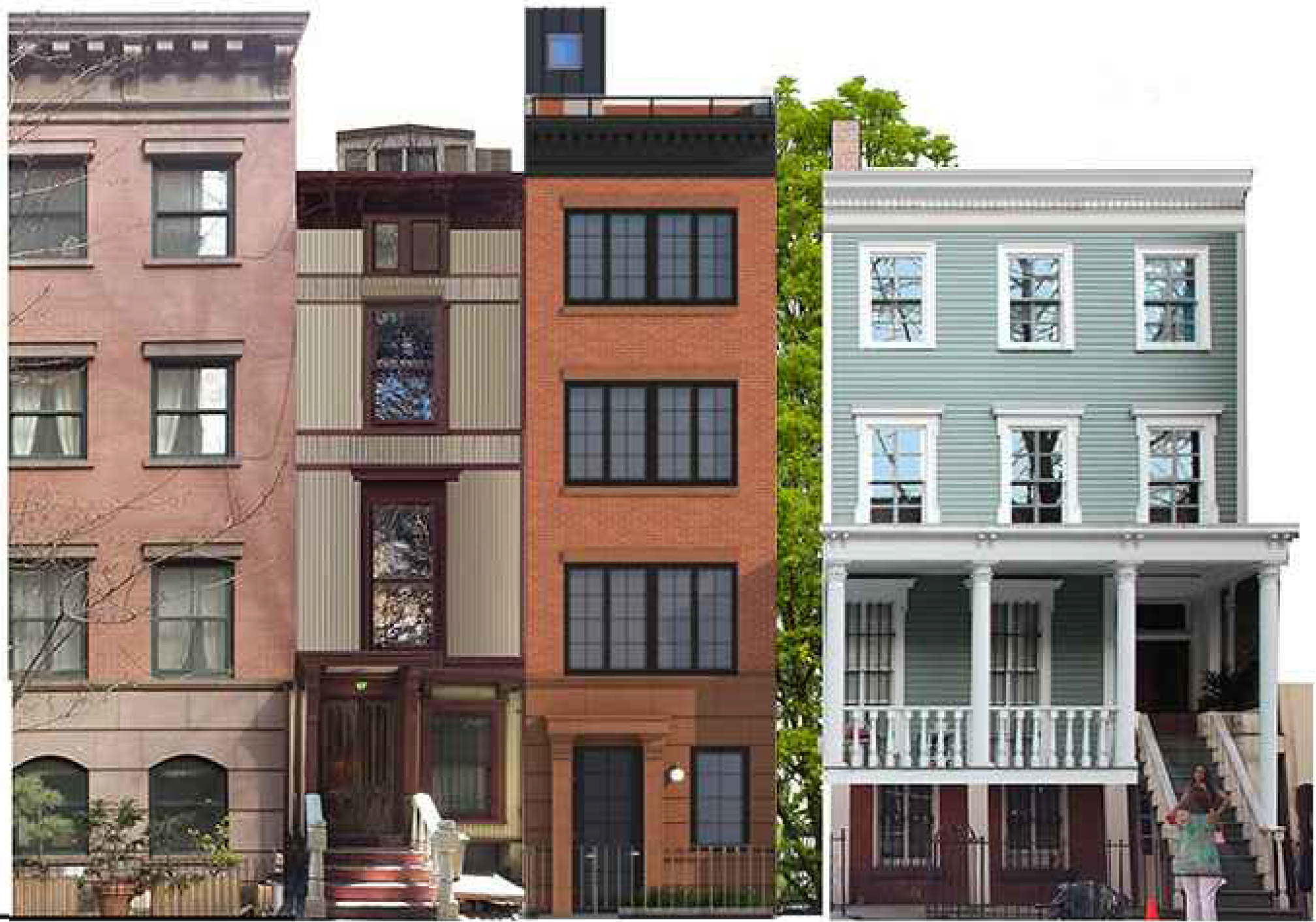
The previous proposal had the front façade done in limestone, which Eskreis called a “versatile material,” but it was both contextually inappropriate and, according to Commissioner Michael Devonshire, could present maintenance problems. Now, the front façade will be done in brick with some cast-stone. The front door will be metal, a piece of information revealed when Commissioner Diana Chapin asked for it.
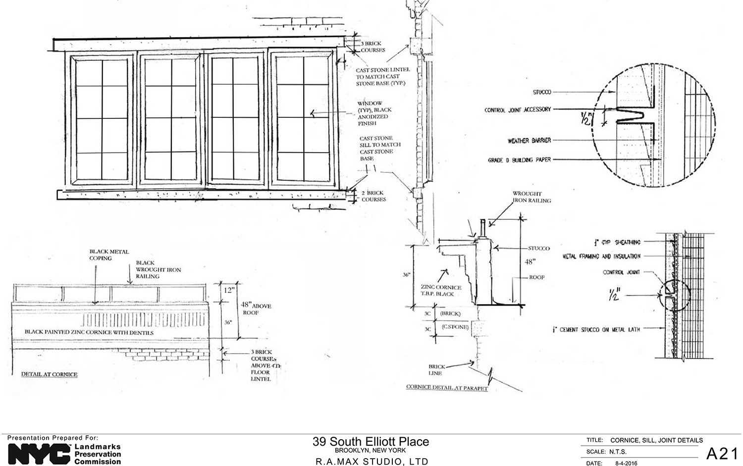
In the previous proposal, the windows were also far uniform. Each of the upper floors’ front fenestrations were of a different size and the second floor appeared to have a Juliet balcony. Now, all three of the upper floors have the same windows.
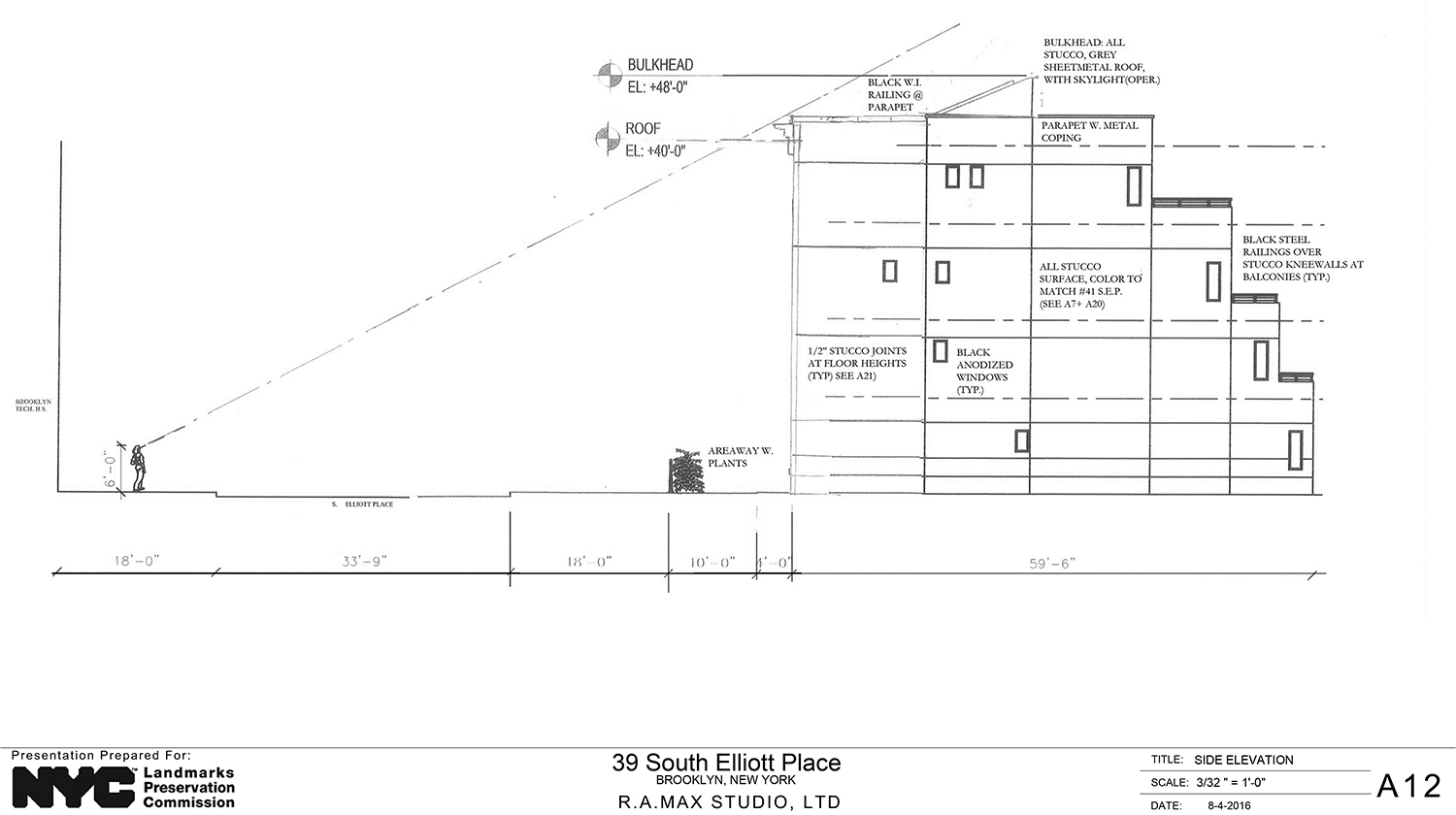
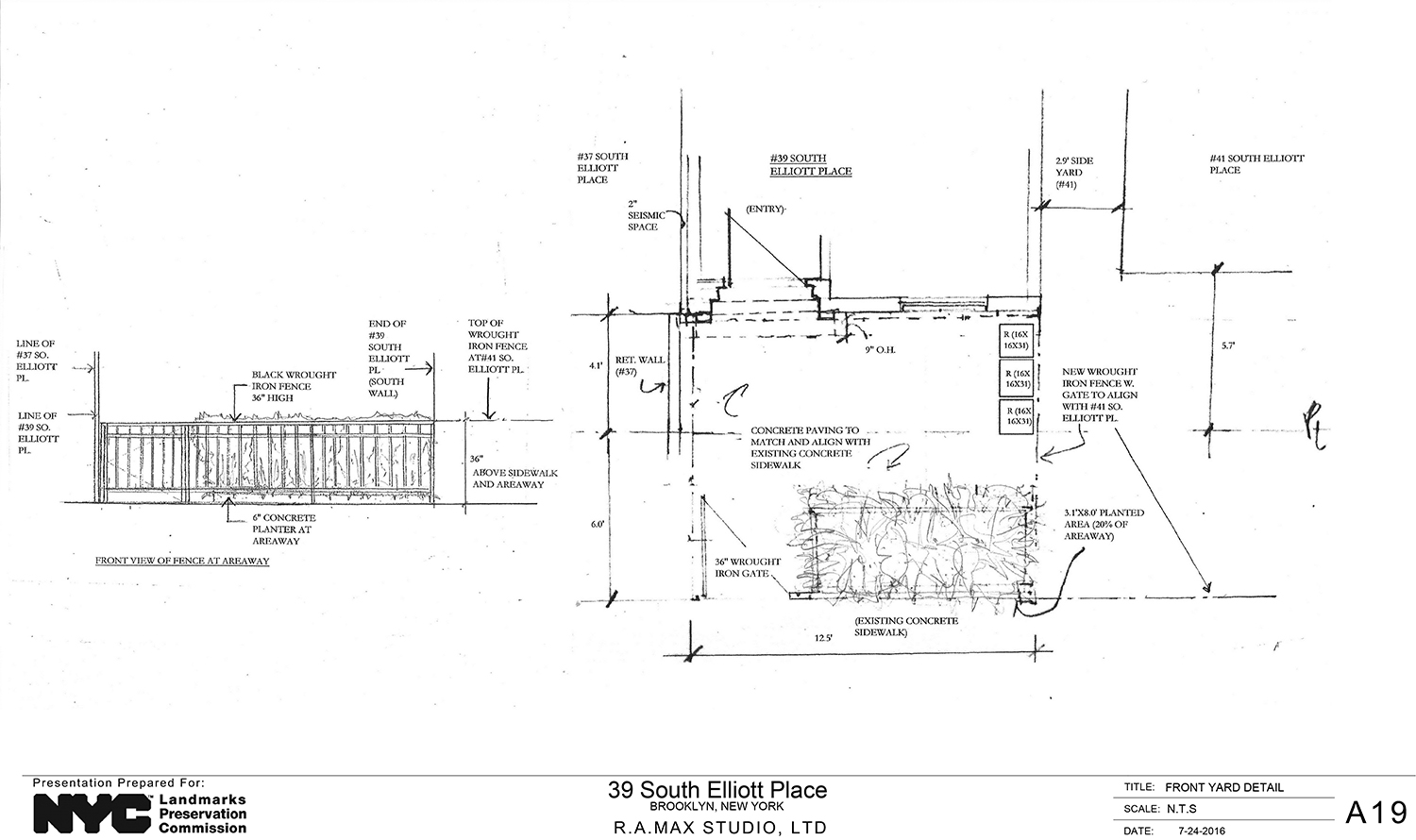
Also changed is the cornice, skylight, and bulkhead, which was flipped. All of them are more aesthetically pleasing and the chimney no longer interferes with 37 South Elliott Place. The roof now has a railing at the front.
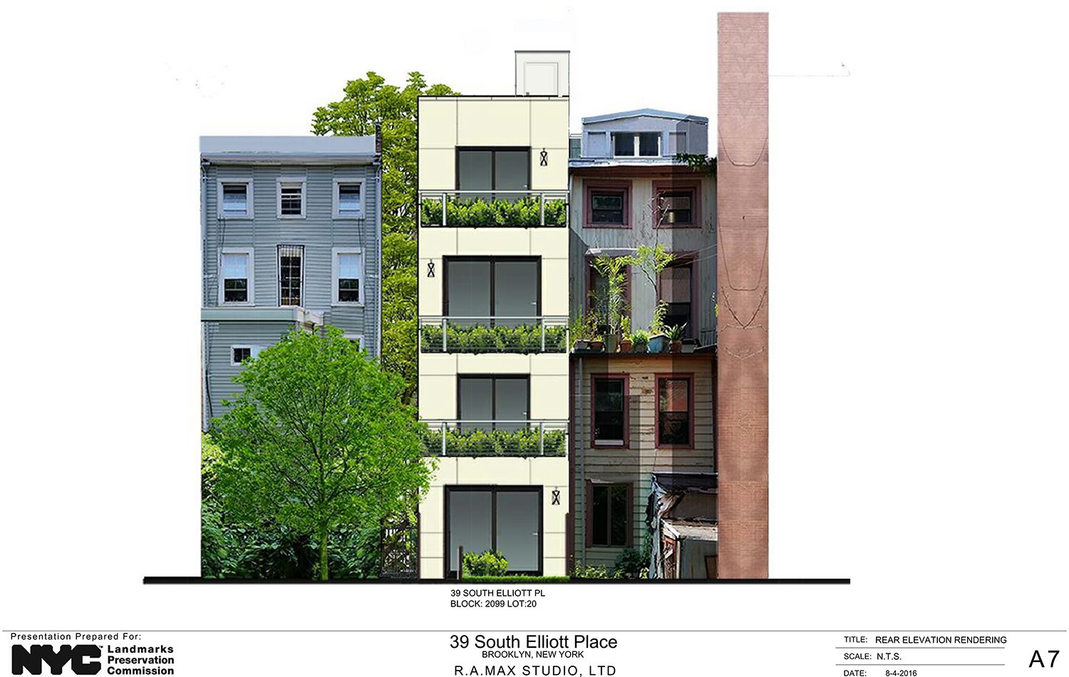
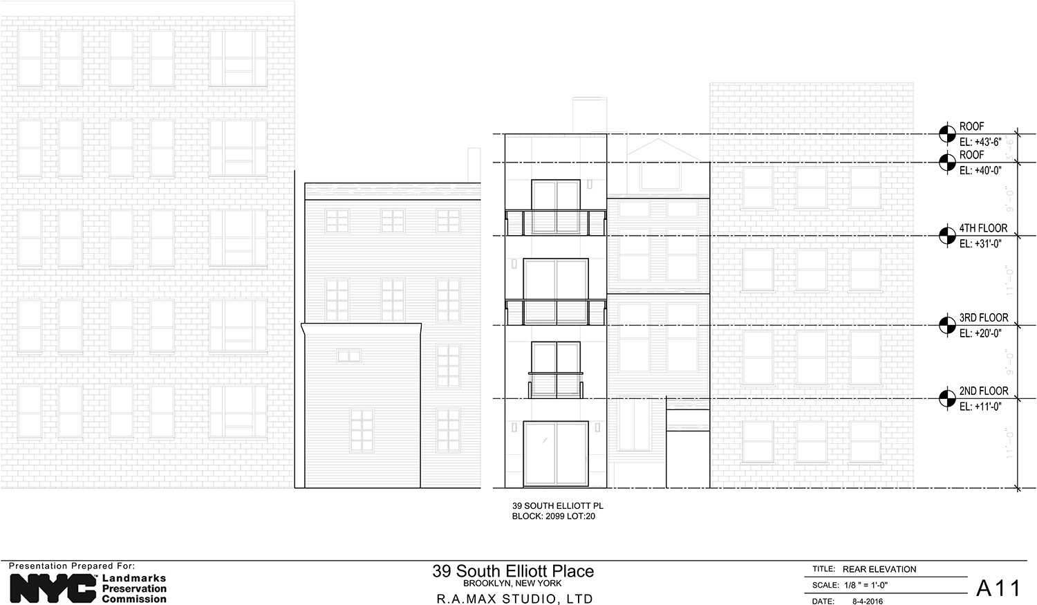
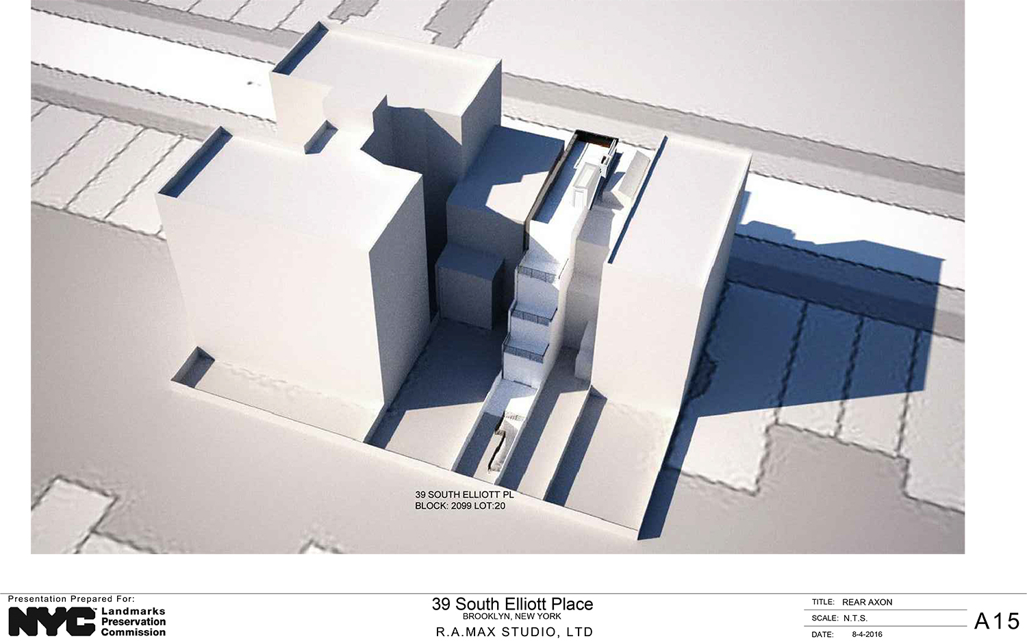
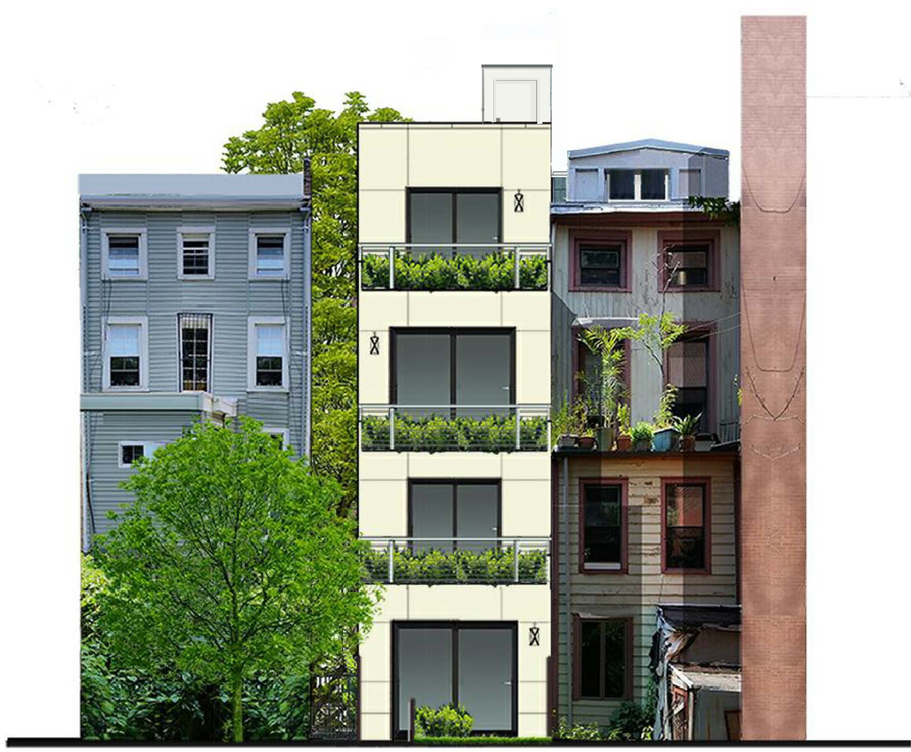
The rear plan is unchanged and calls for a stepped arrangement using stucco.
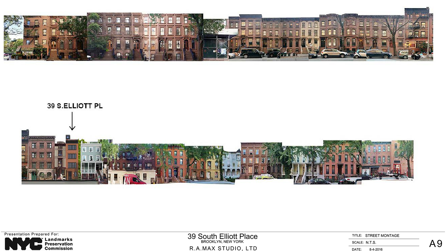
LPC Chair Meenakshi Srinivasan called the revised proposal “an improvement.” She commented on how it is unusual for a structure on that block to only have one bay of windows per floor. But this is an odd and narrow lot, so it’s okay.
Commissioner Chapin echoed the chair, also calling the revised proposal “an improvement.” She said it was somewhat modern, but that that was okay.
Commissioner Michael Goldblum wasn’t satisfied with some of the details, particularly the windows, saying that they need to be either more traditional or more modern.
In the end, the commissioners approved the proposal. They did mandate that the applicant work with LPC staff to refine the details of the window design, as well as the configuration of the roof, to make it less visible.
View the full presentation slides here:


Subscribe to YIMBY’s daily e-mail
Follow YIMBYgram for real-time photo updates
Like YIMBY on Facebook
Follow YIMBY’s Twitter for the latest in YIMBYnews





I like version of August 4, 2016..not gloss but window is suitable building stand together. (plus lamp on the wall)
Fenestration on street elevation shows lamentable ‘horizontal emphasis’.
Congrats for the designer. Looks great!