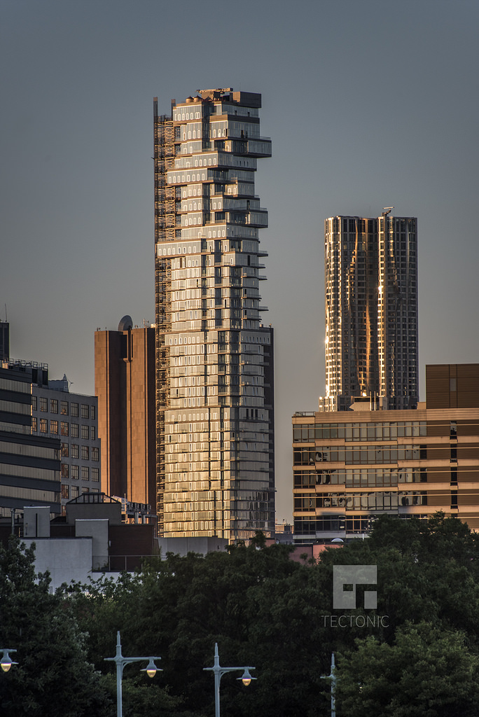
Construction is wrapping up on the 60-story, 145-unit residential tower at 56 Leonard Street, located on the corner of Church Street in TriBeCa. Tectonic’s latest photo, posted to the YIMBY Forums, shows that the exterior is practically complete, with the exception of the construction elevator and the façade that will go in its place. The 821-foot-tall building’s Jenga-like pattern of overhanging floors is now clearly visible. The upper floors were still sheathed in netting when YIMBY last brought you an update a year ago. The bold design is the work of Herzog & de Meuron. Alexico Group and Hines are the developers. All of 56 Leonard’s condominiums sold by late last year and occupancy is now underway.
Subscribe to the YIMBY newsletter for weekly updates on New York’s top projects
Follow YIMBY’s Twitter for the latest in YIMBYnew
Subscribe to YIMBY’s daily e-mail
![]()
Follow YIMBYgram for real-time photo updates
Like YIMBY on Facebook
Follow YIMBY’s Twitter for the latest in YIMBYnews

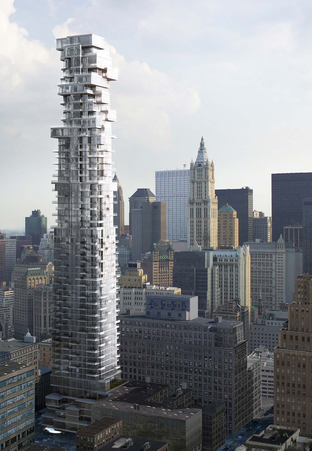
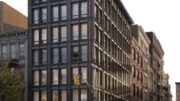

I can’t think of a another building where the execution lived up to renderings less. Window frames are brutal.
Jon, I’ve seen the hideous white window frames in person and it destroys the entire building. What were they thinking? The building is so very disappointing and so unlike the archifake rendering.
David, I walk by pretty often as well, they totally ruin the design. It’s such a shame cause the rendering would’ve really been a standout tower.
I was excited to see the building as it got near completion. This looks awful. Architects totally misrepresented the truth. Imagine how crappy it will be in 25 years after owners start “enclosing” their porches…
When will it be ready for viewing? or when will the pricing be published?
This building is awful! Looks like already belong to China or Thailand of 1970s. Or like Russian city of Voronezh microdistrict apartment flats of 1960s, placed on the roof of each other! Tribeca finally got a worst high-rise in her history! Hope 111 Murray would be not such gaaaudy like this one!
56 Leonard, A “Zenga like” Neo-brutalist destruction of NYC Skyline with 56 stories high and 821 feet cruppy and real socialist architecture monster!
Belong to Thailand or Malaysia of 1970-80s!
Such a shame! On the views to New WTC and famous Woolworth Building, this a 56 storeys, 821 feet high gaudy and glassy monster!
Three failings here in my mind:
1. The heavy-handed window frames Jon already mentions — what the heck ARE these anyway? Operable windows cut into the glass curtain wall?
2. Failure to elegantly enclose the mechanicals and water tanks on the roof. Gotta love how the rendering just omits this entirely. Surprise!
3. The dark concrete floor slabs are truly dull compared to the light airy color in the render.
That said, the shape is faithful to what was promised and you can’t deny this is a standout structure — love it or not, it’s iconic. It’s a shame the developer fell short on some crucial details that severely compromise the end result.
145 mega rich internationals have a building what they really deserved, and 100 percent sold already! But New Yorkers now had a worst building on the World’s famous skyline!
Yeah, got what’s you deserve, but unfortunately this building is pretty tall to make it iconic on the Downtown skyline, love it or hate it! At least 8 Spruce 76 stories Tower looking like a real gem on it now! Sadly a nice elegant 82 story 930 feet 30 Park place in such bad company on our still iconic skyline!
At least they had scrapped completely, “Terraces on the spin” supertall by Santiago Calatrava… Now they trying top floors of Verizon Brutalist Tower made partially open by re-glass them, while have a lower half floors still almost windowless, so prize of worst looking Downtown tower definitely won by them, New Worst Tower Viewed From Brooklyn Bridge…
I like design I love windows and structures, this is one tower that most impressive in the world.
This photo was taken at an unfortunate time of day, when the the setting sun illuminates the smaller operable windows mercilessly. Perhaps in a softer light the building will look more transparent or maybe when illuminated from within at night. But the concrete floor slabs are truly hideous, is that their final look? Ugh! That said, the silhouette is attractive, and I am sure we will get very comfortable with this building as time goes on.
Crazy association but reminding me of Adolf Loos Tribune Competition entry!
How is construction nearly complete??
The hoist is still up!!
Barf
Click on the YIMBY Forums link in the article, scroll up and see a few shots of the tower in different lighting; Tectonic also posted one that shows the “dark” floor slabs are actually white. Got to agree about the framed windows-in-windows, not a great look from the distance shown in the pictures. But here’s a listing for one of the penthouses showing how they look from the inside. Not so bad.
http://www.corcoran.com/nyc/Listings/Display/2652508
Have to say I’m amazed at all the negative comments. I’ve been watching this building rise over the past several years and I love it. It’s unique and interesting and catches the eye in the skyline.
this building is truly work of art.