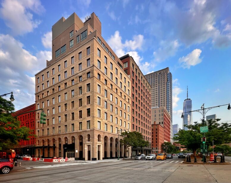
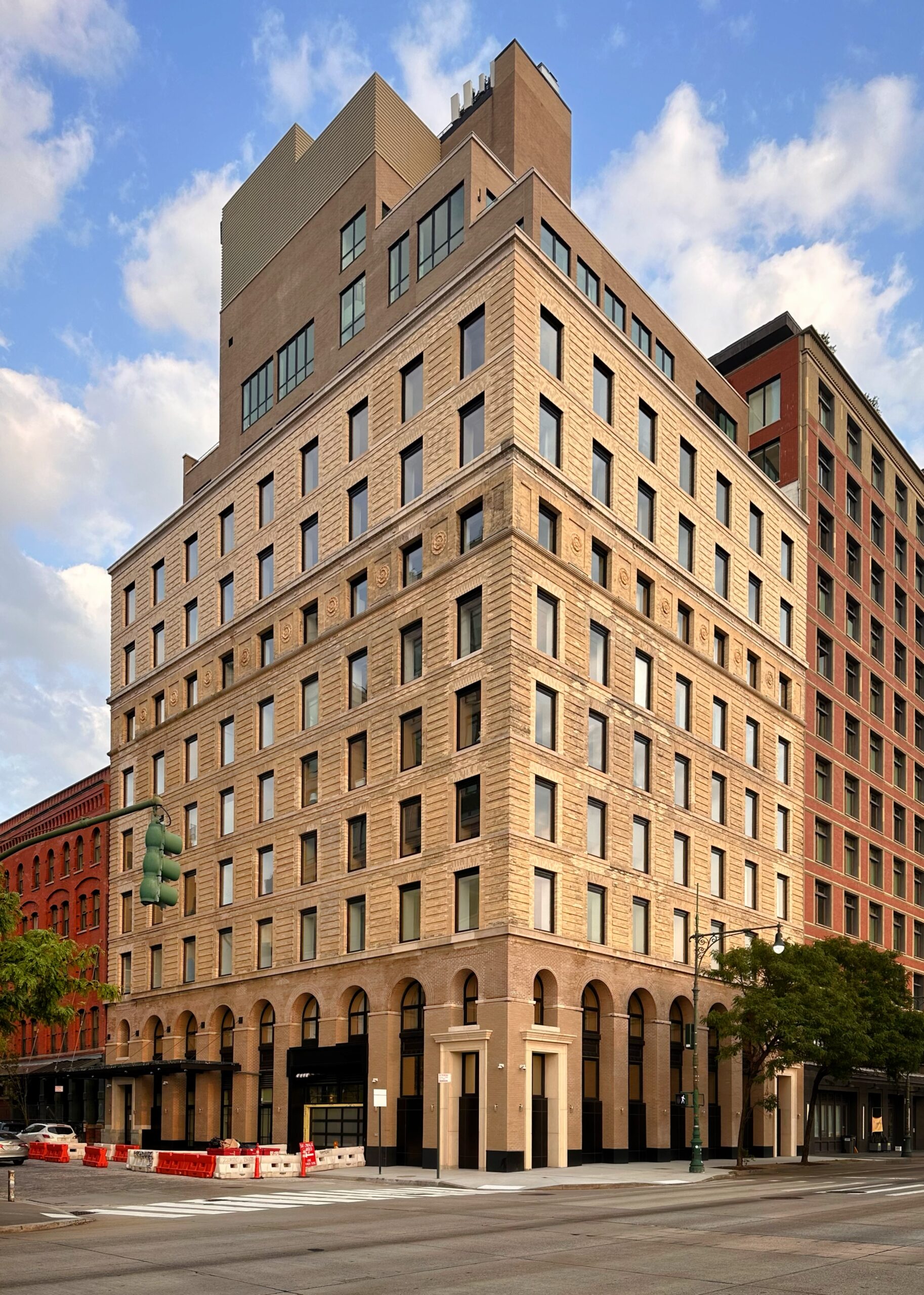
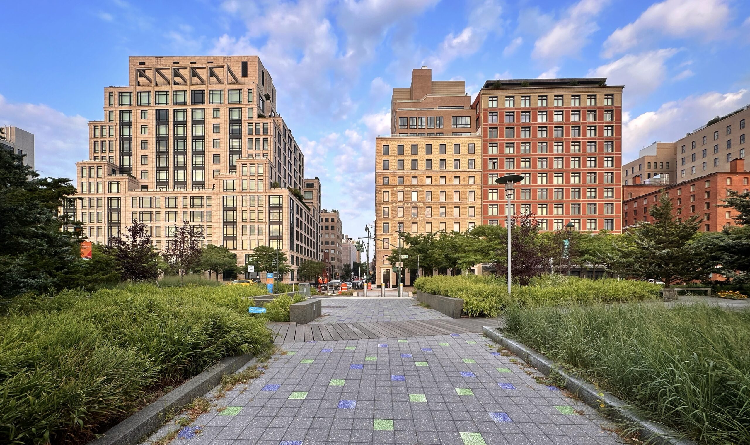
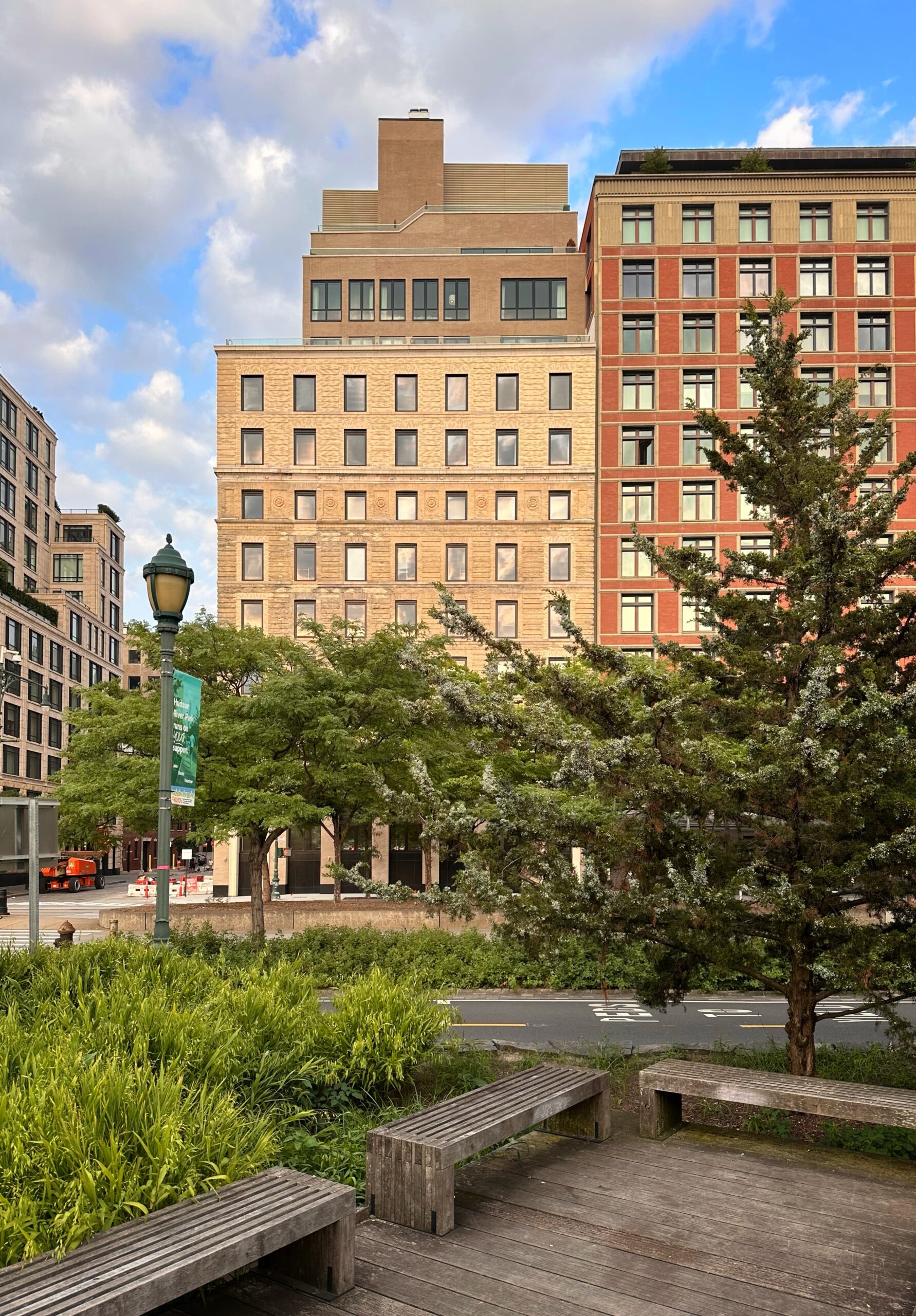
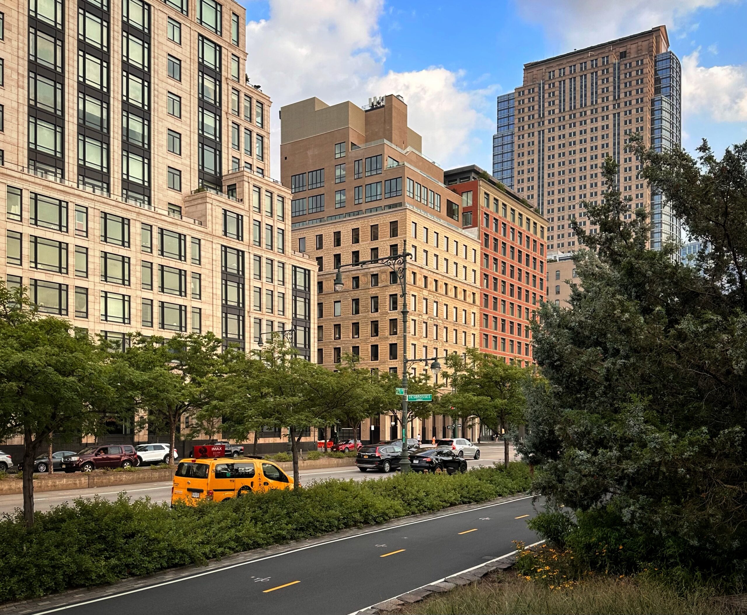
Renovation and expansion work is complete on 67 Vestry Street, a 13-story residential building in Tribeca, Manhattan. Designed by BP Architects and developed by Iliad Realty Group, the project involved the restoration of the Romanesque-style stone façade, gut renovation of its interiors, and the construction of four new stories above the original roofline. The 115-foot-tall structure spans 88,712 square feet and yields 13 condominium units. Urban Atelier Group served as the general contractor for the property, which is located at the corner of Vestry and West Streets, directly across from Hudson River Park.
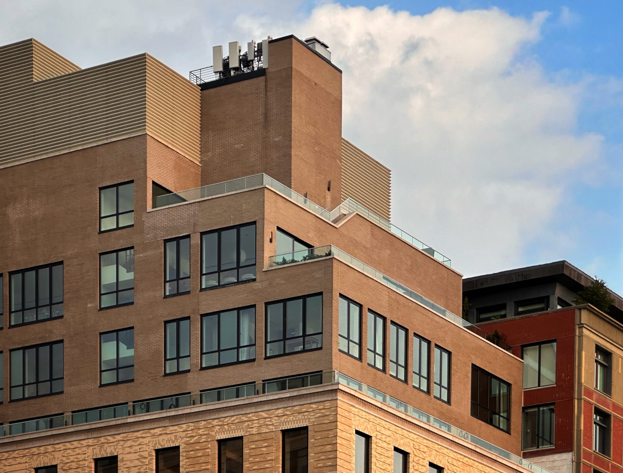
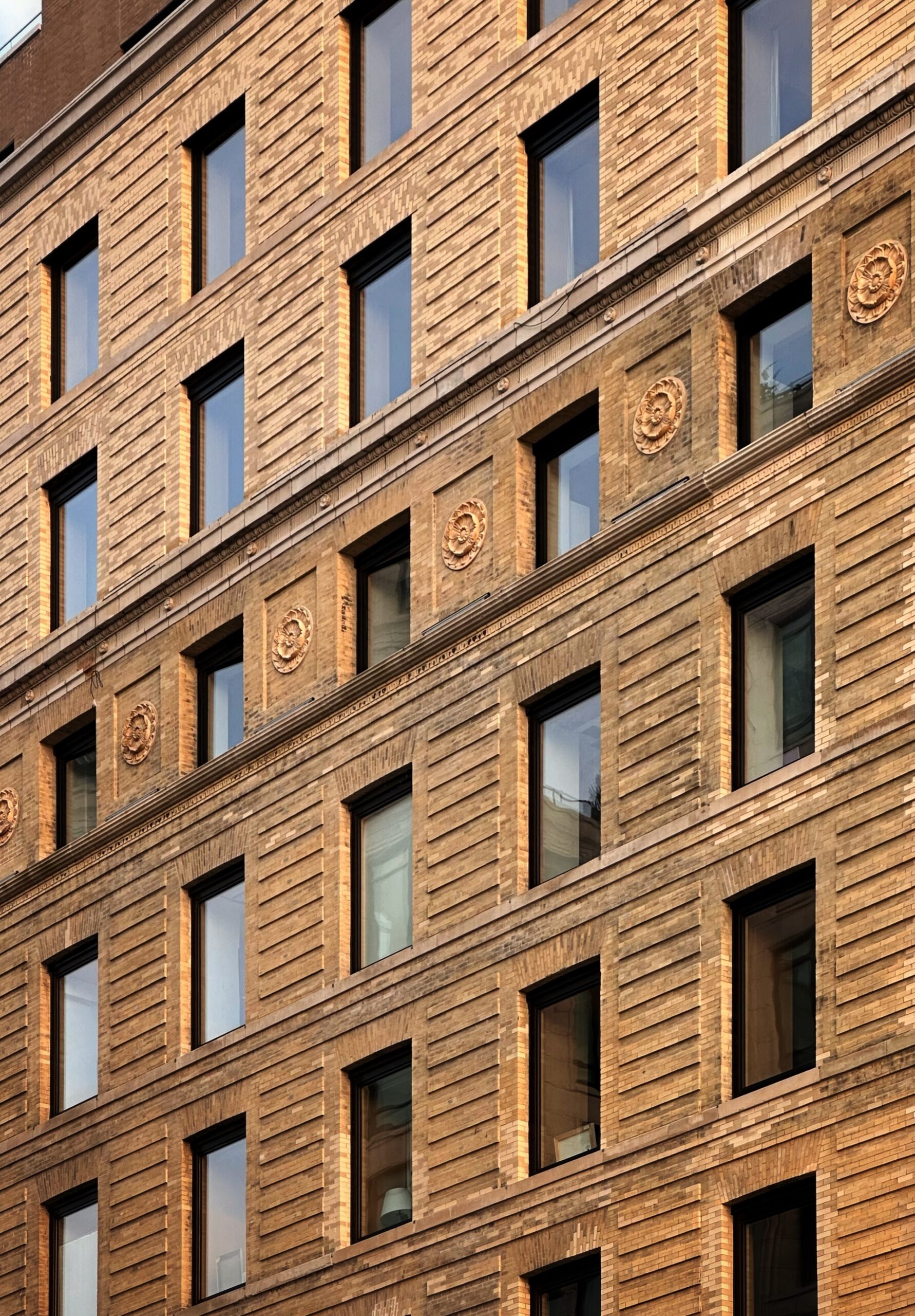
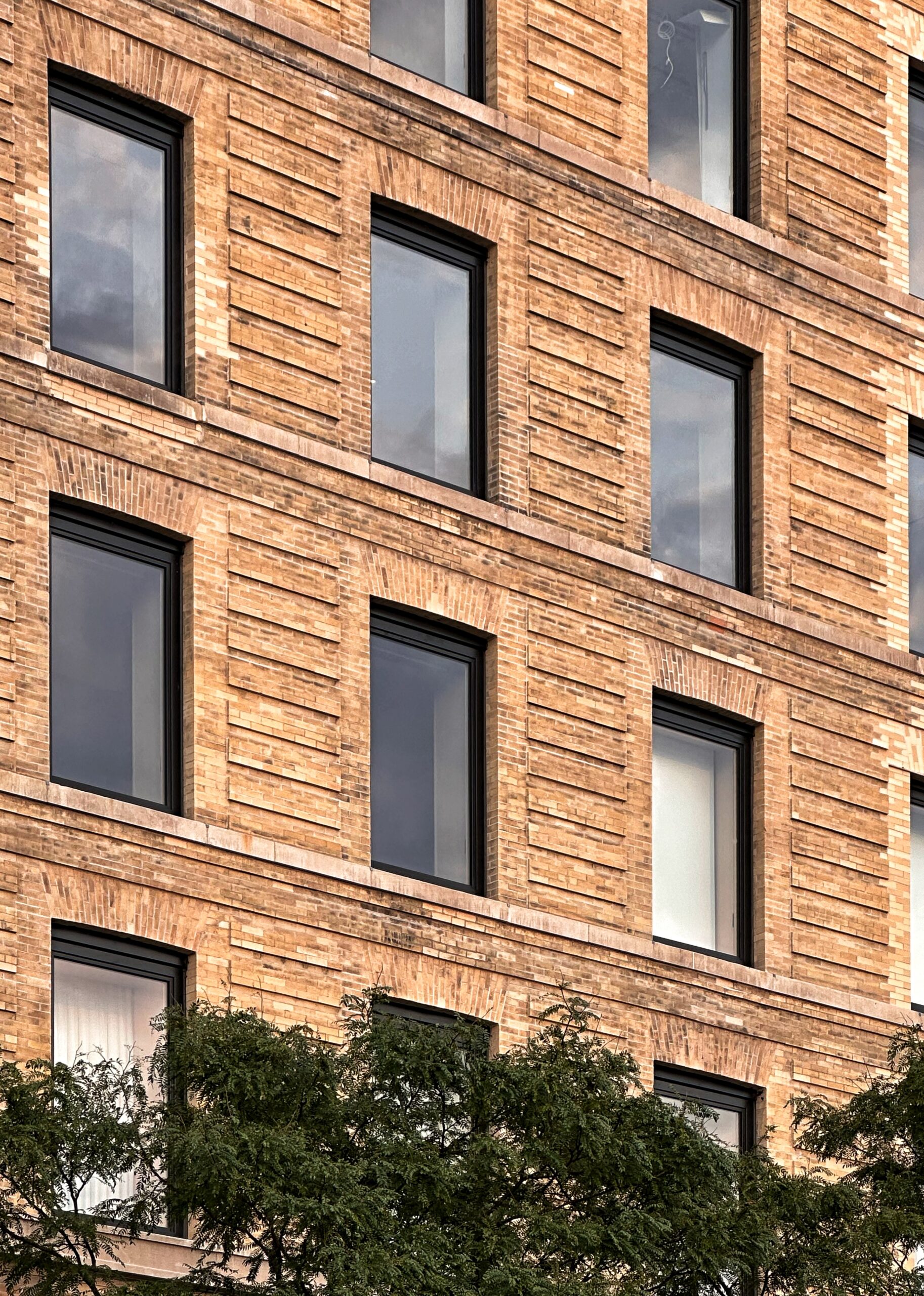
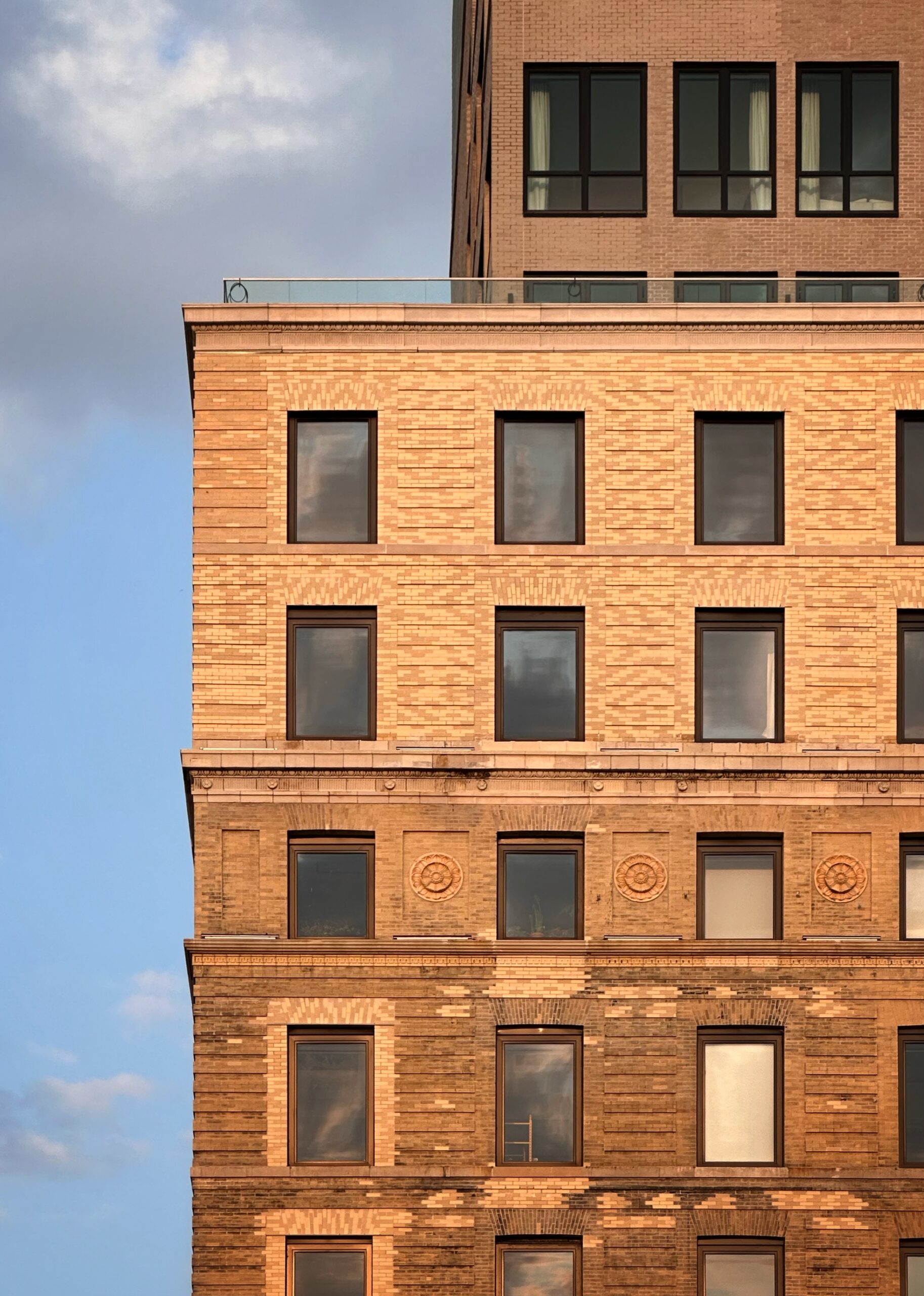
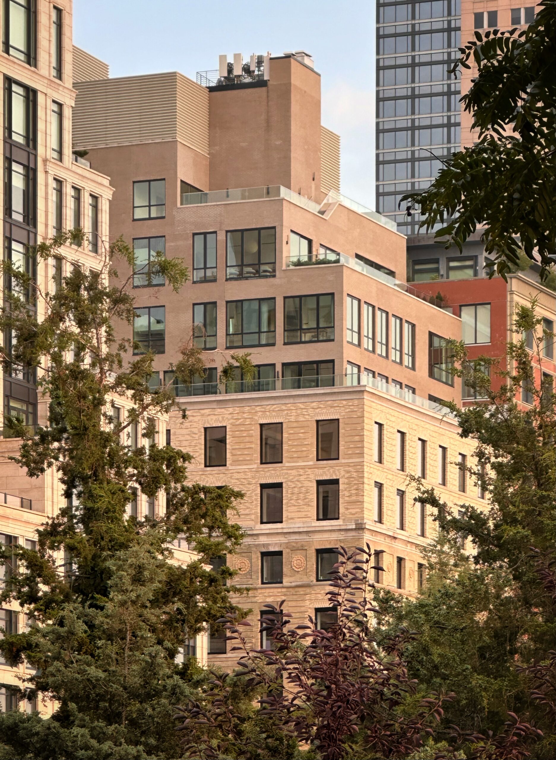
Photographs from the end of summer show the finished look of the renovated exterior and new levels, whose reinforced concrete core was still rising at the time of our last update in September 2021. The addition is now fully enclosed in its brown brick façade and grid of floor-to-ceiling windows with black mullions, and the terraces atop its several setbacks are lined with glass railings. The extension culminates in a bulkhead enclosed in tan horizontal fins.
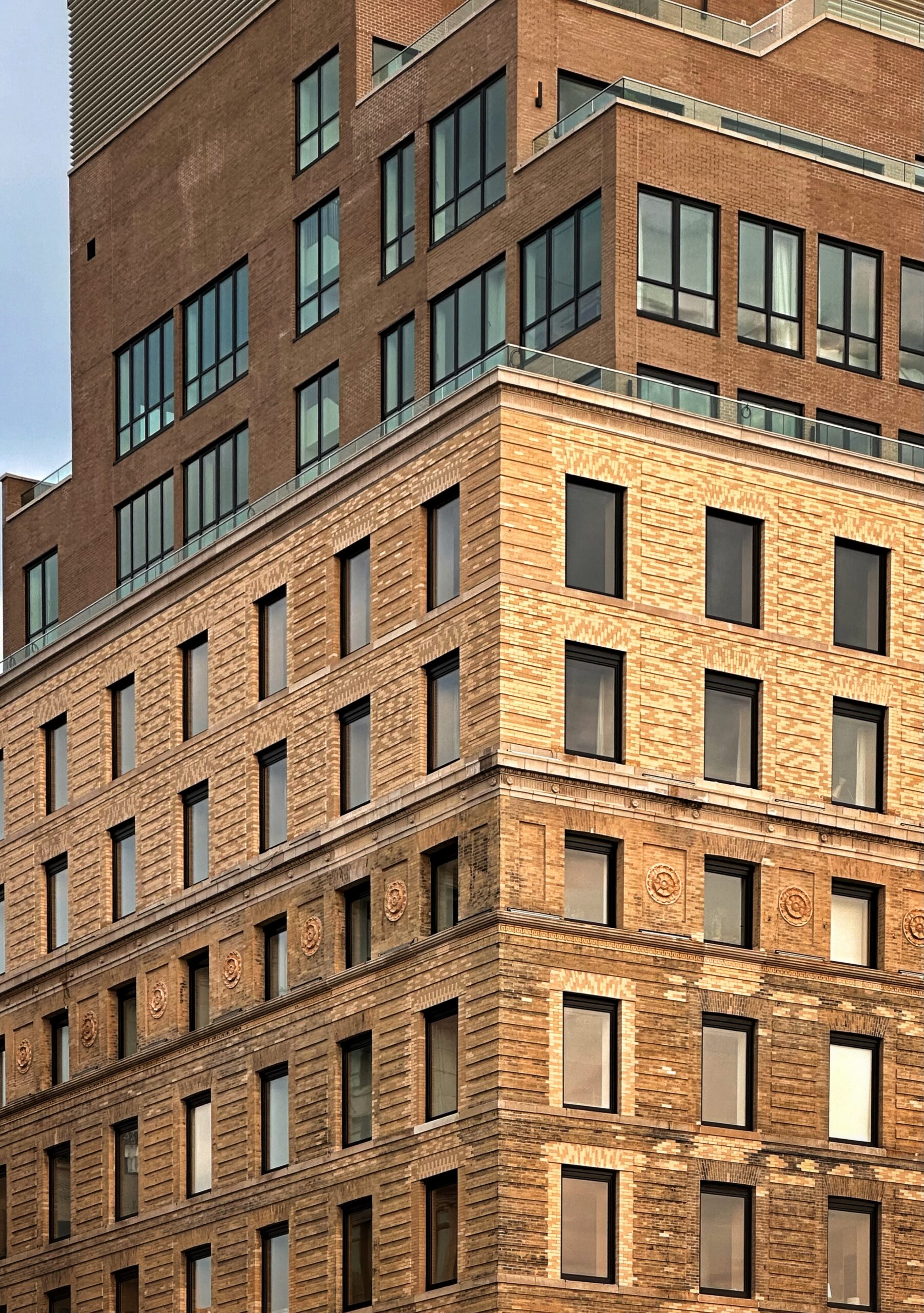
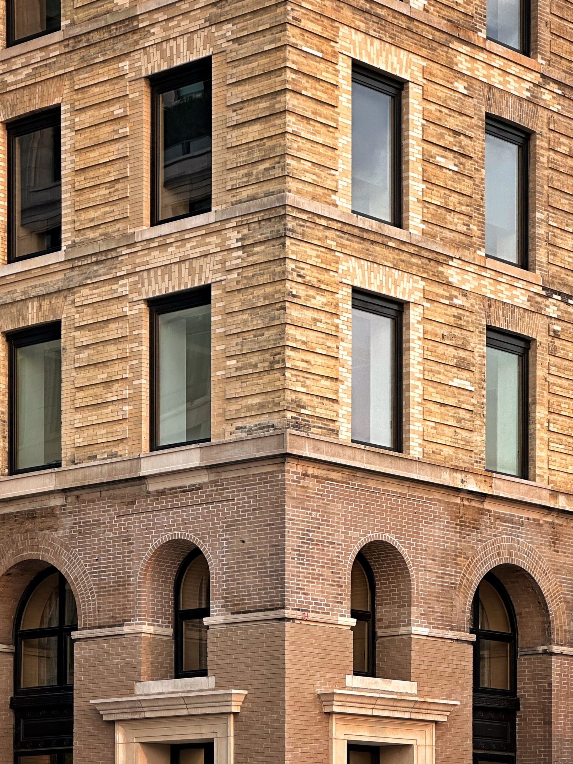
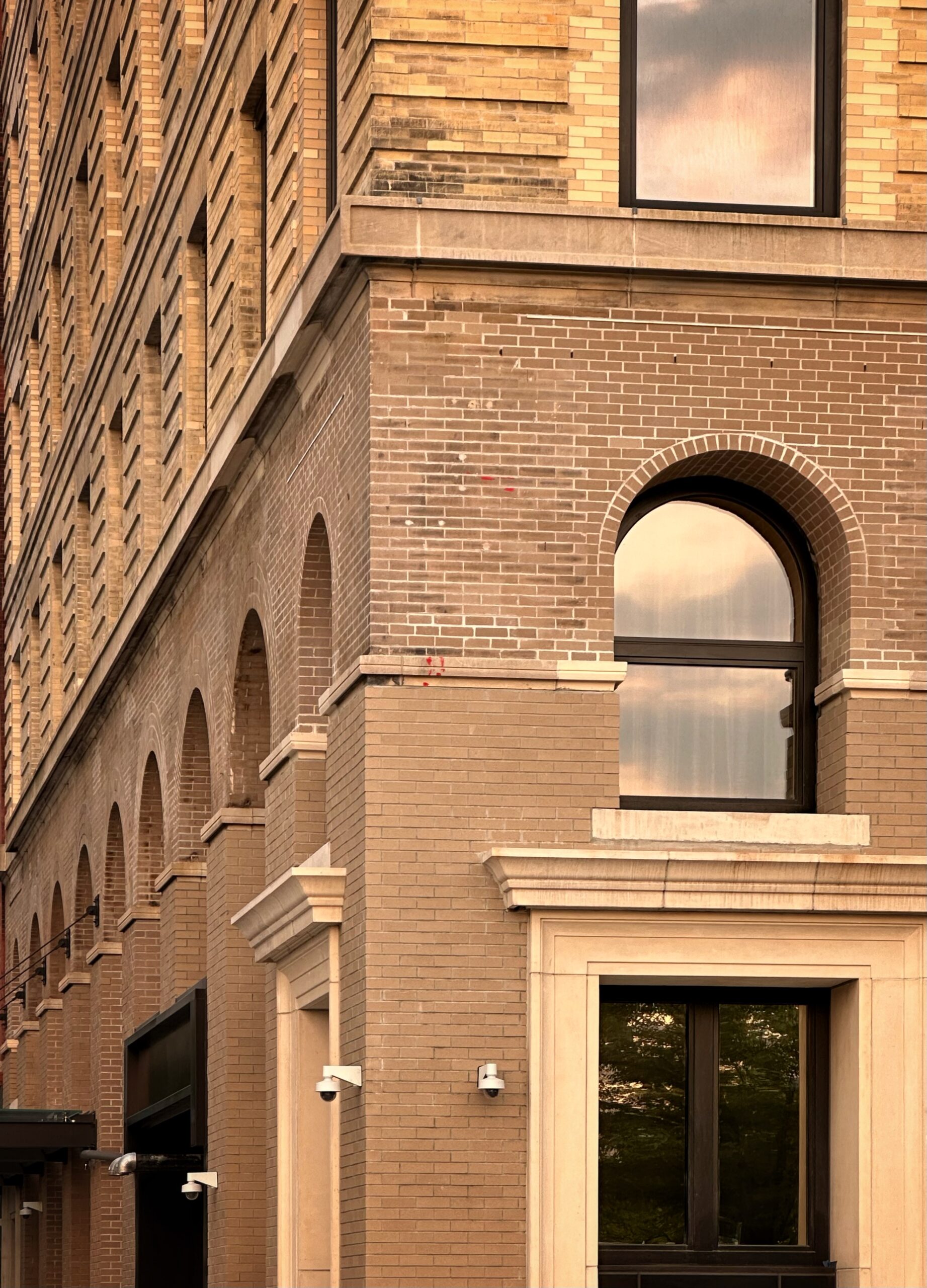
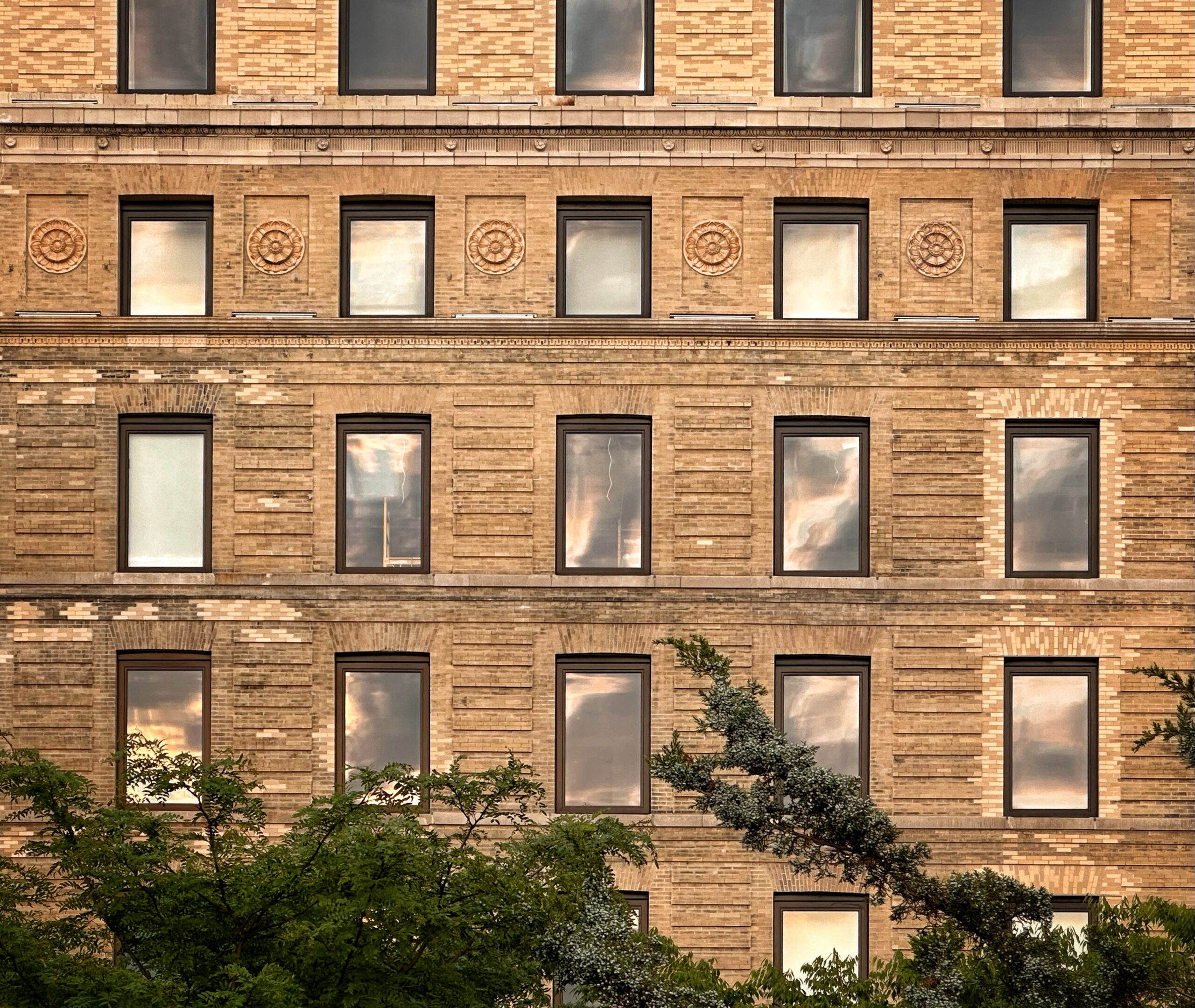
Below, the 19th century structure’s exterior has been cleaned and restored, with new windows installed in the two-story arches at its base that now extend down to street level.
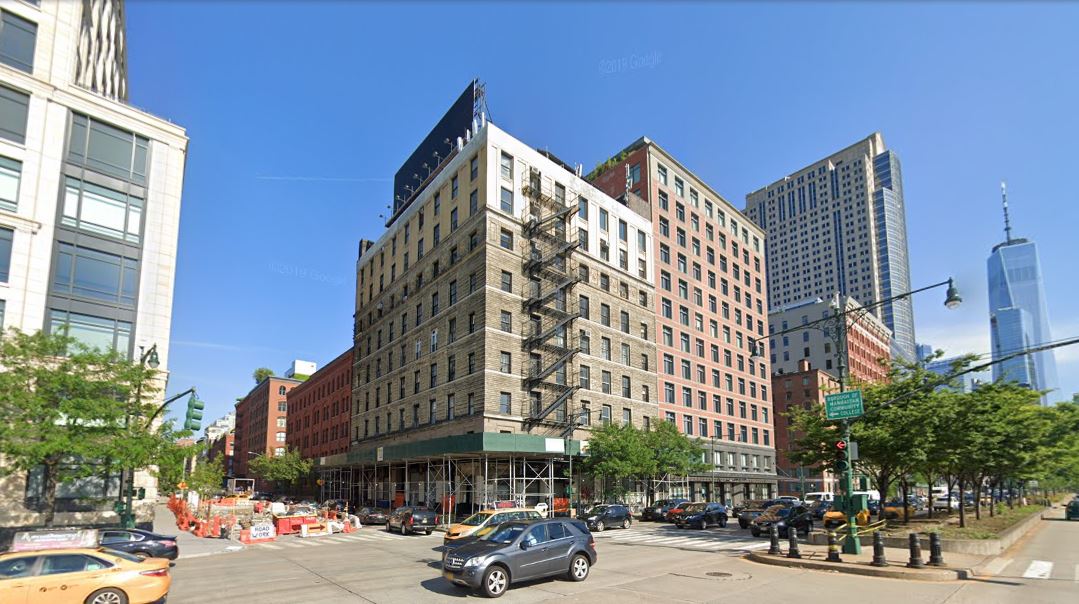
The below Google Street View image shows the former state of 67 Vestry Street, which had a fire escape on the western elevation, aging windows, dirt and grime on the bricks and stone blocks, and mismatched yellow paint on the top two floors.
Residential amenities at 67 Vestry Street include a fitness center, an indoor swimming pool, a laundry room, lounge, bike storage, and residential storage space.
Subscribe to YIMBY’s daily e-mail
Follow YIMBYgram for real-time photo updates
Like YIMBY on Facebook
Follow YIMBY’s Twitter for the latest in YIMBYnews


The original building is gorgeous. The rooftop addition is as terrible as the renderings were when presented earlier: the windows at the stairwell of the penthouse says it all about the design skill set of the architects, or the vision of the developer: bland and innappropriate.
Agreed
So very pedestrian and ordinary
Where were the architects?
How could this even be planned.
Who are the individuals that green lighted this addition…..
How did that addition get approved? Looks like something that would have been done in the 60’s. What a missed opportunity.
More like in the late 40s or early 50s to accommodate all of the veterans returning from World War II
I was surprised to see the number of brick colors used in the original building.
Yes, there must be a 6 or 7 different color bricks used here. Very strange.
I suppose the utilitarian roof addition is meant to look like it was added 60 years ago.
For the addition, they should have chosen masonry and a window style that was cohesive with the original building.
Beautiful photos, but wish the new addition integrated itself more to the brick and stone facade
Given what these units went for price wise, I expected more oomf than this mediocrity. What a shame.
I think it looks fantastic. The restoration work is done very meticulously and the jarring mix of brick colors will begin to blend more with each passing year. The addition on top works perfectly. Its broken massing gives you the sense that this is some nondescript building in the distance and thus of no concern. If they had given the addition too much detail or made any broad attempt to make it add to the facade it would have been too intrusive and would have changed the proportions of the building in odd and undesirable ways.
inane ridiculous reply. why bother going to architecture school, learning about history, contextual design, proportion, scale.
Empty condos in an ugly mass next to constant traffic.
The addition does not match the original building, or will it be used as the most expensive penthouse? Thanks to Michael Young.
Really crude subpar work and in such a visible and desirable location. ‘BP Architects’ did you walk across the street and consider what this would look like?
Forget that addition for a second, those ‘new’ windows in the original building have quickly ‘unoriginated’ it.