Last week, YIMBY featured a terrible new hotel coming to 525 Eighth Avenue, off the northwest corner of 34th Street and Eighth Avenue. A few blocks to the north and west, on the southwest corner of Ninth Avenue and 42nd Street, another architectural atrocity is getting ready to open its doors, at 577 Ninth Avenue, and Tectonic has the latest photos of progress.
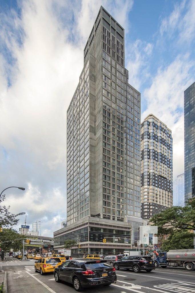
Sidewalk fencing is mostly down and exterior work on the project appears just about entirely complete. The architect of record is SLCE, and the tower stands 28 floors and 300 feet to its rooftop, with the bulkhead boosting the apparent height to 363 feet. Within, there will be 665 “pod” hotel rooms above 25,000 square feet of retail space on the cellar, first, and second floors.
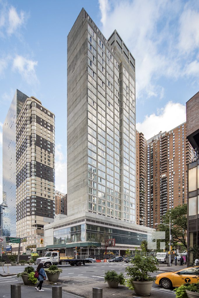
400 West 42nd Street, photo by Tectonic
As a “pod” hotel, the design is not expected to rival starchitecture like 53 West 53rd Street, but this corner of Midtown is particularly prone to horrible design. Indeed, 577 Ninth Avenue stands adjacent to the Zebra Building at 420 West 42nd Street, which is perhaps the ugliest tall building in all of the West 40s.
While the Zebra Building’s stripes make its blandness a secondary offense, the pod hotel is a direct ode to the architectural brutality of cities like Pyongyang. The exterior musters several muddled shades of grey between windows that, if just a bit larger, would brighten the tower substantially.
The podium-style retail of the project is an additional offense to the streetscape of Ninth Avenue, which is already somewhat bleak in the immediate vicinity due to the encroachment of Port Authority onramps.
BD Hotels will run the pods, while the site is being developed by Friedman Group and Landis Group. Opening is imminent.
Subscribe to YIMBY’s daily e-mail
Follow YIMBYgram for real-time photo updates
Like YIMBY on Facebook
Follow YIMBY’s Twitter for the latest in YIMBYnews



It hits every high-rise in the city.
Compare it with neighboring Related MiMa complex, Hudson Yards towers, or Times Warner Center, and what’s about Silver Towers or Orion, why this ugly piece of shit ever allowed to be built? Belongs to East Berlin of 1960s, not to 2017 NYC!
Most uglu is top 3 mechanical levels over main 28 floors and bulkhead, is any reason left top 63 feet over main floors total 300 feet in such disarray, it’s on the top of building, who is bare concrete, especially it’s across not too bland 58 story Orion and nearby Related 55 storied complex on the top of Signature theater who is about 7 level who isn’t too bland either, but this is one of worst example of modern architecture in whole United States! Must put a paint job or at least billboards to at least add some color. Zebra building nearby is architecture gem comparable with this POD Hotel building!
Ugly, unattractive crush of concrete, completely belongs to communist architecture of North Korea or Soviet Union provincial towns, just a fill of previously one-two story corner occupied by 99 cent pizza and fruit vegetable store, but replaced with 33 story tall piece of bare concrete, with lacking any architecture details, except 3 story retail podium, and this is 42nd street of Midtown!!!
At least NYC have now ugliest companion to PABT, wonder if anyone who visit NYC, ask self “why this piece of crap was ever built there”, or would be learned by surprise that this monument of minimalist brutalizm was built in 2017! Why not built something simular but in glass, or like Westin Hotel in shades of glass and concrete, painted in mozaic or covered in colorized brick?
363 feet to the top of bulkhead and 665 pod rooms, a good name for this structure would be “Devil’s nose”, since it’s 3 “six” and really it’s Satan’s designed architecture, especially bulkhed 63 feet tall tower on the roof!
BTW, why not named it as “Hotel 1960’East Berlin”, it’s really like time transferred from there!
The bare cement exterior is particularly heinous.
We live across the street and were dismayed to see it it’s 27 floors rise above our 45 floor building. The building looks ugly and unfinished. We call the zebra building the “bumble bee building” in our home. I didn’t think anything could be uglier that that ode to the worst of the 60’s -70’s architecture, I might have to rethink that now. What were they thinking?
Why is concrete ugly? What gives you (the author of this article) the right to make and publish that judgement, for no obvious reason?
Concrete is not ugly, but this is!
Have you even _seen_ the building in person? I’ve watched it go up, living adjacent since 2014 and it is an absolute eyesore. I hadn’t seen any renderings prior to it being built, and actually had a hint of optimism about hotels expanding further, that we might actually do something about all the empty/abandoned PABT areas around 40 & 9. Then, walking out one day, and seeing it 10 stories high, thinking “that can’t be the finished exterior, can it?” But it was.
I’m sorry, but you have it wrong. The zebra building is far from the ugliest build in the West 40’s. It is the ugliest building on planet earth. And if there are other life forms on other planets that build buildings, it is uglier than all of structures they might create. I think a correction would be appropriate.
It’s obvious that the developers of the Zebra Building got a great deal on 1/2 a building’s worth of 1970’s era leftover brown bricks, and 1/2 a building’s worth of 1907’s era leftover ivory bricks, and thought they were doing an outstanding job being “clever” and “creative” to alternate them, thus making in one fell swoop an exterior statement… oh, and an airplane warning beacon.
It’s also obvious that the developer of the Pod Hotel (yes, that’s the amazingly original name they came up with), did not get a deal on bricks, paint, aluminum siding, shingles, pasties, construction paper, glass, or any other potential exterior adornment to give those of us who reside here at least a little “eye candy” for what has long been a tourist-overrun, traffic-blighted intersection.
On the plus side, the new sidewalks look nice and wide… God knows, we’ll need all the square footage we can get.