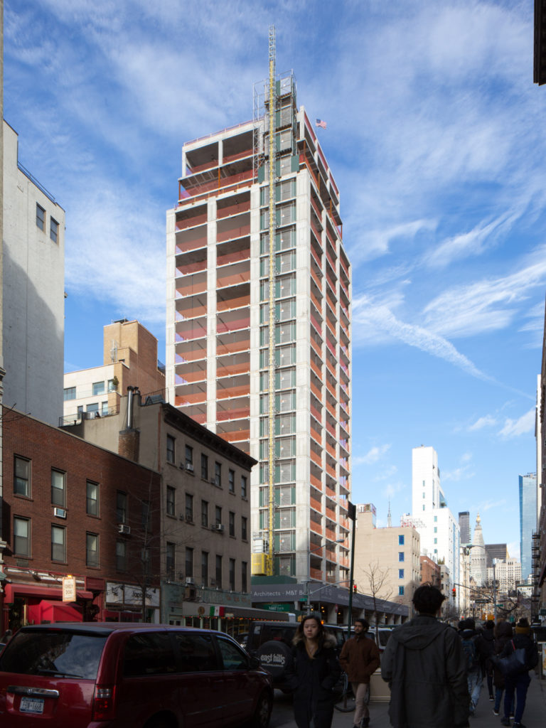
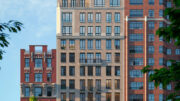
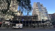
Four months after the structure topped out, we have an update on construction progress at 21 East 12th Street, in Greenwich Village. Installation of the façade is underway, and has now reached the fifth floor.
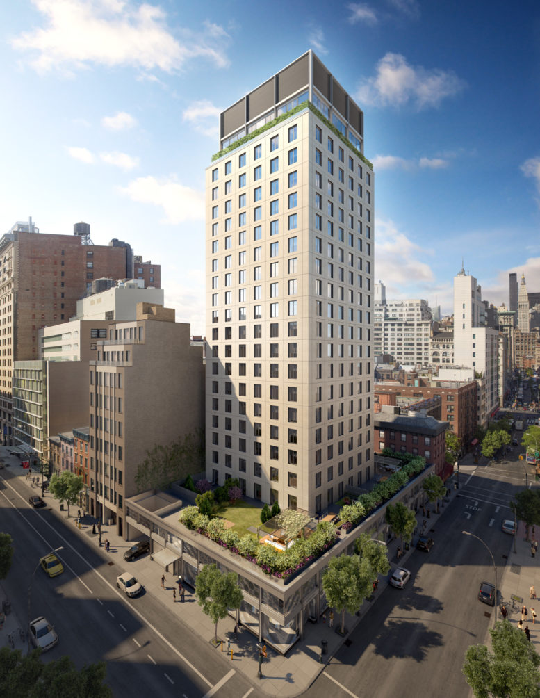
The 309-foot tall structure yields 108,000 square feet of residential space, as well as 13,000 square feet of retail, and a 1,050 square foot community facility space. 52 condominiums will be created, starting at $2.5 million for one-bedroom units, $4 million for two-bedrooms, and $6.2 million for three bedrooms.
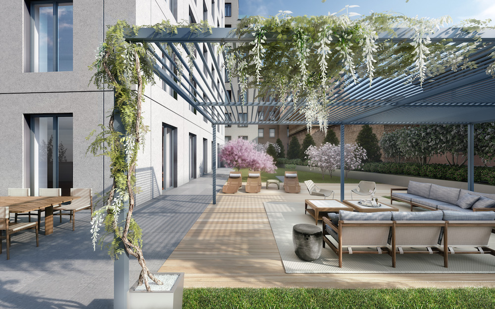
Annabelle Selldorf is responsible for the design, which features a white stone, gridded structure that hopes to mesh with the surrounding neighborhood. The project will be enriched with plenty of amenities, including a lounge, terrace, outdoor gas grill, children’s playroom, and a fitness center.
William Macklowe Company is developing the project, with joint sponsorship from Goldman Sachs. If progress continues steadily as anticipated, completion is likely later this year.
Subscribe to YIMBY’s daily e-mail
![]()
Follow YIMBYgram for real-time photo updates
Like YIMBY on Facebook
Follow YIMBY’s Twitter for the latest in YIMBYnews

Please pardon me for using your space: How about semicircle at entrance?
Its impossible to know who is responsible for the over-all massing of this project, but its pretty unfortunate, especially in such a special urban context as the Village. To put an isolated tower on a retail podium is an old idea from the 60s and 70s that violates sound concepts of urban street walls and ignores what made the Village such a great place in the first place. No amount of elegant stone detailing can make up for this essential mistake, which was probably dictated to this architect by the developer.
Pre-cast stone garbage.
Wait and see how this thing ages.
It won’t be pretty.
The developer is a monster.
Google the family.
Blandiose. What a bowser. The massing is a throwback to the worst tower on a base cliche’s of the 1960’s, and an insult to the legacy of the traditional village street wall. It creates a void where there should be a solid. How did this visual blight get approved? The facade is reductio ad absurdum to the lowest common denominator: featureless punched windows in a featureless blank wall. Was Albert Speer a consulting architect? It has all the charm of his Luftwaffe Airforce Ministry in pre-war Berlin. You can slather it with as much pre-cut limestone as you want, it still looks like the worst nondescript developer office blocks from 50 years ago. And as another commentator notes, it will be even uglier in ten years when it’s dirty and streaked. The only reason to live here is that at at least you won’t see it when you look out of the window. SHAME on Annabella Seldorff.
I’m curious about the criticism of massing and the streetwall. From the pedestrian’s perspective, it looks like there will be a 2-storey retail facade that follows the 12th Street building line. This is not much (if at all) different from what the new structure replaces — Bowlmore Lanes. Of course that building (basically a taxpayer) was appreciated for its cultural rather than design contribution to the neighborhood and it should be expected that a new building improve on the aesthetic. But is a higher streetwall really necessary to do that? The low-rise stretch of several blocks on the west side of University gives this unusual avenue its lightness and airiness despite its narrow, two-lane width. Compare that to the stretch of Broadway on the north side of Union Square that this section of University mirrors, and I’m not at all sure one would want anything higher here.
Paul, Larry and Jack – the 3 stooges with stoogie comments. Boohoo, they built in Greenwich Village. Wake up call: the neighborhood needs housing!