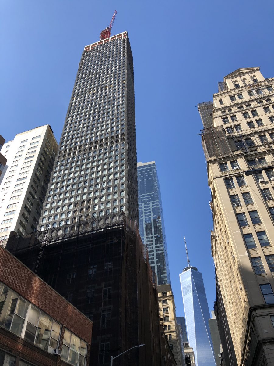
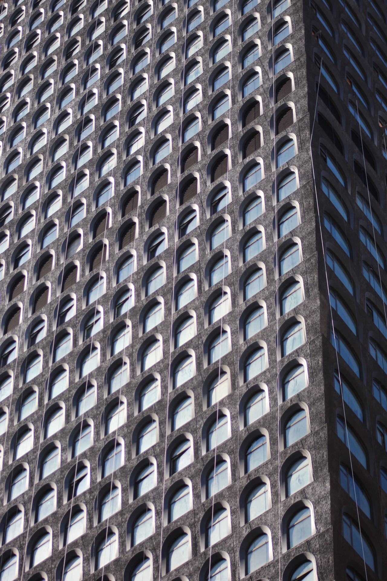
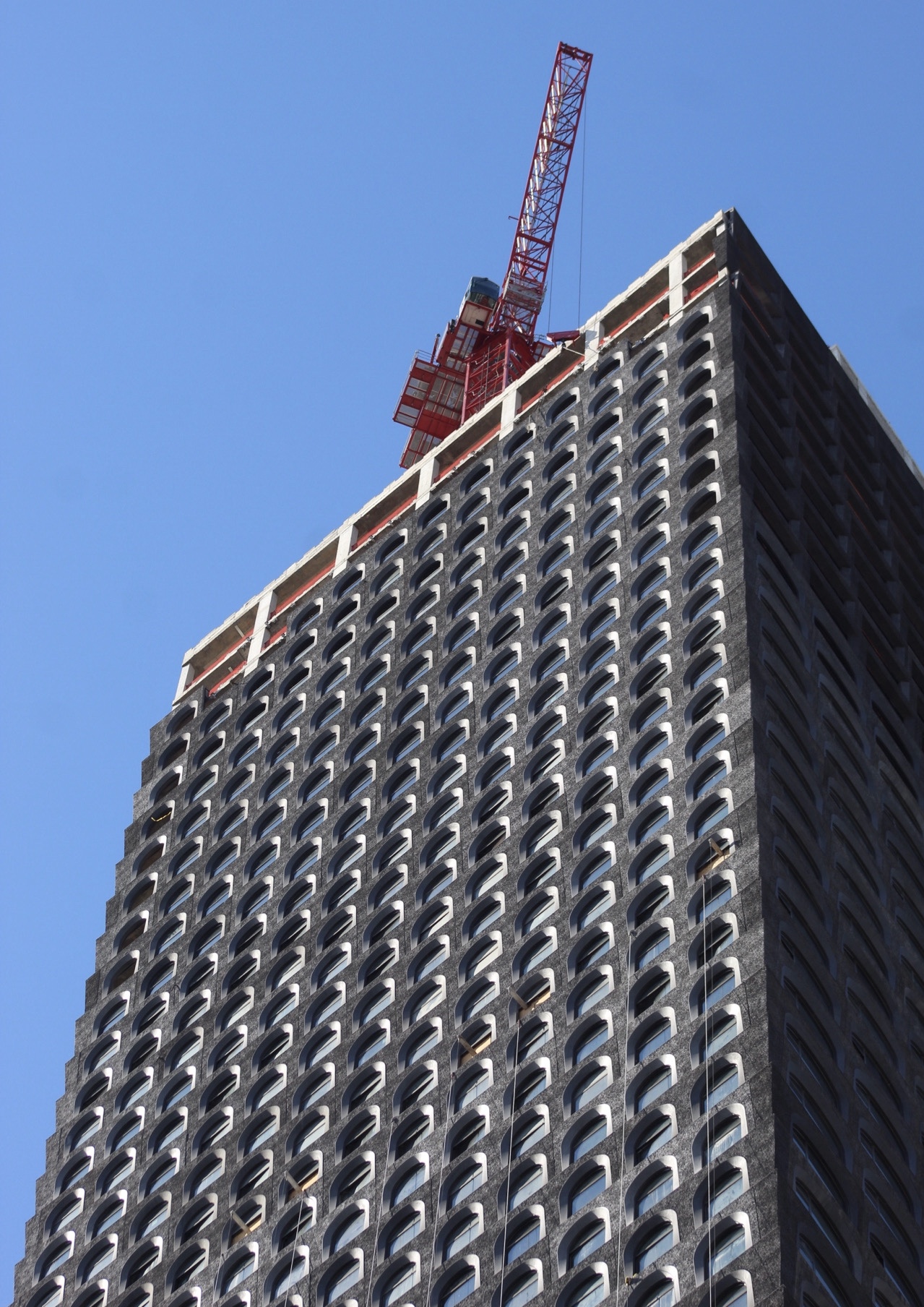
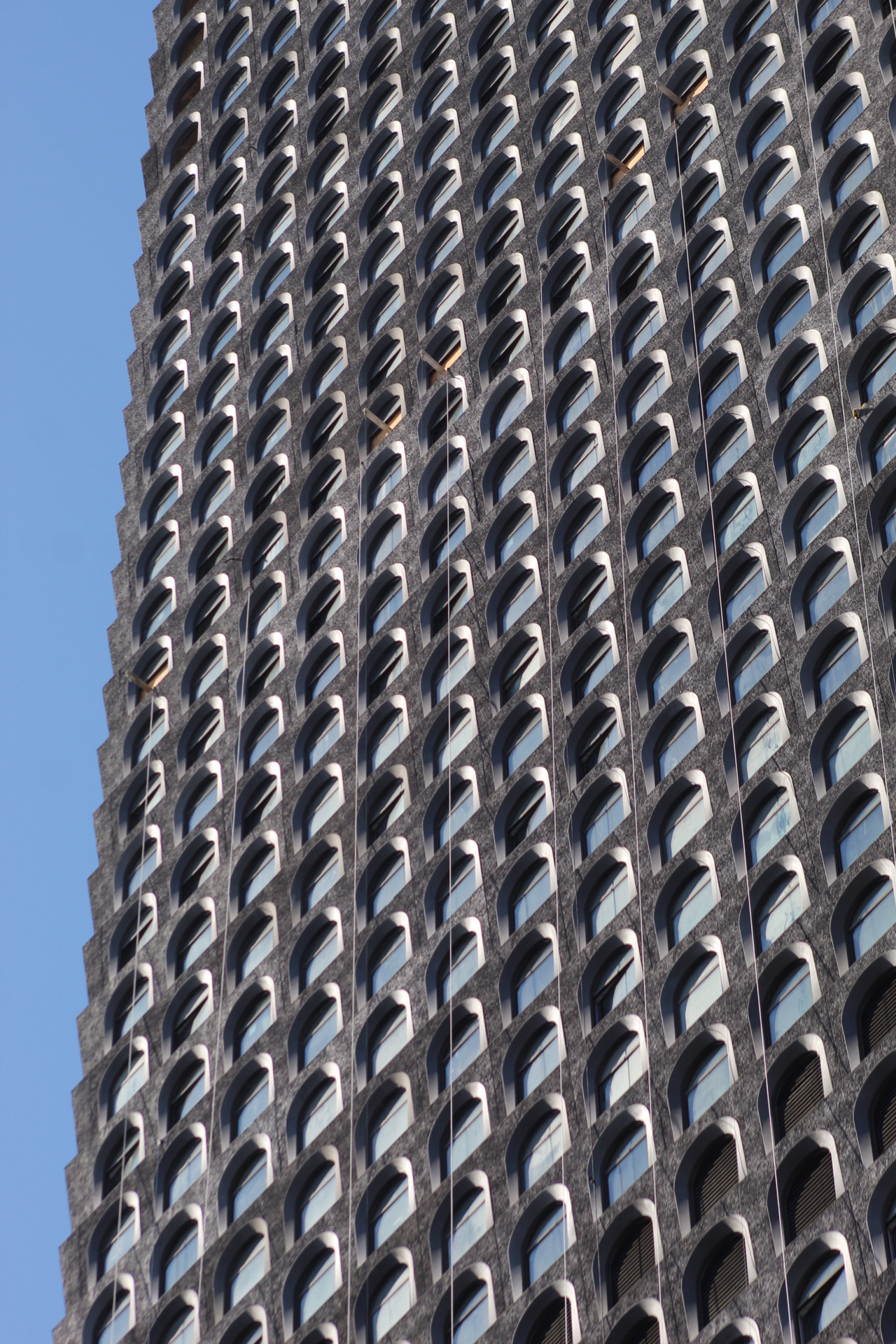
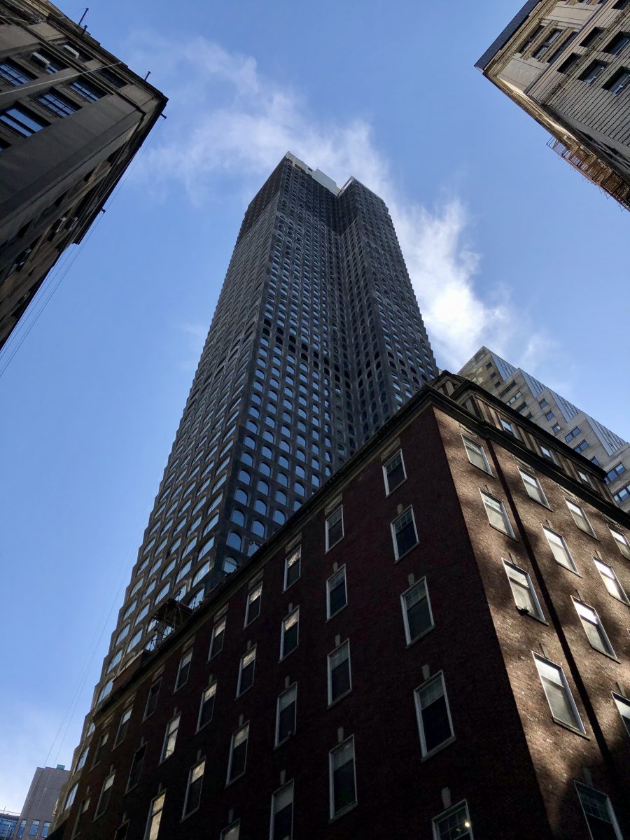
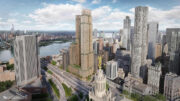
130 William Street‘s signature façade has made significant progress since YIMBY’s last report in August. The charcoal-colored, concrete-cast arches are now approaching the flat roof of the topped-out Financial District skyscraper. The first New York project from David Adjaye of Adjaye Associates, the 66-story tower stands 800 feet tall and will contain 242 residences. Hill West Architects is the architect of record, Lightstone is the developer, and Corcoran Sunshine Marketing Group is handling sales and marketing for the units, which will range in price from around $1,300,000 for a one-bedroom to $20,000,000 for a four-bedroom, full-floor penthouse.
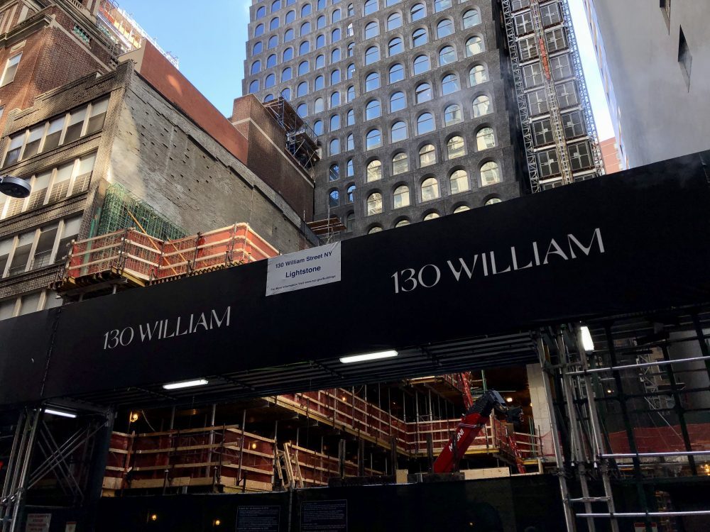
Close-up photos of the envelope show the dense, compact grid of arched windows on the wide eastern elevation.
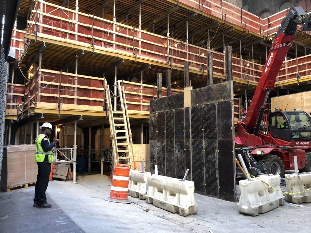
Work on the walls of the outdoor entrance and courtyard along William Street is also underway.
The remaining sections are arriving on site and being hoisted into position.
The lower floors along Fulton Street have extra large arched windows.
Completion of 130 William Street should happen sometime next year.
Subscribe to YIMBY’s daily e-mail
Follow YIMBYgram for real-time photo updates
Like YIMBY on Facebook
Follow YIMBY’s Twitter for the latest in YIMBYnews







A building Darth Vader could love..
Kick….. Ass
And where are those larger arches on the top floors that are curved on the bottom?..seemed a bit awkward. I don’t see them in any of these photos
Nor can you see them from a street-level view; from Brooklyn you’d be able to.
^The north and south facades.
I bought a 2 bedroom here. beautiful building. clean design and nice bronze arches.
I know it’s not to everyone’s liking but it’s one of my favorite buildings in NYC
I don’t like it. It looks dirty as in soot-stained.
Hideous, truly hideous. Didn’t we learn anything from the 60s and 70s?
Straight facts.
A few years down the road, the developers will reclad this building in a new shiny surface to encourage purchase. The structure is sound and the interiors are fine. It is the exterior that is revolting to the eyes. Buyers (or the lack thereof), will determine the fate of this hideousness
Not sure why, but I like it. The eastern elevation detail reminds me of a cheese grater.
Dystopian. Looks like it could use a good power-washing.
Looking through these photos, I don’t think that this is a curtain wall. It is a window wall with precast piers.
Please delete above. That was meant for the Park Row project.
What is missing is the red, shining Eye of Sauran at the top, suspended from the center of one of those horn-like widowframs hoisted on the rooftop, and the Dark Tower would be complete. Amazing how much of the Lord of the Rings’s Dark Tower is present in this design! Life mimicking art?
Neo brutalist building. More precast dark grey concrete covers between windows, looks like precast brutalist office towers of 1950-1960s across America, mostly 30-40 story. The only difference they weren’t arched.
Generally looking as a puncture in skyline, but overall sharp building, unusual for NY, except the former US postal office tower on 3rd Avenue, I believe on 3rd and 53.