Construction is now above street level at 58 West 39th Street, aka H Hotel W39, in Midtown. Designed by Peter F. Poon Architect and developed by Wei Hong Hu of H Hotel LLC, the 447-foot-tall, 29-story structure is rising from a narrow plot below Bryant Park between Fifth and Sixth Avenue.
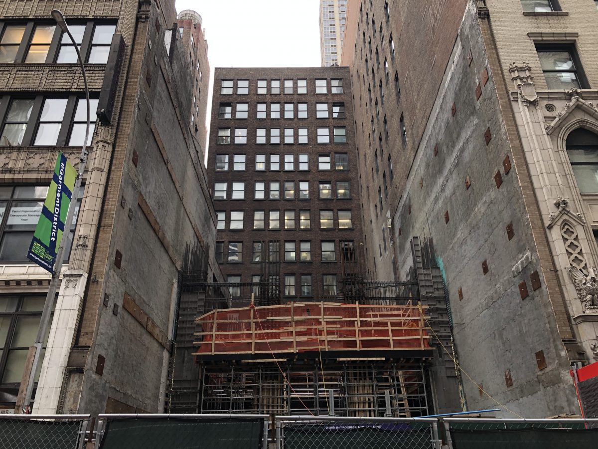
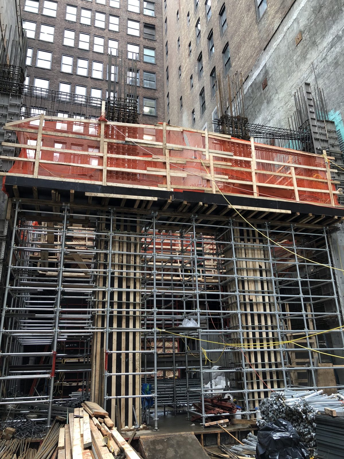
Photos show the ground floor and second story in the process of formation. The reinforced concrete columns and floor slabs are being supported by a thick web of temporary supports.
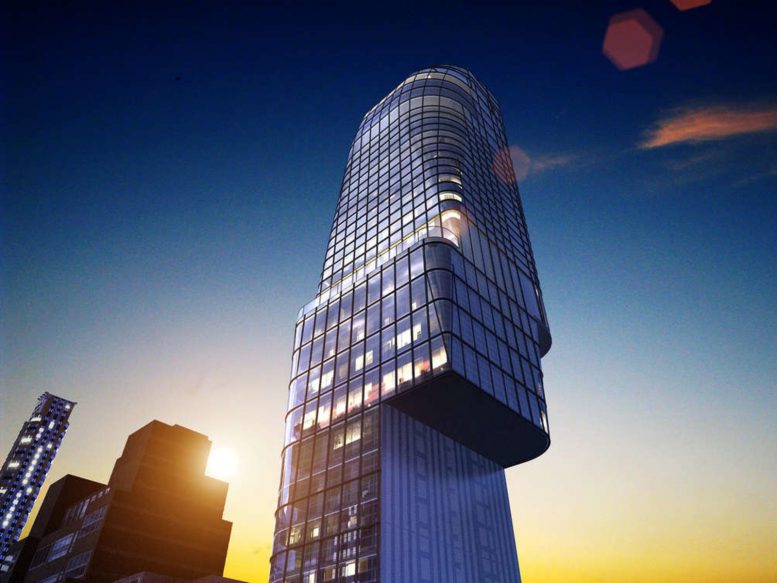
The rendering shows a futuristic, glass-clad design with a dramatic cantilever high above street level, much like the Central Park Tower. Almost all the corners of each floor plate appear to be curved, while the final levels culminate in a rounded parapet. The grid of mullions further accentuates the idiosyncratic shape of the structure.
The development will contain a total of 56,000 square feet, with 41,500 square feet of commercial space and 65 hotel rooms, meeting rooms, a fitness center, and a hotel lobby along West 39th Street. The closest subway station is at the end of the street at the corner of Sixth Avenue with access to the B, D, F, M, and 7 trains. Times Square is a short walk from the hotel, while the Port Authority Bus Terminal is only two avenues away to the west.
A completion date for 58 West 39th Street was posted on the construction fence for this winter.
Subscribe to YIMBY’s daily e-mail
Follow YIMBYgram for real-time photo updates
Like YIMBY on Facebook
Follow YIMBY’s Twitter for the latest in YIMBYnews






Wow..see, a building doesn’t have to be ten thousand feet tall to stand out..right out of a Science Fiction film..l love it, especially squeezed between ‘old world’ midtown buildings.
Please tell me that absolutely absurd setback is not actually what’s happening…
Thank god for those owners around all this new “smoke and mirrors buildings going up” for not saling out and keeping with traditional old style New York, a new York I grew up with yes I’m a native New yorker. One more thing outside of the few classy and art deco style buildings going up around town why does everything else look the same or uniformed as if to put everyone into a one frame of mind mindset? Look at Hudson yards and you see no life or vibrance to it, just tall buildings to impress tourist and implants wanting to call New York home.
Most cantilevered buildings, by their very nature. may seem unbalanced to a degree.
But this one is truly grotesque, without any grace or balance whatsoever.
I would not want to live in an already overly congested city where every inch of the available air-right spaces above us are filled in with the sky-grabbing greed that is manifested in cantilevered follies such as this.
Easter Island Head
Some cantilevers work and many don’t so this is a wait and see situation. The most positive aspect of these building policy loopholes is that they should save many historic buildings from demolition.
Not impressed with how this tower is being “shoehorned” between the adjacent buildings. Somehow it looks like all the weight is on one side. How is this structurally stable?
Also it appears that the tenants in the building on the right will be trapped in rooms with no sunlight or exit in case of a fire!!! ?
Pretty insane cantilever… I like it! A breath of fresh air. I have no idea how that thing is stable
Not so awful, especially for Poon. This is among his better works. Not saying much, but still…
Really is a “sticking finger” architecture. Why is seatback backward? What is the true reason to make this cantvelier for high rise floors, what’s the reason???
On rendering looks like ugly finger, really if it’s built like this one!!!
Maybe this good for a Sheepshead Bay, but completely wrong for Midtown Manhattan!!! Or built it next to High Line.
Truly ridiculous.
The rendering doesn’t help me understand the context at all.
Another out of plumb non union job
If they are rounding the top why not round the bottom of the cantelivers? It would make it curvaceous and not jagged. Incomplete design. Go back and developed the design.
How it that legal to build cutting off the windows of 3 other buildings? Doesn’t NYC zoning law require windows to some degree? There also used to be a “covenant of quiet enjoyment” which protected a tenant or an owner against a disturbance of his or her right to possess or use property.
This is a West 30s budget hotel by the hotel Taliban… The context is irrelevant. I blindfolded child could design a building with markers that is more respectful and appropriate to those streets. Plus the city sweeps in and requires the whole cheap, banal, tacky or equal parts cheap, banal or tacky affair be setback from the historic streetwall which takes a pile of thoughtless garbage and makes it ten times worse.
H means “hah”. Worst design, architetor want to build “mini skyscraper” in pointing over the block like an angry finger like “hah”…
Is it a balancing act of terror or ugly? Horror or just bad manners? Whether it’s stable or not, I’d rather not be near this poop emoji of a building when the next hurricane visits NYC.
It’s have probably spring tension inside in case of next 120 mile per hour Superstorm. Antigravity design from High Line absurd architecture came debut on Broadway, in her worst show!!!
A 1 legged chair. This is what happens when you buy your neighbors air rights and don’t know what to do with it.
For everyone asking why they did the cantilever i’ve been by the construction site and there is an existing building that is only about 6 stories tall next to it. so this won’t appear to float when it is done, it’ll look like two separate buildings till the 6th floor (which it is) and then the one on the left widens out and continues up.
In comparison with previous work of Peter Poon I can see the evolution and challenge to welcome a new design era on the Firm.
Many boutique architectural/design firm in NY close when a generation doesn’t pass the baton to a younger one trained in the same firm and is sad, boutique and corporations must coexist for the sake of clients.
If you keep on doing the same..you can’t expect a different result.
Kudos for Poon!
air right is the reason to this evolutionary design.