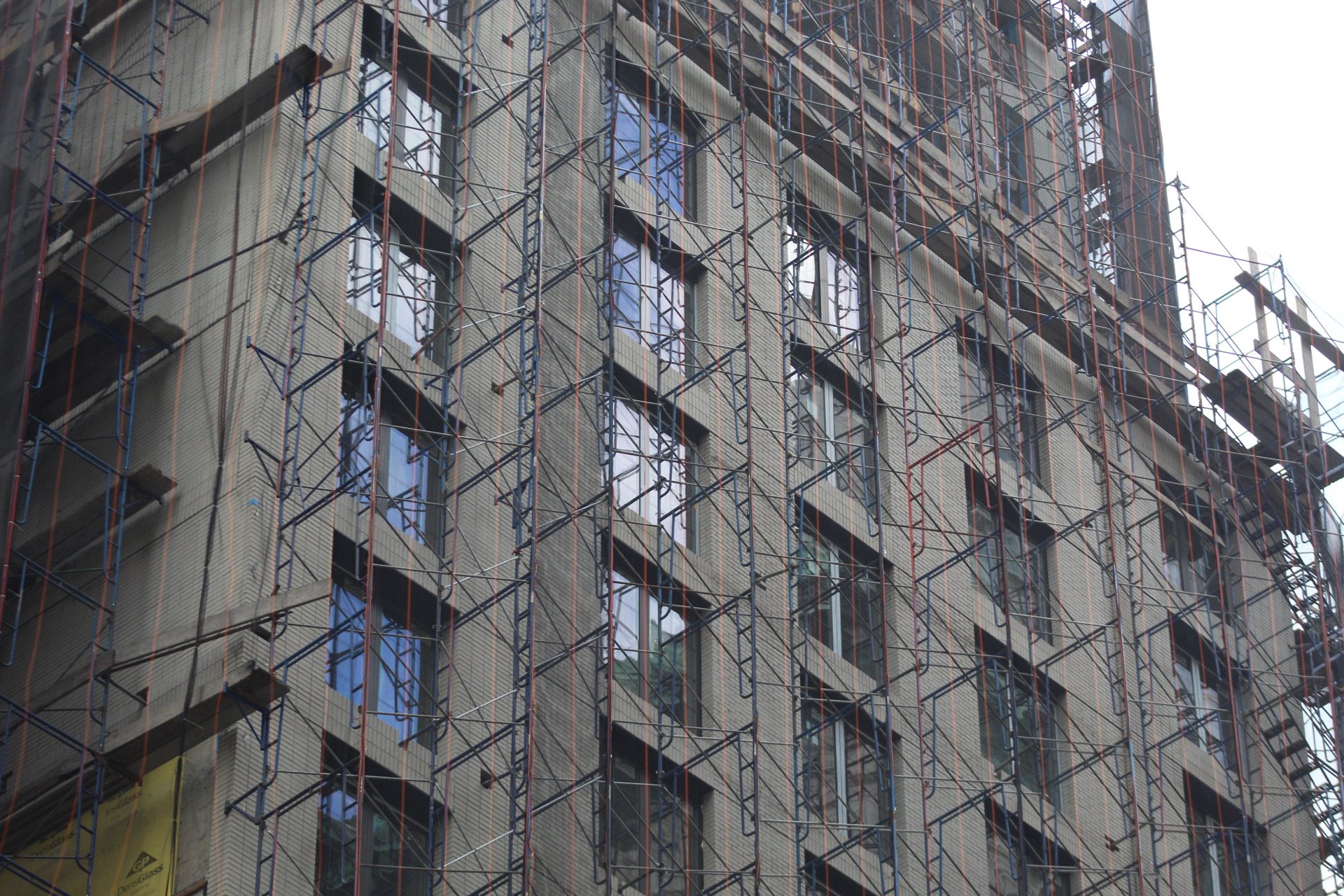
The brick envelope is nearing the top of 292 Fifth Avenue, a new mixed-use hotel designed by Gene Kaufman Architect on the border of Koreatown and NoMad. Developed by Sam Chang, the 21-story project is located between West 30th Street and West 31st Street and is slated to house a Le Meridien hotel and 16 residential units.
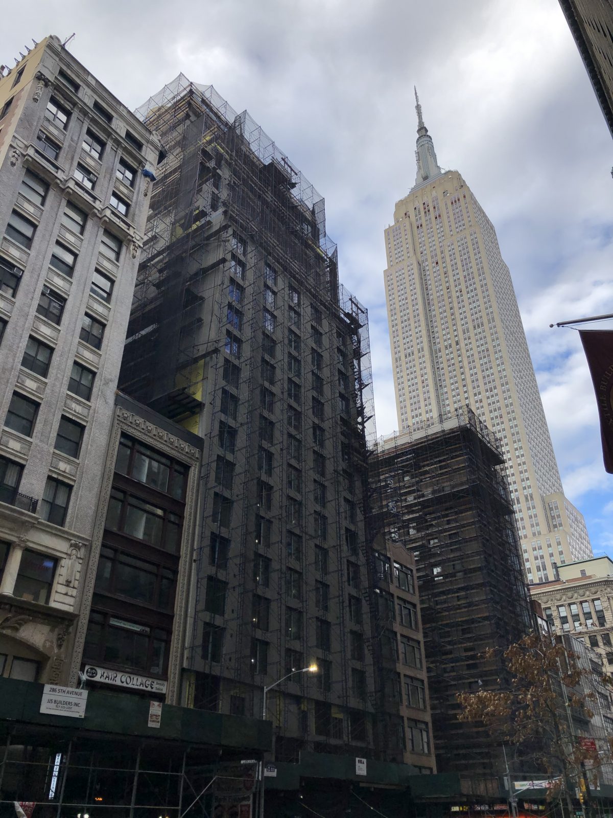
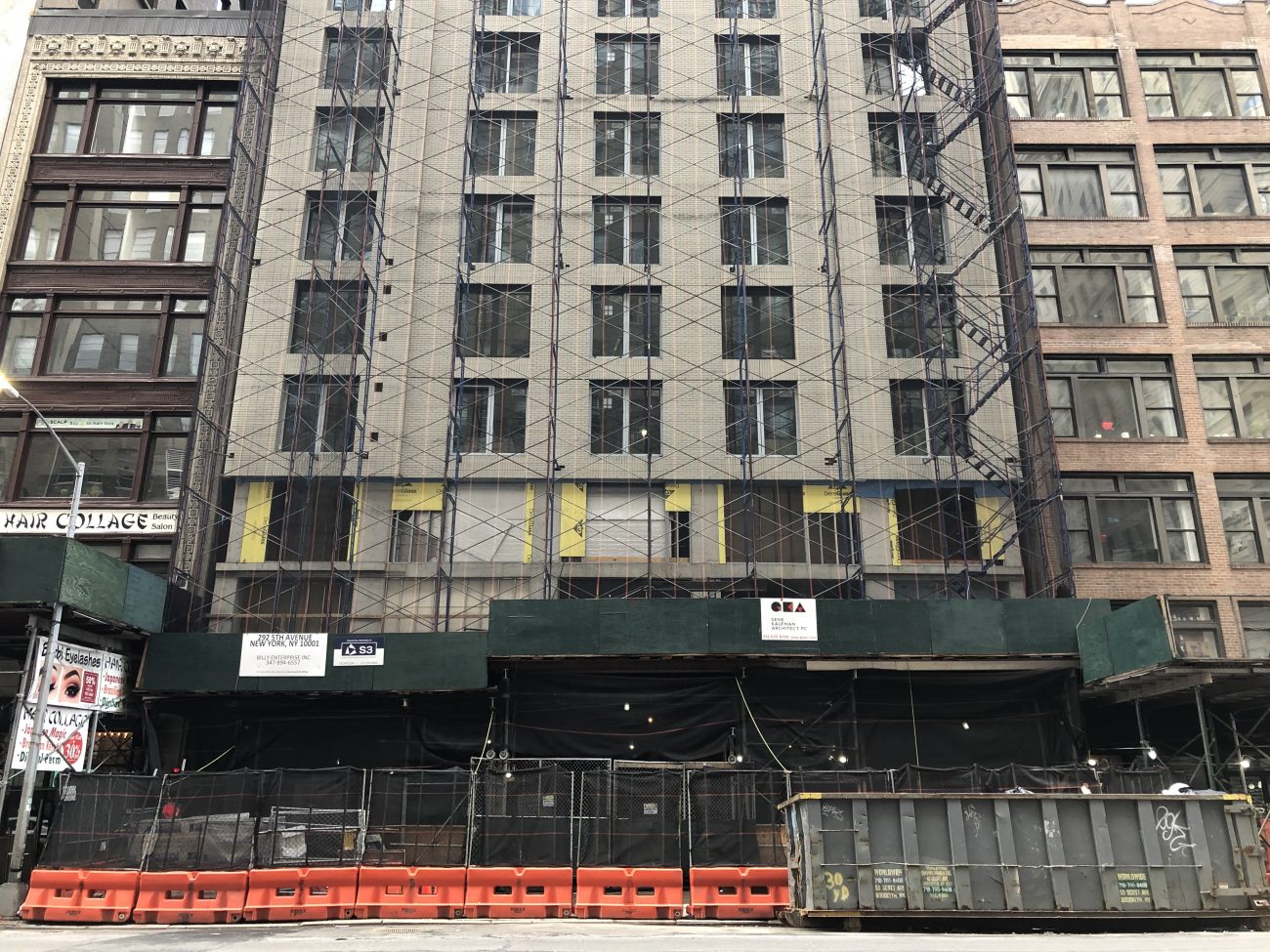
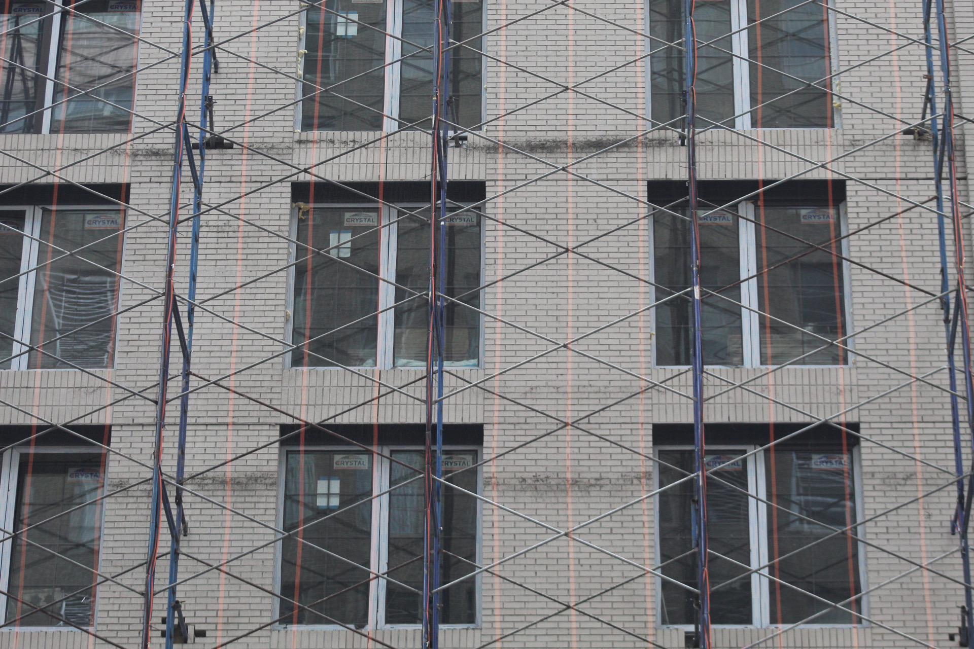
The main eastern profile is still covered in black netting and scaffolding, though the hand-laid brick façade is visible behind it. The brick looks much warmer in color than in the rendering, which portrays the building with a bright white curtain wall. The entire structure will be clad in this masonry, with the exception of the large multi-story section of glass above the main setback.
The hotel will contain 196 guest rooms, averaging 325 square feet apiece. Rooms begin on the second floor and culminate on the 16th story, while the residential component and meeting rooms will occupy floors 17 through 21. Amenities include an outdoor terrace on the 17th floor, a ground-level restaurant, and bicycle storage. The closest transit options to 292 Fifth Avenue are the B, D, F, N, Q, R, W, and PATH trains at 34th Street-Herald Square station, as well as the 4 and 6 trains at the 33rd Street station along Park Avenue South.
Construction should finish before the end of the year.
Subscribe to YIMBY’s daily e-mail
Follow YIMBYgram for real-time photo updates
Like YIMBY on Facebook
Follow YIMBY’s Twitter for the latest in YIMBYnews

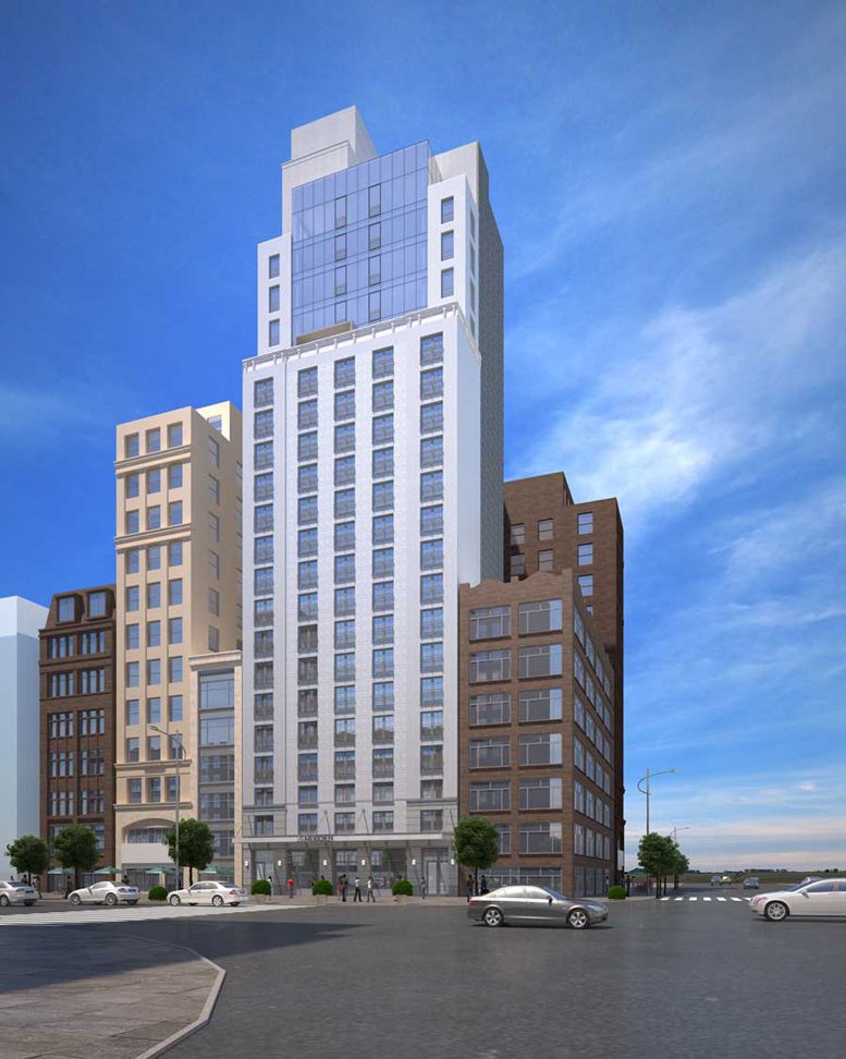




LMAO this rendering. That sky is open and unrealistic. Where did all the neighboring buildings go?
Sam clearly spared no expense here.
The rendering is very funny. Some things seem to be missing.
Our prairie is growing up!
I would rather he had built it out of straw, than bricks. At least it would have been more exciting! ?
These 2 clowns – kaufman and chang – are literally ruining the aesthetic of our city… by adding one crappy building at a time.. It is just offensive
Kaufman is back!!! Few days ago he was created a good looking building, but now is gift of another crap, now in the middle of Fifth Avenue, just stone up from majestic ESB!!! Seatback on higher floors, with top of building in very messy crown part. Better built just straight and paint this brick with yellow and green, orange and black, at least will be looks funny!!! And leave water tanks with words “GK”.
GK architecture is back,now on stone up from majestic ESB. Measly crown after unnecessary setback on top floors. Would be more aesthetic to built just plain brick building with moderate colors, beige, grey, stone like.
Hate these duo of twisted towers, should be better looks like adding 100 floors on each one, and somewhere in China, but not on moderate highrise architecture of High Line.